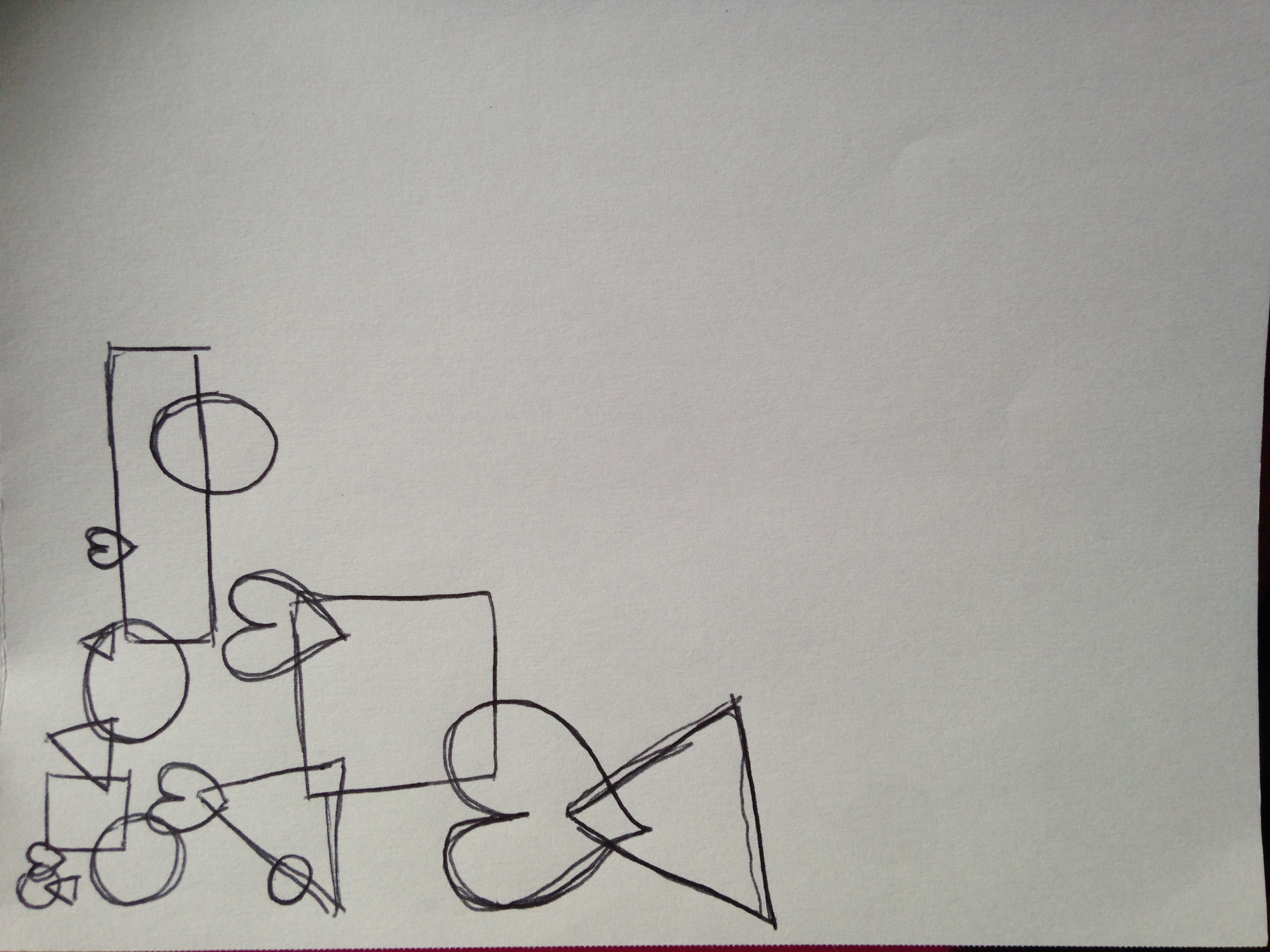
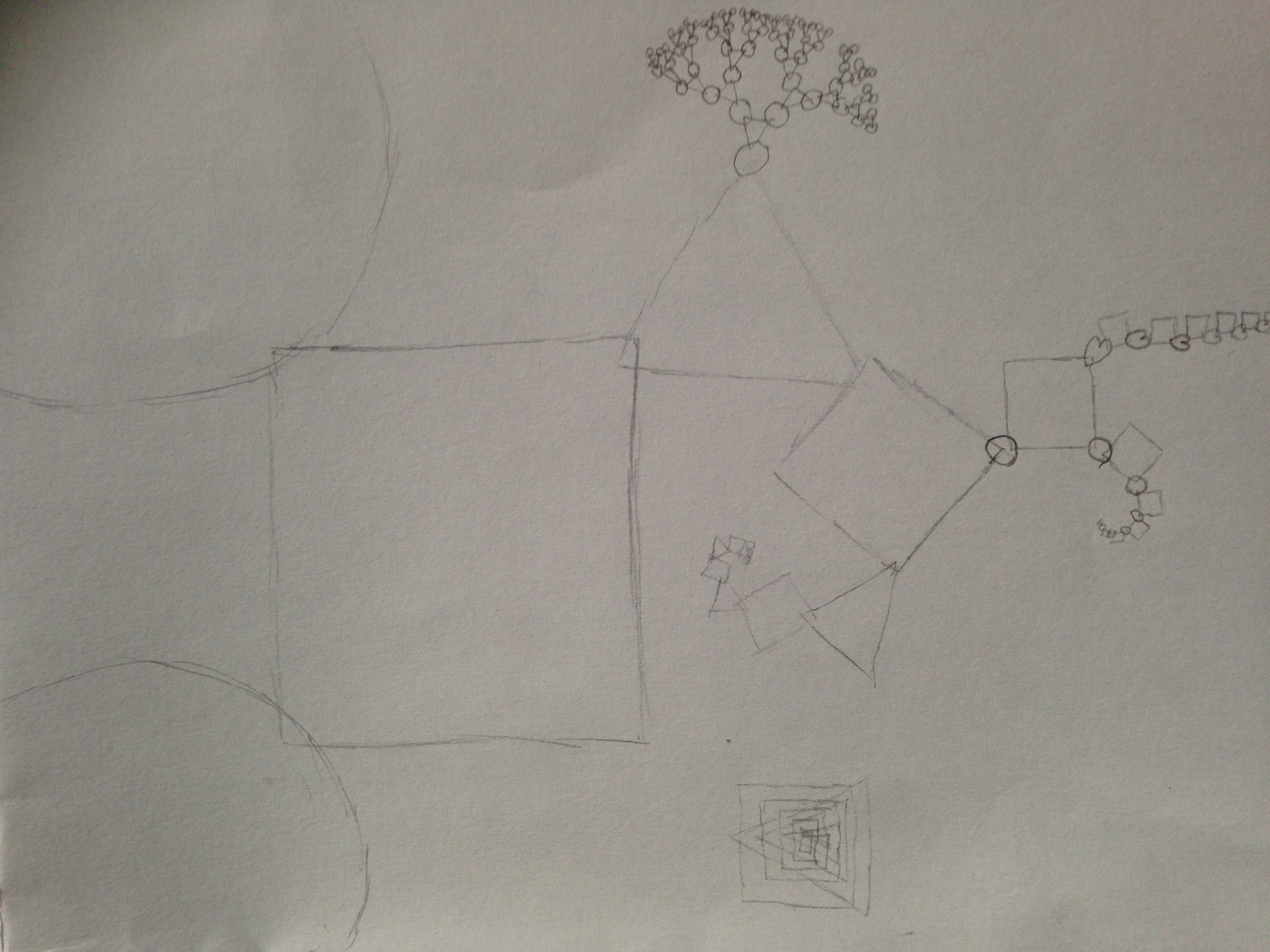
According to the designing manifesto, the process is the product. I was really interested in the process of creating drawings, one that no matter who followed the instructions the result would be different and when working with my own drawing instructions that was my focus. I wanted to make instructions that no matter who followed them each piece would be different. Below are the set of instructions I created for my instructional drawings. I also wanted to make the instructions as easy to follow as possible so when writing them, I attempted to separate different aspects required in the piece, from the initial set up to the actual drawing.
Concept:
This project looks to create a series of drawing based off instructions
You will be provided with a pencil, a ruler and a clear sheet of paper
Instructions
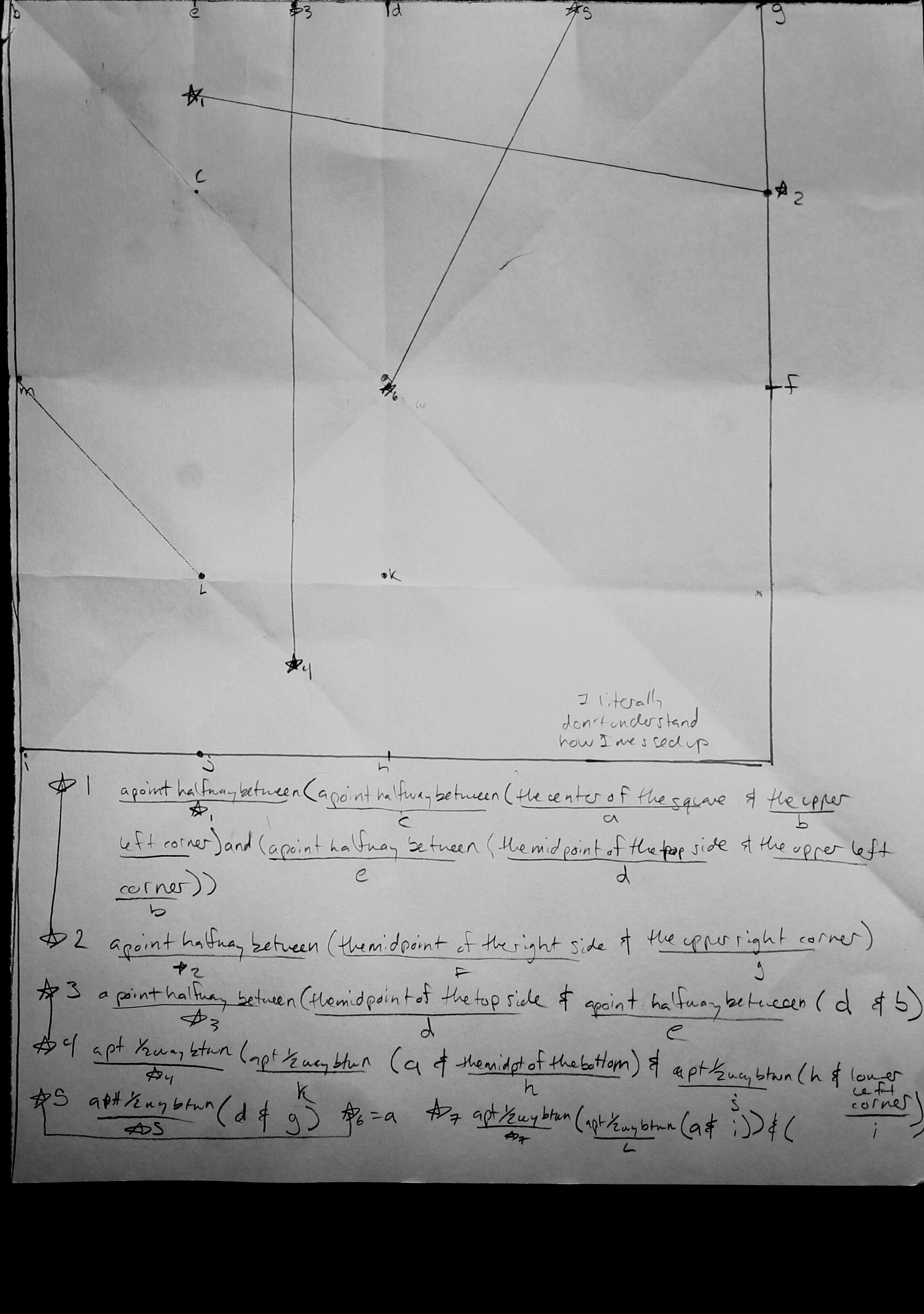
On the clear sheet of paper Create a Frame
- STEP 1
Label the top of the page T
Label the bottom of the page B
Label the left side of the page L
Label the right side of the page R
Draw 2 horizontal lines
Draw the first line ½ an inch from the Bottomof the page
Draw the second line ½ an inch from the Topof the page
Draw 2 vertical lines
Draw the first line ½ an inch from the Leftside of the page
Draw the second line ½ an inch from the Right sideof the page
Create a Drawing
STEP 2
With your pencil make dots
-Make a dot in the center of your page, equidistant from the horizontal and vertical lines you drew
Make 8 dots on the horizontal line [next to the label T]
Make 5 dots on the horizontal line [next to the label B]
Make 7 dots on the vertical line [next to the label L]
Make 3 dots on the vertical line [next to the label R]
STEP 3
Draw:
Draw a line (without your ruler) from:
*DO NOT LIFT YOUR PENCIL BETWEEN MOVING FROM DOT TO DOT
2nd dot next to label T to 3rd dot next to label R
=2T to 6R
4th dot next to label B to 8th dot next to label T
=4B to 8T
3L to halfway between 3B and 4B
Draw a line from your current point to the dot in the center
Draw a semi-circle from the center and loop through any three dots in on the lines
–5B to 3R
–connect the first dot on the horizontal line on the Top zig zag to an odd dot directly opposite on the Bottom and from that connect it to an even dot directly opposite it on the vertical line. Repeat this process until the painting is finished.
-If you’ve reached this point the painting is finished.
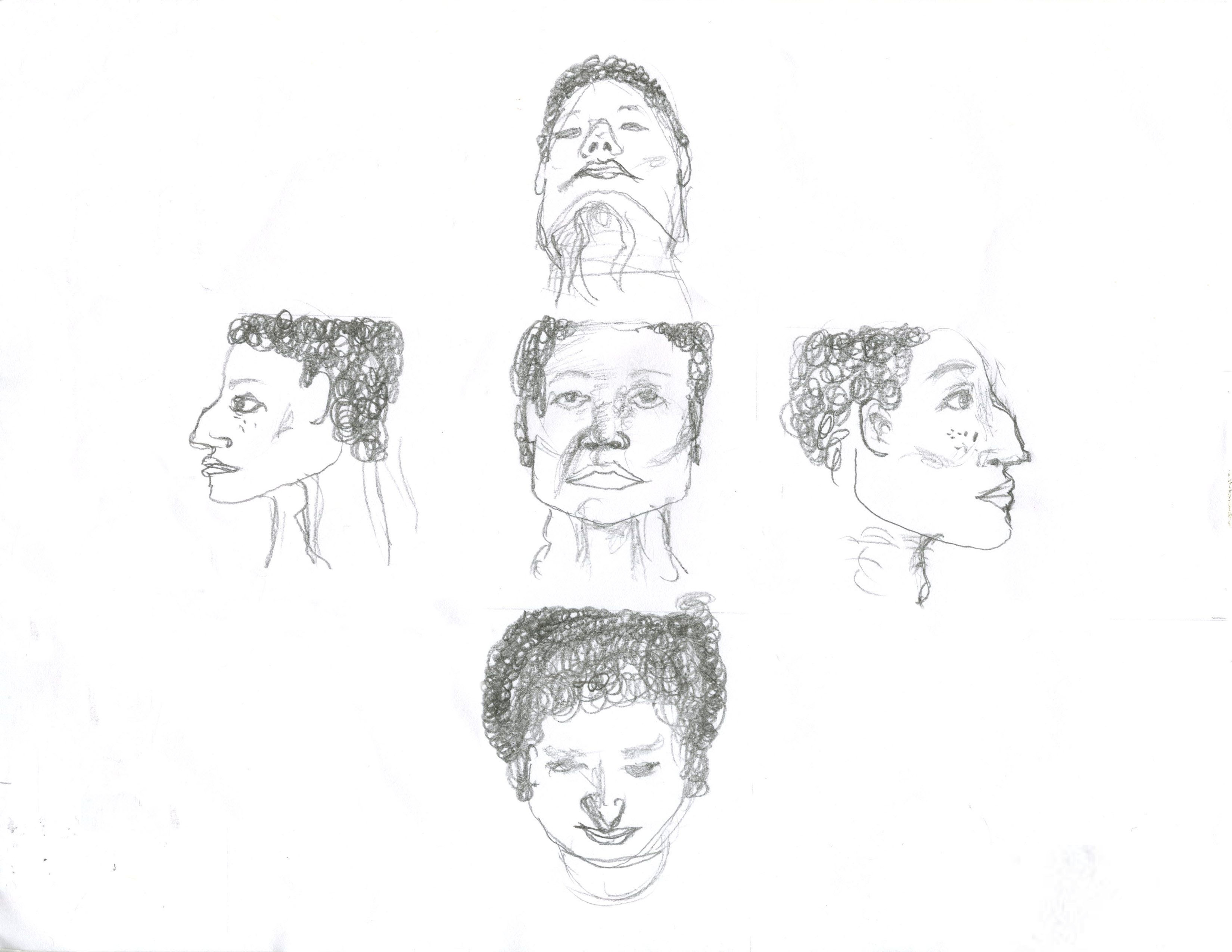
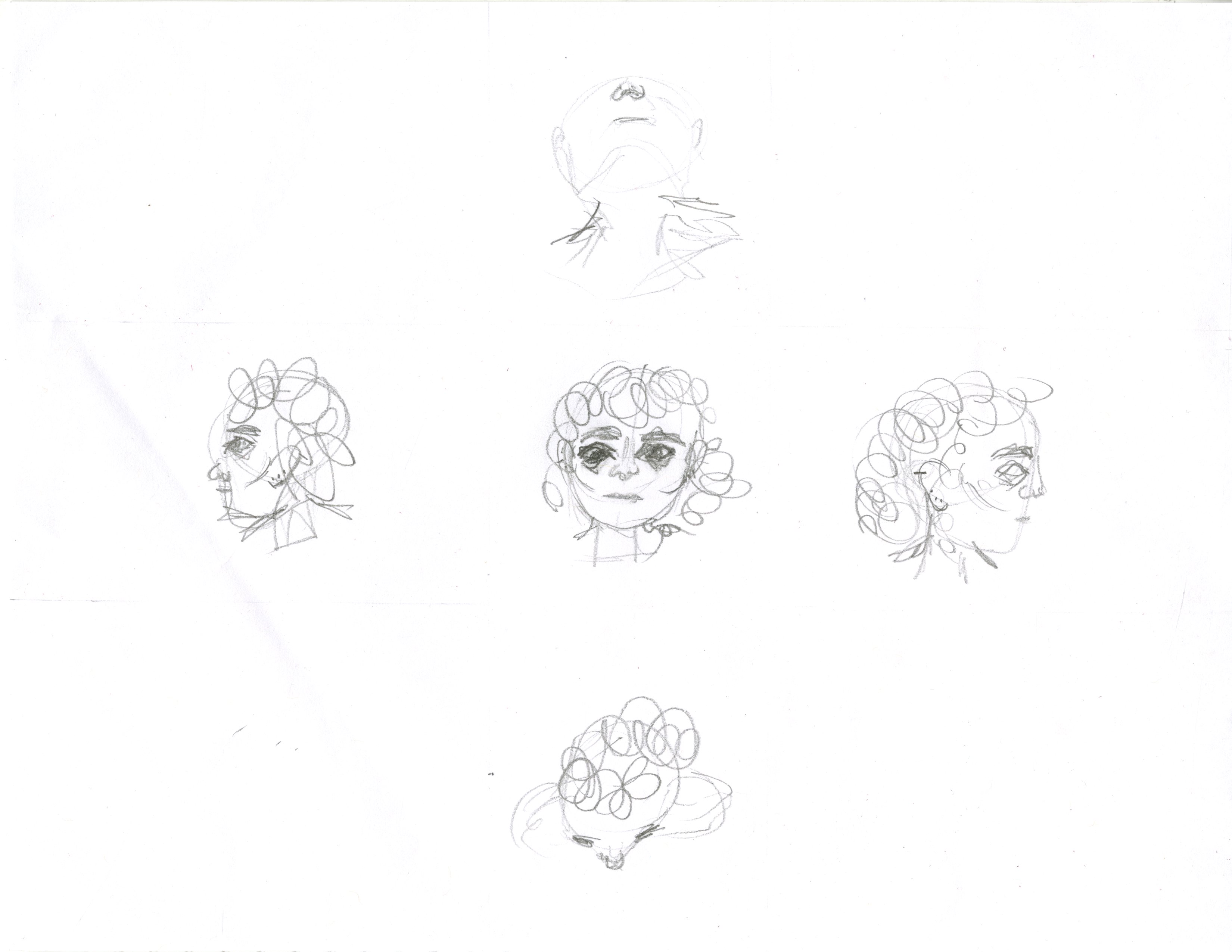
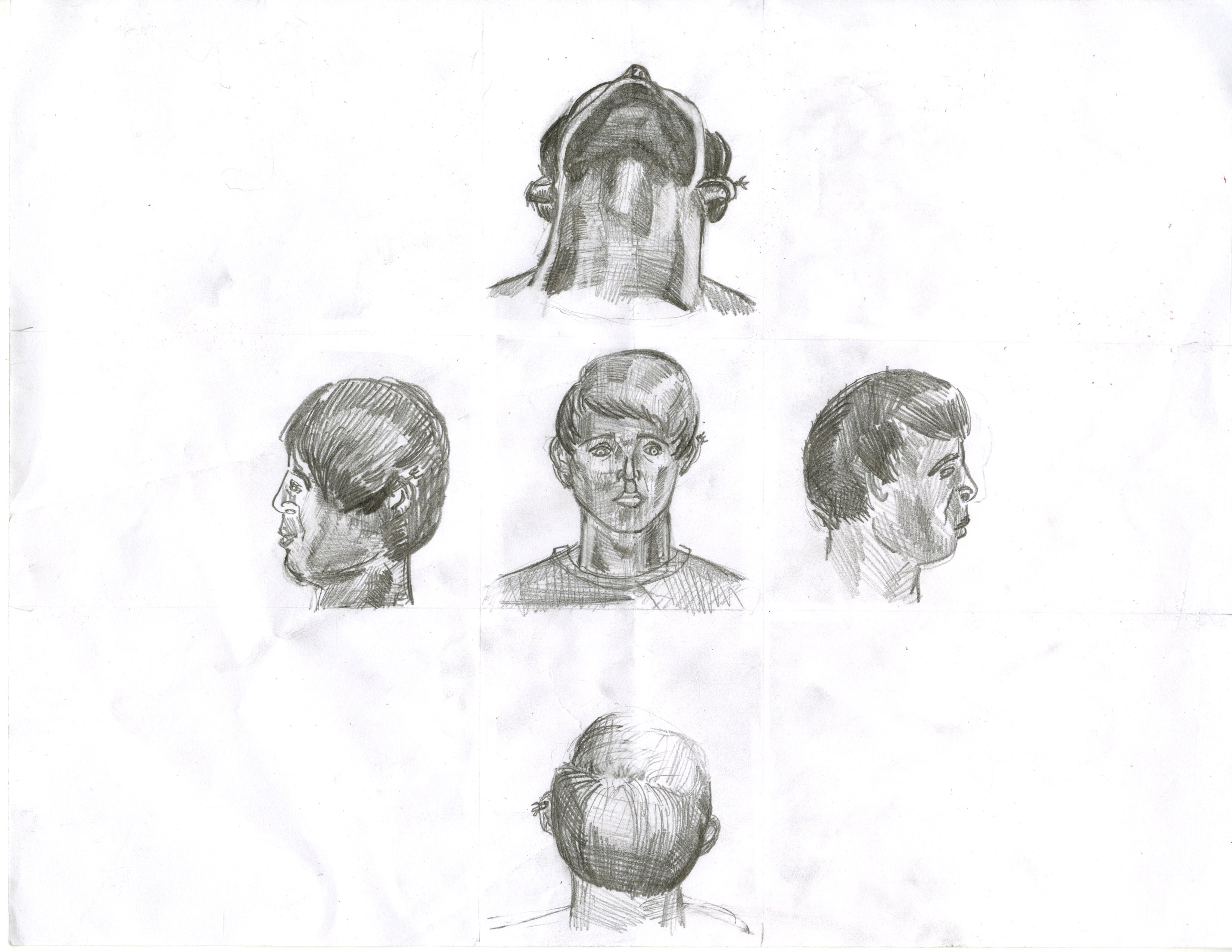
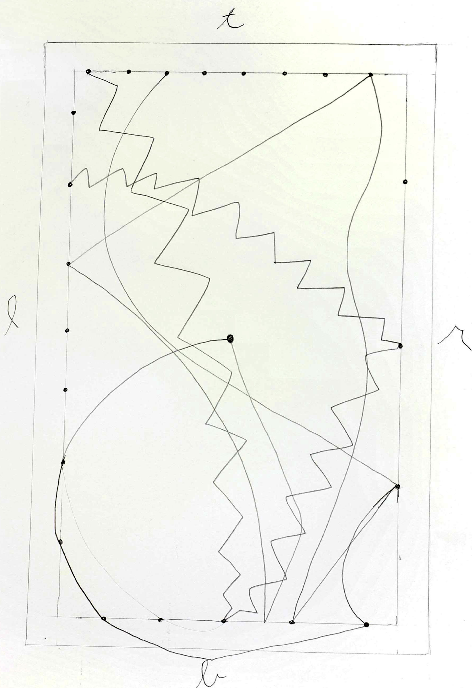
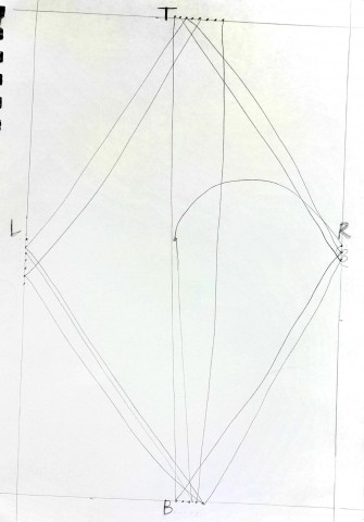
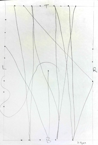
One instruction that I initially left ambiguous is the last instruction that says “Repeat this process until the painting is finished”. This instruction is my form of a loop but one that takes into consideration the artist. For normal loops one, or at least a computer, would continue repeating the process until a specific set of parameters are met. As an artist, painting kind of seems like a loop, except for me I never seem to know when to stop. A drawing or painting in my mind is never really finished and so when creating this ‘loop’ I wanted the artist to decided when they thought the drawing was finished, or if they would continue forever. Below is a series of drawing. The first is a drawing a created myself based off of my own instructions. The next three are the drawings I gave out for other people to complete. What I found interesting about the resulting pieces is how each individual interpreted different instructions. I made two initially random instructions. First, I didn’t dictate where on the lines the people following the instructions would have to place their dots which meant that no matter what the lines made by different artists would never meet or be the same. Second, in one instruction I allowed the artist to connect the dots they selected to any other they selected. This was another way to intentionally generate randomness. One instruction that I found particularly interesting was the zigzagging from one dot to the next. In one painting the person choice to make zigzags, mini ones all the way to the next dot. It’s always things like this that you can’t really anticipate but also serve to create really unique and interesting pieces. That piece was my favorite because it was so unexpected.
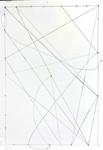
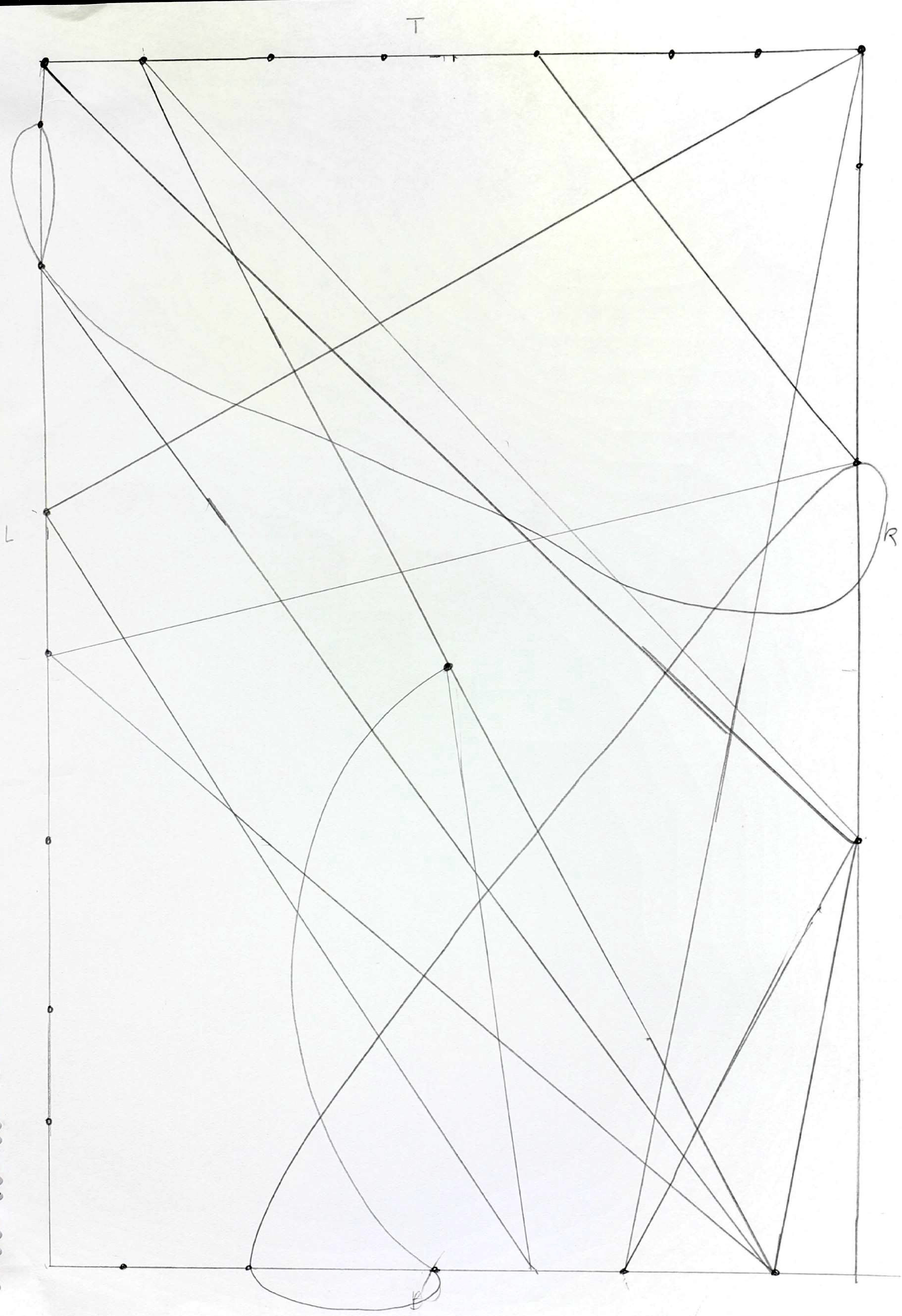
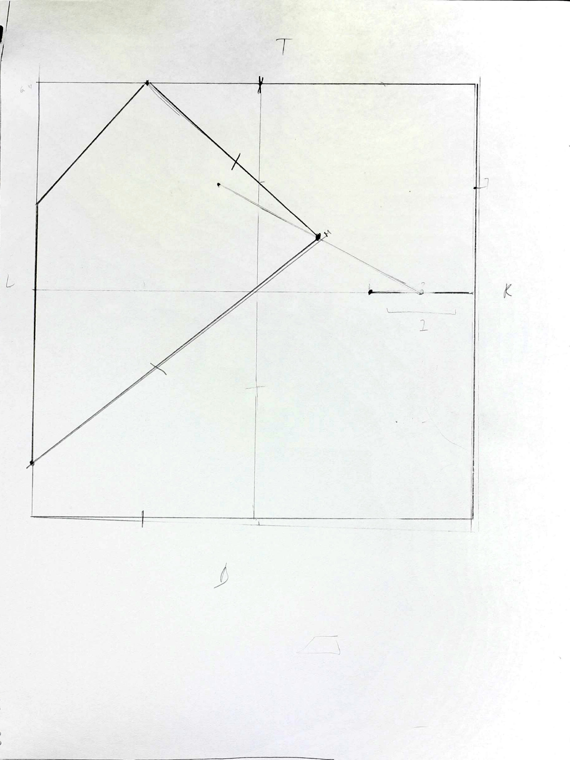
My Drawing following the instructions I made
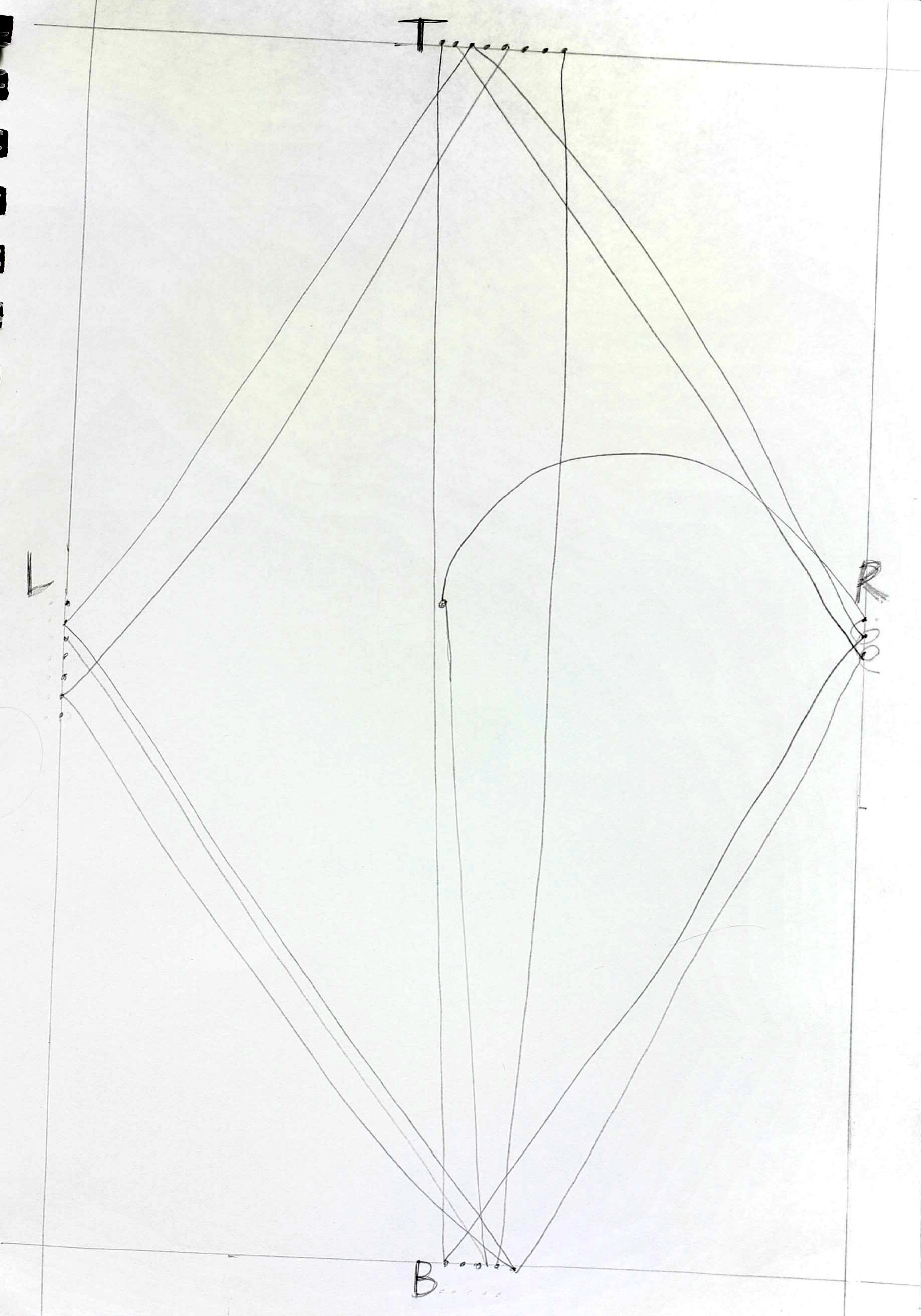
First Person to follow my instructions
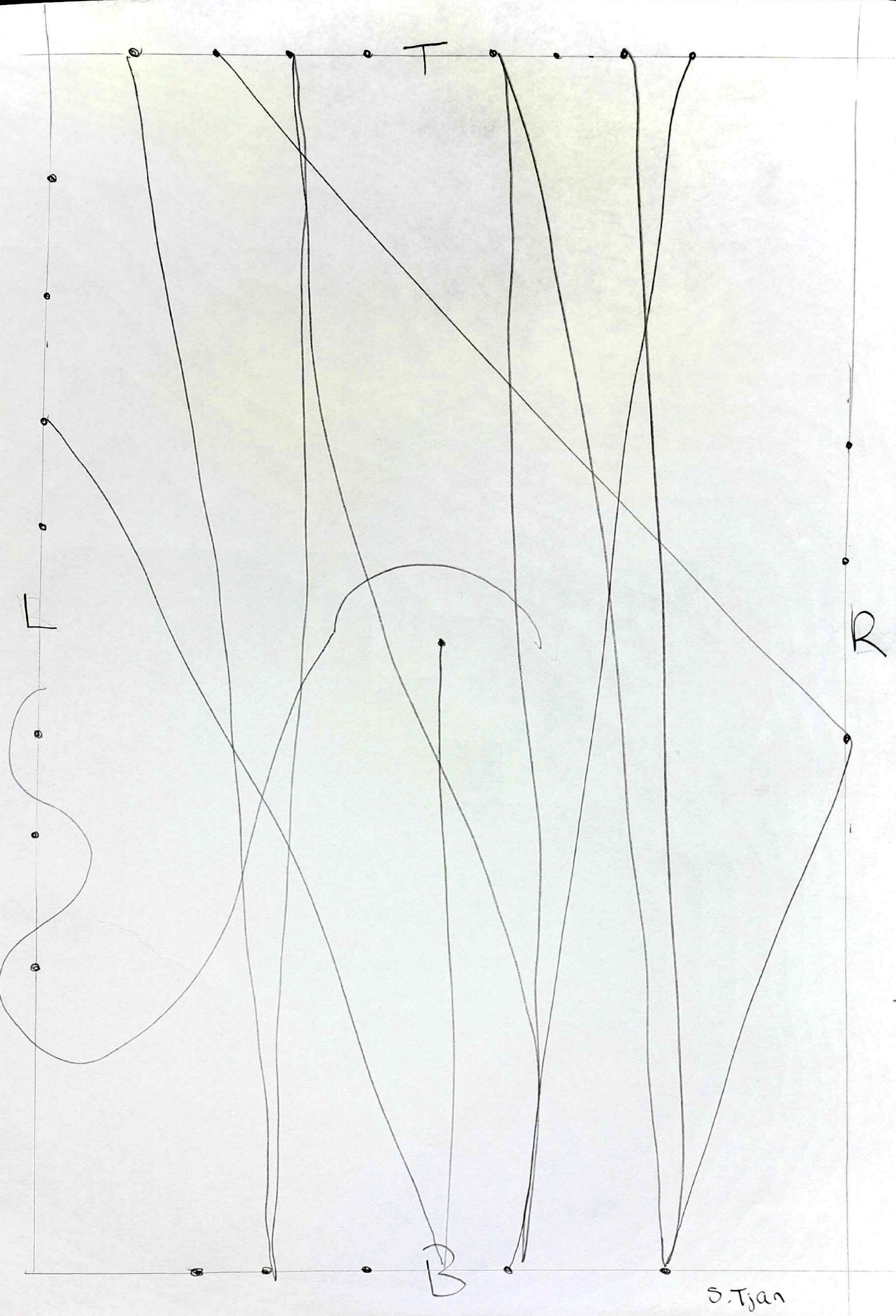
Second Person to follow my instructions
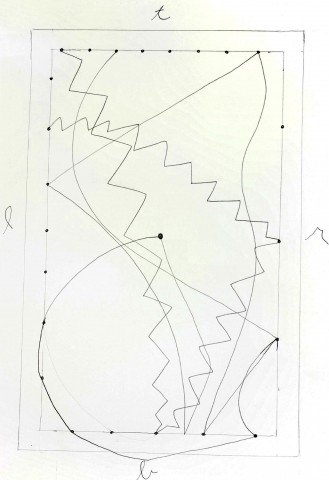
Third Person to follow my instructions. My favorite.