Lewitt

I have extremely limited knowledge of code, but I’m going to go ahead and classify Sol Lewitt’s Wall Drawings as such. I enjoyed this rather frustrating task even though I’m still a tad confused and pretty sure it’s not right. As executor, I translated his instructions into a language I could decipher and draw from. I struggled with different ways of interpreting the text and figuring out which ways of translating worked best for me. In the end I tried to highlight the word “to” and map out the connections by labeling each point with a letter, ending up with instructions like A is half way between B and C and is drawn to D etc.img002

Wall Drawing: The Dreaded Trapezoid

MAJ_Lewitt I realize that the paper was supposed to be oriented in portrait rather than landscape. Whoops.

The syntax of Sol Lewitt’s “Wall Drawings” is halfway between the language of men and halfway between the language of machines. As a result, it is nearly incomprehensible to both. As one may be able to tell by my (somewhat illegible) handwriting, I was befuddled by Lewitt’s instructions, and attempted to create the shape from what little I understood.

I am thankful that our current computing machines cannot grasp the concept of tedium, nor that of frustration. I am also thankful that the typical exchange between a given person and a given machine is somewhat straightforward (and the reason we have user interfaces).

Looking Outwards 2 : Processing

ADMIRATION Chronomorphologic Modeling by Madeline Gannon

Madeline Gannon, a graduate student in the CMU School of Architecture, uses the natural fluidity of motion to create 3D printed wearables. Within the scope of a Processing-run 3D environment, Gannon’s program allows the user, via Kinect (wholly unnecessary in my opinion), to drag a squid-like entity through space. As the squid’s tentacles and tendrils twist and whip through space, a periodic snapshot is taken of the squid’s location, and added to a mesh file, compiling its motion over time into a static physical form, which is then 3D printed.

Apart from its inherent beauty, I admire that Gannon’s structures draw their intricate patterns and organic composition from iteration and accumulation, two very powerful tools of digital expression.

SURPRISE unnamed soundsculpture by Daniel Franke and Laura Keil

Admittedly, I am a sucker for particle effects, so this video had me hooked from the get go. The particle effects, however, are only the vehicle through which Daniel Franke and Laura Keil convey a stunningly beautiful mix of emergent imagery and contemporary dance:

Recognizing form within a previously chaotic system, especially human form, is an immensely enjoyable experience. I love artwork which explores the basic human need to extract familiarity from confusion. The effectiveness with which unnamed soundsculpture explores this concept surprised me greatly.

MISSED OPPORTUNITY Mycelium by Ryan Alexander

Mycelium simulates fungal growth over an image, where the brightness of each pixel represents a food supply that the fungus can use to grow. While a very promising and creative idea by itself, Ryan Alexander could have taken this in so many directions, and yet left it decidedly bland:

No sound, black and white, TWO DIMENSIONAL. When dealing with simulated organic growth, three dimensions is almost guaranteed to provide a more interesting result, as would certainly be the case with Mycelium. Also, the fungus mimics the pixel values of the image it is eating, thereby reducing itself, for all intents and purposes, to a simple image filter. With a few changes to the display function of the fungus, and perhaps a foray into the third dimension, Mycelium could be much more engaging.

If This Then That: Pigeons

Because I'm a bird-brain.

So I made a recipe that tells me about pigeon videos.


yep_thats_a_pigeon

As for Jim Campbell’s Formula for Computer Art, I believe that as long as there are connections to be made between disparate sources, there will always be a way to do the unexpected with well-known tools and formulae. Jack Burnham’s opinion piece, Art and the API, focuses on the potential ramifications of these “connections”, and serves as a fair rebuttal to Campbell’s implied assertion that computer art is dull and repetitive. However, Campbell does have a point in showing that a lot of computer-based art is similar, but not everything is as simple as pure input/output, especially when dynamic feedback is involved.

(To be clear, I am not holding up my use of IFTTT as an example. Pigeons may be dynamic in flight, but my recipe certainly isn’t.)

Instructional Drawing: Bird and Squiggy

Firstly, a big thanks to everyone who volunteered to create an instructional drawing. All participants are credited by name in the caption of their respective drawing(s).

All participants were given an 8.5 x 11 sheet of paper, a fine point black sharpie, and asked to choose between two sets of instructions, hereafter known as “bird” and “squiggy”.

Interestingly, three out of the five people who volunteered first tried the “bird” instruction set, and then asked to try the “squiggy” instruction set. (The other two stuck with their initial choice.)

Why the switch? Well, here’s the instruction set for “bird”:

Begin by drawing the top half of a circle with the diameter of half an inch.

Place a dot in the center of where the half-circle’s full circle would be.

On an edge of the half-circle that is parallel with the dot, draw an acute angle so that each of the two lines creating the angle is the length of the half-circle’s radius, and so that the interior of the acute angle faces the dot.

From the edge of the acute angle that is not connected to the half-circle, draw a half-inch long straight vertical line that travels away from the dot.

Continued from the straight line, draw a quarter-circle that mirrors the half-circle.

Go back to the half-circle. At the side opposite from the acute angle, draw a horizontal line that is one inch long, and travels away from the dot.

From the end of the one inch horizontal line to the end of the quarter-circle, draw and arc.

Find the intersection between the half-circle and the one inch line. Move vertically away from this point by a half-inch, and place a new dot.

Draw an arc between the new dot and the three fourths of an inch point of the one inch line.

Starting from the quarter-inch point on the one inch line, move down until you encounter the edge of the shape. At this edge, draw a half-inch vertical line traveling away from the shape.

At a right angle to the half inch line (180 degrees on the unit circle), draw a horizontal quarter-inch line.

This is now a finished shape. You must continue making this shape until the page is full, with the condition that you may only draw this shape where the right angle quarter-inch line can connect to a previously drawn shape.

Compared to the instruction set for “squiggy”:

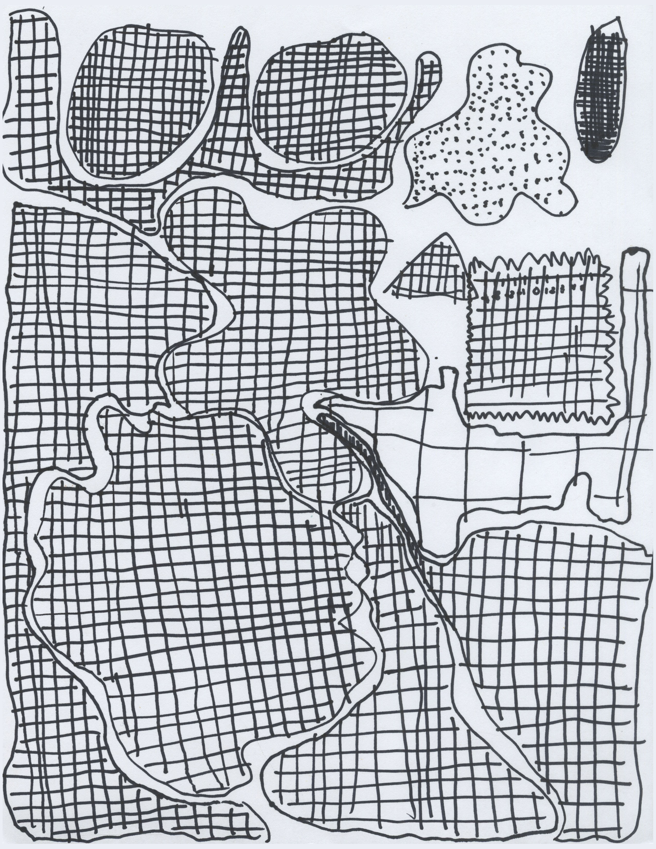
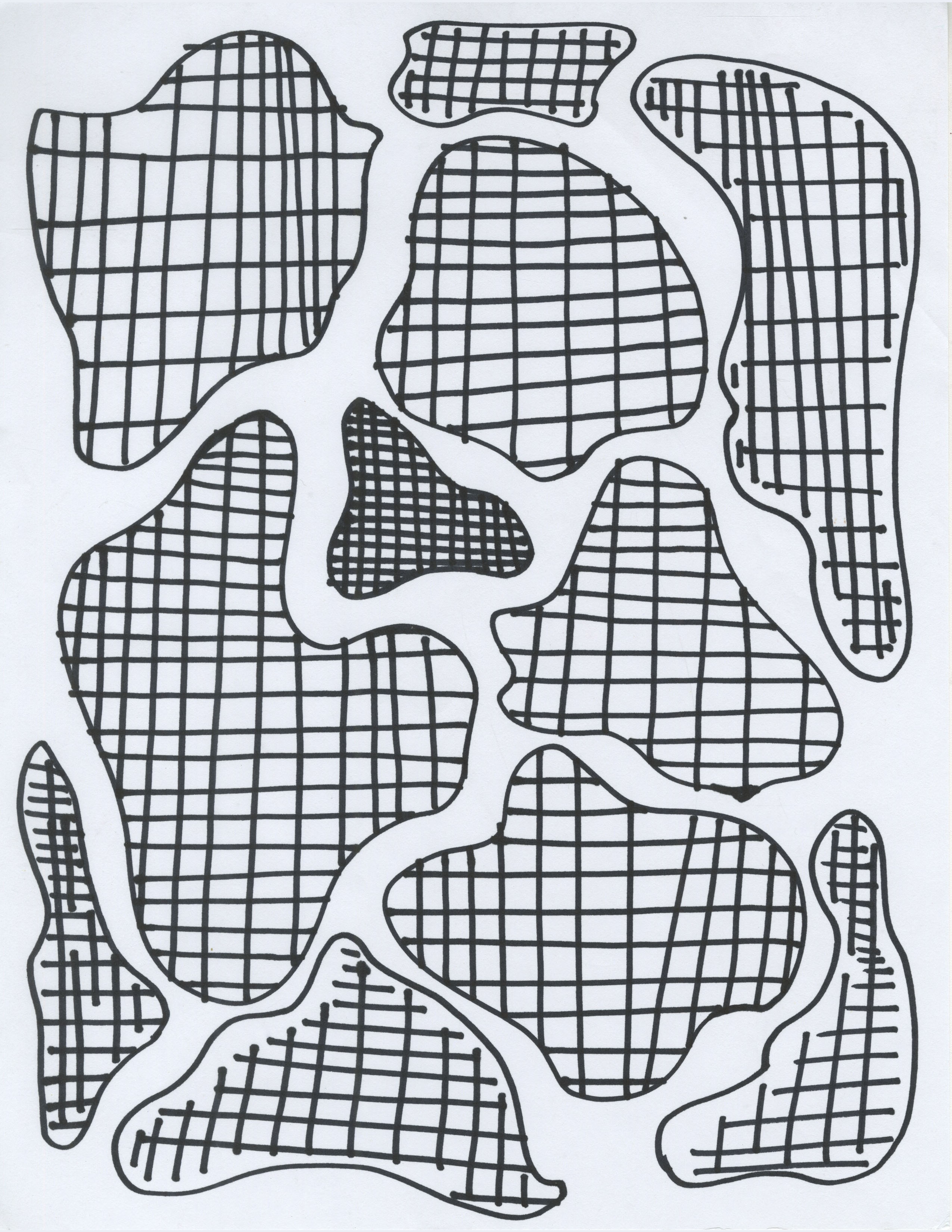
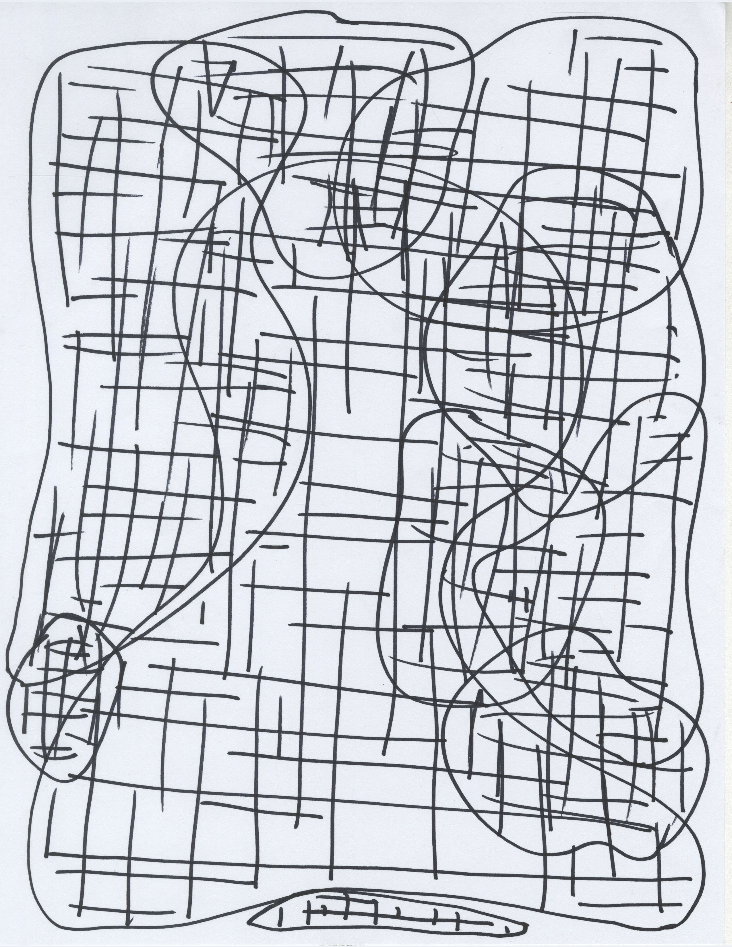
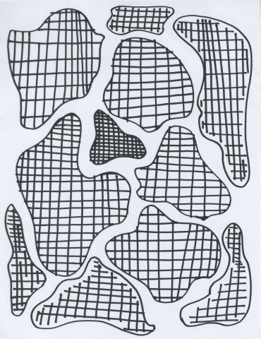
Draw a squiggly shape that is a closed space and does not have overlapping lines.

Fill this shape with horizontal lines. The lines may not pass through the outline of the shape.

Fill this shape with vertical lines. The lines may not pass through the outline of the shape.
Repeat until page is full of squiggly shapes filled with horizontal and vertical lines.

Repeat until page is full of squiggly shapes filled with horizontal and vertical lines.

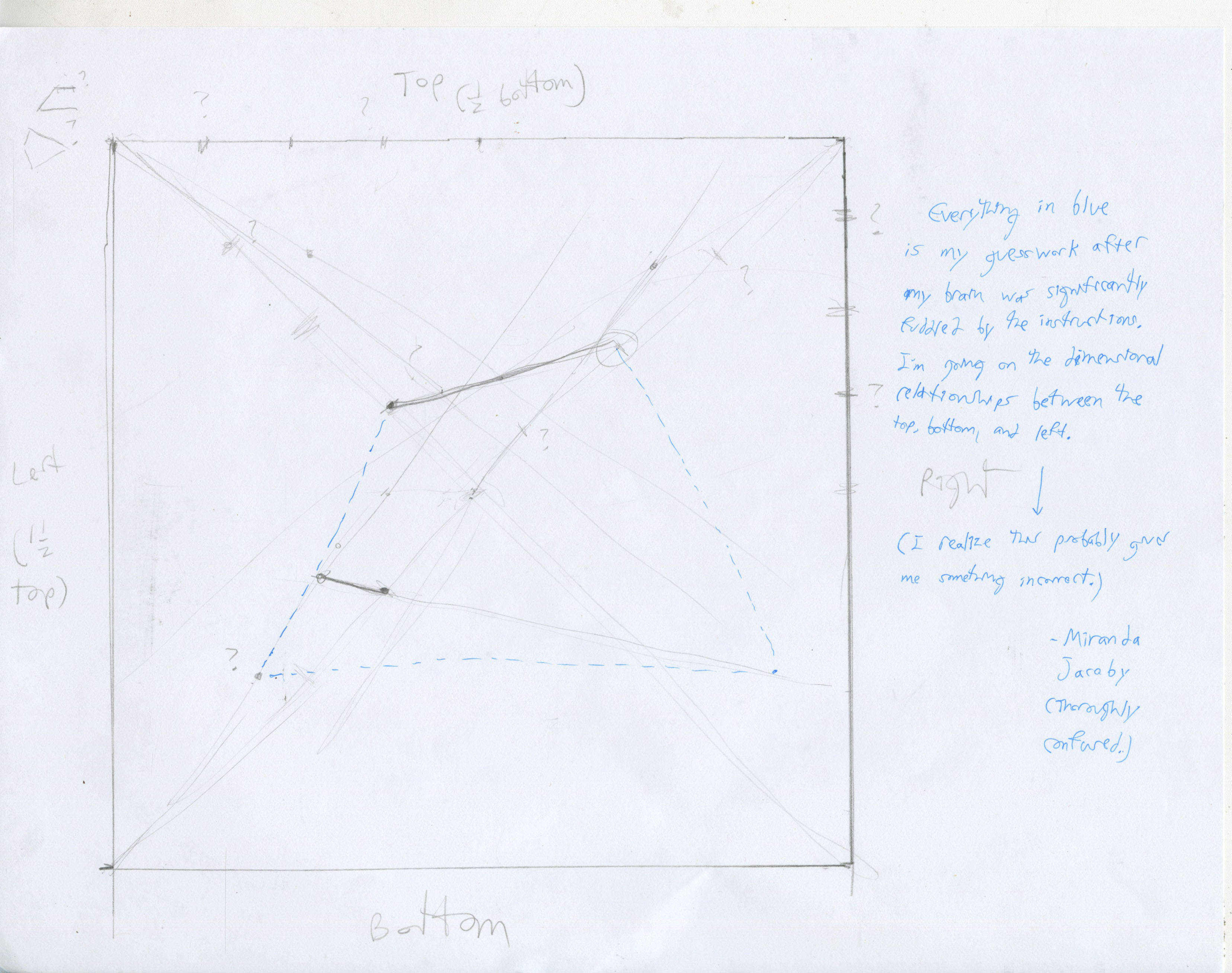
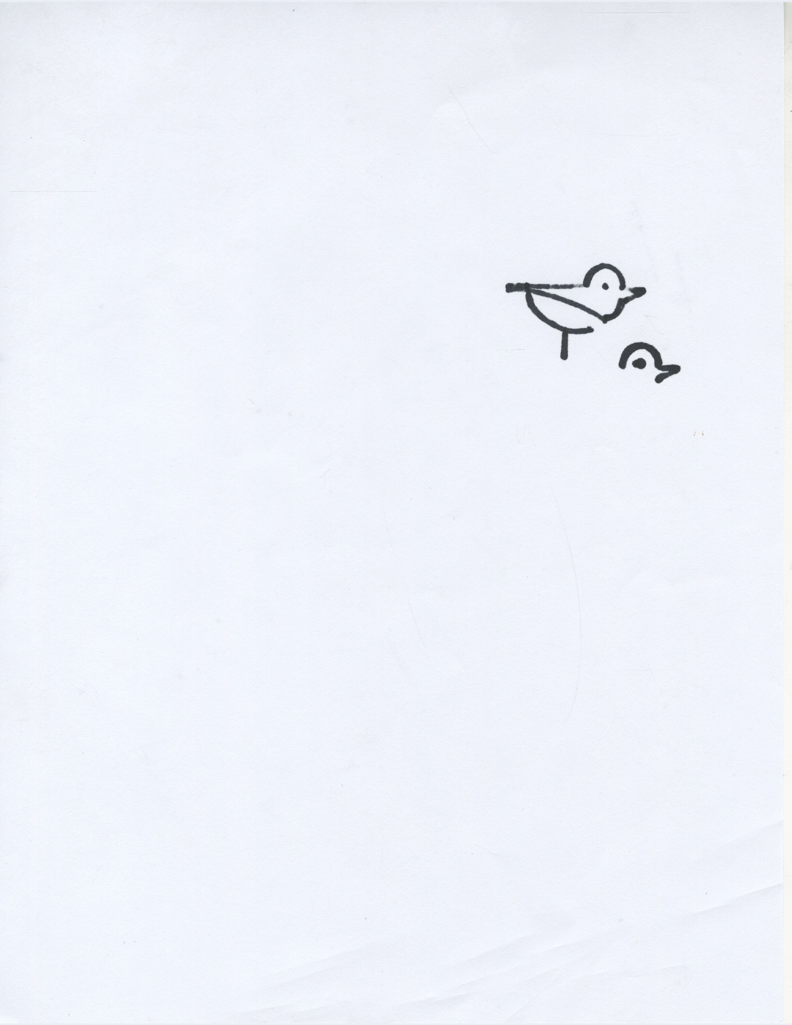
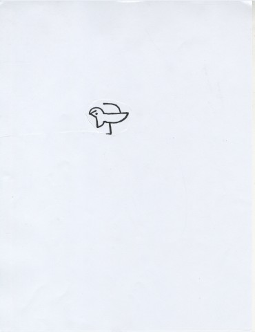
As “bird” is a bit hard to visualize, below is a digitally-assisted image to help make sense of the instructions.

Miranda Jacoby's (digitally assisted) Bird Drawing 
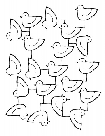
Miranda Jacoby’s (digitally assisted) Bird Drawing

Now for the submissions.

Sean Reidy's Bird Drawing 
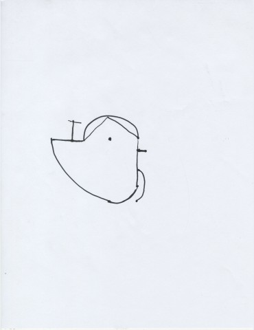
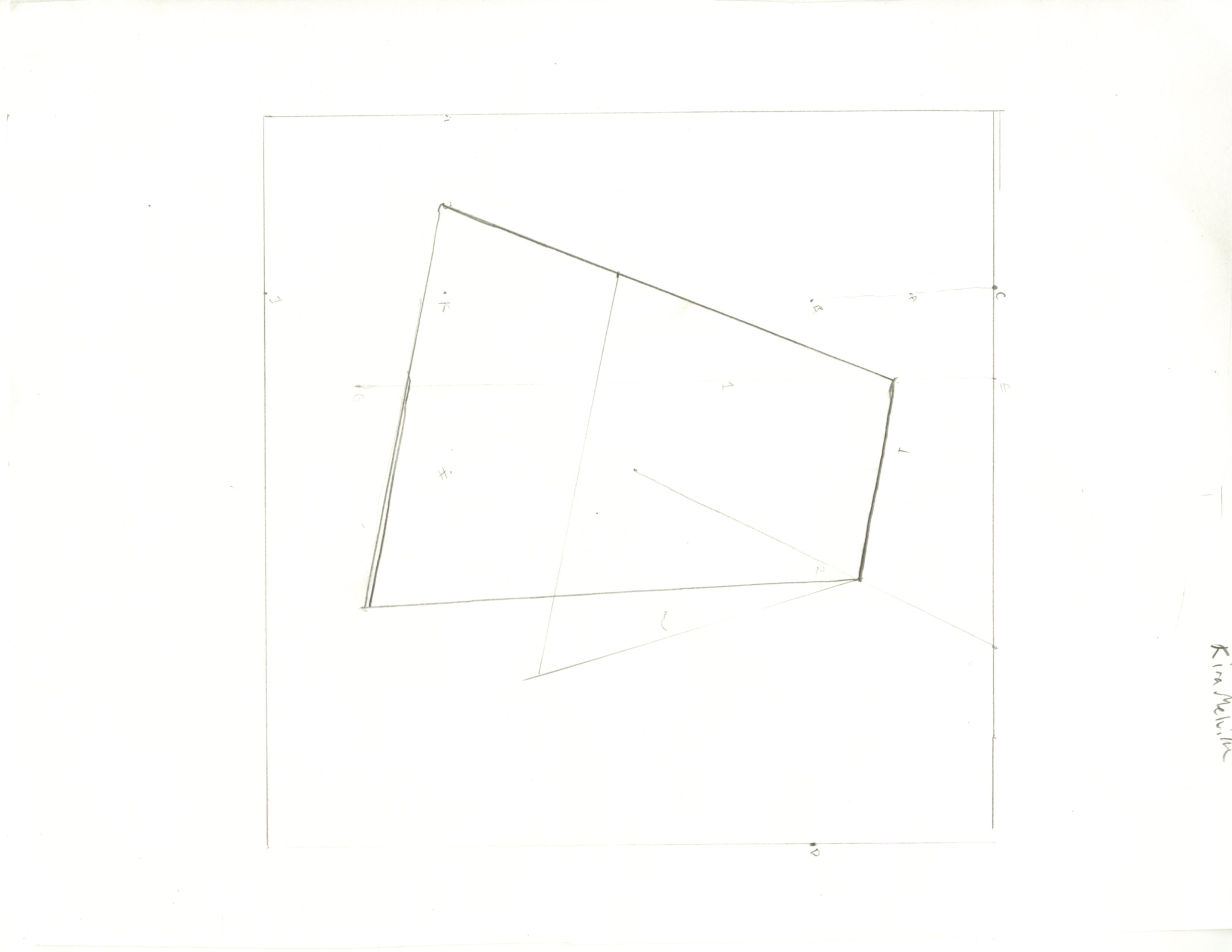
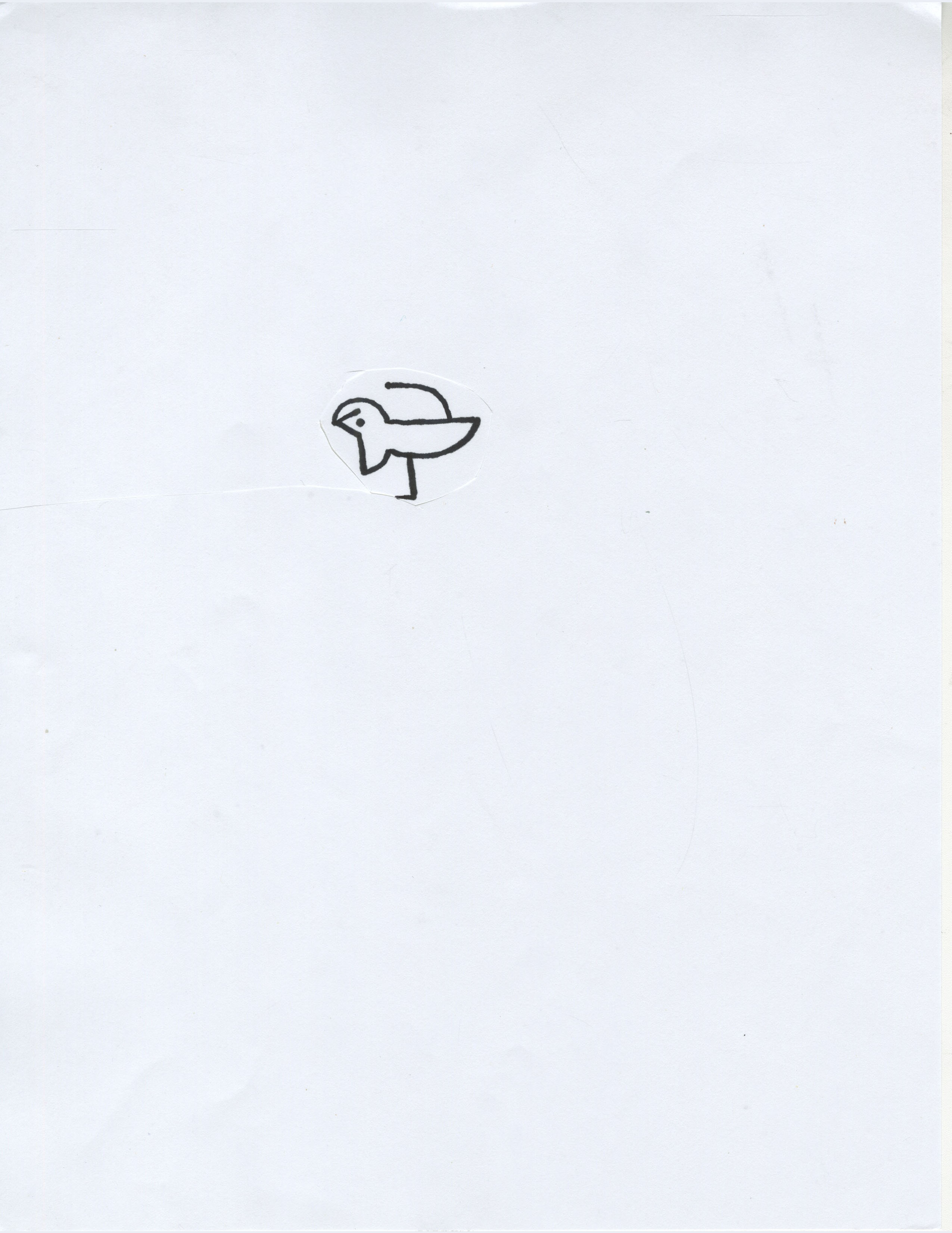
Sean Reidy’s Bird Drawing Meghan Chin's Bird Drawing 
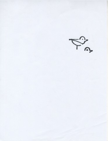
Meghan Chin’s Bird Drawing Natalie Moss' Bird Drawing 
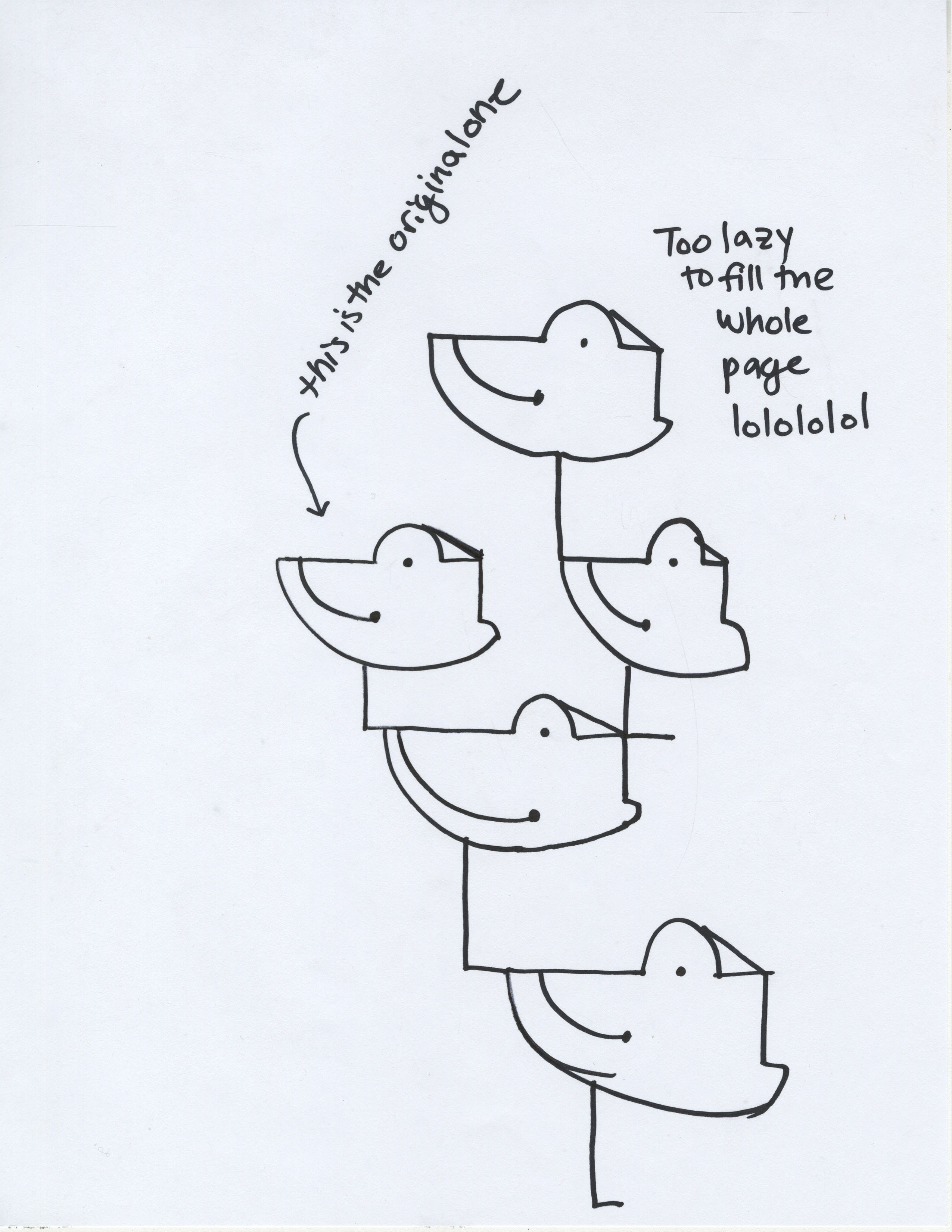
Natalie Moss’ Bird Drawing Sylvia Kosowski's Bird Drawing 
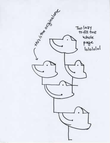
Sylvia Kosowski’s Bird Drawing

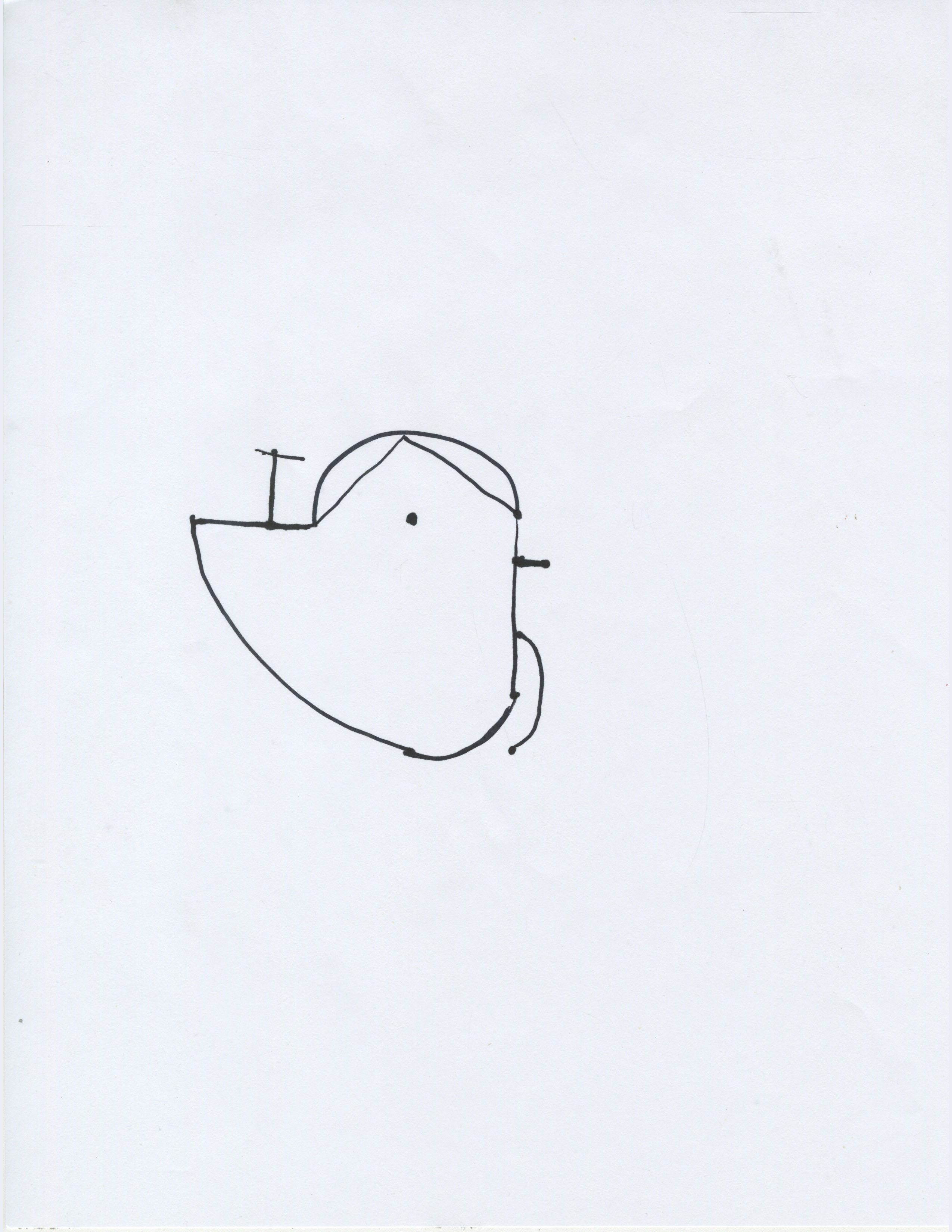
Sylvia sums up the general sentiment toward the “bird” instructions quite nicely. Natalie took a rather clever approach and cut her drawing out of its page, creating a new page that the drawing filled. Overall, it seems like everyone had trouble understanding how the beak shape and/or the wing shape was supposed to work. The idea of “bird” was to define a shape relative to points and shapes already plotted. Evidently I have to work on my ability to describe the overall orientation of those shapes in an understandable way.

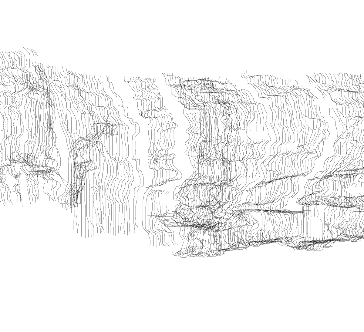
Now for the “squiggy” drawings:

Kay Nestor's Squiggy Drawing 
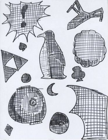
Kay Nestor’s Squiggy Drawing Sean Reidy's Squiggy Drawing 
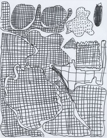
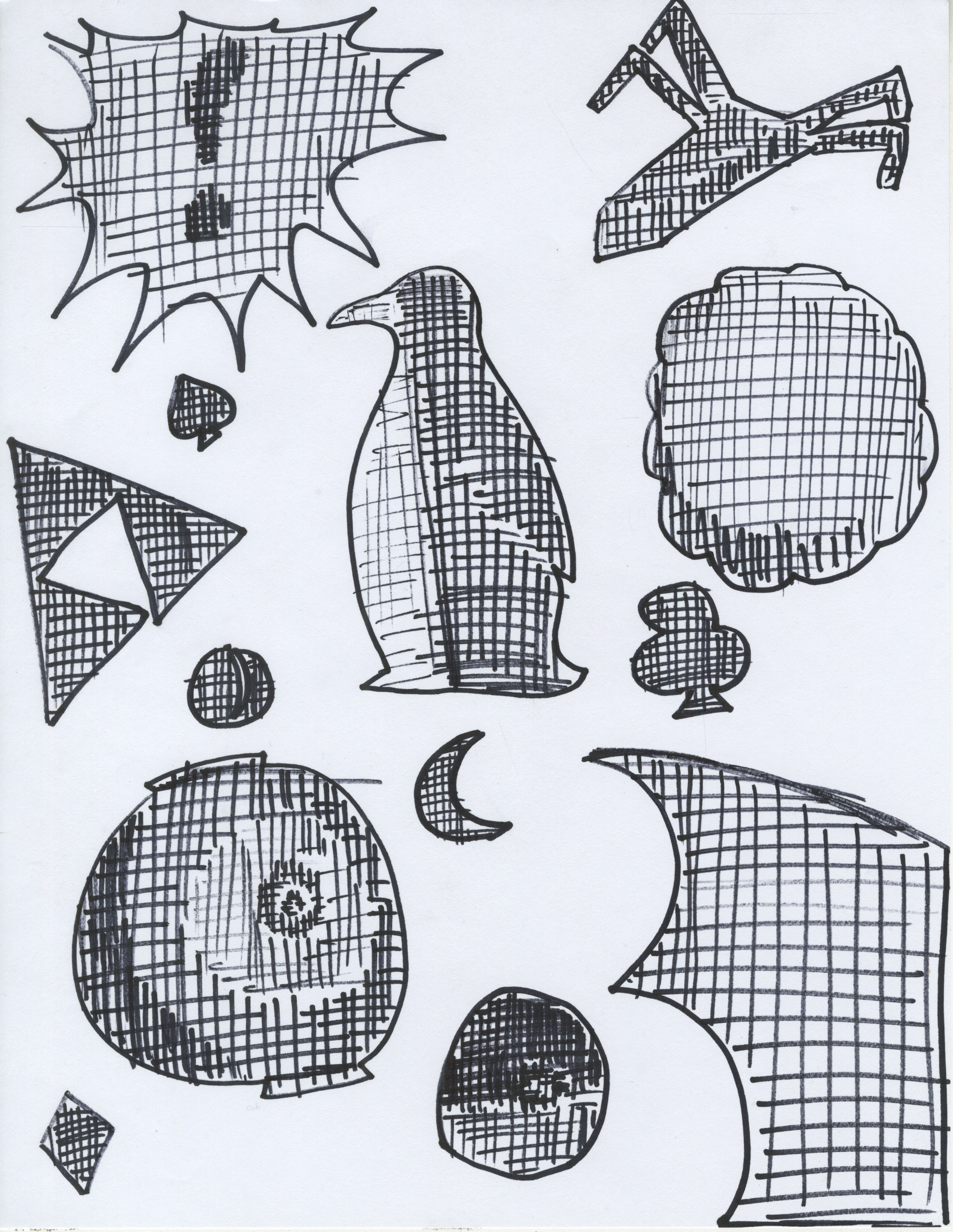
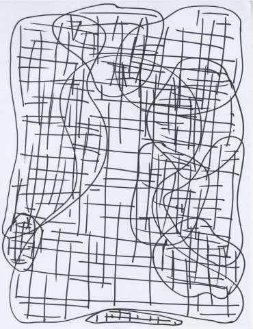
Sean Reidy’s Squiggy Drawing Meghan Chin's Squiggy Drawing Meghan Chin’s Squiggy Drawing Natalie Moss' Squiggy Drawing Natalie Moss’ Squiggy Drawing

Again, no two submissions are alike. Kay seemed focused on making her shapes into recognizable objects, while Sean realized that the kind of line was not specified, and thus included dotted lines and a number line into his drawing. Unlike “bird”, “squiggy” is a lot more open-ended, allowing for more organic permutations.

Overall, the instructional drawing exercise was a sliding scale between frustration and fun.

IFTTT – CSB – Post-Scarcity Economics/Asteroid Mining, Bitcoin Market Collapse House Alarm, Tumblr FB Group Dump, CMU Campus Entry/Exit Spreadsheet

Most of these speculative rather than practical, except for the last two, which I will be using as methods of self-quantification.

Screen Shot 2014-08-31 at 2.45.42 PM Screen Shot 2014-08-31 at 2.45.56 PM Screen Shot 2014-08-31 at 2.46.18 PM Screen Shot 2014-08-31 at 2.46.24 PM


Jer Thorp’s opinion article Art and the API introduces the technique of the “conceptual API,” a way to connect the API’s of various services to make some sort of conceptual statement. He believes the technique is suitable for media artists, who have long worked via the mashup of services, processes, and physical media. I agree, specifically in terms of the ease of combining / manipulating APIs currently. Moreover, artists/hackers/etc can reclaim the processes underlying efficiency in computing/networking and subvert them more easily than ever before for alternative agendas. IFTTT takes this a step further, giving users the ability to create new connections between the APIs of the online services they use.

Jim Cambell’s Formula for Computer Art raises the issue that media artists simply bridge some input and output, a critique that could easily be leveled at Thorp’s “conceptual API” and at art made with IFTTT. As in, it doesn’t matter whether your inputs/outputs are more or less complex (ie physical media, networks, or services). Campbell’s ‘formula’ problematizes what media artists make under the guise of efficiency and techno-optimism and instead asks what sort of conceptual complexities, critiques, and politics can be embedded within media art.

Looking Outwards 2: Processing

Admire:

punch_jeff_flat

The Khronos projector by Alvaro Cassinelli blends space and time into one an interactive installation. Using a pre-recorded movie and user input  The original Khronos projector was made in C++ using OpenGL and this was an installation that people could touch with their hands.  This is the demo version made in processing, it is still interactive, but with the mouse instead of the hand. It works by blending video of the same subject from different time, deeper through time where the user puts their hand or mouse. So, in the picture below of half the watermelon rotting, where the white cross is where the mouse is, and thats where time is sped up to where the watermelon rotted. Then, it seamlessly blends out to earlier time where the mouse isn’t.

watermelon_dec1

Surprise:

The creator M-Plummer Fernandez has really straightforward and interesting projects. Better yet, he explains his process, and answers questions. This project is very surprising because is demonstrates that with a few free plugins, some self-taught knowledge, and time it is feasible for me to make something as cool and interesting as this. It was hard to choose a project of his to post, I decided to post  his most popular project that is actually one of the most simple. This project “We Met Heads On”  is 3D scans of artifacts from the Metropolitan Museum of Art are animated in response to music. The plugins used are toxiclibs by Carsten Schmidt (free download available) and Minim by Damien (already included in Processing software).

Could have been done better:

06792c3e12f254167d282e62ecafc796.600.0.0.0.100


This is a data visualization by Brendan Dawes (He is a renown data visualization artist). This is one of a series of portraits of cities that visualize what people are talking about in that city. This particular picture is Southampton. This was commissioned by EE (a mobile network in the UK) for the launch of 4G. It was going to be viewed by a large audience of the average public, so taking that in account, this project was not clear enough. The shape of the object may be beautiful, but serves no purpose, and it makes it more confusing. The writing is too small, even when blown up on his own website it is too small. I think he missed an opportunity to touch a lot of people with his art.


GDB-LookingOutwards-2

A Series of Lines Traced by Five Hundred Individuals – Clement Valla

A Sequence of Lines Traced by Five Hundred Individuals from clement valla on Vimeo.

A Sequence of Lines is based off a fairly simple premise: Ask somebody to trace a straight line, then ask somebody else to try to trace the line that the last person drew. Repeat the second step another 498 times. I really love this idea of evolution through failure, and it’s fascinating to see how easily the line changes, splits and twists. Valla has also processed the raw data into a number of different forms, each with their own character. Below is a detail from an image of all of the lines placed side by side. I would really like to see the basic principle of this technique applies to different mediums and ideas.

DETAIL

One of Valla’s primary interests in the use of digital systems and technologies, particularly those that skew reality, to explore social systems and behavioural process.

.fluid – Hannes Jung

.fluid – A reactive surface from Hannes Kalk on Vimeo.

.fluid is a unusual use of non-newtonian fluid. The piece consists of a board which is connected via a set of sensors to a speaker below the fluid, which activate the surface when the board or fluid are touched. .fluid is a concept piece for reactive surfaces, and is mainly grounded in a basis of design applications for this behaviour. It brings a strange sense of the other to when it is interacted with; It is completely innocuous when first approached, and its behaviour unexpected. This brings the user into a new space of interactivity and play. At this scale, it’s an interesting concept piece, but I would like to see what could be done with this on a larger scale.

The Aether Project – Raman K. Mustafa, Refik Anadol, Julieta Gil, Farzad Mirshafiei

THE AETHER PROJECT from Refik Anadol on Vimeo.

The Aether Project is a great show of computational force. It consists of two enormous robotic arms on rails. One wields a projector and the other a moveable irregular surface to which the projector links. The Project was made through UCLA’s Architecture and Urban Design Department, and the arms are an exploration into use of architectural form as a dynamic surface.  There is a ponderous beauty to these massive arms in motion, and the sheer technical challenge of mapping a 3D projection in this mutable a space is inspiring. However, this seems to me to still be in a technical development stage; The piece seems to me to be a tool that has yet to be applied.

Gobelins Animation

This is a short produced by animation school Gobelins for the Annecy 2014 Film Festival. I’m a huge fan of the content that comes out of Gobelins, as every short has an immense amount of polish regardless of the subject matter. If you have the time, I heartily recommend checking out In Between, Le Royaume, Fenrir, and Un Conte.