Looking Outwards 2: Processing
Admire:

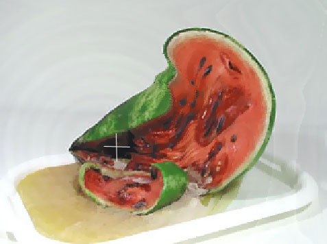
The Khronos projector by Alvaro Cassinelli blends space and time into one an interactive installation. Using a pre-recorded movie and user input The original Khronos projector was made in C++ using OpenGL and this was an installation that people could touch with their hands. This is the demo version made in processing, it is still interactive, but with the mouse instead of the hand. It works by blending video of the same subject from different time, deeper through time where the user puts their hand or mouse. So, in the picture below of half the watermelon rotting, where the white cross is where the mouse is, and thats where time is sped up to where the watermelon rotted. Then, it seamlessly blends out to earlier time where the mouse isn’t.
Surprise:
The creator M-Plummer Fernandez has really straightforward and interesting projects. Better yet, he explains his process, and answers questions. This project is very surprising because is demonstrates that with a few free plugins, some self-taught knowledge, and time it is feasible for me to make something as cool and interesting as this. It was hard to choose a project of his to post, I decided to post his most popular project that is actually one of the most simple. This project “We Met Heads On” is 3D scans of artifacts from the Metropolitan Museum of Art are animated in response to music. The plugins used are toxiclibs by Carsten Schmidt (free download available) and Minim by Damien (already included in Processing software).
Could have been done better:
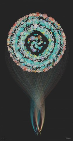
This is a data visualization by Brendan Dawes (He is a renown data visualization artist). This is one of a series of portraits of cities that visualize what people are talking about in that city. This particular picture is Southampton. This was commissioned by EE (a mobile network in the UK) for the launch of 4G. It was going to be viewed by a large audience of the average public, so taking that in account, this project was not clear enough. The shape of the object may be beautiful, but serves no purpose, and it makes it more confusing. The writing is too small, even when blown up on his own website it is too small. I think he missed an opportunity to touch a lot of people with his art.

