Looking Outwards #2: Works made with Processing

Recently I’ve been interested in programs as tools for new ways of drawing and mark making, so for this Looking Outwards, I’ve specifically researched experimental drawing applications created with Processing.

The Sonic Wire Sculptor Machine is a program that adds two more dimensions to drawing. Marks made are converted to 3D models and spun in three dimensions, and tones are derived from the positions and shapes of the marks. I was impressed by this project because it’s very successful in creating a fascinating new way of drawing and experiencing a drawing. It seems like there are many possibilities for this project. I can imagine complex improvisational drawing/music hybrid performances that could be done by mastering this software.

The Stone Spray Project is a machine which allows the user to draw in the same way a 3D printer “draws” by using several 2D layers. It’s a surprising project because the technique of using a pen or stylus to build up a sculpture (as opposed to the process of removing in sculpture) is relatively new. The only other way I am aware of playing with this technique is with a 3D printer pen which have only recently (in the past few years) entered the consumer market.

Chronodraw is another drawing software experiment where the user can draw frame by frame into cells that can be tiled together. The effects that can be created are similar to particle systems that use flocking algorithms. The issue here is that the drawing application itself is very limited; the tools are very basic (a simple non-anti-aliased “pencil” tool that doesn’t support tablets with pressure sensitivity) and users can only use white on a black background. If this project was instead some sort of plugin or addon to software with a more complete drawing system (gimp, Photoshop, etc.) then there would be much more flexibility on what is possible with Chronodraw.

Assignment-02-A “Wall Drawing”

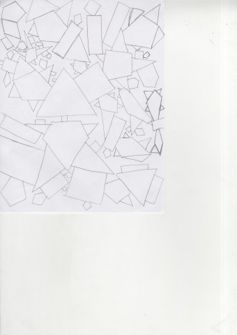
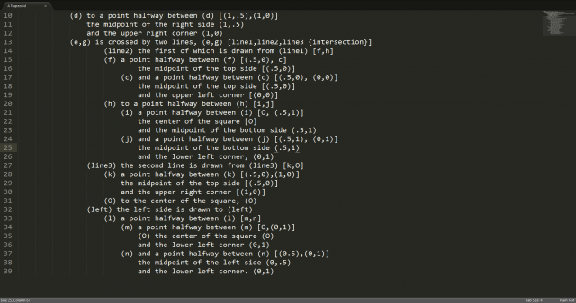
Looking at Sol Lewitt’s wall drawing for the first time is overwhelming. The excessive repetition coupled with the ambiguity of many of his statements makes it nearly impossible to understand at first glance. Immediately I realized that I would need to structure his instructions in a way which was easier for me to understand. I took to relabeling each individual instruction on a separate line and showing which lines relied on others like so:

Snap 2014-09-03 at 12.41.31

At this point, I noticed how code like this process was. Instruction – Evaluate – Instruction. Before I organized Lewitt’s instructions it was not very code-like because of it’s ambiguity. While there were some portions of the drawing which are still left to the imagination of the executor, after the organization it is much clearer as to how to go about the drawing.

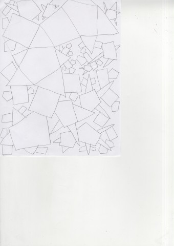
My Interpretation of Lewitt’s instructions :

LucaDamascoSolLewittDone

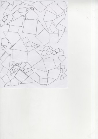
Lewitt’s “Wall Drawing”

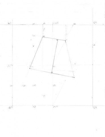
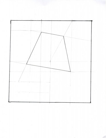
img001

I think Lewitt’s Wall Drawing can be thought as a code in some perspectives. It is giving out instructions to the person who is executing it and it doesn’t differ even if somebody else draws it. It always need to have the same outcome just like code. Code doesn’t give you a different answer because you are a different person; it does the same for everyone. When I was executing it, the instruction itself was not difficult but the way that it was written was more confusing since all of the instruction was put into one sentence instead of trying to explain it short and clearly. It seemed more like a math question trying to figure where the dots and the lines goes to and connecting them together. I had hard time translating the long languages into instruction rather than the actual drawing itself.

Assignment – 02 -Art and The API (And IFTTT)

My first recipe on IFTTT was all about utility. The one which I currently have running saves all of the photos taken on my mobile device to my cloud storage account. I like that a lot because having a reliable way to backup my data (especially after multiple recent hardware crashes) is a top priority. IFTTT’s formulas all have utilitarian roots.

The idea of having a “formula” for art seems a bit out of whack. Add a touch of composition here, a bit of color here and *bam*, art. While Jim Campbell’s infinitely looping “formula for art” does express common themes in the realm of computer art it leaves out vital portions of the art itself. The response and interactions which the art elicits. Jer Thorpe’s “Art and the API” effectively communicates how artists can design seemingly impressive technical projects, which can still hold an impressive amount of weight in an artist context.

Instructional Assignment- HC

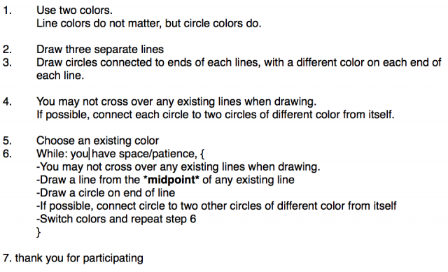
Instructions:

Screen Shot 2014-09-03 at 5.41.34 PMResults:

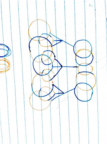
September_03__2014_at_0434PM (1) September_03__2014_at_0434PM (3) September_03__2014_at_0434PM

Evaluation:

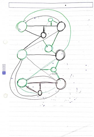
The first image (last to be created) was the most shocking and different. I had imagined my instructions to be clear and result in the other two images, but I never imagined the drawer would read into the directions and really overthink it and think outside the box like that. No rules were broken- I never stated the circles shouldn’t be connected to each other physically by its outline, and I never stated the circles have to be a single color. Although I know that I would revise those rules later to have a more set design standard.


Assignment – 02 – Tweet

The idea of shipping data such as a selfie or tweet onto an asteroid which will not be touched by humans in even the distant future is both interesting and puzzling. Instant communication being used as long term storytelling…

Looking Outward 2- Alex

This weeks theme was processing.  My prior knowledge of this word was that all types of computers had to using something called processing in order to run functional programs and other software.  I apologize for my complete ignorance of computing language.  Therefore, after learning that Processing is a software toolkit and sketchpad for computer arts, this theme became less overwhelming. After browsing The Processing Exhibition website, I discover Body Navigation 2008 by Jonas Jongejan, Tina Tarpgaard, Digital Natives 2012 by Matthew Plummer-Fernandez, and Strata #3 2009 by Quayola.

I admired by Strata #3 because it was able to successfully combine GENERATIONS of art history into one piece.  It used contemporary practices to digitized classical paintings and architecture in surrealist, impressionistic, and modernist ways.  I would argue that it is an example of all of art history combined into one piece.

I was surprised by Body Navigation because it seemed to be just one big video game to me.  So it touched up the interaction between perfumer and computer but thats pretty much the basis for all digital art.  There was nothing truly unique about this piece to me.

Finally, I think that Digital Natives was a piece that was good but could have gone further.  The forms of the 3D printed objects were aesthetically appealing but I think that the contact of the types of objects that were selected could have been discussed in-depth more.

Looking Outwards #2

Emotica^2 from Tammy Wong on Vimeo.

Emotica^2 aims to make users more aware of their emotional state by projecting their emotions onto the room which surrounds them. These emotions are projected through generative images, sound and text. They are also projected on a mannequin head directly in front of the user.

I think that Emotica is a fairly inspirational work because the success of the piece relies on the emotional status and participation of its viewers. At this point in time I myself am aiming to design works which need the participation of viewers to create the piece. In many ways the idea of Emotica superseded the execution. At Least through the documentation provided, the generative images around the room and on the mannequin don’t seem to have a close enough connection to life like creatures or emotions.


ElectricSheep.org from Karmalize Productions on Vimeo.

Electric Sheep definitely surprised me because it is run by thousands of people all over the world. Without the collaboration of these people the work would be just a repetitive sequence of visuals, but over time the contributions of the projects participants shape the global ideal of a beautiful / interesting image. Technically, developing a generationally based highly complex graphical system and interface is also impressive. Knowing that this project came to fruition is very inspirational on both the artistic and technical sides.


Net worth (2004) from Osman Khan on Vimeo.


Net Worth by Osman Khan is a project which aims to display the “net worth” of each participant by searching for them on the internet. In a modern context, page hits are definitely popular and a visualization of such is definitely an interesting concept. Very often we as humans put ourselves directly up against our friends and colleagues in order to see who stacks up higher. While the visual representation of this project is fairly intriguing, the background of the assignment, “the searching” is only based on the google search metric which can be accessed by anyone at any time. It’s a cool project, but to me, when talking about personal or grand scheme net worth, this is missing something. (This could have been due to the fact the project was made a decade ago.)

Creating a Conditional Drawing


001 002 003 004 005


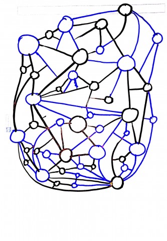
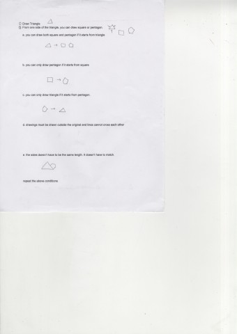
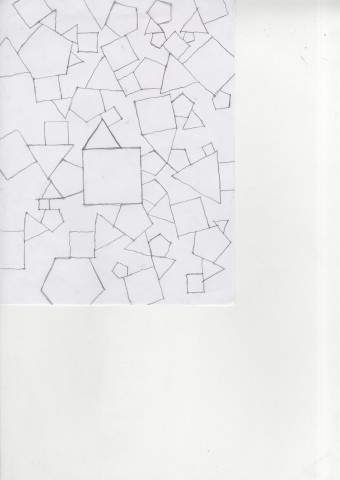
I was surprised by the fact that everyone had started out big and went into smaller parts instead of the other way around or messing with the sizes. I thought that when I put the condition that the two lines doesn’t have to be the same size I thought that people would play with the sizes a little more than when there was no condition. But that expectation had passed. I also thought that rather than creating a pattern people would try to fill up the page when they were given the conditions since the conditions allow you to draw small and big sizes no matter what. I think I might tinker with the shapes a little more since many people drew rectangle and not so octagon looking octagon rather than the actual conditions given.