Full Disclosure: I went for a minimalistic approach because I got incredibly frustrated with using beginShape(), endShape(), and curveVertex() to get the exact shapes I wanted. This is also why the sketch has no eyes. sketch.js code
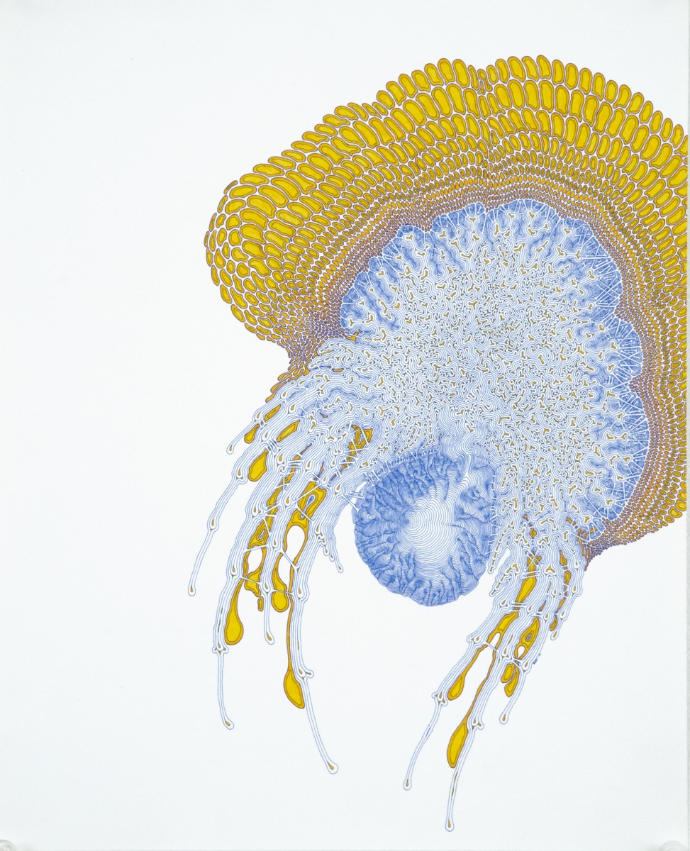
“Enforced Toxification” 2008, Ink and Acrylic on Paper
“Internalized Wobularity” 2010, Ink, Watercolor and Acrylic on Paper,
Daniel Zeller only loosely fits within the category of Generative Art, but I feel that his work is an outstanding example of successful use of modular aesthetic style. Zeller only uses three or four shapes in his pieces, which he repeats with different parameters to create larger, emergent constructs. Despite his strict adherence to an aesthetic system, Zeller never plans any of his work beforehand, and simply improvises with flawless penmanship as he goes along. I respect both his methodical approach as well as his diligence in implementing an artistic process which leaves no margin for error.
Karl Sims
I focused specifically on Karl Sims’s 1994 project, “Evolving Virtual Creatures”. Sims randomly generated moving “creatures” within a simulated physics environment. Using an arbitrary fitness measure, such as ability to move through water, or walk on land, Sims’s genetic algorithms would select only the most successful generated creatures, and create a new generation of creatures using their genetic information. Not only was I born in 1994, but I also am intensely interested in genetic algorithms and self-improving programs, so this project has provided me with an aesthetically pleasing (albeit spastic) benchmark as to the state such of technologies at the beginning of my life.
Casey Reas
“Substrate” 2013, Laser etched anodized aluminum
Casey Reas’s 2013 project Substrate is a great example of re purposing utilitarian input for generative art. Reas etched television signals into anodized aluminum, creating surreal visual landscapes which assume three dimensional geometric qualities. I like the landscapes my mind constructs (reminiscent of Final Fantasy Tactics terrain) from data that was never meant to be spatially interpreted in the first place.
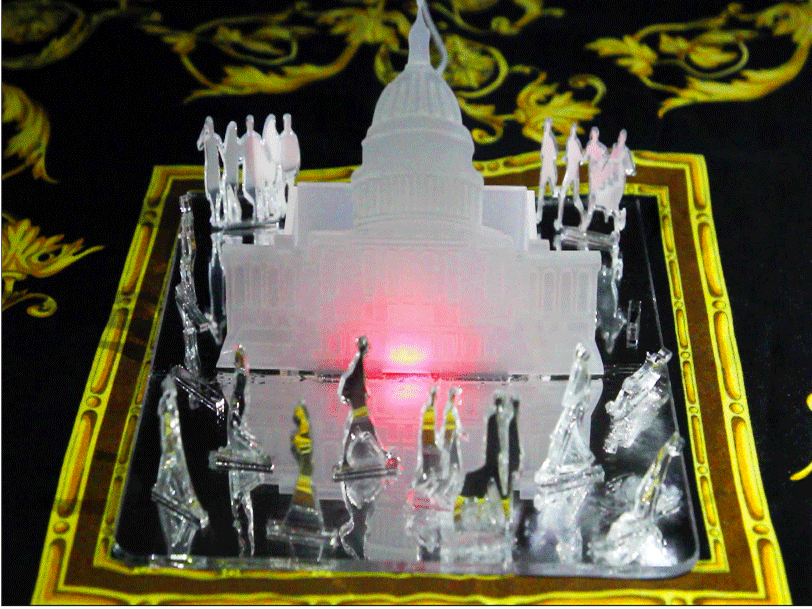
Transparency is a tool designed for citizens to gain insight into the inner workings of the legislative branch, promoting transparency and public awareness about congressional action. In this project the blink(1) becomes the lights illuminating the Capitol Building. Forming an interface between the public and congress, the lights indicate in real time if a bill was passed, rejected or somehow deferred, by changing colors. The lights will blink red if the bill was just rejected, pink if the bill was deferred, and blue if the bill was passed. By categorizing each act of congress, Transparency illuminates how the systems and processes facilitating congressional action can have unexpected and even insidious effects on what actually ends up as law. More broadly, this tool allows people to know when there are decisions being made that could affect their life without even knowing it.
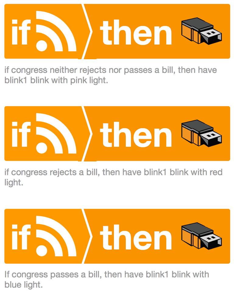
Three IFTTT recipes control the lighting in Transparency. Each of the recipes uses the ‘Feed’ API as its “If” input and the ‘blink(1)’ API as its “Then” output. The color of light coming from the blink(1) can either be red, indicating a rejected bill; blue, indicating a passed bill; or pink, indicating a bill that was neither passed nor rejected (for instance: bills sent to subcommittees, deferred, or otherwise recycled internally). Each recipe, associated with one of these colors, parses the most recent update of an RSS feed from govtrack.us, which reports the status of every bill in congress following each occasion that the house or senate assembles. If a specific keyword, either “passed,” “rejected,” or neither, is found, then the recipe is triggered, causing the blink(1) to light up with the specified color. So in practice, this protocol will always cause the blink(1) to first turn pink any time the RSS feed updates, then turn blue or red if the bill in question was passed or rejected, respectively. Otherwise, the light will stay pink, representing a sort of default or baseline.
Luan Chyi by Shuai Chen in 2013 is hard to describe. The artist refers to it a “landscape generator”. In literal terms, it is a collection of 12 two-way mirror boxes placed in grid formation on top of two monitors. The monitors play a stream of watery ripple effects reminiscent of traditional Chinese landscape paintings, while the mirror boxes reflect and magnify their images. When the piece is activated in the dark, the result is a strange, yet mesmerizing view of pixels reflecting infinitely into the mirrors. I found this piece interesting because I have never thought of using mirrors and monitors in this combination – and it I think it looks really pretty.
The Senseless Drawing Robot by So Kanno and Takahiro Yamaguchi in 2012 is a “graffiti bot.” The robot is basically a set of wheels carrying a pendulum-like swing holding a spray can. When placed in front of a wall, the robot will sweep back and forth, and the swing’s momentum causes virtually unpredictable motion, which is exactly when the robot begin to paint the wall. One could argue that this piece simultaneously exhibits both random and rule-based behavior. The robot’s wheel motion and spray can timing both appear to be controlled by a tight program, but physics ends up taking over, and makes every work produced by this robot unique. Personally, I thought this piece was funny because it could replicate the works of many budding graffiti artists by simply following a pre-made set of rules.
WURM (now Fabrika) is a generative art app for mobile devices by Anna Oguienko in 2010. What sets this apart from other visual generative art pieces is that it is interactive; the user helps in creating the art, aided by generative algorithms provided by the mobile device. By using fingers as virtual brushes, the app generates a set of flowing 3d-esque shapes that algorithmically respond by adjusting size and color of the touch. In the end, the human and the artwork are working together to create new masterpieces, allowing an unlimited amount of creativity to be visualized. I wonder what interacting with this would be like on a larger touchpad screen…
“10 minuets of cold” is a image and a music piece by Jamy Sheirdan and John Dunn. In this project the image is used as score to make the music (click to listen to the music). The image is made using slit-scan photography (or what looks like slit-scan, there is no description on the work). The width is about 1000 pixels long when the height is 500 pixels. So, like reading music, the picture is read from left to right. Here is the full picture. I really feel like this project missed an opportunity because it is poorly documented. I really had to dig to find this project, not that I was looking for it. The artist interested me because of his essay that argues that cyberspace is a sub-class of space itself, and having that in mind changes the piece for me.
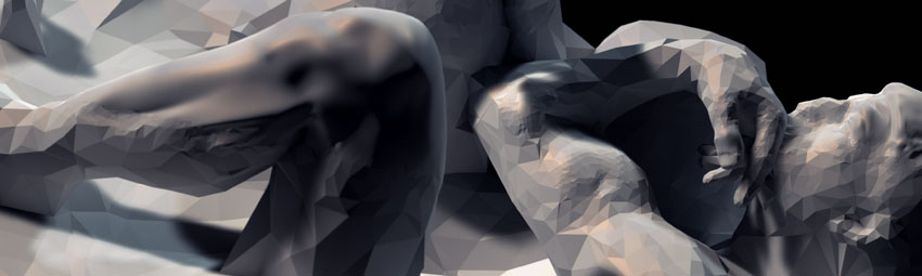
“Matter” by Quayola is a computer generated short film where blocks of geometric shapes are chiseled down to reveal an iconic sculpture, Rodin’s The Thinker. That subject was a nice choice, being that it was considered the bridge between classical and modern sculpture. The piece has the figure emerge and submerge slowly, bobbing back and forth, like it is stuck between two worlds.
Casey Reas made a very smart simple comparison between the artist who uses different materials like, leather, honey, blood, oil, steel, felt and so on, and the artist using software has different materials to work with like Java, c, c++, Python, PHP ect. Having that in mind, the Recode project (initiated by Matt Epler) had a different meaning. Its not just copying some work that was already done, each re-creation is its own unique piece, because it was done in a completely different material. Like the difference between a copy of a Mona Lisa painting and Andy Warhol’s Mona Lisa. That was my own little revelation. One of my favorites from the transcribed gallery was “Kube Series” by Mary Scahill based of of “Kube Series” by Klaus Basset.
 “Enforced Toxification” 2008, Ink and Acrylic on Paper
 “Internalized Wobularity” 2010, Ink, Watercolor and Acrylic on Paper,
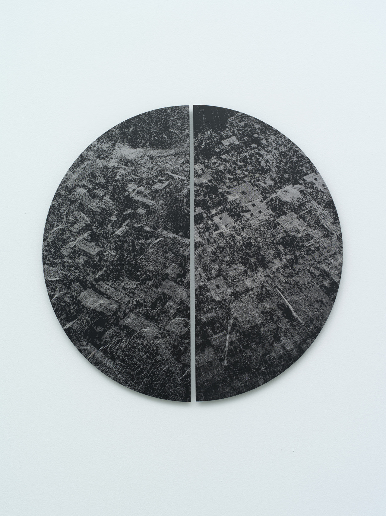 “Substrate” 2013, Laser etched anodized aluminum