Category: LookingOutwards

JohnChoi-LookingOutwards-2

One project that I admire is Petting Zoo by Minimaforms studio. This project is basically a a set of three glowing robotic tentacles that hang from the ceiling and act as robotic life forms that intelligently respond to nearby human presence. It appears to have a Kinect-like device stationed from a hidden area that sees humans, whom the robotic tentacles can “look at” and play with. I admire this project because it demonstrates state of the art technology being used to push the envelope on artificial life and what it means to be alive. While I admire this project for what it is, I think this project could go further in a variety of ways, particularly by introducing more artificial “lifeforms,” each of which interact and play with humans in their own unique ways.

One project that surprised me is Magnetosphere by flight404 in 2007. While I have used Processing for some simple 3D graphics before, the level at which Magnetosphere demonstrates the power of Processing is astounding to me. It was as though the universe itself was recreated on the spot in real time from a blown out perspective. It is beautiful to look at, and the level of awe and immersion could only increase as one stared at longer and longer. I have only one qualm about it however – the patterns can get somewhat repetitive, and while the degree of randommess that occurs while times passes is certainly there, it does not appear to affect the grand scheme of the piece. Despite this, I really do like Magnetosphere.

One project that I believe missed an opportunity is Processing Tech Support by Jonah Brucker-Cohen. According to the description provided, this work is a satire on modern technical support and how it would evolve over the course of several decades. The funny thing is that, the artwork itself does not play on any of my browsers. It is ironic that a piece criticising the nature of tech support would fall victim to needing the very thing it is condemning. While this is forgivable given the current state of Java and the fact that many browsers do not allow Java apps to run (including a many artworks created with Processing), this piece misses an oppotunity to reflect upon itself and further the irony in and out of itself.

Link: http://processing.org/exhibition/works/techsupport/index_link.html

Looking Outwards 2 : Processing

ADMIRATION Chronomorphologic Modeling by Madeline Gannon

Madeline Gannon, a graduate student in the CMU School of Architecture, uses the natural fluidity of motion to create 3D printed wearables. Within the scope of a Processing-run 3D environment, Gannon’s program allows the user, via Kinect (wholly unnecessary in my opinion), to drag a squid-like entity through space. As the squid’s tentacles and tendrils twist and whip through space, a periodic snapshot is taken of the squid’s location, and added to a mesh file, compiling its motion over time into a static physical form, which is then 3D printed.

Apart from its inherent beauty, I admire that Gannon’s structures draw their intricate patterns and organic composition from iteration and accumulation, two very powerful tools of digital expression.

SURPRISE unnamed soundsculpture by Daniel Franke and Laura Keil

Admittedly, I am a sucker for particle effects, so this video had me hooked from the get go. The particle effects, however, are only the vehicle through which Daniel Franke and Laura Keil convey a stunningly beautiful mix of emergent imagery and contemporary dance:

Recognizing form within a previously chaotic system, especially human form, is an immensely enjoyable experience. I love artwork which explores the basic human need to extract familiarity from confusion. The effectiveness with which unnamed soundsculpture explores this concept surprised me greatly.

MISSED OPPORTUNITY Mycelium by Ryan Alexander

Mycelium simulates fungal growth over an image, where the brightness of each pixel represents a food supply that the fungus can use to grow. While a very promising and creative idea by itself, Ryan Alexander could have taken this in so many directions, and yet left it decidedly bland:

No sound, black and white, TWO DIMENSIONAL. When dealing with simulated organic growth, three dimensions is almost guaranteed to provide a more interesting result, as would certainly be the case with Mycelium. Also, the fungus mimics the pixel values of the image it is eating, thereby reducing itself, for all intents and purposes, to a simple image filter. With a few changes to the display function of the fungus, and perhaps a foray into the third dimension, Mycelium could be much more engaging.

Looking Outwards 2: Processing

Admire:

punch_jeff_flat

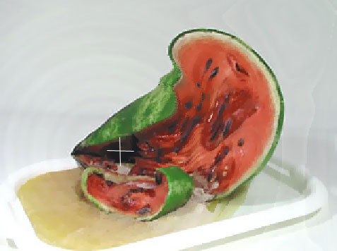
The Khronos projector by Alvaro Cassinelli blends space and time into one an interactive installation. Using a pre-recorded movie and user input  The original Khronos projector was made in C++ using OpenGL and this was an installation that people could touch with their hands.  This is the demo version made in processing, it is still interactive, but with the mouse instead of the hand. It works by blending video of the same subject from different time, deeper through time where the user puts their hand or mouse. So, in the picture below of half the watermelon rotting, where the white cross is where the mouse is, and thats where time is sped up to where the watermelon rotted. Then, it seamlessly blends out to earlier time where the mouse isn’t.

watermelon_dec1

Surprise:

The creator M-Plummer Fernandez has really straightforward and interesting projects. Better yet, he explains his process, and answers questions. This project is very surprising because is demonstrates that with a few free plugins, some self-taught knowledge, and time it is feasible for me to make something as cool and interesting as this. It was hard to choose a project of his to post, I decided to post  his most popular project that is actually one of the most simple. This project “We Met Heads On”  is 3D scans of artifacts from the Metropolitan Museum of Art are animated in response to music. The plugins used are toxiclibs by Carsten Schmidt (free download available) and Minim by Damien (already included in Processing software).

Could have been done better:

06792c3e12f254167d282e62ecafc796.600.0.0.0.100


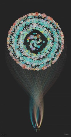
This is a data visualization by Brendan Dawes (He is a renown data visualization artist). This is one of a series of portraits of cities that visualize what people are talking about in that city. This particular picture is Southampton. This was commissioned by EE (a mobile network in the UK) for the launch of 4G. It was going to be viewed by a large audience of the average public, so taking that in account, this project was not clear enough. The shape of the object may be beautiful, but serves no purpose, and it makes it more confusing. The writing is too small, even when blown up on his own website it is too small. I think he missed an opportunity to touch a lot of people with his art.


GDB-LookingOutwards-2

A Series of Lines Traced by Five Hundred Individuals – Clement Valla

A Sequence of Lines Traced by Five Hundred Individuals from clement valla on Vimeo.

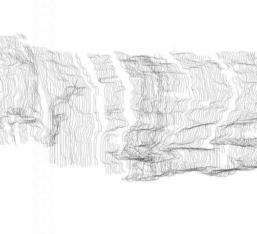
A Sequence of Lines is based off a fairly simple premise: Ask somebody to trace a straight line, then ask somebody else to try to trace the line that the last person drew. Repeat the second step another 498 times. I really love this idea of evolution through failure, and it’s fascinating to see how easily the line changes, splits and twists. Valla has also processed the raw data into a number of different forms, each with their own character. Below is a detail from an image of all of the lines placed side by side. I would really like to see the basic principle of this technique applies to different mediums and ideas.

DETAIL

One of Valla’s primary interests in the use of digital systems and technologies, particularly those that skew reality, to explore social systems and behavioural process.

.fluid – Hannes Jung

.fluid – A reactive surface from Hannes Kalk on Vimeo.

.fluid is a unusual use of non-newtonian fluid. The piece consists of a board which is connected via a set of sensors to a speaker below the fluid, which activate the surface when the board or fluid are touched. .fluid is a concept piece for reactive surfaces, and is mainly grounded in a basis of design applications for this behaviour. It brings a strange sense of the other to when it is interacted with; It is completely innocuous when first approached, and its behaviour unexpected. This brings the user into a new space of interactivity and play. At this scale, it’s an interesting concept piece, but I would like to see what could be done with this on a larger scale.

The Aether Project – Raman K. Mustafa, Refik Anadol, Julieta Gil, Farzad Mirshafiei

THE AETHER PROJECT from Refik Anadol on Vimeo.

The Aether Project is a great show of computational force. It consists of two enormous robotic arms on rails. One wields a projector and the other a moveable irregular surface to which the projector links. The Project was made through UCLA’s Architecture and Urban Design Department, and the arms are an exploration into use of architectural form as a dynamic surface.  There is a ponderous beauty to these massive arms in motion, and the sheer technical challenge of mapping a 3D projection in this mutable a space is inspiring. However, this seems to me to still be in a technical development stage; The piece seems to me to be a tool that has yet to be applied.

Looking Outwards 02: Processing

I really like the idea behind this project because it combines the computer made aspect with real-time manipulation. This project uses the music of Dirty Freud to create a sound visualization which is then also affected by another musician Jean-Michel Rolland with a midi controller. The real time manipulation is what interests me the most about this project. Its a digital collaboration where one party doesn’t know they’re involved. Its like visual DJ-ing.

http://p5p.cecinestpasparis.net/index.html

I was surprised by how much i enjoyed watching these sketches evolve despite the projects seeming simplicity. Very pretty.

I like this project because it takes something that already exists in a physical form, text, specifically from a book, and animates it digitally. I think it sort of missed an opportunity to do something ironic like use a really old text or use at least a more renowned book than fahrenheit 51, like maybe even the bible at least.

Written by Comments Off on Looking Outwards 02: Processing Posted in LookingOutwards

Looking Outwards 1

  1. Yoshi Sodeoka: GIF Compositions displayed in an online gallery.
    1. I really like this project, because I’m very interested in how different formats of digital art can be used in a gallery context. These GIFS have inspired me to switch from working with static images on the computer and try to make something that moves.

i.     http://www.todayandtomorrow.net/2013/04/08/13-compositions/

  1. Vax by Ellsworth Campell and Isaac Bromley
    1. This project is a network visualization game about how diseases are spread.

i.     I really love the concept of this game, because it’s a cool way to show people the effect that one infected person can have on those around them. That being said, it looks really really boring and grey. If I’m being honest, I would probably stop playing this game in less than a minute, no matter how educational.

ii.     http://flowingdata.com/2014/07/31/network-visualization-game-to-understand-how-a-disease-spreads/

  1. Noa Raviv: Impossible clothes
    1. This designer made a line of clothes utilizing 3D rendering and 3D printing. The interesting part to me about this line is that she used designs that would glitch the 3D rendering program she was using. However, this project was one that surprised me because I hadn’t thought about the utilization of 3D printing in the context of fashion. I think there’s some really cool stuff going on here, and that she just opened up a wide range of exploration for other fashion designers interested in exploring new technologies.

http://thecreatorsproject.vice.com/blog/meet-the-fashion-designer-whos-3d-printing-impossible-clothes

HC Looking Outwards Week 1

I found the following three projects on the Media Art Tube and wanted to analyze and compare them.

The Prouduct: Sound Machines

This project intrigued me but dissapointed me. I’ve seen many projects that involve music have a more interesting, noticable and exciting musical outcome than this. Perhaps it is limited by how the designs are put on the disks, or the number of disks. However, I feel there is much potential to this project but it was overall an anti-climactic intro video.

Joshua Kirsch- Light Sculpture Interactivity

This was a project that surprised me because it was not what I was expecting after seeing the thumbnail. I’m not sure what exactly I thought I would see, but it was far more interesting than I imagined. The movement of the center piece is such a unique design, a form of joystick or control method that I have never seen before, amazingly created. The light patterns, although a bit random seeming, were pleasant and mesmerizing to watch. I would love to play around with this sculpture if it were here.

Paul Prudence: A/V Performance

This video was one that intrigued me and amazed me the most, because I am one who’s used graphic and visual effects software such as AE that can create videos and visualizations like this but this one looks so cool. I just wish it could have had music and the rings and dials could appear/disappear, spin and move to the beat. Like each one could be a different instrument or something.

Looking Outwards

The inFORM is a dynamic shape display that uses what reminds me of PinArt a classic childrens toy to create a dynamically interactive surface. It surprised me. The project is able to interact with objects placed on top of it and be used as a medium to display digital information. The setup shown in the video is also capable of using a Kinect to define how the display should move. The objects in front of the Kinect are rendered as a landscape on the inFORM. It is an entirely new type of display. I feel that it could have been more effectively done with a better resolution of pins. It would be interesting if the project could be done in such a resolution that textures could be represented on a surface. Former attempts at the project were called Relief, Recompose, and Contour. This project was made by the Tangible Media Group led by Professor Hiroshi Ishi in and attempt to create a TUI (Tangible User Interface).

This is a small bluetooth speaker that levitates. I feel that it is an interesting idea, but that it was not executed well. There have been several levitating pieces in the last 10 years, the first which I had seen was a levitating lightbulb. The artist did some things right in my mind; this speaker uses bluetooth to transmit audio and actually levitates. However, it shows all of its wiring and sensors allowing everyone to see how it works for the most part. I think that it could have been improved greatly by encasing the arm and speaker with sensible enclosures. It would also be more interesting if the speaker did not have a set height of levitation or possibly reacted in some way to the audio it played.

Looking Outwards #1

One project I admire profoundly

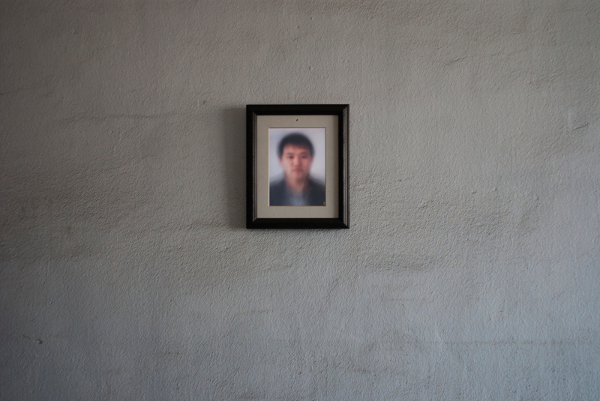
Memory is a project by Shinseungback Kimyonghun that creates a composite portrait of every person who has ever viewed the piece by using a facial detection algorithm to track faces and superimpose them on top of each other. The idea of being added to this collective portrait may make you feel uneasy, and forces you to consider how we think of identity in a post-Snowden world of data collection and surveillance.

One project that surprised me

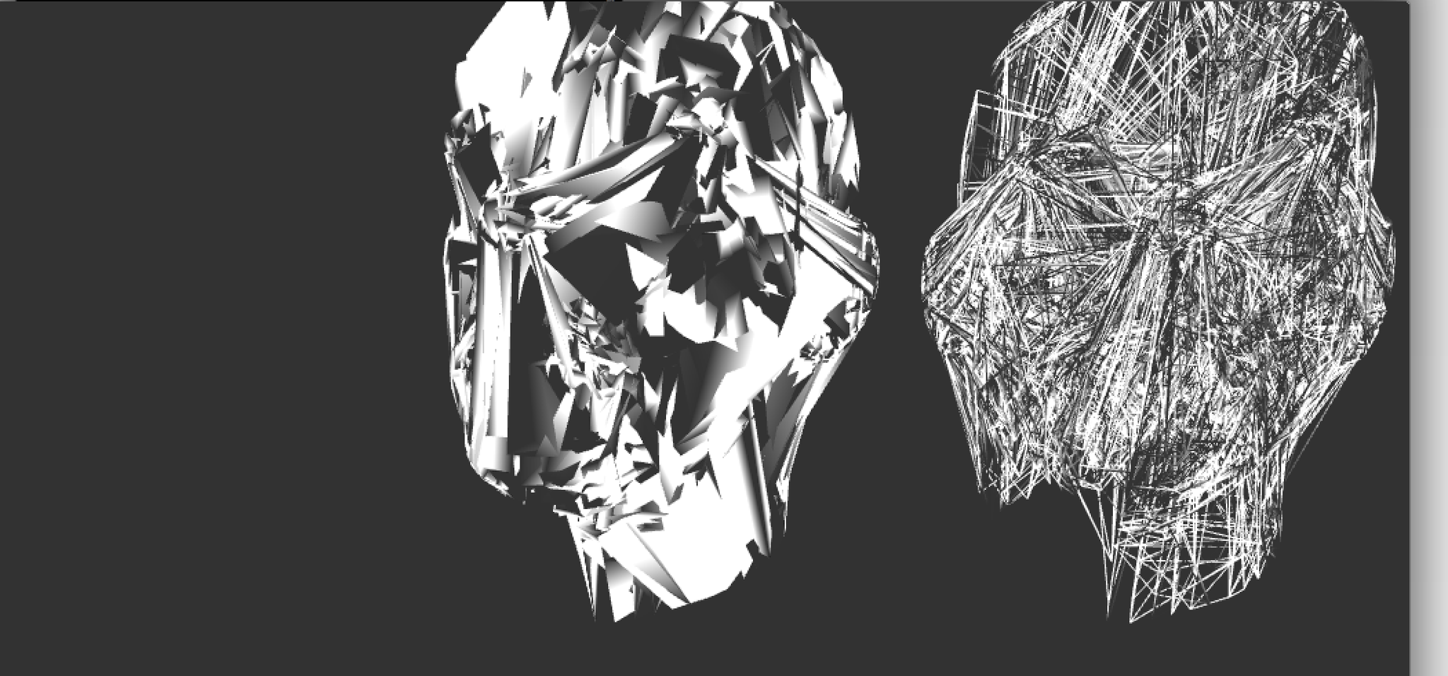
Zach Lieberman has a few tweets of screenshots of what looks like several experiments with broken, ugly, bad, and misused 3D graphics, labeled with names such as “bad geometry looking good” and “more wrongness”. This isn’t necessarily a full project by itself, but the casual attitude here of, “hey, look what happened here, what do we think of this?” is very interesting. It reminds me of how while painting, you can try something new, completely screw it up, but end up producing a strange new effect or technique that you wouldn’t have found without the aspect of improvisation. These screenshots show that even though computers seem to give the artist less control than paint or charcoal, spontaneity is still possible.

One project I found disappointing

This set of new GIFs by artist Dave Whyte demonstrates excellent technical skill and creative design, but I worry that this kind of work will dissuade artists to experiment with generative art to create new aesthetics beyond this sort of perfect mathematical pattern-based visuals that computers are good at simulating, and to push the medium of coding to new places.

(not to say that I don’t think these GIFs are visually stunning – the mathy side of me could stare at these for hours)

MAJ: Looking Outwards #1

Admiration: Parhelia

Parhelia, one of the many nature-themed generative works of Paul Prudence, is a real-time generative performance made with VVVV. A parhelion is the atmospheric phenomenon responsible for the bright halo that appears around the sun on cold winter days.

While I know this work is generative, I have no idea how one would go about making something like it. I enjoy the cinematic quality of the documentation and would love to take a peek at the source code to understand how Purdence’s work achieves its ethereal quality. I would like to see works such as Parhelia incorporated in to every-day user applications, giving an environment that often feels sterile and calculating a more organic feel.

Surprise: Patatap

Created by Jono Brandel and the musical duo LullatonePatatap uses input from one’s computer keyboard to create visual and musical feedback. Keys A through Z each have a unique sound and visual, while the spacebar is used to cycle through different modes that modify the A-Z keys output. The aim of Patatap is to create the experience of synesthesia. Brandel cites the works of Wassily Kandinsky, the famous synesthete artist, as his source of inspiration.

What I find surprising about this project is how something with such a simple concept can be so delightful. I couldn’t resist pressing every key in every mode to see what would happen, and discovered that some of the visuals have a randomized element. My personal favorite is the “G” key on the default setting.

What Could Have Been: Kilobots

Harvard Robot Swarm Close-Up

Harvard Robot Swarm

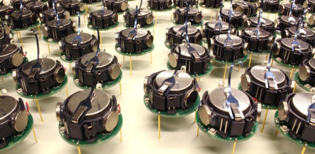
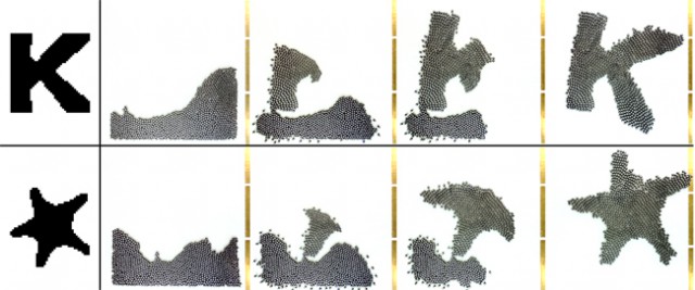
In the lab of Radhika Nagpal, researchers at the Harvard School of Engineering and Applied Sciences have released a swarm of 1024 “kilobots”, minuscule robots capable of self-organization. Kilobots represent a milestone in the development of collective artificial intelligence, able to execute complex behaviors from simple instructions. This article from Electronics Weekly explains in detail the mathematical and mechanical details of the swarm.

The group intelligence of the kilobots is intriguing, but at the moment leaves something to be desired. While their ability to form shapes is impressive, said shapes appear to be somewhat imprecise. I see this a the first step in  a larger project, which may one day culminate in a distant relative of the kilobot, able to mold its swarm into three-dimensional shapes.