by cdoomany @ 8:07 pm 24 January 2011
Currently I have a Processing sketch that can accommodate multiple realtime data feeds from Pachube and use the datastreams from those feeds to drive the recursive growth of a virtual tree.
The growth of the tree is dependent on two parameters; ambient light intensity and temperature. The recursive stages of growth consist of 5 divisions ( the first division is represented by a single line (or sapling) and the fifth (last) division represents a fully matured tree. When the optimal environmental conditions are are met for plant growth IRL (roughly 7000 lumens for the light reading and 65 degrees Fahrenheit for temperature), the tree is represented in its mature form (5th division).
My final version of the program will have three distinct geographic locations with their own corresponding tree. The stage of growth will serve as a rough representation of the ambient environmental data from that geographic location.
Here is a rough mock-up of what the final realtime animation will look like:

* The code for the tree itself is based on a project by Stefan Boeykens since I do not have prior experience with simulating recursive growth. The final version of the program will also include additional modification to the source code.
by Alex Wolfe @ 8:10 am
As of right now I have the bare bones of the processing sketch finished (particle system that does what I want more or less, running on random numbers instead of the actual data). I’ve done several sketches of a background image that will contain the various objects that are jumped from.
I have also compiled my data into a .cvs file, sorted by cause of death/place jumped from (ICD-10 number when available).I went through the entire ICD, picked out any codes related to falling, and then sorted those out of the 21st Century Mortality Compendium. Also added fatalities/survivors from BASE jumpers.
I’d like to actually have more survivors, the BASE jumpers (1500 recorded from all time, about 300 or so from the time period from the 21st Century i’m looking at) are slightly outnumbered by the less fortunate. However, there aren’t many reliable records of survivors of intentional jumpers besides them (since usually the jumping is illegal). Still the balance isn’t half as terrible as I expected.
Data Sources at my previous posthere
by Meg Richards @ 5:52 am
I’ve processed the network traffic from the border and incorporated the hostip.info free database of IP<->Country mappings to plot the source and destination IPs on a map of the earth. The sphere is given an earth-like texture from Marius Watz’s TileSaver lib that takes a rectangular image and applies it across a sphere. In this case I used the Blue Marble image of the earth provided by NASA.
The border network traffic is well-suited to being plotted on a map, but I still need to finalize the presentation of core traffic. With such a small set of IPs representing internal traffic (mostly 128.2 and 128.237 prefixes) it might be possible to represent the flow of internal traffic as a water simulation or as a set of edges and vertices where the vertex size denotes the amount of traffic it receives.
by Ben Gotow @ 1:08 am
So I spent way too much time working on this over the weekend, but I got Processing to draw what I wanted! I pulled a data set of 2200 text messages off my Android phone, and I created a visualization that creates an animated graph of your social network. The bubbles represent individuals in your network, and their relative size and distance from the center are tied to the number of text messages you’ve been sending them and the “currentness” of your relationship, respectively. People you stop talking to drift out farther in the ring and become dim over time.
Video, just because:
Comments Off on Ben Gotow-SMS Visualization Progress Report
by Max Hawkins @ 12:43 am
Closing Keynote: Vernacular Video from Vimeo Festival on Vimeo.
I’ve heard Bruce Sterling talk about the importance of augmented reality technology before, but it didn’t really click with me until I watched this video.
It’s a little long, but worth it for the visionary part at the end.
It’s interesting that he relies so heavily history as a basis for his prognostications. If you want to see 25 years into the future you must look 50 years into the past.
Comments Off on Looking Outwards 3
by Marynel Vázquez @ 12:37 am
I’ve collected a bunch of data about wikipedia’s common misspellings.. I’m working on the visualization now.
Here is an interesting way of using AppleScript to search phrases with Safari (have in mind this is not fast!):
1
2
3
4
5
6
7
8
9
10
11
12
13
14
15
16
17
18
19
20
21
22
23
24
25
26
27
28
29
30
31
32
33
34
35
36
37
38
39
40
41
42
43
44
45
46
47
48
49
50
51
52
53
54
55
56
57
58
59
60
61
62
63
64
65
66
67
68
69
70
71
72
73
74
75
76
77
78
79
80
81
82
83
84
85
86
87
88
89
90
91
92
93
94
| -- Access Safari and save page
on run argv
-- check for input arguments or show help
if (count of argv) is less than 2 then
return "Not enough arguments were given!" & myHelp()
end if
-- join arguments from 2nd to last
set theWords to item 2 of argv
repeat with i from 3 to (number of items of argv)
set theWords to theWords & " " & (item i of argv)
end repeat
-- output file comes from argument 1
set sourceFileName to (item 1 of argv)
set sourceFileName to POSIX file sourceFileName as string
-- play with Safari
my SearchWords(theWords, sourceFileName)
end run
-- Search a particular word or group of words
on SearchWords(queryText, sourceFileName)
-- enclose query in quotes
set queryText to "\"" & queryText & "\""
tell application "Safari" to activate
-- add some random delay
delay (random number from 2 to 5)
tell application "Safari"
-- open new window and move to the search bar
make new document
tell application "System Events"
tell process "Safari"
keystroke "l" using {command down}
delay 1
keystroke tab
delay 1
keystroke queryText
delay 1
keystroke return
end tell
end tell
delay 3
-- wait until page loads
set web_page_is_loaded to false
set myCounter to 0
set maxCounter to 50
set my_delay to 2
repeat until web_page_is_loaded is true
-- change words here depending on home page
if name of window 1 contains "Loading" or name of window 1 contains "Untitled" then
delay my_delay
else
set web_page_is_loaded to true
end if
set myCounter to myCounter + 1
if myCounter is maxCounter then
set web_page_is_loaded to true
end if
end repeat
delay 1
if name of window 1 contains "Loading" or name of window 1 contains "Untitled" or name of window 1 contains "http://www." then
-- do nothing! results didn't load...
else
-- save results page
save document 1 in file sourceFileName
end if
end tell
-- close window
tell application "System Events"
tell process "Safari"
keystroke "w" using {command down}
delay 1
end tell
end tell
end QueryWords
-- Command usage
on myHelp()
return "
You should pass the output file path and a list of words (at least one) through the command line.
this-applescript output-file word1 [word2] [word3] [...]"
end myHelp |
The previous script can be called as follows:
1
| arch -i386 osascript this-applescript-path output-path word1 [word2] ... |
Relative paths gave me you-don’t-have-permission-kind-of-errors, so I recommend using full paths. I’m no expert here.. just thought it might be fun to use AppleScript ;)
by Caitlin Boyle @ 12:36 am
I ended up ditching the bat data; it was too widespread, and difficult to prep; I want to try and pick it back up later in the semester. For now, I am working with data of North American predator population from NERC Center for Population Biology, plotting the data over time (how far back in time depends on the state) and in space over a map, wherein silhouettes of the animals will grow and shrink depending on population size- mouse over will display population estimate. The data will represent relations between black bear, coyote, fox and cougar habitats and population in the United States over time. The data has been prepped and put into .csv documents, and the visuals are planned out, code is maybe 35% done.
Comments Off on Caitlin Boyle :: Infoviz Progress
by Max Hawkins @ 12:36 am

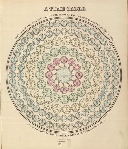
I love this collection of Victorian infographics from the blog BibliOdyssey. It’s easy to become too techno-centric when creating information visualizations. These beautiful graphics made without computers are a reminder of what’s possible without the assistance of a computer.
[Victorian Infographics]
Comments Off on Looking Outwards 2 – Data Visualization
by Chong Han Chua @ 12:11 am
Data scraping is going well.. I have at the time of writing about 65k+ images scrapped of the iTunes App Store.
I forgot to mention, I’m changing my idea to try to visualize something interesting from the abundance of (mostly bad) icons on the App Store. I don’t think I will have sufficient time to scrape the entire app store, I’ll just have to work with what I have.
I’m not too sure what kind of visualization I can get out of all these data. On the fundamental level, I’m going to try to generate a colour chart of all the icons in the app store. I’m also thinking of experimenting with data averaging or various other techniques to see what I can get.
by Ward Penney @ 12:09 am
I have a pretty good handle on using Google’s GeoCode to get lat/long from my cities. Next, I am plotting them on a map, which Ben Fry provides a pretty good example for. Then, add a date slider. Then, maybe a zoom thing where you can read the sighting text.
by susanlin @ 11:56 pm 23 January 2011
I have started to tackle my project. I see this in 2 parts:
1. Data Wrangling – Source: Comments RSS. Here is the simple way I am attempting to make sense of it and putting it in a form:
- Indicate +/- words
- Input: comment
- Output: categories
- Change radius based on number of words
- Irregular shape: vector function, RNG for shape, +/- for change
2. Form – Starting here as it made more sense for me to, the exact means of wrangling the data will depend on how I’d like things to look/interact. A bit backwards, but works best for me.
Starting places: Bouncy Bubbles, Lava Lamp
by Samia @ 11:51 pm
The project is coming along. Currently, I have a working parser for my data, as well as the beginnings of the pieces of the visualization. I need to push forward with the interaction – building the framework for how the user views/clicks through/accesses the infromation/visualizations.
by Le Wei @ 11:09 pm
I changed my project idea pretty drastically since last week. I’m now going to be working with a website [http://www.coins-of-the-uk.co.uk/] that hosts images of a ton of coins from the UK, all the way back to 3-digit years. The UK has a tradition, like many places, of putting their current leader on the face of their coins. Because they have been a monarchy since forever, many of their Queens and Kings have images of them from the majority of their lives catalogued through these coins. My base project will be to create sort of a flipbook that shows the coins in chronological order, so we can see how their appearance change over the years. If I have time, I might add a little information about the historical context of the coins. So far, I have a complete dataset of the images and the monarch and year of each coin. I was out of town this weekend so unfortunately not much got done on the coding front, but it shouldn’t be too hard to turn the data into an animation pretty quickly, so that is my next goal.
by mshuster @ 9:46 pm
I spent a good portion of my weekend creating version one of my visualization.
The concept is to take the current weeks’ Top 40 Radio chart and mash it up with YouTube to see if the music that the recording industry is pushing on the airwaves is in sync with what people consume when they can self-select their music in video format. Thumbnails from the videos are displayed in a collage and their image sizes correspond to the total video views they have received. This means that a video with 100,000,000 views will have 50x the surface area of a video that has only 2,000,000 views, where a video with only a few thousand views will appear to be only a few pixels large.
I’m doing all the scraping (BeautifulSoup), data crunching and processing (PIL) in python and sending the result to HTML via a templating (Jinja2) engine. Right now everything works locally. I’m going to work on the interaction and aesthetic and hopefully have a version that works on web rather than just my machine, but that may not be feasible (each request requires ~40 API calls and a good deal of image processing).
by Asa Foster @ 8:26 pm 22 January 2011

After a productive brainstorming session with Golan, I have decided that I will be doing a study of people’s intangible connection to music. The specific piece – Sufjan Stevens’ 5 part, 25-minute long suite “Impossible Soul” – will be played to a listener, who during which will be asked to, in their heads, define some variable by which to rate the music using a physical knob supplied to them. This self defined variable could be something as basic as “how much I’m liking it at the moment” to something more of the obtuse hippie psychobabble type such as “how much the music is flowing with my inner karmic energy”. Using whatever rating scale they choose, the listener will be asked to track their response over time with the knob, and the information will be presented in graph form.
Comments Off on Project 2: General Direction
by cdoomany @ 2:17 pm 20 January 2011
I gave the project a little more thought, and I will be making a processing app that acquires realtime environmental data (i.e. barometric pressure, temperature, humidity) via a live feed from Pachube, and uses that realtime data to drive the recursive growth of virtual plant life. The realtime animation (the growth and form characteristics of the plant) will serve a virtual representation of the environmental conditions at that specific remote location.

I am also considering taking multiple feeds (which will be individually represented by a different plant life or pseudo-species), so one could compare sets of environmental data from various international remote locations.
Currently I have a few live Pachube feeds that I can use which seem to be streaming reliable environmental data.
Here is a feed out of Ogaki, Japan that is streaming light intensity, humidity, temperature, etc.:
link: http://www.pachube.com/feeds/7257
Comments Off on Charles Doomany- InfoViz: Revised Project Concept
by cdoomany @ 5:12 pm 19 January 2011
1. Pachube
“Pachube is a convenient, secure & scalable platform that helps you connect to & build the ‘internet of things’, Store, share & discover realtime sensor, energy and environment data from objects, devices & buildings around the world.”
A possible project would be to create a Processing/Arduino application that uses a remote or an international data feed to control a software animation or hardware that visualizes the data in some form
2. The FreeSound Project
A collaborative database of recordings that can be used to easily obtain sounds for audio analysis and processing
3. Realtime ambient sensor data from a local source
Monitor environmental data from a public space and display that information visually in the space in order to provide an augmented sensory experience for the observer. (ex. visualization of ambient wind velocity)
by cdoomany @ 4:46 pm
Flight Patterns by Aaron Koblin
Flight Patterns is an animation that represents air traffic over North America by visualizing flight path data.
Exploring the Genomic Conservation by Circos
A visualization of the human geonome.

Comments Off on Looking Outwards: Visualization
by Alex Wolfe @ 8:03 am
After the workshop on Monday, I decided to further explore the idea of flight vs. fall. I found a number of data sources on falling, a list of accidental falls, skydiving fatalities, suicide records, etc. I want to aggregate this information into one visualization.
I was thinking of creating a particle system that would begin in the top left side of the screen and would “jump” from the varying heights, building, bridge, plane, and would either halt before hitting the ground if the person survived or continue all the way to the bottom to some dramatic effect if the person was not so fortunate.
Data Sources
21st Century Mortality Dataset
A list of all of the deaths from 2007 – 2009 categorized by cause. Deciphered using the ICD-10, the World Health Organization Classification of Deaths Compendium. I specifically looked at all entries labeled from W00, Fall on same level involving ice and snow, to W19 Unspecified Fall.
BASE Jumping Fatality List
List of all reported BASE jumping deaths from inside the community with short snippets on how they died
BASE Numbers
Number of people rewarded a ranking for jumping off of a building, antenna, span(bridge), earth(cliff)
by ppm @ 3:47 am
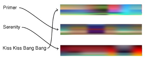
The idea is to render color palettes over time for a selection of movies. We could look for color trends by genre or year, or play a “match the movie to the palette” game like so:

Of course I don’t know what the rendered palettes will look like yet–I will have to try and see.

