Meg Richards – Project 2 Final

by Meg Richards @ 3:14 pm 4 February 2011

Network Usage Bubbles

The original incarnation of this project was inspired by the Good Morning! Twitter visualization created by Jer Thorp. A demonstration of CMU network traffic flows, it would show causal links for the available snapshot of the network traffic. All internal IP addresses had to be anonymized, making the internal traffic less meaningful. Focusing only on traffic with an endpoint outside of CMU was interesting, but distribution tended towards obeying the law of large numbers, albeit with a probability density function that favored Pittsburgh.

This forced me to consider what made network traffic interesting and valuable, and I settled on collecting my own HTTP traffic in real-time using tcpdump. I summarily rejected HTTPS traffic in order to be able to analyze the packet contents, from which I could extract the host, content type, and content length. Represented appropriately, those three items can provide an excellent picture of personal web traffic.

Implementation

The visualization has two major components: Collection and representation. Collection is performed by a bash script that calls tcpdump and passes the output to sed and awk for parsing. Parsed data is inserted into a mysql database. Representation is done by Processing and the mysql and jbox2d libraries for it.

Visualization Choices

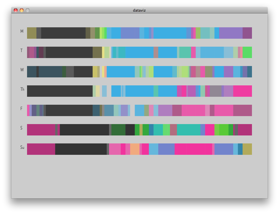
Each bubble is a single burst of inbound traffic, e.g. html, css, javascript, or image file. The size of the bubble is a function of the content size, in order to demonstrate the relative amount of tube it takes up to other site elements. Visiting a low-bandwidth site multiple times will increase the number of bubbles and thus the overall area of its bubbles will approach and potentially overcome the area of bubbles representing fewer visits to a bandwidth-intensive site. The bubbles are labeled by host and colored by the top level domain of the host. In retrospect, a better coloring scheme would have been the content type of the traffic. Bubble proximity to the center is directly proportional to how recently the element was fetched; elements decay as they approach the outer edge.

The example above shows site visits to www.cs.cmu.edu, www.facebook.com (and by extension, static.ak.fbcdn.net), www.activitiesboard.org, and finally www.cmu.edu, in that order.

Network Bubbles in Action

Code Snippets

Drawing Circles

Create a circle in the middle of the canvas (offset by a little bit of jitter on the x&y axes) for a radius that’s a function of the content length.

Body new_body = physics.createCircle(width/2+i, height/2+j,sqrt(msql.getInt(5)/PI) );
new_body.setUserData(msql.getString(4));

Host Label

If the radius of the circle is sufficiently large, label it with the hostname.

if (radius>7.0f) {
    textFont(metaBold, 15); 
    text((String)body.getUserData(),wpoint.x-radius/2,wpoint.y);
  }

tcpdump Processing

Feeding tcpdump input into sed

#!/bin/bash
tcpdump -i wlan0 -An 'tcp port 80' | 
while read line
do
if [[ `echo $line |sed -n '/Host:/p'` ]]; then 
    activehost=`echo $line | awk '{print $2}' | strings`
...
fi

The full source

Project 2: The Globe

by huaishup @ 6:30 am 2 February 2011

1. Overall
When talking about data visualization, most of the people will think of computer graphic visualization. However, from my view, this is only one of the possible ways to do it. Why not trying visualizing data in physical ways? People can not only see the visualization result, but can also touch and manipulate the visualization device, which could be really interesting.

In this project, I explores the physical/tangible way of visualizing data. Using a paper globe as the data media, people can learn the language of a certain area by spinning the globe and adjusting the probe.

2. Material

Arduino x1

WaveShield with SD card x1

Button x1

Speaker x1

Variable resister x2

Paper

Wood

Wire

3. Process

a. Prepare the paper globe
Using google images to download one LANGE size global map. Download a Photoshop plugin called Flexify 2 to revise the map images. Here is the tutorial. Plot the revised image, cut and glue.

b. Fix the variable resistor
Laser cut 4 pieces of round woods to fix the shape of the paper globe. May use extra timber to do so. Install one of the variable resistor to the bottom of the globe. See below.

c. Install all the other parts
Install another variable resistor as the probe which points to the globe. Lazer cut a seat for the probe and the globe. Hook up two different Analog Input pins with the Arduino and resistors.

d. Calculate the position
Spin the globe and alter the probe. Different position has different resistor value, which can be mapped to the sound track. Calculate the position and map the sound track.

e. Prepare the sound
Download the language sound from Google translate and store them in the waveshield.

4. Video

5. Code

#include 
#include 
#include 
#include "WaveUtil.h"
#include "WaveHC.h"
 
char decision = 0;
SdReader card;    // This object holds the information for the card
FatVolume vol;    // This holds the information for the partition on the card
FatReader root;   // This holds the information for the filesystem on the card
FatReader f;      // This holds the information for the file we're play
 
WaveHC wave;      // This is the only wave (audio) object, since we will only play one at a time
 
#define DEBOUNCE 100  // button debouncer
 
int mySwitch = 7;
 
// this handy function will return the number of bytes currently free in RAM, great for debugging!
int freeRam(void)
{
  extern int  __bss_end;
  extern int  *__brkval;
  int free_memory;
  if((int)__brkval == 0) {
    free_memory = ((int)&free_memory) - ((int)&__bss_end);
  }
  else {
    free_memory = ((int)&free_memory) - ((int)__brkval);
  }
  return free_memory;
} 
 
void sdErrorCheck(void)
{
  if (!card.errorCode()) return;
  putstring("\n\rSD I/O error: ");
  Serial.print(card.errorCode(), HEX);
  putstring(", ");
  Serial.println(card.errorData(), HEX);
  while(1);
}
 
void setup() {
  // set up serial port
  Serial.begin(9600);
  putstring_nl("WaveHC with 6 buttons");
 
  pinMode(mySwitch,INPUT);
 
   putstring("Free RAM: ");       // This can help with debugging, running out of RAM is bad
  Serial.println(freeRam());      // if this is under 150 bytes it may spell trouble!
 
  //  if (!card.init(true)) { //play with 4 MHz spi if 8MHz isn't working for you
  if (!card.init()) {         //play with 8 MHz spi (default faster!)
    putstring_nl("Card init. failed!");  // Something went wrong, lets print out why
    sdErrorCheck();
    while(1);                            // then 'halt' - do nothing!
  }
 
  // enable optimize read - some cards may timeout. Disable if you're having problems
  card.partialBlockRead(true);
 
// Now we will look for a FAT partition!
  uint8_t part;
  for (part = 0; part < 5; part++) {     // we have up to 5 slots to look in
    if (vol.init(card, part))
      break;                             // we found one, lets bail
  }
  if (part == 5) {                       // if we ended up not finding one  :(
    putstring_nl("No valid FAT partition!");
    sdErrorCheck();      // Something went wrong, lets print out why
    while(1);                            // then 'halt' - do nothing!
  }
 
  // Lets tell the user about what we found
  putstring("Using partition ");
  Serial.print(part, DEC);
  putstring(", type is FAT");
  Serial.println(vol.fatType(),DEC);     // FAT16 or FAT32?
 
  // Try to open the root directory
  if (!root.openRoot(vol)) {
    putstring_nl("Can't open root dir!"); // Something went wrong,
    while(1);                             // then 'halt' - do nothing!
  }
 
  // Whew! We got past the tough parts.
  putstring_nl("Ready!");
}
 
void loop() {
  //putstring(".");    // uncomment this to see if the loop isnt running
  if(digitalRead(mySwitch) == HIGH) {
    Serial.println("switch is ok");
    int spin = analogRead(5);
    int probe = analogRead(2);
    Serial.println(spin);
    Serial.println(probe);
 
    if(spin>=0 && spin<=576 && probe >=179 && probe <=276) {
      playcomplete("r.wav");
    }
    else if(spin>=85 && spin<=313 && probe >=35 && probe <=160) {
      playcomplete("c.wav");
    }
    else if(spin>=580 && spin<=780&& probe >=0 && probe <=142) {
      playcomplete("a.wav");
    }
    else if(spin>=980 && spin<=1023 && probe >=7 && probe <=22) {
      playcomplete("p.wav");
    }
    else if(spin>=980 && spin<=1023 && probe >=0 && probe <=7) {
      playcomplete("s.wav");
    }
    else if(spin>=1023 && probe >=47 && probe <=288) {
      playcomplete("e.wav");
    }
    delay(1000);
  }
 
}
 
// Plays a full file from beginning to end with no pause.
void playcomplete(char *name) {
  // call our helper to find and play this name
  playfile(name);
  while (wave.isplaying) {
  // do nothing while its playing
  }
  // now its done playing
}
 
void playfile(char *name) {
  // see if the wave object is currently doing something
  if (wave.isplaying) {// already playing something, so stop it!
    wave.stop(); // stop it
  }
  // look in the root directory and open the file
  if (!f.open(root, name)) {
    putstring("Couldn't open file "); Serial.print(name); return;
  }
  // OK read the file and turn it into a wave object
  if (!wave.create(f)) {
    putstring_nl("Not a valid WAV"); return;
  }
 
  // ok time to play! start playback
  wave.play();
}

Alex Wolfe | Data Visualization

by Alex Wolfe @ 8:34 am 31 January 2011

Beginning

I’m personally terrified of falling. I used to be a big rock climber, and one time I was sort of shimmying my way up a chimney, it’s this narrow space and there are no handholds so your back is wedged up against one wall and your feet the other and you just try to walk your way up. But I was too short and my shoes were too slippery and a lost my grip, my baleyer wasn’t paying attention so I just fell. I was pretty high up and it was probably only 100ft before  he stopped the rope and grabbed me, but it felt like eons, and I was so scared and I kept thinking of that unpleasant wet *thwack* sound I’d make when I finally hit the bottom.

So I have a sort of morbid fascination for people who’d jump of their own free will. Initially when I started this project I had this idea of flight vs. fall, visually displaying all the people who jump each year, and showing who survived and who didn’t seeing as I myself came so close to the statistic. I really wanted to highlight the falling motion, and probably the dramatic splat I’d so envisioned.

Data

I stumbled across the 21st century mortality dataset which was this comprehensive list of everyone who’d died since 2001 in england, and exactly where and how they died. It was ridiculously huge, with over 62,000 entries, each storing multiple deats. They used the ICD-10 International Classification of Diseases which is brutally specific to categorize them. Just looking for deaths related to falls earthed up 17 different categories, ranging from meeting your demise by leaping off of a burning building to death by falling off the toilet. However, when I went digging around for survivors, there wasn’t anything half so comprehensive. BASE jumpers are assigned a number when they complete all 4 tasks, skydiving companies keep some vague handwavy statistics, and I found several lists of people who’d died trying. However those crazy people who jump for fun typically are up to some crazy(illegal) stunts, such as underwater base jumping, or walking out to the edge of a wind turbine so there is no easy way to count/find/categorize them all with half the level of detail as the less fortunate.

So i decided to focus on the dataset I had. I wrote a quick javascript that essentially just trolled through the dataset, which was stored as a .cvs file, and pulled out any deaths filed under codes related to falling and put them in a nice new .cvs file

First Stab/Brainstorming

Since I had that jumping/falling effect in mind, I went through and made each person I had into his/her own particle. Mass/Radius I based on the age of the person who died, color based on gender, and I stored any information other information about them in the particle. I put some basic physics and started playing around. I had this idea where I could simulate the “jump” with each particle starting from the height of the person’s final leap, and I could hand-draw a graphic for the side displaying the more common places.

Here was my initial attempt

Final

Although interesting, it wasn’t particularly informative at all, so i abandoned the “jumping effect” and focused on other things I could get the particles to do. Ultimatly I executed blobbing based on gender, and then sorting themselves into the ICD-10 categories of death, keeping hold of the “falling effect” during the in between transitions. I wanted to have each stage look like the particles just fell into place create the visualization

Critique

Although I love the freeform effect of the falling particles, and their transition from displaying each of the patterns, it doesn’t really do the data justice. I have so many juicy details stored in there I just couldn’t display. With the number of particles, it was horribly slow if you did mouseover display, and each one was virtually unique as far as age, place, cause of death, gender, so there weren’t any overarching trends for the really interesting stuff. I think I’m going to go back and guess my best estimate for height, hardcode it in and maybe do a state where it attempts to display it, or at least a few more things, eg. line up by age and mouseover explain ICD-10 code. I really want to think of a way to get the cause of death to be a prominent feature for each individual

Chong Han Chua | App Store Visualization | 31 January 2011

by Chong Han Chua @ 8:31 am

This project explores the possibility of doing an interesting visualization of icons from the Apple iTunes App Store.

This project was conceived when I saw the visualization of flags by colours. The whole nature of a set of similar manner graphics, such as  the flags, amused me immensely. It then suddenly occurred to me that the icons on the iTunes App Store are of the same nature. Almost rectangle, with rounded corners, and usually vector graphics of some sort – would be interesting to look at.

I guess in a way, this existed as largely a technical inquiry. This is the first time I wrote a crawler as well as a screen scraper. This is the first time I dealt with a large set of data that takes almost forever to do anything with. I can almost feel that heart beat when I ran the scraping script for the first time, half expecting Apple to boot me off their servers after a few hundred continuous queries. Thankfully, they didn’t.

There are a bunch of technical challenges in this inquiry mainly:

1. Scraping large sets of data requires planning. My scraping code went through at least 3 different versions, not to mention playing with various language. Originally, I wanted to use Scala as I was under the impression that the JVM would be more efficient as well as speedy. Unfortunately, the HTML returned by the iTunes App store is malformed – one of the link tags is not properly closed and choked the built in Scala’s XML parser.

After determining that using any random Java XML parser would be too much of a hassle, I turned to my favourite scripting language, JavaScript on node.js (using Google V8). After looking through a bunch of DOM selection solutions, I finally got jsdom and jquery to work, then I knew that I was in business.

The original plan was to crawl the website from first page to last page and create a Database entry for every page in the website. There was only very basic crash recovery in the script which basically state that the last scraped entry is a certain index n. Unfortunately for me, the links are traversed not exactly in the same order every time so I ended up having duplicate entries in my database. Also, the script was largely single threaded, and it took almost over 10 hours to scrape 70+k worth of pictures.

After realizing that a partial data set will not do me any good, I decided to reconcentrate my efforts. I then built in some redundancy in getting links and test the data base for existing entries before inserting. I also ran another script on top of the scraper script that restarts the script when it crashes on a bad response. Furthermore, I used 20 processes instead of 1 to expedite the process. I was half expecting to really get booted off this time round, or get a warning letter from CMU but thankfully till now there is none. After 10 hours or so, I managed to collect 300,014 images. Finder certainly isn’t very happy about that.

2. Working with large data sets requires planning. Overall, this is a pretty simple visualization, however the scaffolding required to process the data consumes plenty of time. For one, there was a need to cache results so that it doesn’t take forever to debug anything. SQLite was immensely useful in this process. Working of large sets of data also means that when there is a long running script, and it crashes, most of the time, the mid point data is corrupted and has to be deleted. I pretty much ran through every iteration at least 2 to 3 times. I’m quite sure most of my data is in fact accurate, but the fact that a small portion of the data was corrupted (I think > 20 images) does not escape me.

I wouldn’t consider this a very successful inquiry. Technically it is ego stroking, on an intellectual-art level, there seems to be no very useful results from the data visualization. When constructing this visualization, I had a few goals in mind

1. I don’t want to reduce all these rich data sets into simply aggregations of colours or statistics. I want to display the richness of the dataset.

2. I want to show the vastness of the data set.

As a result, I ended up with a pseudo spectrum display of every primary colour of every icon in the App Store that I scraped. It showed basically the primary colour distribution in something that looks like a HSB palette. The result was that it seems to be obvious that there are plenty of whitish or blackish icons, and the hue distribution of the middle saturation seems quite even. In fact, it says nothing at all. It’s just nice to look at.

There’s a couple of technical critiques on this: The 3D to 2D mapping algorithm sucks. What I used was a very simple binning and sorting via both the x and y axis. Due to the binning, the hue distribution was not equal for all bins. To further improve this visualization, the first step is to at least equalize the hue distribution across bins.

I guess what I really wanted to do, if I had the time, was to have a bunch of controls that filters the icons that showed up on the screen. I really wanted to have a control where I can have a timeline where I can drag the slide across time and see the appstore icons populate or a bunch of checkboxes which I can show and hide categories that the apps belong to. If I have more chops, I would attempt to sort the data into histograms for prices and ratings and have some sort of colour sorting algorithms. If I had more chops, I would make them animate from one to another.

I think there is a certain difficulty in working with big data sets as there is no expectation of what trends to occur since statistically speaking everything basically evens out and on the other hand it basically just takes forever to get anything done. But it is fun, and satisfying.

If you want the data set, email me at johncch at cmu dot edu.

Code can be found at:

Scraper
Data prep
Visualization

SamiaAhmed-Final-Infoviz

by Samia @ 7:15 am

For my project, I wanted to explore the data of my life. For fall and spring semester of my sophomore year, I kept a detailed, fairly complete log of all of my actions in an analogue notebook. I wanted to see if there were any connections I could draw out of my everyday actions.

One of the biggest problems I ran into was simply getting the data into digital form. I had (and still have) to type it up personally because no one else can read my handwriting or understand the shorthand.

After I had a few days of data written, and a working parser, I began to run the data with a first, basic visualization of a pie chart. I mapped events catagorized as sleep to a dark purple, school to blue, fun to pink, housekeeping to yellow, and wasting time to green. In the screen shots below, I also gave them a transparency with alpha. NOTE: because I am silly, these graphs start midnight at 0300, and then move through the day clockwise.

the image below is of maybe 3 or 4 days worth of data. Already patterns are emerging — a desaturated area where I sleep, a yellow/olive band of waking up and getting up in the morning. two blue peaks of morning and afternoon classes, and a late afternoon pink band of doing fun after class stuff.

by this point, probably around 10 days of data, the patterns are pretty clear — especially the sharp line between black and yellow when I wake up every morning.

the pie chart re-oriented so that 0000 hours is midnight. 0600 is midday.

below I looked at the data sequentially, each day as a horizontal band.

My final interaction looked like the below images: each of the bands is a day of the week. So monday, for example, is the three days of semi-transparent monday data graphed on top of one another. patterns are pretty obvious here – the front of the school week has lots of blue for homework and school. The afternoons of thursday and friday are fairly homework free, etc

Clicking on a day allows you to compare the “typical” day with specific ones, as well as compare the events broken down by catagory (how many hours of school work vs that days’ average)

All in all, I’m glad I got this to work in some capacity. I think the data would be more interesting if I had all of it. In terms of interaction and design there are lots of weak points — poor labelling, jarring color-coding, and non-intuitive buttons.

For concept however, Golan hit the nail on the head. As I was transcribing the data, I was really excited to work with some of the specific things I tracked — for example, when I tried to get up in the morning and failed, or when I did my laundry, or how much time I spent doing homework, verses in class, what times of day I biked. I think I was so caught up in getting the “overview” of the project to work that I never got to those more interesting and telling points. In retrospect, my time may have been better spent digitizing the data about, perhaps, when I slept, and then just working with that, since it became obvious that I would not have time to put in the entire database. A smaller subset of the information might have conveyed a more understandable picture — for example seeing that I’m biking home from campus at 2 in the morning might just as well convey I had a lot of work to do as writing all the tasks of that day.

Caitlin Boyle :: Project 2 InfoViz

by Caitlin Boyle @ 6:35 am


My idea came from…, various exercises in frustration. In a way, the hardest part about this project was just committing to an idea… Once my initial project fell through, my attack plan fell to pieces. I’m not used to having to think in terms of data, and I think I got too wrapped up in the implications of “data”. Really, data could have been anything… I could have taken pictures of my belongings and made a color map, or done the same for my clothing; but in my head, at the time, I had a very specific idea of what the dataset I was searching for was, what it meant, and what I was going to do once I found it. I think stumbling upon the ruins of the government’s bat database put me in too narrow a mindset for the rest of the project… for a week after I realized the batdata wasn’t going to fly, I went looking for other population datasets without really questioning why, or looking at the problem another way. It took me a little longer than it should have to come back around to movie subtitles, and I had to start looking at the data before I had any idea of what I wanted to visualize with it. My eventual idea stemmed out of the fluctuation of word frequency in different genres; what can you infer about the genre’s maturity level, overarching plot, and tone by looking at a word map? Can anything really be taken from dialogue, or is everything in the visuals? The idea was poked along with thanks to Golan Levin and two of his demos; subtitle parsing and word clouds in processing.

Data was obtained… after I scraped it by hand from www.imdb.com ‘s 50 Best/Worst charts for the genres Horror, Comedy, Action and Drama. .srt files were also downloaded by hand because I am a glutton for menial tasks I’m a novice programmer, and was uncomfortable poking my nose into scripting. I just wanted to focus on getting my program to perform semi-correctly.

Along the way, I realized… how crucial it is to come to a decision about content MUCH EARLIER to open up plenty of time for debugging, and how much I have still to learn about Processing. I used a hashtable for the first time, got better acquainted with classes, and realized how excruciatingly slow I am as a programmer. In terms of the dataset itself, I was fascinated by the paths that words like “brother, mother, father” and words like “fucking” took across different genres. Comedy returns a lot of family terms in high frequency, but barely uses expletives; letting us know that movies that excel in lewd humor (Judd Apatow flicks, Scary Movie, etc.) are not necessarily very popular on imdb. On the other hand, the most recurring word in drama is “fucking”, letting us know right away that the dialogue in this genre is fueled by anger.

All in all I think I gave myself too little time to answer the question I wanted to answer. I am taking today’s critique into consideration and adding a few things to my project overnight; my filter was inadequate, leaving the results muddied and inconclusive. I don’t think you can get too much out of my project in terms of specific trending; the charm is in it’s wiki-like linking from genre-cloud, to movie titles, to movie cloud, to movie titles, to movie cloud, for as long as you want to sit there and click through it. I really personally enjoy making little connections between different films that may not be apparent at first.

Subtitle Infoviz ver. 1 video

Pre-Critique Project

Post-Critique (coming soon) :: more screenshots/video/zip coming soon… making slight adjustments in response to critique, implementing labels and color, being more comprehensive when filtering out more common words. I plan to polish this project on my own time.

Project 2: Data Visualization – Mapping Our Intangible Connection to Music

by Asa Foster @ 4:28 am

General Concept

Music is an incredible trigger for human emotion. We use it for its specific emotional function a lot of the time, using music to cheer us up or calm us down, as a powerful contextual device in theater and film, and for the worship of our deities of choice. Although it is very easy for an average listener to make objective observations about tempo and level of intensity, it is harder to standardize responses to the more intangible scale of how we connect to the music emotionally. This study aims to gain some insight on that connection by forcing participants to convert those intangible emotional responses to a basic scale-of-1-to-10 input.

The goal of this project is to establish a completely open-ended set of guidelines for the participant in order to collect a completely open-ended set of data. Whether correlations in that data can be made (or whether any inference can be made based on those correlations) becomes somewhat irrelevant due to the oversimplification and sheer arbitrariness of the data.

Execution

An example of an application of a real-time system for audience analysis is the response graph at the bottom of the CNN screen during political debates. The reaction of the audience members, displayed by partisanship, is graphed to show the topic-by-topic approval level during the speech. By having a participant listen to a specific piece of music (in this case, Sufjan Stevens’ five-part piece Impossible Soul) and follow along using a program I created in Max/MSP to graph response over time, I can fashion a crude visual map of where the music took that person emotionally.

Data & Analysis

Data was gathered from a total of ten participants, and the graphs show some interesting connections. First off are the similarities within the opening movement of the piece; from talking with the participants there seemed to be a general sense of difficulty standardizing one’s own responses. This led to a general downward curve once the listener realized that there was a lot more breadth to the piece than the quiet opening lets on. Second is the somewhat obvious conclusion that the sweeping climax of the piece put everyone more or less towards the top of the spectrum. The third pattern is more interesting to consider: people were split down the middle with how to approach the song’s ending. To some it served as an appropriately minimalist conclusion to a very maximalist piece of music, to others it seemed forced and dry.

Areas of Difficulty & Learning Experiences

  • The song is 25 minutes long, far too long for most CMU students to remove their noses from their books.
  • As the original plan was to have a physical knob for the listener to use, I had an Arduino rig all set up to input to my patch when I fried my knob component and had to scale back to an on-screen knob. Nowhere near as cool.
  • A good bit of knowledge was exchanged for the brutal amount of time wasted on my initial attempt to do this using Processing.
  • I have become extremely familiar with the coll object in Max, a tool I was previously unaware of and that has proved EXTREMELY useful and necessary.

Code

Download Max patches as .zip: DataVis

Susan Lin — InfoViz, Final

by susanlin @ 3:14 am

Visualizing a Flaming Thread
InfoViz based off of WSJ article “Why Chinese Mothers are Superior” comments thread.

This is a looong post, so here’s a ToC:

  • The Static Visualization
  • Everything Presented Monday
  • Process Beginnings
  • Pitfalls
  • Retrospective

The Static Visualization

As per the advice during the critique, I create a infographic based off the static variant of my project. I decided to keep the 10×100 grid layout for aesthetic reasons (not having 997 bubbles all in one row and thus making a huge horizontal graphic).

This alternative version of the above offers the same thing with the areas of interest highlighted.

Everything Presented Monday
Links for everything pre-critique.

Process Beginnings

Like mentioned, the data source of interest was this WSJ Article. The article sparked some serious debate leading to threads such as these. Here is a particularly powerful answer from the Quora thread from an anon user:

Drawing from personal experience, the reason why I don’t feel this works is because I’ve seen an outcome that Amy Chua, the author fails to address or perhaps has yet to experience.

My big sister was what I used to jealously call “every Asian parent’s wet dream come true” [… shortened for conciseness …]
Her life summed up in one paragraph above.

Her death summed up in one paragraph below.
Committed suicide a month after her wedding at the age of 30 after hiding her depression for 2 years.

I thought the discussion around it, though full of flaming, was very rich with people on both ends of the spectrum chiming in. My original idea was to take apart the arguments and assemble it in a form which would really bring out the impact, similar to the excerpt from Quora.

I started off with the idea of having two growing+shrinking bubbles “battle.” More information can be read on this previous post.

This was the baseline visual I devised:

  • Green and Orange balls collide with each other.
  • Collision: green does not affect green, likewise, orange did not affect orange.
  • Colliding with opposition shortens your life span (indicated by opacity).
  • Touching an ally ups your life span.

Giving credit where credit is due:
The code started with Bouncy Balls and was inspired by Lava Lamp.

Next, I wanted to see if I could work some words into the piece. Word Cloud was an inspiration point. In the final, I ended up using this as the means of picking out the words which charged comments usually contained: parent, Chinese, and children.

Cleaning up the data:

  • When I downloaded the RSS feed of the comments, it was all in one line of  HTML (goody!).
  • With some help, I learned how to construct a Python script to organize it.
  • Basically, the code figures out where each time stamp and comment is relative to the mark-up patterns, and separates the one line out to many lines.
import re
 
f = open('comments.html', 'r')
 
text = ''
for line in f:
 
    while 1:
        m = re.search('#comment.*?#comment\d+', line)
        if m is None:
            break
 
        comment = line[:m.span()[1]]
        n = comment.find("GMT") + 4
        text += comment[:n] + "\n"
        text += comment[n:] + "\n\n"
 
        line = line[m.span()[1]:]
f.close()
 
f2 = open('comments-formatted.html', 'w')
f2.write(text)
f2.close()

Sources: comments.html, comments-formatted.html

More looking outwards:

While working, I often took a break by browsing Things Organized Neatly. It served both as motivation, inspiration, and admittedly procrastination. Also, if I could revise my idea, maybe something interesting to look at in a future project would be commonly used ingredients in recipes (inspired by above photo taken from the blog).

Pitfalls

The greatest downer of this project was discovering that language processing was actually quite hard for a novice coder to handle. Here were abandoned possibilities, due to lack of coding prowess:

  • LingPipe Sentiment Analysis – This would have been really freaking cool to adapt this movie review polarity to a ‘comment polarity’ analysis, but unfortunately, this stuff was way over my head.
  • Synesketch – Probably would have been a cool animation, but didn’t get to show two emotions at once like the original idea desired.
  • Stanford NLP – Again, admired this stuff, but way over my head.

Retrospect
In no order, some of the things I learned and discovered while doing this project.

  • Language processing is still a new-ish field, meaning, it was hard to find a layman explanation and adaptation. It would have been nice to do more sophisticated language processing on these comments, but language processing is a monster on its own to tackle.
  • Vim is impressive. I now adore Vim users. (Learned during the Python script HTML clean-up portion of this project.)
  • Mechanical Turk: This might have been an alternative after figuring out language processing was hard to wrangle. Though building a framework to harvest this data is unfamiliar territory as well (probably with its own set of challenges).
  • Another field: I really wanted to map this variable out, especially after harvesting it, but the time stamp was not used. An animation with the time stamps normalized by comment frequency may have added another layer of interpretation. Addition: Though, from the critique, it seems like more layers would actually hurt more than help. Still, I wonder if in the static visualization the time stamp could have added.
  • All-in-all: I thought this was parsed down to the simplest project for 2+ weeks… This clearly wasn’t the case. Lesson: Start stupidly simple next time!
  • As for things that went well: I forced myself to start coding things other than simple mark-up again, which is very pleasing when things come together and start working.
  • I am pleased with the combined chaos+order the project exudes (lava lamp on steroids?). The animation made for a poor visualization compared to the static version even though I spent 80% of my time getting the animation to work. On the bright side, I would have never found out without trying, so next time things will be different.

Charles Doomany- InfoVis: Final Post

by cdoomany @ 2:29 am

Digital Flora

This project acquires realtime environmental data (ambient light and temperature) from several distinct geographic locations and uses the data as a parameter for driving the recursive growth of a virtual tree. Each tree serves as a visual indicator of the environmental conditions of their respective geographic location. When the optimal conditions are met for plant growth (~7000 lumens/ 18.3 °C) the animation displays a fully matured tree at its last stage of recursion.

I used Pachube to acquire the data and Processing to generate the tree animation.

Ideas for Improvement:

• Add more parameters for influencing growth ( ex: daily rainfall, soil pH, etc.)

• Increase the resolution of growth (currently only ten levels of recursive depth)

• Growth variation is not observable over short periods of time, but is only apparent over long term seasonal environmental changes

• Current animation appears fairly static, there is an opportunity to add more dynamic and transient animated elements that correspond with environmental conditions

• An ideal version of the program would have multiple instances of the animation running simultaneously, this would make it possible to compare environmental data from various geographic locations easily

• A viewable history of the realtime animation would be an interesting feature  for accessing and observing environmental patterns

• More experience with recursively generated form and some aspects of OOP would certainly have helped me reach my initial goal

Timothy Sherman – Project 2 – ESRB tag cloud

by Timothy Sherman @ 1:17 am

My project is a dynamic tag cloud of word frequency in video game titles. The user can select a number of ratings and/or content descriptors (short phrases that describe the content of a game), assigned by the Entertainment Software Ratings Board (ESRB), and the cloud will regenerate based on the narrower search. The user can also hover their mouse over a word in the cloud, and access a list of the games with the given rating/descriptor parameters which contain that word in their title.

Initially, my data source was going to be a combination of the Entertainment Software Ratings Board’s rating data against sales numbers from VGChartz. After getting my data from both websites using scrapers (both XML based in Ruby and Nokogiri, but one that loaded 35000 pages and took 5 hours to run), I encountered a problem. The ESRB and VGchartz data didn’t line up – titles were listed differently, or co-listed in one, and listed separately in the other. There were thousands of issues, most unique, and the only way to fix it would be by hand, something I didn’t have time or patience for. I decided to drop the VGchartz data and just work with the ESRB data, as it seemed more relatable on it’s own.

Though I had my data, I didn’t really know how to visualize it. After a lot of coding, I ended up with what basically amounted to a search engine. You could search by name, and parametrize it with ratings or content descriptors, and recieve a list of games that matched. But this wasn’t a visualization! This was basically what the ESRB had on their site. I felt like I had hit a wall. I’ve never done data visualization work before, and I realized that I hadn’t thought about what to actually do with the data – I’d just thought about the data’s potential and assumed it’d fall into place. After thinking about it, I came up with a couple potential ideas, and I decided the first one I’d try would be a word frequency visualization on the game titles, one that could be parametrized by content descriptors and rating. This was what ended up being my final project.

I was working in Processing, using the ControlP5 library for my buttons, and Golan’s Tag Cloud demo which used OpenCloud. I began by coding the basic functionality into a simple and clean layout – I ended up liking this layout so much that I only modified it slightly for the final project. The tag cloud was easy to set up, and the content-descriptor-parametrized search wasn’t terrible either. I added a smaller number next to each word, showing how many times that word appeared in the search, to help contextualize the information for the viewer. I saw that there was some interesting stuff to be found, but wanted more functionality. What I had gave no information about the actual games that it used to make the tag cloud. When I saw an odd word in a given search, I wanted to be able to see what games had that name in their title. I added a scrollable list that pops up when the user mouses over a word in the cloud which lists all the games in the search with that word.

At this point, most of my work became refining the parameters I wanted to allow users to search, and various visual design tasks. I figured out colors and a font, added the ability to search by a games rating, and selected the parameters that seemed more interesting.

Overall, I’m decently happy with the project. It’s the first data visualization I’ve ever done, and while I feel that it shows to some extent, I think that what I came up with can be used to find interesting information, and there are some unintuitive discoveries to be made. I do feel that had I been thinking about how I would visualize my data earlier, I would’ve been able to achieve a more ambitious or refined project – there are still some problems with this one. The pop-up menus, while mostly functional, aren’t ideal. If you try to use them for words in small font, they become unscrollable. I had to compromise on showing the whole title in them as well. There was no way to make it fit and still display a lot of information in the table, and no way to make the table larger and still keep track of if the mouse had moved to another word – limitations of ControlP5 which I didn’t have time to figure out how to get around. That said, these are issues with a secondary layer of the project, and I think the core tag cloud for chosen descriptors is interesting and solid.

Presentation Slides

Processing Source:
Note: This requires the ControlP5 library to be installed.

import controlP5.*;
 
ControlP5 controlP5;
 
int listCnt = 0;
 
Button[] ratingButt;
Button[] descripButt;
 
Button[] textButt;
boolean changeTextButt = true;
ListBox hoverList;
int listExists = -1;
 
color defaultbg = color(0);
color defaultfg = color(80);
color defaultactive = color(255,0,0);
color bgcolor = color(255,255,255);
color transparent = color(255,255,255,0);
color buttbgcolor = color(200,0,0);
color buttfgcolor = color(150);
 
Cloud  cloud;
 
float  maxWordDisplaySize = 46.0;
 
int combLength;
String names[];
String rating[];
String descriptors[];
ArrayList descripSearch;
ArrayList rateSearch;
String descriptorList[];
String ratingList[];
ArrayList currentSearch;
PFont font;
ControlFont cfont;
 
void setup() 
{
  font = createFont("Helvetica", 32, true);
  cfont = new ControlFont(font);
  cfont.setSize(10);
  //cfont.setColor();
  textFont(font, 32);
  size(800, 600);
  smooth();
  background(bgcolor);
  frameRate(30);
  cloud = new Cloud(); // create cloud
  cloud.setMaxWeight(maxWordDisplaySize); // max font size
  cloud.setMaxTagsToDisplay (130);  
  controlP5 = new ControlP5(this);
  controlP5.setControlFont(cfont);
 
  //rating list
  ratingList = new String[5];
  ratingList[0] = "Early Childhood";
  ratingList[1] = "Everyone";
  ratingList[2] = "Teen";
  ratingList[3] = "Mature";
  ratingList[4] = "Adults Only";
 
 
  //rating buttons
  ratingButt = new Button[5];
  for(int i = 0; i < 5; i++)
  {
    ratingButt[i] = controlP5.addButton("rating-"+i,i,(10+(0)*60),40+i*24,104,20);
    ratingButt[i].setLabel(ratingList[i]);
    ratingButt[i].setColorBackground(defaultbg);
    ratingButt[i].setColorForeground(defaultfg);
    ratingButt[i].setColorActive(defaultactive);
  }


  //descriptor list - used with buttons for faster lookup.
  descriptorList = new String[17];
  descriptorList[0] = "Tobacco";
  descriptorList[1] = "Alcohol";
  descriptorList[2] = "Drug";
  descriptorList[3] = "Violence";
  descriptorList[4] = "Blood";
  descriptorList[5] = "Gore";
  descriptorList[6] = "Language";
  descriptorList[7] = "Gambling";
  descriptorList[8] = "Mild";
  descriptorList[9] = "Realistic";
  descriptorList[10] = "Fantasy";
  descriptorList[11] = "Animated";
  descriptorList[12] = "Sexual";
  descriptorList[13] = "Nudity";
  descriptorList[14] = "Comic Mischief";
  descriptorList[15] = "Mature Humor";
  descriptorList[16] = "Edutainment";
 
  //descrip buttons
  descripButt = new Button[17];
  for(int i = 0; i < 17; i++)
  {
    descripButt[i] = controlP5.addButton("descrip-"+i,i,(10+(0)*60),180+(i)*24,104,20);
    descripButt[i].setLabel(descriptorList[i]);
    descripButt[i].setColorBackground(defaultbg);
    descripButt[i].setColorForeground(defaultfg);
    descripButt[i].setColorActive(defaultactive);
  }
 
  //load strings from file.
  String combine[] = loadStrings("reratings.txt");
  combine = sort(combine);
  combLength = combine.length;
  names = new String[combLength];
  rating = new String[combLength];
  descriptors = new String[combLength];
  descripSearch = new ArrayList();
  rateSearch = new ArrayList();
  currentSearch = new ArrayList();
 
 
  //this for loop reads in all the data and puts into arrays indexed by number.
  for(int i = 0; i < combLength; i++)
  {    
    //this code is for the ratings.txt file
    String nextGame[] = combine[i].split("=");
    names[i] = nextGame[0];
    rating[i] = nextGame[2];
    descriptors[i] = nextGame[3];
    currentSearch.add(names[i]);
    listCnt++;
    String nameWords[] = split(names[i], " ");
    for(int z = 0; z < nameWords.length;z++)
    {
      String aWord = nameWords[z];
      while (aWord.endsWith(".") || aWord.endsWith(",") || aWord.endsWith("!") || aWord.endsWith("?")|| aWord.endsWith(":") || aWord.endsWith(")")) {
        aWord = aWord.substring(0, aWord.length()-1);
      }
       while (aWord.startsWith(".") || aWord.startsWith(",") || aWord.startsWith("!") || aWord.startsWith("?")|| aWord.startsWith(":") || aWord.startsWith("(")) {
       aWord = aWord.substring(1, aWord.length());
       }
      aWord = aWord.toLowerCase();
      if(aWord.length() > 2 && !(aWord.equals("of")) && !(aWord.equals("and")) && !(aWord.equals("the")) && !(aWord.equals("game")) && !(aWord.equals("games"))) {
        cloud.addTag(new Tag(aWord));
      }
    }
  }
}
 
void controlEvent(ControlEvent theEvent) {
  // with every control event triggered, we check
  // the named-id of a controller. if the named-id
  // starts with 'button', the ControlEvent - actually
  // the value of the button - will be forwarded to
  // function checkButton() below.
  if(theEvent.name().startsWith("rating")) {
    ratingButton(theEvent.controller());
    search(0);
  }
  else if(theEvent.name().startsWith("descrip")) {
    descripButton(theEvent.controller());
    search(0);
  }
 
}
 
void descripButton(Controller theCont) {
  int desVal = int(theCont.value());
  int desInd = descripSearch.indexOf(descriptorList[desVal]);
  if(desInd == -1)
  {
    descripSearch.add(descriptorList[desVal]);
    theCont.setColorBackground(buttbgcolor);
    theCont.setColorForeground(buttfgcolor);
  }
  else
  {
    descripSearch.remove(desInd);
    theCont.setColorBackground(defaultbg);
    theCont.setColorForeground(defaultfg);
  }
}
 
void ratingButton(Controller theCont) {
  int ratVal = int(theCont.value());
  int ratInd = rateSearch.indexOf(ratingList[ratVal]);
  if(ratInd == -1)
  {
    rateSearch.add(ratingList[ratVal]);
    theCont.setColorBackground(buttbgcolor);
    theCont.setColorForeground(buttfgcolor);
  }
  else
  {
    rateSearch.remove(ratInd);
    theCont.setColorBackground(defaultbg);
    theCont.setColorForeground(defaultfg);
  }
}
 
void draw()
{
  background(bgcolor);
  textSize(12);
  fill(255,0,0);
  text(listCnt,45-textWidth(str(listCnt)),30);
  fill(0);
  text("/"+combLength+" games",45,30);
  //text("games games",20,30);
  List tags = cloud.tags();
  int nTags = tags.size();
  // Sort the tags in reverse order of size.
  tags = cloud.tags(new Tag.ScoreComparatorDesc());
  if(changeTextButt)
  {
    textButt = new Button[130];
  }
  float xMargin = 130;
  float ySpacing = 40;
  float xPos = xMargin; // initial x position
  float yPos = 60;      // initial y position
  for (int i=0; i<nTags; i++) {
 
    // Fetch each tag and its properties.
    // Compute its display size based on its tag cloud "weight";
    // Then reshape the display size non-linearly, for display purposes.
    Tag aTag = (Tag) tags.get(i);
    String tName = aTag.getName();
    float tWeight = (float) aTag.getWeight();
    float wordSize =  maxWordDisplaySize * ( pow (tWeight/maxWordDisplaySize, 0.6));
 
    //we calculate the length of the text up here so the buttons can be made with it.
    float xPos0 = xPos;
    textSize(wordSize);
    float xPos1 = xPos + textWidth (tName) + 2.0;
    textSize(wordSize/2);
    float xPos2 = xPos1 + textWidth (str((float)aTag.getScore())) + 2.0;
 
    //make a transparent button for each word. This can be used to tell if we are hovering over a word, and what word.
    if(changeTextButt)//We only make new buttons if we've done a new search (saves time, and they stick around).
    {
      textButt[i] = controlP5.addButton("b-"+str(i),(float)i,(int)xPos0,(int)(yPos-wordSize),(int)(xPos2-xPos0),(int)wordSize);
      textButt[i].setColorBackground(transparent);
      textButt[i].setColorForeground(transparent);
      textButt[i].setColorActive(transparent);
      textButt[i].setLabel("");
    }
    else//if we aren't making new buttons, we're checking to see if the mouse is inside the button for the current word.
    {
 
      if(textButt[i].isInside())
      {
        if(listExists == -1)//If there is no popup list on screen, we make one and fill it
        {
          hoverList = controlP5.addListBox(tName,(int)xPos0-40,(int)(yPos-wordSize),(int)(xPos2-xPos0+20),60);
          hoverList.setItemHeight(12);
          hoverList.setBarHeight(12);
          hoverList.setColorBackground(buttbgcolor);
          hoverList.setColorForeground(buttfgcolor);
          hoverList.setColorActive(defaultactive);
          fillHoverList(tName, xPos2-xPos0+25.0);
          listExists = i;//This is which button/word the list is on.
        }
        /*else
         {
         //inside a button and list is here. could add keyboard scroll behavior.
         }*/
      }
      else if(listExists == i)//outside this button, and list is here. delete list.
      {
        listExists = -1;
        hoverList.hide();
        hoverList.remove();
      }
    }
 
 
    // Draw the word
    textSize(wordSize);
    fill ((i%2)*255,0,0); // alternate red and black words.
    text (tName, xPos,yPos);
 
    //Advance the writing position.
    xPos += textWidth (tName) + 2.0;
 
 
    //Draw the frequency
    textSize(wordSize/2);
    text (str((int)aTag.getScore()),xPos,yPos);
 
    // Advance the writing position
    xPos += textWidth (str((float)aTag.getScore())) + 2.0;
    if (xPos > (width - (xMargin+10))) {
      xPos  = xMargin;
      yPos += ySpacing;
    }
  }
  if(changeTextButt)//If we made new buttons, we don't need to make new buttons next draw().
  {
    changeTextButt = false;
  }
}
 
//Fills the popup list with games.
void fillHoverList(String word, float tWidth)
{
  int hCount = 0;
  for(int i = 0; i < currentSearch.size(); i++)
  {
    boolean nameCheck = false;
    String[] nameSplit = split((String)currentSearch.get(i)," ");
    for(int j = 0; j < nameSplit.length; j++)
    {
      String aWord = nameSplit[j];
      while (aWord.endsWith(".") || aWord.endsWith(",") || aWord.endsWith("!") || aWord.endsWith("?")|| aWord.endsWith(":")) {
        aWord = aWord.substring(0, aWord.length()-1);
      }
      aWord = aWord.toLowerCase();
      if(aWord.equals(word))
      {
        nameCheck = true;
        break;
      }
    }
    if(nameCheck)
    {
      String addName = (String)currentSearch.get(i);
      textSize(10);
      if(addName.length() > (int)(tWidth/7.35))
      {
        addName = addName.substring(0,(int)(tWidth/7.35-1))+"\u2026";
      }
      hoverList.addItem(addName,i);
      hCount++;
    }
  }
  hoverList.captionLabel().set(word+" - "+hCount);
}
 
//this searches the data for games that contain any of the parameter ratings, and all of the parameter descriptors.
void search(int theValue) {
  listCnt = 0;
  currentSearch.clear();
  cloud = new Cloud();
  cloud.setMaxWeight(maxWordDisplaySize); // max font size
  cloud.setMaxTagsToDisplay (130);
  String[] searchedGames = new String[combLength];
  for(int i = 0; i < combLength; i++)
  {
    String[] ratingCheck = {
      "none"
    };
    for(int r = 0; r < rateSearch.size(); r++)
    {
      ratingCheck = match(rating[i],(String)rateSearch.get(r));
      if(ratingCheck != null)
      {
        break;
      }
    }
    String[] descripCheck = {
      "none"
    };
    for(int d = 0; d < descripSearch.size(); d++)
    {
      descripCheck = match(descriptors[i],(String)descripSearch.get(d));
      if(descripCheck == null)
      {
        break;
      }
    }
    if(descripCheck != null && ratingCheck != null)
    {
      searchedGames[listCnt] = names[i];
      currentSearch.add(names[i]);
      String nameWords[] = split(searchedGames[listCnt], " ");
      for(int z = 0; z < nameWords.length;z++)
      {
        String aWord = nameWords[z];
        while (aWord.endsWith(".") || aWord.endsWith(",") || aWord.endsWith("!") || aWord.endsWith("?")|| aWord.endsWith(":") || aWord.endsWith(")")) {
          aWord = aWord.substring(0, aWord.length()-1);
        }
        while (aWord.startsWith(".") || aWord.startsWith(",") || aWord.startsWith("!") || aWord.startsWith("?")|| aWord.startsWith(":") || aWord.startsWith("(")) {
       aWord = aWord.substring(1, aWord.length());
       }
        aWord = aWord.toLowerCase();
        if(aWord.length() > 2 &&!(aWord.equals("of")) && !(aWord.equals("and")) && !(aWord.equals("the")) && !(aWord.equals("game")) && !(aWord.equals("games"))) {
          cloud.addTag(new Tag(aWord));
        }
      }
      listCnt++;
    }
  }
  changeTextButt = true;//time to make new buttons.
  for(int i = 0; i < textButt.length; i++)//delete old buttons.
  {
    textButt[i].hide();
    textButt[i].remove();
  }
}

Eric Brockmeyer – Project 2 (finished work)

by eric.brockmeyer @ 12:31 am

I have always found the stairs in Pittsburgh to be unexpectedly beautiful and exciting to discover. They are tucked between houses, up steep hills, and along busy streets all over the city. Pittsburgh public stairs are iconic of a city built on hills and should be maintained and respected as such. Unfortunately, they have fallen into a state of dilapidation and disrepair. It could be that fewer people take the stairs since their construction due to increase in ownership in cars, or it could be a National trend toward underfunded and under maintained infrastructure. In a report in 2009, the American Society for Civil Engineers ranked the US as a D (on an A-F scale).

The purpose of this project was to find a source of data that was easily accessible and convert it into some form of useful data. I used a website which contains a collection of photos of Pittsburgh public stairs and used these images to drive a Mechanical Turk survey regarding the state of disrepair of these stairs. The data analysis was somewhat subjective and based on inconsistent images of a sampling of stairs, however it does provide some general feedback on what the most prevalent problems are.

I used 45 images of 45 different sets of stairs. Each of these had 5 surveys performed to help discover anomalous answers and to provide a larger overall data set. The survey consisted of 8 questions 2 of which were controls to cull bad responses (a learned necessity when using a service such as Mechanical Turk. They are as follows:

1. Is the hand rail rusted?
Yes
No

2. Is the hand rail bent or broken?
Yes
No

3. Are plants growing on or over the path?
Yes
No

4. Is the concrete chipped or broken?
Yes
No

5. Is there a pink bunny in the image? (control)
Yes
No

6. Is there exposed rebar?
Yes
No

7. Is this an image of stairs? (control)
Yes
No

8. Would you feel safe using these stairs?
Yes
No

To analyze and visualize the data I made a couple of processing sketches which performed different functions. I created a sketch to download and save all the images used in the survey into a folder of thumbnails and full size images. Next, I wrote a sketch to extract the results from my Mechanical Turk survey. The results came as a .csv file and was easily traversed and accessed using the XlsReader library. Finally I created two different visualizations to get some idea on what this data meant.

One visualization (at the top of this page) describes the overall responses to the questionnaire across all 45 images. Each circle represents the number of positive responses from each question for each question in each image. The spacing of the circles is randomly generated based on the total number of affirmative responses for each question.

The other visualization (below) contains an array of all 45 images which a user can select and see the data related to each individual photo. It also provides a bar graph on top of each thumbnail which is the sum of all affirmative responses for that image. Thus the larger the bar the more decrepit those stairs should appear.

The results of this project were interesting but not too surprising. I was very interested in the subject matter but I think the work flow from web images to mechanical turk to processing was fun to navigate. This project has uncovered some of the challenges in this work flow and there is definitely room to improve the interaction between these pieces of software.

Otherwise, I think the data provides some feedback on the number of stairs which require maintenance or larger repairs. I’m considering another iteration on this concept which encourages individuals to participate in a game where they are actually surveying public works like the Pittsburgh public stairs.

eric_brockmeyer_project_02

Sonification of Wifi Packets

by chaotic*neutral @ 9:12 pm 30 January 2011

I used the stock Carnivore Library for processing to sniff wifi packets in local coffee shops to create a sonification of the data. An ideal situation would be to pump the sound back into the coffee shop sound system. In doing this, my collaborator and I came up with a few more wifi intervention ideas. But I will save those for a later date.

The next step after this is using LIWC, text-to-speech, to add more content to the project instead of abstracting the data.


//
// + Mac people:      first open a Terminal and execute this commmand: sudo chmod 777 /dev/bpf*
//                    (must be done each time you reboot your mac)
 
import java.util.Iterator;
import org.rsg.carnivore.*;
import org.rsg.carnivore.net.*;
import org.rsg.lib.Log;
 
HashMap nodes = new HashMap();
float startDiameter = 150.0;
float shrinkSpeed = 0.99;
int splitter, x, y;
CarnivoreP5 c;
 
boolean packetCheck;
 
//************************** OSC SHIT
import oscP5.*;
import netP5.*;
OscP5 oscP5;
NetAddress myRemoteLocation;
 
void setup(){
  size(800, 600);
  ellipseMode(CENTER);
 
  Log.setDebug(true); // Uncomment this for verbose mode
  c = new CarnivoreP5(this);
  c.setVolumeLimit(4);
  myRemoteLocation = new NetAddress("localhost", 12345);
}
 
void draw(){
    drawMap();
}
 
void drawMap(){
  background(255);
  drawNodes();
}
 
 
// Iterate through each node 
synchronized void drawNodes() {
  Iterator it = nodes.keySet().iterator();
  while(it.hasNext()){
    String ip = (String)it.next();
    float d = float(nodes.get(ip).toString());
 
    // Use last two IP address bytes for x/y coords
    String ip_as_array[] = split(ip, '.');
    x = int(ip_as_array[2]) * width / 255; // Scale to applet size
    y = int(ip_as_array[3]) * height / 255; // Scale to applet size
 
    // Draw the node
    stroke(0);
    fill(color(100, 100, 100, 200)); // Rim
    ellipse(x, y, d, d);             // Node circle
    noStroke();
    fill(color(100, 100, 100, 50));  // Halo
 
 
    // Shrink the nodes a little
    if(d > 50)
      nodes.put(ip, str(d * shrinkSpeed));
  }  
}
 
// Called each time a new packet arrives
synchronized void packetEvent(CarnivorePacket packet){
// println("[PDE] packetEvent: " + packet);
 
  String test = packet.ascii(); //convert packet to string
  if(packetCheck=test.contains("fuck")){ // check for key phrase then send OSC msg
    OscMessage on = new OscMessage("/fuck");
    on.add(1.0); /* add an int to the osc message */
    OscP5.flush(on,myRemoteLocation);
    OscMessage off = new OscMessage("/fuck");
    off.add(0.0);
    OscP5.flush(off,myRemoteLocation);
    // delay(30); // test for latency
    }


  // Remember these nodes in our hash map
  nodes.put(packet.receiverAddress.toString(), str(startDiameter));
  nodes.put(packet.senderAddress.toString(), str(startDiameter));
  String sender = packet.senderAddress.toString();
  String sender2 = sender.substring(0,8); //pseudo anonymizing end user ip address
    OscMessage on = new OscMessage("/node_" + sender );
    println( sender2);
    on.add(1.0); /* add an int to the osc message */
    OscP5.flush(on,myRemoteLocation);
    OscMessage off = new OscMessage("/node_"+ sender );
    off.add(0.0);
    OscP5.flush(off,myRemoteLocation);
//    
//    
  println("FACEBOOK HIT = " + packetCheck);
  println(packet.ascii()); // print packet to debug
  println("---------------------------\n"); 
}

Paul-Infoviz

by ppm @ 12:25 pm 26 January 2011

25 movies and their color palettes graphed over time:

At the macro level, certain patterns can be seen. Tron: Legacy seems to take its colors more from Blade Runner than from the original Tron. Disney’s Lion King and Miyazaki’s Princess Mononoke share natural themes, but render them differently. The Lion King uses short splashes of bold color. In Princess Mononoke, colors are less intense and more consistent throughout the movie, especially the natural greens.

There is also a lot of high-frequency data; camera cuts and therefore color changes are more frequent than I realized. At the micro level, here is a breakdown of 2001: A Space Odyssey:

How it works:
One frame per second is extracted from the video file, scaled down to 60x30px, and saved as a PNG using ffmpeg like so. I wrote a C/OpenCV program to convert to HSV, do k-means analysis, and convert back to RGB. (k=5 seemed to be a good magic number in my tests.) This program is run on each frame, writing the five colors and the number of pixels close to that color to a text file. Then a Processing program reads the text file and renders the image.

It turns out that these steps are in decreasing order of time taken; acquiring the movies took the longest. Next longest was transcoding with ffmpeg, which I ran in scripted batches over a day. Color analysis with OpenCV took about and hour and a half for all 25 movies. Finally, generating the images happened in sleep-deprived minutes this morning.

This project would definitely benefit from more work. The color analysis is not as accurate to human perception as I’d like, and could probably be made to run much faster. I’d also like to analyze many more movies. There are some good suggestions for movies in the responses; Amélie is actually one I had on my hard drive but didn’t get around to using…I wanted to do The Matrix, but didn’t find a good copy online.

UFO Infoviz

by Ward Penney @ 11:20 am

What would you do if 60,000 people saw a UFO? Well that’s exactly what the National UFO Reporting Center has worked so hard to gather. Since 1981, they have been collecting voluntary UFO sighting reports over the phone, in person and on the web. Forming a record of moments from tens of thousands of people across the US, the data speaks volumes to us today. I decided to analyze the data and generate a visualization in Processing in order to find patterns and determine if we truly aren’t alone.

The Data

A mass of self-reported sighting instances since the early 1900’s, the collection of sightings comes to nearly ~100MB indexed in SQLite. The fields are:

  • sighting date,
  • reported date,
  • a one-word description of the “shape” of the craft,
  • the duration, and
  • a description of the sighting.

Some of the fields were missing from a lot of the data, for example only half of the records had the shape field populated. Almost all had dates, and all had descriptions. I used Ruby on RAILS to parse the data into a SQLite database, and began to think about how I may want to visualize it.

Ideas

I had several ideas in the beginning. I considered morphing the Shapes together, to form a Voltron UFO, but I didn’t think that would make sense even if I had the technical ability. I also wanted to somehow connect the top-grossing Sci-fi movies to the data, possibly showing “tails” behind the movie posters to represent the “tail” of the movie. The tails would be larger if more sightings were reported following the movie. I had finally settled on placing dots on a US map for the sightings, perhaps over time, when our TA pointed out something.

Dan Wilcox found out that Slate.com had done just that! With the same data set! They did one that plotted the sightings geographically as points on a US map. I thought this looked good, but was not that informative because it generally tracked population. They also did one that had a weekly slider control, and it displayed prevalent “shapes” as small icons on a US map. This was interesting because it was over Google Maps, but I don’t think it was informative at all.

So, after a brief data identity-crisis, I decided to just plot a histogram of sighting count per day. When I got the visualization working, I did notice a pattern.

UFO Infoviz Screenshot

UFO Sighting Count Over Time. Notice the seasonal spikes.

The data showed seasonal spikes during the summer months. I was also really interested in why some days had so many sightings, so I began googling the date. A few of the dates were quite revealing: one was a “Earth-grazer”, an asteroid nearly colliding with Earth! Another was a piece of a Chinese satellite falling from orbit and crashing into a house.

Features

I added in a few features on the visualization. First, you can select if you would like to see the data for “sighted_at” or “reported_at” date. The data goes back to 1400, and it is really spread out, so I added date sliders to adjust your beginning and end date. Also, when you hover a datapoint, it shows the date in an opaque box. Clicking the box takes you to a google search for that date.

Credits

The GUI controls were in Processing from controlP5, by Andreas Schlegel. SQLite interfacing provided by SQLibrary for Processing, by Florian Jenett.

What I Would Change

I wish I would have filled in the columns below the points, like a true histogram. The axes and their labels were also obscured when using the date sliders. The top left of the graph contains a lot of wasted space.

After I noticed the seasonal spikes, I should have taken some time to create another visualization that was circular and used polar coordinates to show how the summer months yielded many more sightings than the other months.

Lessons

I learned to really look for examples of something you’re trying to do, especially if your dataset is public or accessible. I also learned that in order to include zooming functionality, you need to think about it from the beginning. I achieved something close to this, but I doubt my structure could have zoomed a US map.

Slides and Code

Here are the slides from my presentation.

Here is the code and dataset zipped up on my Dropbox folder. ~100MB.

Visualization Project

by honray @ 9:02 am

Facebook photos project.

This project prompts the user for his facebook account credentials, and fetches their photos, in chronological order. Then, these photos are scaled depending on the number of comments they have (larger if they have more comments). The photos are then arranged on the canvas using a distance minimization function.

Implementation Details:
Images from facebook are placed onto a discrete grid with a resolution of 10 pixels/cell. The application keeps a list of used cells and perimeter cells. When a new image is to be placed, the algorithm iterates through the list of perimeter cells, performing a hit test on each perimeter cell with the image to be placed, and the images that already exist. If the hit test returns false, then the image is placed there and the respective lists are updated.

You can view the source code by the view source option in your browser.

btw’s: You’ll need to use the browser that has full support of HTML 5 canvas tags…Like chrome and safari. Firefox 3.x and IE 8.x don’t work…

Link to full site

Visualization Project Ideas

by honray @ 8:50 am

For this project, I have several ideas:
Visualization of how people use energy
Visualization for Facebook photos
Visualization using flickr photos

Mark Shuster – InfoViz – “Video Killed the Radio Star”

by mshuster @ 8:41 am

Video Killed the Radio Star

Do people watch what they are told to listen to?

Even in the age of digital consumption consumption, millions of people still pass their time listening to music on the radio. Stuck in their cars or cubicles, listeners tune in to hear whatever the DJ, station, and ultimately, the music industry wants them to. When these people are given the chance to self-select their music preferences, and watch music videos on YouTube, will their choices mirror what the music industry has labeled as worthy of consumption? This visualization attempts to show whether radio play is congruent with video play and what the relationship is between the two mediums, if anything.

Datasets and Implementation

Billboard.com publishes weekly music charts involving many metrics on a weekly, and sometimes daily, basis. Conveniently, they also implemented an API for their chart data. Somewhat less conveniently, they neglected to detail how users are supposed to know which chart corresponds to which chartid. After many hours of searching, it was becoming apparent that radio chart data was not going to be available through their API system.

I resorted back to Google to find a new radio chart data source and was met with a few options, none of them good, and all of them statically published. The dataset that I settled on was produced by Mediabase, a company that produces “charts and analysis based on the monitoring of 1,836 radio stations in the US and Canada.” While the data was not available via API, it was human readable.

To actually make use of the chart data, I employed a Python script and the BeautifulSoup html parsing library. Using the BeautifulSoup library made getting at the three columns of data that I needed much easier. Once I had parsed the rank, artist and song, data, it was time to mash it against YouTube.

YouTube’s Search API provides beautiful results in JSON, returning the “most relevant” result first. Each radio song is then associated with a video that comes along with a thumbnail. The thumbnails are then processed using the Python Image Library to render their size relative to the most viewed video. This creates one of the visualization elements of being able to see that a video with approximately 100,000,000 views will have twice the pixel area than a video with 50,000,000 views.

The resulting data is arranged and sent to an HTML templating engine powered by the JinJa2 module that makes quick work of assembling the resulting web page. Running on the web page is a jQuery script that controls the dynamic layout and layering of thumbnails and allows users to click and drag around images to compare image sizes.

The final product is hosted at markshuster.com/iacd/1/ and currently displays data from the week of Jan 17 – 24. The source code, in Python, HTML, and JavaScript is available for download.

Findings

Looking at the data through the visualization, it can sometimes be easy to see examples of songs that while less popular on the radio, are more popular on Youtube. There is significant variability as the difference in frequency between #1 and #40 is about 40x on the radio chart and about 100x or more on the YouTube chart. This variance can create some interesting blips that are easy to distinguish among the data. Also unsurprising was that many popular radio songs are also big hits on YouTube and appeal to very large audiences.

Reflections

I think that the visualization is much less than perfect. Firstly, the current implementation isn’t “live” in that it isn’t dynamically updating and querying. This can be solved by placing the script in an appropriate web-facing python environment which I don’t currently possess. Second, there is a conceptual conflict between radio chart data and YouTube view data. While radio chart positions will climb and fall, week to week, YouTube view data will accumulate over time. This mismatch can lead to potentially confusing results for songs that are new to the radio chart or old on YouTube. Third, one key element of the final visualization was to be able to play video within the context of the visualization, and although the code to perform this function is within the jQuery script, the publishers of the video forbid YouTube to allow the videos to be embedded on other pages.

Given a second iteration, I may have found more congruent sets of data, or provided the ability to look at datasets over time to see trends. There could also be value in mapping the number of radio plays or the number of video likes and dislikes to find deeper trends in music palatability.

LeWei – Project 2 Final – InfoViz

by Le Wei @ 8:38 am

Coin Collection

Ideation

I went through quite a few ideas before I settled on my final concept. Initially, I wanted to do a scrape of wikipedia to map out a family tree of a royal family, and supplement it with interesting historical facts to give each node of the tree more personality and depth. I then amended this idea to have it be a visualization comparing the structure of a ‘normal’, modern day family with that of a royal family. But since I didn’t have access to the family tree of a real family, I then thought about creating an “average” family tree using statistical data about population, birth rate, and families. Pretty soon I realized this was all spinning out of control, so I amended my focus to just looking at the lives of the British monarchs, which was my original interest anyway.

I remembered seeing British currency from different years and noticing that the portrait of the monarch on the coin changes throughout their lifetime. I thought if I could get a bunch of coins from different years I could flip through the images of the monarchs and see how they looked at different points in their life. I quickly found the main source of my data at http://www.coins-of-the-uk.co.uk/ and downloaded the images. After speaking with Golan on Monday, I decided that after going through the trouble of collecting all the images, it might be really interesting to do some analysis on them as coins instead of just as portraits of people.

Data Collection

To collect the images, I wrote a java program using the HtmlParser library to crawl through the links on the site to pages of coin images and download them all. I then created a spreadsheet to record the monarch on the coin, the name of the image file, and the year of the coin. I actually went through the site by hand to get the years, which was pretty silly of me because it definitely would not have been hard to get them programmatically. I was initially just worried about the years being in varying formats, but as it turns out that didn’t happen too often. I also weeded out any images that weren’t of entire coins or weren’t of a monarch (because I was still planning to do the monarch flipbook).

Data Analysis


After deciding to focus on circularity measurement, I started to write a little program using openCV to try to detect the coins in the image and show the result with a red outline. Since the images had such varying backgrounds and brightnesses of coins, the same thresholds and other variables wouldn’t work for everything. I then dabbled in using imageJ, which has built-in functionality to calculate circularity, but it was really hard to get it to do batch work effectively and I ran into the same problem of how different the images were. That ended up being a colossal waste of time but maybe it was a good experience. But probably not. I went back to processing and just had the program go through every image and show what it thought was the coin, and I recorded the circularities it found and noted which coins it got mostly write and which ones it didn’t. Changing the thresholds around a few times, I was able to get circularities for most of my images, but I missed a bunch of them.

Getting the average color was much, much easier. I found some code on the Processing Discourse forums that worked perfectly with just a tiny bit of modification.

Display

Both displays were pretty simple to make and since I was running out of time Tuesday night, I didn’t go through that many versions. For the color display, I made each coin a 1 x 100 pixel line and placed them next to each other to create a rectangle of color over time. I made this image once, saved it, and just loaded it up for subsequent runs of the visualization. I also consulted this timeline from the BBC to get general eras in british history to see if any trends appear. For the circularity graph, I gave one pixel on the horizontal axis to each year, and divvied up the vertical pixels between 0 and 1. So each coin’s dot is placed at (year – some offset, circularity * height). For both visualizations, I added some mouseover action because I thought it was important to be able to get detail on each piece of data (mostly because I spent so much time getting it!!).

Video

Self-Critique

There were definitely a lot of problems with the circularity measurements, so the visualization of circularity and time was not completely correct. I feel if I had used a more reliable method of getting circularity, it would be easier to make inferences based on the visualization. At the very least, I would be able to trust it more even if it did show that there was not any interesting correlation. I’m much more satisfied with the color visualization, although it doesn’t actually show the original coin images. I actually did create a sketchy visualization of my original flipbook idea and showed it to a friend, who said it was a little nice in that it allowed you to actually see the coins clearly, which my final two visualizations didn’t do.

Presentation

Project 2 Presentation – Le Wei


Marynel Vázquez – Misspellings

by Marynel Vázquez @ 7:56 am

My focus in this project is the popularity of common misspellings (maybe typos) detected by Wikipedia collaborators (see the list here).

I considered 4423 pairs of words (misspelling and possible replacement) from the previous list, and represented each one of them with a rectangle. The lightness of the rectangle depends on the (approximate) amount of hits returned by Google when querying the misspelling.

When the user does not interact with the blocks that represent the pairs of words (does not point the mouse over any of them), the application enters in automatic mode. In this mode the display changes every once in a while to show a different pair of words. The idea is to be able to explore the diversity of words in a random manner, where the next misspelling is a surprise.. Is it something you usually type? Have you seen it a lot in the web? Is it really annoying?

The application also allows text input, and highlights those blocks that match with the query. This feature allows to visualize the misspellings in a more global way.

Development
Data was collected from Google. Different python scripts were used to query this data and to extract links and hits for the misspellings.

One of the first iterations of the project consisted in comparing the ratio of a pair of words (number of hits of the misspellings divided by the number of hits for the replacements) versus the popularity of the misspelling:

Another initial visualizations of the data showed the diversity of the results:

Each pie chart shows the amount of hits for a misspelling (orange) and the amount of hits for a valid replacement proposed in Wikipedia (gray).

From this experiments I realized two main things: Wikipedia did not provide as many information as I expected with respect to Google, and there is a lot of diversity in the data. This made me favor a more abstract view of the information:

With this view I tried to engage the user into discovering what mistakes people make when typing. The natural inclination is to go for the brightest or darkest blocks (the more or less popular queries), and here comes the surprise. The proportion of results for a misspelling/typo versus a possible correction might be completely unexpected because of the distribution of the data.

The idea of the string matcher came after having the grid. I thought that visualizing the spatial distribution of data according to their letters was a nice addition. Playing with this feature, I discovered that a’s and e’s where a lot more common than o’s. I thought might be a natural thing to know in English.. so I kept typing more and more. Who would knew l’s are more common than u’s in this data set?

Improvement
The visualization displays the titles and links of the 3 first results in Google of the misspellings. Sadly, I didn’t have time to extract the description of the links provided by Google correctly. I believe that adding this information would make the visualization more entertaining.

When the user searches the misspellings by typing, nothing special happens if only one misspelling matches the search. I think adding a special flag or something to indicate this particular situation would be a nice addition to the project.

Code
The processing project can be downloaded from here.

shawn sims-realtime audio+reactive metaball-Project2

by Shawn Sims @ 6:45 am

I knew when this project began that I was interested in collecting real time data. I quickly became interested in live audio and all the ways in which one can collect information from an audio stream/input. I began by piecing together a fairly simple pitch detector, with the help of Dan,(thanks Dan!) and from there passed that information along in an osc packet to Processing. This saved me from having to code some fairly intense algorithms in processing and instead simply send over a float. At that point I began to investigate fft and the minim libraries of Processing. Intense stuff if you aren’t a sound guy.

The video below shows the reactive metaballs in realtime. Due to the screen capture software it lags a bit and runs much smoother in a live demo.

The data extracted from the audio offers us pitch, average frequency (per specified time), beat detection, and fast Fourier transform (FFT). These elements together can offer unique inputs to generate/control visuals live in response to the audio. I used pitch, average frequency, and FFT to control variables that govern metaball behavior in 2D.

The specific data used is pitch and the fft’s maximum average. The pitch produces the color spectrum of the metaballs and the fft maximum average changes the physics of the system. When the fft max average is high the metaball system tends to move closer to the center of the image.

There are a few lessons I learned from working with live audio data…1. its super tough and 2. I need to brush up on my physics. There are a dozen variations of each method of frequency detection that will yield you different results. I do not poses the knowledge to figure out exactly what those differences are so I left it at that. By the end of coding project 2 I have gained an understanding of how difficult dealing with live audio is.

The code implemented uses the built in pitch detection of the Sigmund library in PureData. The OSC patch provides a bridge to Processing where opengl, netP5, oscP5, and krister.Ess libraries are used. The metaball behavior is controlled by a few variables that determine movement along vectors, attractor strength, repel strength, and tendency to float towards a specified point. Below is the source code.

// shawn sims
// metaball+sound v1.1
// IACD Spring 2011
 
/////////////////////////////////////////////
/////////////// libraries ///////////////////
 
//import ddf.minim.*;          // load the Minim library
import processing.opengl.*;  // load the openGL library
import netP5.*;              // load the network library
import oscP5.*;              // load the OSC library
import krister.Ess.*;        // load the fft library
 
/////////////////////////////////////////////
////// metaBall variable declaration ////////
 
int metaCount = 8;
PVector[] metaPosition = new PVector[metaCount];
PVector[] metaVelocity = new PVector[metaCount];
float[] metaRadius =     new float[metaCount];
 
float constant = 0.0;
int minRadius = 65;
int maxRadius = 200;
 
final float metaFriction = .999;
 float metaRepel;
float maxVelocity = 15;
float metaAttract = .08;
 
PVector standard = new PVector();
PVector regMove = new PVector();
PVector centreMove = new PVector();
 
PVector repel = new PVector();
float   metaDistance;
PVector centre = new PVector(0,0);
 
float hue1;
float sat1;
float bright1;
 
/////////////////////////////////////////////
//////// sound variable declaration /////////
 
FFT myFFT;
//Minim minim;
AudioInput myInput;
OscP5 oscP5;
 
int OSC_port = 3000;
float pitchValue = 0;
float pitchConstrain = 0;
 
int bufferSize;
int steps;
float limitDiff;
int numAverages=32;
float myDamp=.1f;
float maxLimit,minLimit;
float interpFFT;
 
/////////////////////////////////////////////
/////////////////////////////////////////////
 
void setup (){
 size (500,500,P2D);
 
   Ess.start(this);  
  bufferSize=512;
  myInput=new AudioInput(bufferSize);
  // set up our FFT
  myFFT=new FFT(bufferSize*2);
  myFFT.equalizer(true);
  // set up our FFT normalization/dampening
  minLimit=.005;
  maxLimit=.05;
  myFFT.limits(minLimit,maxLimit);
  myFFT.damp(myDamp);
  myFFT.averages(numAverages);
  // get the number of bins per average 
  steps=bufferSize/numAverages;
  // get the distance of travel between minimum and maximum limits
  limitDiff=maxLimit-minLimit;
  myInput.start();
 
  oscP5 = new OscP5(this, OSC_port); // arguments: IP, portnum
 
 for(int i=0; i<metaCount; i++){
   metaPosition [i] = new PVector(random(0,width),random(0,height));
   metaVelocity [i] = new PVector(random(-1,1),random(-1,1));
   metaRadius [i] = random(minRadius,maxRadius);
 }
    frameRate(2000);
}
 
void draw () {
 //println(pitchValue);
 
 float mapPitchHue =    map(pitchValue,0,1000,350,500);
 float mapPitchSat =    map(pitchValue,0,1000,85,125);
 float mapPitchBright = map(pitchValue,0,1900,400,500);
 
      float hue1= mapPitchHue;
      float sat1= mapPitchSat;
      float bright1= mapPitchBright;
 
colorMode(HSB,hue1,sat1,bright1);
 
    // draw our averages
  for(int i=0; i<numAverages; i++) {
    fill(255);
    interpFFT = myFFT.maxAverages[i];
    //println(interpFFT);
    float mapVelocity = map(interpFFT, 0, 1, 200, 1000);
    float metaRepel = mapVelocity;
  }
 
 centre.set(0,0,0);
 for(int i=0; i<metaCount; i++){
 
 centre.add(metaPosition[i]);
 metaVelocity[i].mult(metaFriction);
 metaVelocity[i].limit(maxVelocity);
 
}
 
centre.div(metaCount);
for( int i=0; i<metaCount; i++){
  centreMove = PVector.sub(centre,metaPosition[i]);
  centreMove.normalize();
  centreMove.mult(metaAttract);
  metaVelocity[i].add(centreMove);
 
  metaPosition[i].add(metaVelocity[i]);
 
  if(metaPosition[i].x > width) {
      metaPosition[i].x = width;
      metaVelocity[i].x *= -1.0;
    }
    if(metaPosition[i].x < 0) {
      metaPosition[i].x = 0;
      metaVelocity[i].x *= -1.0;
    }
    if(metaPosition[i].y > height) {
      metaPosition[i].y = height;
      metaVelocity[i].y *= -1.0;
    }
    if(metaPosition[i].y < 0) {
      metaPosition[i].y = 0;
      metaVelocity[i].y *= -1.0;
    }    
  }
 
background(0);
  for(int i=0; i<width; i++) {
    for(int j=0; j<height; j++) {
      constant = 0;
      for(int k=0; k<metaCount; k++) {
        constant += metaRadius[k] / sqrt(sq(i-metaPosition[k].x) + sq(j-metaPosition[k].y));
      }
set(i,j,color(360,100,(constant*constant*constant)/3));
  }
 }
 
public void audioInputData(AudioInput theInput) {
  myFFT.getSpectrum(myInput);
}
 
// incoming osc message are forwarded to the oscEvent method
void oscEvent(OscMessage theOscMessage)
{ 
  // do something when I recieve a message to "/processing/sigmund1"
  if(theOscMessage.checkAddrPattern("/processing/sigmund1") == true)
  {
    if(theOscMessage.checkTypetag("i"))
    {
      // set the x and y position
      pitchValue = theOscMessage.get(0).intValue();  
 
    }
  }
}
Next Page »
This work is licensed under a Creative Commons Attribution-Noncommercial-Share Alike 3.0 Unported License.
(c) 2023 Interactive Art & Computational Design / Spring 2011 | powered by WordPress with Barecity