SamiaAhmed-Final-Infoviz
For my project, I wanted to explore the data of my life. For fall and spring semester of my sophomore year, I kept a detailed, fairly complete log of all of my actions in an analogue notebook. I wanted to see if there were any connections I could draw out of my everyday actions.
One of the biggest problems I ran into was simply getting the data into digital form. I had (and still have) to type it up personally because no one else can read my handwriting or understand the shorthand.
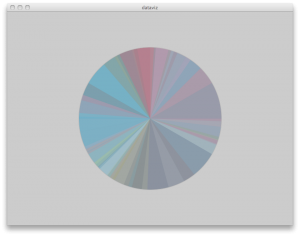
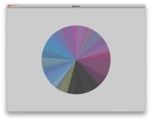
After I had a few days of data written, and a working parser, I began to run the data with a first, basic visualization of a pie chart. I mapped events catagorized as sleep to a dark purple, school to blue, fun to pink, housekeeping to yellow, and wasting time to green. In the screen shots below, I also gave them a transparency with alpha. NOTE: because I am silly, these graphs start midnight at 0300, and then move through the day clockwise.
the image below is of maybe 3 or 4 days worth of data. Already patterns are emerging — a desaturated area where I sleep, a yellow/olive band of waking up and getting up in the morning. two blue peaks of morning and afternoon classes, and a late afternoon pink band of doing fun after class stuff.
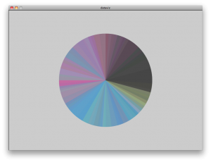
by this point, probably around 10 days of data, the patterns are pretty clear — especially the sharp line between black and yellow when I wake up every morning.
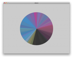
the pie chart re-oriented so that 0000 hours is midnight. 0600 is midday.
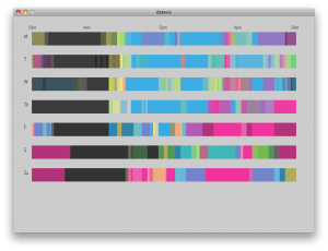
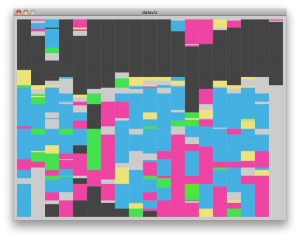
below I looked at the data sequentially, each day as a horizontal band.
My final interaction looked like the below images: each of the bands is a day of the week. So monday, for example, is the three days of semi-transparent monday data graphed on top of one another. patterns are pretty obvious here – the front of the school week has lots of blue for homework and school. The afternoons of thursday and friday are fairly homework free, etc
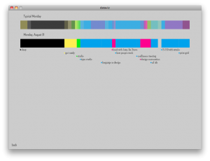
Clicking on a day allows you to compare the “typical” day with specific ones, as well as compare the events broken down by catagory (how many hours of school work vs that days’ average)
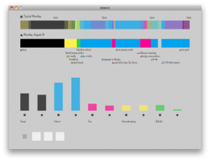
All in all, I’m glad I got this to work in some capacity. I think the data would be more interesting if I had all of it. In terms of interaction and design there are lots of weak points — poor labelling, jarring color-coding, and non-intuitive buttons.
For concept however, Golan hit the nail on the head. As I was transcribing the data, I was really excited to work with some of the specific things I tracked — for example, when I tried to get up in the morning and failed, or when I did my laundry, or how much time I spent doing homework, verses in class, what times of day I biked. I think I was so caught up in getting the “overview” of the project to work that I never got to those more interesting and telling points. In retrospect, my time may have been better spent digitizing the data about, perhaps, when I slept, and then just working with that, since it became obvious that I would not have time to put in the entire database. A smaller subset of the information might have conveyed a more understandable picture — for example seeing that I’m biking home from campus at 2 in the morning might just as well convey I had a lot of work to do as writing all the tasks of that day.
Hi Samia — nice work — here are comments from the PiratePad.
i like the personal inquiry
sms into a web interface or some kind of live-ness
iphone app
http://infosthetics.com/archives/2011/01/track_and_visualize_personal_statistics_with_the_new_daytum_iphone_app.html
Reminds me of the Feltron annual reports (www.feltron.com) – nice!
Colors are not evident (not sure what they mean). Why are there different shades of blue?
Could use a legend.
What’s circles vs squares? Nice comparison of the typical day vs that day.
Too fast jumping from thing to thing so I’m not sure what you clicked/did.
Nice project.
You should upload this to Daytum. Then Felton could create your charts for you.
Daytum is an EXCELLENT recommendation for you!!!!!!! (!!!!)
labels would be useful..maybe even two twelve hour clocks…strips are more useful…individual day is much better still
^^Agreed. Even with you explaining what the colors in the pie chart mean it’s hard to keep track. A key seems necessary. Ah, there we go! Comparing a specific day to the average is very interesting. With a larger inputted data set, that could become very cool. Unfortunately, it seems that the smaller the inputted dataset, the less relevant the average is. Maybe condensing your analysis to only a few activities, but getting a wider range, would be more helpful/productive – such as just trying to get up vs. sleep time/amount? Just an idea.
^^Labels!! I like the bars presentation. The level of understanding about your logs through this visualization is great.
I like howyou can compare a specific day to a typical day.
Nice use of sequential screens! I also like the coding of typical to example day. very clear. Your crazy and I love it. I think it is important to note however that this is not objective. ;D
Twitter might be your new favorite poison.
— “rave” —
This looks like a scientific spectrum graph
Impressive that you manually input all of this data! Nice visualization, I like the comparison between a “typical” day and the current day, very cool! Nice job on your analysis – like that you have a few different ways of looking at the same data. On the overall view, it would be helpful to have a key to indicate what the colors represent.
Very interesting starting point — this notebook listing everything you did. Whew! What a mess of data.
The visualization is lovely. Can you discuss any unique findings about yourself that you only were able to discover in retrospect?
Can you explain better what it means to “run a chart over itself”? I think you mean that you’re using transparency/alpha, but this could be more clearly articulated.
The project will benefit from having more data, as painful as that will be to have.
What if it was just a visualization of “tried to get up”? People could really relate to that.
You need a better tool to enter this data.
Very dedicated of you to keep that recording up for so long. I would never be able to do that. Love the detail view for each day. Really detailed data.
Like others, I’m finding the data impressive. It would definitely be neat to see the further application of your other data to see further patterns.
Great data. Hard to understand the charts without labels or interaction. Nevermind- I see the details in the next layer.
Final visualization could really use a color key. Ability to dive into the data by clicking is a nice touch. Your layouts do a great job showing comparisons.
It’s wonderful that you had the stamina to keep writing all this stuff down… the color key is super helpful. I really like the colors you ended up picking, they’re intuitive to the activities that are occuring.
Check out this guy’s annual reports: http://feltron.com/
And.. his Daytum software!
talking a bit fast
ahh! we need a color key, ah ok no there is a nicely labeled layout, could have used that in the first mode
i like what you’re doing with the colors, but the projecter is hurting it. It’s funny to see our lives containig sleep and how much that really is proportionally. good idea with the single/typical comparison, maybe throw in an “ideal” comparison?
This is pretty cool, but I feel like your visualization would break down if you put data from a larger time period in. I think the “typical days” would become a lot more messy and washed out. Ahh – glad you’ve thought about this.
HOW CAN YOU DOCUMENT NOT GETTING UP WITHOUT GETTING UP. I am impressed.
You could use a throwaway twitter account to document your life and avoid the processing.