Alex Wolfe | Data Visualization
Beginning
I’m personally terrified of falling. I used to be a big rock climber, and one time I was sort of shimmying my way up a chimney, it’s this narrow space and there are no handholds so your back is wedged up against one wall and your feet the other and you just try to walk your way up. But I was too short and my shoes were too slippery and a lost my grip, my baleyer wasn’t paying attention so I just fell. I was pretty high up and it was probably only 100ft before he stopped the rope and grabbed me, but it felt like eons, and I was so scared and I kept thinking of that unpleasant wet *thwack* sound I’d make when I finally hit the bottom.
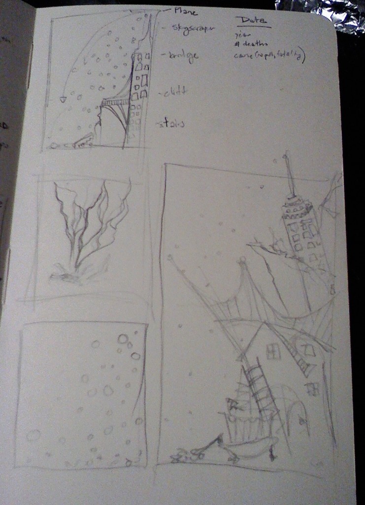
So I have a sort of morbid fascination for people who’d jump of their own free will. Initially when I started this project I had this idea of flight vs. fall, visually displaying all the people who jump each year, and showing who survived and who didn’t seeing as I myself came so close to the statistic. I really wanted to highlight the falling motion, and probably the dramatic splat I’d so envisioned.
Data
I stumbled across the 21st century mortality dataset which was this comprehensive list of everyone who’d died since 2001 in england, and exactly where and how they died. It was ridiculously huge, with over 62,000 entries, each storing multiple deats. They used the ICD-10 International Classification of Diseases which is brutally specific to categorize them. Just looking for deaths related to falls earthed up 17 different categories, ranging from meeting your demise by leaping off of a burning building to death by falling off the toilet. However, when I went digging around for survivors, there wasn’t anything half so comprehensive. BASE jumpers are assigned a number when they complete all 4 tasks, skydiving companies keep some vague handwavy statistics, and I found several lists of people who’d died trying. However those crazy people who jump for fun typically are up to some crazy(illegal) stunts, such as underwater base jumping, or walking out to the edge of a wind turbine so there is no easy way to count/find/categorize them all with half the level of detail as the less fortunate.
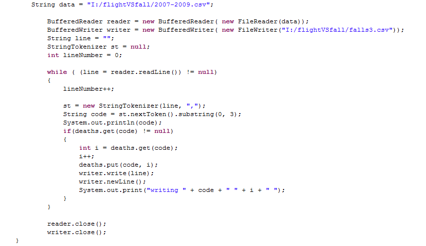
So i decided to focus on the dataset I had. I wrote a quick javascript that essentially just trolled through the dataset, which was stored as a .cvs file, and pulled out any deaths filed under codes related to falling and put them in a nice new .cvs file
First Stab/Brainstorming
Since I had that jumping/falling effect in mind, I went through and made each person I had into his/her own particle. Mass/Radius I based on the age of the person who died, color based on gender, and I stored any information other information about them in the particle. I put some basic physics and started playing around. I had this idea where I could simulate the “jump” with each particle starting from the height of the person’s final leap, and I could hand-draw a graphic for the side displaying the more common places.
Here was my initial attempt
Final
Although interesting, it wasn’t particularly informative at all, so i abandoned the “jumping effect” and focused on other things I could get the particles to do. Ultimatly I executed blobbing based on gender, and then sorting themselves into the ICD-10 categories of death, keeping hold of the “falling effect” during the in between transitions. I wanted to have each stage look like the particles just fell into place create the visualization
Critique
Although I love the freeform effect of the falling particles, and their transition from displaying each of the patterns, it doesn’t really do the data justice. I have so many juicy details stored in there I just couldn’t display. With the number of particles, it was horribly slow if you did mouseover display, and each one was virtually unique as far as age, place, cause of death, gender, so there weren’t any overarching trends for the really interesting stuff. I think I’m going to go back and guess my best estimate for height, hardcode it in and maybe do a state where it attempts to display it, or at least a few more things, eg. line up by age and mouseover explain ICD-10 code. I really want to think of a way to get the cause of death to be a prominent feature for each individual


Alex – nice documentation — thanks!
Here are the comments from the PiratePads:
———————————————-
nice metaphor in the visuals falling — very strong
even the jitteryness, if that is a programming glitch, it looks good visually, nervousy
This is like a pachenko game for the brually unintelligent
This would be a lot faster in a lower-level language.
The strongest part is the way the particles transition between visualizations.
When the particles fall, I really want to see the suicide particles hit the ground and go splat
^^Agreed with the two above. It’s not clear which color is which gender. Either of the sorted falls are much more interesting then the initial unsorted fall you showed us. I really like the idea of comparing gender and cause of death, but without knowing what the codes mean, I unfortunately don’t get anything out of it.
Where do those numbers come from? Oh.
The number is redundant with the color.
Why the space in the column view?
I like that you map to the concept of “fall” but there’s something I don’t get.
This is a “fun” data set. I like how you created a variety of visualizations for it. It would be cool to see them fly as well as fall.
Is a bigger particle an older person? I like when you sort it by type of death, and then you let them fall…
I really like the attempt to make the data match the falling theme. skillz girl. I think the interface could use some work however.
The execution is very well done from a visual perspective. I like the different ways you provide to look at the data. The animation is fun too, but maybe a bit distracting. It is not immediately clear that each dot represents a person. Given the subject matter, maybe there is a more appropriate way of presenting the information.
I like your thinking =)
Would be also morbid, but appropriate, to have the deaths stop at the bottom (but would help show the difference) More seriously, I think the color choice is more appropriate for the gender sort, but not so much cause of death. Very clean app, would be a lot of fun to explore through the data. I like the histogram style view and the animation.
When the dots start to magnet towards a number, the movement is really jittery. Like especially with the cause of death organization. But really cool dataset. Makes something scary actually look pretty lighthearted… Not sure where the “Flight” part comes in.
Really clever presentation of data. I like the motion.
Fabulous. Also love the seamlessness of the transitions. Nitpicky, but it could use a little bit more labelling, not always sure what a number means or what category is open.
The colors are almost too happy for the subject matter… maybe a deeper blue/red would be more appropriate. However, love the animation; watching them fall gives you a morbid sense of fascination, especially with the numbers attatched.
The design of the app overall is very nice, Especialy the
If you were to redesign the layout of the dots, I think that you should work to try express all your info from the falling gesture … can the different falling categories be used formally to characterize the dots?
Great job tying the visualization to the underlying concept. Loved watching the dots fall repeatedly. I found the wiggling (when the dots are sorted) distracting.
good, skip the powerpoint, give us something to chew on right away
talking a bit fast
animations are nice
what’s the x/y arrangement as they fall? since the particles are jumbled up, how do we read them?
why not use man/woman icons to when showing the gender, perhaps drawn under the numbers
You’re having good fun building an interactive interface. You’re realizing the difficulty of interface design — mouseovers etc. You could have “listened to the data better.” — this was heavily driven by the up-front conceit (“I want to see things falling”).
I love the interface, lots of fun. But the connection between the visualization and the falling concept is not obvious to me.
It’s neat looking but it’s hard to read the text after the balls have fallen
great introduction / explanation. speech is pretty fast. the falling concept works great in the viz. ahh, I thought the numbers were dates.
Looks cool. It would be nice if the bubbles stopped jiggling once they finish sorting — esp the one where you have it sorted by year. Interface is somewhat confusing – how do you get it to show deaths over year?
I like the visual feedback that you give from the use of physics and how it ties into the concept. I think that the graphic interface is nice. Some of the data is lost in the way that the audience is reading it but all-in-all i dig.
I keep trying to look for filters that correspond with “flight” The form is beautiful, I would keep clicking different filters to watch the particle effects.