Elizabeth Agyemang: Looking Outwards
#1: Project I admire
A project that really resonated with me was one recently completed by Melanie Wang, a master’s student at the University of Washington School of art. I think what really drew me to this project was my love of literature and words and how Melanine combined it with computers and patterns in a really interesting and unique way. Essentially what she did was create a program that generated graphical images based off of the text from books. The program generates patterns that represent the books based off of clause structure, parts of speech and syntax that coincide with narrative events in the book.
Melanine’s project reminds me of this website I follow which creates posters and t-shirts based off literature called lithographs. What I really like about that project is that it takes every single word of text from a book and fits it into a confined space and pictorial representation of the book. I find that visually, some of the lithographs are more compelling than Melannie’s work because, though she does create a graphical representation of the books she doesn’t really convey any of the tone or essence of the subjects she selects which, as I’ll discuss further in this post—on my third post actual—is one thing that really disengages me from computer art. With graphical renderings and representations, it feels as if the substance and narrative is lost amongst all that information and processing making the work seem cold and empty in some way.
http://www.visualizing.org/stories/student-spotlight-melanie-wang
#2: Project that surprised me
A Project that surprised me, so much so that I’d probably admire and like it more than the earlier piece I spoke of, was The Codification of Leadership by Matthew Plummer-Fernandez. What really surprised me about this work was that when I initially saw it, I thought of it as a simple Photoshop painting that probably had no programing or coding behind it. However when I read about the process used in order to create the work I was completely blown away and found that the piece resonated more with me than I thought it did.
In the Codification of Leadership, Fernandez initially distorted the image of George Bush signing into law the Patriot Act, the Homeland Security Act and the Intelligence Reform Act. However, Fernandez created an painting script, similar to the counter-terrorism, security and surveillance algorithm, that continually selected and reproduced the image. What I like the most about this is that this is one of the few instances where I felt the complicated process of creating the image—In this case the script which searches and selects the images—actually worked to benefit and speak on a another level than the art simply did in itself because of its intent to mirror or mimics the way in which we resolve operations through the use of such procedures and scripts. This image is literally the ‘code’ of law.
#3: Piece I was disappointed by
So recently I read an article on Creative Applications Network about art drawn by wind. Exciting right? It is, it’s just that, it’s a little bit more complicated than that, maybe too complicated to actually be interesting.
First of all, I’ll just start by saying that the images generated by the program Elliot Woods and Mimi Son are gorgeous. Essentially what it is, is a fan blows on a projected image of a circle on a vertical flag of fabric. Years ago, Elliot created a program by altering the systems in the Kinect—a video game console for the Xbox—not the first one but you know what I mean—that works with a projector to create a 3D graphic. They use these projections and the exposures, quick 30 seconds shots, of the waving flag, to compile a 3D image of a lunar like object on the computer which they then place into photographs. Once again, I’ll say it, the work is gorgeous. The images the computer creates from these quick exposure shots are breath taking surreal, but honestly I can’t say that I find the whole project very compelling. Sure the process in which these images are created is interesting in itself, but really, I find no real meaning behind the work.
My issues?
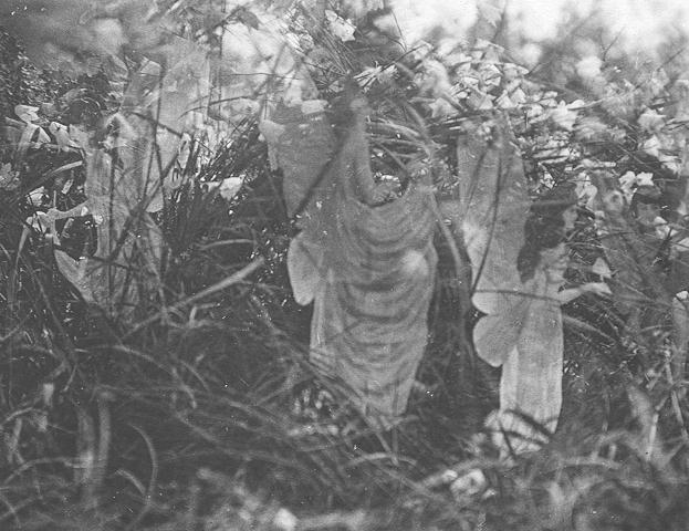
I think the process itself is very interesting and compelling but the images created from it, look as if they could have been created through any computer generated means. They are to crisp, to structures, have none of the mystical quality that the moon or anything really revolving space seem to possess. At its heart this work uses photography techniques dating back decades—those involving over exposure—and yet I feel like photographs like Elsie Wright’s Cottingley Fairies are more compelling because despite the very structured way in which they were created, they have a mystical, almost unearthly aura about them at the Lunar photographs seem to lack.
Elsie Wright’s Cottingley Fairies
I think my issue with this work really goes back to my issue for a lot of computer generated work; everything seems to crisp and planned, there is a certain lack of spontaneity to the piece that just leaves it at the level where it’s stunning to look at but not compelling enought to think very much more of.
