DEF FIRST NAME BUTTERFLY
You will be generating a design using your first name.
Please use UPPERCASE LETTERS throughout the process
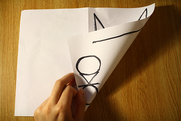
- Fold the paper in half, and position it so that the opening of the fold is on the right, with the spine of the fold on the left.
- Write the first letter of your name so that it takes up the entire half-page leaving a half-inch margin on the top, bottom and right sides of the page.
- Write the next letter of your name within a space created by the form of the previous letter.
- Extend the ends of the next letter so that it touches the lines of the previous letter
- Make sure the next letter is centered within the space it occupies
- Repeat step 3 for each letter of your first name until you are done
- Flip the folded paper over and mirror the design. Place it over a lightbox or some sort of flat light source so that your design can be more easily traced.
- Unfold. Your design is complete
END
———————————————-
I got the idea for this set of instructions while trying to brainstorm my personal brand, paying around with typeforms and their placement. I decided to tie my major of communication design with my love for generative art based upon input of a user’s personal information–in this case, their first name.
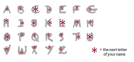
I struggled a lot with finding that balance between defining what I would have liked to see with allowing for some sort of variation. In my original instructions I actually included a diagram to make sure that my intentions were clear. However, I realized that this could be restricting. So I tried both set of instructions.
WITH DIAGRAM:


WITHOUT DIAGRAM:


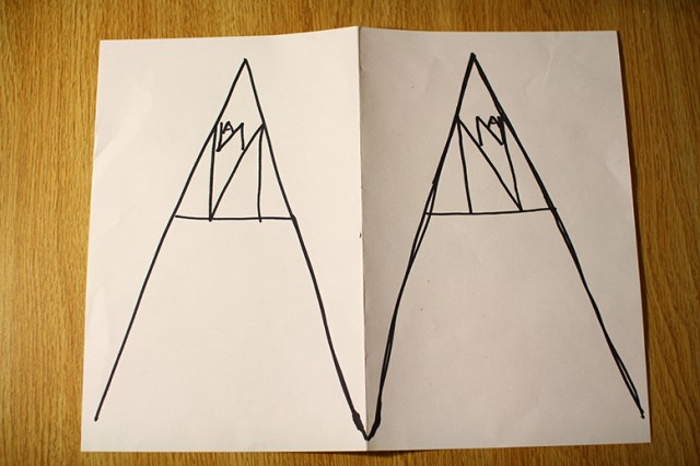
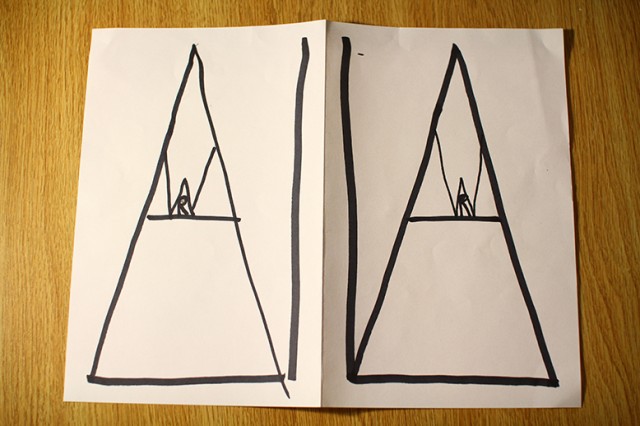
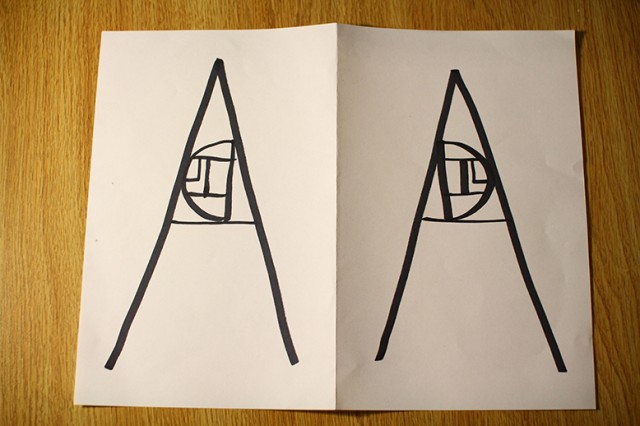
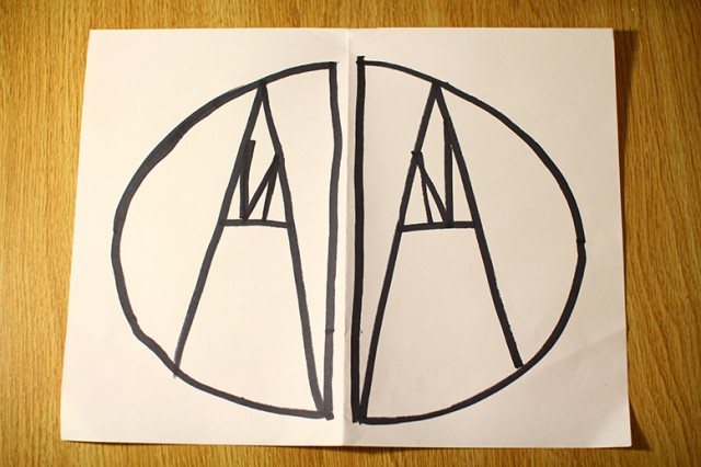
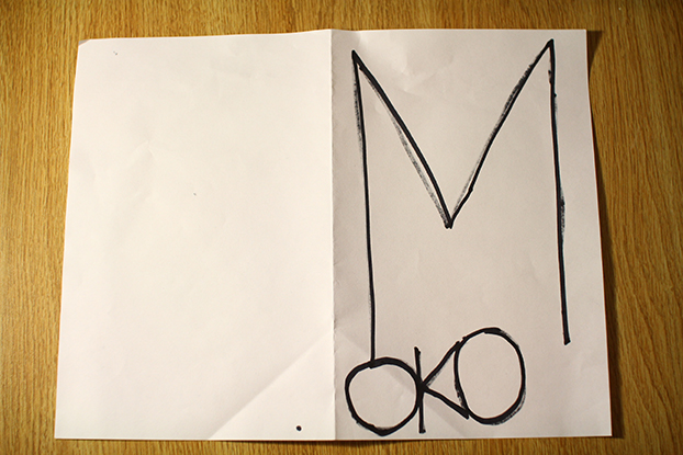
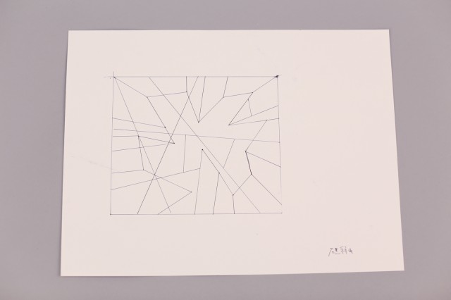
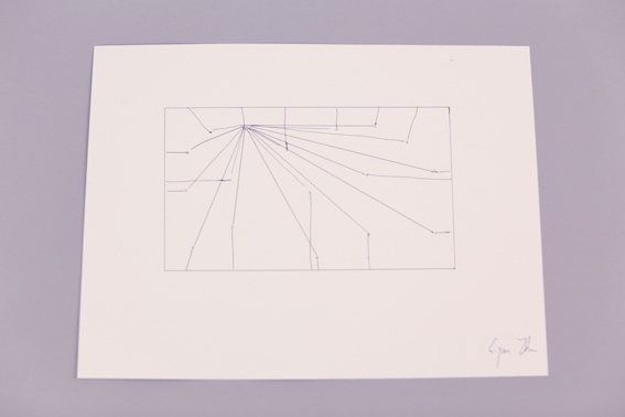
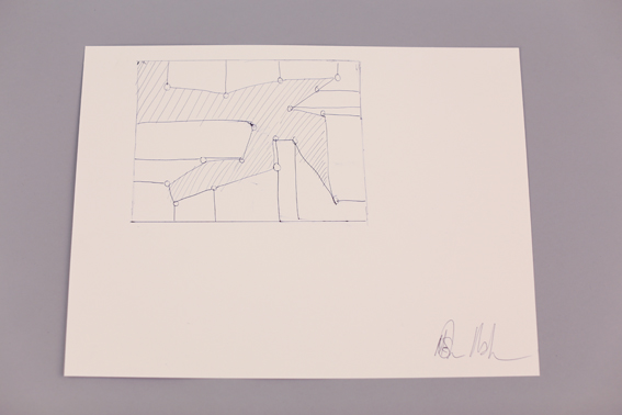
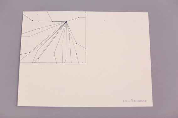
Between the two sets of instructions, the output was generally the same. However, it was interesting to see that even though the diagram was meant to facilitate a better understanding , my participants still struggled with figuring out the placement of letters. This could be due to one of the flaws in my algorithm, which is its lack of accounting for long names. The design was limited in the sense that it would only show 4-6 letters at most because of size limitations. This left many of my longer-named participants nervous as opposed to those who shorter names who seemed to enjoy the exercise more, seeing the merits in it as “a way of creating personal logos”. When the instructions worked as intended they produced results pretty close to what I was aiming for. However there were a couple instances where some misinterpretations of language happened, such as this instance:


I’d like to try out this exercise again sometime, but perhaps with some tweaks to the way the instructions are laid out, greater standardization of the sharpies used (no shifting between fine point and chisel tip), or perhaps just doing this on the computer to get really accurate.

