Category: Assignment-01-2

Inspirational Project

In the 2012 fall semester of 15-112 taught by Kosbie, a student made a Magneto-themed game for his final project. It used a typical computer webcam as motion sensor to recognize bright-colored tape on a glove, which the user wears to guide a metal ball past obstacles to the end of the maze. The game-play as presented in the video (which was visually fantastic) was smooth and responsive to the user’s motions. I didn’t admire a particular aspect about the project so much as I admire the fact that a single person, probably also just an incoming freshman like me at the time, was able to put that together in 2-3 weeks. Suddenly, cool things found on the distant internet suddenly seemed a lot closer (and made me wonder what I’ve been doing with my time). I really wanted to play that game, and I still do. If expanded, it has the potential to be sold.

I apologize for not having the author and name of the game currently. It seems the maker of the game has not put his project on Kosbie’s term project gallery.

Adam-Assignment-01-2

InstaCRT
A real world camera filter | Ruben Broman & Erik Erikwahlstrom

InstaCRT is a critical response to the growing popularity of photo filter and sharing apps (instagram and others). The creators argue that the photos that the apps create do not represent anything real, but are rather the boring product of an algorithm. I agree with their sentiments and admire their implementation of what they call the “real life photo filter”. It is the perfect mix of art, design, low and high technology.

When an image is taken with the iphone app it is sent to their studio in Sweden where is is momentarily displayed on a miniature CRT screen. A DSLR takes an image of your image displayed on the CRT and sends it back to you. Something about this real world manipulation happening in both the digital and physical realms half way accross the world really appeals to me.

In an ever increasing digital world this project proves that there is something intrinsically beautiful in the analogue physical world. Something that cannot be replicated digitally.

The product of two swedes – @rubenbroman (photographer) & @erikwahlstrom (programmer)

Interestingly when Ray-Ban does the same thing it comes across as soulless – http://designtaxi.com/news/355907/Ray-Ban-Introduces-Real-World-Retro-Filter-Through-Sunglasses/


Silk Pavilion

SILK PAVILION from Mediated Matter Group on Vimeo.

Developed by the Mediated Matter research group at MIT Media Lab, Silk Pavilion endorses a non-anthropocentric future in which a variety of creatures (engineered or otherwise) play vital roles in the production of shelters and resources. Silk Pavilion is a tangible prototype of a potentially disruptive means of production. It is undeniably beautiful, both aesthetically and in the rich constellation of environmental and social implications it elicits.

At its simplest, Silk Pavilion is just what the name implies – a pavilion constructed by 6,500 silkworm laborers.  A structural skeleton was designed based on meticulous research into the behavior of silkworms, and laid out in silk thread by a CNC machine. This process raises interesting questions regarding robot-insect cooperation.

Silk Pavilion resists disciplinary classification, a fact reflected in the diversity of the research group itself, which includes, among others: architects, interaction designers and scientists from various fields.

Improvisational Animation


(start at 29m 16s)


During his talk “Inventing on Principle”, Bret Victor showed off a simple animation he singlehandedly created. In the animation, a leaf falls to the ground, then we pan across a painting of an autumn background, and glimpse a rabbit hopping away. It’s a very simple animation. The quality of the painted images and the timing are very nice. However, it is the motion that I find inspirational in the animation. Not because it is complex or amazingly harmonious, but because of how it was made possible.

In the talk, Victor demos the iPad app which he programmed to use as a medium for creating the animation. Rather than having to specify keyframes and tweening functions, the app allows him to conduct the animation through gesture.

What truly inspires me about this piece not the piece itself, it’s that in creating the piece, Victor almost creates a new medium—improvisational animation. It creates so many possibilities for more spontaneous animations created by a broader variety of people.


Note: This probably falls more on the Tinguely side of art being people just doing stuff…

Things that inspire me that don’t quite count as technological art/design, but that I looked at before writing this:

Inspirations

One of the most memorable moments was when I first came across the project by Camille Utterback, “Text Rain”. This project involves projectors and computer programming that allows cameras to detect the placement of dark objects such as people and influence the placement of the words on the screen. The falling text appears to be moving according to the movement of the audience. Camille and Romy Achituv created this amazing phenomenon. Although there has been much improved versions similar to “Text Rain” today, the fact that this piece was from a time ago, makes it all the more astounding. This project paved roads for future projects that involves human and technology interactions, bringing the audience into the work of art and allowing the viewers to have a direct impact on the piece. Some of her later pieces, such as the “Active Ecosystem”  shows this progress, as Camille installs large panels on an elevator with a fish that interacts with the elevator.

http://camilleutterback.com/projects/text-rain/

http://camilleutterback.com/


mortal engine – chunky move


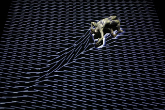
Mortal engine was for me not only an inspiration it was the reason why I want to explore the new/digital media. The first time I saw this video I was fascinated, magnetized, breathless. This performance touches me emotionally and tells me stories without one word.

Chunky move, the producing company of Mortal Engine, describes their concept as “a dance-video-music-laser performance using movement and sound responsive projections…” It sounds like a overload of visual impressions or like a technical spectacle. However, all different media together are telling the story. Each one has its meaning, each one supports the others, together they build an amazing work. The artwork is concrete enough to encourage the storyline but also abstract enough to keep space for the dancers’ expression and everybody’s own vision. With this work Chunky move reached and inspired an audience which would usually never get into dancing performances. The visuals and the sound supported the dancing and put the idea and the core across.

The basis of this performance is the interactive system of Frieder Weiss, a German “engineer in arts”. He is working for over twenty years now in the field of real-time computing and interactive computer systems in performance art. His system allows that dancer – projection – laser and sound can communicate without delay.

https://www.youtube.com/watch?v=sbjOMualLVs
www.chunkymove.com

CREATIVE TEAM

DIRECTION AND CHOREOGRAPHY Gideon Obarzanek
INTERACTIVE SYSTEM DESIGN Frieder Weiss
LASER AND SOUND ARTIST Robin Fox
COMPOSER Ben Frost
COSTUME DESIGNER Paula Levis
LIGHTING DESIGNER Damien Cooper
SET DESIGN Richard Dinnen and Gideon Obarzanek
MULTIMEDIA ENGINEER Nick Roux

The Wilderness Downtown

http://www.thedonutproject.com/wp-content/uploads/2010/08/the-wilderness-downtown-arcade-fire.jpg
http://thewildernessdowntown.com/

‘The Wilderness Downtown’ is an interactive multimedia film featuring Arcade Fire’s  “We Used to Wait”, created by music video director Chris Milk, and a team of Google employees lead by interactive artist Aaron Koblin to show the technological and aesthetic capabilities of Google Chrome. Through user input of an old home address, an entire audio-visual interaction is then tailored to the individual using Google Earth and HTML5, creating a unique experience that tugs at the heart strings of nostalgia while also blowing audiences away through the flexing of Google Chrome’s technological muscles.

There are many aspects of the project I admire; the synergy of its audiovisual elements, the quality of thought and emotion in those elements, the customization of the experience to an individual (which all the more enhances the nostalgic themes of the song), and so on.

What strikes me the most about this project however was in the intention of its creation. Through a project like this, many parties had the opportunity to achieve a variety of things. With Google needing to find ways to be more personable to its users, finding new creative ways to advertise its products, it seemed most natural for it to invest in the creative spirits of new media artists such as Chris Milk, Aaron Koblin, and the employees in their blossoming Data Arts Team. For these artists, having the rich foundation of a large corporation to build off of is freeing to the creative spirit through the expansion of potential, unbound by concerns of resources. This is where I personally believe the future of culture works should head, exploration and building upon the legacies of those before it, providing a balanced hybrid that straddles a familiar comfort with the spice of the new.

In a nutshell, this project to me represents a harmony of harmonies–it explores the synergy of the arts with technology, of companies with individuals (both the artists and customers), of producer and end user, music and visuals, and more.

Inspiration

The Binding of Isaac trailer: https://www.youtube.com/watch?v=9au_e0im0aM

Steam link: http://store.steampowered.com/app/113200/
This is an indie game designed by Edmund McMillen (art) and Florian Himsl (code). Its meticulous balance, precise controls, complex interaction of numerous mechanics, ridiculous difficulty curve, as well as randomization makes this an engaging, rewarding, as well as endlessly replayable game.
The game boasts a thriving community (http://www.reddit.com/r/bindingofisaac/) and a speedrun league called BoILeR. To see a work so finely crafted and celebrated coming from the efforts of just two people is inspiring. Indie games have been in an upward trend in the recent years, but this is the game that showed that the tools for creating games have advanced to the point that each individual has the ability to impact the medium in a significant way, and those tools are still being improved

RainRoom

Assignment 01-02:

The Rain Room by the Creator’s Project

Unless stated otherwise, all quotations are taken directly from the video on the Creator’s Project official Rain Room video (embedded below) which appears on both the Creator’s Project official YouTube channel and website.

“Rain Room is a 100 square meter area of falling water that uses 3D tracking cameras to sens a person’s presence, allowing visitors to walk through the rain without getting wet.”

If I had to mention one particular computational art project in the world which left a lasting imprint on me, I would have to name the Creator’s Project, the “Rain Room”. It always bothered me how, when the rain started pouring down, people start running around or fumbling for umbrellas and walk around with their heads down and miss the spectacle. I find some people take it for granted that the fact that water falls from the sky in little droplets isn’t weird, unusual, and beautiful. The Rain Room resonated with me because it means that (a) people who are unused to seeing such a natural phenomenon may now do so at their leisure, and (b) people like me who enjoy looking at the rain may do so without getting wet and catching the resulting cold.

“Quite cocooned and protected”

Another aspect I appreciate about the Rain Room is that I don’t feel that one has to be an artist to comprehend or enjoy the experience. For the Museum of Modern Art to offer such a comprehensive installation puts it in good stead with the general public, and I know from talking to many of my non-friends that this is worth the while within and of itself.

“We didn’t intend to trigger memories”

This particular installation was set up by a team of seven artists who collaborate under the title of rAndom International. Three people: Stuart Wood, Florian Ortkrass and Hannes Koch are Founders/Directors. They also function as art directors. The rest of their crew consists of a studio manager, a creative technologist and two designers.

“There was quite a sound element”

The project does boast a considerable lifespan. So far it has been on tour. Interviews picture the creators talking about the adaptable nature of the rain room, particularly in terms of use of space. From a curved wall in one exhibition space to the specially-built housing at the MoMA, these artists have been able to watch their art evolve. They also allowed visitors to take pictured and to upload them — preferably with the hashtag #RainRoom — and would show those images on the MoMA website. These images continue to show the beauty of the rainroom even though the project itself is no longer in existence as of July ’13. The group has now moved on to other projects.

The principal objective of MoMA’s partnership with MoMA PS1 is to promote the enjoyment, appreciation, study, and understanding of contemporary art to a wide and growing audience.

— http://www.moma.org/about/ps1


The Lady’s Glove

LAETITIA SONAMI (FR/US): LADY’S GLOVE (II) from kontejner.org on Vimeo.

Laetitia Sonami’s The Lady’s Glove weaves together performance, technology, interaction, and sound into one. Through a system of sensors, microphones, and stylish mesh, the glove generates sound by measuring distance, light, and motion relative to the artist’s hand in performance. These measurements are mapped using MAX-MSP and are converted to sound or light. The object has a unique relationship to the artist, evolving with her over the years to fit her performances. I enjoy this intimacy between art object and creator and how this translates to Sonami’s interactions with her glove while performing; I also enjoy the cross over of media within art. Sonami created the first three iterations of the glove with Paul DeMarinis, but the current and previous versions were created by Bert Bongers. Bongers fabricated the gloves along Sonami’s original designs, but updated the sensors and equipment for the changing technologies of the day. Sonami’s current glove was built in 2001. This work is an example of the artistic uses of sensors in motion and foreshadows further exploration of interactive performance.