lass-viewing04

I think that Akinori Goto's 3D Printed Zoetrope is a good example of spectacle. It takes something that has been around for many years (the zoetrope) and refines it using impressive modern technology. The project is very clean, polished, and precise. Although the project is definitely explorative, it was created by a very controlled and deliberate process, which is outlined in detail in the video. In addition to software, the piece requires lighting and a spinning mechanism to show anything of interest. The project is successful in showing off new and difficult technology, and the idea is very awe-inspiring. The combination of all these things makes this zoetrope fit in with the idea of spectacle.

In terms of the dichotomies presented by Warburton, I would say that this project is very visible, as its simple beauty can be enjoyed even without context. I don't see the project as having much waste, since it seems to have been crafted efficiently with a moderation of software. I would also say that this project is more art than commerce, and also more dysfunctional, since it holds little commercial value. Finally, I think that it has more drag than acceleration, since there is not much else to be done with this technology in the future (at least that I can think of).

nannon-telematic

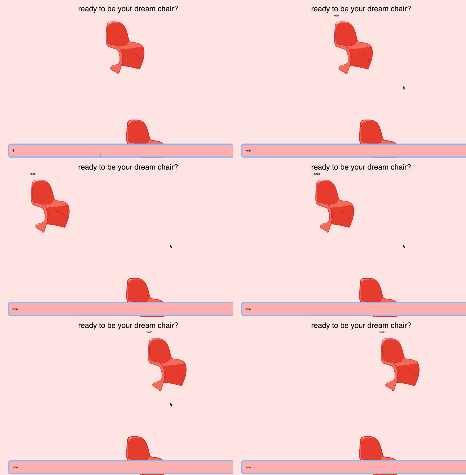
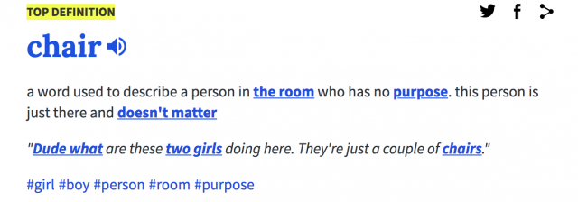
A kitchen chat room where you show up as a chair. Inspired by my own kitchen, where my roommates and friends have had many long nights of fun chats, deep talks, and laughs. Also doubles as a place where chairs can comfortably hang out with other chairs.


The regular chair is taken directly from my kitchen, but in this digital kitchen, you can be any chair you want. 

Kitchen Chat v1 (New):  Use arrow keys to move around!
Kitchen Chat V0 (Broken) :

(Different possibilities of chairs)


Sept 28:I wanted this chat room to be a literal room where users could move around and chat with each other. However, one of the biggest obstacles was getting the images to load correctly. In addition, I had a lot of trouble keeping track of who was in the room--as such, when a new user joins a room, they won't see people who arrived previously, but users can see new people joining the room live. To be continued.

Oct 2 Update: 
The chat works! Used the agar.io template as a base, instead of the drawing template. Helped a lot, since I realized the agar.io template solved all my previous problems with users showing up. The hardest part was learning how it worked, and understanding the socket code. Will be adding new chairs (currently only 3), and a prettier log in page, including explanations for each chair) soon.


yuvian-viewing04

When Wharburton refers to a work as a "spectacle", he implies that the project may be technically astounding and visually interesting but is lacking in content and self-awareness.

Conversely, computer art that is "speculation" deals heavily with conceptual and theory-based ideas but may not have strong technical applications.

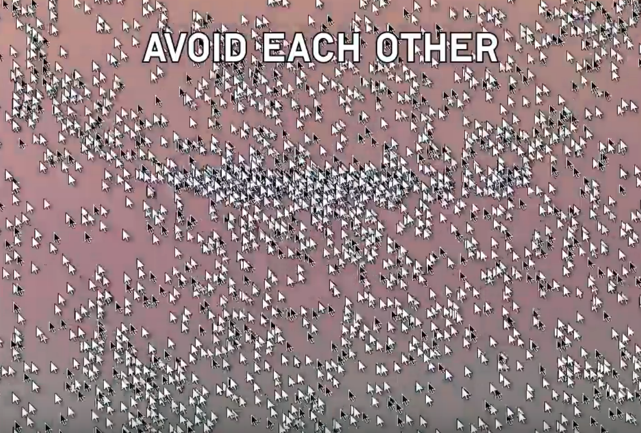
Studio Moniker's "Do Not Touch" (2013) is an example of a "spectacle". Visually, the project is interesting and compelling to look at while the video plays but substance-wise, there's not much to be said about the concept. Using the dichotomies from Wharburton's video, "Do Not Touch" leans more towards commerce than art as it is a music video intended to sell copies of the band's albums. Furthermore, it does nothing to increase awareness/visibility of pressing social issues. The only compelling aspect of the project is its "interactivity" with the band's fans. One could argue that the tracking of the users' mice allow us to visualize the obedient and disobedient tendencies of the users. But not much else can be said about the work as a whole.

yuvian-telematic

click here to play

note: webcam does not work in the embedded iframe below. please click the above link to play in glitch

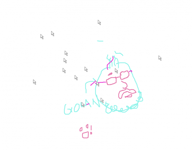
Trace/sketch from your webcam. See webcam sketches from other people. Can you understand where they are, what they're doing, what they look like from their tracings?

So this project turned out a lot different than what I originally had in mind. First, I played around with clmtrackr.js because I wanted to make a multi-user sketching game where clmtrackr would generate a very simplified outline of a user's face from their webcam feed and other users would be able to add features such as facial hair, hairstyles, etc. That didn't work out too great because although I got clmtrackr.js to work in p5, I couldn't figure out how to draw on it. So then, I decided to retain the webcam input idea but without facial tracking. Eventually, it got to the point where it was very simplified - use the webcam feed to capture snapshots of the user's environment, ask them to trace/sketch over it, and show that sketch within a shared environment. I wanted the webcam snapshot to only be seen by its user because I wanted to retain some anonymity. The purpose of tracing/sketching over the webcam is to simulate a video call while forcing users to rely on their creativity and artistic ability to "show" themselves rather than reveal everything about them from live video. Because of this, this project is synchronous, because it requires users to be active and drawing at the same time. It's pretty anonymous because although you're trying to represent yourself through tracings of your image, it's unlikely that other users will be able to tell who you really are. In addition, you can manipulate your features at will.

chaine-telematic

This app is for however many people you want there to be, as it is an interactive drawing canvas. Simply click on the screen to shoot out paint balls the same color as you, press left/right to grow smaller/bigger, press q for "party mode" (anyone could toggle it on or off), and any other key to respawn with a different size/color.

Gif:

The agario canvas is a drawing board that changes its brush quality according to the player itself.
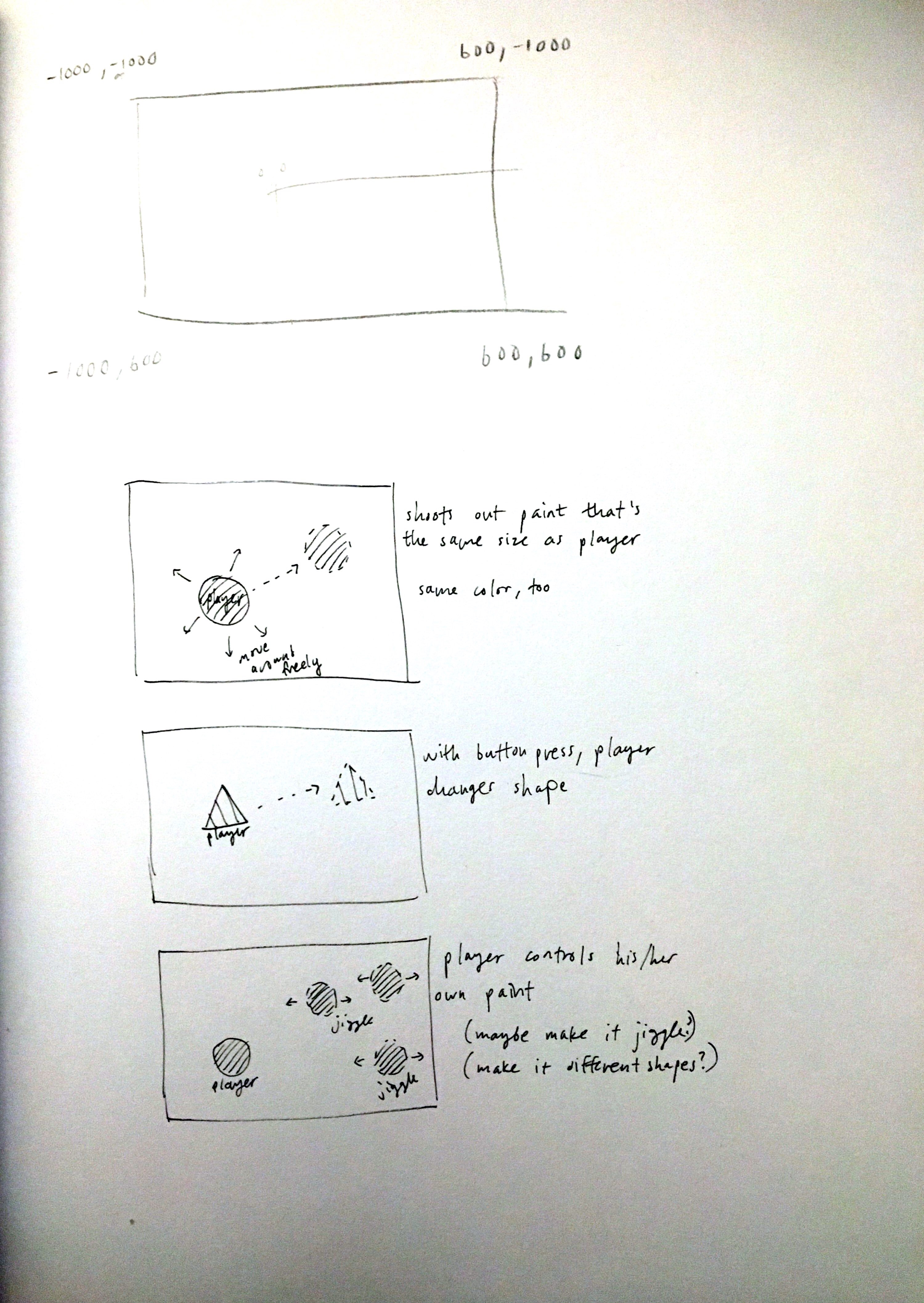
Originally, I wanted to make an endless platformer of some sort with randomly generated holes--when a player crashes into the walls, they would explode and carve out this platformer for other people to get further. I tried creating this at first using the agario template's centering functionality already set for me. There were a lot of issues with this, however, and I decided to scrap that idea and create something entirely different while still using the agario template. I liked the idea of being able to move around freely as a player in his/her own painting. The trickiest part of this assignment was getting players to shoot out paint and make their mark stay relative to a bigger canvas than just a simple width and height. Although I implemented the core functions, I wish there were some more functions available. Some other ideas I had were players turning into different shapes to shoot something other than a circle, players being able to control their own paintballs (sway back and forth), etc. In terms of design issues, my canvas is based on equal roles with many people painting with many other people. It is a shared space where people can paint with their own "bodies".

Previous ideas:

rigatoni-telematic

Don't Cross Me!
A shared canvas space online where you may draw whatever you'd like, so long as you don't cross anybody else!

See the project here!

Don't Cross Me is intended to be a light-hearted metaphor for our basic expectations for what free speech is: "You may say whatever you want as long as it does not incite harm". Don't Cross Me has no repercussions for hoarding the precious 800x800 canvas space, but if a user draws over another user's line(s) then every participant's lines will be lost forever. This mechanic raises questions about individual expression, unspoken distribution of resources and perhaps gauge whether the resulting behavior of users leans towards unspoken altruism to allow everyone to have a space/voice or towards nihilism and self-centricity.

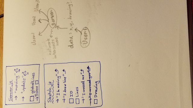
Above: Me trying to figure out sockets and server/client as a relationship

shuann-telematic

Some actions you can take:

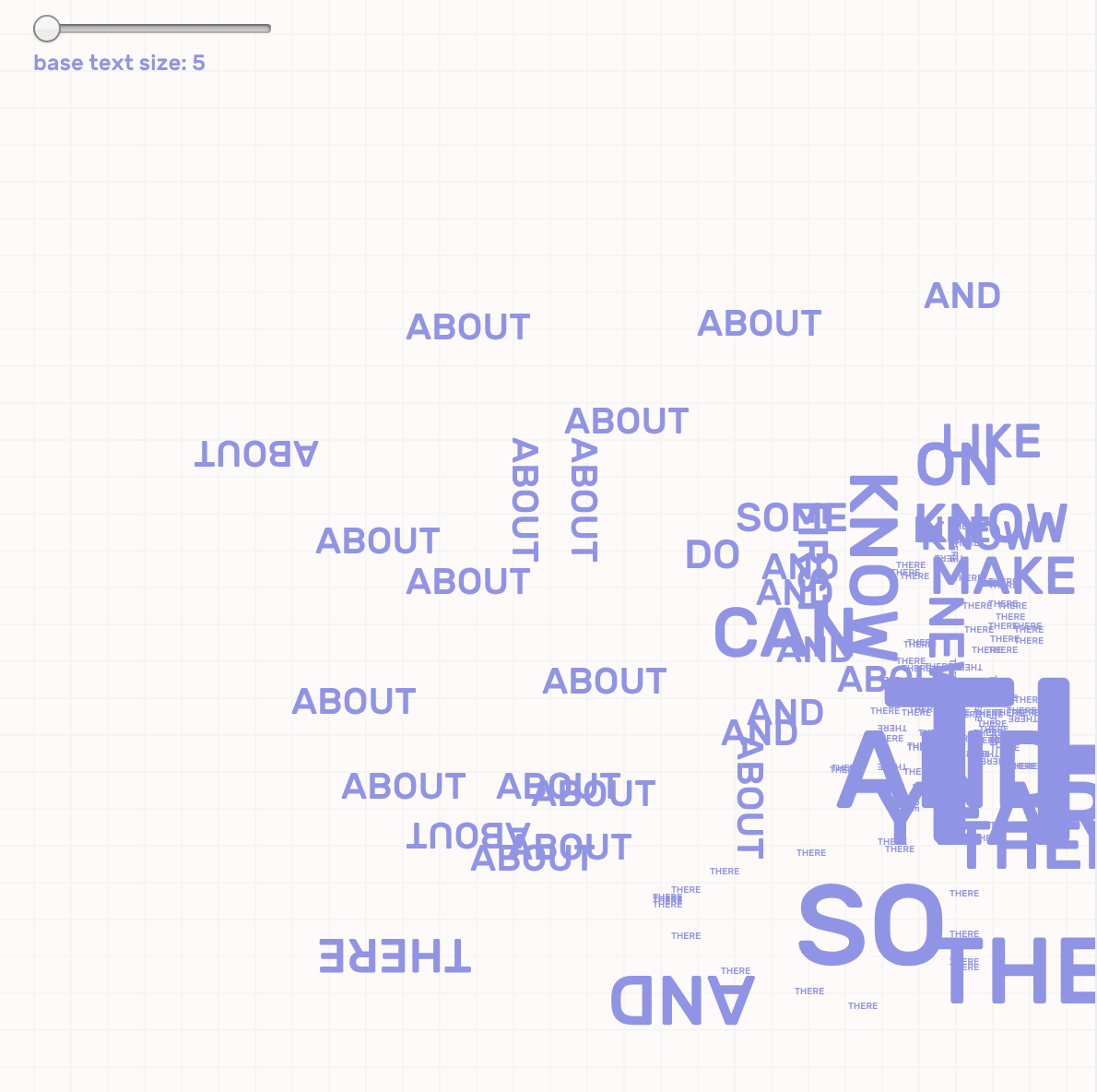
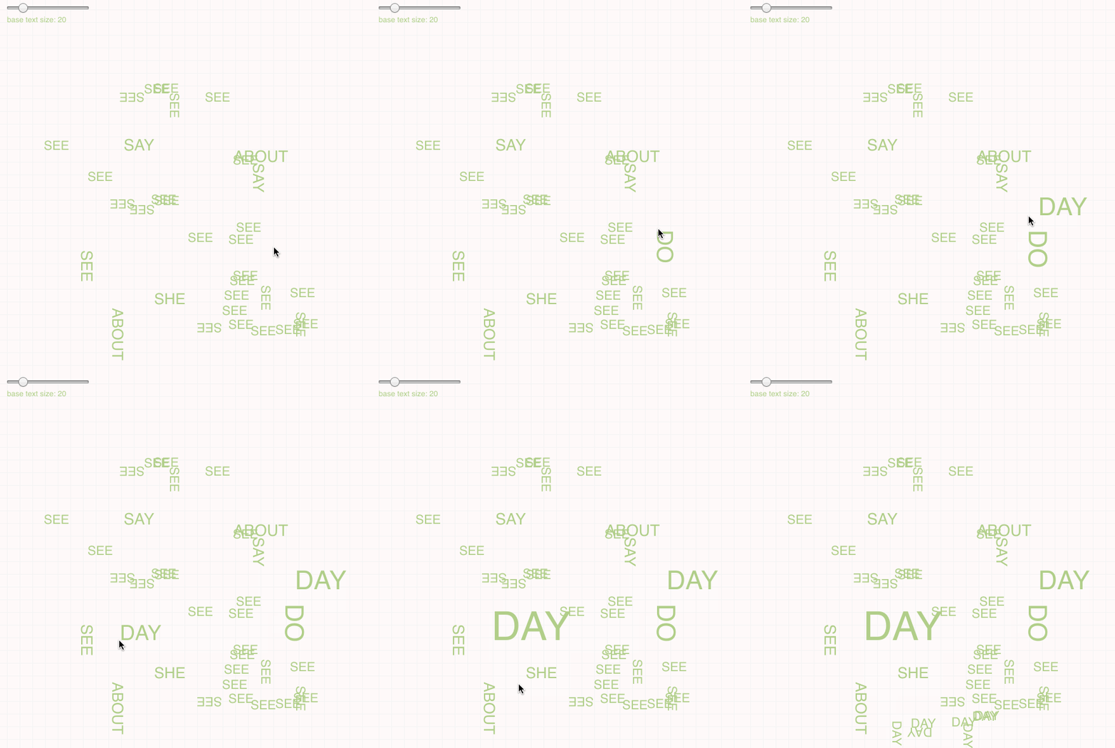
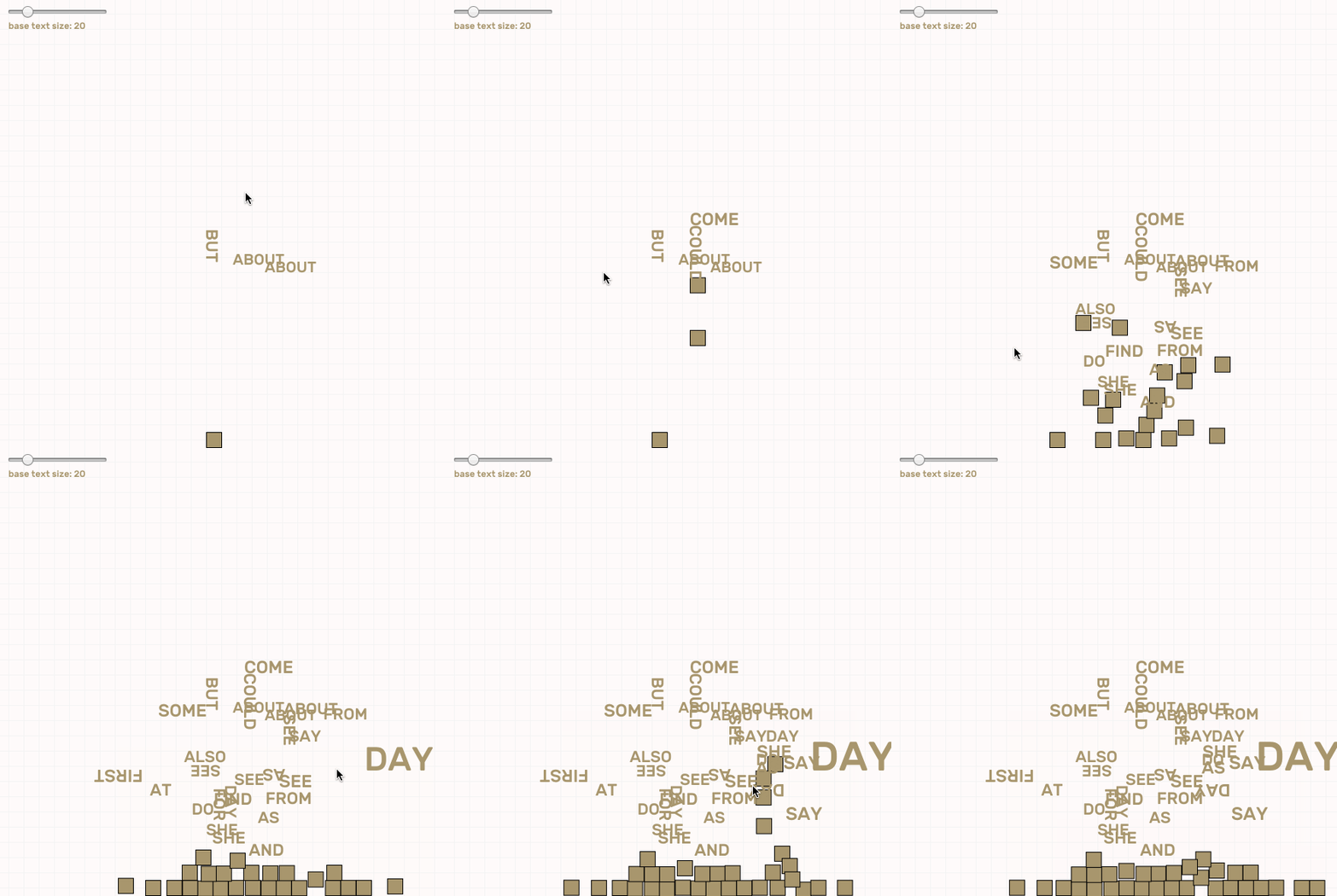
  1. Type any key, and the program will randomly select a word that begins with the letter that you specified, from the list of 100 most used words, and place it at your mouse position.
  2. You can change the font size either by holding down the key, or by changing the slider located at the top left.
  3. You can also drag with your mouse to quickly place down a number of the same word that you just typed onto the canvas.

This project is about: Collectively create a text based collage that is based on realtime back-and-forth conversation.

Some screenshots:


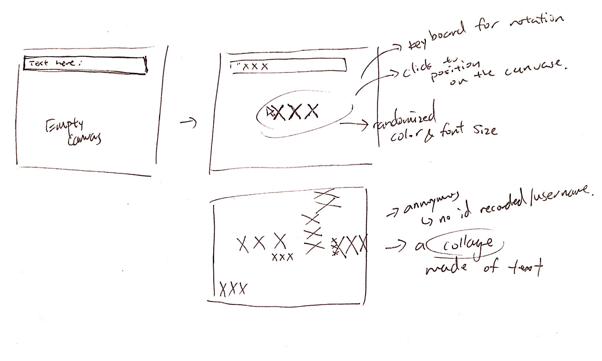
Originally, I wanted to create something more complex. Allowing users to type a word/phrase and see a preview of that on screen, following their mouse. Then they can click to place the text onto the canvas. However I was not able to get that working thus I tweaked my idea on the fly.  Now with this simplified version, with every key press, a random word will be selected based on the 100 most frequently used word. Thus, it is a play on the conversation itself by experimenting with interrupted communication and what we can get out of those talks, if anything. Although it is possible to communicate with this tool, it takes some effort in deciphering or working around.

Idea sketch:

Although I am not really satisfied with my final result, the good thing is that I am still able to address a fair amount of my original idea. For instance, I wanted the conversation to be anonymous and thus focus people on the words but not dig into who said those and if there is any deeper meaning to those words. I wanted to see the users perceive words more as a pattern. I also had no idea how html, css or socket.io works so it took me a long time to understand what the code is doing and how are values been communicated back and forth. I think I began to grasp the central concepts of how these things work which I considered a plus from my own perspective.

I also tried to incorporate some physics using matter.js into this project so that when a user left the chat, all the word that he/she entered would free-fall towards the bottom of the screen. However I didn't have enough time to figure out how I can apply it onto texts. But I think adding that element in would defiantly make this piece more interesting.

airsun-telematic

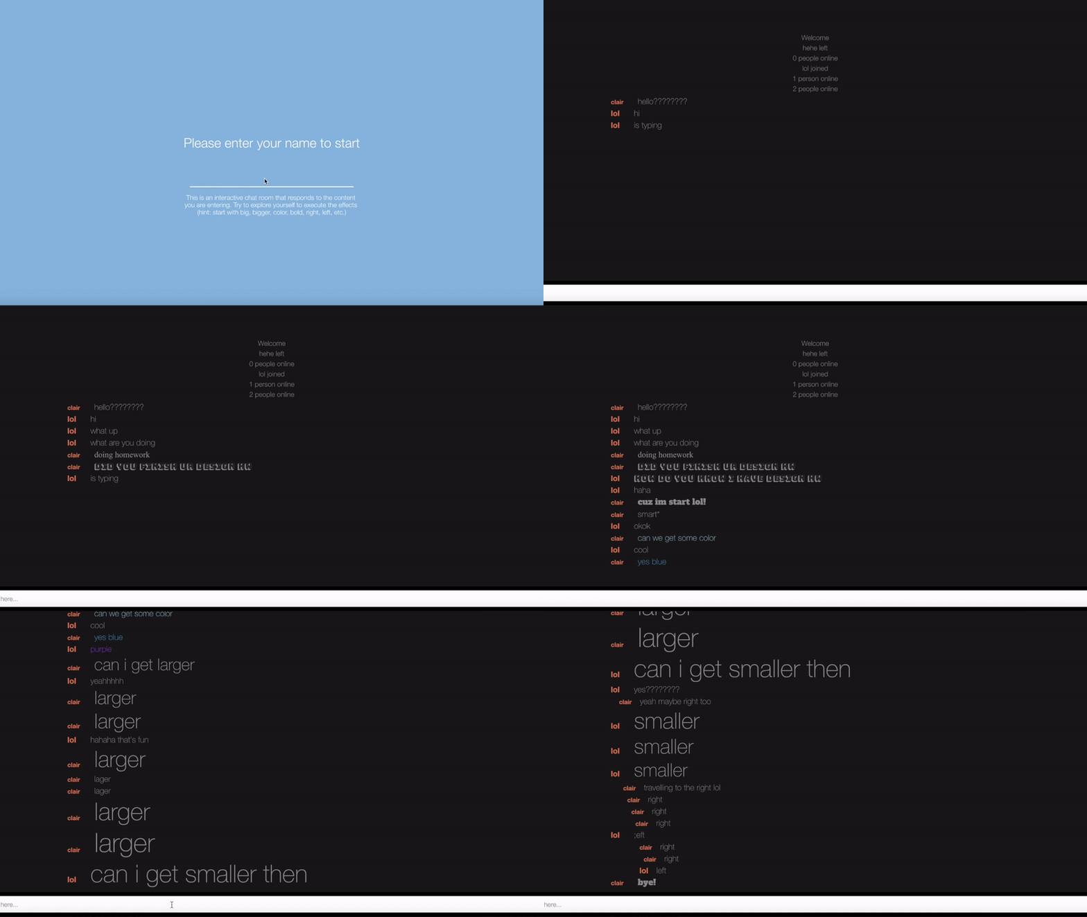
Recorded Version of two people talking and exploring some visual feedbacks

Click To enter full-screen mode

This is a dynamic chat room. The idea is that user can see the visual response of the content and words they are putting into the conversation. The font, color, position of the text, and typography all change corresponding to the content of the conversation. For example, when typing "right", the text will go towards the right edge of the chatroom. Similarly, when typing "left", the text will go toward the left edge of the chatroom. When typing "larger", the text size will increase, and when typing "smaller", the text size will decrease. Moreover, the similar idea applies to the color function in which when users type keywords of different shades of color, the color of the text will change. Other more reactions can be found when typing "bold", "child", "design", "Halloween", "scare", "scary", "fear", "essay", "report", "homework", "study", "important", "highlight", "tension", "note","technology", "computer", "coding", "computing", "round","circle", "hand", "poe", "literature", "letter", "dot", "tight", "squee", "italic", "Italic".
I always feel like text in conversation can be more fun and interesting than what it looks like now in messaging apps (all in default gray color and same size). Except for using emoji, how can text itself express anything interesting? If the text can do more, maybe we can get rid off emoji. The original idea of this project was to incorporate the basic emotions ("joy", "angry", "fear", "surprise", "disgust", and "sad") to execute the changes of type. However, this idea generalizes people's current state of feeling and have many issues with the user experience, therefore, I changed and developed the current version of the project, hoping the idea will come across with more interesting user interactions.

chewie-telematic

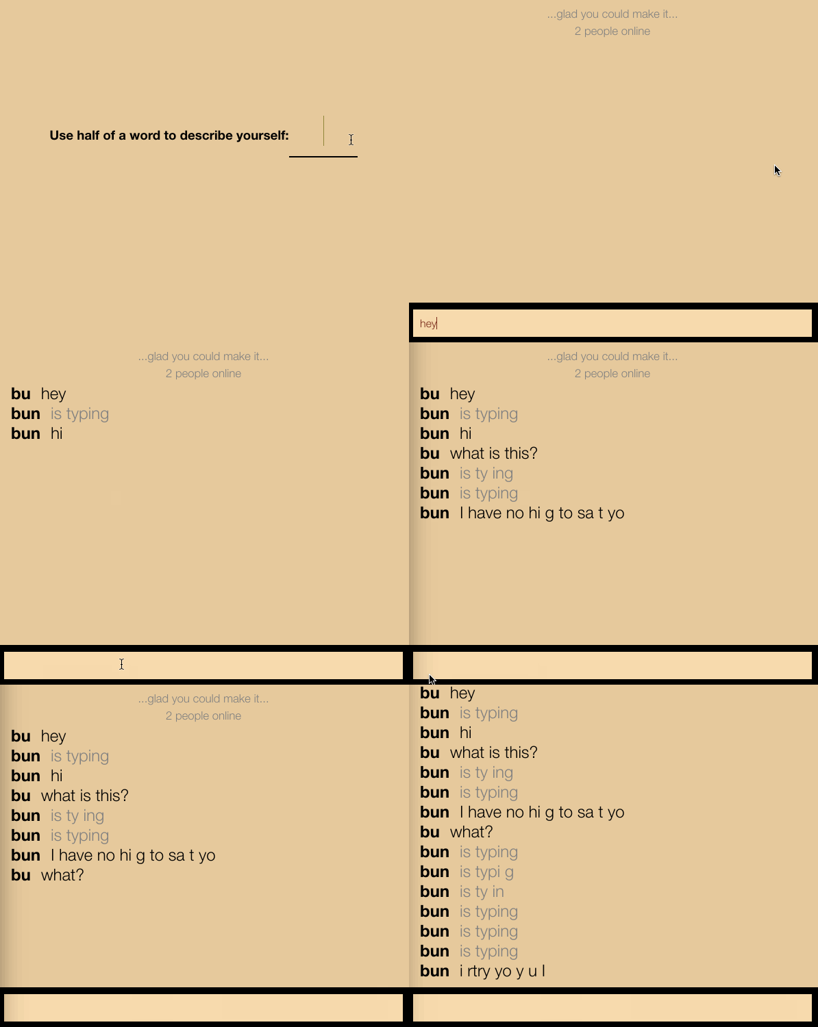
This is a chatroom where the more words you try to use in a single message, the more deteriorated and confusing the message becomes. If you send short messages of few words, the room will usually send the message as is. If the user tries to use too many words or letters, the message starts to disappear.

My original concept for this chatroom was a platform where the user has to collect the materials needed to construct their sentence. I planned on including some sort of pixel pile that you would have to collect from to get enough material to type out and send your message.  In the working app above, each message is given a certain amount of length tolerance- the longer a message is, the more likely characters are to be missing. The result is a tool that forces the user to use as few words as possible at the risk of having their message made unreadable.

The design aspect that this project addresses most clearly is its criticality and self-awareness. Ordinarily, chatrooms like this have no limit to the length of messages you can send. With most things we do in life, however, there is a trade off between pleasure or action and the resources spent to make that happen. By using this chatroom, where there is an implied limit to the length of your message it makes the user consider the "luxury" of digital tools their limitless theoretical resources.


weirdie-viewing04

Spectacle is when a medium is used to show off the latest software, often by large companies and in advertising.

Speculation focuses not on craft, but on the relationship between technology and art-making, often in a way that is meant not to be visually appealing but conceptually interesting.

The project A Hole in Space is one that I think could be argued as both spectacle and speculation, and for that reason I view it as sitting somewhere in the middle. It absolutely has elements of being a spectacle - it is showing off new, grand technology in capturing and broadcasting video in a way that is meant to be technically amazing to the viewer. However, it also has elements of speculation, where it is commenting on growing technology's ability to impart a sense of togetherness and to make the world a little smaller. This is something less about the technically impressive aspect of the project and more about what it is "about" conceptually.

This piece falls very strongly towards technological acceleration in acceleration vs drag, as it promotes a future with increased telecommunication capabilities. Clearly it is more about visibility rather than invisibility, particularly in the aspect that viewers cannot see themselves on the screens, as with a typical video-chat, but can only see the other city. I would argue this piece leans more towards surplus rather than waste, as it is more emphasizing the positives of the development of technology. Finally, I think this piece is exclusively in the category of art rather than commerce, as it was done unannounced with no brand, advertisement, or promotion of any kind attached to it.