Spoon-Telematic

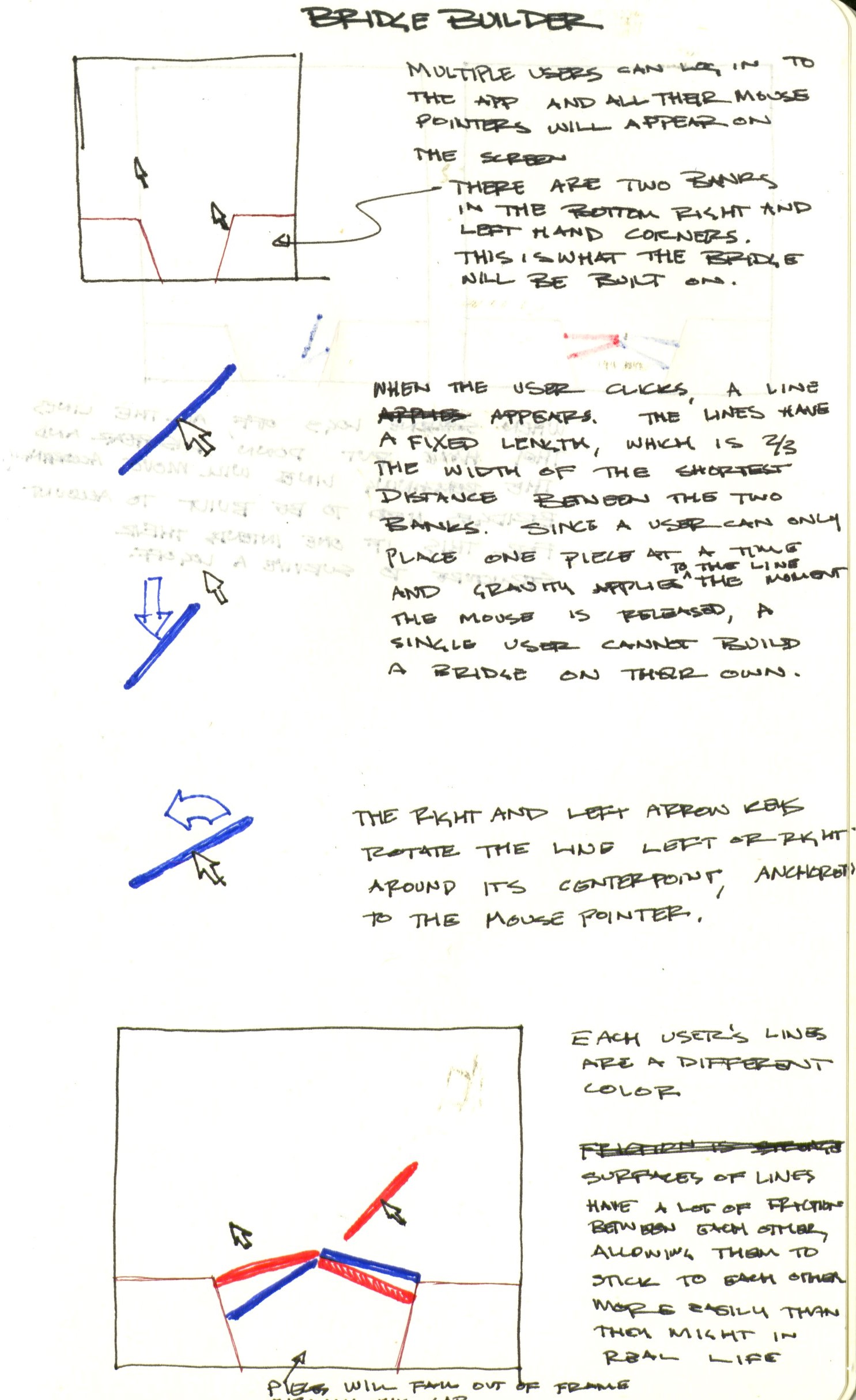
This project was intended to be a collaborative bridge builder. When the user presses and holds the mouse, a line appears, centered on the user's mouse, that is two-thirds the size of the gap between the two ground banks. When the mouse is released, physics will begin applying to the line and it will continue to fall downwards unless it is obstructed by something. Since a user can only place one line at a time and no line is the width of the gap, a single user cannot build a bridge by themselves. In order to build a bridge, there must be multiple users collaborating. When the user logs off, though, all the lines they have set down disappear. Thus, if a user wants a bridge that will survive if all the other users logoff, they will have to lay their lines in such a way that they would be able to support themselves without the other user's presence.

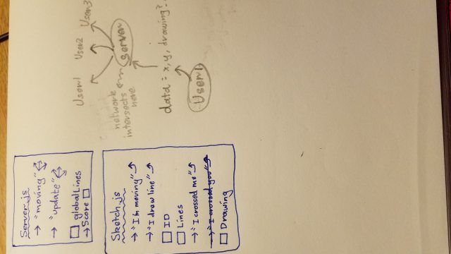
Unfortunately, I was unable to get the application to work. I attempted to use glitch.js to allow for the multiple users to interact with the same scene and p2 as the physics engine. Having trouble with the interactivity and physics, I attempted to simplify the project by having the users stack blocks instead of build bridges. While this simplified the interactivity and graphics little bit, it still involved figuring out how to use glitch and p2 together. Because of the server-side preference in glitch, I was unable to get the physics engine in p2 to work properly, as it has to run in the server rather than the browser.  In order to get this to work, I would have had to take the mouse data from each user in the browser, send it to the server, which would then create the rigid bodies for the lines and calculate their interactions, and then send all of that data back to the browser. In addition to getting the code to compile with the p2 library, I was unable to figure out how to code the transfer of all this data back and forth in this manner.

While it does not compile, I have attached the app:
paukparl-telematic

Link :
https://paukparl.github.io/

Brief:
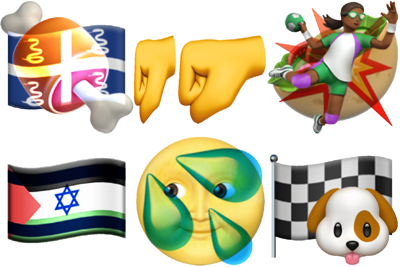
There are surprisingly many emojis out there (or more accurately stored in your OS). I wanted to make use of this rich source of images somehow. This Emoji Editor grabs the emojis from the hidden file of your computer, enlarges them, and lets you conveniently reconstruct images. You can create virtually infinite number of combinations with various transformations. The resulting images look familiar, but still feel somewhat different from ones we're used to seeing.

Thoughts:
There were maybe too many trials and errors. At the end, I got rid of libraries and used plain Javascript. So it took me longer, but the experience was somewhat rewarding. The app is still a bit buggy and is missing a few functions. But I finished much of what I planned for. My goal was to make the whole image-making process simple and addictive. The interface turned out a bit complicated. But I'm still hooked on this idea, and I'm planning to refine the app in the following couple weeks.


Sepho – Telematic

My project is about reaching through a kind of field or veil of abstract shapes to communicate with other people on the other end.

https://the-veil.glitch.me/  - (url because the embed only works in the WordPress preview for me?)


The idea for my project started as a way to play around with interactive, emergent behavior, however, the more I considered this project and its nature and the more I fiddled with my code the more this project because about the various abstractions we use to communicate and interact with one another. I really wanted to play with how much I could limit the rules of interaction while still allowing for that feeling of 'someone on the other end.' In a way, communication it self is just us arranging things such as ink, light, our bodies, or the air around us to get ideas across, so why not add weird glowing circles into the mix?"

lass-telematic

(you will probably need to open the app in a new tab to allow webcam permissions, and as far as I know it only works on google chrome.)

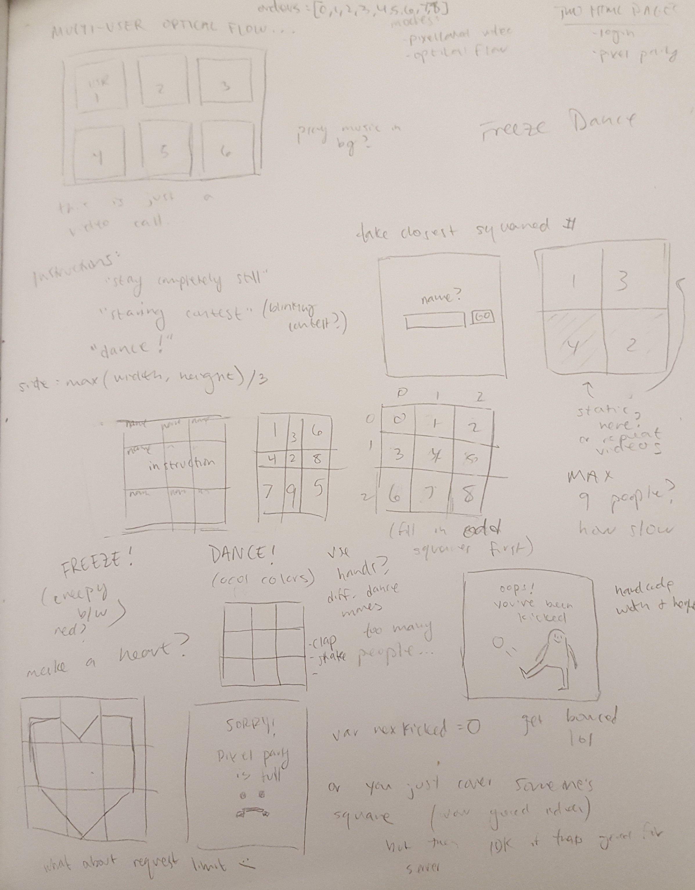
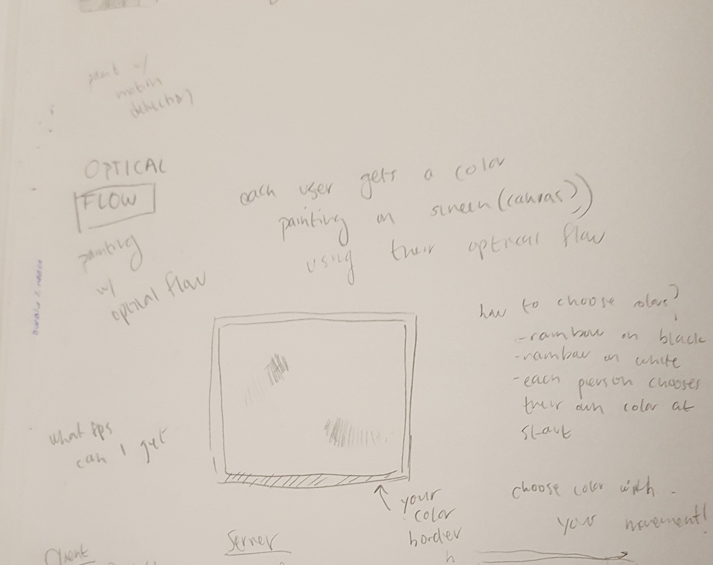
My telematic environment shows the optical flow of up to nine users in a square grid. I used oflow.js to find optical flow, and also started with this template that Char made using p5.js and socket.io.

Some things that I appreciate about optical flow after doing this project are that 1) it allows more anonymity than a video chat,  and 2) it focuses on expression through movement (change), so nothing will show if you stay still. At times I was worried that the user wouldn't be able to distinguish optical flow from just a pixelated video, but I think that by staring for a bit it becomes apparent that your movements are being tracked. 

(animated gif) 

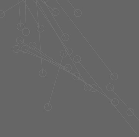
Something to note with this project is the lag. It can track the optical flow of the user at a fine rate, but transferring all of the flow data takes a while and makes the other squares become choppy. They play about one second behind in time (in the example above you can see that the orange user moves much more fluidly than the others). Since the project was meant to be synchronous, ideally this wouldn't happen, but I think it has an interesting and slightly spooky effect. 

Honestly, I struggled  with ideas for this project and I wish the final product involved more communication between users. My initial idea was to overlay the feeds on top of each other so people could collaboratively "draw" with their motions, but that was too messy and difficult to discern what was going on, which is why it is a grid now. I also tried having instructions appear on the screen for every user to follow (such as telling them to freeze, or wave at each other), but I removed that since it felt disruptive. Although I like the appearance of the uniform squares, it is a bit of a letdown that they are just 9 independent boxes.

Thank you to Char for the templates, and Golan for the project title!


nerual-Telematic

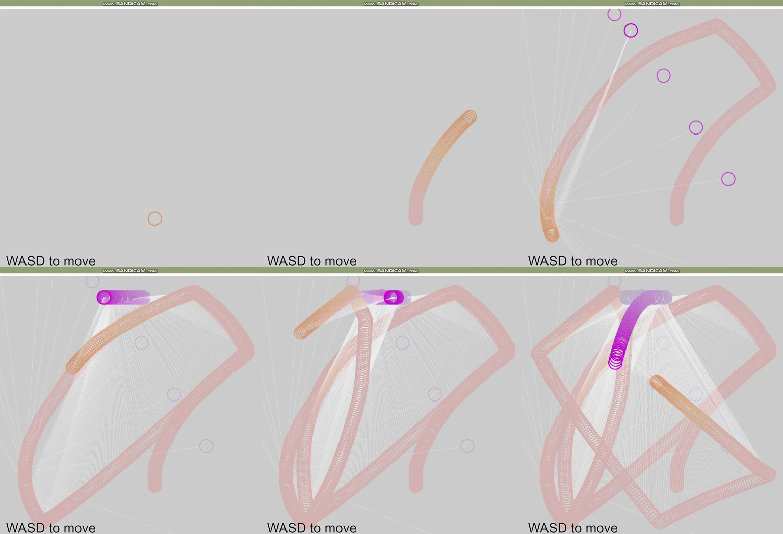
Visual Echos : Let your interactions leave a visual footprint. WASD to move.

Notes on bugs: A player isn't removed if they disconnect. If you refresh, you will start with a fresh screen, but on everyone else's screen, you will appear as a new player and your old particle will just be a moveable object. 

Looks cooler with more people, but also potentially gets buggier.

GIF:

I wanted to explore equal collaboration/competition, creating an environment where either can manifest. In the process of working with a physics engine, I became interested in incorporating the ceding of control to external forces. In this case, you and the other players may be collaborating, but there is still chaos that hinders that, yet creates satisfying after images. The white line between players makes the canvas itself dynamic, as it erases past drawings.

This is getting into "it's a feature not a bug" territory, but I actually like the freedom you have with the thin lines, because now you have to negotiate the speed of your movements as well, in order to create or avoid creating smooth shapes.

I didn't get to try everything I wanted to do, but I think I touch upon some ideas worth exploring further. I think it lacks a lot polish, in terms of the color choice and overall feel, as I definitely could have fiddled around with the design elements more.

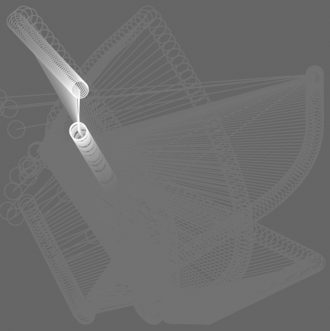
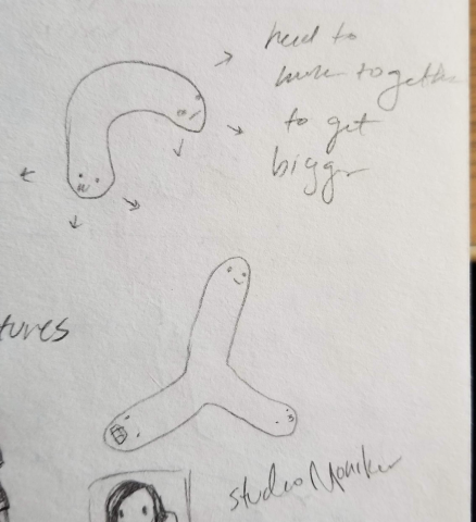
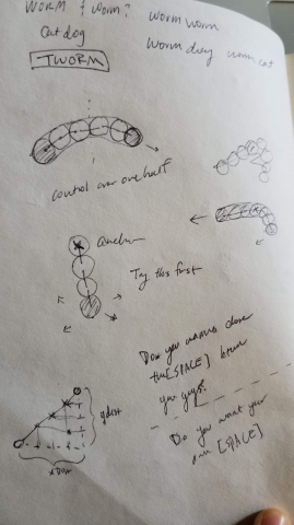
My original idea was to create a many headed worm(inspired in part by the cartoon CatDog), but I think I end up exploring the visuals that result from interactions, rather than the gamified mechanics.

These are some progress screen shots of what it might have looked like with a chalkboard kind of aesthetic.

glitch
glitch
2 player interaction
one player

Some things to explore still:

  • using real colors
  • changing the aspect ratio
  • adding constraints
  • smoothing out
  • incorporating instructions
  • distinguishing features for the players
  • different shapes

Below are some sketches of the original idea. I discovered that you could record the path of the interaction and I thought it might be more interesting to deal with geometric relations instead.

Concept sketches
I successfully modeled a worm-like creature but I was unable to make one player the head and the other player the tail.

Code can be found on Glitch: https://glitch.com/edit/#!/visual-echoes

Future Work:

  • Fix bugs: make sure players disconnect properly
  • Fiddle with colors and transparency more
  • Fork project to explore having the midpoint between the two players be the drawing brush

yuvian-telematic

click here to play

note: webcam does not work in the embedded iframe below. please click the above link to play in glitch

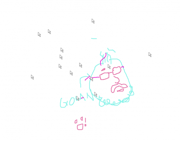
Trace/sketch from your webcam. See webcam sketches from other people. Can you understand where they are, what they're doing, what they look like from their tracings?

So this project turned out a lot different than what I originally had in mind. First, I played around with clmtrackr.js because I wanted to make a multi-user sketching game where clmtrackr would generate a very simplified outline of a user's face from their webcam feed and other users would be able to add features such as facial hair, hairstyles, etc. That didn't work out too great because although I got clmtrackr.js to work in p5, I couldn't figure out how to draw on it. So then, I decided to retain the webcam input idea but without facial tracking. Eventually, it got to the point where it was very simplified - use the webcam feed to capture snapshots of the user's environment, ask them to trace/sketch over it, and show that sketch within a shared environment. I wanted the webcam snapshot to only be seen by its user because I wanted to retain some anonymity. The purpose of tracing/sketching over the webcam is to simulate a video call while forcing users to rely on their creativity and artistic ability to "show" themselves rather than reveal everything about them from live video. Because of this, this project is synchronous, because it requires users to be active and drawing at the same time. It's pretty anonymous because although you're trying to represent yourself through tracings of your image, it's unlikely that other users will be able to tell who you really are. In addition, you can manipulate your features at will.

chaine-telematic

This app is for however many people you want there to be, as it is an interactive drawing canvas. Simply click on the screen to shoot out paint balls the same color as you, press left/right to grow smaller/bigger, press q for "party mode" (anyone could toggle it on or off), and any other key to respawn with a different size/color.

Gif:

The agario canvas is a drawing board that changes its brush quality according to the player itself.
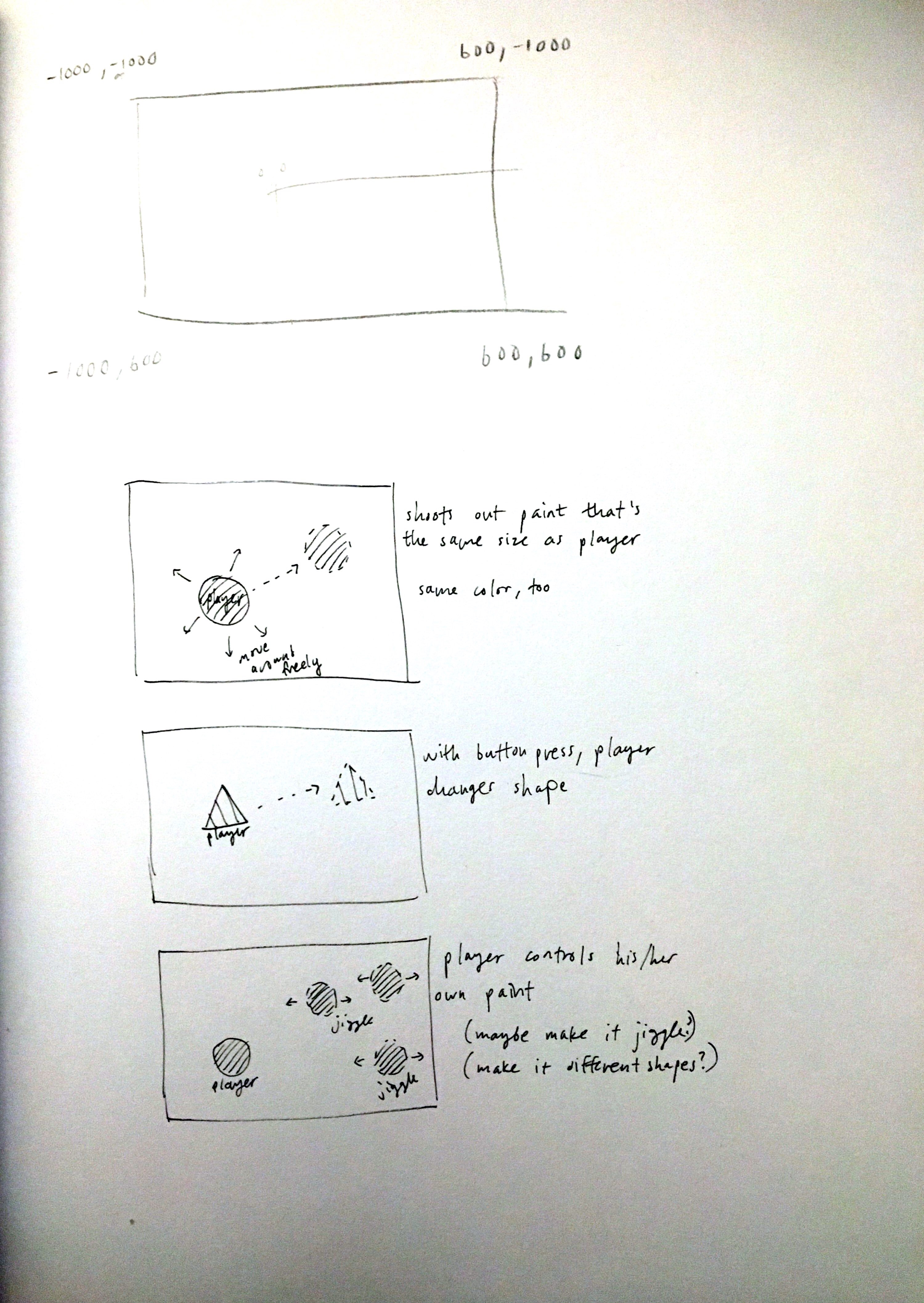
Originally, I wanted to make an endless platformer of some sort with randomly generated holes--when a player crashes into the walls, they would explode and carve out this platformer for other people to get further. I tried creating this at first using the agario template's centering functionality already set for me. There were a lot of issues with this, however, and I decided to scrap that idea and create something entirely different while still using the agario template. I liked the idea of being able to move around freely as a player in his/her own painting. The trickiest part of this assignment was getting players to shoot out paint and make their mark stay relative to a bigger canvas than just a simple width and height. Although I implemented the core functions, I wish there were some more functions available. Some other ideas I had were players turning into different shapes to shoot something other than a circle, players being able to control their own paintballs (sway back and forth), etc. In terms of design issues, my canvas is based on equal roles with many people painting with many other people. It is a shared space where people can paint with their own "bodies".

Previous ideas:

rigatoni-telematic

Don't Cross Me!
A shared canvas space online where you may draw whatever you'd like, so long as you don't cross anybody else!

See the project here!

Don't Cross Me is intended to be a light-hearted metaphor for our basic expectations for what free speech is: "You may say whatever you want as long as it does not incite harm". Don't Cross Me has no repercussions for hoarding the precious 800x800 canvas space, but if a user draws over another user's line(s) then every participant's lines will be lost forever. This mechanic raises questions about individual expression, unspoken distribution of resources and perhaps gauge whether the resulting behavior of users leans towards unspoken altruism to allow everyone to have a space/voice or towards nihilism and self-centricity.

Above: Me trying to figure out sockets and server/client as a relationship

shuann-telematic

Some actions you can take:

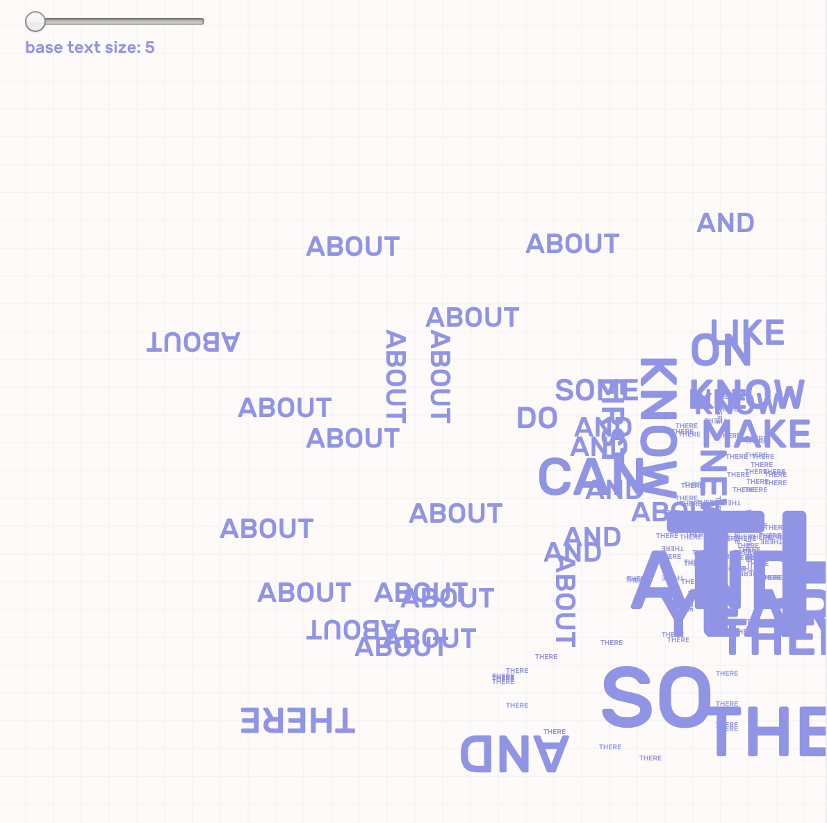
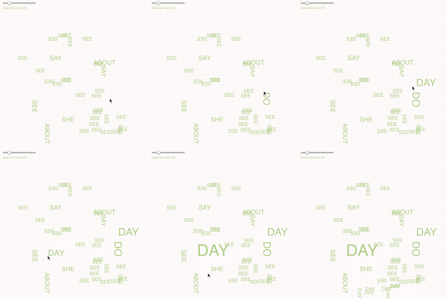
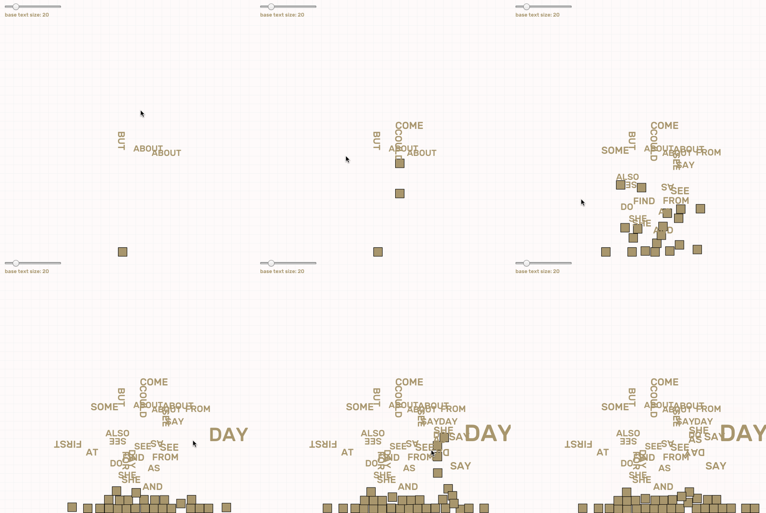
  1. Type any key, and the program will randomly select a word that begins with the letter that you specified, from the list of 100 most used words, and place it at your mouse position.
  2. You can change the font size either by holding down the key, or by changing the slider located at the top left.
  3. You can also drag with your mouse to quickly place down a number of the same word that you just typed onto the canvas.

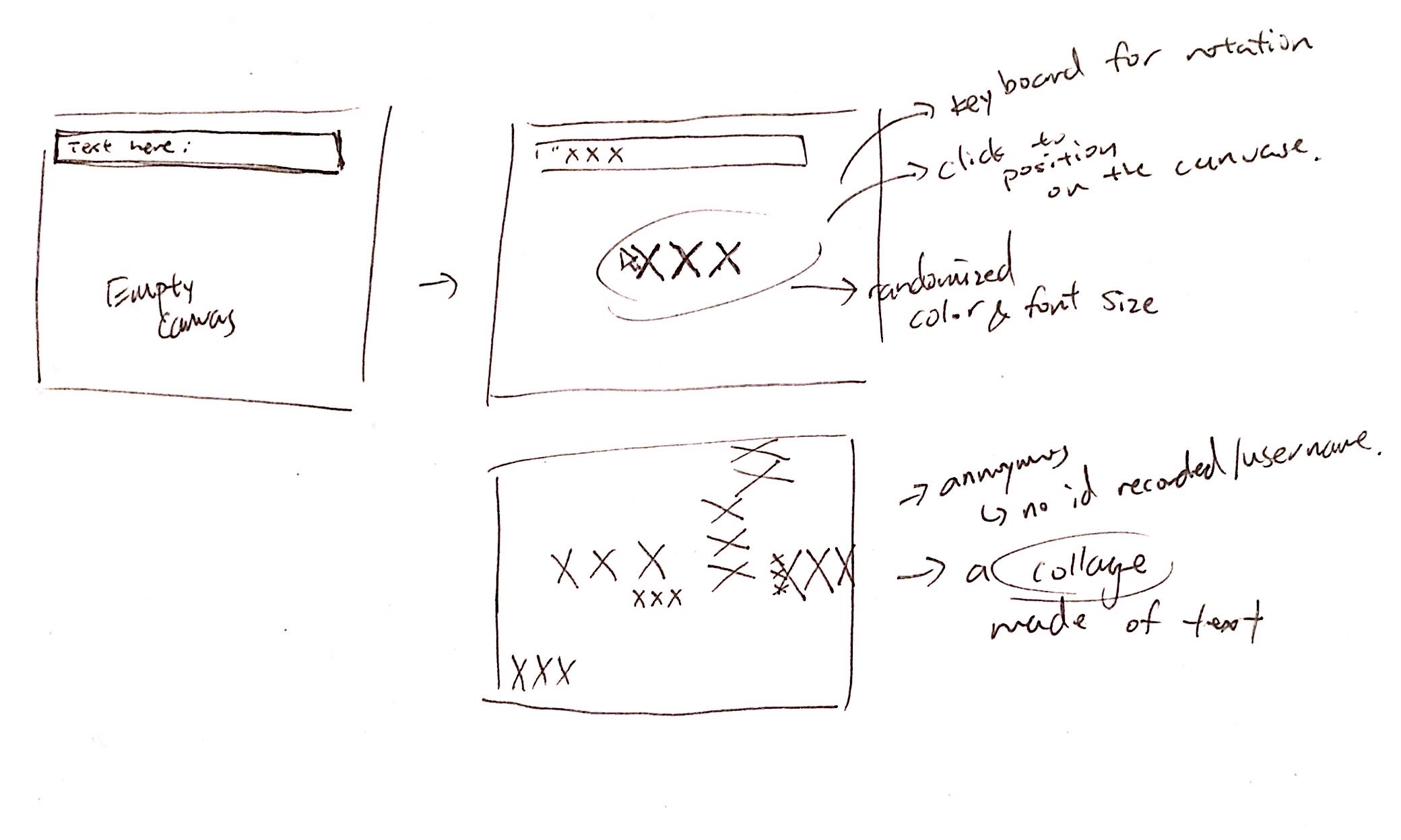
This project is about: Collectively create a text based collage that is based on realtime back-and-forth conversation.

Some screenshots:


Originally, I wanted to create something more complex. Allowing users to type a word/phrase and see a preview of that on screen, following their mouse. Then they can click to place the text onto the canvas. However I was not able to get that working thus I tweaked my idea on the fly.  Now with this simplified version, with every key press, a random word will be selected based on the 100 most frequently used word. Thus, it is a play on the conversation itself by experimenting with interrupted communication and what we can get out of those talks, if anything. Although it is possible to communicate with this tool, it takes some effort in deciphering or working around.

Idea sketch:

Although I am not really satisfied with my final result, the good thing is that I am still able to address a fair amount of my original idea. For instance, I wanted the conversation to be anonymous and thus focus people on the words but not dig into who said those and if there is any deeper meaning to those words. I wanted to see the users perceive words more as a pattern. I also had no idea how html, css or socket.io works so it took me a long time to understand what the code is doing and how are values been communicated back and forth. I think I began to grasp the central concepts of how these things work which I considered a plus from my own perspective.

I also tried to incorporate some physics using matter.js into this project so that when a user left the chat, all the word that he/she entered would free-fall towards the bottom of the screen. However I didn't have enough time to figure out how I can apply it onto texts. But I think adding that element in would defiantly make this piece more interesting.

airsun-telematic

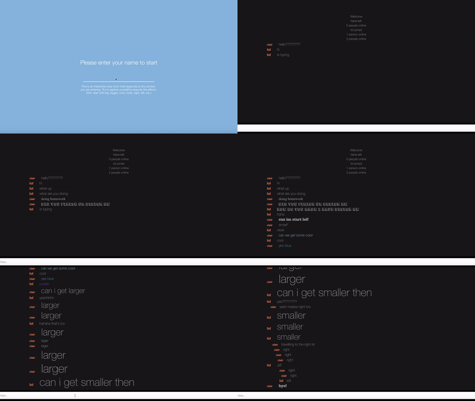
Recorded Version of two people talking and exploring some visual feedbacks

Click To enter full-screen mode

This is a dynamic chat room. The idea is that user can see the visual response of the content and words they are putting into the conversation. The font, color, position of the text, and typography all change corresponding to the content of the conversation. For example, when typing "right", the text will go towards the right edge of the chatroom. Similarly, when typing "left", the text will go toward the left edge of the chatroom. When typing "larger", the text size will increase, and when typing "smaller", the text size will decrease. Moreover, the similar idea applies to the color function in which when users type keywords of different shades of color, the color of the text will change. Other more reactions can be found when typing "bold", "child", "design", "Halloween", "scare", "scary", "fear", "essay", "report", "homework", "study", "important", "highlight", "tension", "note","technology", "computer", "coding", "computing", "round","circle", "hand", "poe", "literature", "letter", "dot", "tight", "squee", "italic", "Italic".
I always feel like text in conversation can be more fun and interesting than what it looks like now in messaging apps (all in default gray color and same size). Except for using emoji, how can text itself express anything interesting? If the text can do more, maybe we can get rid off emoji. The original idea of this project was to incorporate the basic emotions ("joy", "angry", "fear", "surprise", "disgust", and "sad") to execute the changes of type. However, this idea generalizes people's current state of feeling and have many issues with the user experience, therefore, I changed and developed the current version of the project, hoping the idea will come across with more interesting user interactions.