Sound Evolution

https://twitter.com/bitcraftlab/status/373413456231161857

This experiment attempts to generate “music” from a collection or random sounds over a long period of time. People visit the site and click around until they find a combination of sounds they consider music. The creators parallel this process with natural selection. This tweet attracted me with its vocabulary. I wanted to see how evolution and music could be combined and analyzed. I find that engaging this process is highly interactive and becomes and individualized experience unique to my musical tastes. With generations of music influencing each individual, definitions of music shift wildly across a vast spectrum, making the evolution process incredibly slow.

#TwitterNoob

I just got started on Twitter today and, honestly, it’s had for me to understand what people are saying in their tweets. They could be sarcastic or totally emotional and I will never tell. Plus, the number of links riddled through each post overwhelms me, because I feel like I have to click everything

Anyways, I found this particular tweet to be very interesting:

The second I read the word “soup” I had a feeling it had to be about Campbells. After all, Warhol basically pop-cultured it all the way to the top of American symbolism. And when I clicked on the link, I was pleasantly surprised to find out that Campbells is paying tribute to Warhol by releasing limited edition cans on September 9. Funny, how it all comes back full circle.

Quadrangle

img001

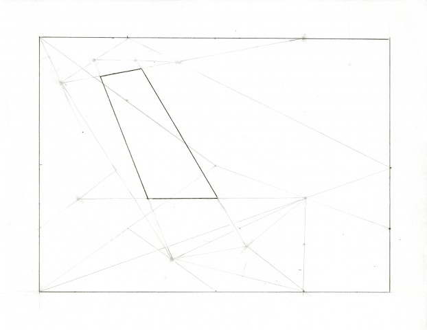
When I first took on the assignment of attempting Sol Lewitt’s Wall Drawing, I thought following instructions would be a very simple thing to do. Boy, was I wrong. Just in the first line, I was stuck trying to put parentheses around the groupings of words and just couldn’t get it right. Sure enough, an hour whittled away. So I tried to read a little about Lewitt instead.

I learned he was a German artist, and I was suddenly struck with the thought that the instructions I’ve been reading are probably a translation. When I looked through the instructions on how to draw the first line once more, I figured that there must have been a part omitted by accident. Here is what I think the first part should read:

… the first of which is drawn from [a point halfway between] a point halfway between point halfway between the center of the wall and the upper left corner and the midpoint of the left side and the upper left corner to a point halfway between the midpoint of the top side and the upper right corner…

This is the only way it made sense to me and allowed me to finish the drawing. Then again, I may just be bad at following instructions.

In conclusion, I thought this was a great demonstration of instructional art, and how an artists’ instructions must be as full-proof as possible for the desired results. This is definitely important as well when implementing code, as computers just churn out what you tell them to do without question.

Manipulation for intention

Screen Shot 2013-08-29 at 8.32.08 PM (2)

On Tumblr there are typically three flavors of users: Creators, Consumers and Curators. For most of my time on that platform I’ve been more of the latter two, even though I myself am very heavily involved in creative endeavors. I figured that it would be a good time for me to increase my Tumblr’s quality by putting my own original content on there instead of simply regurgitating and recycling what is already on there. And with my new recipe, I am able to easily and effortlessly share my photography without the hassle of opening up new posts, etc.

While APIs are largely developed for functionality, it’s also interesting how it can be used as a tool for art. As Jer Thorp wrote, APIs are essentially “conduits for the mash-up, long a preferred creative tool for media artists. Instead of producing a single mash-up, though, a functional API makes a permanent link between two applications, one whose pitch and timbre can change as the data themselves are updated.” It points to an interesting wave of art unseen of nor so easily possible before–that is, the remix culture. Even if its very basis can be (cynically?) broken down into input-processing-output as Jim Campbell did, the implications we can draw from the simple arrangements of what those components are can already say a lot. It is simply up to the human modifying the machinery to figure out how best to portray his intentions with it.

I also can’t help but think of a quote from Bruce Sterling’s essay on the rise of the New Aesthetic with digital media and remix culture:
“Our human, aesthetic reaction to the imagery generated by our machines is our own human problem. We are the responsible parties there. We can program robots and digital devices to generate images and spew images at our eyeballs. We can’t legitimately ask them to tell us how to react to that…..You can have all the machinic imagery out of CERN that you want, but the question is: what does it mean, how does it feel, what you do with it, how can you create? Is is beautiful, ugly, worthy, worthless, how is that good or bad, how does it change us?

Source:
Sterling, Bruce. “An Essay on the New Aesthetic.” Wired.com. Conde Nast Digital, 02 Apr. 2012. Web. 29 Aug. 2013. <http://www.wired.com/beyond_the_beyond/2012/04/an-essay-on-the-new-aesthetic/>.
Of words and hype

The concept of First Work/Last Work seems to fit in the earlier stages of the GHC cycle–that is, the novelty of the Technology Trigger and a new exploration of art, and the inflation of expectations towards the peak and the Last Work that has the final say in terms of how ‘high’ a project can go. The Last Work could also be placed somewhere on the Slope of Enlightenment as the last inflation of hype before the Plateau of Productivity is established. After that, the practice of a medium or technology has been established, the wonder is lost, and the cycle of hype is complete until another trigger or game changer shakes the plateau.

Upon my first glance of the Hype Cycle, I couldn’t help but see it as a graphical representation of the creative process, where there is great hype with an initial idea, followed by the crash of reality, and then the struggle to balance the two as the process goes on, leading to a final compromise that helps even out the nerves of the artist. I would say that like Sculze, I like working in the valley of Expectations, Disillusionment and Enlightenment, simply because of the range of emotions and the richness of experiencing a rebirth of the initial hype in the Enlightenment stage. It is a stage much easier to work for simply because there are parameters already set, as opposed to the Technology Trigger stage where there is the implication of working from scratch. There is a common misconception of creativity being originality, however I truly believe that working under limits and pressure can in fact be a hot breeding ground for truly creative and innovative ideas. The overwhelming pressures of infinite possibility, although idealized, end up being a failure point for many, hence the scarce nature of large-scale triggers.

In terms of actual work though, I find the plateau of productivity the most comfortable as tools and skills are assimilated and feel more natural. Call me old fashioned, but I see the merits and enjoy repetitive mundane work. Much easier to get ‘in-the-zone’, as they call it.

Adam-Assignment-01-4

The GHC attempts to map technologies based on pubic perceptions of them and their practical (commercial and technological) stages of development. In contrast Michael Naimark discusses the concept of First Word and Last Word as terms to describe the application  of a particular technology and subsequent, more refined applications of that same technology.

While on the one hand I am very interested in coming up with completely novel ideas and uses for technology.  Part of me (perhaps the designer part) finds satisfaction in the refinement of ideas. Taking old ideas, improving them, repurposing and re-conteztualising them.

Schulze prefers to play in the trough because technology down there is cheap. It has often been hyped and mass produced. I think that Schulze also likes to surprise the public and it is easier to surprise them if they already have low expectations of a technology.
It is hard to impress people with Virtual reality, voice recognition or cloud computing because the publics expectations of these technologies are are already high. Build something interesting or useful with RFID and we are pleasantly surprised.

Jun-LookingOutwards-1

1. The Carp and the Seagull: http://thecarpandtheseagull.thecreatorsproject.com/

This project is an interactive film with 3D polygonal animation, and uses HTML5 and WebGL THREE.js techniques. It tells of a story about a fisherman named Masato and his encounter with a demon. I found the presentation in this animation interesting, as everything was in simple colors and shapes, and along with the narration, gave an other-worldly, but not unpleasant, feel to the story. I was a bit disappointed with the interactive part of the story. Although the animation was nice, the interactive part was very limited and the motions of the characters and scene not much different from other 2D interactive stories, and I expected something a bit more complex.

2. Big Blue Interactive Pool: https://vimeo.com/72335659

This is a projected interactive floor installation that simulates the depth of an ocean. It uses real-time graphics and depth sensors. Flocking algorithms for individual life objects are also incorporated, and the lifeforms interact with the humans differently. I didn’t expect much initially, but was surprised by the details incorporated into this project, such as the variety of ocean life and bubbles. The image quality of projection could be improved however.

3. Stone Spray: http://www.stonespray.com/

This is a robot built to use materials (sand) from the landscape to create structures. The creators’ original goal for this project was to create eco-friendly and efficient architecture using 3D printing. Although the texture of the resulting structures are very rough, the shape and forms are interesting. I was impressed how the robot created the structures. This project is similar to Kayser’s Solar Sinter, but the way Stone Spray’s robot creates the objects are much more interesting – they seem like they are “grown”, so doesn’t have the layered look the objects Kayser’s robot created.

Critical Engineering

2. The Critical Engineer raises awareness that with each technological advance our techno-political literacy is challenged.

The tenet that interested me the most is number 2. I think it means that as new technology is coming out frequently, we often find ourselves in an awkward adapting period where we have to adjust to the interface of the new technology, to find out how it works and fits into our lives. We rely on technology as a powerful tool, but often do not know how it works and are reminded of that whenever we are faced with new technologies. Some older generations’ difficulties with handling modern computers is a prime example of this, as the computer could still be considered “new technology” for them, and their lack of techno-literacy provides a problem for them in the current era.

Inspirational Project

In the 2012 fall semester of 15-112 taught by Kosbie, a student made a Magneto-themed game for his final project. It used a typical computer webcam as motion sensor to recognize bright-colored tape on a glove, which the user wears to guide a metal ball past obstacles to the end of the maze. The game-play as presented in the video (which was visually fantastic) was smooth and responsive to the user’s motions. I didn’t admire a particular aspect about the project so much as I admire the fact that a single person, probably also just an incoming freshman like me at the time, was able to put that together in 2-3 weeks. Suddenly, cool things found on the distant internet suddenly seemed a lot closer (and made me wonder what I’ve been doing with my time). I really wanted to play that game, and I still do. If expanded, it has the potential to be sold.

I apologize for not having the author and name of the game currently. It seems the maker of the game has not put his project on Kosbie’s term project gallery.

Swetha Kannan- LookingOutwards – 1

shell

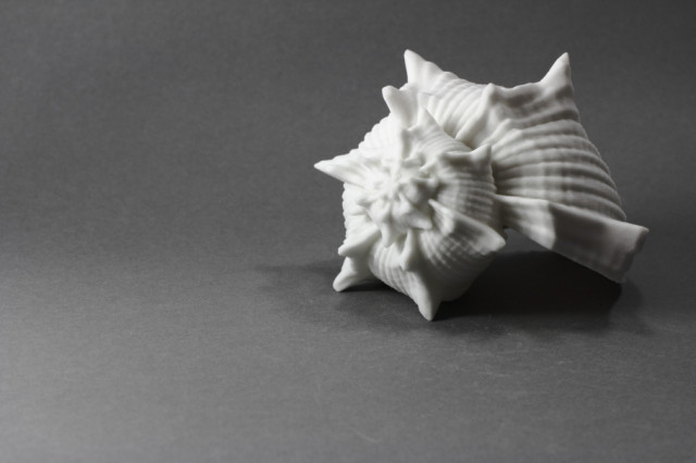
The project Listening to the Ocean on a Shore of Gypsum Sand is a collaboration between Gene Kogan, Phillip Stearns, and Dan Tesene. By using a software they themselves had created they were able to make interesting forms of shells as digital models and then print them. These shells were created for the purpose of hearing ocean waves and to me, that feels really poetic and inspirational when you think of all this work being put in for such a simplistic and humble goal. The shells themselves are also very beautiful and look organic just as the artist probably intended. However, it also looks as if some of the shells that they made were obviously fake and made digitally. If these shells could look more organic, then I feel as if the overall project can be strengthened much more.

https://www.youtube.com/watch?v=ykmBWptOaGc&feature=c4-overview-vl&list=PL6C1909B96FB79A2A

This video shows a project by Daniel Rozin entitled ‘snow ‘mirrors’. Initially, I did not like this project because of how slow and static it seemed (when you thick of technical media you think of fast pace progression). It sort of irked me a bit when I saw that the audience were posing absolutely still in order to be able to interact with the piece. However, as I learned more about the project I was surprised to find that I came to appreciate it since the artist had based all of his concepts upon the ideas of monochrome, sedate, slow, etc. I believe he was trying to capture that same feeling in nature after the first snow fall when everything is silent and it feels as if the whole world is resting under a sheet of white pure virgin snow. I came to appreciate the more organic concepts of this piece.


drawing machine

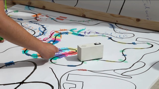
Yuri Suzuki’s “Color Chaser” is an art piece that I really admire yet could have been much better with a simple change. It incorporates a lot of the elements of play, interaction, community, and fun that I like seeing in art. The small machine that Suzuki created is made from old records and can follow the path of color in front of it while simultaneously turning this color into music. In a way, it presents the audience with an opportunity to listen to color; the audience is encouraged to draw more and more paths for the machine to follow. I love how beautiful the pictures the audience ends up drawing can be; they are full of color and are reminiscent of childhood play. However, the machine itself looks to me like an electric sharpener of some sort. If Suzuki had put more effort into making the appearance of the box more colorful and inviting, then perhaps it would have hinted more at it’s purpose and remained as vibrant and powerful even when it was not in use.


Written by Comments Off on Swetha Kannan- LookingOutwards – 1 Posted in Uncategorized