Schotter – Swetha

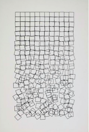
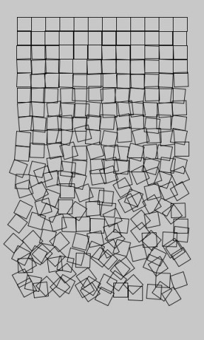
Man, this assignment was frustrating until I took a deeper look into pushmatrix() and popmatrix() after that, it was just a matter if getting the rotations right…

Schotter

void setup() {
  size(400, 550);
  background(200);
  noFill();
  int numOfCol = 300/12;
  int numOfRows = 500/numOfCol;

  //Now use nested for loop to generate a graph
  for(int a = 1; a<=numOfRows; a += 1){
    for(int b = 1; b<numOfCol-10; b +=1){
      pushMatrix();
      //push and pop matrix will help reset the rotation of the sqaure
      translate(numOfCol*b, numOfCol*a);
      rotate(radians(random(-a*4, a*4)));
      rect(0,0,numOfCol, numOfCol);
      popMatrix();
  }
  }

}

Ticha-Ad Astra

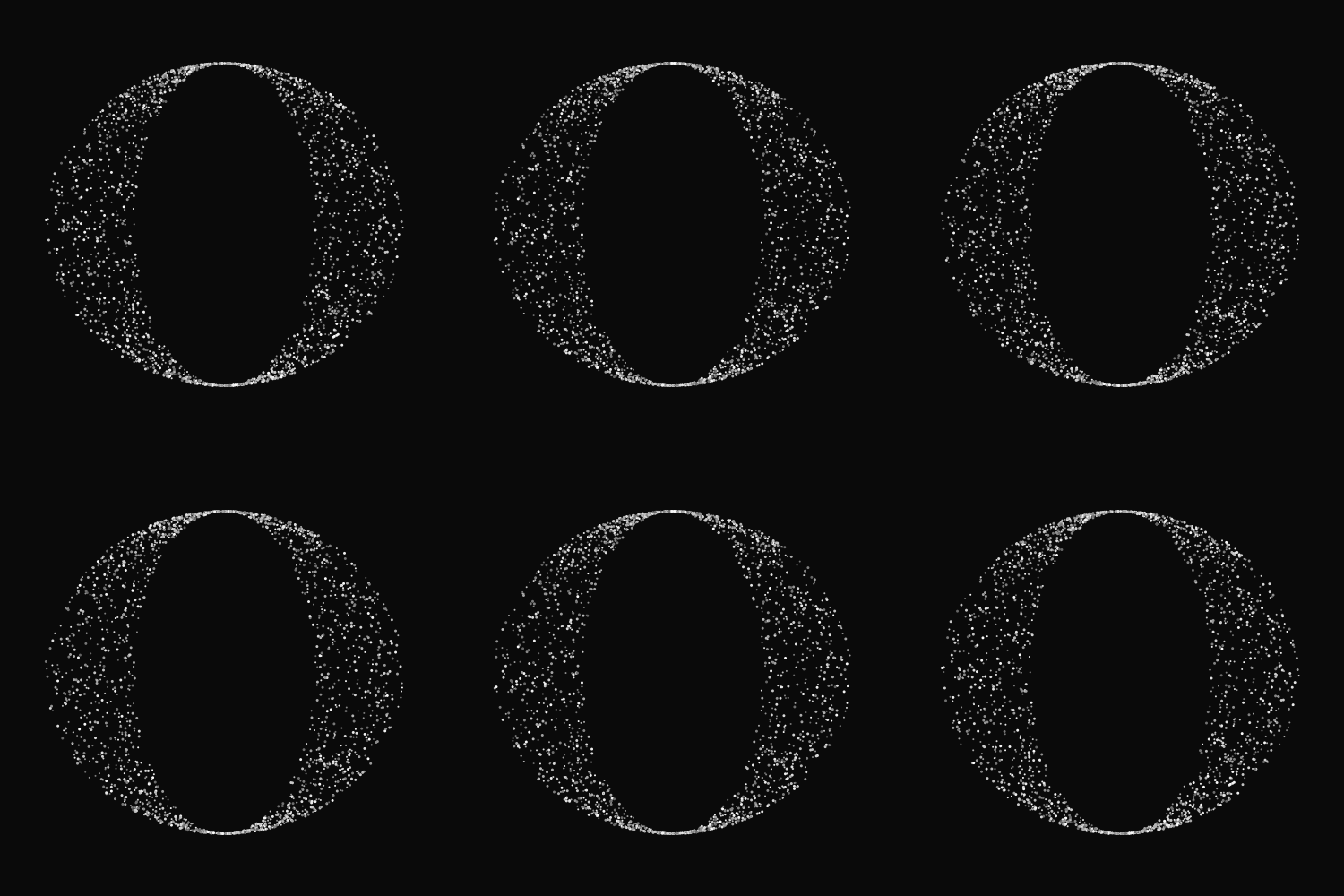
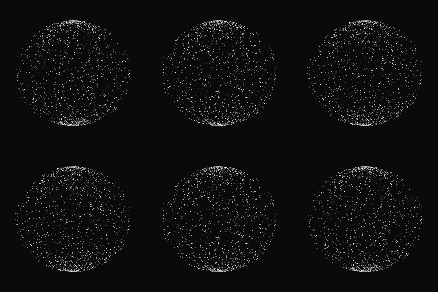
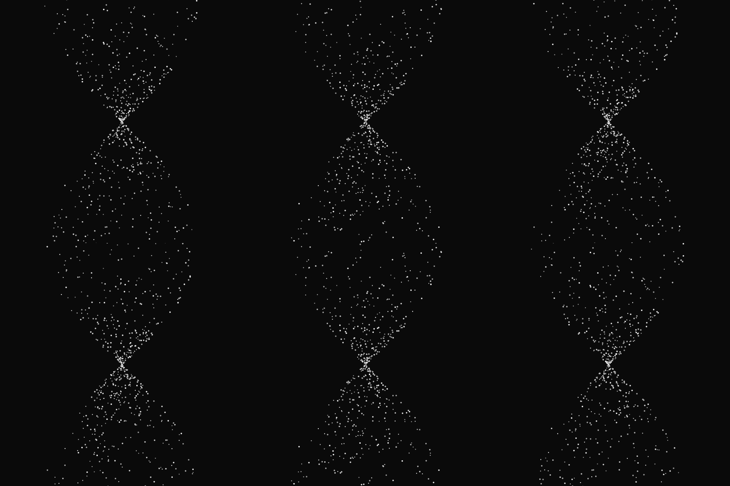
So, after talking to Golan (thanks!), I decided to do have another go at the GIF assignment. I admit that animating in Processing was intially a difficult concept for me to grasp because I was so accustomed to highly graphical animation software – more specifically, After Effects – in which ‘clicking and dragging’ is a sufficient tactic for creating movement (well there is some programming involved, but only to a minimal extent). This second attempt at the animation was both a large step outside of my comfort zone as well as a significant mental leap for me – and I found it to be a very rewarding and enjoyable experience.

I stumbled across some code on OpenProcessing.org that beautifully simulated moving particles and used a bit of it to make these animations. The code was heavily tweaked though – the original used vectors in 3-dimensional space and did some weird isometric formula conversions (???) that I barely understood. So, I simplified it so that it could both be easier for me to understand and behave the way I wanted it to.

There is a quote by Virgil that goes, ‘sic itur ad astra’, which translates to ‘thus you shall go to the stars’. I hope these simple, yet strangely soothing GIFs will make people feel a little closer to them. (:

Here is the source code for the third animation, as it is my favorite one. The code for the other two are very similar, except that they use different trigonometric functions.

/* Credit to https://openprocessing.orgsketch/5582 for amazing particle reference 
 Credit to Golan Levin for the recording option
 */

int nFramesInLoop = 160;
int nElapsedFrames;
int particleCount = 1000;
Particle[] particles = new Particle[particleCount];
boolean bRecording;

void setup() 
{
  noStroke();
  size(500, 500);

  //initializing particles
  for (int i = 0; i < particleCount; i++) { 
    particles[i] = new Particle();
  }
}

void keyPressed() {
  bRecording = true;
  nElapsedFrames = 0;
}

void draw() {

  // Compute a percentage (0...1) representing where we are in the loop.
  float percentCompleteFraction = 0; 
  if (bRecording) {
    percentCompleteFraction = (float) nElapsedFrames / (float)nFramesInLoop;
  } 
  else {
    percentCompleteFraction = (float) (frameCount % nFramesInLoop) / (float)nFramesInLoop;
  }

  // Render the design, based on that percentage. 
  renderMyDesign (percentCompleteFraction);

  // If we're recording the output, save the frame to a file. 
  if (bRecording) {
    saveFrame("output/myname-loop-" + nf(nElapsedFrames, 4) + ".png");
    nElapsedFrames++; 
    if (nElapsedFrames >= nFramesInLoop) {
      bRecording = false;
    }
  }
}

void renderMyDesign(float percent)
{
  translate(width/2, height/2); 

  background(10);

  /* Loop through the particles */
  for (int i = 0; i < particleCount; i++) { 
    Particle particle = (Particle) particles[i];
    particle.display();
  }
}

class Particle {
  float rad;
  float angle;
  float dec;

  int size;

  //particle constructor
  Particle() {
    angle = random(-10, 10);
    rad = random(0, 200);
    dec = (150 - rad) * 0.00004; 

    size = (int) random(2, 4);
  }

  void display () {
    
    fill((int)random(80, 200)); //twinkling
    ellipse(rad * sin(angle), 180 * cos(angle), size, size);
    
    fill((int)random(150, 255)); //twinkling
    ellipse(rad * cos(angle), 180 * sin(angle), size, size);

    angle += dec; //direction of particle movement
  }
}

I also made this thing for giggles:

Swetha Kannan – Looking outwards – 2

Unnamed Sound Sculpture

Daniel Franke - unnamed soundsculpture

“Unnamed Sound Sculpture” by Daniel Franke & Cedric Kiefer may be a piece that many of you have passed by as you were working on assignment four since it is one of the first few projects advertised on he processing home page. However, I would still like to give credit where it is due because this project was absolutely amazing to me. The way the sculpture was rendered seemed as if it was in an actual place and the sculpture itself seemed to take up more room than it’s location or even the computer screen would allow. The dance positions the sculpture posed in was striking because of the fragments of pixels seemingly falling of the subject. A few critiques I do have about the piece was that the video dramatized the piece so much so that I was not able to get away from the ‘computer’ feeling of the piece since the footage was so obviously edited. This may or may not be a good thing, however from reading the accompanying article, it looked to me as if they were focusing on the simplicity of the motion. therefore, it seemed illogical that their video featured flashing lights, revolving cameras, and thundering sounds.

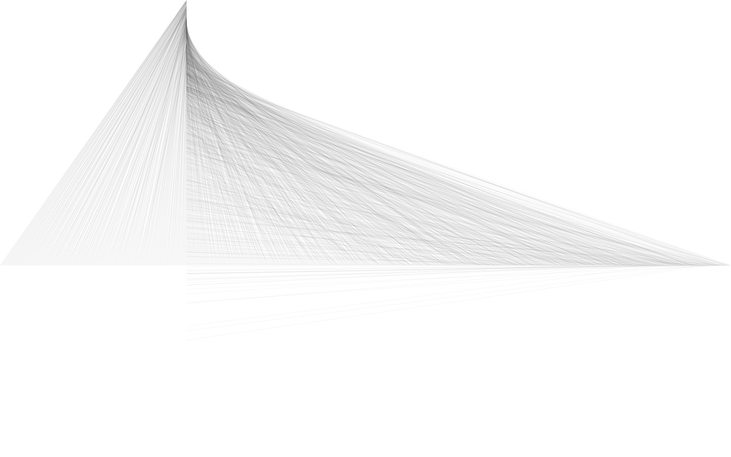
This composition by Miquel Parera Jaques interested me because it has a delicate nature about it. The lines are small and thin enough that the piece looks as though it was drawn with a pencil. Unlike the last piece, simplicity was really the founding principal for this piece and has been carried out very successfully. The piece also has a lot of depth to it since I find myself getting lost in the lines that all seem to point to the same line/tip.  The form created by the lines seems architectural and thus appears to pop off the page.


This “Kiss Controller” by Hye Yeon Nam was hilarious! The concept was so ridiculous but at the same very charming; by attaching a wire to her tongue, Nam was able to play a virtual bowling bowl game by kissing. The motions and speed of her tongue affect controls in the game and thus she is able to knock down pins. This project strongly reminded me of (some) Japanese restrooms in which there are games that you can play while peeing (the strength and duration and aim of it are the controllers). I doubt that the player of this kissing game can even see the screen very well with your partner right in front of you. These sort of projects are so ridiculous that one has to laugh; they are nothing short of charming.


JuliaTeitelbaum-Schotter

Julia-Schotter

 
/* This is a copy of George Nee's classic "Schotter" (1968) 
 * http://www.medienkunstnetz.de/works/schotter/
 *
 * by Julia Teitelbaum, 09/09/2013
 */

int numRows;
int numCols;
float squareSideLength;
float padding;
float rowsRandomnessFactor; 

void setup() {
  /* set/calculate width and height based on proprortions of 
   * Schotter's original piece */
  int drawingHeight = 600;
  float widthHeightRatio = 0.49;
  int drawingWidth = int(drawingHeight * widthHeightRatio); // ~285
  
  /* set randomness factor 
   * lower means more rows will be more random, 
   * higher means more rows will be more ordered
   */
  rowsRandomnessFactor = 70.0;
  
  /* calculate padding for squares  and length of their sides 
   * based on proportions of Schotter original */
  float paddingRatio = 0.14;
  padding = drawingWidth * paddingRatio; // ~40
  squareSideLength = padding/2; // ~20
  
  size((drawingWidth + int(padding)), drawingHeight); 
  noLoop(); // we aren't animating, so draw() only needs to run once
  noFill(); // none of the squares have fills, only outlines
}

void draw() {
  int schotterGrey = 225;
  background(schotterGrey);
  smooth(); // alias lines so the squares look nice
  
  numCols = 12;
  numRows = 2*numCols; // 24
  
  for (int currentCol = 0; currentCol < numCols; currentCol++) {
    for (int currentRow = 0; currentRow < numRows; currentRow++) {
       pushMatrix(); // save current canvas position
       
       // calculate positional change for canvas
       float leftOffset = padding + (currentCol * squareSideLength);
       float topOffset = padding + (currentRow * squareSideLength);
       translate(leftOffset, topOffset);
       
       // calculate rotational change for canvas
       // to shift the square's angle
       float lowerRandomBound = PI*currentRow/(-1*rowsRandomnessFactor);
       float upperRandomBound = PI*currentRow/rowsRandomnessFactor;
       float angleShift = random(lowerRandomBound, upperRandomBound);
       rotate(angleShift);
        
       // draw the square (as far as it knows, it's at the origin)
       rect(0, 0, squareSideLength, squareSideLength);
       
       // put the canvas back as it was
       popMatrix();
    }
  }
}

/* NOTE ON USAGE OF PUSHMATRIX() AND POPMATRIX()
 * We're using matrix translations to conceptually move the canvas. 
 * we're basically always drawing the box/keeping the imaginary
 * pen in the same location, but keeping a record of where we've 
 * moved the canvas so we can shift it differently for each square */

Looking Outwards: Processing and Generativity

Discovery 1: “unnamed soundsculpture”

Artwork

Process Video

“unnamed soundsculpture” is a piece by Daniel Franke and Cedric Kiefer. The video was produced by onformative, a studio for generative design, which was co-founded by Kiefer, and Chopchop, a three person studio of which Franke is a member.

“unnamed soundsculpture” not only interested me, but fascinated and moved me. My first reaction was just to the aesthetics.—I find the piece itself to be truly beautiful. I love the movement and how the movement’s sound interplays with the music. I love the cinematography and the look of the particles in motion. It made me feel. Aside from my immediate reaction, I think this piece is so interesting because it uses computation and technology so artistically. The technology augments the dancer’s performance, and the generative movement-sound code makes the dance that much more expressive. The technique of capturing motion using a kinect, then using it for a piece—as raw material, also impresses me and makes me think about the possible uses for that technique.

Discovery 2: Firewall

Firewall is an interactive media installation created by Aaron Sherwood and Mike Allison, a master’s student at ITP at NYU. Aaron Sherwood is a musician and the Artist in Residence at the Tribeca Performing Arts Center in New York. They created the piece for the performance piece Mizaru.

The interface for the installation (which, to me, is more an instrument than an installation) is a large piece of spandex which people can brush their hands over or push into to affect the speed and volume of the music being played. Sherwood and Allison created the piece using Processing, Max/MSP, Arduino, and a Kinect. Their documentation doesn’t specify how exactly they used Processing, but my best guess is that they used it for the visuals—changing the projected lines on the spandex in response to data from the Kinect depth camera.

I find firewall interesting because of the depth of interaction it creates; even a brief interaction with the firewall is expressive for a user/viewer. I also enjoy the combination of touch (pressure on the fabric), sound, and light in the piece; I think each mode fits in well with the whole. Another aspect of this piece that interests me is how it plays with the definition music performance. I’ve played piano for most of my life, and performed in recitals. The way I always approached performance was to memorize my recital piece, then, once I could reliably play the right notes, to add some of myself to the piece, changing the way I played it subtly. What’s interesting about firewall is that it allows people to get to the point where they express themselves through the performance of a piece of music so quickly.

 Discovery 3: Kinograph

Kinograph is a project by Matthew Epler, a freelance technologist and artist. Kinograph is an open source project for digitization of old film strips, extracting both the picture and sound to digital media at high resolution. Kinograph uses Processing to stabilize the captured images—a pretty utilitarian use of the language.

Epler’s project interests me because while it is generative art, the code part of the art doesn’t take center stage. Kinograph does fall on the edge of generative art, to me, though. I think the concept, extending and refreshing cultural memory, is strong and artful and meaningful. However, the project is tricky because the film it’s digitizing isn’t really Epler’s art; it’s the project itself. To me, the way that this project generates art is by generating new experiences of people with old films. Aside from being on the edge of generative art/having a different take on it, I liked Kinograph because it seemed so well-engineered, using multiple open source libraries and manufacturing techniques economically to achieve Epler’s desired effect.

Written by Comments Off on Looking Outwards: Processing and Generativity Posted in LookingOutwards

Jun-Schotter

 
//Number of rows and columns, and margin are adjustable
int nRows = 20;
int nCols = 12;
int margin = 30;

float sqSize;

void setup() {
  size(360, 600);
  noLoop();
  noFill();
  //Square sizes depend on set margin, 
  //and number of columns and rows
  sqSize = min((width-(2*margin))/nCols, 
  (height-(2*margin))/nRows);
}

void draw() {
  background(200);
  for (int row=0; row<nRows; row++) {
    for (int col=0; col<nCols; col++) {
      //Draw squares in each row left to right
      float left = col*sqSize+margin;
      float top = row*sqSize+margin;

      //Make each square's disorder depend on its row
      float shiftX = random(-row, row)/2;
      float shiftY = random(-row, row)/2;
      float shiftAngle = random(-PI/2, PI/2)*(1.0*row*row/nRows/nRows);

      pushMatrix();
      translate(left+shiftX, top+shiftY);
      rotate(shiftAngle);
      rect(0, 0, sqSize, sqSize);
      popMatrix();
    }
  }
}

Sample output:
schotter-run

Rachel-Looking Outwards-2

 photo InteractiveRootsStill_zps2d4b0e58.jpg
http://openprocessing.org/sketch/2920

Interactive Roots by Esteban Hufstedler generates patterns of root structures emanating from a central point, creating beautiful, two dimensional, radial structures in Processing. This work is highly engaging, and I enjoyed the many levels of interaction it provides. From color, speed, size and transparency, the work explores all permutations of the root pattern. This allows each use of Interactive Roots to be unique in experience, process, and result. The applicable changes to the form are simple, almost expected, and that lends the work a sense of simplicity that heightens the importance of each change and each form. The simplicity gives the work its whimsical feeling and each change to the setting gives whimsical form. This simplicity surprised me in visual effectiveness.


similar diversity

http://similardiversity.net/project/

Similar Diversity by Phillipp Steinweber and Andreas Koller visualizes the word traffic of five of the world’s sacred texts. The project uses Processing to connect word frequency and context among the books, showing the common ways humans describe their spirituality. The work is a comment on the absurdity of religious conflicts. I think the forms used in this visualization could take into account the various symbols of the religions. The way the words are connected gets the information across, but lends no content to the work. Color choice too, is important. I feel that color was used organizationally here, but not for content. Choosing colors that resonate with the beliefs of the faith, for example red for Christianity to symbolize the blood of Christ, could help to push the idea. Having these colors bleed into the connection lines and mingle with the colors of the other faiths would reinforce the point.

http://tomgerhardt.com/mudtub/

Tom Gerhardt’s Mud Tub uses Processing to allow the user control a computer with a vat of mud. The work reminds me of my childhood; Computers were these sacred clean objects and it was punishable by death if you even brought a glass of water near one. This work uses a childish material, mud, to fly in the face of that limitation. Mud is opposite of what society sees as an acceptable computer; it is dirty, shapeless, free, and associated with children. The mud gives the user a more organic experience, taking the pain out of the general sit and stare computer interface. I also enjoy the variety of games you can play with the mud, from “Drop the ball in the hole” to Tetris. The fun of this work is the combination of material and game choice, all childhood favorites of mine, creating an unexpected, simple experience that reconnects a user to his childhood.

Joanna – Lookingoutwards2

The Generative Gatsby is a design project in generative typography by Vladimir Kuchinov, it uses nine songs from swing-era musicians such as Ella Fitzgerald, Jelly Roll Morton, Cab Calloway, Count Basie, and more to influence the typographic layout of Fitzgerald’s text. “The algorithm I used transposes The Great Gatsby‘s content according to the attributes of the notes,” Kuchinov says.

This work is a nice piece where an analog medium is enhanced with digital tools. Typography meets processing. music is translated into fonts and letters.

“I have been carefully selected six typefaces for every single instrument. I did a very solid contextual research to fit the concept. For example, drums and percussions are represented by Remington Typewriter font, because this brand was extremely popular …” (Kuchinov in Huffpost, 8th September 2013)