Category: Uncategorized

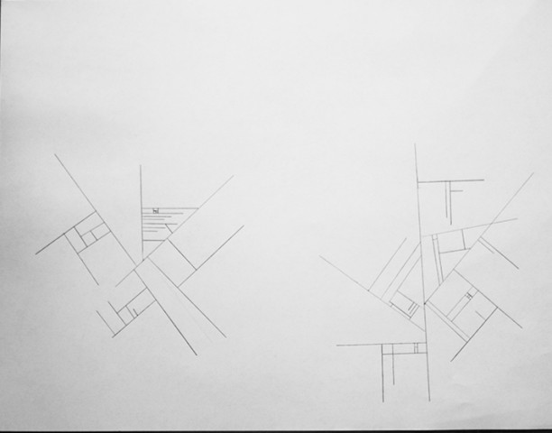
Instructional Drawing in Reverse

reversal

Setup (do this once)

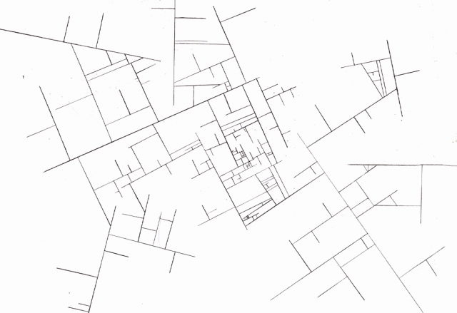
Distribute nonintersecting lines of similar length and variable orientation across a plane.

Loop (repeat this indefinitely)

Allow lines to branch out of existing lines, provided the new lines:

– are drawn perpendicular to the lines from which they stem

– do not intersect other lines

– do not exceed the length of the lines from which they stem

Written by Comments Off on Instructional Drawing in Reverse Posted in Uncategorized

Rectification

Test Subject Uno Test Subject Uno
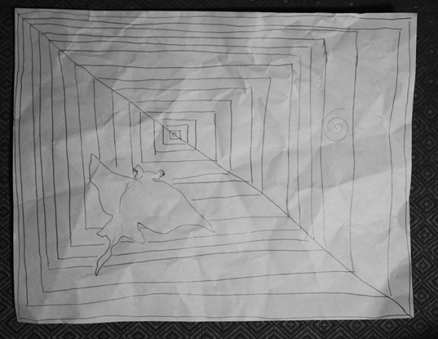
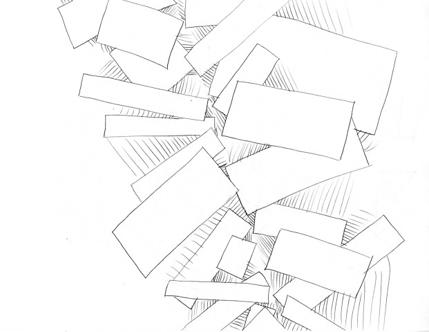
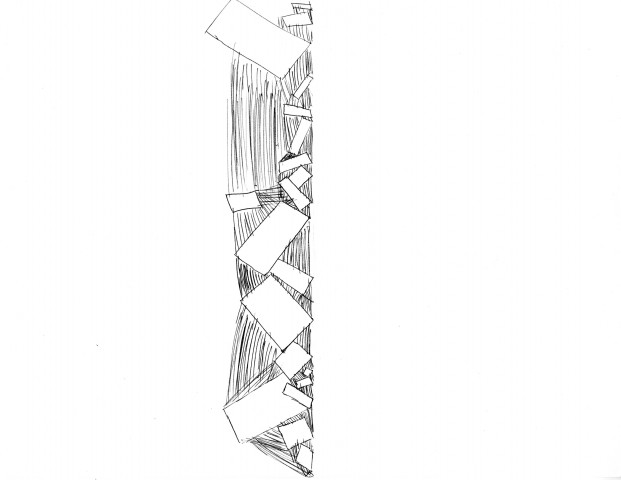
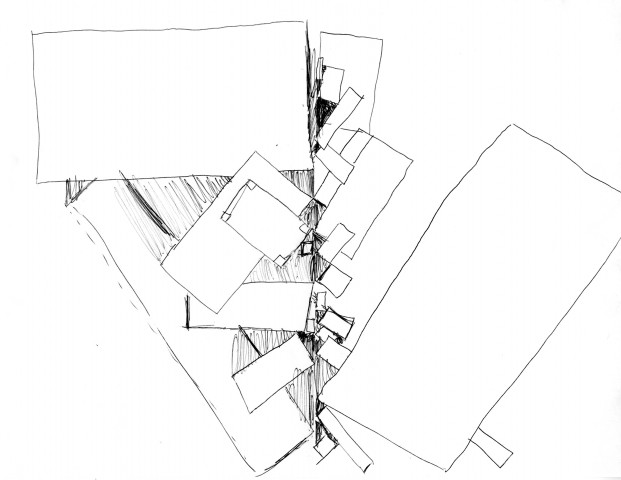
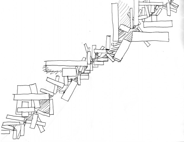
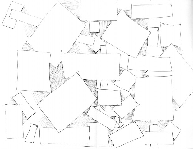
  1. Fold the page into two and crease. The fold can be diagonal. Unfold the page.
  2. Draw a rectangle of any size such that only one point touches the crease.
  3. Repeat. In the case that another rectangle will overlap another rectangle, do not cross your line over the other rectangle. Instead, pass over it and continue drawing on the outside of the rectangle.
  4. If your rectangle makes an acute angle with another rectangle, “shade” in between the rectangles with lines that touch both rectangles.
  5. End when you think the crease is covered.
So here was my take on my own instructions…


img002

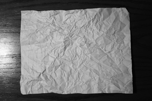
When I first wrote these instructions, I knew there would be some confusion over rules 3 and 4. However, my hope was that the parts with the most confusion would provide the most insight about the individual artists. So on my quest to find some test subjects, I found very different people–all non-art majors.

One thing that surprised me was that most people refused to fold their paper diagonally. They just liked hamburger or hotdog style. I was also surprised that the definition of “shading” translated directly into “close scribbles” for most people. That was probably a vague word to use in my instructions. I was happy when one person started to think that they were drawing something cool. But most people were a little too focused on making perfect rectangles or following the instructions without any fun. If I could redo this whole project, I would want to make sure the artist is having fun when following instructions and not worrying about “getting things right”.

Test Subject Dos

Test Subject Tres


Test Subject Cuatro

Let’s Draw


Instructions: 

Have one clean sheet of printing paper and pencil ready.
Turn paper portrait view.
1) Shoes have laces. Move to 5.
Shoes don’t have laces. Move to 7.
else Move to 8.
If bored. Done.

2) Use non-dominant hand.
Draw your favorite animal next to other shape.
Animal is mammal. Move to 11.
Animal isn’t mammal. Move to 12.
Cannot be determined. Move to 13.
If bored. Done.

3) Use non-dominant hand.
Draw rectangle.
Length of rectangle longer than other shape’s diameter. Move to 2.
Length of rectangle shorter than other shape’s diameter. Move to 10.
Length of rectangle as long as other shape’s diameter. Move to 14.
If bored. Done.

4) Clap your hands to a rhythm.
Draw out your rhythm.
Rhythm is fast. Share it with a friend.
Rhythm is slow. Share it with an enemy.
Rhythm is just right. Hum it out loud.

5) Untie Shoe laces.
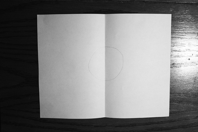
Grab clean paper and draw circle on page.
Fold paper in half so the shorter sides meet at the bottom.
Unfold.
Circle in top half. Move to 3.
Circle in bottom half. Move to 4.
Circle on fold. Move to 6.
If bored. Done.

6) Glance around the room secretly.
Choose an object as your target.
Object is female. Move next to object and continue to 8.
Object is male. Move around object for 20 seconds and continue to 3.
Unable to determine gender. Grab object. You have won.
If bored. Done.

7) Draw laces on paper.
Imagine a color for your laces.
Color is warm. Move to 11.
Color is cool. Move to 2.
else. Move to 4.
If bored. Done.

8) Cross your legs and shake your feet.
Crumble up your paper.
Unfold.
Straighten out your paper and reposition landscape view.
Choose a corner of the paper and draw a contour line starting from that corner to the other
side of the paper until done.
Think of a number from 1 – 100.
Number between 1-33 included. Move to 9.
Number between 34-66 included. Move to 14.
Number between 67-100 included. Move to 3.
If bored. Done.

9) Think of an animal you would like to devour.
Imitate a mating call to try and lure the animal in.
Successful. Move to 4.
Unsuccessful. Move to 2.
Want to try again. Repeat step.
If bored. Done.

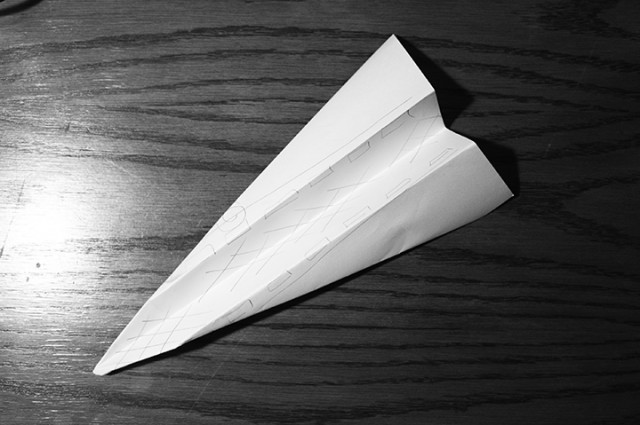
10) Fold paper into plane.
Unfold.
Write your instructions on the back of the page.
Refold.
Throw it to an unsuspecting victim.

11) Use dominant hand.
Draw the largest spiral you can manage.
Spiral overlaps something on page. Move to 10.
Spiral doesn’t anything on page. Move to 8.
If bored. Done.

12) Fold paper in half.
Paper is too thick to fold. Unfold and trace lines.
Paper is still foldable. Repeat step.

13) Draw biggest shape possible.
Draw smaller shapes until finished.
Grin.
Hand paper to person closest to you and ask them to sign it.

14) Attempt a cartwheel.
Successful. Describe how you feel on paper.
Unsuccessful. Describe how you feel to another person and draw their response on paper.
Undetermined. Move to a sunny spot and describe your next attempt on paper.
Results: 
instructions-1 instructions-2 instructions-3

instructions-4 instructions-5

Analysis: 

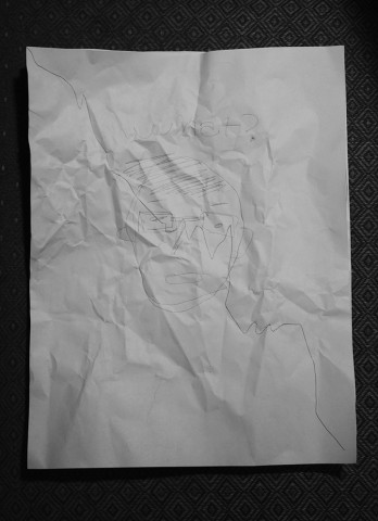
The style of my instructions originated from the tests used to classify difference between subspecies in biology. Each questions contains 3 choices that lead to different choices which each also contain 3 different choices and eventually comes to an end result. Along the way, the test subject’s choices, personality, and preference changes his or her result. What both surprised me and confirmed my hypothesis was the vast differences between results. Although the test itself seemed very long, one result came out to be fairly simplistic.I knew that even if two people chose the same path, their drawings will come out differently through little details in drawing style or positioning, dominance of hand and longevity of patience. If I had a choice to edit my test, I may make some questions a little more ambiguous or simple, so the user is able to apply more of his or her own imagination and understanding of the questions.
Tweets!

https://twitter.com/CreatorsProject/status/373125138684071936

This tweet was interesting to me because I found the title, “RPG OKC: A love story set in the world of 8-bit fantasy games” very interesting. I had to laugh since it reminded me of all the other 8-bit fantasy games I used to play as a child. When I looked into it, I found that I was very interested in the video as well as the artist who made it. the video was both, hilarious, clever, and heartbreaking; I found myself on the edge of my seat the whole time.


Reverse

1) Pick one point that isn’t touching the edge of the paper.

2) Draw At least four lines from the point that are not perpendicular or parallel to each other.

Lines must somehow touch each other, but not cross over each other.

3) Pick one line a draw at least one line perpendicular to it. The new line need not to be perpendicular to the surrounding lines. New lines must not overlap any other lines on page.

4) Continue to repeat step 3 with existing lines and new lines until satisfied with image.

5) Repeat steps 1-4 at another point on page if desired. New design cannot overlap existing lines.

End result.

Reverse

Swetha Kannan- LookingOutwards – 1

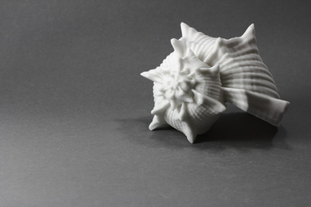
shell

The project Listening to the Ocean on a Shore of Gypsum Sand is a collaboration between Gene Kogan, Phillip Stearns, and Dan Tesene. By using a software they themselves had created they were able to make interesting forms of shells as digital models and then print them. These shells were created for the purpose of hearing ocean waves and to me, that feels really poetic and inspirational when you think of all this work being put in for such a simplistic and humble goal. The shells themselves are also very beautiful and look organic just as the artist probably intended. However, it also looks as if some of the shells that they made were obviously fake and made digitally. If these shells could look more organic, then I feel as if the overall project can be strengthened much more.

https://www.youtube.com/watch?v=ykmBWptOaGc&feature=c4-overview-vl&list=PL6C1909B96FB79A2A

This video shows a project by Daniel Rozin entitled ‘snow ‘mirrors’. Initially, I did not like this project because of how slow and static it seemed (when you thick of technical media you think of fast pace progression). It sort of irked me a bit when I saw that the audience were posing absolutely still in order to be able to interact with the piece. However, as I learned more about the project I was surprised to find that I came to appreciate it since the artist had based all of his concepts upon the ideas of monochrome, sedate, slow, etc. I believe he was trying to capture that same feeling in nature after the first snow fall when everything is silent and it feels as if the whole world is resting under a sheet of white pure virgin snow. I came to appreciate the more organic concepts of this piece.


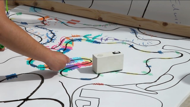
drawing machine

Yuri Suzuki’s “Color Chaser” is an art piece that I really admire yet could have been much better with a simple change. It incorporates a lot of the elements of play, interaction, community, and fun that I like seeing in art. The small machine that Suzuki created is made from old records and can follow the path of color in front of it while simultaneously turning this color into music. In a way, it presents the audience with an opportunity to listen to color; the audience is encouraged to draw more and more paths for the machine to follow. I love how beautiful the pictures the audience ends up drawing can be; they are full of color and are reminiscent of childhood play. However, the machine itself looks to me like an electric sharpener of some sort. If Suzuki had put more effort into making the appearance of the box more colorful and inviting, then perhaps it would have hinted more at it’s purpose and remained as vibrant and powerful even when it was not in use.


Written by Comments Off on Swetha Kannan- LookingOutwards – 1 Posted in Uncategorized

Improvisational Animation


(start at 29m 16s)


During his talk “Inventing on Principle”, Bret Victor showed off a simple animation he singlehandedly created. In the animation, a leaf falls to the ground, then we pan across a painting of an autumn background, and glimpse a rabbit hopping away. It’s a very simple animation. The quality of the painted images and the timing are very nice. However, it is the motion that I find inspirational in the animation. Not because it is complex or amazingly harmonious, but because of how it was made possible.

In the talk, Victor demos the iPad app which he programmed to use as a medium for creating the animation. Rather than having to specify keyframes and tweening functions, the app allows him to conduct the animation through gesture.

What truly inspires me about this piece not the piece itself, it’s that in creating the piece, Victor almost creates a new medium—improvisational animation. It creates so many possibilities for more spontaneous animations created by a broader variety of people.


Note: This probably falls more on the Tinguely side of art being people just doing stuff…

Things that inspire me that don’t quite count as technological art/design, but that I looked at before writing this:

Ralph-LookingOutwards-1

Stone Spray Project: http://www.stonespray.com/

This is a machine that prints 3D object out of soil and a liquid binder, much like Markus Kayser’s 3D sinter. The Stone Spray can operate entirely on solar energy as well, but is not completely dependent on it like the sinter, so it is functional even during the night or under cloudy conditions.

I greatly admire the resourcefulness of the project, offering an ecological alternative to conventional 3D printing. Its design allows the user to build complex structures on-site with minimal preparations, so its potential is not only limited to printing out curiosities for fun. This could have great practical use in construction, and the structures it creates are surprisingly sturdy.
Though for now, it is still limited to printing out small, coarse curiosities, I’m sure further development will allow smoother printing as well as building on a large scale.

Void: https://www.creativeapplications.net/environment/void-3d-robotic-structure-suspended-between-buildings-paints-with-light/

Void is a mechanical structure by Wit Pimkanhanapong which suspends a light source within a space and moves that point of light freely to create a spatial drawing over time. This piece is a continuation of a piece by Jurg Lehni who managed to create a structure that moved a drawing tool across a 2D plane.

I was surprised by this piece because of how simple the setup was. I would not have imagined such smooth movement through any point in space being possible through a mostly physical contraption utilizing only 8 stationary winches.

Though this is probably due to physical limitations, the movement feels too sluggish. The gifs presented on the page shows the movement sped up, and it forms a beautiful gesture which is probably interesting no matter what angle you see it from. The sluggishness hides this gesture.

Sonumbra: https://www.youtube.com/watch?v=CF9rqiHNDuA

This is an installation of umbrellas which emit streaks of light that resemble vines in response to movements within the umbrellas. According to the description, the artist intended to breathe harmony and musical rhythm in the viewer’s steps as he or she walked along. Many works by Loop.pH seem to involve intricate lattices of lights much like this project.

Its choice of location is nice; it appears to be outdoors near shrubbery, breeding an atmosphere of a magical, otherworldly forest. The intricate patterns created by the lattice of light are also very pleasing to look at. Its humanitarian value is also not to be overlooked; it is proposed to be used in impoverished villages to both provide shade and light with only solar energy.

Unfortunately, the iteration presented in this video does not seem appropriately responsive to the participant. Sometimes, the entire lattice glows while the man walks lightly or stands still, and the umbrellas generally respond with much delay. In addition, the algorithm that controls the pattern of light does not seem to create a sense of rhythm as advertised very well.

Welcome to EMS2!

Dear students! Welcome to our section of EMS2, “Introduction to the Electronic Media Studio” for the fall semester of 2013! This course is an introduction to the core tools and idioms of interactive and computational new-media arts. Usually we cover topics like interactive imaging (with Processing), physical computing and microcontroller programming (with Arduino), and flow-based signal patching (with Max/MSP). Our core goal is to produce stimulating and provocative new culture.