Category: LookingOutwards

Ralph-LookingOutwards-2

rubegoldberg_totale_exhibition_grey_web

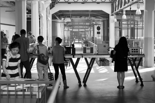
The Product – “Rube-Goldberg Processor”
This is a set piece in which numerous different machines are arranged to receive input from one machine and translate it into another state. It is much like the Rube-Golberg machine, for which it is named, as both transform a fundamental unit (data or energy) into different forms, leading to a highly impractical result. It first came about as a teaching tool to show how data is unified, even if it comes in the form of light, sound, or electrical signals.
I especially enjoy the playfulness of this piece. It derives a very simple sense of fun — the same kind of fun I had when watching physical RGMs, but recontextualized in a manner more meaningful to me and modern culture. It also reminded me of Jim Campbell’s “Formula for Computer Art”; this piece took that formula to the extreme and made a point of outputting useless data. I’m interested in what input was initially fed into the machine, and wonder whether the meaning behind that input could add another layer to the piece.

fragmented-memory_02

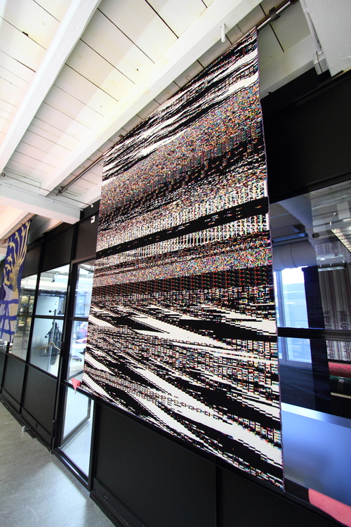
Phillip Stearns – “Fragmented Memory”

In truth, I did not find the physical manifestation of this piece or the general concept behind it particularly intriguing. I did, however, find interest in the vast connections that this piece made. The idea behind this piece is to visually represent raw data input from the computer processor (or from a closed-circuit camera like with a previous iteration of a similar piece), and print out this repurposed data in the form of textile pattern. There are connections being made among between modern computers and archetypical art forms, acting as a quaint bridge between the old and the new. It’s a project whose process is very involved, but the product is just as important. It involves algorithms, but also randomness. I find the artist’s vision to be ambitious, and the textile pattern from a distance makes a visually striking pattern, like a damaged VCR tape. Yet, at the same time, the fabric itself seems pretty tacky, and I can’t derive actual meaning from the pattern. I’m left wondering cynically what was so important about the data input that Stearns used.

ElectricDeluxe_SpeedyJ_Installation_3

Studio Hands – “Ultra Deluxe Merchandise”

I love the idea behind this one. Studio Hands created a process by which a digital image is transmitted via sounds, and another computer picks up the input with a microphone and generates the image on the computer, as well as printing it out as a merchandise piece. It’s so artfully fitting that a promotion for a musical artist should occur via soundwaves. On top of that, the actual quality of transmission is also surprisingly good, even though I expected a garbled image. There’s also a poetic quality to the fact that merchandise production would happen this way – sound is spread rather than directed, and it can be infinitely duplicated.  I only want to see this piece expanded even further, to become more than merchandising just one image between just two computers.
Madeleine-LookingOutwards-2

Paper Note – Created by Andrew Spitz and Andrew Nip at the Copenhagen Institut of Interaction Design, Paper Note generates a stack of paper disks that represent a sound wave. I’m enchanted by the creation of physical objects through code, and thought it was a clever way to create appealing mementos. I thought that having to string the disks by hand was super inefficient–I think that a different physical method, such as 3D printing, would be more efficient in terms of rapid production. Andrew Spitz, one of the co-creators of the project, specializes in sound design, so the interest in waveforms makes sense!

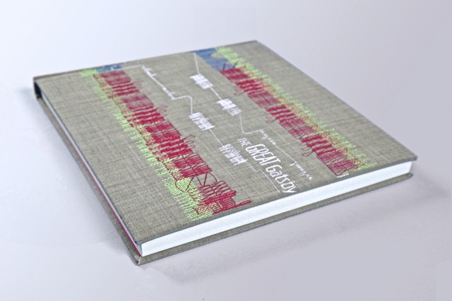
The Generative Gatsby – Vladimir V. Kuchinov, a typography designer who focuses on contextual narrative, created The Generative Gatsby: Jazzed Up Typography, a book whose words are used to represent big band arrangements from the Prohibition-era. The lovely computationally stitched cover originally caught my eye–I was somewhat disappointed that this wasn’t a sewing project! I enjoyed that this used the text itself to provide a context for its generative aspect.

The Feltron Reports – For several years Nicholas  Felton has compiled huge datasets of information about himself into annual reports. The reports are beautifully designed, conveying vast amounts of information with simplicity and strong color choices. They provide a compelling argument for the quantified self movement, in fact, Felton has founded Daytum, a site that allows users to collect and compile large datasets into graphs for public display. While incredibly visually appealing, in some cases I think that some of his design choices (especially light text on light backgrounds) make the understanding of the data more difficult.

Swetha Kannan – Looking outwards – 2

Unnamed Sound Sculpture

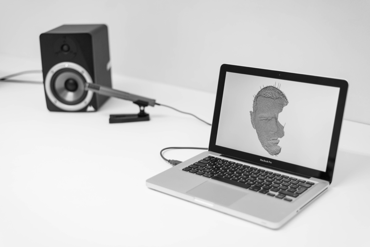
Daniel Franke - unnamed soundsculpture

“Unnamed Sound Sculpture” by Daniel Franke & Cedric Kiefer may be a piece that many of you have passed by as you were working on assignment four since it is one of the first few projects advertised on he processing home page. However, I would still like to give credit where it is due because this project was absolutely amazing to me. The way the sculpture was rendered seemed as if it was in an actual place and the sculpture itself seemed to take up more room than it’s location or even the computer screen would allow. The dance positions the sculpture posed in was striking because of the fragments of pixels seemingly falling of the subject. A few critiques I do have about the piece was that the video dramatized the piece so much so that I was not able to get away from the ‘computer’ feeling of the piece since the footage was so obviously edited. This may or may not be a good thing, however from reading the accompanying article, it looked to me as if they were focusing on the simplicity of the motion. therefore, it seemed illogical that their video featured flashing lights, revolving cameras, and thundering sounds.

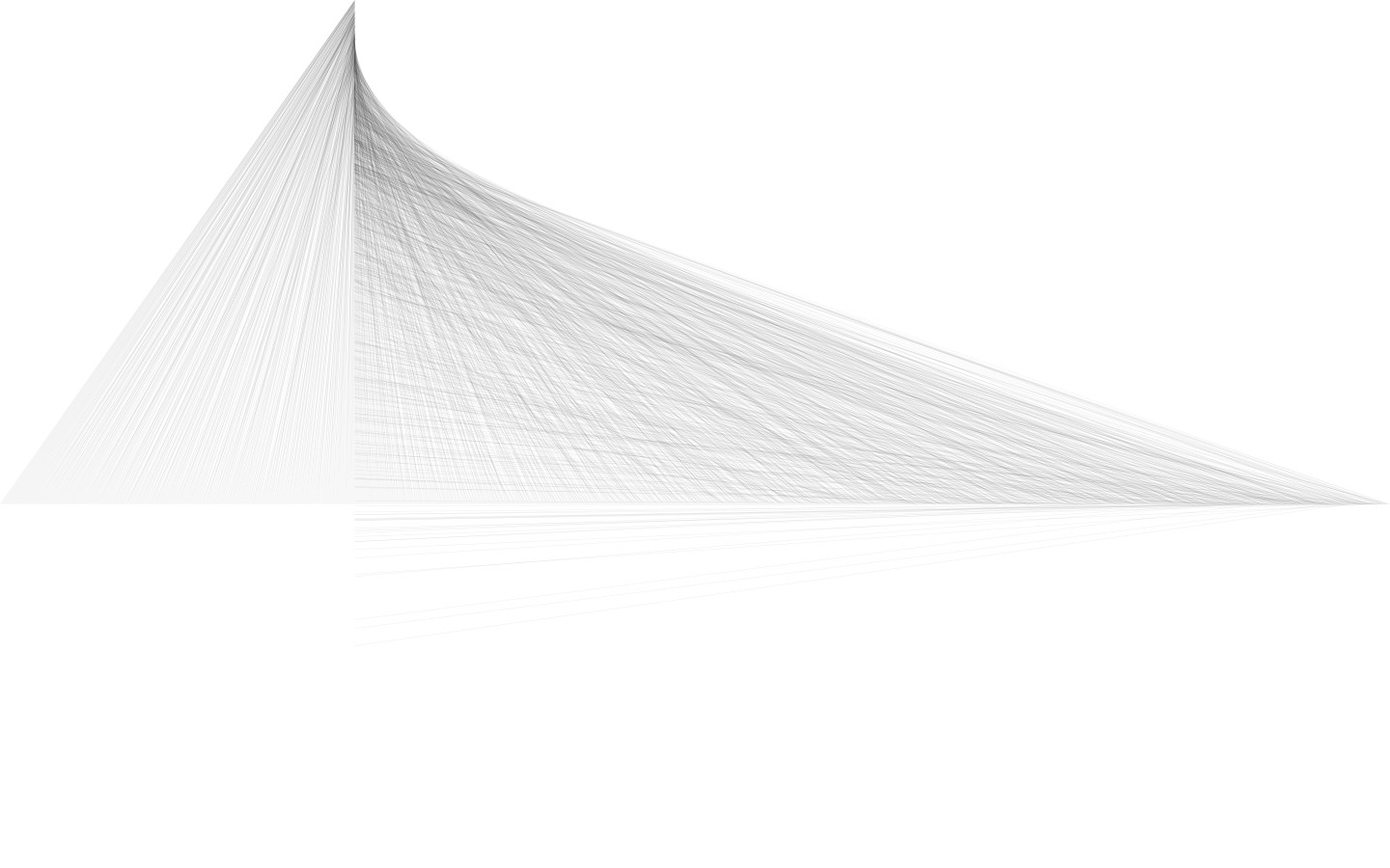
This composition by Miquel Parera Jaques interested me because it has a delicate nature about it. The lines are small and thin enough that the piece looks as though it was drawn with a pencil. Unlike the last piece, simplicity was really the founding principal for this piece and has been carried out very successfully. The piece also has a lot of depth to it since I find myself getting lost in the lines that all seem to point to the same line/tip.  The form created by the lines seems architectural and thus appears to pop off the page.


This “Kiss Controller” by Hye Yeon Nam was hilarious! The concept was so ridiculous but at the same very charming; by attaching a wire to her tongue, Nam was able to play a virtual bowling bowl game by kissing. The motions and speed of her tongue affect controls in the game and thus she is able to knock down pins. This project strongly reminded me of (some) Japanese restrooms in which there are games that you can play while peeing (the strength and duration and aim of it are the controllers). I doubt that the player of this kissing game can even see the screen very well with your partner right in front of you. These sort of projects are so ridiculous that one has to laugh; they are nothing short of charming.


Looking Outwards: Processing and Generativity

Discovery 1: “unnamed soundsculpture”

Artwork

Process Video

“unnamed soundsculpture” is a piece by Daniel Franke and Cedric Kiefer. The video was produced by onformative, a studio for generative design, which was co-founded by Kiefer, and Chopchop, a three person studio of which Franke is a member.

“unnamed soundsculpture” not only interested me, but fascinated and moved me. My first reaction was just to the aesthetics.—I find the piece itself to be truly beautiful. I love the movement and how the movement’s sound interplays with the music. I love the cinematography and the look of the particles in motion. It made me feel. Aside from my immediate reaction, I think this piece is so interesting because it uses computation and technology so artistically. The technology augments the dancer’s performance, and the generative movement-sound code makes the dance that much more expressive. The technique of capturing motion using a kinect, then using it for a piece—as raw material, also impresses me and makes me think about the possible uses for that technique.

Discovery 2: Firewall

Firewall is an interactive media installation created by Aaron Sherwood and Mike Allison, a master’s student at ITP at NYU. Aaron Sherwood is a musician and the Artist in Residence at the Tribeca Performing Arts Center in New York. They created the piece for the performance piece Mizaru.

The interface for the installation (which, to me, is more an instrument than an installation) is a large piece of spandex which people can brush their hands over or push into to affect the speed and volume of the music being played. Sherwood and Allison created the piece using Processing, Max/MSP, Arduino, and a Kinect. Their documentation doesn’t specify how exactly they used Processing, but my best guess is that they used it for the visuals—changing the projected lines on the spandex in response to data from the Kinect depth camera.

I find firewall interesting because of the depth of interaction it creates; even a brief interaction with the firewall is expressive for a user/viewer. I also enjoy the combination of touch (pressure on the fabric), sound, and light in the piece; I think each mode fits in well with the whole. Another aspect of this piece that interests me is how it plays with the definition music performance. I’ve played piano for most of my life, and performed in recitals. The way I always approached performance was to memorize my recital piece, then, once I could reliably play the right notes, to add some of myself to the piece, changing the way I played it subtly. What’s interesting about firewall is that it allows people to get to the point where they express themselves through the performance of a piece of music so quickly.

 Discovery 3: Kinograph

Kinograph is a project by Matthew Epler, a freelance technologist and artist. Kinograph is an open source project for digitization of old film strips, extracting both the picture and sound to digital media at high resolution. Kinograph uses Processing to stabilize the captured images—a pretty utilitarian use of the language.

Epler’s project interests me because while it is generative art, the code part of the art doesn’t take center stage. Kinograph does fall on the edge of generative art, to me, though. I think the concept, extending and refreshing cultural memory, is strong and artful and meaningful. However, the project is tricky because the film it’s digitizing isn’t really Epler’s art; it’s the project itself. To me, the way that this project generates art is by generating new experiences of people with old films. Aside from being on the edge of generative art/having a different take on it, I liked Kinograph because it seemed so well-engineered, using multiple open source libraries and manufacturing techniques economically to achieve Epler’s desired effect.

Written by Comments Off on Looking Outwards: Processing and Generativity Posted in LookingOutwards

Rachel-Looking Outwards-2

 photo InteractiveRootsStill_zps2d4b0e58.jpg
http://openprocessing.org/sketch/2920

Interactive Roots by Esteban Hufstedler generates patterns of root structures emanating from a central point, creating beautiful, two dimensional, radial structures in Processing. This work is highly engaging, and I enjoyed the many levels of interaction it provides. From color, speed, size and transparency, the work explores all permutations of the root pattern. This allows each use of Interactive Roots to be unique in experience, process, and result. The applicable changes to the form are simple, almost expected, and that lends the work a sense of simplicity that heightens the importance of each change and each form. The simplicity gives the work its whimsical feeling and each change to the setting gives whimsical form. This simplicity surprised me in visual effectiveness.


similar diversity

http://similardiversity.net/project/

Similar Diversity by Phillipp Steinweber and Andreas Koller visualizes the word traffic of five of the world’s sacred texts. The project uses Processing to connect word frequency and context among the books, showing the common ways humans describe their spirituality. The work is a comment on the absurdity of religious conflicts. I think the forms used in this visualization could take into account the various symbols of the religions. The way the words are connected gets the information across, but lends no content to the work. Color choice too, is important. I feel that color was used organizationally here, but not for content. Choosing colors that resonate with the beliefs of the faith, for example red for Christianity to symbolize the blood of Christ, could help to push the idea. Having these colors bleed into the connection lines and mingle with the colors of the other faiths would reinforce the point.

http://tomgerhardt.com/mudtub/

Tom Gerhardt’s Mud Tub uses Processing to allow the user control a computer with a vat of mud. The work reminds me of my childhood; Computers were these sacred clean objects and it was punishable by death if you even brought a glass of water near one. This work uses a childish material, mud, to fly in the face of that limitation. Mud is opposite of what society sees as an acceptable computer; it is dirty, shapeless, free, and associated with children. The mud gives the user a more organic experience, taking the pain out of the general sit and stare computer interface. I also enjoy the variety of games you can play with the mud, from “Drop the ball in the hole” to Tetris. The fun of this work is the combination of material and game choice, all childhood favorites of mine, creating an unexpected, simple experience that reconnects a user to his childhood.

Joanna – Lookingoutwards2

The Generative Gatsby is a design project in generative typography by Vladimir Kuchinov, it uses nine songs from swing-era musicians such as Ella Fitzgerald, Jelly Roll Morton, Cab Calloway, Count Basie, and more to influence the typographic layout of Fitzgerald’s text. “The algorithm I used transposes The Great Gatsby‘s content according to the attributes of the notes,” Kuchinov says.

This work is a nice piece where an analog medium is enhanced with digital tools. Typography meets processing. music is translated into fonts and letters.

“I have been carefully selected six typefaces for every single instrument. I did a very solid contextual research to fit the concept. For example, drums and percussions are represented by Remington Typewriter font, because this brand was extremely popular …” (Kuchinov in Huffpost, 8th September 2013)

Dave-LOOKINGOUTWARDS-2

The Stone Spray Project by Petr Novikov, Inder Shergill and Anna Kulik is a robot which generates sculptures from sand. The final products it creates look great, but the process of making them are even more mesmerizing. The way it moves seem almost human, and as it slowly carves out every detail, the sculpture­­­­­ grows out in an organic manner. Using sand as a medium is also intriguing, as I always thought of it as a flowing form instead of a solid state.

However, I do feel that if the robot can also make concrete sculptures rather than just generative forms alone, it would have more appeal to larger groups of people. Also I would have enjoyed a longer footage of the robot working.

Its use of sand as material to make 3D objects by a computer reminded me of Markus Kayser’s Solar Sinter Project, although Kayser melts the sand into glass before using it while The Stone Spray Object mixes the sand with substances to make it stabilize.

Oscillate by Daniel Sierra features threads vibrating to the sound of music. I have become a big fan of visualization, and this piece does it exceptionally well by having perfect sync between what is seen and what is heard, thus creating a powerful engrossing atmosphere. He also kept the animations fresh by having different viewpoints and by generating multiple effects, ranging from those similar to slivers of sand to fading flames. The heavier techno section in the middle of the video I feel is the weakest part, as it takes away the ambient atmosphere generated by the rest of the video. The visualization of music with threads and particles is similar to the lyrics video of Madness by Muse, however Oscillate uses a completely different kind of music and only uses abstract shapes instead of typography.

trailers_anemone by John Carpenter allows the audience to interact with an abstract form projected onto a wall. The movement and shape of the form caught my attention because of its color, its glow, and how it uses threads as much of its shape causes it to look electronic, or at least similar to some type of data visualization. But when it starts to move, it becomes organic, as the threads and lights start swimming in patterns reminiscent of schools of fish. I can just stare at its movements for days. However, the video is a bit short, and does not show all the interactive possibilities I would like to see, and I ended up longing for more details on the project. The lighted up organic forms moving as if though they are swimming is similar to Thatgamecompany’s Flow, although the presentation of Flow is very different from trailers_anemone which allows for more direct human interaction.

MichelleMa-LookingOutwards-2

I based my Looking Outwards subjects on the generative art I read about in Form + Code by Casey Reas, Chandler McWilliams, and LUST. Thanks for lending me the book, Golan!

Malwarez” by Alex Dragulescu (2007) analyzes the source code of malware and viruses and generates 3-D forms to model the information found in the codes. The forms almost resemble biological pathogens, and the artistic rendering of found patterns adds wonder and mystique to the subject matter. His concept of presenting invisible data into familiar, organismal is really amazing. On the other hand, the simulations might be more effective if the colors and the shapes were more imposing to instill a sense of threat in the viewer. I certainly feel the fact that only this artist could generate these pieces through his knowledge and experience with visualizing code. I can almost imagine his whole collection of works compiled into a visual encyclopedia about data.

In the piece “EPF:2003:V:A:997141“, Kenneth A. Huff incorporates the properties of prime numbers into each 3-D structure. According to his website, Huff is very knowledgeable in utilizing prime factors in math visualizations. And because I am not a mathematician, I cannot begin to fathom the elegance and beauty of the world derived in numbers. That’s why I really love how his piece shares his vision of the world. However, I think if he was trying to teach the viewers how essential and beautiful prime numbers can be, I think he could have made the visual impression more dramatic. I don’t mean that he has to make it flashy or colorful, but he could have channeled the voice of the piece from, “Look what numbers can do,” to “LOOK! THIS is the work of numbers!”

Hopefully that makes sense.

Being Not Truthful” by Ralph Ammer and Stefan Sagmeister (2006) is a really thoughtful and thought-provoking installation piece. When a person’s silhouette passes through the spiderweb projected on the screen, the web rips, but gradually mends together again. Immediately the viewer can figure out through the interaction that the piece represents a sort of fragility, and emulates how a spider continues to mend its web despite this fact. Their inspiration for the piece comes from how a maxims like the one written on the web are used despite how vulnerable it may be. Metaphors about fragility are far and wide, but I really like this piece because the interaction forces a viewer to acknowledge it. I would like to see different versions of this web in many places and in different contexts.

Ticha-LookingOutwards-2

silk

Silk by Yuri Vishnevsky

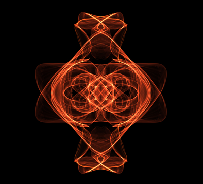
I was looking through some generative artwork for inspiration the other day and came across this beautiful piece called Silk. As the name suggests, the user selects a color and uses the mouse to ‘weave’ the silklike neon threads. The user also has the option to choose the degree of rotational symmetry, whether they would like the figure to be mirrored across the center, and whether they would like the figure to spiral towards the center.

While Silk is not anything revolutionary, it certainly holds a lot of aesthetic appeal and its use of musical ambience makes it both a visual and audial experience. However, what I find most appealing about the work is not in the visuals or the sound, but the way users can share their creations. In more conventional ‘art apps’ the sharing of results simply involves saving the image and uploading it to some social network site. In Silk, people can actually view the process involved in making the images – giving it an almost livestream-like feature. I only wish that the generation of the user-created images did not run so quickly, as I feel that this detracts from the meditative aspect of the program.


Content is Queen by Sergio Albiac

‘Content is Queen’ is an interesting mosaic of internet videos that combine to form a unique portrait of the Queen. I believe the charm of this project comes from the fact that, instead of using images to create just a picture of someone’s face, Albiac uses motional  images to create a dynamic form of portraiture.

One aspect I particularly like about this project is that each of the generated portraits have some semblance of the Queen’s face, but have just enough randomness and ‘artistic liberties’ for the viewer to see the content of the videos. There some images that show the Queen’s face in near-perfect clarity, and others that just barely resemble a face and are dominated by the videos. This I think, epitomizes the tension between monarchy and democracy – which is Albiac’s intent. With this particular kind of piece, it would be even more effective if he placed it in a certain location (like a place that has a lot of traditional portraits of the Queen) to further enhance the effect of  the work.

(on a side note – I also enjoyed Albiac’s Videorative Portrait of Randall Okita)


Fine Collection of Curious Sound Objects by Georg Reil 

Found this little gem in the Exhibition section of Processing’s site. The project is very true to its name indeed; the sounds produced by the objects are by no means conventional, and each give its object a unique history. Reil is able to effectively create a narrative for each of these commonplace items by giving them distinct – and unexpected – ways of interacting with the user. In doing so, he challenges the belief that objects are purely utilitarian tools and entices the viewer to rediscover each object’s function. While I think this work is already very poetic as it is, I only wish his descriptions of the items were even more cryptic – so as to allow the viewer to construct their own interpretation of an item’s history.

All aspects considered, this is quite an inspirational piece that makes me want to experiment with sound objects in the future.

MELANIE-LookingOutwards-2

Garden Of Eden // Rule 110 by Peter Curet

This is a case where title greatly affects how I interpret the visuals; I could see the garden, specifically the Garden of Eden, and kept projecting what I know of the story of Garden of Eden onto the visuals. The result is fascinating; these abstract shapes become narrative. It’s obvious in the beginning because the shapes form a garden of sorts, but as time goes on, the shapes become more and more abstract, and I continued to connect the concept of Eden to the shapes. The ending is worth watching, only because there were so many complex generative shapes before and then suddenly, it all gets quiet…

Midimals by Georg Reil

Creation of sound loops is pretty common, but the way Georg Reil used the visual interface to make it seem magical is really cool to me. I’m a sucker for the idea of generating visuals with just my hands, physically touching the materialized sound. It’s also unique to find beautiful visualization of such interface in the first place, and the freedom to create shapes that correspond to the loops is inspiring. I guess I really like technology disguised as magic. I just wish there was a better documentation of it.

unnamed soundsculpture by Daniel Franke and Cedric Kiefer

This was the first thing that popped up after I googled “sound sculpture,” so I presume it’s pretty famous? And rightly so. Although they do not mention it in the process, the documentation video shows that they used Processing, presumably for collecting and manipulating the movement data from Kinect. At first I wasn’t impressed, but as they started introducing dynamic camera angles and blackness, I became mesmerized by how fantastical it looked despite being a digital form. It almost looked like a weeping goddess, if I’m allowed to be that dramatic… I’ve always appreciated dancers and the artful contortions of the human body, but this makes me appreciate the sense of unreality dance can portray through technology. The constant afterimages gave the impression that there were often multiple people dancing together, and the imagery of gravity is powerful by the end of the piece. And it’s beautiful, especially when the dancer stops moving and the particles become static and shadowed. I just have one complaint: I wish it were more dynamic at some points, to keep the audience engaged and tickled. At times it suffers from the trap dance performances fall into: letting their audience go. Though, I wonder if that’s the fault of the dancer and not the algorithm?