rigatoni-LookingOutwards04

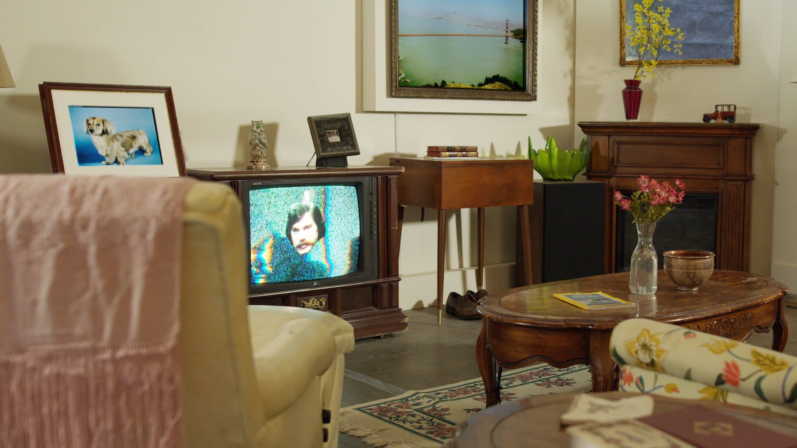
I looked at House Party, an arduino controlled room that utilizes household objects (lamps, shoes, tvs, etc) to create its own symphony.

I was surprised to see how much this project could get done with a modest amount of basic circuitry. Elements like the shoe tapping (which seemed to control both rotation and "tapping" with the same motor) was impressive to me. They used Logic Pro (the same DAW I have been using for years now) and fed it MIDI data from json files to get the sounds to play. I would like to do something similar with MIDI files, and go as far as assign all 127 values to some kind of response. For my automoton project I ended up doing something musical (Wilson, the drummer puppet) but I would like to go even further combining music with physical computing.

chewie-LookingOutwards04

After Deep Blue (ADB)

After Deep Blue (referencing the first chess computer to beat a world champion) focuses on the emotional connections we develop with computers. In these videos you can see how the snake-like robot seems to cuddle against the user in a convincingly organic way. Voice automation and the A.I. systems generating their words have been able to operate in more socially acceptable ways, catering to our perception of what natural language sounds like. Similarly, the features and nuances that make up tactile affection are seen reproduced in ADB aggregating into behavior that comes alive.

Because the piece is so simple and elegant, there's not much that I think would improve the overall experience. Different modes of activity would be interesting to see, for example the snake could get more or less hyperactive the more it's struggling to be touched or it could become fatigued. I would also like to see multiple snakes all snuggling together in a pile on the floor to see if that would create any interesting feedback-loop behavior.

There's a great blog post written by the creators about the influence the Deep Blue project had on this piece. Deep Blue in part made audiences realize computational advancement in relation to human function and ability. People wondered about what different human behaviors and processes could be replicated by computers to the point of allowing for seamless interaction. With ADB, rather than replicating a function as logical as playing chess, a much more real sensation - intimacy and affection - is exploited to make incredibly animalistic behaviors.


paukparl-LookingOutwards04

Installation with boxes - Zimoun

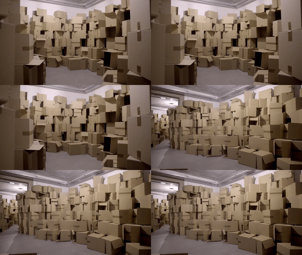
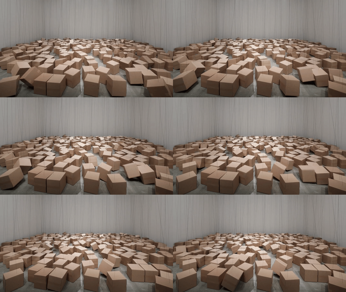
The architect Zimoun creates "architecturally-minded platforms of sound." Repetition and the sum scale of the artwork plays a key role here. In many of his works, subtle movements of various transducers add up to create a whole environment. In all of them, the installation is big enough to immerse the audience into the experience and simply overwhelm them. The experience might not be so exquisite with the repetition of large movements. I think the small changes happening in your peripheral vision would play a very big role.

The part I really like about these box installations is that their movements are exceptionally subtle. Also, a kind of personality is invested to these boxes as they jostle and bump into each other. One of the first thought that went off in my mind was that the boxes resemble the crowd, and I like that it reminds me of the world we're living in. And the boxes seem somewhat symbolic of consumerism, which pervades the modern society. But the boxes overall seem strangely naive.

A big takeaway from this would be that you don't need the latest technology to come up with great art.

weirdie-LookingOutwards04

Type Case

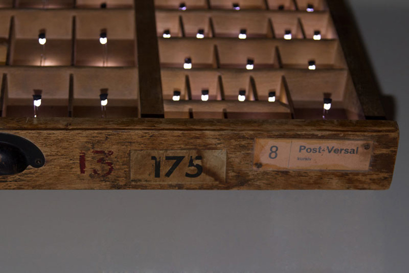
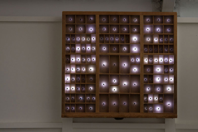
Type Case is a piece by Martin Bircher which uses 125 rectangular "pixels" that are created by setting an LED light in every section of a type case which was used to store letters for a printing press. Close up, it is impossible to tell that the lights turning on and off are showing anything more than random noise, but from a far distance viewers can see that the lights are actually forming text which is from recent headlines.

What I really enjoy about this piece is the necessity for it to be a physical work as it would not have anywhere near the same effect if it were to be, say, a program on a computer screen. It requires a certain degree attention and interactivity from the viewer. The idea of our ability to perceive or process an event based on our distance from it is a compelling one.

One thing I wonder is whether or not most people would be able to recognize the box as a type case, or be able to recognize that the words are headlines and not simply random text. It would be exciting if the headlines were updating in real-time as well. Bircher has also used Type Case to display images as well, but due to the limited pixels I don't find this to be as compelling.

Type Case from Martin Bircher on Vimeo.

airsun-LookingOutwards04

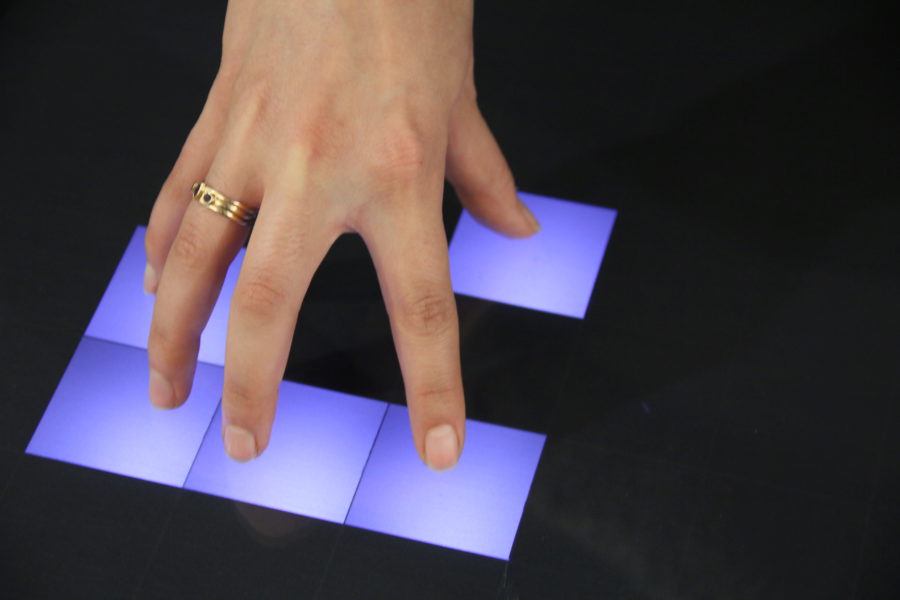
Multitouch (2010), designed and made by Amanda Ghassei, is a very elegant, clean designed, and interesting multitouch system. It interacts with fingers. When someone touches the glass surface, lights will be placed on the corresponding plane. Moreover, it will generate different sound effects or music tone when different squared surfaces were selected. The engineer behind this is briefly introduced on Ghassei's website. Multitouch was built based on the open source monome project. In order to generate a thin plane of light on the surface, the engineer uses a technique called Laser Light Plane. The work also uses an Arduino Uno scanner for determining the coordinates of the point(s) of contact. What attracts me the most about the project is the later versions of development. After making the Multitouch interacting with the hand, Ghassei places the work into new context and environment, e.g. before a museum or in nature. By placing them there, she let the context interact with Multitouch. It is really interesting to see the change in natural light and the corresponding subtle music. It challenges our conventional idea towards associating music with a specific setting and a mood. Seeing how technology/algorithm interprets different environment and to find a music tone for them is very fresh and thoughtful.


shuann-LookingOutwards04

I think the idea of a robot that gradually builds itself is an extremely interesting! Not only was the fiberbot able to construct itself over time, it was also creating very organic shapes that one would probably find in nature, despite the fact that itself was a pertly mechanic object. The bot is placed in to the nature (on a outdoor grass field, completely exposed to the outside environment) instead of being displayed in a museum/lab setting which I see as an artistic choice. It defiantly adds to the conversation happening between the artificial an the natural, which is what really caught my eyes. Moreover, I think this piece really stands out from the other ones that I have looked at so far because it can be almost seen as a performance work that last over a few days. It is not only the final structural form that was the art work but more so the slow process of continuous self-construction in the field.

Link to project: https://www.creativeapplications.net/robotics/fiberbots-framework-for-cooperative-swarm-robotic-manufacturing/

casher-LookingOutwards04

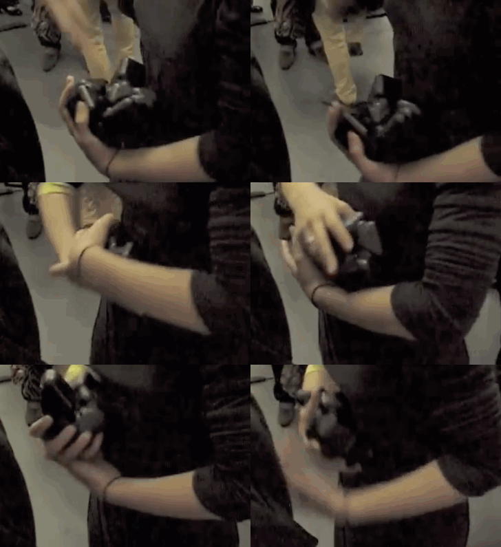
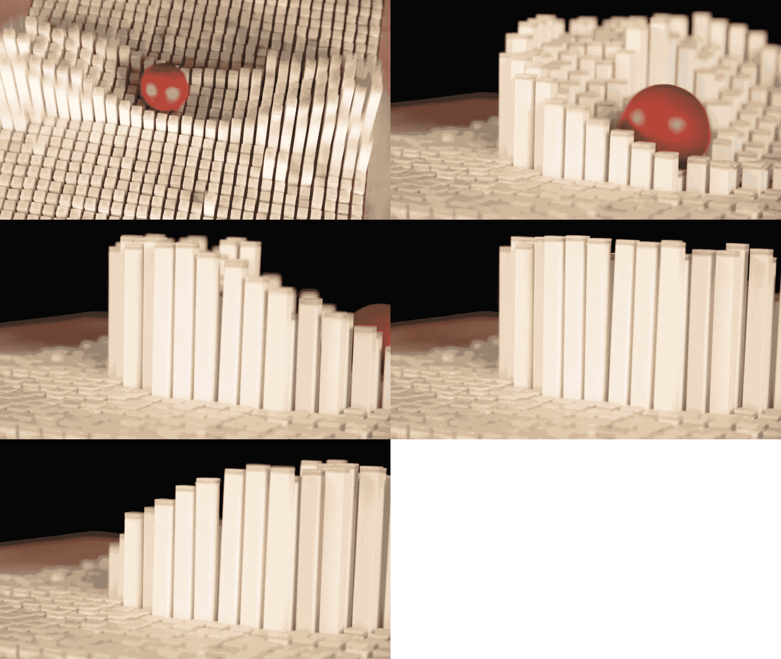
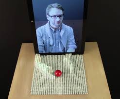
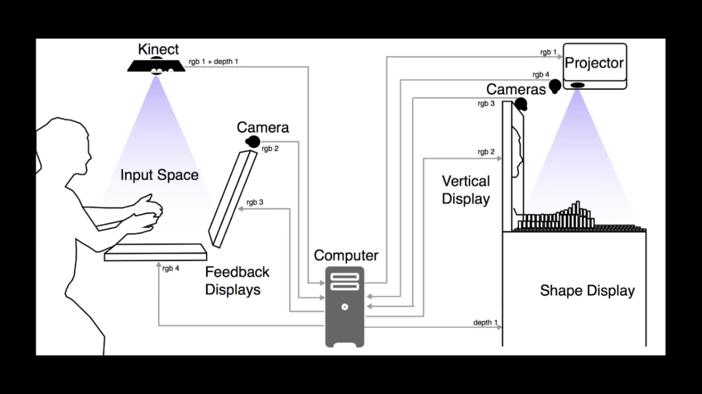
Physical Telepresence is a project by MIT's Tangible Media group from 2014. A Kinect is hung above one platform and captures a bird's eye view of various hand movements made by the user, and the program transforms that data into a physical and almost graphical representation of your hands, creating an accurate "topography" of the distance between your hands and the platform with white pegs. I am interested in this project because I actually got to experience it when I went to the MIT Media Lab's 30th Anniversary celebration (both of my parents went to the Media Lab for grad school). At the time I didn't know I would become so excited about these kinds of works, and that it was considered art! I think the design of Telepresence is especially well done -- it has a really nice aspect of simplicity. This is the kind of work I aspire to make as an artist -- I really appreciate how that with a good eye and by using sensors, you can take natural, fluid aspects of the world and visualize it in a totally nuanced way. And the interactive component is inspiring as well. I love creating art that allows the viewer/user to have a personal experience with it, as it allows them to think deeper about the meaning of the piece. I am excited to see what kinds of visualization this leads to.

nerual-LookingOutwards04

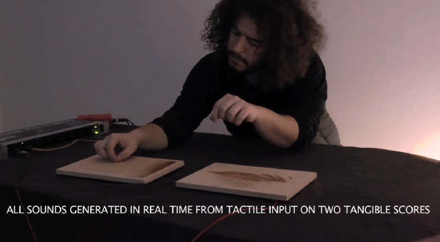
I really like this "Tangible Scores" project by Enrique Tomas, a PhD student at the University of Art and Design of Linz (at the time presumably). It is a tool for making music essentially, featuring a wood board with scores on it in various shapes, such as a scribble, or a series of parallel lines. A program senses the user's touch and gestures across the augmented surface, and translates it to sound. The actual mechanics of the project are very, very complicated (there is a paper explaining the design and concept in more depth).

I love when the human mind sees meaning in abstract patterns(such as a series of lines looking like instrument strings), and art and technology allows us to experience those imaginative thoughts for real(strumming your finger across it actually creates a strumming sound). And I find the combination of tactile, visual, and sonic elements particularly interesting, since you can essentially see and touch the musical forms created from it(because the musical forms were created from these visual and tactile forms to begin with).

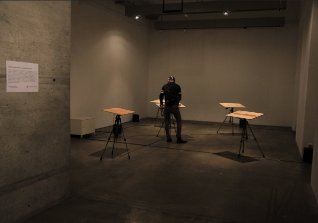
What is somewhat off-putting about the project is the contrast between the way it is demonstrated in the Vimeo video and the way it was displayed in a gallery. It invites a very different kind of interaction, where it seems like you would feel more like you're making sounds than making music. Something about the gallery setting, despite being immersive, is rather empty and unwelcoming.

Vimeo video still of Enrique performing
Gallery showing

chaine-LookingOutwards04

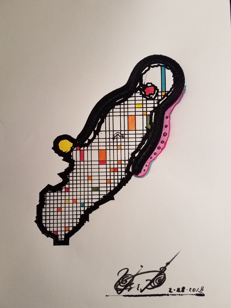
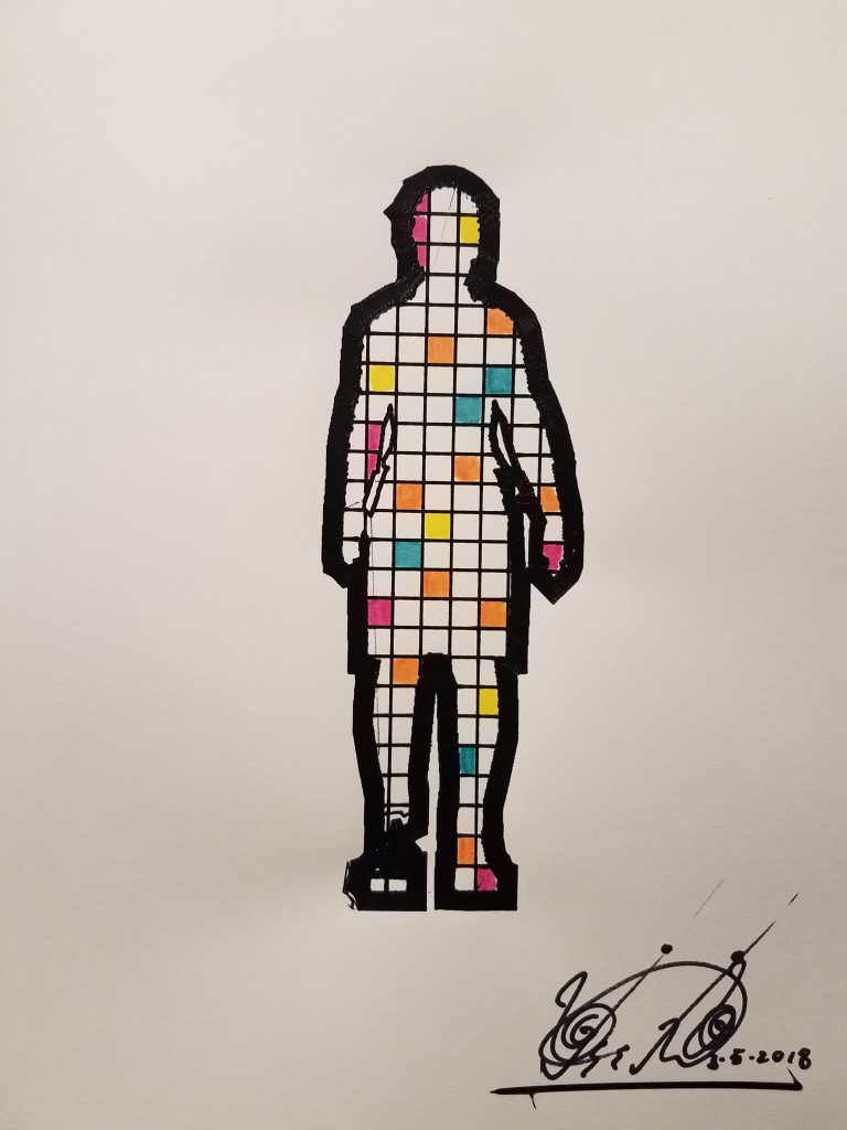
Machine Drawings by Ken Rinaldo is a series of drawings that were created from 3D models that were compressed to be nearly 2D and drawn with a rapidly prototyping printer robot. The drawings are then hand painted and embellished. What interested me the most about this piece was the relationship between chaos and order. While the printer robot does its best in copying things perfectly, there are still unknown variables causing machine flaws that are sometimes beautiful, although unplanned. This clash of media makes for some extremely abstract looking and vaguely familiar subjects. The person's outline is very distinct and unmistakable, but when other factors come into play, such as someone's clubbed foot, the drawing seems to draw that feature out way more in an interesting way. In some way, I would like to see how the project would have looked if it had entirely been 3D, but I'm glad overall that the work was compressed into being 2D although it was originally from 3D models. That was the only way to have created such specific and abstract drawings.

dinkolas-LookingOutwards04

This is Zimoun's untitled work from 2016 consisting of 317 DC motors, paper bags, and a shipping container. The interior of the container is covered with crinkling paper bags, and lit by a single light bulb hanging from the center of the ceiling. The walls are colored the same as the bags, and the crinkling is produced by simple rotating motors inside the bags. The work was displayed publicly, with the shipping container suspended above the ground with a hole in its bottom so that viewers could duck into the space.

The materials are simple, but the craft is very professional with no glaring seams between surfaces and a clear unified aesthetic. The mechanics of the project are hidden by the paper bags, but they are intentionally unambiguous, leaving the viewer with very little to ponder besides the exploration of how the space makes them feel. There is no artist statement, no explanation of "meaning," just the artwork. This simplicity forces the viewer to confront themselves more than anything. It's difficult to pull that effect off, because you must capture attention, but not occupy the entire consciousness of the viewer. That's why I think architectural spaces are particularly well equipped for such an effect: they surround the viewer, but are still read as a background.

Zimoun's body of work consists of many sound spaces, often taking up entire rooms and surrounding viewers. What makes this particular piece unique is the way that the viewer enters the space. The fact that the sound is subtle enough and that the room is well enough insulated makes the piece a complete mystery from the outside. Usually Zimoun's pieces can be approached gradually, but this one gives no hints as to what's inside, and essentially transports passersby into an entirely new domain. That's why this is my favorite one of Zimoun's works. I find the notion of unexpected interiors very appealing.