nerual-LookingOutwards02

This project by Melanie Hoff is called "15,000 Volts", showcased in 2015. She hooks a a few alligator clips to  a sheet of wood, and sends (presumably) 15,000 volts through them, letting the electricity generate branching patterns as it find its way through the trees veins. I thought it was interesting because the action of creating it was very simple(just sending ludicrous amounts of electricity through wood), and it was an application of the spirit of generative art to a traditional or craftsman kind of material.  Looking at there other works, this doesn't seem to fit in with their style and interests, but I assume the call back to old craftsmanship, with the sepia tones and material itself, was intentional.

In this project, the algorithm or computer is nature, which means surrendering even more control over what is created. Part of appreciating the work is seeing it be created too. You see the rate at which the branches grow. Who grows first, and in what direction? And eventually some branches thicken as the wood essentially melts. There was an attempt to exercise control in intentionally spacing the clips out, and probably picking out the certain type of wood. For the most part it's a kind of predictable randomness; you know what the general shape looks like, but the subtitles are much more difficult to predict.

Later extensions of this project involve non-conductive materials which force the branches into more specific shapes, using the randomness more for texture than as the main feature.

chromsan-LookingOutwards02

This is a project by Marcin Ignac entitled "City Icon" from 2012. It's a generative city simulation with a variety of randomly created systems. Their interactions create a dynamic and constantly changing view of an imaginary city. I like the balance between the order of a city and the randomness in the direction that its parts take. How the water flows through and energy sources appear is fairly random, but what's impressive is that it is still is identifiable as a city, like you might see from an airplane above when flying at night. The generation transforms when it becomes a series of cells that make up a living organism or a collection of energy sources. I imagine there was quite a bit of pseudo-random number generation involved in making this project, as its parts seem to relate in a nice way.

Original source. 

rigatoni-LookingOutwards02

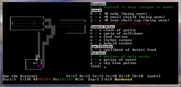
Rogue (1980) is the progenitor of a PCG genre known as "Rogue-like". A player (denoted typically with an '@' character) traverses the floors of a procedurally generated 2D map, navigating obstacles, traps and enemies to get to the bottom. The player has a limited amount of food that may be replenished by looting, but each move in this turn-based tile game costs food; to venture further into the floors is to risk starvation and the brutal perma-death mechanic of this game.

Rogue, and its spin-off Nethack, was my first experience with games that run in the command line. I can only imagine the complexity that co-creators Michael Toy and Glenn Wichman faced as they developed this game for Unix, using a very nascent graphics library known as curses (developed by Ken Arnold. They also were restricted to only using ASCII character to represent their procedurally generated world. Rogue ended up being included in a popular distribution to the internet's predecessor, ARPANET.

"Rogue is the biggest waste of CPU cycles in history." --Denis Ritchie

The map generation algorithm used in Rogue, and consequently many titles in the "rogue-like" genre, follows the following instructions
1) Divide the map into 3x2 cells
2) Choose to/not to draw a room within each cell
3) Use a "drunken walk" to connect the rooms

Prior to Rogue, most adventure games lacked replay value and complexity. Toy and Wichman realized this, and came up with two clever ways to deal with effective complexity, the first of course being the procedural map generation and mob placement algorithm. The other one being "perma-death" was a controversial topic during development. I would argue the "perma-death" mechanic aids the effective complexity of Rogue since the player is unlikely to come across similar levels given the persistent consequences of death.

Here's a video of one of my favorite Youtubers, Scott Manley, playing the original Rogue game.

ocannoli-LookingOutwards02

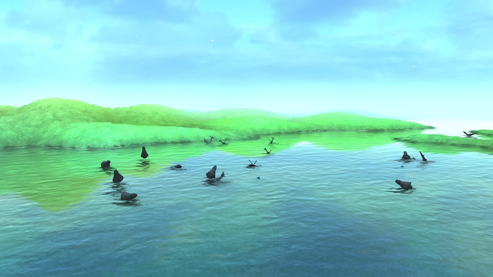
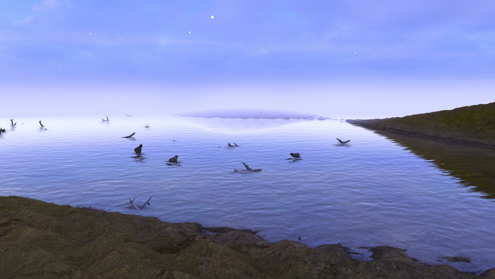
Roger Water's project "A Journey into Hyperland" is a 360 VR live experience where the user can fly around an environment and launch items and creatures in order to interact. An aspect of this piece that is so fascinating is that many aspects of the environment such as shape, colors, mountain and marine shape are all determined in real time by the music of band Niagra. I admire the simplicity and elegance of the execution of the design but I also admire the concept of a generative environment spawning from music. Considering that the program reacts differently based on time and location of the user, I suppose that the algorithm behind the work was definitely heavily guided by the idea of generativity rather than it being added later or as an extra experiment. I believe Water did a pretty great job having an effective complexity considering a random environment that looks very clean yet is powered by a song.

Click here to experience his project

nixel-LookingOutwards02

I've chosen to talk about a fellow CMU student's project for this Looking Outwards report. The project, Hermit, was made by Lingdong Huang for his 15-112 term project in 2015 and is fairly well known throughout the school. It is a procedurally generated interactive environment.

I like this work because I think it's elegant and sophisticated, especially considering the constraints under which it was made (python, 112 term project deadlines).  It is aesthetically pleasing, and it has a narrative. The elements of the project all work together to create something that is able to give the viewer a peaceful feeling.

I did open up the code for the project, but I don't think I'm well versed enough in generative art to know what each part of the program is doing. I do know that it is recursive at its root, but I don't know how he used that to get the generative result achieved.

In terms of effective complexity, I would say it leans more on the side of order rather than chaos. The project is predictable and clean but still interesting in the many possibilities it offers in terms of interaction and uniquely generated landscapes and creatures.

Check it out here:

Sepho – LookingOutwards01


I have to be honest, prior to this class I haven't had any prior exposure to a lot of interactive and computational art outside of video-games, and one game that I have played really stands out to me as doing something profound and interesting with interaction. That game is Dark Souls III, made by From Software on their own engine and funded by Sony. To me, what really stood out about this game was their ability to really use interactivity as its own medium to express ideas and evoke feelings from the player instead of just using it as a device to drive the story. Dark souls as a game is a convoluted, labyrinthine with looming, powerful obstacles  and large hyper-Gothic architecture. Everything from the music to the character design and color pallet is meant to make the player feel small, confused, lost and alone and the game play perfectly echoes those feelings. The level design collapses back on itself and can be frustrating to navigate and everything about combat and exploration can be completely daunting to some. It is the first game I have seen that wasn't designed just to be enjoyable, but to convey ideas and emotions about the world using  the medium of interactivity instead of exposition, and this is where I think interactive art thrives and is truly unique.

nerual-lookingoutwards01

Hermit

"A man. A horse. A nature." By Lingdong Huang

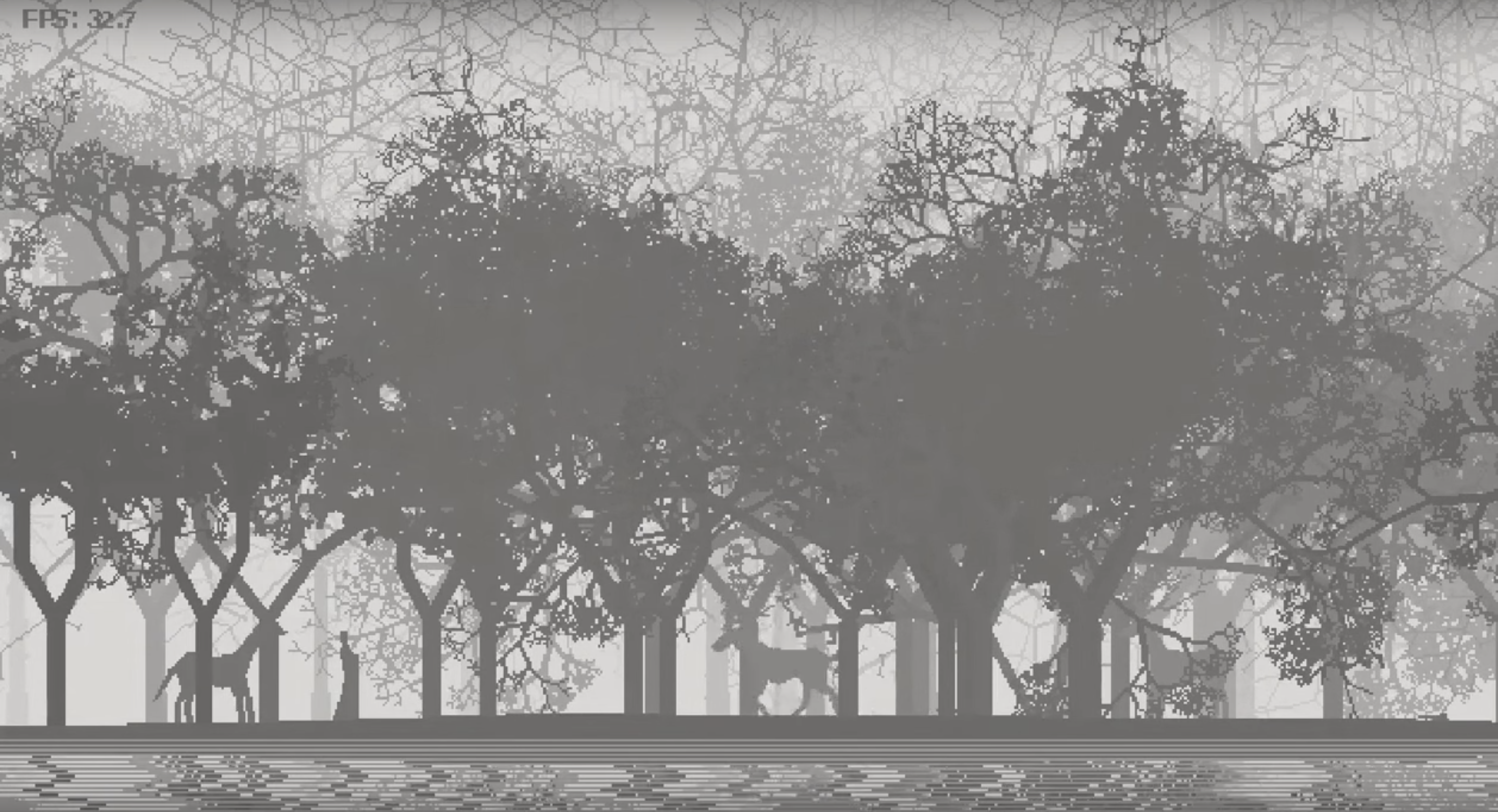
This Python game was a term project for the Fall 2015 15-112 course here at CMU. It seems like most of it was made from scratch, from the procedural generation, use of its own internal time or some global time for the night/day transitions, and all the animations.

I really admire the commitment to making the animations from scratch, because I find that a lot of projects that make use of borrowed material don't have a very polished, cohesive feeling to it. And of course it must have been a lot of work. I also admire the way they used their limitations to their advantage--it seems like they used pixel art to keep procedural generation and game rendering smooth, but they did it in a way that looks very impressive and has a unique style, like an 8-bit zen journey. It makes me want to try to create something with procedural generation, and try applying retro looking pixel art to other unexpected things.

GitHub Repo

paukparl-LookingOutwards01

Slow Hot Computer - Sam Lavigne

"Slow Hot Computer is a website that makes your computer run slow and hot. Use it at work to decrease your productivity."
http://slowhotcomputer.com

I love introducing this work to my friends in design school. You can surprisingly see a lot of art-phobic people in design departments, and it can be hard at times to successfully introduce a work that you like. But Slow Hot Computer has been a constant success. A friend of mine recently got into Samsung and bragged to me about how he's been spreading the site around to his coworkers.

I very much admire the transcendent experience you get from some types of artworks. And this one doesn't give you that. But it speaks to you immediately. When I show this work to people, most of them initially have a good laugh, and agree that Sam Lavigne is a genius. The main factors in play here are:

1. Humor
2. Succinctness
3. Narrative

The first two are quite obvious. This simple artifact also speaks much more about itself than it initially appears to. And that process of revelation happens pretty quick and easily, giving you a pleasant emotional burst, or that "aha" moment. I identify this quality as having a narrative.

Spoon-LookingOutwards01

Emoto - by Gautam Bose, Marisa Lu, Lucas Ochoa

Emoto is an application and hardware attachment for a smartphone that turns the phone into an interactive, moving robot that can communicate.

I am particularly drawn to the way that the robot uses eyes and physical movements to express emotions and communicate. It extends interactions with the smartphone into a much more human space, turning the device into something more like a pet. It also takes the Amazon Echo approach to device interaction (talking and no touching), but places it into a much more personal shell.

Creating the project definitely involved the creation of custom scripts, as the phone need to be able to interface with the arm it sits on. There is likely some inclusion of non-original software, as well, although I am not totally sure.

The creators were likely inspired by Amazon Echo and other home assistant AIs. The expressive eyes and motion of the robot were likely inspired by the movie Wall-E, which manages to get an incredibly high degree of expressiveness simply with moving eyes and physical movement.

The project provides a more interesting interaction than products like the Echo, while not losing a promise of any of the functionality. I'm not sure if the creators have any intention of continuing the project, but if they did, I could see it providing a better way to interact emotionally with the smartphone.

The website for the project can be found here: emotoai.com

nannon-LookingOutwards-01


Deus Ex Machina

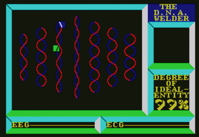
Last year, I came across this book Soft & Cuddly, in which Jared Kobek talks about his experience playing his first bootleg video games on a ZX Spectrum. I went home, spent the next few days googling this amazingly intriguing, but now mostly obsolete, system, and found out about a specific game called Deus Ex Machina.

Before getting into DEM specifically, I wanted to mention that I became momentarily obsessed with ZX Spectrum--as someone who's never really played that many video games, I was intrigued by how much had been done by such minimal engineering (relative to today). The artwork was so communicative with just 6 neon bright colors, and the music, as well as creative, unique storytelling was clearly industry-changing (creating?).

Image result for deus ex machina zx spectrum gif

Deux Ex Machina was made in the time when "video game" was still being defined--thus, it functions less as a playable game, and more of an interactive narrative. What inspires most about this game is that it pushed the boundaries of its time by focusing on the narrative and executing that through syncing an audio tape that the player has to pause at critical points throughout. In today's perspective (and even back then), the gameplay is actually quite boring, since you don't actually need to do anything. However, I believe there have been remake(s) of the game since then that are more player-oriented.

The creator of the project, Mel Croucher, had already been known at the time to be quite innovative. He had already had other more successful games under his belt, but felt that the industry over all was "derivative" and that the "concepts were all stale".