In the fall of last year I went to my first lecture series at CMU and to see Ian Cheng it really inspired me. I specifically enjoyed his work Emissaries. Emissaries for me was really interesting because I was really able to see the artist and his style in his work beyond the 3D models and textures done by him. The movement and behavior of these kind of microcosms just had a general "brush stroke" to them almost that I thought was very dreamy and unique and in the same way a little haunting. Additionally, all of his pieces were up for an extremely long time, on display but not tangible the entire time. This made me feel like i was really watching this tiny world grow and develop in front of my eyes.

Category: LookingOutwards
yalbert-LookingOutwards02
microsurface video from Maayan Albert on Vimeo.
Title of Work: Microsurface
Artist: AlteredQualia
Link
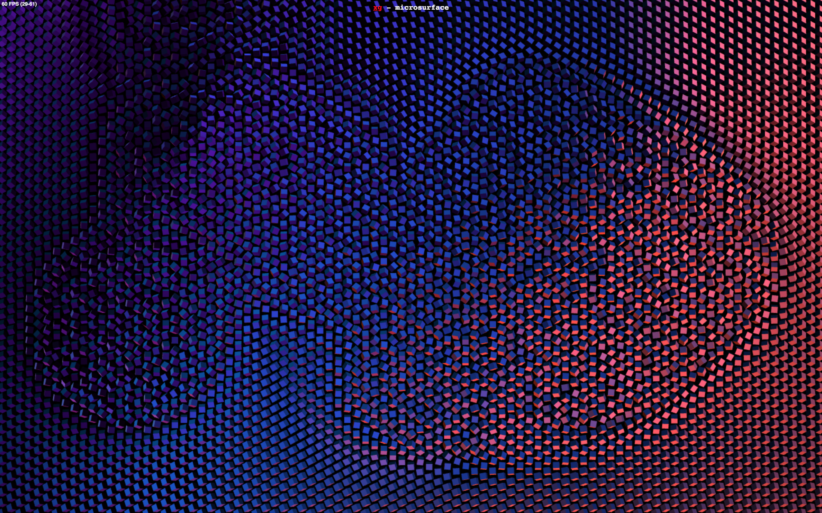
This is a generative art project that features a series of multicolored cubes that rotate when you move over them. I admire how engaging the work is and how the individual cubes form a larger pattern. I suppose that this algorithm simply generates many three dimensional cubes that are programmed to rotate in response to the mouse. Some easing function is probably involved in the motion and the colors are likely generated by perlin noise or some similar function. I admire how organic the motion feels and how it is juxtaposed by the technological modernity implied by the colors and medium.
harsh-LookingOutwards02

Ars (Rockheim) - Feb 2012
This project by Marius Watz particularly caught my eye. It's a generative video for the LED media facade of Norway's national museum of pop&rock. What makes it particularly compelling for me (as may be painfully obvious) is its direct link to architecture. I've rarely seen generative art being linked to built architecture before, and this one is particularly compelling. Not only because of the striking image it makes, but also because of the algorithm that generated it. It looks like Watz used a 2-D ribbon explosion (for the lack of a better word) algorithm in this project - which he then mapped onto the 3-D facade. The 2-D image has a certain animated quality about it which I think is partly the result of some stochastic process. This, combined with the multitude and composition of colors, makes the image very aesthetically pleasing to me - which then directly impacts the architecture.

dinkolas-LookingOutwards02
Michael Hansemeyer's Digital Grotesque II is an eleven and a half foot tall, 3D printed sandstone structure which was modeled using generative architectural algorithms. In topology, a cube and a sphere are considered the same object, however a torus (donut) is not. The algorithm that designed this piece can start out with a topological sphere, and continue to add holes and loops indefinitely, so as to create any shape. The algorithm was incentivised to create stimulating structures through crowd sourced feedback in several cycles, each more fine-tuned than the last.
I like this method because it puts most of the hard work in the beginning -designing the algorithm- and then allows the artist to become curator. Thus the sensibilities of the artist are very directly present in the artwork, because the artist serves as the reward function. And in this case, there were hundreds of people giving feedback to the computer, which even further complicates the notion of authorship for generative artwork. I would say that the effective complexity of the piece is a little past the complexity of fractals, because it shares a fractal aesthetic, but the rules of its creation are far more complex.
http://www.michael-hansmeyer.com/digital-grotesque-II

weirdie-LookingOutwards02
Politics of Power by automato
Politics of Power is an interactive installation piece that uses different "models" of plugs - Model D, M, and T - to simulate different ideological structures in the politics of networks by using different algorithms to distribute power between the lights which are plugged in. For example, in Model M, power is distributed hierarchically, where the topmost light gets the most power, and the bottom row gets very little. The "monarch" may randomly die, but this does not give any more power to those that were beneath it.
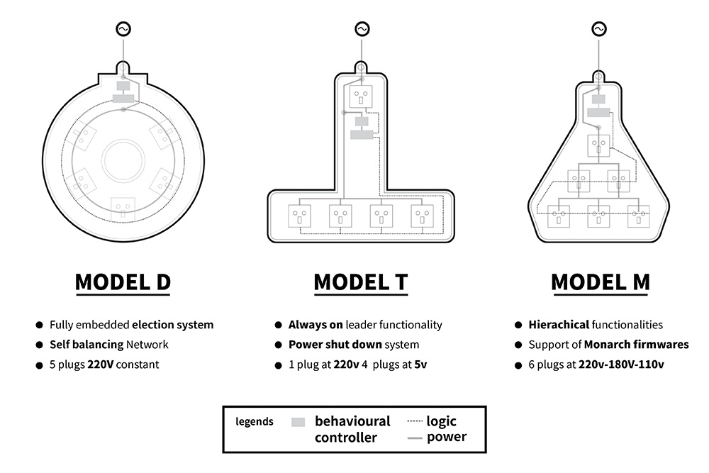
I was intrigued by this project because it played with a dual meaning of the word "power" and was able to convey such a complex issue in a simple and entertaining way. I think this project alludes to a greater link between generative art and sculpture, one that can react to viewers and change its behavior accordingly. To take this piece even further, I think it would be exciting to be able to combine different hierarchical structures and see how they interact with one another - how a monarchy influences a democracy and the vying for power between them.
The artists behind automato are Simone Rebaudengo, Matthieu Cherubini, Saurabh Datta and Lorenzo Romagnoli. Their work often deals with the ethics of technology, and the idea of how technology can be used to reflect human ethics.

chaine-LookingOutwards02
"Amoeba Dance" by Memo Akten is an interactive sound-reactive installation which features an amoeba-like 3D life form responding to sound in real time. Although the year of creation is ambiguous, a video of the dance was published by Akten in March 2008. I really admire the fact that this project is happening in real-time and it can be a continuous life form until powered off. "Amoeba Dance" is known to use 1ch HD video, a microphone, and custom software.

Although the methods of its algorithmic creations are unknown, I can suppose that Akten played around a lot with geometrics and reflections. In the artist's own words, this was an "exploration of abstract anthropomorphism and unconventional computer generated visuals and 3D aesthetics." Throughout the amoeba's transformations, it still has a sense of balance and likeness even while rotating and changing shape. It's movements, while sometimes rigid and seemingly unpredictable, are actually just following the sound patterns. Loud noises jerk the amoeba forward while it has a constant, slower rotation it follows. Therefore, I would place this piece nearer to being balanced. It moves and transforms in a way that is predictable--less dictated by chaos.
Link to dance below:
lass-LookingOutwards02

For this Looking Outwards, I am focusing on the work of Glen Marshall. When browsing his gallery, I was immediately drawn to his music video for Clouds in Cloudless Skies (2014). Honestly, I think this is just because I really like cubes and squares. The music video shows travel through an infinite world, where cubes are constantly being generated. The generation of these cubes is different in each scene of the music video. I appreciate this because each scene has a different quality to it--in some scenes, cubes are disappearing and reappearing, and in others they are constantly being distorted. I think that the choice to have a theme between these scenes, yet make them distinct from each other, makes it more believable as a "world". Each scene follows a theme, yet they show different aspects of life with different generative methods. It is clear that Marshall used a large variety of algorithms to create this work.
As for effective complexity, it is clear that the cube shapes have a high amount of order. They are all perfect cubes of the same size that tessellate perfectly. However, there is a randomness in their patterns of creation and movement that makes it so believable as a living world.
breep-LookingOutwards02

I decided to talk about The Binding Of Isaac as my choice of generative art, mostly because its one of the few generated games that I have found myself play over and over and over again, and with my general propensity to not replay games I find this significant to me.
The game follows the story of Isaac, a young boy whose mother is asked by God to sacrifice him as a test of her faith. Upon trying to murder him, Isaac flees to their basement where he must fight for his life against a cohort of monster's and manifestations of traditionally evil elements that faith challenges. It is this element that I so admire about this work, the complete freedom to enjoy it's gameplay or read into the dense subplot about conflicts over religion and how evil manifests itself within the stereotypes we associate with certain qualities of character (eg Greed, Envy etc).

The floors are generated from a library of rooms, with certain fixed rooms (like the starting room and the boss fight room) acting as cruxes for the rest of the rooms. What makes the game so replay are the endless combinations of items, enemies and rooms which makes every individual room a unique experience, as well as each instance of the game. The system as a whole is very ordered, as multiple replays will make apparent, but its the chaotic nature of every individual room that really makes the game. It was heavily inspired by the first Legend of Zelda, with the gameplay following a very similar format. The art style of the game stands bold as well, with the combination of the algorithm and the design of the rooms combining to build the overall experience.
Creation: Edmund McMillen and Florian Himsl, initially released in 2011, with a remake (The Binding of Isaac: Rebirth) in 2014
casher-LookingOutwards02
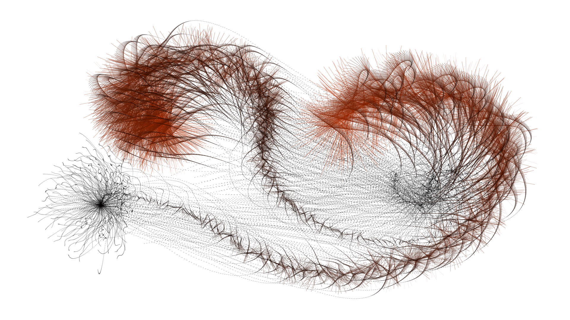
I have chosen to look at Tentasho (2016), a work of Lia, a generative software artist based in Austria. It is a procedural installation on a touchscreen, and it can either be interactive, where the user touches the screen to drag a path in the application, or it is automatic (and completely generative) when there is no user and the application draws paths itself. These paths are randomly calculated but follow a specific algorithm that creates "tentacle"-like splines coming off the main spline. The drawings end up looking similar to caterpillars, or like some kind of many-legged creatures.
As mentioned in the description on the main website, I too appreciate the minimalist design. There are only three colors, and every image only consists of lines on a white background. I can tell that Lia has a good eye for clean design and aesthetics. It gives the piece a sense of simplicity. Therefore, I would say that it has a moderate amount of effective complexity -- the lines follow a general order, or what seems to be algorithmic "rules," but the paths in total are somewhat disordered. I suppose that the algorithm simultaneously generates the main center line and the smaller spline lines as the path gets larger, but the length limit of the splines gets smaller as the path is drawn.
https://www.liaworks.com/theprojects/tentasho/
airsun-LookingOutwards02
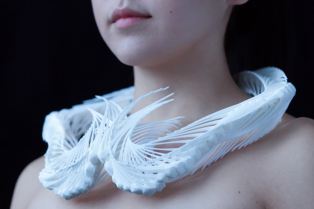
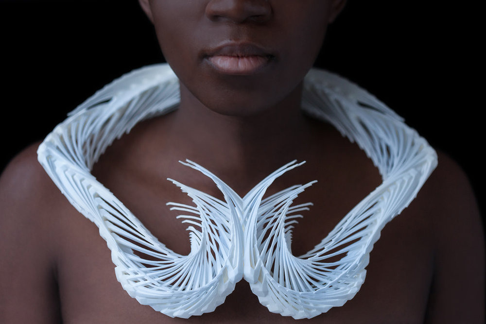
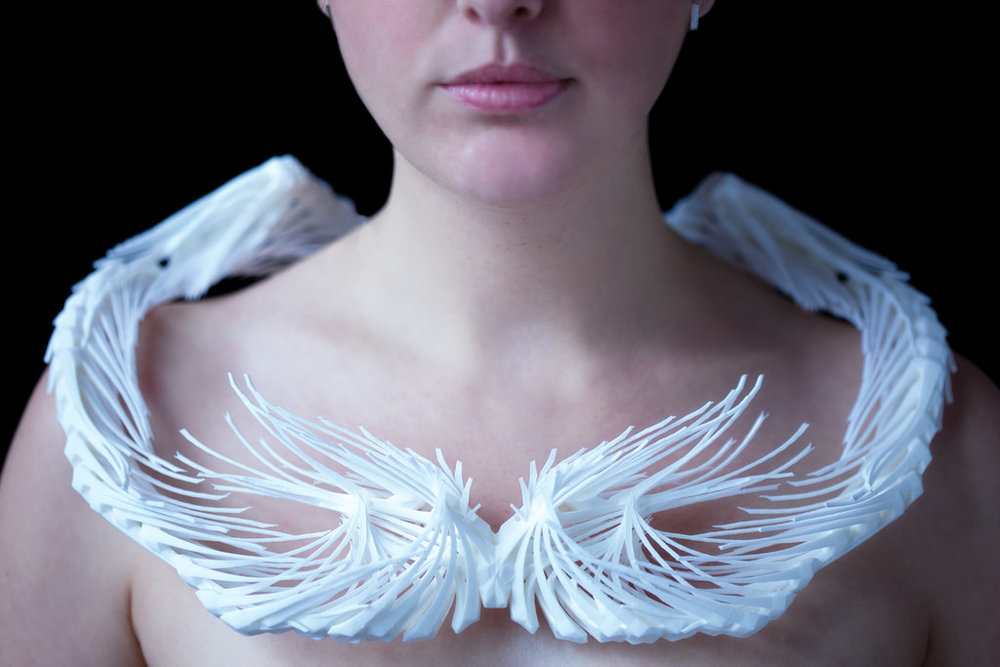
Reverb is done by Madeline Gannon. It is a context-aware 3D modeling environment that lets users design ready-to-print wearables around their own body. One thing I admire the most about this project is the dynamic it creates, both in the transformation from digital design to physical products and the evolvement from the living squid, producing random activity, to patterns that are aesthetically pleasing. Because the work is all generated from a virtual squid, it leaves this complexity of dynamic that the creator can play with the squid around the neck of a person, and leave this trace in various ways. The modeling interface uses a three-phase workflow, from 3D scanning to 3D modeling to 3D printing. First of all, it starts with the scanning phase, where it imports the physical context into the virtual environment. Then, the physical space is translated to a three-dimensional point cloud. The modeling phase will create the expressive digital form through different gestures in the scanned context. The printing phase will translate this digital geometry into physical matter.
Looking at the collar studies, different versions with their elegant curves and intersections all show Madeline Gannon's artistic sensibilities. It also involves effective complexity, combining both elements of order from the regularity and logic in the complex geometries around the 3D scanned context and elements of disorder from the user interaction and manipulation of the virtual squid.
