shuann-LookingOutwards02

Sorry I just realize I did not publish this properly. 🙁

Link to the work: http://www.av-controls.com/#/lull/


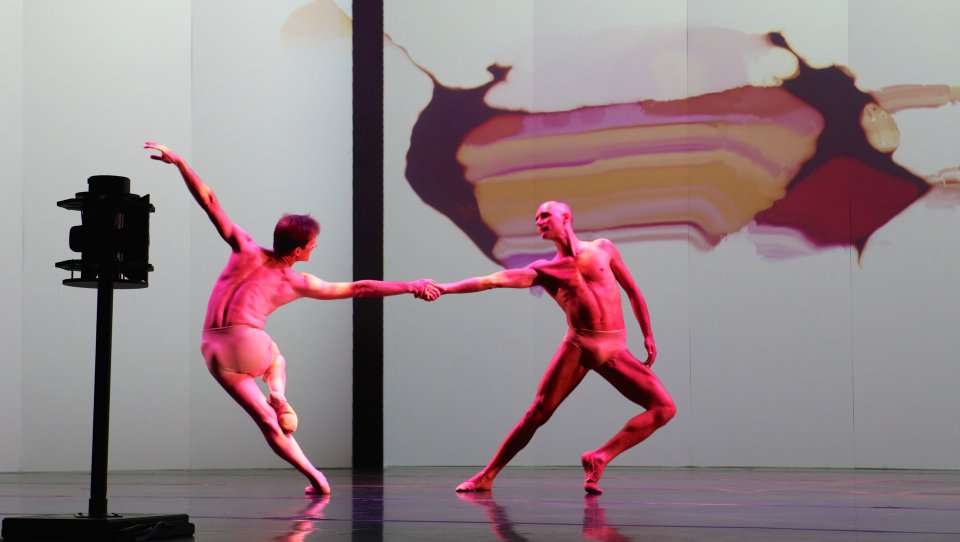
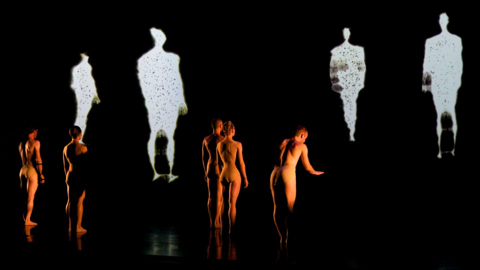
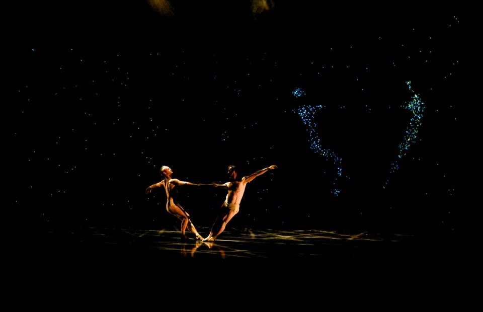
This project is an immersive installation named "Lull". It creates the illusion of an immersive surreal environment for the visitors by cascading visuals on translucent fabric walls combined with the help of dense fog, which I think is a very cleaver decision that they made. Through this new way of projection, the artists are able to bring late, 2d visuals into the third dimension and allow visitors to literally immerse themselves into the art work.
I suppose the artist had to experiment a lot with the fabric walls to finally get the effect that they wanted. It also seems like the passion of the projectors and their own movements are are also something that needed a lot of tweaking.
To quote the artists " Simple rules shape this ever-evolving animation, giving rise to organic abstracted patterns with complex behavior that teeter between order and chaos". This point came across quiet nicely with the final installation as it was able to a dreamy space just using very simple, organic shapes.

ocannoli-LookingOutwards03.

Fragments of RGB is an interactive installation made by Onformative which experiments with the concept of human perception. In this work, projected light points on an LED screen react to the viewer of the work by changing the content as they approach. I find the concept and the commentary of the piece extremely interesting and intriguing to consider the relativity of the world based on our perceptions. Although the topic is large and broad, the execution of the piece is very elegant and communicates that idea subtly but clearly. I appreciated how the creator of the piece left the message they were trying to communicate not be simply stated but required to be discovered through interaction which I think makes the piece more powerful. However, I think the piece could have been stronger if there was something that indicated a bit clearer that the viewer was in the variable controlling the perspective changes but there is equally something to be said about elegant simplicity. Overall, I thought it was extremely inspiring how combing RGB values and having human influenced transformation of the perspective had not only an extremely beautiful result but also carried a lot of meaningful commentary.

yalbert-LookingOutwards03

Name: inForm

Creators: Daniel Leithinger, Sean Follmer

Year: 2013

Source

This is a project that came out of Hiroshi Ishii's incredible Tangible Media Lab. It explores how far we can push interactive surfaces and proves that they don't have to be confined to pixels on a screen. The possibilities of the concept really excite me. Imagine if every surface was covered in this material. Our future could contain interactive spaces that have a physicality to them in a way that doesn't exist in most contemporary visions of the future. One disappointing element of this project was that it was put out in 2013. I'm unsure if any improvements or compelling use cases have been created since then. I'd like to see this concept move beyond an interesting research project and into the public sphere as a consumer product, but I'm unsure when that will actually occur.

nixel-LookingOutwards03

I played flute for 8 years but still only have surface level knowledge of music. I think this exhibition, which takes a rather abstract concept and turns it into concrete physical representations, is neat. Music and sound usually exist invisibly, without physical indicators. Even when playing instruments, there is a disconnect between where to move your fingers and the ink on the page.  By linking different aspects of sound and music to physicality, it makes the process of learning and creating intuitive. If created on smaller scale, I could see this becoming part of early music education.

Another reason why I like this exhibition because it is very simple on the surface level, and any person with any amount of music knowledge can interact with and enjoy it, but if you're practiced and educated  in the craft, the exhibition also has a lot of potential to create great compositions.

breep-LookingOutwards03

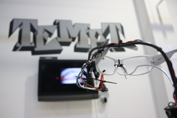
The eyewriter is a collaborative project that allows individuals who are paralyzed but still retain full brain function and eye movement to draw with the movement of their eyes. Initially teaming up with LA graffiti artist TEMPTONE, who was diagnosed with ALS in 2003, the project aimed to get the artist to be create again despite his condition. I love how the vast respect for this singular artist and the empathy for his condition inspires a hugely impactful project.

I find this project exceptionally praise worthy for its aim to get those who have been given a horrible card in life to fully realize their creative desires and share their creativity with the world. Along with this, I find the parallels between the emotional range that eyes can present in relation to the creation of projects entirely with eyes vastly intriguing its potential. This is one element of the project that I wish was explored more, but given the circumstance and what the EyeWriter accomplishes that is a very minor aspect. The notion of turning this project into a wide bracing international framework is also hugely admirable, sharing this wonderful technology with the world. I find that a-lot of the time we expect the viewer to be able to interact with a work of interactive art, but in this case the viewer interacts with the work through a larger social context which amazed me about this work.


airsun-LookingOutwards03

"Dances of the Sacred & Profane"(2014) done by Camille Utterback is an hour-long collaborative dance work. It has a motion capture projection which utilizes a real-time particle physics system. The dancers' movements will be captured by the cameras and then projected to panel screens at the background. However, the relationship is not linear in which the pattern projected on the screen does not only depict dancers' movements but also other components such as moving particles interacting with each other. The whole aesthetics here is inspired by the music and art of the Impressionist period. The artist is interested in observing and understanding how images offer a visceral connection between the real and the virtual.

For me, what attracts me the most about this piece is its novel way of interacting with dancers' bodies with technology. Interactions with dancers are familiar and we have seen many performances before, for example, seeing dancers interacting with the music or seeing them having charcoal on them and dance to draw patterns. However, this project took the approach that elevates these interactions into a new place with the invitation of technology. The dances combined the uncertainty of human actions with the imagination of art. It enhanced this concept of using our body to draw. It also visualizes the human interactions in various ways.

paukparl-LookingOutwards02

Digital Grotesque II - Michael Hansmeyer

"What is needed is a new type of design instrument. We need tools for search and exploration, rather than simply control and execution. We require tools that go beyond the fulfillment or optimization of simple functional requirements, and that allow us to investigate and advance more ambiguous factors of the design: soft criteria."
http://www.michael-hansmeyer.com/digital-grotesque-II

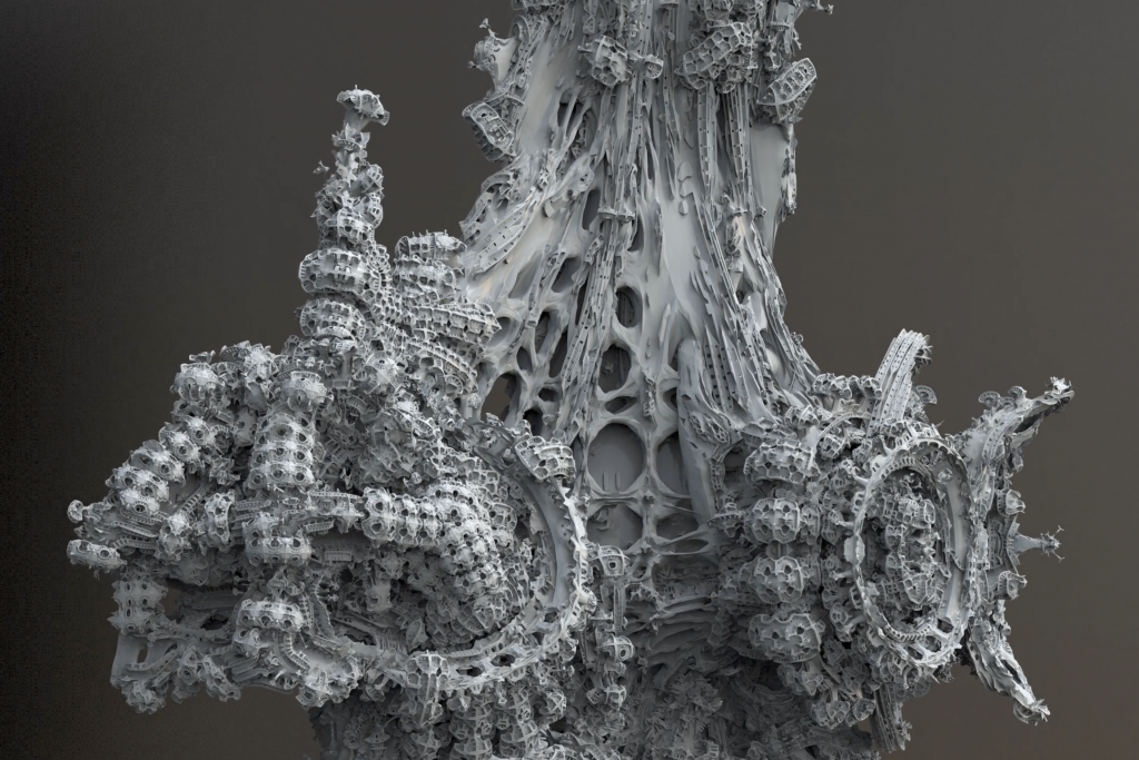
The above excerpt from the project description effectively summarizes the core value of the artwork. Digital Grotesque II is 3.5 meter high 3D printed structure that explores both form and design/manufacture process. I am not familiar with grasshopper or any other parametric modeling tools, so I'm not sure as to how this form came about, or how much of it would be generative. But even if the form weren't completely generated by computer, I believe the result is a proof of the architect's statement that the computer "expands the imagination of the designer." Computer much exceeds the human capacity for speed and complexity in thought.

I also love how the work falls right within the range of "effective complexity"--with both identifiable architectural details and incomprehensible chaotic distortions.

Spoon-LookingOutwards02

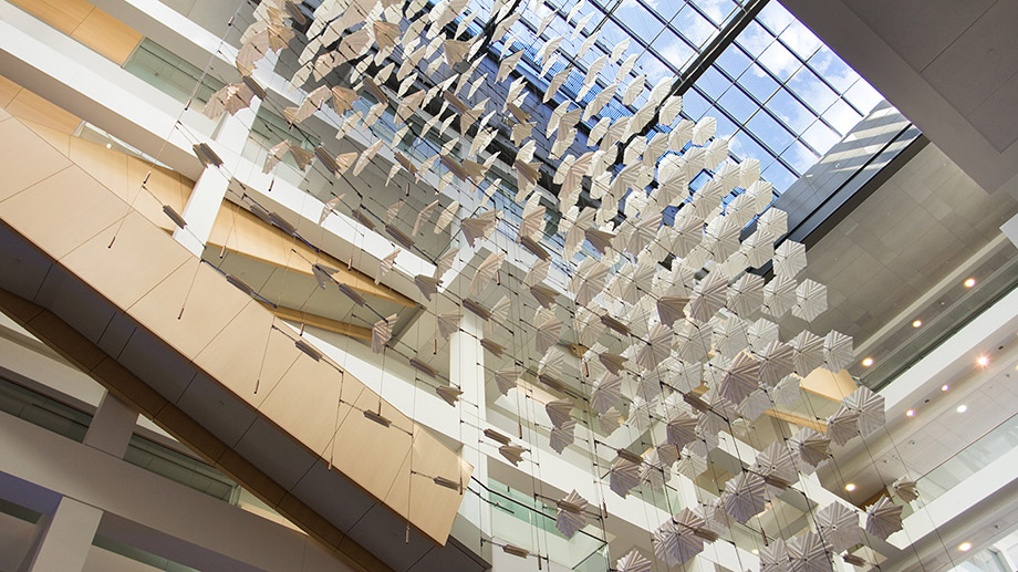
Diffusion Choir by David Wicks is a massive kinetic sculpture consisting of hundreds of independently-actuated folding paper forms. These forms are powered by a flocking algorithm that makes them appear to have the flapping motions of birds. This piece stuck out to me particularly because of its use of an art form that I am newly interested in and an art form that I was interested in a number of years ago: generative art and origami. I used to spend hours trying to fold, with occasionally moderate success, intricate origami models. Recently, though, I have been increasingly interested in algorithmic generative art. Seeing the two combined, both of which begin with relatively simple concepts (bits for generative art and just a piece of paper for the origami) and turning them into something so complex amazes me. My only real piece of criticism for the installation is that the artist seems to emphasize the idea that each item in the installation portrays a bird in his statement for the piece. While I can see the image quite clearly from the bottom, from the side (the piece is designed to be viewed from all sorts of angles), the image of birds gets lost for something far more abstract.

The piece can be viewed here: https://sansumbrella.com/works/2016/diffusion-choir/

Abstracted, repeated image of human face.

nannon-LookingOutwards02

I had completely forgotten I had come across Mokafolio years before until Golan presented his work again a couple weeks ago. I had loved the artful, analog quality of his work then, and I still do love it. When I first encountered his work, I had no idea that there was so much technology behind the pieces. I especially love the vending machine pieces because not only are they generative, they are so in a very engaging way. Vending machines are great because the user never knows exactly what they're getting, yet they choose to receive something anyway.

In a lot of the generative art examples, there's a certain "generative art" aesthetic that is extremely telling of how the results are made. I love Mokafolio's work because it's decidedly not that--not that any aesthetic is better or worse than another, I just think in terms of uniqueness, this work stands out (going back to Galanter's Problem of Uniqueness).

sapeck-LookingOutwards02

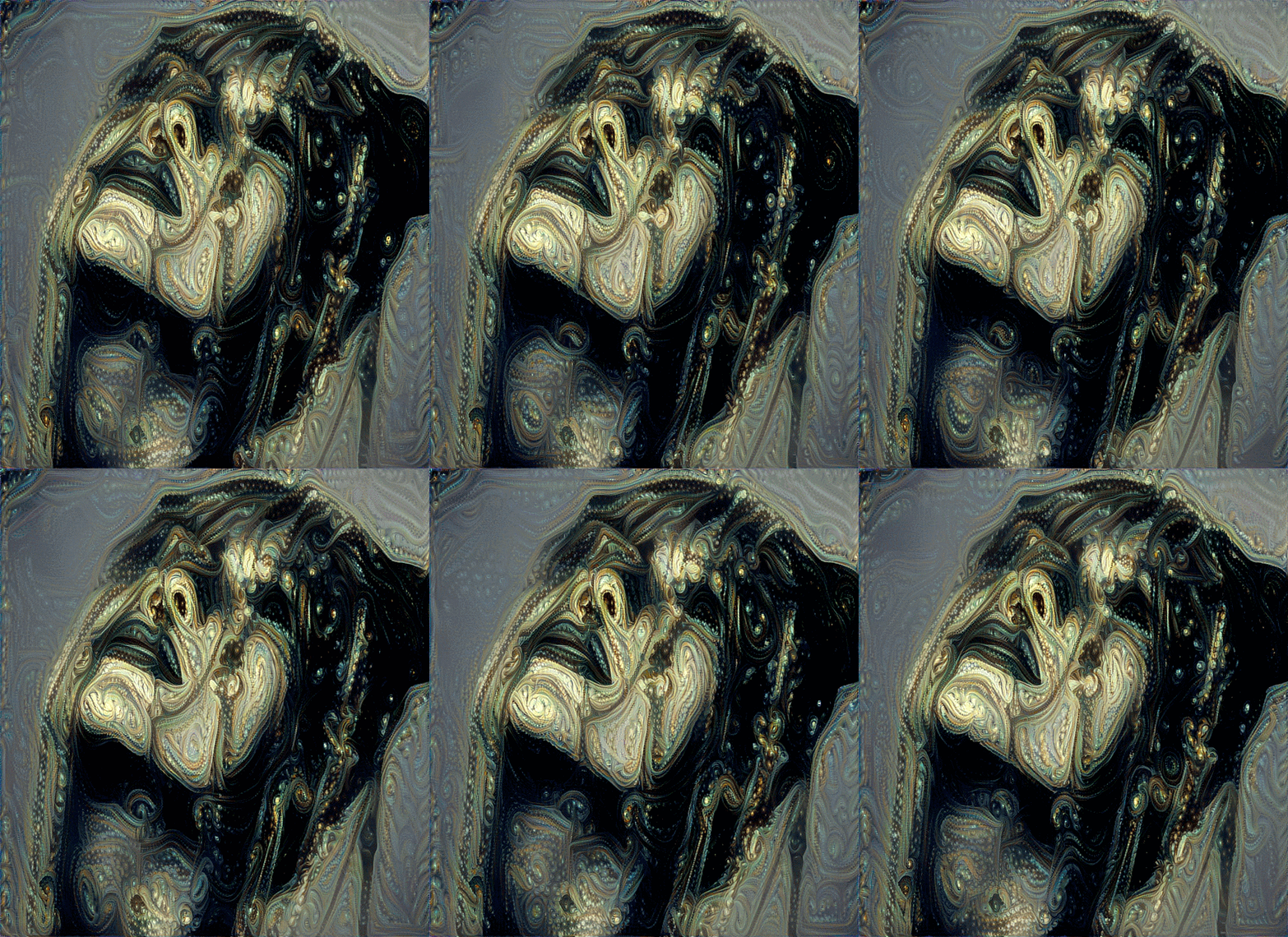
Glenn Marshall combined GIF loops and generative neural styling to cover the loops in flowing, pixelating, continuous plasma. I like the combination of order and disorder that each GIF shows. In one way, the GIFs obviously show a human head, but they are filled with noise. What is so satisfying is that the pixelation and graininess that usually comes from such noise creates moving, flowing patterns in the pieces. There is no write up for these pieces other than that they are a neural style transfer. I assume that Marshall started with the flowing GIFs and a reference image with noise or scales and applied a neural style transfer to it. So, the GIF loops transformed to take on the style of the reference image. Marshall's touch is in how he trained the neural network and which GIF loop he choose to work with. Marshall used the computer to build off of his own work. The computer created a derivative, not an entirely new piece.
Glenn Marshall Neural GIF Loop
Neural GIF Loops by Glenn Marshall (2018)