chaine-LookingOutwards02

"Amoeba Dance" by Memo Akten is an interactive sound-reactive installation which features an amoeba-like 3D life form responding to sound in real time. Although the year of creation is ambiguous, a video of the dance was published by Akten in March 2008. I really admire the fact that this project is happening in real-time and it can be a continuous life form until powered off. "Amoeba Dance" is known to use 1ch HD video, a microphone, and custom software.

Although the methods of its algorithmic creations are unknown, I can suppose that Akten played around a lot with geometrics and reflections. In the artist's own words, this was an "exploration of abstract anthropomorphism and unconventional computer generated visuals and 3D aesthetics." Throughout the amoeba's transformations, it still has a sense of balance and likeness even while rotating and changing shape. It's movements, while sometimes rigid and seemingly unpredictable, are actually just following the sound patterns. Loud noises jerk the amoeba forward while it has a constant, slower rotation it follows. Therefore, I would place this piece nearer to being balanced. It moves and transforms in a way that is predictable--less dictated by chaos.

Link to dance below:

http://www.memo.tv/portfolio/amoeba-dance/

lass-LookingOutwards02

For this Looking Outwards, I am focusing on the work of Glen Marshall. When browsing his gallery, I was immediately drawn to his music video for Clouds in Cloudless Skies (2014). Honestly, I think this is just because I really like cubes and squares. The music video shows travel through an infinite world, where cubes are constantly being generated. The generation of these cubes is different in each scene of the music video. I appreciate this because each scene has a different quality to it--in some scenes, cubes are disappearing and reappearing, and in others they are constantly being distorted. I think that the choice to have a theme between these scenes, yet make them distinct from each other, makes it more believable as a "world". Each scene follows a theme, yet they show different aspects of life with different generative methods. It is clear that Marshall used a large variety of algorithms to create this work.

As for effective complexity, it is clear that the cube shapes have a high amount of order. They are all perfect cubes of the same size that tessellate perfectly. However, there is a randomness in their patterns of creation and movement that makes it so believable as a living world. 

breep-LookingOutwards02

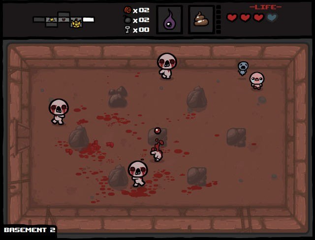
I decided to talk about The Binding Of Isaac as my choice of generative art, mostly because its one of the few generated games that I have found myself play over and over and over again, and with my general propensity to not replay games I find this significant to me.

The game follows the story of Isaac, a young boy whose mother is asked by God to sacrifice him as a test of her faith. Upon trying to murder him, Isaac flees to their basement where he must fight for his life against a cohort of monster's and manifestations of traditionally evil elements that faith challenges.  It is this element that I so admire about this work, the complete freedom to enjoy it's gameplay or read into the dense subplot about conflicts over religion and how evil manifests itself within the stereotypes we associate with certain qualities of character (eg Greed, Envy etc).

The floors are generated from a library of rooms, with certain fixed rooms (like the starting room and the boss fight room) acting as cruxes for the rest of the rooms. What makes the game so replay are the endless combinations of items, enemies and rooms which makes every individual room a unique experience, as well as each instance of the game. The system as a whole is very ordered, as multiple replays will make apparent, but its the chaotic nature of every individual room that really makes the game.  It was heavily inspired by the first Legend of Zelda, with the gameplay following a very similar format. The art style of the game stands bold as well, with the combination of the algorithm and the design of the rooms combining to build the overall experience.

Website

Creation: Edmund McMillen and Florian Himsl, initially released in 2011, with a remake (The Binding of Isaac: Rebirth) in 2014


casher-LookingOutwards02

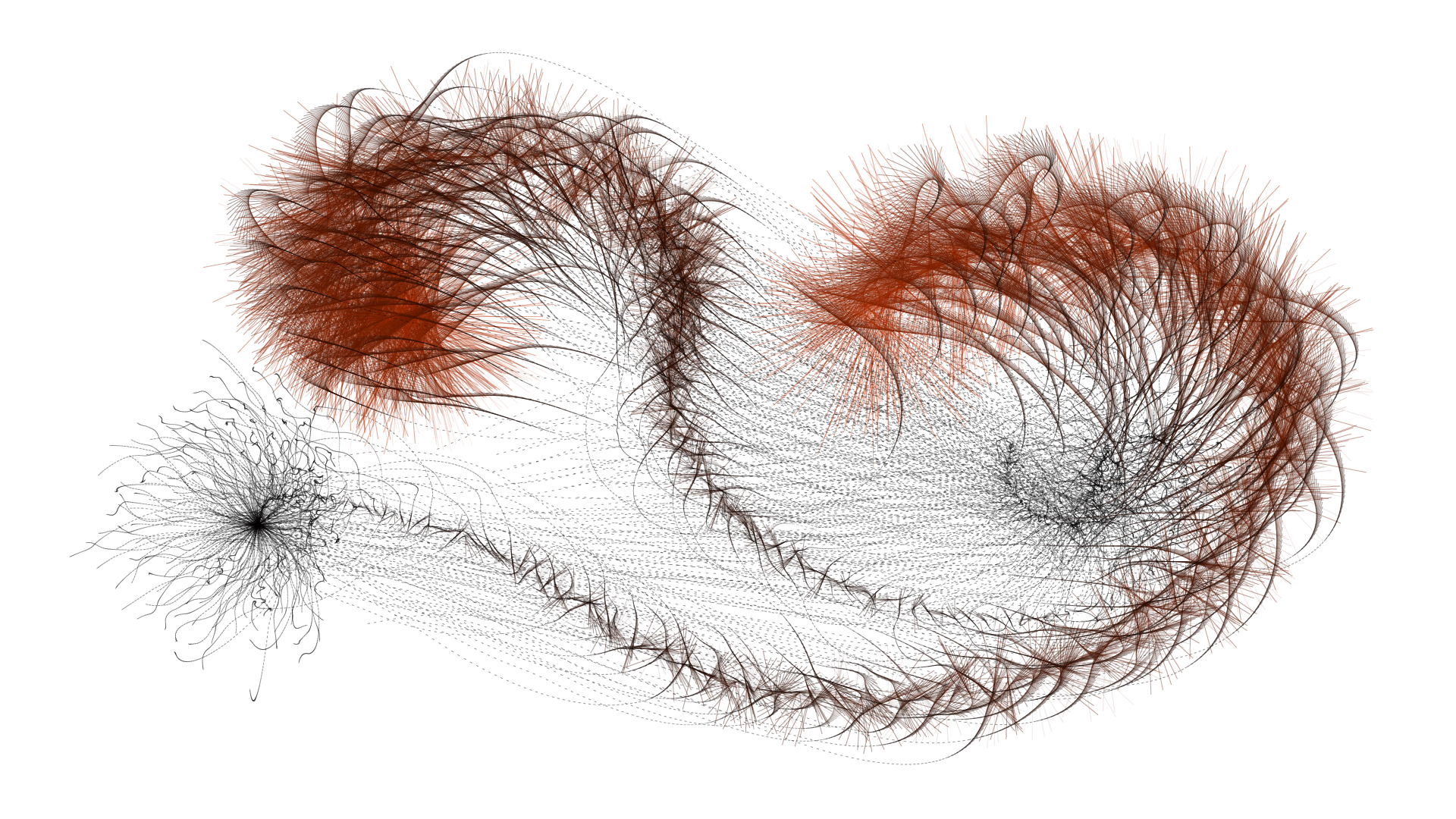
I have chosen to look at Tentasho (2016), a work of Lia, a generative software artist based in Austria. It is a procedural installation on a touchscreen, and it can either be interactive, where the user touches the screen to drag a path in the application, or it is automatic (and completely generative) when there is no user and the application draws paths itself. These paths are randomly calculated but follow a specific algorithm that creates "tentacle"-like splines coming off the main spline. The drawings end up looking similar to caterpillars, or like some kind of many-legged creatures.

As mentioned in the description on the main website, I too appreciate the minimalist design. There are only three colors, and every image only consists of lines on a white background. I can tell that Lia has a good eye for clean design and aesthetics. It gives the piece a sense of simplicity.  Therefore, I would say that it has a moderate amount of effective complexity -- the lines follow a general order, or what seems to be algorithmic "rules," but the paths in total are somewhat disordered. I suppose that the algorithm simultaneously generates the main center line and the smaller spline lines as the path gets larger, but the length limit of the splines gets smaller as the path is drawn.

https://www.liaworks.com/theprojects/tentasho/

airsun-LookingOutwards02

Reverb is done by Madeline Gannon. It is a context-aware 3D modeling environment that lets users design ready-to-print wearables around their own body. One thing I admire the most about this project is the dynamic it creates, both in the transformation from digital design to physical products and the evolvement from the living squid, producing random activity, to patterns that are aesthetically pleasing. Because the work is all generated from a virtual squid, it leaves this complexity of dynamic that the creator can play with the squid around the neck of a person, and leave this trace in various ways. The modeling interface uses a three-phase workflow, from 3D scanning to 3D modeling to 3D printing. First of all, it starts with the scanning phase, where it imports the physical context into the virtual environment. Then, the physical space is translated to a three-dimensional point cloud. The modeling phase will create the expressive digital form through different gestures in the scanned context. The printing phase will translate this digital geometry into physical matter.

Looking at the collar studies, different versions with their elegant curves and intersections all show Madeline Gannon's artistic sensibilities. It also involves effective complexity, combining both elements of order from the regularity and logic in the complex geometries around the 3D scanned context and elements of disorder from the user interaction and manipulation of the virtual squid.


nerual-LookingOutwards02

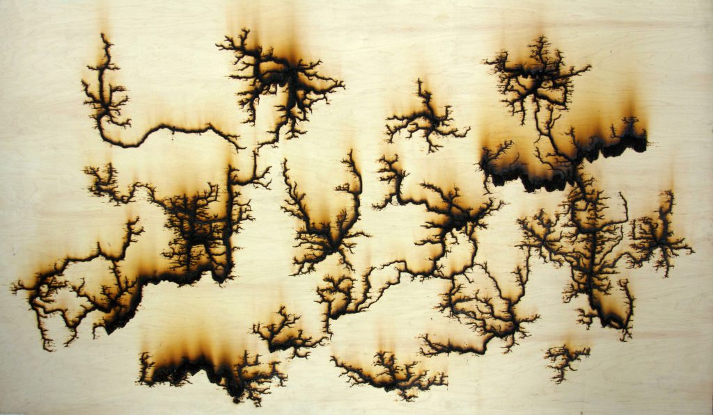
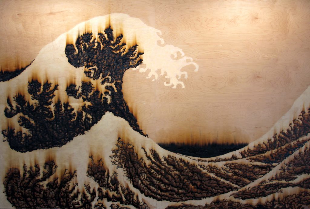
This project by Melanie Hoff is called "15,000 Volts", showcased in 2015. She hooks a a few alligator clips to  a sheet of wood, and sends (presumably) 15,000 volts through them, letting the electricity generate branching patterns as it find its way through the trees veins. I thought it was interesting because the action of creating it was very simple(just sending ludicrous amounts of electricity through wood), and it was an application of the spirit of generative art to a traditional or craftsman kind of material.  Looking at there other works, this doesn't seem to fit in with their style and interests, but I assume the call back to old craftsmanship, with the sepia tones and material itself, was intentional.

In this project, the algorithm or computer is nature, which means surrendering even more control over what is created. Part of appreciating the work is seeing it be created too. You see the rate at which the branches grow. Who grows first, and in what direction? And eventually some branches thicken as the wood essentially melts. There was an attempt to exercise control in intentionally spacing the clips out, and probably picking out the certain type of wood. For the most part it's a kind of predictable randomness; you know what the general shape looks like, but the subtitles are much more difficult to predict.

Later extensions of this project involve non-conductive materials which force the branches into more specific shapes, using the randomness more for texture than as the main feature.

chromsan-LookingOutwards02

This is a project by Marcin Ignac entitled "City Icon" from 2012. It's a generative city simulation with a variety of randomly created systems. Their interactions create a dynamic and constantly changing view of an imaginary city. I like the balance between the order of a city and the randomness in the direction that its parts take. How the water flows through and energy sources appear is fairly random, but what's impressive is that it is still is identifiable as a city, like you might see from an airplane above when flying at night. The generation transforms when it becomes a series of cells that make up a living organism or a collection of energy sources. I imagine there was quite a bit of pseudo-random number generation involved in making this project, as its parts seem to relate in a nice way.

Original source. 

rigatoni-LookingOutwards02

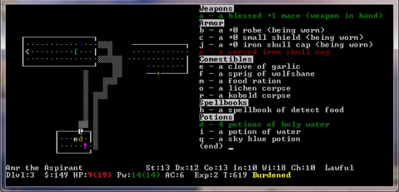
Rogue (1980) is the progenitor of a PCG genre known as "Rogue-like". A player (denoted typically with an '@' character) traverses the floors of a procedurally generated 2D map, navigating obstacles, traps and enemies to get to the bottom. The player has a limited amount of food that may be replenished by looting, but each move in this turn-based tile game costs food; to venture further into the floors is to risk starvation and the brutal perma-death mechanic of this game.

Rogue, and its spin-off Nethack, was my first experience with games that run in the command line. I can only imagine the complexity that co-creators Michael Toy and Glenn Wichman faced as they developed this game for Unix, using a very nascent graphics library known as curses (developed by Ken Arnold. They also were restricted to only using ASCII character to represent their procedurally generated world. Rogue ended up being included in a popular distribution to the internet's predecessor, ARPANET.

"Rogue is the biggest waste of CPU cycles in history." --Denis Ritchie

The map generation algorithm used in Rogue, and consequently many titles in the "rogue-like" genre, follows the following instructions
1) Divide the map into 3x2 cells
2) Choose to/not to draw a room within each cell
3) Use a "drunken walk" to connect the rooms

Prior to Rogue, most adventure games lacked replay value and complexity. Toy and Wichman realized this, and came up with two clever ways to deal with effective complexity, the first of course being the procedural map generation and mob placement algorithm. The other one being "perma-death" was a controversial topic during development. I would argue the "perma-death" mechanic aids the effective complexity of Rogue since the player is unlikely to come across similar levels given the persistent consequences of death.

Here's a video of one of my favorite Youtubers, Scott Manley, playing the original Rogue game.

ocannoli-LookingOutwards02

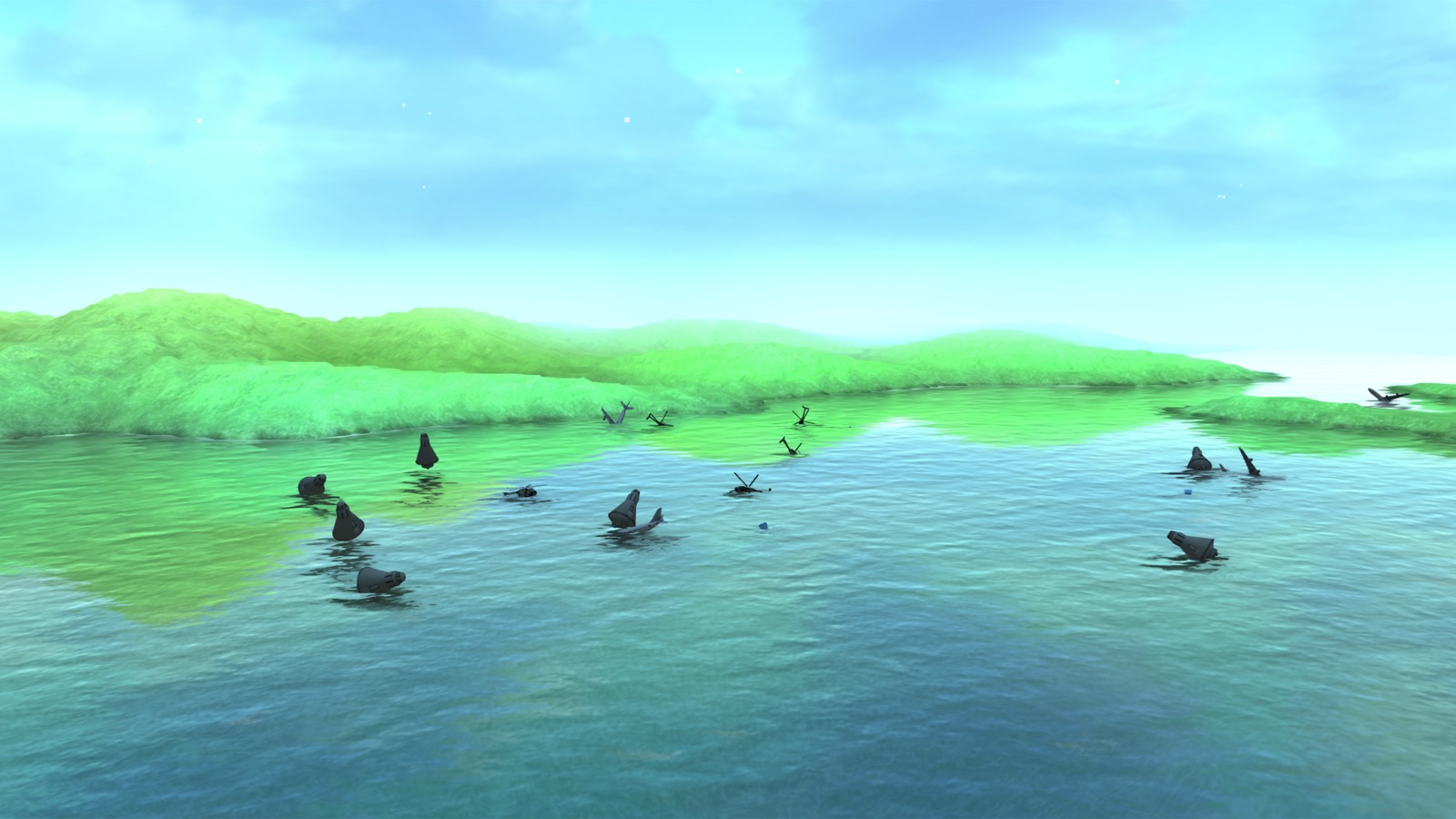
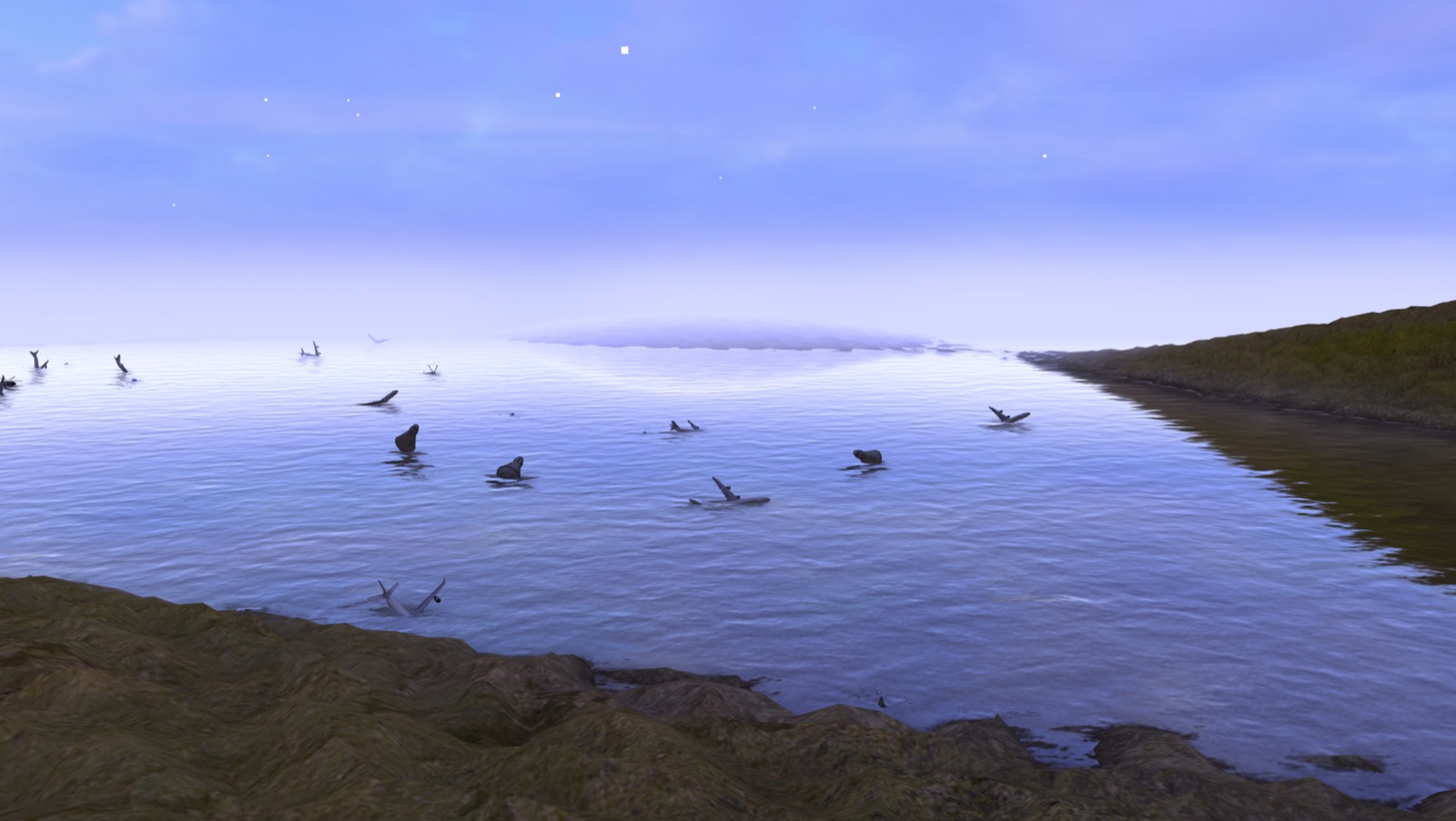
Roger Water's project "A Journey into Hyperland" is a 360 VR live experience where the user can fly around an environment and launch items and creatures in order to interact. An aspect of this piece that is so fascinating is that many aspects of the environment such as shape, colors, mountain and marine shape are all determined in real time by the music of band Niagra. I admire the simplicity and elegance of the execution of the design but I also admire the concept of a generative environment spawning from music. Considering that the program reacts differently based on time and location of the user, I suppose that the algorithm behind the work was definitely heavily guided by the idea of generativity rather than it being added later or as an extra experiment. I believe Water did a pretty great job having an effective complexity considering a random environment that looks very clean yet is powered by a song.

Click here to experience his project

nixel-LookingOutwards02

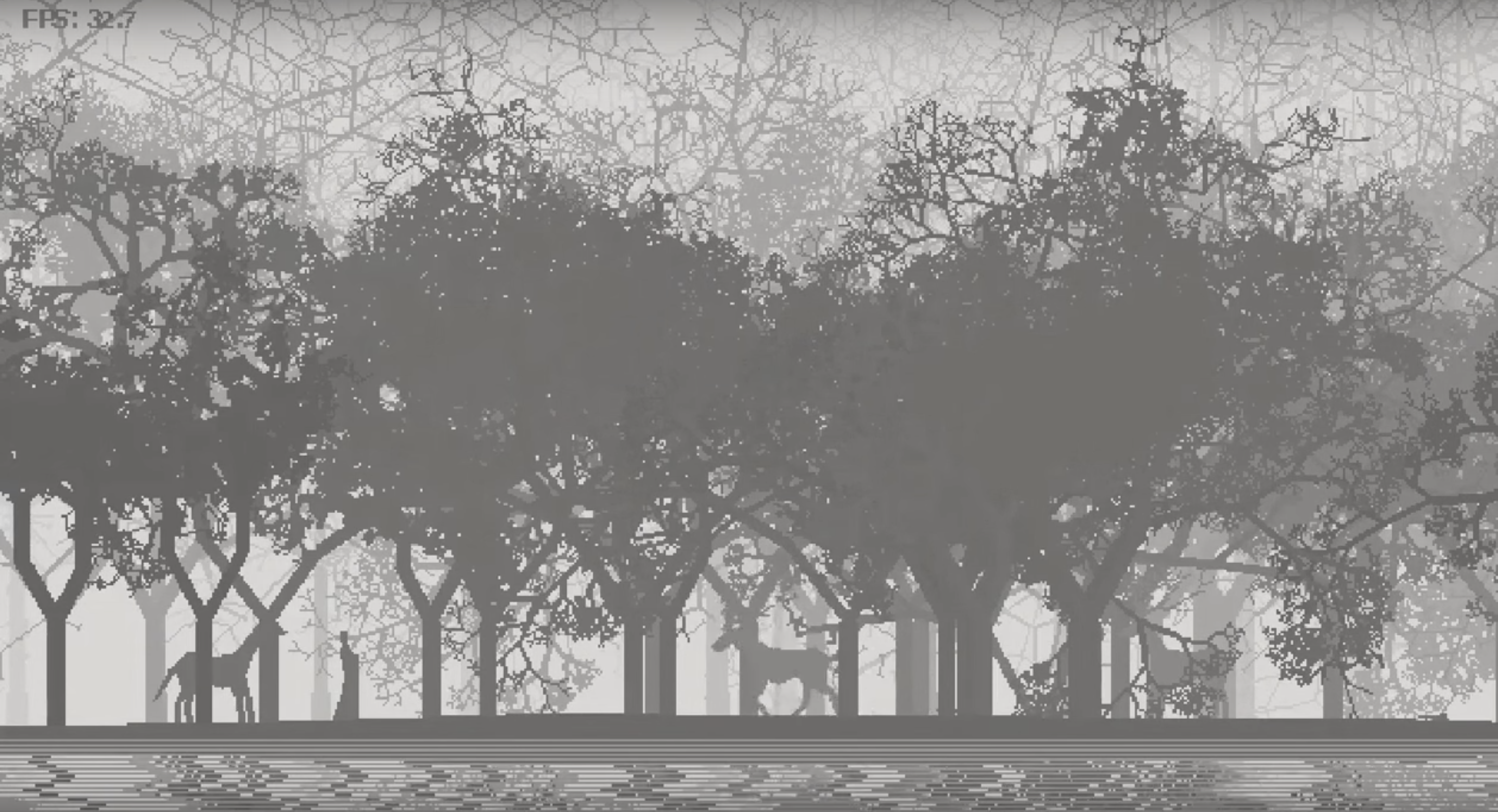
I've chosen to talk about a fellow CMU student's project for this Looking Outwards report. The project, Hermit, was made by Lingdong Huang for his 15-112 term project in 2015 and is fairly well known throughout the school. It is a procedurally generated interactive environment.

I like this work because I think it's elegant and sophisticated, especially considering the constraints under which it was made (python, 112 term project deadlines).  It is aesthetically pleasing, and it has a narrative. The elements of the project all work together to create something that is able to give the viewer a peaceful feeling.

I did open up the code for the project, but I don't think I'm well versed enough in generative art to know what each part of the program is doing. I do know that it is recursive at its root, but I don't know how he used that to get the generative result achieved.

In terms of effective complexity, I would say it leans more on the side of order rather than chaos. The project is predictable and clean but still interesting in the many possibilities it offers in terms of interaction and uniquely generated landscapes and creatures.

Check it out here: