lass-lookingoutwards01

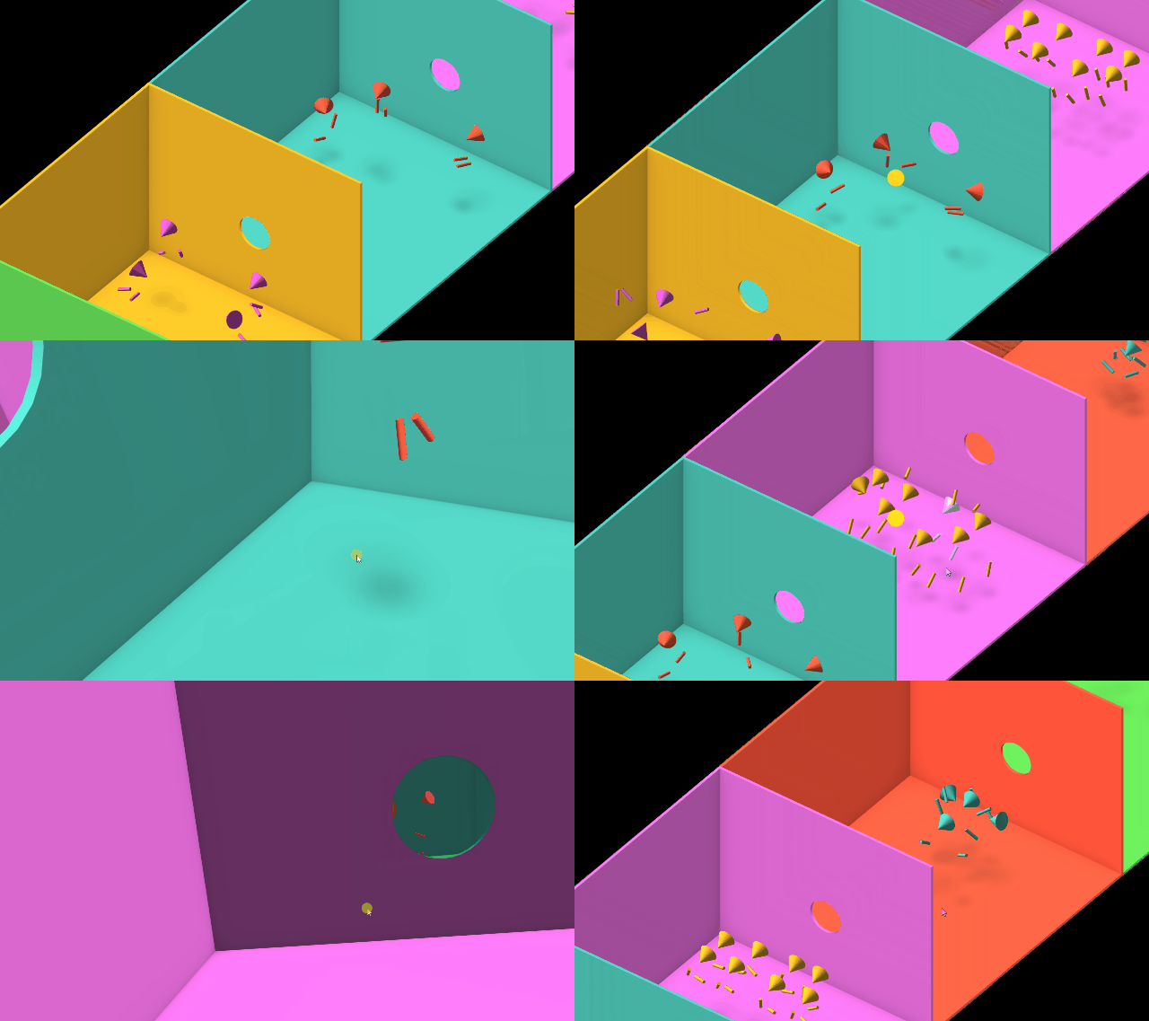
Dance Tonite is a web based VR experience in which the user travels through a series of rooms containing virtual dancers, moving to the beat of Tonite by LCD Soundsystem. Each dance performance was created by a fan of the band using a VR controller. When viewed from a web or mobile device, which is how I viewed the project, the user can watch the dances from a birdseye perspective or the perspective of individual dancers. The thing that I admire most about this project is its simplicity--since the movements of the dancers was captured with two controllers and a headset, they are portrayed in the app as a single cone with two stick arms. The project makes use of solid, bright colors to match the upbeat tone of the music. The movements of the dancers is very natural and imperfect, (which is expected since they are recorded movements of actual dancers) which I think really adds to the experience and gives it less of a robotic feeling, despite how clean the shapes and colors are.

The project was created by Jonathan Puckey and Moniker, in collaboration with the Data Arts team at Google. The site lists a ton of technologies that they used: WebVR, Gamepad, Three.js, Preact, and Firebase, to name a few. I really appreciate how the artists are exploring recent technologies to create a unique music video, and I think that this project shows off some great capabilities that we have for creating easily accessible virtual reality experiences in the web.

Dance Tonite by Jonathan Puckey, Moniker, and the Google Data ArtsTeam

airsun-lookingoutwards01

It was not long ago when I saw this powerful installation in the Mori Art Museum in Tokyo this summer. I have seen interactive artworks through screens, however, I was not able to participate in many of them. But for this one, when standing in the space and looking at what is happening around me, the power this installation delivered is magnificent and significant. "Power of Scale" is a play rendering of installation done by Seiichi Saito and Rhizomatiks. It can be viewed as an informative introduction on architecture as well as an interactive digital art installation that embraces the audience by the demonstration of architecture history and human interaction design. Indeed, the exhibition is about Arata Isozki's book Japan-ness, a groundbreaking book about Architecture in 2006. It deals with topics such as "coexistence with nature" and "hybrid architecture", explaining how Japanese architecture flourishes with movable screens instead of traditional concepts of walls. This work is accomplished through video and fiber laser technology. It provides a human-scale environment where the audience can feel the most realistic experience of discovering and reflecting on human scale and its relationship with the immediate surroundings.

Introducing "Power of Scale"- Mori Art Museum


chaine-lookingoutwards01

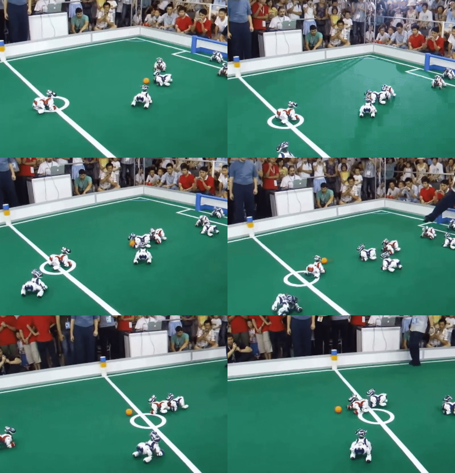
AIBO is a series of robotic pets created by Sony and first introduced on May 11, 1999.  Both prestigious designers and engineers worked together and ultimately earned AIBO spots in places like the Museum of Modern Art, the Smithsonian Institution, and receive many design awards. (they were also added into the Carnegie Mellon University Robot Hall of Fame!)

Teams of AIBO played during several Robocup events (short for Robot Soccer World Cup), which were aimed at promoting robotics and AI research. These robots were unique in that they had the capacity to learn, responding to a plethora of different variables--especially on the soccer field. The robodogs are able to take in sensory data and compute an action. If they perform a less than ideal action, they are able to improve their subsequent actions with positive feedback, much like a real dog being rewarded for learning how to high five. Ever since their release in 1999, new models of AIBO came out until 2006 when AIBO was discontinued. Every AIBO was created with the usage of AIBOLife software which enabled them to "see", walk, and recognize commands while their sounds were programmed in by music composers who fused together mechanical and organic noises.

The creators of AIBO were most likely studied previous robots with artificial intelligence and were inspired to make something that was more complex and ever-evolving to its surrounding environment. The AIBO serves as one of the checkpoints in artificial intelligence, giving opportunities for more self-learning algorithms.

https://us.aibo.com/

https://en.wikipedia.org/wiki/AIBO#Hardware


casher-lookingoutwards01

Last summer, I had the chance to attend SIGGRAPH, the world's largest computer graphics conference. While I was there I saw some of the coolest art and tech projects I've ever seen -- one that stood out to me was a projection art project called INORI-PRAYER (https://vimeo.com/209356195). A small group of Japanese developers from WOW collaborated with the University of Tokyo and two dancers, AyaBambi, to create this interesting performance, which uses real-time face tracking and projection mapping at 1000fps. The girls dance to the song, and dark, creepy images that reflect the sad themes of the song are mapped on their faces. I love how the images enhance the mood of the music, especially because the song doesn't have words. I think the software and scripts of the project were mostly custom-made, which is impressive -- they developed both the projection technology and the face mapping technology. Projection mapping is destined to become a very useful tool for both artists and scientists. It is helpful for AR, so it is a cool way to incorporate interactivity into pieces, especially when combined with a camera. It provides a new medium for artists, but it can also help with data visualization, and it is very popular in the advertisement industry.

ocannoli-lookingoutwards01

        Detroit Become Human is an adventure game officially released May 25 2018 by Quantic Dream that emphasizes mainly the importance of choices and moral conflicts. I admire the extremely complex web of decisions that creates the basis for this game, the stunning and tedious use of motion capture graphics, and the ability to create a narrative so relevant and important to the atmosphere of today. The project took five and a half years to complete, with about 180 employees of Quantic Dream and 250 actors working on the project not including outsourced work. Although Quantic Dream used pre-existing software to create their visuals, they had to develop their own software in order to track and debug the insane amount of code in the numerous branches of the narrative, so in a sense it is a combination of the new and the old. Director David Cage and his team were definitely inspired by the legacy of choose your own adventure type games and narratives such as the Blade Runner series, Westworld, A.I. etc.; however, it still adds elements to create a twist to all its influences. It is important to note that Detroit Become Human does have its flaws. Many criticize that the narrative is too cliche and that the gameplay is somewhat lackluster and not as engaging as a game should be. Though many of its criticisms could be addressed by the new medium others claim the game is pushing towards. This new medium being a future of more cinematic videos games or even a future where the lines between film and audience input and interaction are blurred, which I find so exciting especially when the narrative has such valuable societal implications and relevant lessons.

Detroit Become Human Launch Trailer:

Branches and Brief Gameplay:

Branching Narrative Example:

chromsan-lookingoutwards01

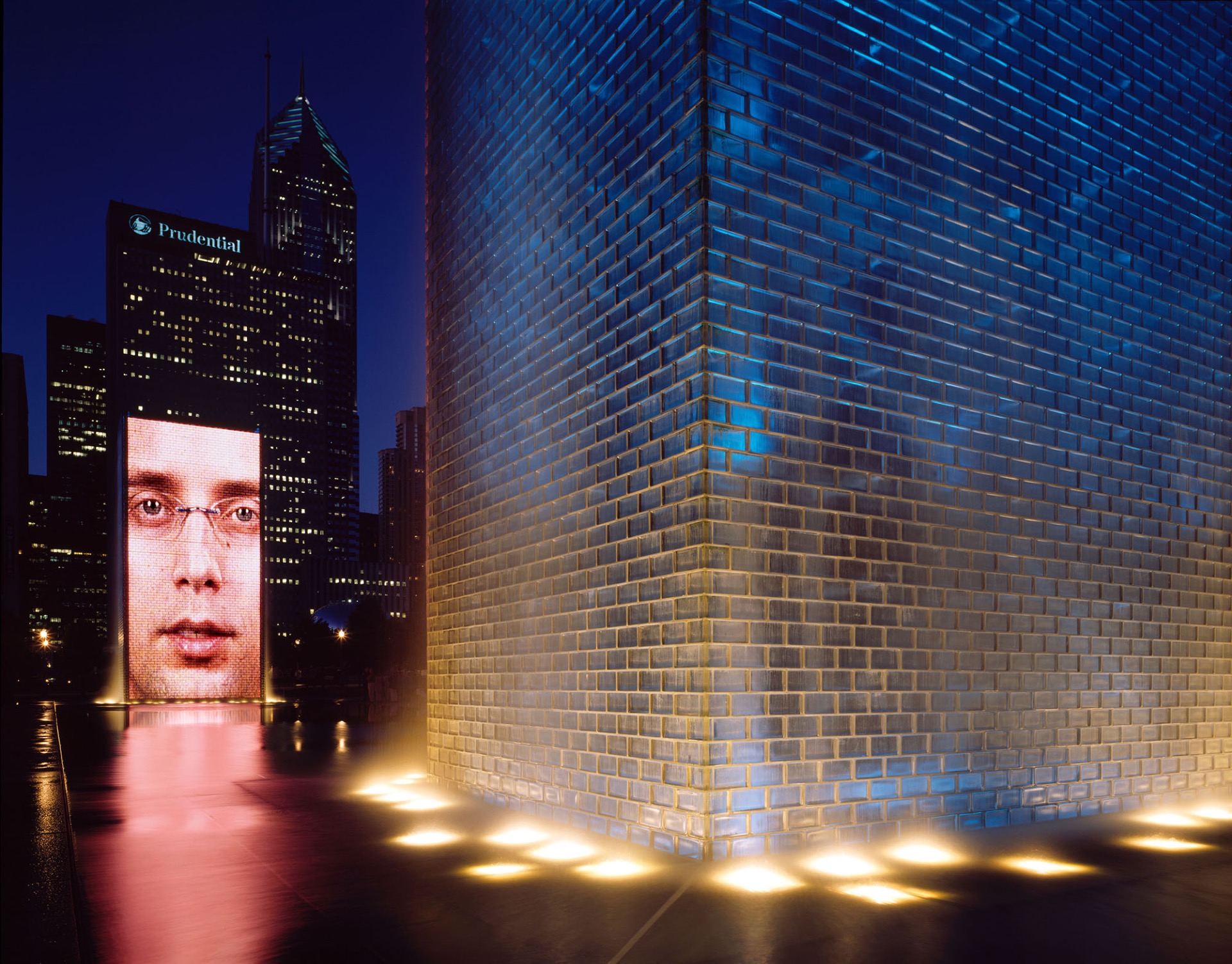
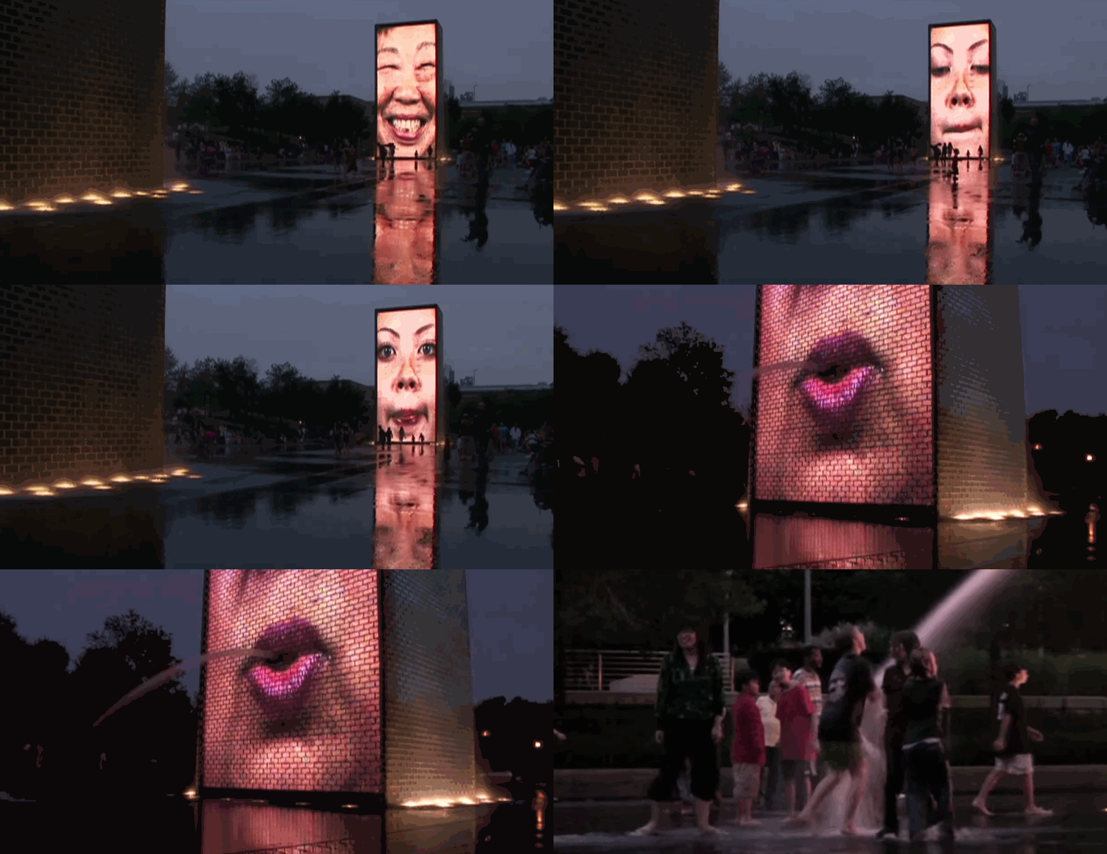
The Crown Fountain has become an iconic part of Millennium Park in Chicago. It's an interactive work of public art designed by artist Jaume Plensa that was installed in 2004. The fountain consists of two 50 foot towers made out of glass blocks, which have a huge array of LEDs that create an image on the side of the towers. Water cascades down the sides of the towers into a large granite reflecting pool. The piece encourages public interaction; during the summer kids fill the pool and stand under the flow of water from the towers.

Though Plensa designed the sculpture, it was executed by Krueck and Sexton Architects. The total cost of construction and design is estimated to be $17 million, and it costs the City of Chicago $400,000 a year to maintain.  Filming of the people on the towers was done at the School of the Art Institute of Chicago by 2o masters students in 2004.

The Fountain uses a large number of sensors to determine how to distribute water. The water falling from the top varies based off of the wind speed and direction to avoid loosing water due to splashing. Sensors in the pool measure water temperature and level and adjust the flow accordingly. The images displayed on the towers are randomly picked from a selection of around 1,000. Brightness and contrast of the video is automatically adjusted based off light conditions. When the faces "spit" a stream of water, the water and video are aligned across both towers. All the software written for this project was proprietary and runs on a number of controllers designed for shows.

Plensa was inspired by large European fountains with figures in the center. He wished to preserve the same principle but allow the public to become a part of the water feature. Where many decorative fountains are fenced off or prohibit public interaction, Crown Fountain encourages interaction. Instead of spitting gargoyles, Plensa enlisted Chicago residents to be the subjects in the ever changing face of the towers.

shuann-lookingoutwards01

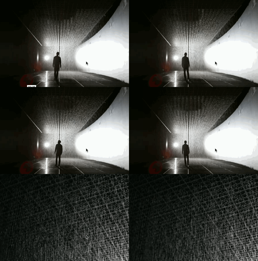
This project is an interactive installation called Rain Room (2012), produced by Random International, a team of artists headed by Florian Ortkrass and Hannes Koch who consider science as a new form of raw material for art making. The creation of this installation was somewhat accidental. Random International initially intended to create something that prints images with droplets of water, but along the way, the process started getting too complicated and convoluted so the team took a step back and crated the Rain Room. In order to make the interaction work correctly, they had to developed their own program to trace human movement with 3D tracking cameras. What I really admire about this work is that, it incorporates so many advanced technologies to work together to create a scenario that is basically impossible to experience in nature. In addition, the installation uses about 528 gallons of water but the water is ben constantly recycled to power the art work. Thus the water footprint is controlled to a manageable and reasonable amount.


Link to the work: https://www.random-international.com/rain-room-2012

Title: Rain Room

Author: Random International

Year: 2012

rigatoni – LookingOutwards – 1

Hard Time MDickie

I am always fascinated by the kinds of video games that the rising amount of "one-man team" game developers can come up with. Developer Mat Dickle's 2007 game Hard Time is no exception. The player can design a custom avatar from an impressively wide variety of stats and appearance modifiers. He (and I use this pronoun because all avatars are suspiciously male) is then thrown into a prison environment with real-time events such as "lunch time", "lock down" and even the occasional "terrorist attack"!. It is evident that this game with all its procedurally ensuing hilarity is part of the trend of "great terrible games", a subversive genre of games that unabashedly feature comically poor characters, environments and purposefully cheesy dialogue. On my first play through I struggled with in-game obesity, depression and gang violence on a daily basis.


As I mentioned earlier, I was inspired by this game because I am in awe of the rich, dynamic self-contained gamespace and deeply comical characters that Mat Dickle has been able to create all by himself. And he isn't even remotely humble of his tendency to fly solo; crediting himself several times through all of his games' end credits and putting the following quote from Bruce Lee on the masthead of his website:


"The creative individual is more important than any established style or system"

--Bruce Lee


Although his writing style might be lacking in humility, an indie developer such as myself cannot help but feel a small, albeit vicarious, sense of empowerment to see a fellow developer compete with larger and better-funded teams to refreshingly unique content with a robust shelf life. I spent some time thinking on how a single developer team like Mat Dickle can produce seemingly vast content. It seems to me that he focused on reusability and symbolic abstractions wherever possibility. Creating assets for games is a costly and time-consuming process; wouldn't it maximize efficiency of these hard-earned assets to reuse them with procedurally generated modifications wherever possible rather than treating them as singletons? To compliment this reusability, we can also take advantage of the human tendency to find patterns and reduce complexity down to its core components and then restrict ourselves as developers to create only these components to create believable patterns and let the player project the superfluous details themselves.


From what reading I have done on Mat Dickle so far, it seems clear he has built his engines and tools himself; he credits himself for the creation of everything in his game. This is not hard to believe as Dickle as been working on open source games long before heavyweight engines like Unity and Unreal were open to the general public. As far as his inspirations, rather than standing on the shoulders of giants he seeks to topple them, expressing his distaste of "the bureaucracy of a team". While personally I cherish the opportunity to work with other developers every now and then, after experiencing some of Mat Dickle's solo work, I am compelled to set my sights higher and approach projects I may have once deemed out of my reach.

via GIPHY
 

chewie-lookingoutwards01

ARCADE SCAM SCIENCE (not clickbait) - Mark Rober

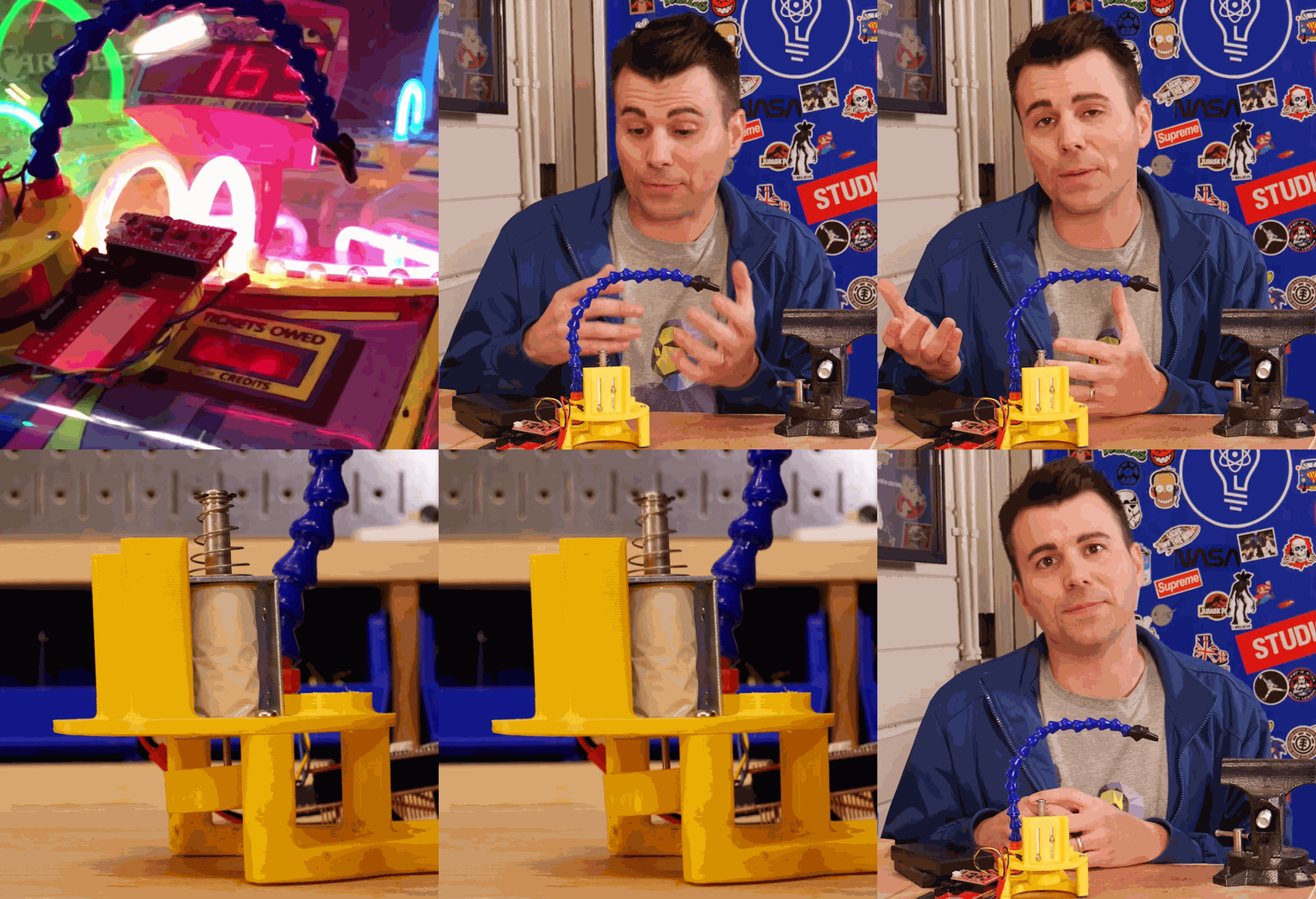
Mark Rober is a YouTube creator who uses a range of scientific and creative methods to solve curious problems. This project is a robot designed to cheat a specific arcade game where you have to press a button at just the right time. What I love about this project is that it's a perfect example of how the curious mind can discover the hidden order of chaotic events. When he doesn't get the result he expects, Mark tests each system of his device independently to narrow down where the problem is arising . From here he discovers how the arcade game he's testing is actually programmed to only allow a certain percent of plays to result in a win.
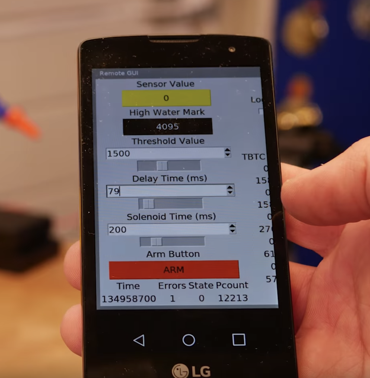
Mark Rober designed the concept and built the prototype with a friend (only referred to in the video as "John") over the course of a few weeks in his home studio.The device was made with 3D-printed parts and includes an Arduino programmed to depress a plunger when a flashing light is detected. This connects via WiFi to an app developed to give the user fine control of the delay between when a light flashes and when the plunger is activated.

Mark's whimsical and flashy style of projects can be seen in many YouTube creators' works. Channels like kipkay, Household Hacker, and G3AR are a few examples of makers who use engineering and critical thinking to produce the gadgets and technology they imagine. Videos like these are a fantastic way to introduce audiences to the creative and scientific process because they present it in a way that's fun and easy to relate to, not one that's confusing and alienating.

I would like to see an entire portfolio of different mechanisms to cheat arcade games. With all of the different mechanisms and goals/incentives of arcade games, it would be interesting to see a range of machines designed to give players the advantage over their master.


weirdie-lookingoutwards01

Firewatch by Campo Santo

A game that I admire and have played several times over is Firewatch, by the video game studio Campo Santo. It is a story-driven game in which the player, Henry, takes up a summer job as a fire lookout in Wyoming. The player receives instructions and information from his supervisor, Delilah, via radio and together they investigate strange happenings in the park.

With a love for nature and exploration, what I admire the most are the visuals of this game - the atmosphere, the strong and constantly changing color palettes, and the immersive quality this brings. The fact that such an eye-catching game was made using Unity is impressive to me, and that combined with a heavily story-based game is what drew me into it.

The game was made in Unity by a group of 10 people. They utilized many Unity add-ons, including Make Code Now!'s "SECTR Complete".

Due to similar visual styles, I imagine this game was inspired by Journey. I believe (and hope) that this game points to a future with more exploratory narrative-driven games that continue to focus on leading the player through the eyes of a character.

via GIPHY

Image source and more development info: http://blog.camposanto.com/ 
Game website: http:/www.firewatchgame.com/
Gameplay trailer: https://www.youtube.com/watch?v=ey96j2aH32U