Sepho – LookingOutwards01


I have to be honest, prior to this class I haven't had any prior exposure to a lot of interactive and computational art outside of video-games, and one game that I have played really stands out to me as doing something profound and interesting with interaction. That game is Dark Souls III, made by From Software on their own engine and funded by Sony. To me, what really stood out about this game was their ability to really use interactivity as its own medium to express ideas and evoke feelings from the player instead of just using it as a device to drive the story. Dark souls as a game is a convoluted, labyrinthine with looming, powerful obstacles  and large hyper-Gothic architecture. Everything from the music to the character design and color pallet is meant to make the player feel small, confused, lost and alone and the game play perfectly echoes those feelings. The level design collapses back on itself and can be frustrating to navigate and everything about combat and exploration can be completely daunting to some. It is the first game I have seen that wasn't designed just to be enjoyable, but to convey ideas and emotions about the world using  the medium of interactivity instead of exposition, and this is where I think interactive art thrives and is truly unique.


nerual-lookingoutwards01

Hermit

"A man. A horse. A nature." By Lingdong Huang

This Python game was a term project for the Fall 2015 15-112 course here at CMU. It seems like most of it was made from scratch, from the procedural generation, use of its own internal time or some global time for the night/day transitions, and all the animations.

I really admire the commitment to making the animations from scratch, because I find that a lot of projects that make use of borrowed material don't have a very polished, cohesive feeling to it. And of course it must have been a lot of work. I also admire the way they used their limitations to their advantage--it seems like they used pixel art to keep procedural generation and game rendering smooth, but they did it in a way that looks very impressive and has a unique style, like an 8-bit zen journey. It makes me want to try to create something with procedural generation, and try applying retro looking pixel art to other unexpected things.

GitHub Repo

paukparl-LookingOutwards01

Slow Hot Computer - Sam Lavigne

"Slow Hot Computer is a website that makes your computer run slow and hot. Use it at work to decrease your productivity."
http://slowhotcomputer.com

I love introducing this work to my friends in design school. You can surprisingly see a lot of art-phobic people in design departments, and it can be hard at times to successfully introduce a work that you like. But Slow Hot Computer has been a constant success. A friend of mine recently got into Samsung and bragged to me about how he's been spreading the site around to his coworkers.

I very much admire the transcendent experience you get from some types of artworks. And this one doesn't give you that. But it speaks to you immediately. When I show this work to people, most of them initially have a good laugh, and agree that Sam Lavigne is a genius. The main factors in play here are:

1. Humor
2. Succinctness
3. Narrative

The first two are quite obvious. This simple artifact also speaks much more about itself than it initially appears to. And that process of revelation happens pretty quick and easily, giving you a pleasant emotional burst, or that "aha" moment. I identify this quality as having a narrative.

Spoon-LookingOutwards01

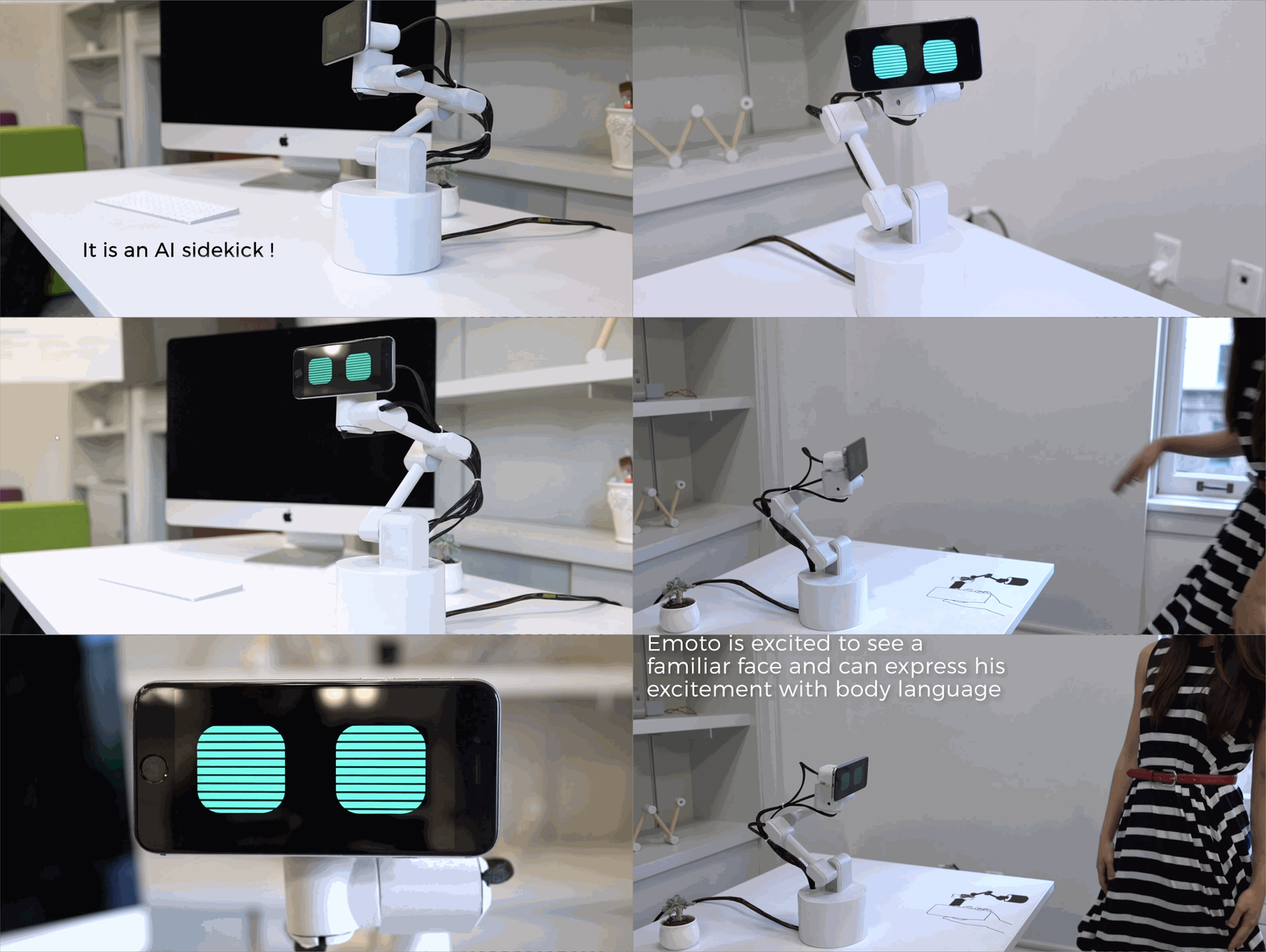
Emoto - by Gautam Bose, Marisa Lu, Lucas Ochoa

Emoto is an application and hardware attachment for a smartphone that turns the phone into an interactive, moving robot that can communicate.

I am particularly drawn to the way that the robot uses eyes and physical movements to express emotions and communicate. It extends interactions with the smartphone into a much more human space, turning the device into something more like a pet. It also takes the Amazon Echo approach to device interaction (talking and no touching), but places it into a much more personal shell.

Creating the project definitely involved the creation of custom scripts, as the phone need to be able to interface with the arm it sits on. There is likely some inclusion of non-original software, as well, although I am not totally sure.

The creators were likely inspired by Amazon Echo and other home assistant AIs. The expressive eyes and motion of the robot were likely inspired by the movie Wall-E, which manages to get an incredibly high degree of expressiveness simply with moving eyes and physical movement.

The project provides a more interesting interaction than products like the Echo, while not losing a promise of any of the functionality. I'm not sure if the creators have any intention of continuing the project, but if they did, I could see it providing a better way to interact emotionally with the smartphone.

The website for the project can be found here: emotoai.com

nannon-LookingOutwards-01


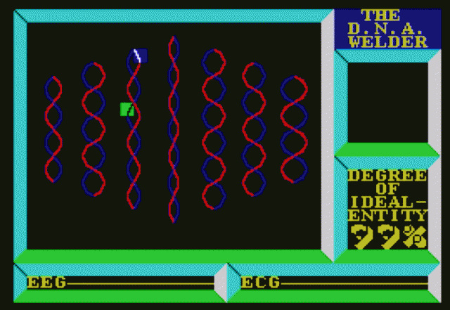
Deus Ex Machina

Last year, I came across this book Soft & Cuddly, in which Jared Kobek talks about his experience playing his first bootleg video games on a ZX Spectrum. I went home, spent the next few days googling this amazingly intriguing, but now mostly obsolete, system, and found out about a specific game called Deus Ex Machina.

Before getting into DEM specifically, I wanted to mention that I became momentarily obsessed with ZX Spectrum--as someone who's never really played that many video games, I was intrigued by how much had been done by such minimal engineering (relative to today). The artwork was so communicative with just 6 neon bright colors, and the music, as well as creative, unique storytelling was clearly industry-changing (creating?).

Image result for deus ex machina zx spectrum gif

Deux Ex Machina was made in the time when "video game" was still being defined--thus, it functions less as a playable game, and more of an interactive narrative. What inspires most about this game is that it pushed the boundaries of its time by focusing on the narrative and executing that through syncing an audio tape that the player has to pause at critical points throughout. In today's perspective (and even back then), the gameplay is actually quite boring, since you don't actually need to do anything. However, I believe there have been remake(s) of the game since then that are more player-oriented.

The creator of the project, Mel Croucher, had already been known at the time to be quite innovative. He had already had other more successful games under his belt, but felt that the industry over all was "derivative" and that the "concepts were all stale".

dinkolas-lookingoutwards01

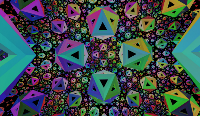
Non-Euclidean Virtual Reality is a project by Vi Hart, Andrea Hawksley, and Henry Segerman, with help from many others. It's a virtual reality world that you can move around in the normal forwards-backwards, up-down, right-left directions, but rather than behaving like a euclidean 3D space, it is a hyperbolic space. This allows for things like four ninety degree angles fitting in a plane. One of my favorite applications of graphics is to demonstrate mathematical concepts, and this is next level immersion in a math space, that gives an intuition that would otherwise take a whole lotta reading and thinking to achieve.

The project used various sources of software for shaders, curved spaces, web VR, etc., but the most of the work is their original javascript code. It is certainly a common thing in mathematics, particularly math that extends beyond the third dimension, to try to imagine oneself as a being in different spaces (Flatland: A Romance of Many Dimensions by Edwin Abbott Abbott is a great example), and this project carries this tradition into new technologies. The core concept of this project could certainly go in many different directions, and I think the educational applications of placing people into foreign dimensions could be valuable for beginners and experts alike.

You can try it out here, move around with arrow keys and WASD keys.

Here's a video:

A .gif:

And an image:

yuvian-lookingoutwards01

As a preface, I did not know of many interactive/computational artworks before this class and most of my exposure to this field has been from looking through OpenProcessing.

One project I remember distinctly is Jason Labbe's sketch entitled "Frozen Brush"

The user interacts with this sketch by moving their mouse across the screen, dragging the "frozen brush" along with it.

<

Jason Labbe is an artist with a strong background in visual effects, game development, and 3d animation. He has worked on films such as "Avatar", "The Avengers: Age of Ultron", and other projects that require the use of sophisticated special effects. Thus, one can assume that he is inspired by game engine physics and other aspects of computer-generated simulations.

Before coming across this project, I had just begun experimenting with Processing and P5, playing around with simple blocks and shapes. It was only after seeing this project and those similar to it that I realized how dynamic, intelligent, artistic, and interactive computational artworks could be. I admire the colors within this sketch and the fluidity of the movement of the "ice" as your mouse interacts with the code. Although simplistic, I think that this sketch is really beautiful because it's straightforward but also seems well-thought out. I aspire to make computational artwork that seems a lot simpler than it is while maintaining a level of artistic complexity.

One thing I would have liked to see in this project is -surprisingly- more interactivity. It would have been interesting to take in the pressure of the user's mouseclick and use that information to affect the movement of the brush. In addition, since it is titled "Frozen Brush", I would have enabled a function that allows the user to actually paint onto the screen. Another feature that would have made this project more interesting and interactive is the use of sound. For some reason, I naturally associated the movement of the brush with sound. An implementation of the visual effects of this project with another associating the position of the brush with sound would be very interesting to interact with.

sapeck-lookingoutwards01

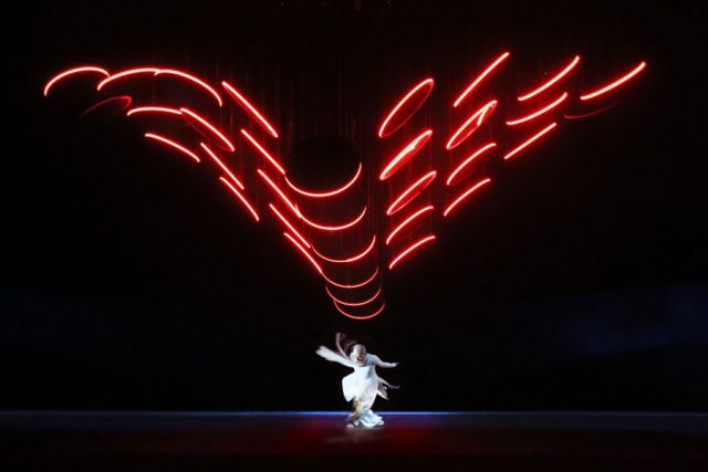
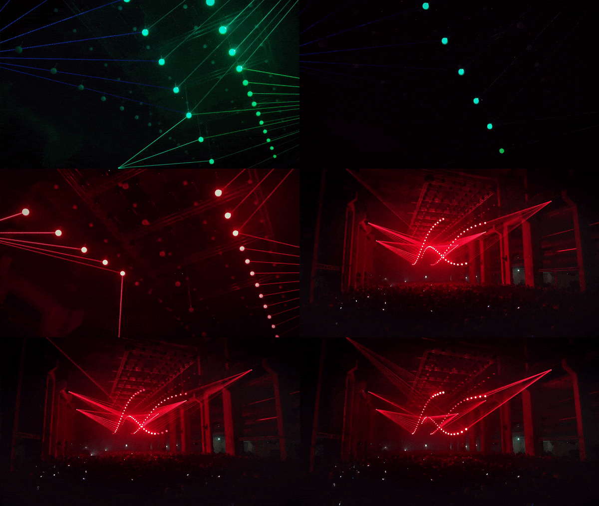
Kinetic Lights is a project from Christopher Bauder and his creative studio WHITEvoid. The DMX-controlled winch and LED platform allows for hanging structures, lights, and mirrors to move and change form. I find objects animated by light captivating. The structures seem like they are from science fiction films, but they aren't images on a screen--they are nearly surreal, breathing spheres, rods, and beams of light.

The ecosystem of winches, light fixtures, and controllers appears to be built from the ground up. Each winch can be connected to an assortment of shapes of light-up forms. WHITEvoid designed software to map out and program in the system in 3D while still controlling the lights through standard DMX. Unfortunately, Kinetic Lights is a commercial product, so not much information on the development of is published.

Bauder developed this project after he created Lichtgrenze, a massive outdoor installation commemorating the 25th anniversary of the fall of the Berlin wall. The same light-up balloon system used in that project are available as Kinetic Lights fixtures. The floating nature of glowing spheres may have inspired the Kinetic Lights project.

The system is primarily used in very large installation art, but there are more possibilities. It may be used in performances where light and movement usually complement performers (ex. concerts, dance, plays). Kinetic Lights would also fit well in malls and large atriums where kinetic, hanging art is already found.

Kinetic Lights by Christopher Bauder as a part of WHITEvoid

MIRROR-MIRRORMIRROR-MIRROR

DEEP WEB - kinetic audiovisual installation and performance

breep-lookingoutwards01

Bastion (by Supergiant Games), Published 20th July, 2011

Bastion remains to this day one of my favourite video games. It follows the exploration of 'The Kid', who you play, through the post-apocalyptic world as he tries to piece together 'The Bastion', one of the last safe havens. For me it was an eye opening experience in the re-working of narratives, the full extent of the power of the soundtrack as well as the capabilities of an small indie publisher with only about 7 people to produce a well defined glossy and fabulously fun project. (I believe it took they two years to finish the project). This combined with the fact that they were working in two different cities to piece it together makes it one of the core works in my library of favourite works. I also feel that Bastion was the first time I fully absorbed the quality of such an individualistic art style for a game, which is very apparently continued in their other games.

I am uncertain of the software they used, but being an indie developer's first project I don't imagine they would have used custom software. The lead developer of the art style was inspired by Japanese isometric games, like the early Romance of Three Kingdom Games. Supergiant Games has produced two other similar third person narrative driven games and I imagine will continue to do so.

https://www.supergiantgames.com/games/bastion/ - This is a link to Supergiant Games' Bastion page (it has videos and images of the work on there as well, including the trailer).  

(Credit: SealedSun Youtube Channel (https://www.youtube.com/channel/UCykRGanLNdkrLBuFLh-Ed3w), Bastion Gameplay, Youtube Video, posted August 16th, 2011, retrieved 5th September 2018)

harsh-lookingoutwards01

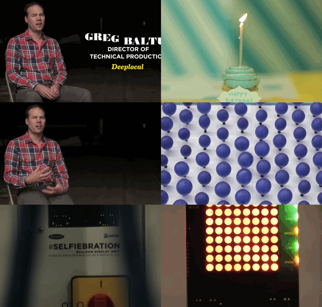
One of my first introductions to the practice of expressing culture through the medium of technology was through Deeplocal. Though I've been interested in their work for a little while now (and curious about how the idea factory over there really works), a project that struck a variety of cords with me is their "Old Navy Selfiebration Machine". The questions this project indirectly asks about the homogeneity of screens in contemporary culture and the projections it makes about new mediums of interactions with technology make this project stand out for me. Beyond that, it does all of this while still maintaining a certain punchiness that's attention-grabbing in a rather ludicrous fashion.

As someone who's trained as an architect, any new medium of interfacing with computation that is physical in nature is always interesting to me. Which is what makes this radical questioning of what a "pixel" means for computation, executed in such a non-conventional method is deeply fascinating.

To briefly describe this project, it is a grid of inflatable balloons connected to Twitter, where people can post their selfies, which then get rasterized and displayed through this inflatable balloon grid. (The video below explains it in a little more depth) . Knowing Deeplocal's project cycle, it's most likely that this was done in a timeframe between 2 weeks and a month, with a team of 5-10 engineers and designers working on it.

From my knowledge of how they work, I'd say Deeplocal probably developed custom hardware (pneumatic systems, circuit boards etc) for this installation, and used some form of either C or C++ to program this system (though I am unsure how they linked it to Twitter).

The potential something like this holds in my mind is enormous. I hate the homogeneity of the screen-based interface of technology, and I envision a world where technology operates around us in a very real and physical manner.  This project for me is both a  provocation and a beginning of that idea(again, this also just might be because of my architecture background). I yearn to experiment and play in that place where the material world interfaces with technology.