Starry Night AgarioInteractive Embedded App
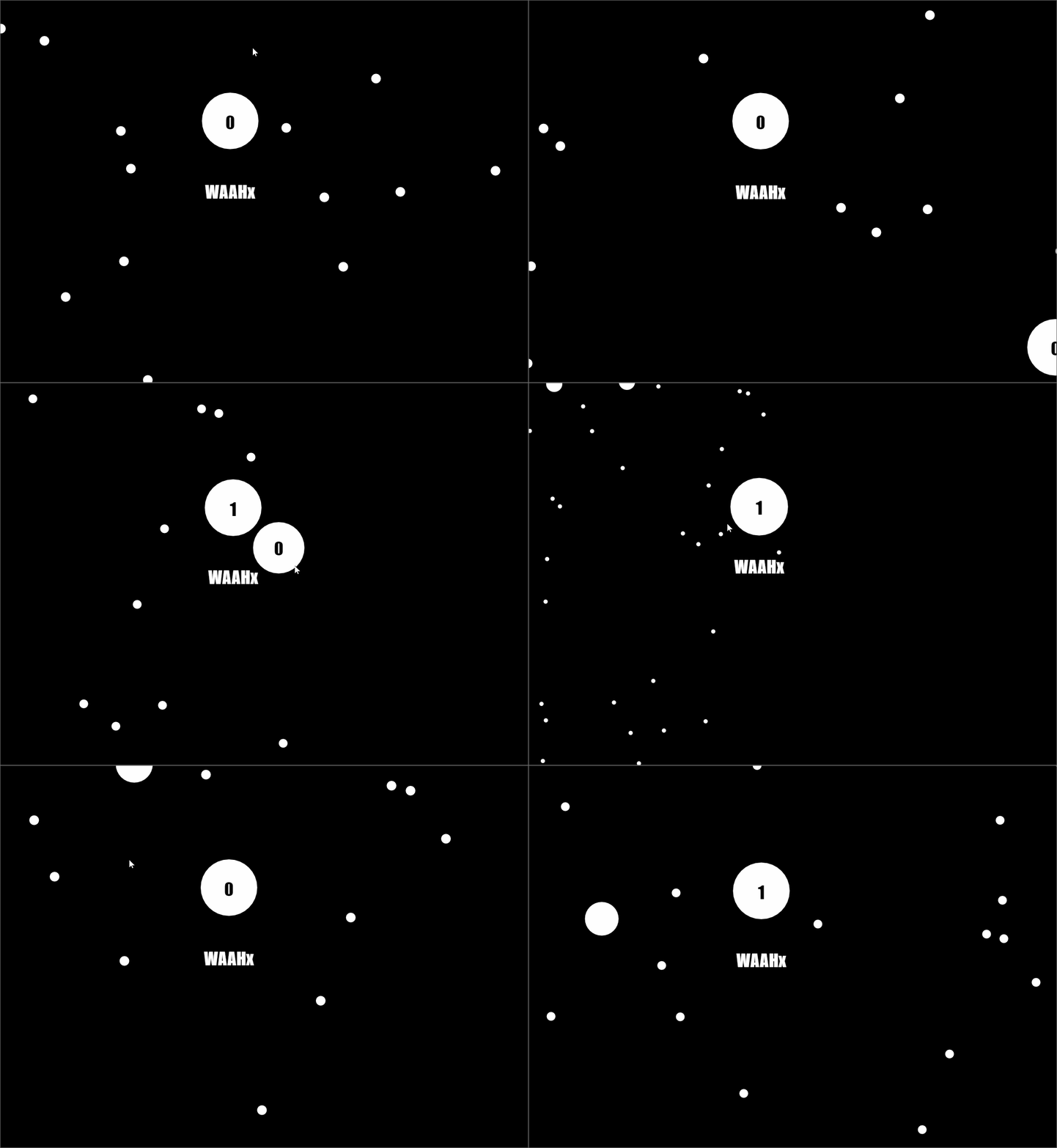 Gif
Gif
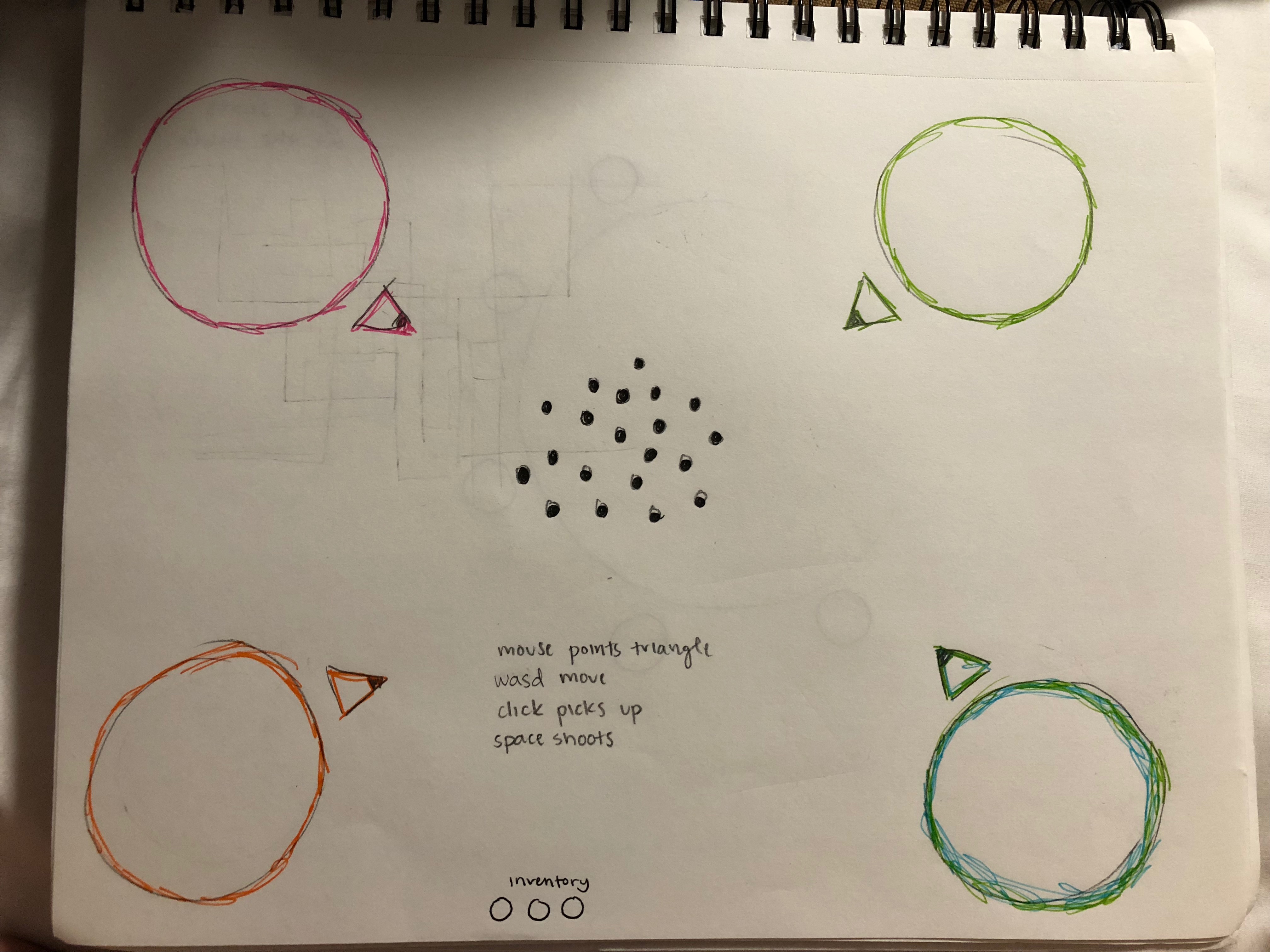
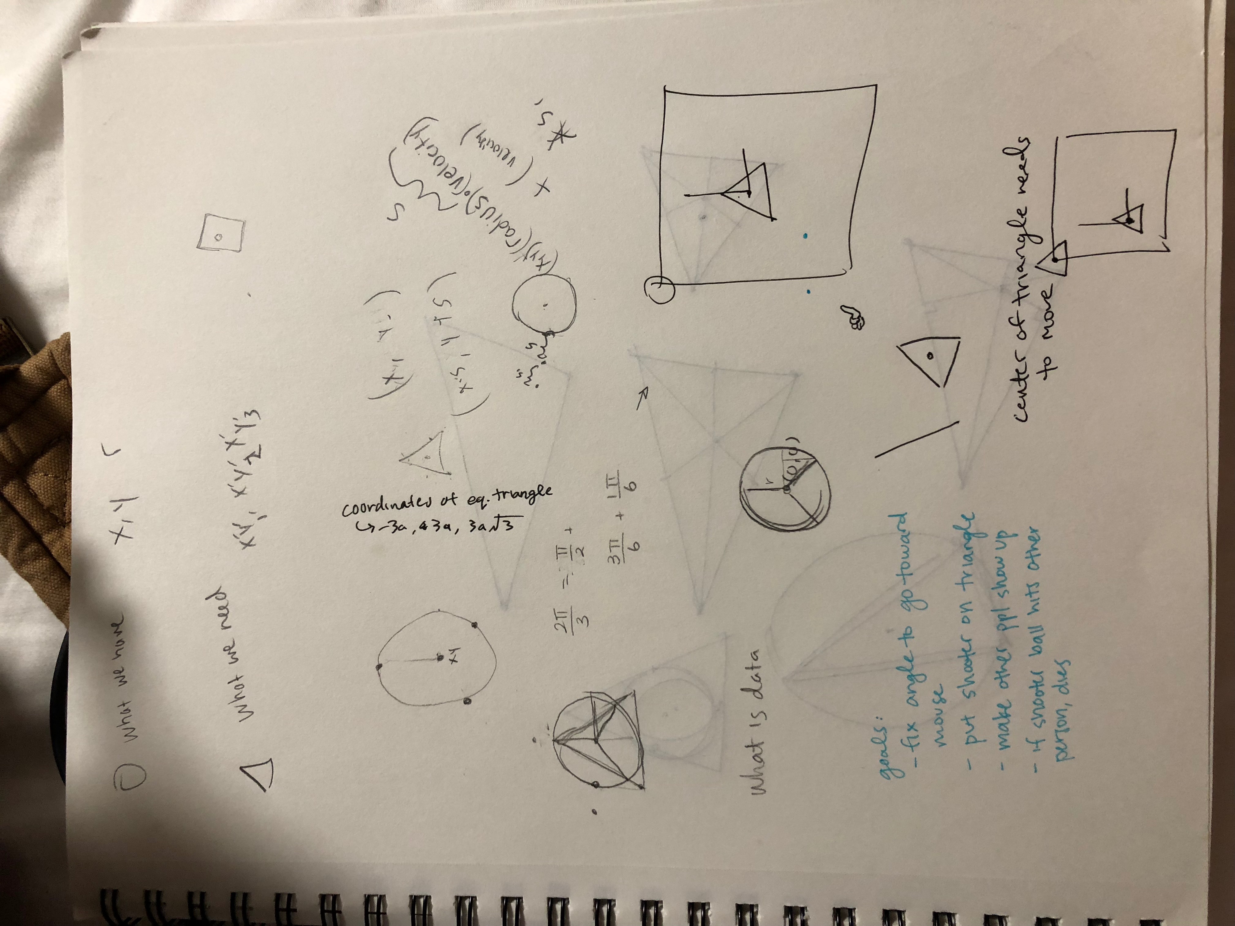
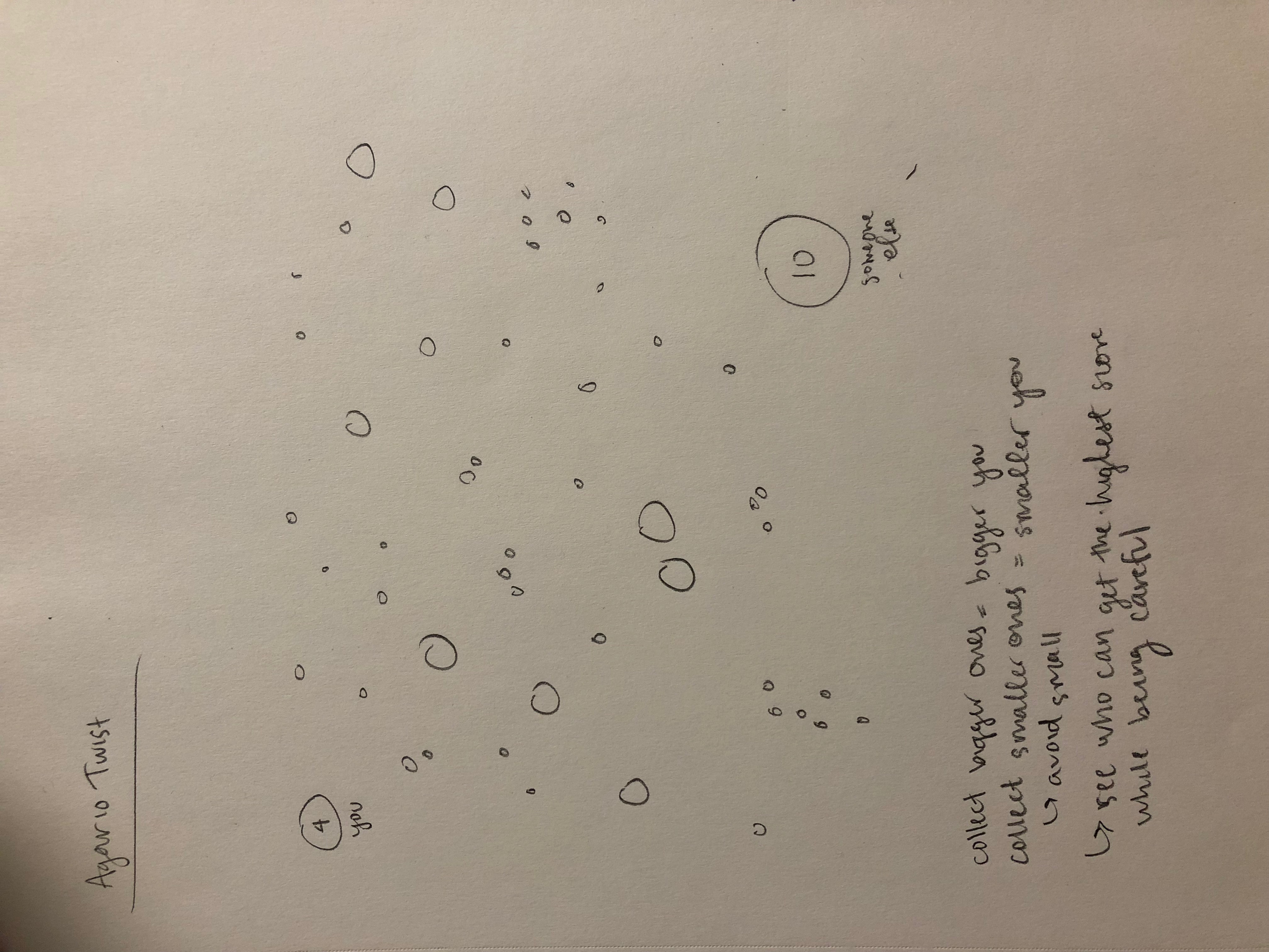
60212: INTERACTIVITY & COMPUTATION
CMU School of Art, Fall 2018 • Prof. Golan Levin / TA: Char Stiles
Starry Night AgarioInteractive Embedded App
 Gif
Gif


Unfortunately, this demo sometimes has issues being embedded due to camera integration. Please run it here if it doesn't work: https://face-game.github.io/
The Face Game is an attempt to create awkward, anonymized interactions by pairing two players' facial expressions.
Players move around their face in various positions without knowing that their picture is being taken. After a few head-moving tasks, players are shown their face side-by-side with other players who have completed the same tasks. The intended affect is to make two players seem like they may be kissing or licking each other. After the game completes, the player's images are upload to a database where (pending approval to filter out NSFW content) they can then be randomly selected to be shown when a new player plays the game. The game's interaction is one-to-many where the many is infinitely growing. The anonymous yet intimate nature of the game makes players both uncomfortable seeing their intimate faces next to a stranger but comfortable in that they don't know the stranger and the stranger did not witness the interaction.
I think that my project is successful in creating an awkward interaction. When I tested the game on my peers, it took them a moment to figure out how to move the cursor, but they then got the hang of it very quickly. One pitfall is that moving the head to the edge of the screen often moves it out of frame if the player is too close to the camera. Another pitfall is in the varying quality of computer webcams. However, the game works fine most of the time. My peers found it odd to see a picture of someone else at the end, but they always laughed. They would then want to play it again and see if they got a different result.
My original idea was to have two face silhouettes side by side. One user on one side and one user on the other. The game would coerce the two players to kiss and then snap a picture. However, this was difficult to implement and hard to understand. I think that the one-to-many approach with the hidden goal is much more successful.
Source code on GitHub: face-game/face-game
Image database on GitHub: face-game/face-game-content
Backend hosted on Glitch: face-game
Link :
https://paukparl.github.io/
Brief:
There are surprisingly many emojis out there (or more accurately stored in your OS). I wanted to make use of this rich source of images somehow. This Emoji Editor grabs the emojis from the hidden file of your computer, enlarges them, and lets you conveniently reconstruct images. You can create virtually infinite number of combinations with various transformations. The resulting images look familiar, but still feel somewhat different from ones we're used to seeing.
Thoughts:
There were maybe too many trials and errors. At the end, I got rid of libraries and used plain Javascript. So it took me longer, but the experience was somewhat rewarding. The app is still a bit buggy and is missing a few functions. But I finished much of what I planned for. My goal was to make the whole image-making process simple and addictive. The interface turned out a bit complicated. But I'm still hooked on this idea, and I'm planning to refine the app in the following couple weeks.

Visual Echos : Let your interactions leave a visual footprint. WASD to move.
Notes on bugs: A player isn't removed if they disconnect. If you refresh, you will start with a fresh screen, but on everyone else's screen, you will appear as a new player and your old particle will just be a moveable object.
Looks cooler with more people, but also potentially gets buggier.
GIF:

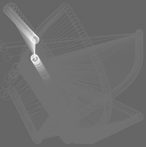
I wanted to explore equal collaboration/competition, creating an environment where either can manifest. In the process of working with a physics engine, I became interested in incorporating the ceding of control to external forces. In this case, you and the other players may be collaborating, but there is still chaos that hinders that, yet creates satisfying after images. The white line between players makes the canvas itself dynamic, as it erases past drawings.
This is getting into "it's a feature not a bug" territory, but I actually like the freedom you have with the thin lines, because now you have to negotiate the speed of your movements as well, in order to create or avoid creating smooth shapes.
I didn't get to try everything I wanted to do, but I think I touch upon some ideas worth exploring further. I think it lacks a lot polish, in terms of the color choice and overall feel, as I definitely could have fiddled around with the design elements more.
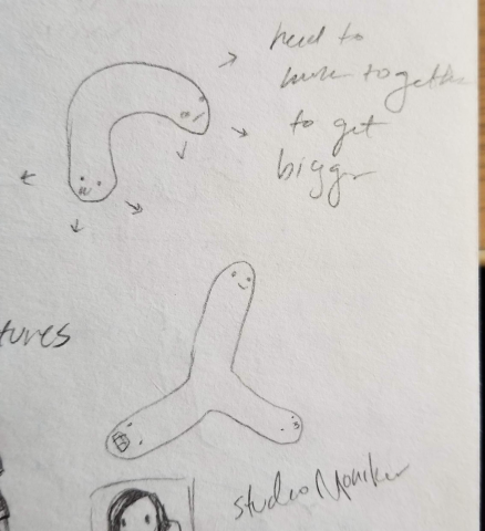
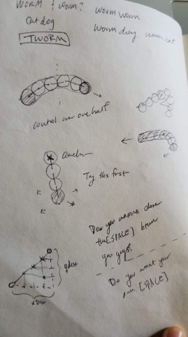
My original idea was to create a many headed worm(inspired in part by the cartoon CatDog), but I think I end up exploring the visuals that result from interactions, rather than the gamified mechanics.
These are some progress screen shots of what it might have looked like with a chalkboard kind of aesthetic.


Some things to explore still:
Below are some sketches of the original idea. I discovered that you could record the path of the interaction and I thought it might be more interesting to deal with geometric relations instead.
Code can be found on Glitch: https://glitch.com/edit/#!/visual-echoes
Future Work:
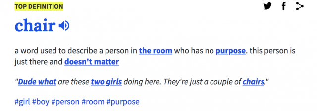
(Different possibilities of chairs)
Sept 28: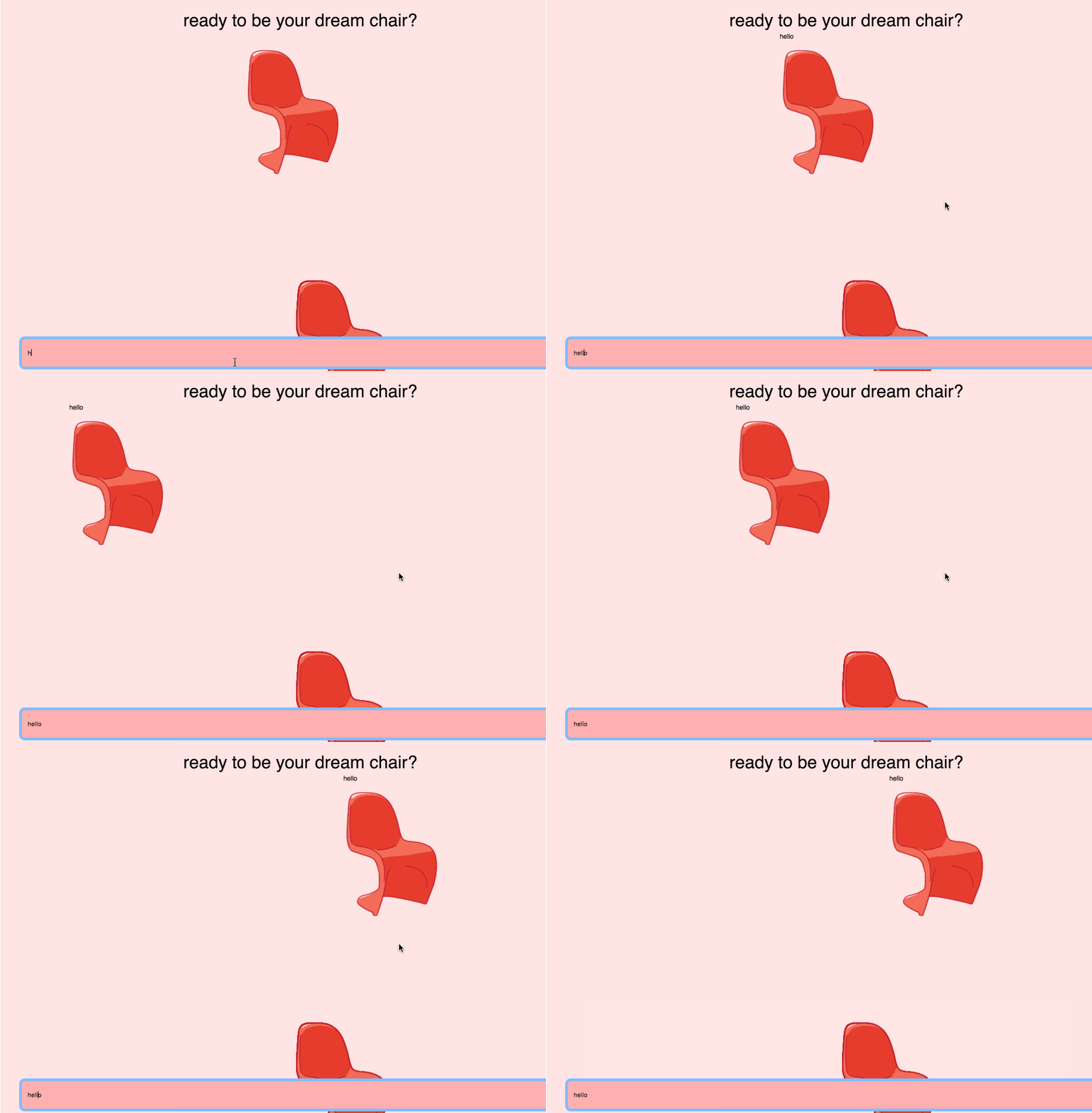 I wanted this chat room to be a literal room where users could move around and chat with each other. However, one of the biggest obstacles was getting the images to load correctly. In addition, I had a lot of trouble keeping track of who was in the room--as such, when a new user joins a room, they won't see people who arrived previously, but users can see new people joining the room live. To be continued.
Oct 2 Update:
The chat works! Used the agar.io template as a base, instead of the drawing template. Helped a lot, since I realized the agar.io template solved all my previous problems with users showing up. The hardest part was learning how it worked, and understanding the socket code. Will be adding new chairs (currently only 3), and a prettier log in page, including explanations for each chair) soon.
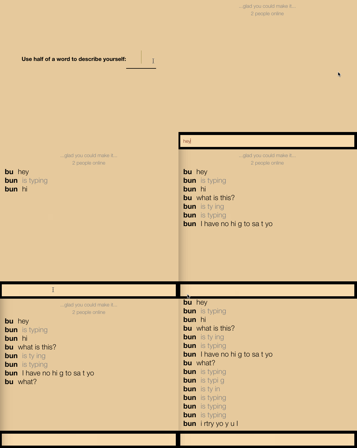
This is a chatroom where the more words you try to use in a single message, the more deteriorated and confusing the message becomes. If you send short messages of few words, the room will usually send the message as is. If the user tries to use too many words or letters, the message starts to disappear.
My original concept for this chatroom was a platform where the user has to collect the materials needed to construct their sentence. I planned on including some sort of pixel pile that you would have to collect from to get enough material to type out and send your message. In the working app above, each message is given a certain amount of length tolerance- the longer a message is, the more likely characters are to be missing. The result is a tool that forces the user to use as few words as possible at the risk of having their message made unreadable.
The design aspect that this project addresses most clearly is its criticality and self-awareness. Ordinarily, chatrooms like this have no limit to the length of messages you can send. With most things we do in life, however, there is a trade off between pleasure or action and the resources spent to make that happen. By using this chatroom, where there is an implied limit to the length of your message it makes the user consider the "luxury" of digital tools their limitless theoretical resources.
Embedded app:
Direct Link:
How to interact:
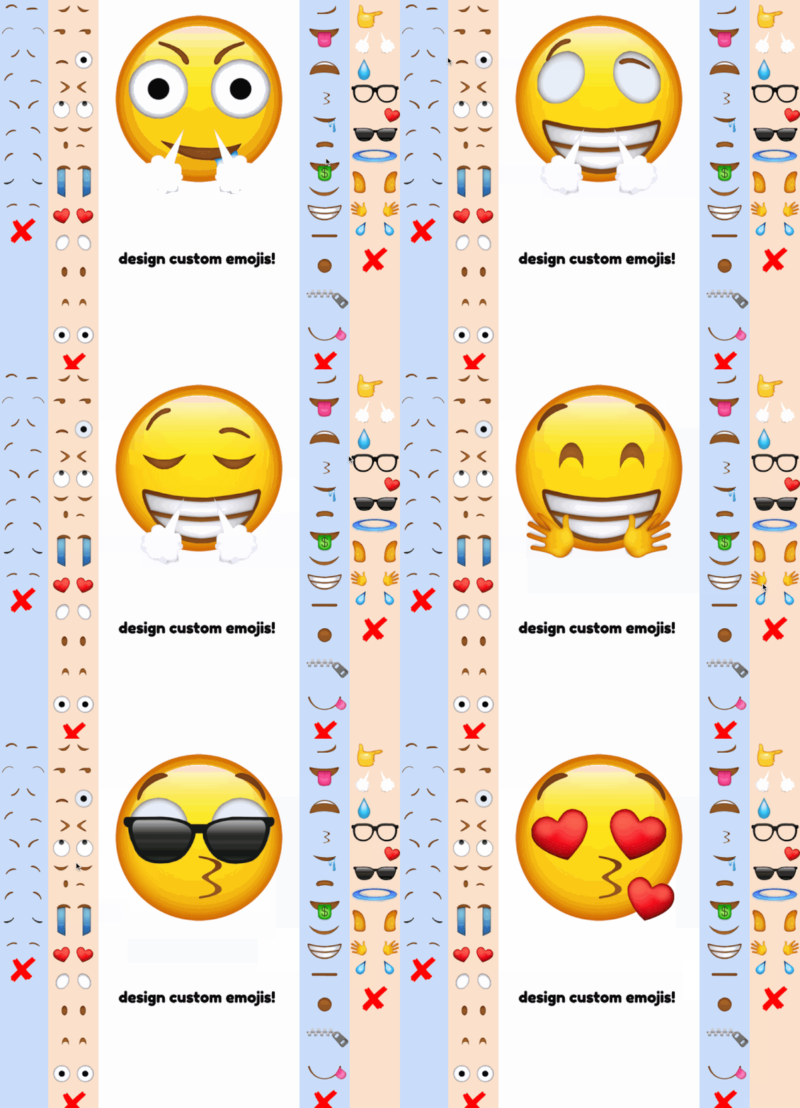
Simply click on the small icons to customize the big one. There are 4 clear categories: eyebrows, eyes, mouth, and accessories. There can ever only be one (or none) of each type on the big emoji at once. Click the X if you ever want to clear that feature. You can interact with many people at once who are on their own browsers.
Description:
Sometimes you want to express an emotion that the current range of emoji's just don't cover. That was the purpose of this project. I took inspiration from iconic internet created emoji's like:  and wondered how many other emotions we feel but aren't able to express.
Gif of me playing with it along with a few friends:
My process:
For this project, I essentially mashed together two of the given prompts for when we're 'stuck for ideas': making a space where people can only interact with emoji's, and having the participants construct a monster corpse through body parts. And this is what I ended up with.
My process was pretty straightforward. I looked for existing dress up games on glitch to reference from, and found this one for cats and based the majority of my structure off of it. I spent a long time cutting apart emojis, formatting HTML, CSS, and messing with jQuery, all of which I'd never worked with before. I hit some pretty dumb bugs that I fought with for a long time (for example, not realizing I didn't import jQuery). I struggled a little with understanding the client-server stuff in application to my own project, but it was a lot simpler than it looked once I broke down the pathways.
Here are some notes I took on the given templates:
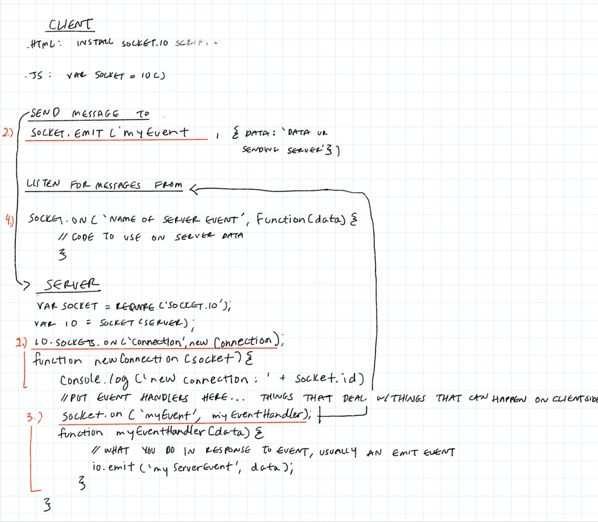
I made remixes of all of the templates and took notes on how each one worked with socket.io. This is how I brainstormed to apply it to my program:

I think a part of this project is that I want it to be kind of chaotic and unpredictable. I want multiple people to be able to explore the different options available and experiment. By having many people on at once, everyone with equal roles, it allows for lots of surprises. It is also good as a solo experience. I think of the multi-user interaction as a feature and not a defining point.
I shared it with my friends, and they had a lot of fun with it. At most, I think there were around 6 people messing with it at once, and everyone was amused at the results we were getting.


By the end of this project, I'd learned a lot about HTML, CSS, jQuery, socket.io, and glitch, and made something that made my friends laugh, so it is pretty successful by my standards.