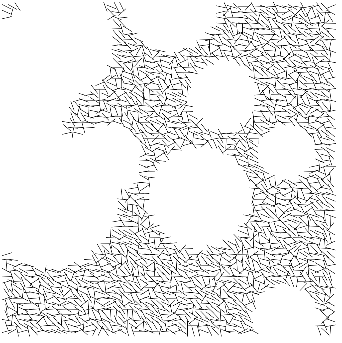
My Observations:
1. The artwork is square
2. The artwork is a series of consistently thick short black lines on a blank white background
3. Each side seems to have 50-60 lines
4. The lines are arranged in a grid-like pattern along their centers
5. The distance between lines is about half the length of a line
6. The lines are long enough and close enough to each other to overlap
7. The artworks all seem to have a primary direction in which the lines are facing (vertically or horizontally)
8. Otherwise, the lines are pointing in a somewhat arbitrary direction in an 'organized chaos' way
9. There are gaps in the work where no lines exist
10. There are usually around 10 gaps in each work
11. The size of the gaps are arbitrary but generally small, around 5x5 line spots
My process in recoding this work was firstly to get all of the lines on screen and tilting the way they were supposed to. This part wasn't too hard with the transformation function and randomGaussian(). The only troubles I ran into in this phase was the placement of push() and pop(), which had drastically different results depending on where I put them in the code.
The most trouble I had with this project was creating the gaps. I started with creating many randomly placed rectangles as placeholders for the gaps and thought that I could use some sort of distance function to omit the lines close to it. Then, I realized this was annoying and changed the rectangles to ellipses which had a much easier distance measurement using the radius. Here, I found that giving the distance measurement some leeway with radius*random(0,0.7) was very important, or else it would end up looking something like this:

I learned a lot about the nuance and finesse this work demanded, and how order really does matter a whole lot.
I think my end result is pretty close to the original.