Possible dataset for Project 2

by huaishup @ 1:58 am 17 January 2011

1. Using Google Trends to self-explore my last years online searching behavior. From Google Trands I can get my searching keywords, searching frequency, and even searching time by months. I can visualize these data to analyze my online activities.

2.  Google Trends provide searching keywords datasets. Using this feature, I can explore people’s online searching keywords and do some interesting comparison, such as the trend of searching “Good” Vs searching “Evil”.

3. I am kinds of interested in the evolution of programming language. Since the very first programming language came out, many of them have died, some of them evolve to others, and some just become popular. I hope to visualize the trends of programming language’s evolution.

4. GLOBAL HUNGER INDEX DATA

It is good to know that on the same earth there are still that huge numbers of people who don’t have enough food and facing the threat of death. I found this dataset from here. Maybe I can do some comparison between the “hungry” world and the “wealth” world through some physical visualization installation, to arouse people’s care for the poor world.

Paul-PotentialDataSources

by ppm @ 1:34 am

I’ve long wanted to record the 3-dimensional shape of a tree–both the high frequency movements caused by the wind as well as the slower growth. I’d be interested to see what parts of the tree move when. Does it swell uniformly, or does the top explode out while the base remains relatively static, or does the entire structure extrude out of the ground? Do the boughs mostly shoot outward, or do they writhe and warp over time? Also, applying that movement data to other 3D models could be interesting–imagine a teapot that flutters in the wind.

There are many apartment buildings around here. Each is a grid of windows, and in each cell, a domestic cycle plays out, indicated by the light turning on and off–a single bit of information. It might be interesting to point a camera at the façade and record the activity overnight. Each “Fourth Floor, Dawn, Up All Night Writing Letters” becomes a datapoint.

But I think that what I actually want to do is graph the color palette of a movie over its duration. I’m working on sampling pixels from a DVD rip and doing cluster analysis to construct a palette for each frame. Each frame’s palette is rendered as a stacked column of pixels. Columns are arranged horizontally to create an oscillating rainbow of color over time. Depending on how recognizable the palettes are, I could then make an interactive game of “match the movie to the palette”.

Susan Lin — InfoViz, Possible Data Sources

by susanlin @ 1:28 am
  1. Why Chinese Mothers Are Superior.
    This article set a cultural debate on fire, it’d be great to map the 7k comments or many rebuttals, somehow. Perhaps mapping some reoccurring ideas based on stereotypes.
  2. Twitter as better than Jenny Craig.
    Use public tweets track what people have been eating, how much weight has been loss, how much support they’ve had … This is a prevailing hot topic of all times which will have a constant stream of new tweets.
    See related articles on ABC News and Lifehacker. It apparently works!
  3. Catfight!
    I know cats on the internet are kind of overdone, but I still love it. Use Google Trends to provide mappings of popularity of certain memes, e.g. lolrus vs. happy cat.

Chong Han Chua – Info Viz, potential sources

by Chong Han Chua @ 1:26 am

I’m trying to think of creative applications of data visualization

I’m thinking of combining Twitter feeds and the Google Ngram datasets. One idea is to mine the latest tweets and see how often the significant words appear in Google books. How common words in tweets relate to book data and vice versa. Perhaps one cool thing that can be done with this is the kind of books that the tweets would recommend, so it can be a real time visualization where the tweet will break down to the common books that the reader would like to read.

I’m interested also in asking questions about education. I’m thinking if data.gov would have comprehensive data that can answer questions like how does education level correspond to GDP. or if student enrollment levels have to do with things like video game sales. Perhaps one big question we can ask is how crimes correspond to education and if that it fits the model that we seem to think it does.

The last thing I have in mind is slightly sillier. I’m thinking about doing a camera/kinect capture of the human silhouette and trying to plot a height and width graph of a person across the other. I’m just kinda thinking if there is something that can be done in this front and the actual visualization can use the actual silhouette to plot something interesting by itself.

Timothy Sherman – Potential Sources – Data Visualization

by Timothy Sherman @ 1:17 am

1. The Entertainment Software Ratings Board is the voluntary regulatory organization for computer and video games. They assign each game a rating, and describe the content that causes it to receive such a rating. While submitting a game for review to the ESRB is a completely voluntary process, most brick-and-mortar retailers and all major console-producing companies (Nintendo, Sony, Microsoft) will not sell or allow any non-ESRB rated game to be published on their system – or any game that receives a rating of Adults Only. The rating data for the ESRB would be something interesting to visualize, as it shows what we as a society consider inappropriate for those of certain ages. It could be interesting to visualize this information in the form of a game as well.

2. Get all of the text off of the CMU admissions site and perform a word frequency analysis. I think it could be interesting to view how the school advertises itself and see how it meshes with our own view of life at this school.

3. Go to various illegal music sharing blogs and get data based on what music they upload and make available for download based on the tags of their music. Using stats on how many people download it (available from some sites), and what files end up getting removed for copyright reasons could provide additional information. I think it would be interesting to visualize what and how we steal.

Paul-LookingOutwards-4-5

by ppm @ 1:16 am


I find this map of Facebook connections striking for how clearly it shows political and cultural borders. Clear lines are drawn between the US and Canada, among the North-Western South American countries, separating Europe from Asia… China is notably absent from the network, though India is included.

This interactive graph shows how people spend the hours of their day. Certain stereotypes are on average validated: men spend more time working, women spend more time on “household activities”. Ages 15-24 sleep in later than older groups. Other trends are unexpected: black people show smaller “eating” spikes during traditional mealtimes. Women more often report not remembering what they were doing at a specific time.

Marynel Vázquez – Potential data sources

by Marynel Vázquez @ 12:43 am

Personal Computers

I find interesting how people (their thoughts, what they do..) change over time. What if we look at the text files stored in the Documents/Home folder of our computer? Does a visualization of the words contained in these files show how we have changed?

The inspiration is Wordle. I think it would be interesting to group relevant words by time, instead of showing them all together.

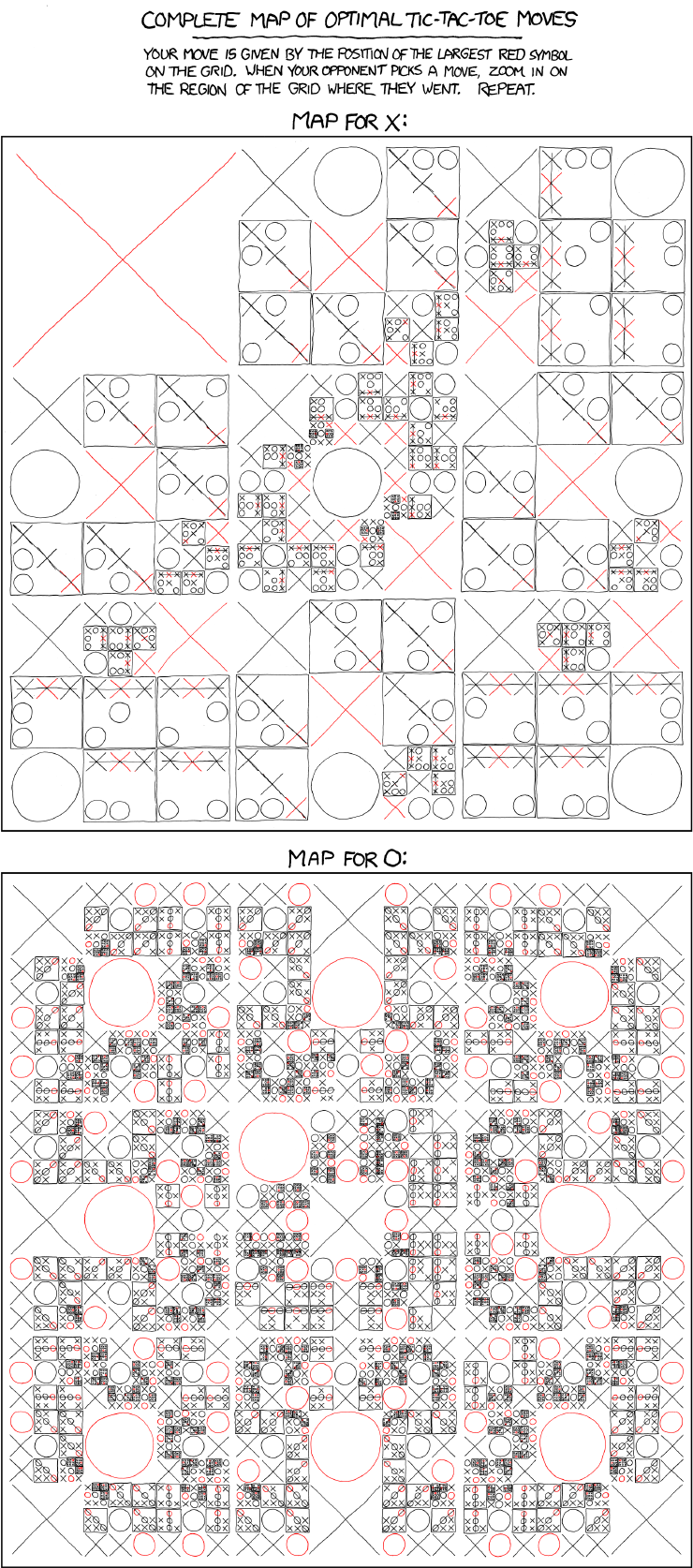
xkcd: Tic-Tac-Toe

I think this comic is pretty cool, but sometimes I find it hard to follow. Maybe adding some interactivity would help.

Craigslist.org

Might be interesting to make a real-time visualization application for new posts (i.e., in apts/housing)

Caitlin Boyle :: Possible Data Sources

by Caitlin Boyle @ 12:32 am

:: in order of preference ::

1. ) Using subtitle files for popular tv shows to search for the frequency of the titular word.

2. ) National overview of power market

3. ) North American bat ranges

Eric Brockmeyer – Project 2 (data sources)

by eric.brockmeyer @ 12:15 am

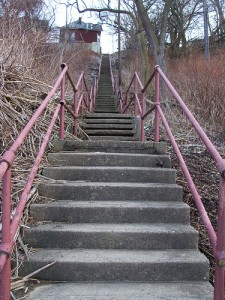
Pittsburgh Public Stair Cases

Visualization of steps based on game style interaction. Users may participate by downloading a smartphone app which records location, elevation change and image of the various staircases throughout Pittsburgh.

This will document and visualize the location and state of decrepitude of Pittsburgh Public staircases.

Or, data may be gathered by myself of a series of stairs across pittsburgh describing slope, elevation change, etc.

Call of Duty stats vs Violent Crime

This correlation is based on my own excess of FPS hours logged and recent highly publicized acts of violent crime. This infographic would be intended to serve as a statement on the current state of affairs rather than a true correlation study (More Art than Statistics).

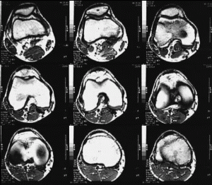
MRI cross sections

I’m not really sure how this data could be utilized as an infographic but I have access to MRI images (my own and others). k-space is the fourier transform of the input image data which is in turn reconstructed to create an output image. It would be intersting to see if this data could be reinterpreted not as an image but as a graphic providing visual data less legible in an image.

Ben Gotow-Potential data sources

by Ben Gotow @ 11:26 pm 16 January 2011

SMS Message Logs:
For the last couple weeks, I’ve been working on a tool that syncs SMS messages off Android phones and stores them on your computer. As a result, I have a data set of thousands and thousands of text messages I’ve sent and received, along with their contents and timestamps. I’d like to create an infographic that explores SMS usage by graphing messages as they travel between phones in a graph. I’d like to visually represent the social network that can be inferred from the frequency of communication between people, and also look at how SMS “conversations” (in which many messages are sent back and forth in quick succession) can be used to gauge the complexity of the relationship between two individuals.

GPS data of runners in Pittsburgh
Garmin Connect is a website that allows people to track their outdoor exercises (running, biking, hiking, etc…) using the GPS signals recorded by Garmin devices. The site has recorded more than 657,000,000 miles of movement by it’s users while exercising, and I’d like to synthesize that information to produce a visualization of this style (http://www.vimeo.com/10199455) that shows the activity of runners within the city of Pittsburgh.

Price of flights out of this winter crap over time
I’d like to write code that periodically looks at the price of plane tickets between Pittsburgh and warmer cities and provides a visualization of the average change in price in the weeks leading up to the flight. This visualization would be a map of the united states. Arrows going from Pittsburgh to other cities would change in thickness based on the price of those flights, and the user would be able to scrub through time to see prices change.

SamiaAhmed-PotentialSources-Infoviz

by Samia @ 11:08 pm

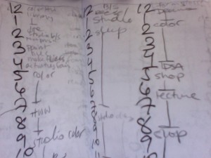
1. A record of every hour of my life for (most of the days) of fall semester 2009, and spring semester 2010.
In the fall and spring of my sophomore year, I kept a (fairly) meticulous record of all of my actions. Even in just looking at “backwards schedules” as I wrote them, I noticed patterns. It might be interesting to compare weekdays to weekends, or fall semester (in which I was more productive) to spring semester, (in which I was mostly cold) or even just see the language in which I wrote things.
Potential pitfalls: Trying to read and enter all of the data in order to work with it. Feels oddly voyeristic.

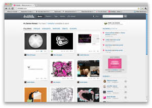
2. Dribbble
Dribbble has a pretty usable API, I’ms still throwing around thoughts on what I would actually like to visualize. Perhaps looking at “trees” of users and their draftees (dribbble is an invite-only website). I would ideally like to make some visual inferences, maybe looking at the colors used in posts, drafter to draftee, or debuts to popular? Maybe looking at the tags on posts to see what kinds of things do better on dribbble verses others?
Potential pitfalls: I have never extensively worked with APIs. Also, dribble seems to have a fairly low request count thing?

3. Twitter
Would it be possible to write/visualize “six degrees of erik spiekermann” (I have already checked — Kevin Bacon is not on twitter)? It might be interesting to see who are the “power users” on twitter.
Potential pitfalls: The internet tells me that “six degrees of separation” algorithms are mostly guess and check and recursive. This may not work so well on twitter. Erik Spiekermann does not follow very many people.

LeWei-Potential Data Sources

by Le Wei @ 9:58 pm

Wikipedia

As we all know, Wikipedia contains a wealth of information about pretty much anything you could hope for. Certain facts and figures are organized in a pretty standard way across Wikipedia entries, making them easily extractable with a little bit of coding.

UK Data Archive

[http://www.data-archive.ac.uk/find ]

“The UK’s largest collected of digital research data in the social sciences and humanities.” This is an educational and research oriented catalog of over 5,000 data sets. Seems like there could be a lot of useful stuff to find here.

Google Public Data Explorer

[http://www.google.com/publicdata/directory]

The main purpose of this looks to be displaying the data in interactive graphs, but they also provide the sources of the data. Playing with Google’s graphs could be good for previewing the data and seeing whether there are any interesting trends to explore, and then the actual data could be used for our purposes.

Ward Penney – Infoviz, Possible Sources

by Ward Penney @ 9:13 pm

Google nGram

Google Labs launched the nGram Viewer, which allows you to search their archived books for keyword frequency. People have had fun with it so far, comparing words like “phone, computer”, but the important thing is they provide the data to you in a raw format. I could compare analysis of different words against each other over time.

UFO Sightings and Descriptions

I found a collection of 60,000 UFO sightings in database format. Keywords and craft descriptors are listed per article. I could visually display what features are most described by them. I could create a UFO with those features, proportional by their mention.

US Diplomatic Cables

I have the US Diplomatic Cables released by WikiLeaks, and could do some word frequency analysis on them. Probably picking out a few keywords and displaying their frequency over time.

Project 2: Data Visualization – Project Brainstorm

by Asa Foster @ 7:35 pm

I would like to do some sort of physical representation (i.e. Rubens’ Tube) of data, with physical information being represented physically. I would also like to do something involving beer, as starting a brewery is a future goal of mine and a group of friends.

One idea that was tossed around was the creation of a “smart coaster” that would visualize data about the beer in the glass that is on it. It would be controlled by an arduino with a pressure/weight sensor, as well as a potential temperature sensor. It would feed data to a program that would represent the fullness of the beer (shown in a battery level type graphic) and its temperature. The program would be written in MaxMSP, and the hardware would theoretically be able to be replicated a number of times with their information all shown on a common screen.

Project 2: Data Visualization – Looking Outwards

by Asa Foster @ 4:14 pm

=================================================================

Visualizing Empires Decline | Pedro M. Cruz, 2010

This piece captures my attention because of the depth of historical and cultural information that can be obtained through a simple graphic. The paths of empires splitting up into independent nations is radically different for each empire, and a concise way of viewing that decline is presented with fissuring blobs, completely stripping centuries of historical tides down to raw numbers.

=================================================================

The Rubens’ Tube | Heinrich Rubens, 1905

wiki | instructables

The Rubens’ Tube is a physical representation of sound waves using propane flames. The changes in air pressure that sound produces directly control a bar emitting a line of many small flames, which change size based on the sine wave of the audio. I would be very interested in doing a project of this type in which I can build a physical object that monitors real-time data input.

=================================================================

200 Countries, 200 Years | Hans Rosling, BBC  Four

The brilliance of this bit is as much a factor of the fantastic representation of the data as it is the delivery of the narration. The way that he brings everything together over time, much like Visualizing Empires Decline, says a huge amount about how history has progressed.

shawn sims-potential data sources

by Shawn Sims @ 1:57 pm

I am very interested in the potential for real time (or as close as possible) data collection. I beleive that there are a few online services such as Pachube that may make it possible to use this for the data viz assignment. The following are possible data sources for the upcoming project…

1. Pattern recognition via ofx or java. Specifically I would be interested in counting the number of times words and/or gestures are used. That data would then be used to produce an infographic live behind the person(s). In order to do this I would need to record test data in order to directly tweak the code for a person. This could be done with computer and microphone and open-source sound recording. For post processing and later live processing libraries like ofxPatterns may be the best option.

Another Idea with pattern recognition is one where the input is video. Certain elements within the screen are analyzed for movement and similar objects that share this movement within a given threshold are then linked visually on the screen. Something like a visual network of movement. Many of the visuals I imagine are of trees in wind or things blowing or people walking.

2. Websites like Pachube offer the ability to stream live data from sensors that are networked. These sensors could be anywhere in the world or on the same local network. This becomes interesting when working with custom made arduino based sensors. This sensor setup may allow for cross referencing geogrphical location with the data collected.

3. The World Bank has recently made a very comprehensive data set that is aimed at research for finical and technical aid to countries around the world. Say what you will about the World Bank but they have out together an amazing data set. I believe that there is quite a bit of data here that when cross referenced in a thoughtful, critical, and provocative way could offer some very unique perspectives as to the dynamic of goods, money, and services distributed in our world. Find out more about the data set here.

Alex Wolfe | Data Visualization | Potential Data Sources

by Alex Wolfe @ 8:35 am

1.) http://www.whiteglovetracking.com/

A ridiculously large group of people helped isolate the position of Michael Jackson’s white glove in all 10,060 frames Billy Jean. 125,000 gloves were located. Use data to visualize its movement through space/time

2.)Flight vs. Fall. Track the number of people who choose to jump each year, and what they jump from. Probably will need to aggregate from several sources.

http://webappa.cdc.gov/sasweb/ncipc/mortrate10_sy.html

gives fatality rates/ information for falls (or any type of suicide, including falls,) for any specific year, gender, age group, or region

http://infochimps.com/datasets/accidental-falls-mortality-rate

Deaths from accidental falls, classified by underlying cause of death. Age-specific death rates per 100,000 population

http://infochimps.com/datasets/years-of-life-lost-yll-due-to-accidental-falls-mortality-rate

Classified by cause of fall.

http://www.dropzone.com/fatalities/

fatal skydiving accidents since 2004

http://www.dropzone.com/dropzone

skydiving dropzone locations.

3.) Use the We feel fine API,  http://datamob.org/datasets/show/we-feel-fine-api, to track the collective mood of the internet

and display as a dynamic visualization.

    « Previous Page
    This work is licensed under a Creative Commons Attribution-Noncommercial-Share Alike 3.0 Unported License.
    (c) 2023 Interactive Art & Computational Design / Spring 2011 | powered by WordPress with Barecity