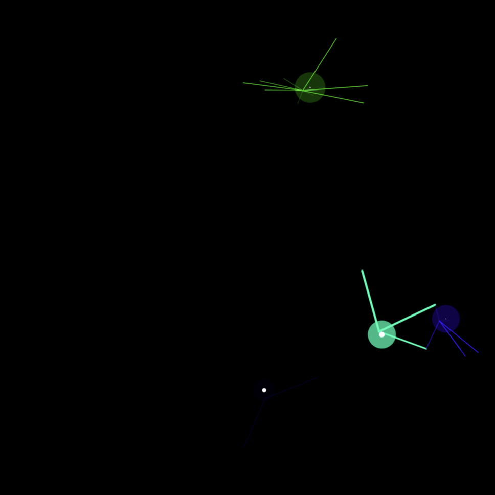
(no name), title: beegoonkee, I love these spiders!!! I can tell that so much went into perfecting the behavior of the spiders.

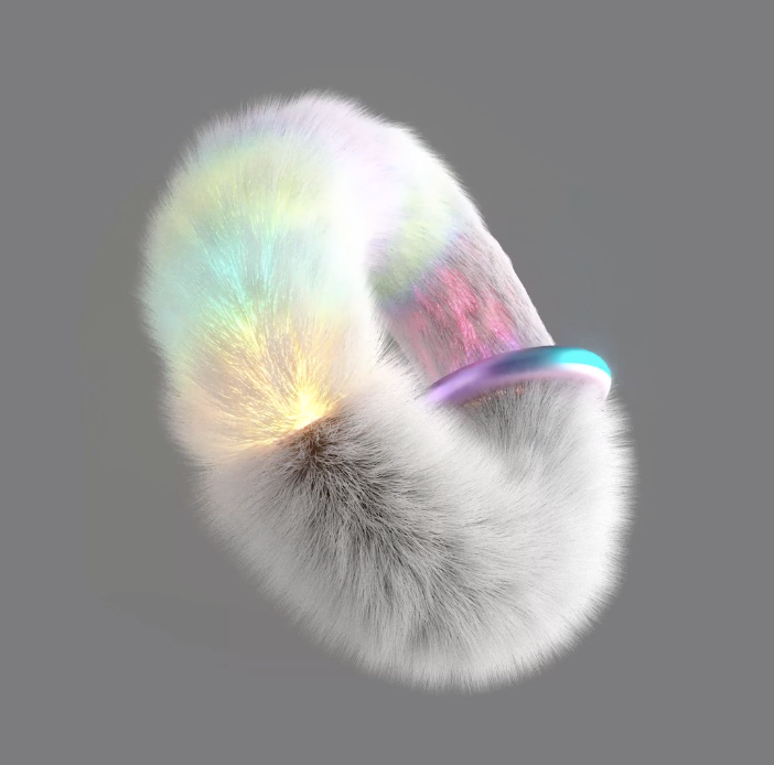
Mark Malta, Ringlight, this guy is super cool.

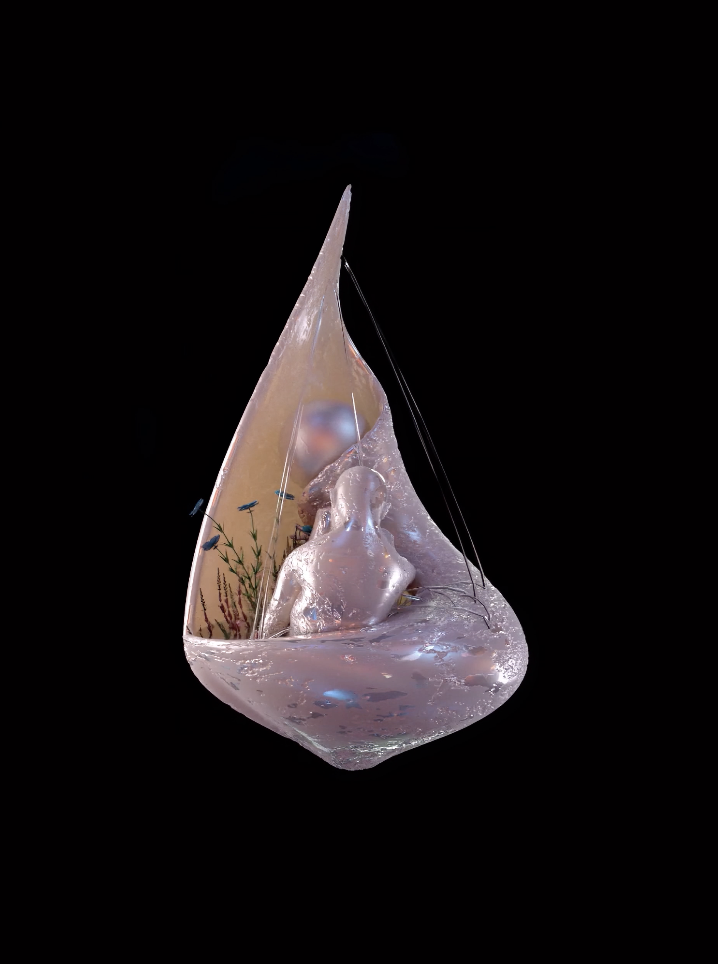
Gustavo Torres, Shelter iii, love the concept of loneliness being explored in digital art.

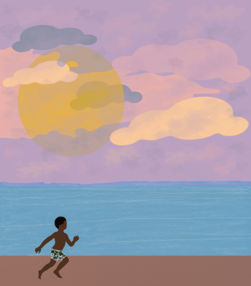
Paola Castillo, The Promise, I like the flatness of the scenery in this piece.

I’m noticing that hic et nunc has the best art. It seems very intricate and that people are being innovative for the sake of expanding the possibilities in art. A lot of it is even interactive or has music! Which to me shows greater care for the work like this or this. Although not all of it is like this, and a lot of it is just meh, it still feels like even the meh art is made by people who care about art and are having fun( Example). I also noticed that a lot of them weren’t for sale, which in a way is nice to see because it shows that people are primarily interested in sharing their work, though I think it would fine if they sold it too.
A lot of the foundation work seems to be “show-off” vibes without containing actually cool art. Here are some examples of what I mean. However, maybe I feel this way because I believe that this site is unethical and so I am more critical of their work. However, I really like this artist and piece (before seeing the description of who they are, which is Russian art activists who were put in jail for anti-Putin riots). I like that they are making money towards something and it made me enjoy their art a lot more after the fact as well. I think that this site has a lot of really cool stuff, it just irks me since a lot of these people are wealthy, they have the capacity to make more advanced art than possibly somebody without their amount of wealth. It also makes the art inaccessible to non-wealthy people, since a lot of it is sold for a lot of money. Meaning, the rich are getting richer and the poor are not exposed to this work. Even if you are not planning on buying anything, it could still make people who can’t afford to buy the art feel excluded.
This website feels like a lot of the work is just kind of pointless. A lot of it is not exciting or impactful in any way. (Example) And then there’s just bad visual stuff that just looks half-assed like this. However, there are some really good pieces interspersed with the bad like this.
I’m really happy someone wrote this to expose more black artists, who are very much under-represented in the art world. I wish they selected more artists so that I could look at more of these artists. However, I’m noticing that these works are not similar to the other really elaborate pieces on the foundation website, which use cgi and other software. On this page, most of the artists are using software that looks not as current or as advanced as other works on this website and are not interactive or mobile( https://rarible.com/paola ). This may be intensional, as the artists may just like painterly art, but also might be due to the fact that black artists don’t have the same financial benefits as white artists due to systemic racism, leading them to have less accessibility to expensive software which fucking sucks.