Final version (high res didn’t upload for first one):
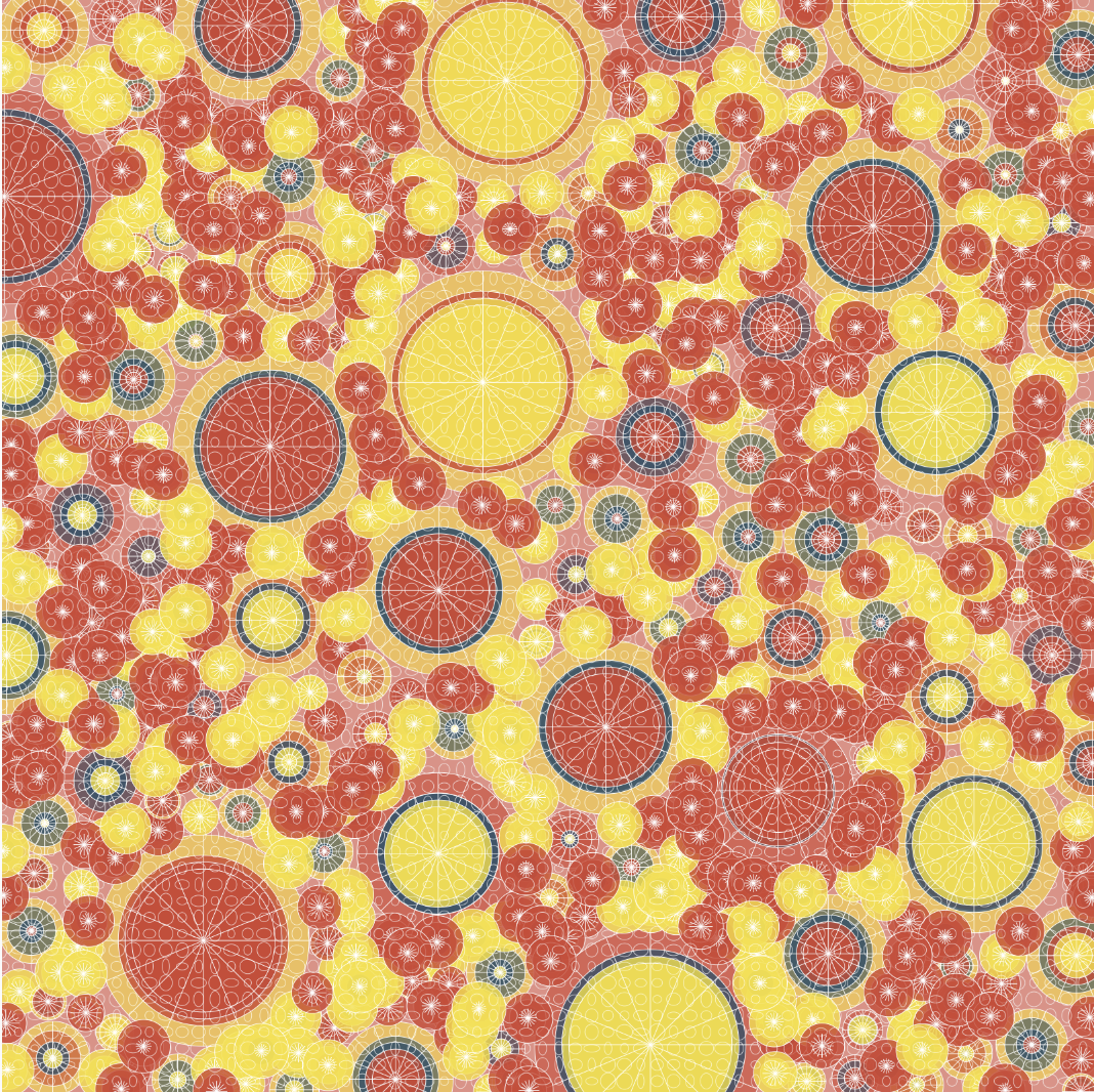
I like this darker color palette better, for some reason when it exported the colors changed and I love it
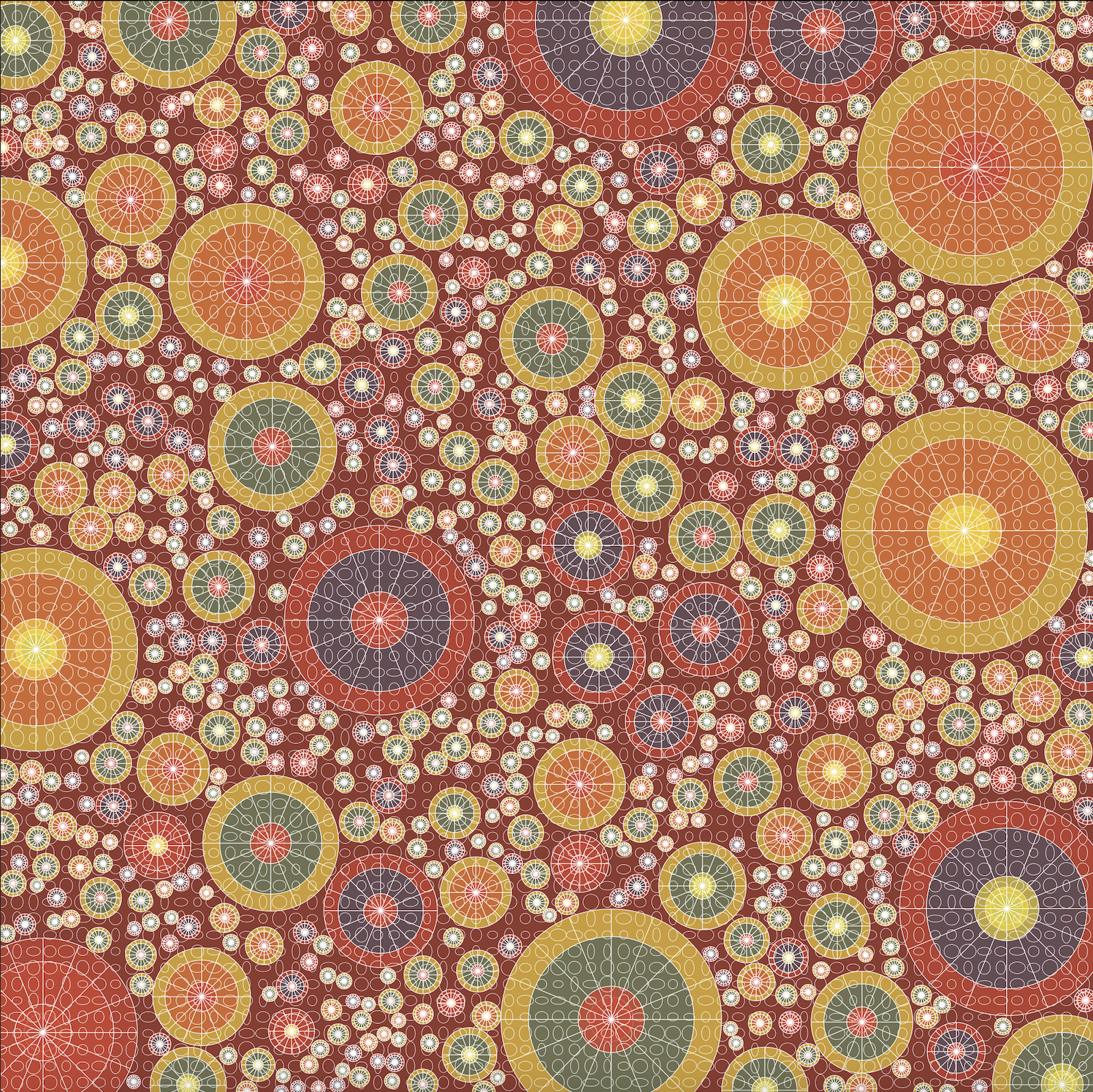
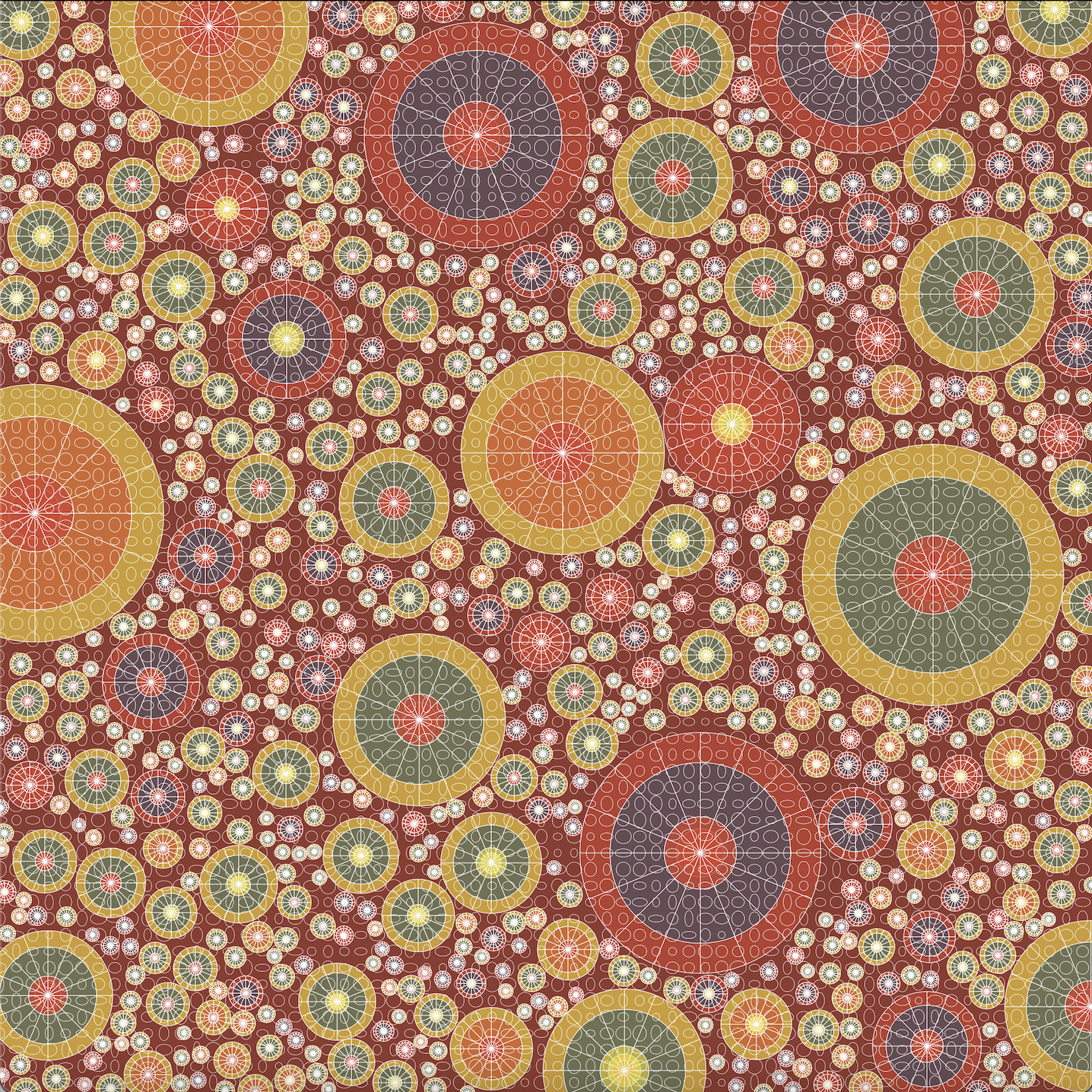
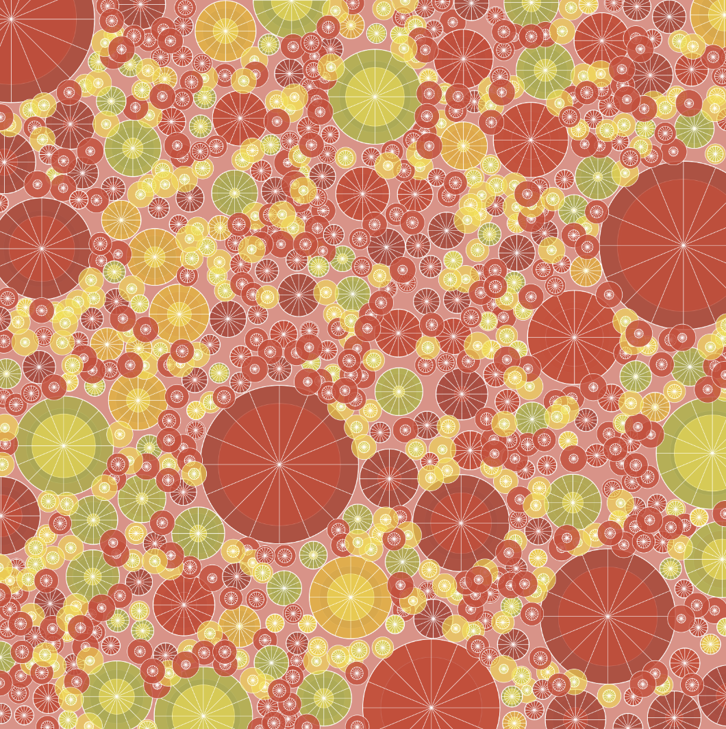
Version 2: Experimenting with color variation and circle packing (left has ellipse grid, right does not)
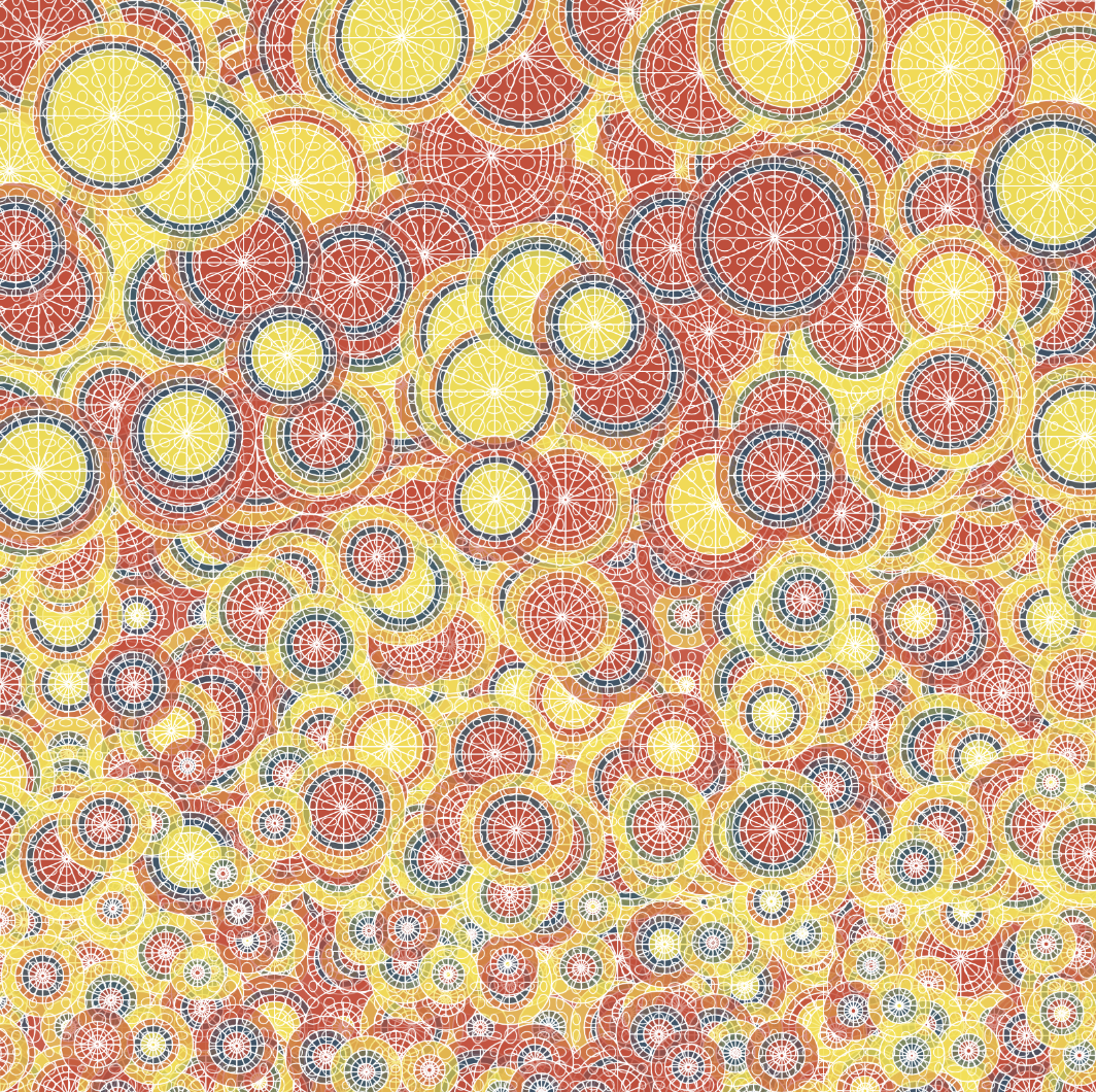
Version 1: Primary colors and size gradient
This design actually was inspired by what I made for the repeated motif exercise. I coded these radial lines on the circles and thought it looked super cool. I took that basic premise and turned it into something completely different. After all of the circles were created, I wanted another layer to add depth to the pattern. With another double for-loop, I created randomly sized ellipses to cover the entire image… I really liked how it looked together.
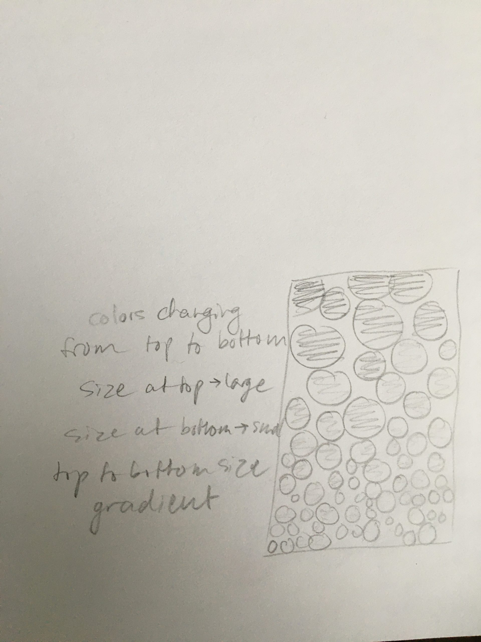
I did not actually start from a sketch with this wallpaper, though I did plan a bit after I had my idea. After that, there was a lot of experimenting and pleasant surprises. Originally I like the idea of the size gradient in the first version, but I personally didn’t love how crowded it felt. So I wanted to try out a circle packing design. With Connie’s help, we wrote the circle packing algorithm and then I merged my code with the new code. I shifted the color randomness around until it became what it is in the last version, and fixed a bug with the radial lines on the circles. I really like how it came out! It kind of reminds me of a Persian rug in my living room at home. If I had more time I would’ve loved to take up Golan’s challenge to make all of the circles irregular. Sadly, I could not do this by today but I will try it in the future!
