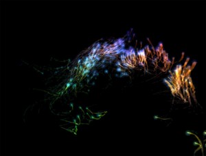
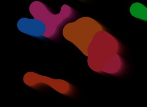
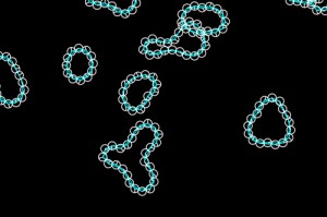
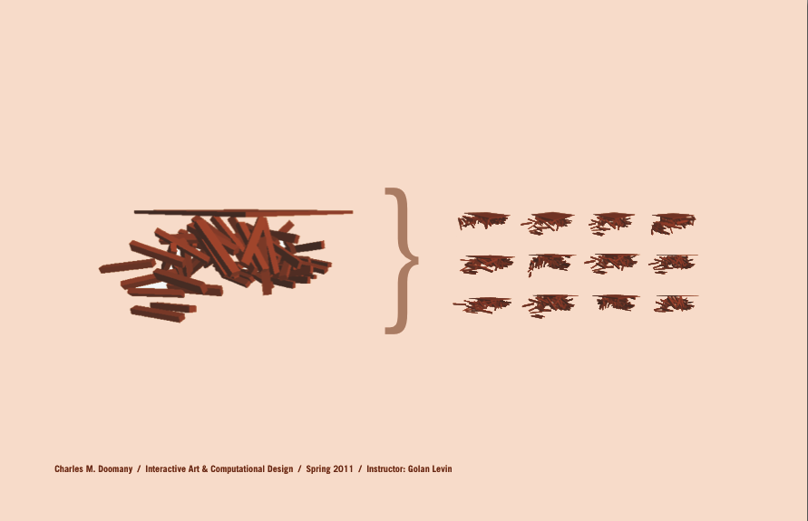
Quick Links to our Spring 2011 Kinect Projects

by Golan Levin @ 1:56 pm 26 May 2011

This page presents a quick link index to all of the interactive projects created in our semester course which made use of the new Microsoft Kinect depth-camera. These included a number of 7-week final projects, as well as sixteen small projects from a 2-week Kinect-specific unit.

Kinect-based final projects (May 2011):

Kinect-based small projects (February 2011):


Alex Wolfe | Final Project | Reaction Diffusion Textiles

by Alex Wolfe @ 4:17 pm 12 May 2011


Abstract

Knitting is often dismissed as a way to pass time for the excessively hip, or the excessively old, and it’s potential for digital fabrication ignored. But really, at its most basic level, knitting is an extremely robust method of transforming one continuous line into a three dimensional flexible form, incorporating color pattern, and also texture and volume seamlessly.

For this project I wanted to explore knitting as a way to fabricate textiles based off of generative systems, choosing to focus on Reaction Diffusion.


Inspiration

Although digitally controlled generative patterns aren’t really in existence, hand knitters for ages have been applying mathematical principles in order to not only produce interesting color patterns, but also form and texture. 

(from left to right, machine knit generative fair-isle by Becky Stern, hand knit from Sandra Backlund's pool collection, and Cables with Whisky sweater by Lucy Neatbody)

My inspiration for this project largely came from Sandra Backlund, one of my absolute favorite knitwear designers. By hand, and without any particular pattern she creates beautiful volumes and textures. However, due to the tedious nature of the work, she is only able to produce a handful of pieces each season, each entirely unique and unreplicable. I started wondering if this process of creating knitwear could be digitalized and algorithmically generated, like the work I’d done before with flocking. Becky stern also has been doing some amazing work with hacking knitting machines to print out patterns in fair-isle, and I was delighted to find out that similar texture producing stitches could also be created in the same methodology. However, as anyone who has knitted before knows, just randomly generating stitches, crossing your fingers, and hoping for the best often produces horrible and ill fitting results. Fortunately, there is a large community of knitters who have been applying mathematics, such as fibonacci sequences, cellular automata, and mobious strips, to the craft for ages. Lucy Neatbody was actually one of the first to apply such methodology to texture, using probability to pseduo randomly cable a sweater.

Process

Since even the most intricate patterns can be reduced to a very simple set of rules, knitting lends itself well to combining with more traditional generative system algorithms. After experimenting with several, including Voronoi diagrams and Diffusion-limited aggragation, I decided to focus on Reaction Diffusion, using Grey Scott’s equations.

Reaction Diffusion is a chemical reaction that produces a large range of emergent patterns in nature, from fish scales, to leopard spots and zebra stripes, whose hosts are often killed so their pelts can be used for textiles. By using it as a basis for a pattern making application, I liked the potential for creating and then fabrication patterns of our own.

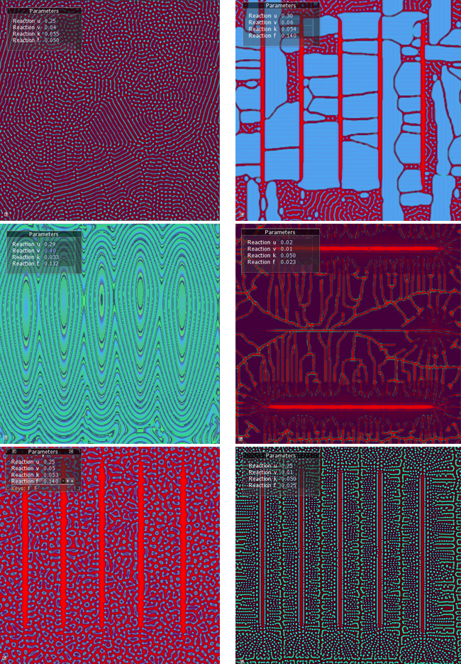
I began experimenting in processing, using Toxiclib’s excellent simUtils library, “growing” reaction diffusion to fit various patterns and forms, and then focusing on creating multiple layers of it in order to produce variety in pattern


However, Processing became frustratingly slow and unwieldy, especially when it came to seeding the diffusion off an underlying layer of the reaction. So following a tutorial by Robert Hodgin and rdex-fluxus on how to recreate Reaction Diffusion with shaders in Cinder I developed my final application.

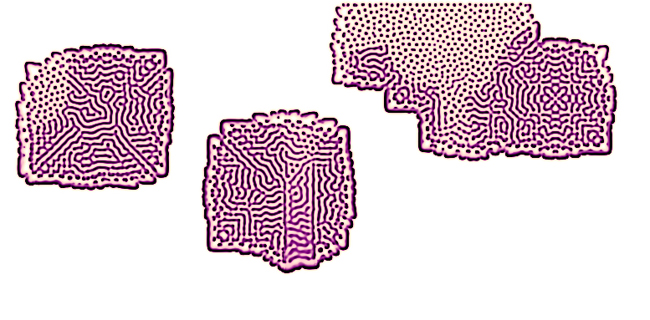
Producing “swatches” of pattern by adjusting the parameters of the equation and user interaction, I then translated them into patterns for knitting by analyzing the colors of pixels in the corresponding row, and translating them into a series of cables and eyelets.

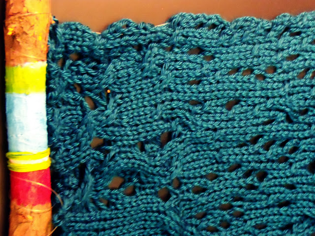
Since plans for using a computer controlled knitting machine fell through (which ended up being a much larger part of the project than I had ever intended), I then hand produced the above pattern on my own machine.

Doing it by hand instead of on a computer controlled machine took a significantly longer time (for something that was rather small), but it allowed me to incorporate certain textural stitches such as cables that would have been impossible otherwise. I really like the final product, and actually wherever there were 3×3 cables in the pattern produced the best results, but those are really difficult to produce on the machine (you have to knit those rows manually since the stitches are too tightly pulled). The 1×1 cables of which there was an abundance of in that middle section are much more subtle.

Conclusion

Although I am extremely pleased with the final swatch, ideally I wanted this project to operate on a much larger scale. Hopefully, one could have the application and machine set up so that once the user finishes creating their own swatch and entering their measurements, garments could be printed out immediately incorporating their unique texture in a few hours rather than the 28-30 it took to produce the swatch. Working with more advanced shaders in Cinder, and learning more than I ever thought possible about knitting machines, how they operate, (and also how to fix terrible broken ones purchased from craigslist!) were also excellent things to know I learned from this project. I’m very excited to pursue this project further, and am working on making a prototype dress using the algorithm, and modding a machine to just print this during the summer


Final Project: Transit Visualization & The Trouble With Large Datasets

by Max Hawkins @ 12:02 am

81B bus in Pittsburgh

If you’ve ever come into contact with the Pittsburgh Port Authority bus system you’re likely familiar with the following situation: You come to the bus stop just before the time when it’s scheduled to arrive. Minutes, often tens of minutes later the bus arrives—full—and is forced to pass you by. Frustrated and disappointed you give up on the bus and walk or drive to your destination.

In my two years in Pittsburgh I’ve become quite familiar with this situation, and this semester I was lucky to come into come across an interesting dataset that I hoped would help me understand why buses so frequently let us down.

The Data

It turns out that every bus in Pittsburgh (and in most other large transit systems) is equipped with some fairly sophisticated data collection equipment. A GPS-based system called AVL or Automatic Vehicle Location records the location of every bus in the fleet once every 500 feet. Another device called an APC or Automatic Passenger Counter is installed on the doors of each bus to track the numer of people boarding and departing the buses. The data from these devices and others is recorded in the bus’s computer and downloaded to a central server at the Port Authority in the depot each night.

This data is then periodically transferred to Professor Eddy in the statistics department at Carnegie Mellon to support an ongoing research project studying the Pittsburgh bus system. I discussed my interest in the bus system with Professor Eddy and he graciously granted me access to the data—all 40 million records—to play around with.

The Work

I was surprised, humbled, and frankly a bit disappointed with how difficult it was to deal with 40 million rows of data. Since I’m a data mining newbie, I unfortunately ended up spending the majority of my time wrangling the data between formats and databases.

However, I did achieve some interesting (if modest) results with the data I was able to process:

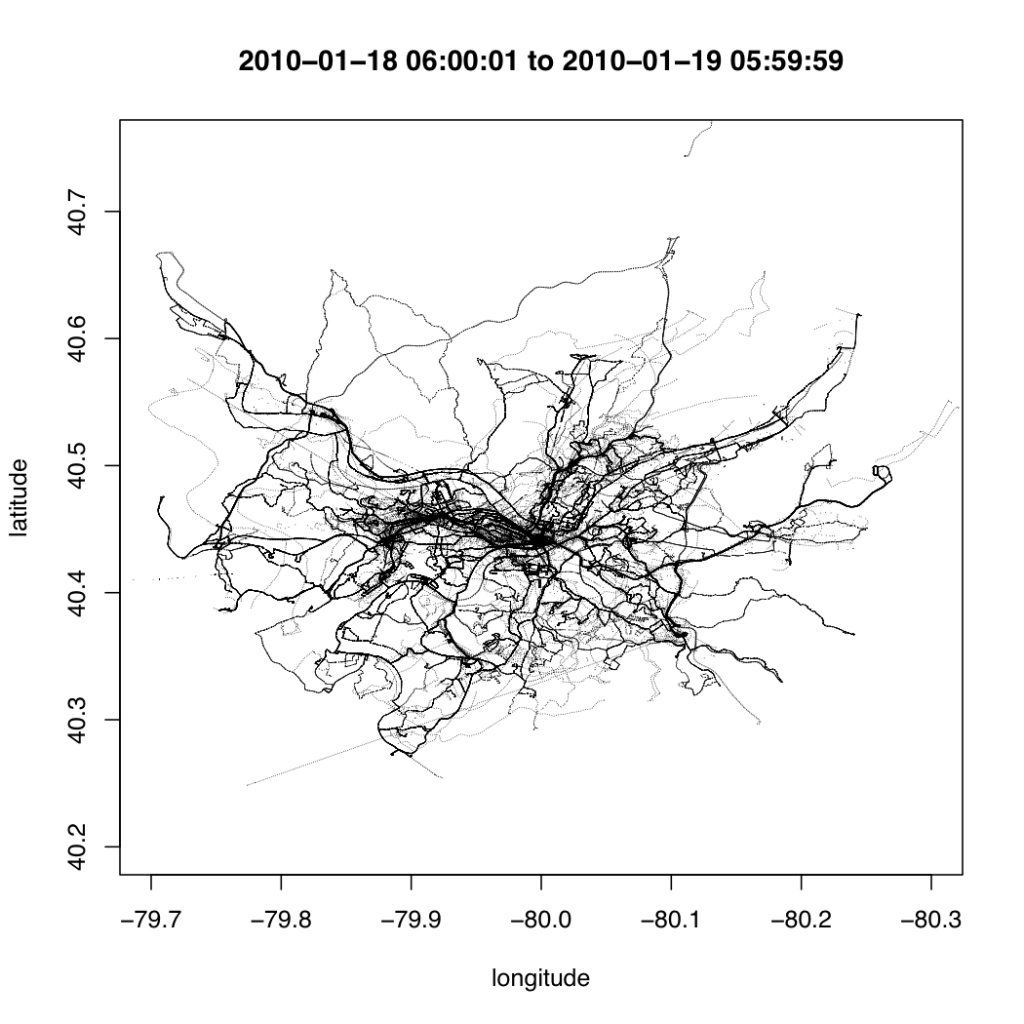
First, I created a “hello world” of sorts by using R to plot one day’s worth of AVL data in a map

Though graphically this visualization is quite rough, it gives you an idea of the type of data contained in the bus dataset. Simply plotting the data gives a rough outline of the map of Pittsburgh in a way that echoes Ben Fry’s All Streets. The data alone is all that’s required for the map to emerge.

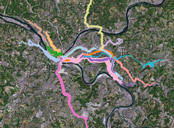
To better understand the data, I built a console that allowed me to interactively query the data and make quick visualizations. The system, built in Protovis and backed by MongoDB, allowed me to make queries based on the type, location, speed, and passenger count of the bus.

I created the above visualization using the console I created. It shows the path of every bus operating at 6:00 AM. The color of the line describes the route that the bus is servicing and the width of the line describes the passenger load. The map is zoomable and live-configurable using javascript.

The most interesting insight that I was able to gain from this console is that single buses often service multiple routes in a given day. The 71D you ride might service two or three other routes in a given day.

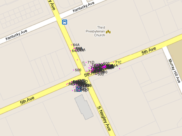
The other (troubling) thing that the console alerted me to was the amount of noise present in the data. Like most real-world sensor data, the location data collected by buses is quite fuzzy. One of the things I struggled with the most was cleaning this data to understand how the records were related and how far along the route each bus was.

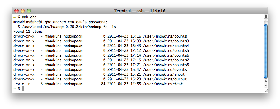
At this point I realized that the modest computing power available on my laptop would not be enough to process all of the data efficiently and I decided to bring out the big guns. In retrospect it may have been overkill, but I decided to throw the data into the School of Computer Science’s 80-computer Hadoop cluster

What’s still to be done

Why It’s Important

== Transpo Camp & Context ==

==

== The Trouble With Large Datasets ==

SamiaAhmed-Final-Final

by Samia @ 8:29 pm 11 May 2011

Daily Life is a generative book.

Daily Life is a generative book. With it I strove to codify and programmatically structure the rules I use to design so as to make a book that designs itself. Daily Life is a program that reads in data (schedules I kept sophomore year of everything I did every day), allows me to choose a color palette and grid structure, and then generates a book of a desired length.

Inspiration
After wrestling with the previous assignment (generative), I found that I had a hard time grasping what it means to make generative art or design, and the process of going about making generative work. In that previous project, I dove in head first into the code, and ultimately that hindered me, because I did not have a sense of what my vision was that I was implementing in code. I realized in doing that project, that I needed to find a better approach to generative work, rooted in my understandings of the process-driven design approach. In this final project, I tried to encorporate more of that. I spent time thinking and sketching about how I wanted to create parts of my book, and that when I finally made it to coding, I was making fewer important design decisions, and instead figuring out the best ways to implement and create the vision that I had already defined.

References
The Written Images book.

PostSpectacular genre book covers

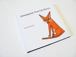
Amazing But True Stories about Cats

Process
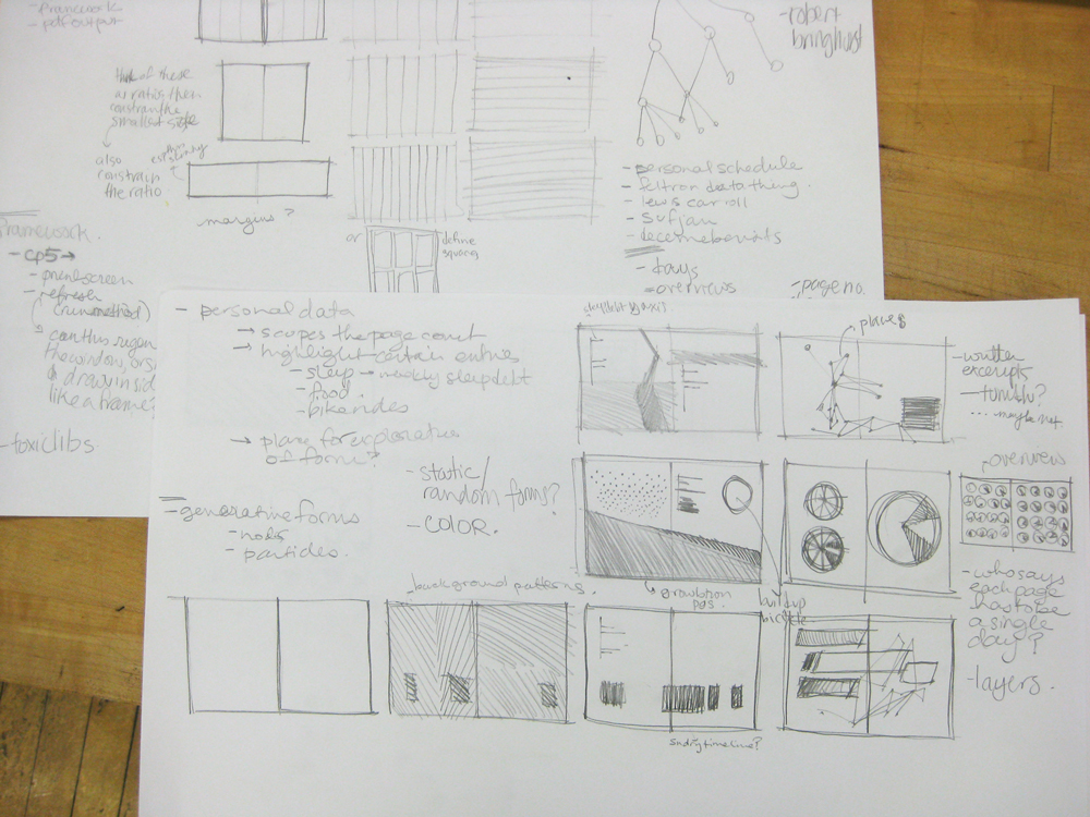
My process for this project began with sketching.

As I began working, one of my hardest challenges was working with two halves of the program — creating a system for the rules and output, as well as creating the visualizations themselves. My first checkpoint was making a program that allowed me to create a number of pdfs that I determined (documented in my checkpoint blog post). After that, it became a game of implementation, firstly, building the grids and color palettes (the color palettes took a lot of time wading through toxilibs documentation, which is rather robust, but has fewer examples than I would have liked), and then creating a series of different visualization-methods called by the program.

Reflection

Overall, I feel like I had a solid learning experience with this project, scoping it out in a ways that gave me concrete objectives to reach. I found that when I got in to the details of it, that generative work is incredibly nuanced and difficult to manage. Though I had a fairly successful output, there were so many details of codifying the rules of design that I wanted to see implemented, that even just dealing with the smallest visual paradigm resulted in many many many edge cases that needed resolution. As a result, the final product I have (though I think I did make a lot of strides forward) is no where as near to sophisticated as I would have liked (especially in terms of typography). I was amazed at how much time and detail it took to realize and resolve very small aspects of the design of the pages. Additionally, I found that by spending so much time dealing with the “data-ness” of my data (past schedules), that I felt somewhat limited in how to represent it, as opposed to simply creating a narrative of visualizations that I specifically curated for the book. However, without the guiding constraints of working with a set of data, I’m not sure that I would have had as successful of an output, because I may have just spent my time worrying about what I was making, as opposed to spending time making that thing.

Timothy Sherman – Final Project – Never Turn Your Back On Mother Earth

by Timothy Sherman @ 4:22 pm

Whatever is built on the table is rendered onscreen as a landscape. Landscapes can be built out of anything. Four heroes explore the world you build. There are many wonderful things in it. But many dangerous things as well. Who knows what will befall them?

Made using openFrameworks with ofxKinect and ofxSpriteSheetLoader. The sprites were loosely based off of examples included with ofxSpriteSheetLoader.

Inspiration
This project was developed from an earlier project by Paul Miller and me, Magrathea. More information on the inspiration and process for that project can be found through that link, I won’t reiterate it here. Instead, I’ll talk about my own inspiration for the particular direction I took this older work in.

I felt Paul and I had been successful with Magrathea, and a lot of the positive feedback we received had to do with how much potential the work seemed to have. A lot of this feedback had to do with the potential of using the engine for a game, and this was something that particularly piqued my interest. I have a strong interest in game design, and the ability to use such an accessible and non-traditional mechanic/control scheme for a game was very exciting. This is what made me decide to work from Magrathea for my final project.

I took inspiration from a number of other sources:
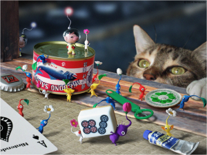
I’ve always been enchanted by the Pikmin games, made by Shigeru Miyamoto at Nintendo. The feeling of controlling a mass of little characters across this giant world that dwarves them and you really appealed to me, and the bond the player forms with the little creatures was something I wanted to evoke.

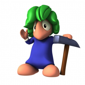
I also took inspiration from the Lemmings games, in which you have to give tools to a group of steadily marching creatures in order to help them survive through the danger-filled, booby-trapped landscape that they aren’t intelligent enough to navigate on their own.

I wasn’t sure for a lot of this process whether to go down the road of a game, or make a more sandbox-styled project, but I knew I wanted interaction with many characters like in these titles.

Process

I’ll talk mostly about design issues here, as technical issues are covered in my other blog posts: Hard Part Done and Final Project Update.

The process for finding a game using the Magrathea system wasn’t an easy one for me. I went through a number of ideas, and talked to Paolo Pedercini for advice in developing a mechanical system that worked. The design didn’t really come together until I had to make my “Late Phase” presentation in front of the class, recieve their feedback, see what was working, what wasn’t, etc. It seemed from the feedback I recieved at that session, that people were connecting to the character enough when he was incredibly simple, stupid, and unchanging, so I decided that expanding that, by adding more characters with more moods, deeper behaviors, etc. would result in an engaging and fun end result.

I added the abilities for characters to wander, instead of just seek the current flower, which enabled me to have more flowers, more characters, a troll that can wander as well, etc. The characters were also given new animations for running from the troll in fear, drowning, and a ghost that rises from the point where they died. This helped to flesh them out and make them feel more alive, which led to users enjoying a stronger feeling of connection and interaction with the characters.


Conclusion

After the exhibition, I gained a lot more perspective on this project. If anything, my belief that the core mechanic of building terrain is intensely interesting has been strengthened – a lot of people were drawn in by this. The characters though, seemed to be the hook that stuck a lot of people in, and I definitely think that people developed connections with them. There was a range of approaches – some ignored them, some obsessed over specific ones, some tried to just get rid of the troll whenever he appeared, some tried to help the troll eat everyone, or drown everyone.

I noticed that for small children, the Play-Doh was the biggest appeal at first – the actual landscape generation was totally ignored. After a few minutes though, they began to pay attention and care about the landscape – the characteres, I’m not sure ever made much of an impact, though they certainly noticed them. More feedback might be necessary in order to really hammer the point home.

I’m happy with how this project turned out overall – a lot of people seemed to really enjoy it during the show. I think theres a lot more room to explore using the terrain generation system, as well as systems using the kinect above a table. The most requested / asked about feature was color recognition – This is something I know is capable, but I didn’t have time to implement, or design a reason to implement it. Using multiple colors of play-doh perhaps begs this question, however.

Icon and Summary

Whatever is built on the table is rendered onscreen as a landscape for characters to explore.
Algo.Rhythm – Final Report

by huaishup @ 3:26 pm

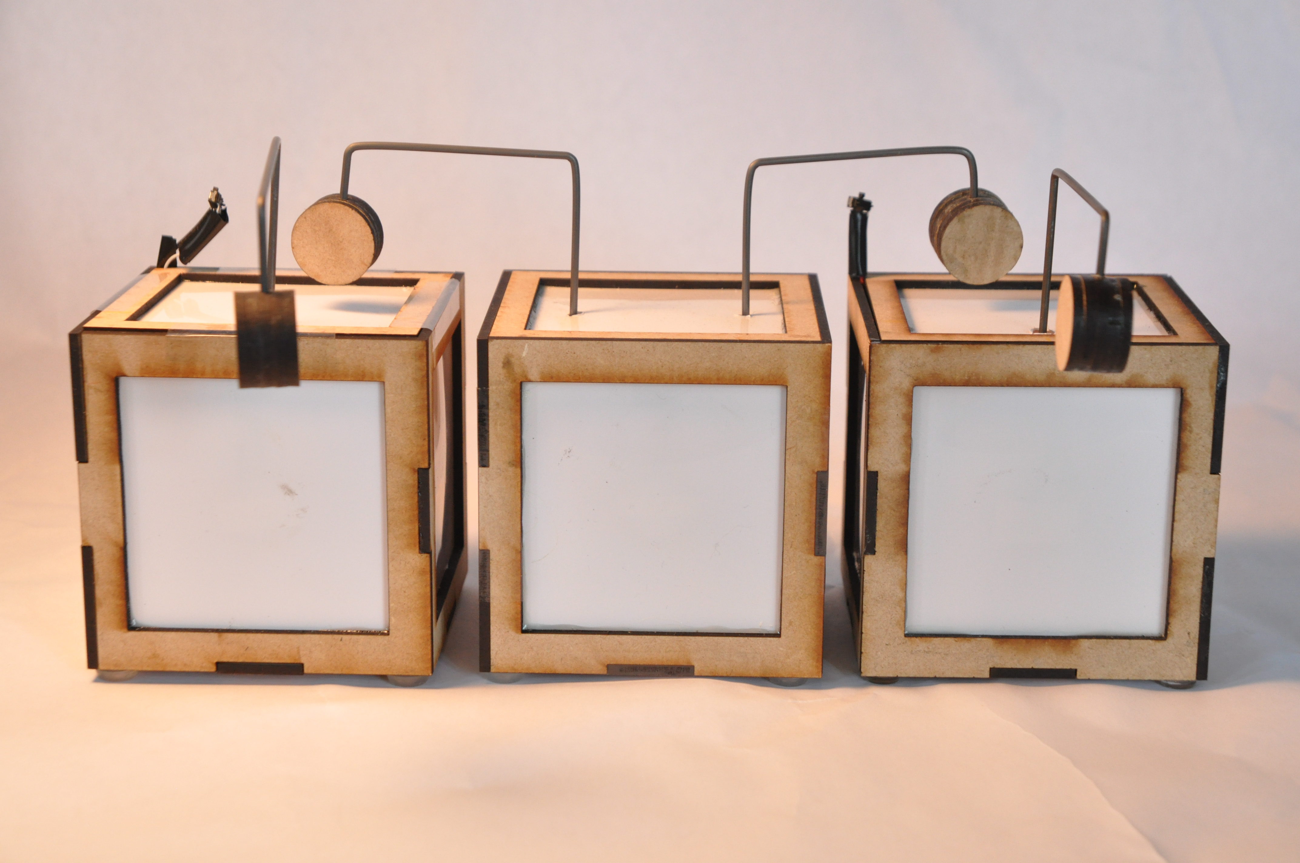
Algo.Rhythm is a physical computing music machine with social behaviors. It consists of a set of drumboxes with can record outside input and replay it in different ways like LOOP, x2SPEED, /2SPEED and so on. By arranging different functional drumboxes in 3D space,users will experience the beauty ofcreating music with algorithm.

INITIAL Inspired by the stunning Japanese drum show KODO in Pittsburgh a couple of weeks ago, Cheng Xu & I had the idea of re-perform those variational and euphoric drum pattern by using a set of “drum robots”. In the show, there were less then 10 people and each handled one or two drums; everyone’s drum patterns are not very complicate but as a whole, these simple drum patterns mixed together and sounds subtle and amazing.


INSPIRATION
Taptap

Taptap is a fantastic project done by Andy Huntington
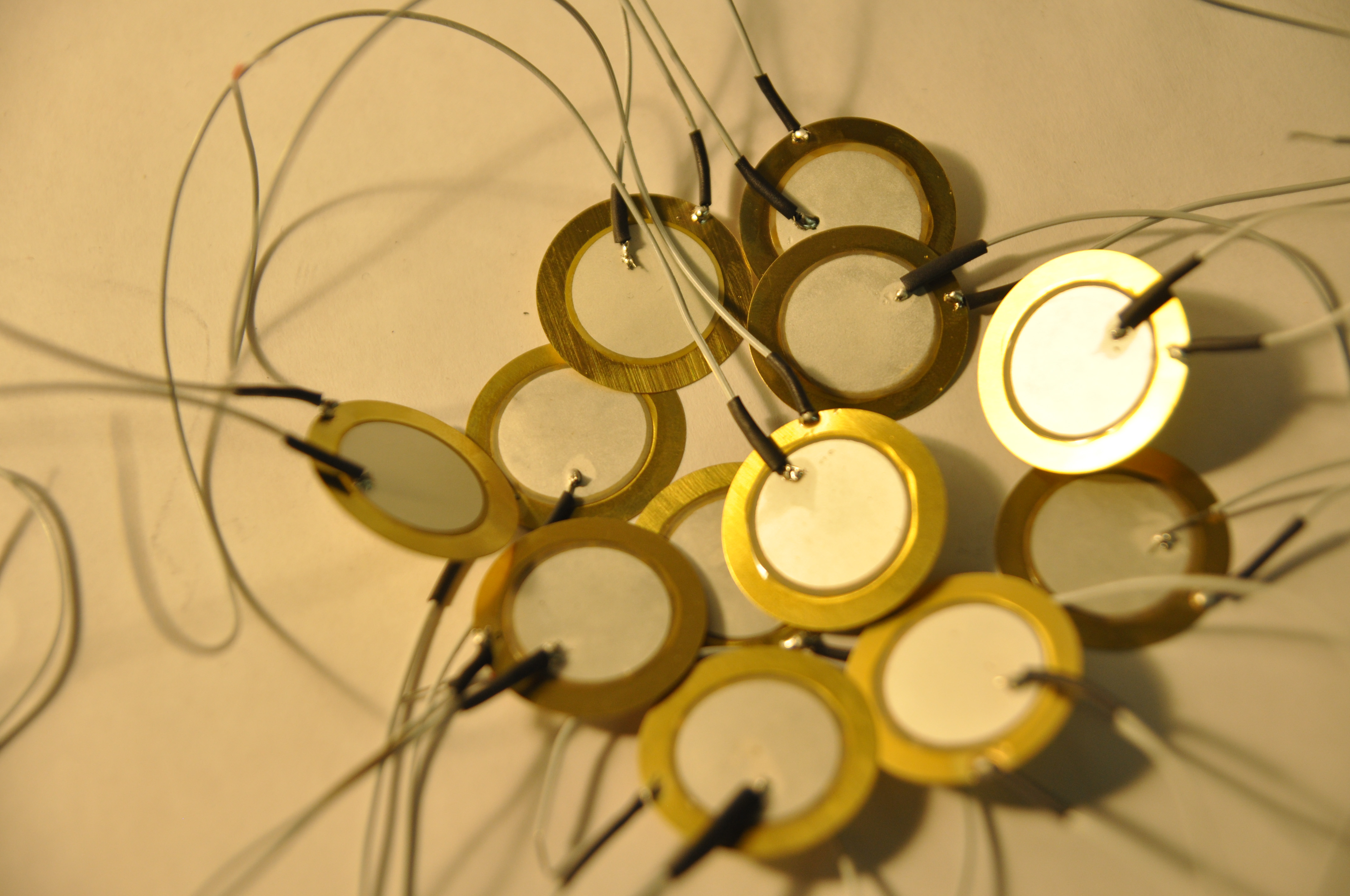
a couple of years ago. It demonstrate the concept of using modular knock boxes to create drum rhythms. Each knock boxes has a input sensor on top and a stick as an actuator. It will remember every input and repeat the beat once. By physically connect two knock box, it start create complex drum rhythms.   Solenoid Concert

This smart project using MAX/MSP to control different solenoids. The hardware is not complicate but the result is really impressive. CONCEPT We found Taptap is a good start. We share a similar idea to create drum pattern using modular robots. But the different thing is that we are more interested in using different “algorithm” to do this. Our initial plan is to let each drumbox can get drum pattern input from all sides, and has different drum output like LOOP function, x2SPEED function and so on. We also proposed that some of the drumbox should have 2 sticks so that it can pass the drum beat to 2 children simultaneously, like a decision tree. PROCESS To test the idea, I made a processing sketch to do the simulation. The result is pretty good. With only a loop function drum and several x2SPEED drum, we can create a relatively beautiful music rhythm.

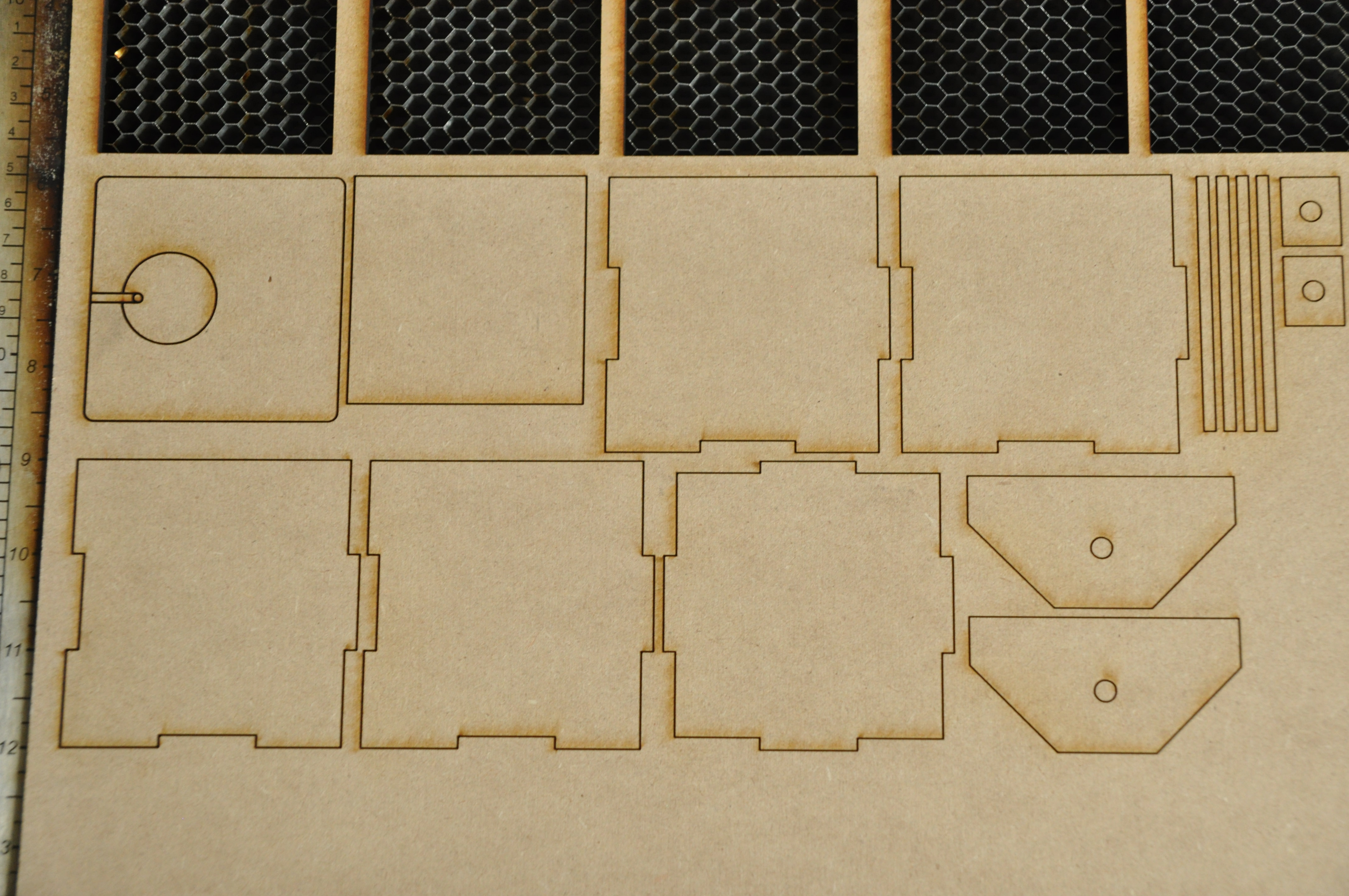
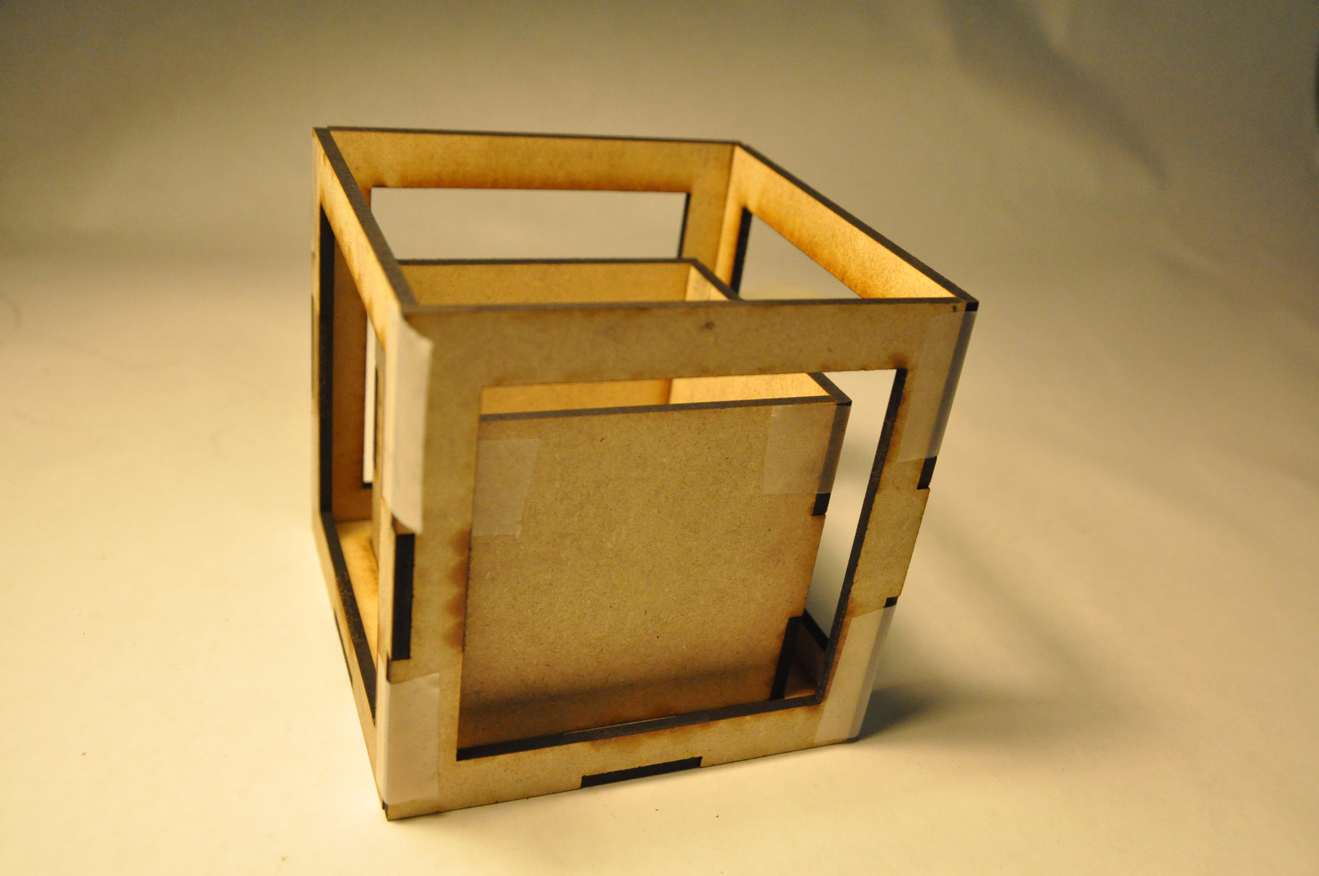
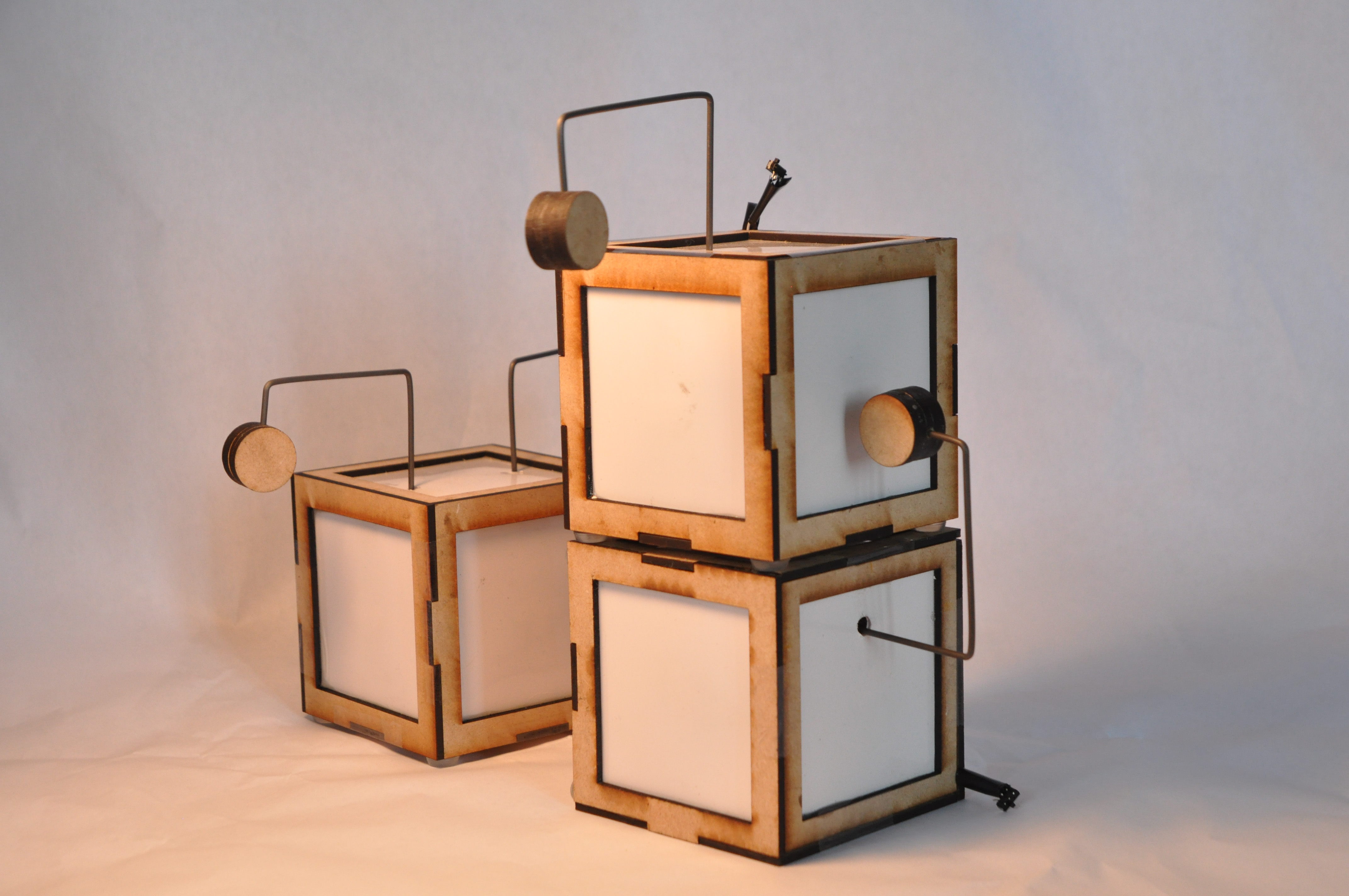
For the hardware, we put a lot of thoughts in it. We thought about different housing but finally end up as a cube shaped drum for the reason that a cube is easy to pile up and the shape is organic.

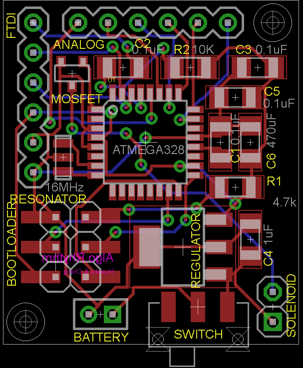
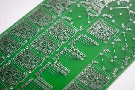
We also designed and made our own arduino compatible board. However, even if we designed and ordered the board 3 weeks before the deadline, we could not get the stuff in time. So in the current prototype, we still using the really big arduino board.


We made 5 different prototypes to test the concept and make it work. Here are some working process photoes:


FINAL


After experiencing several failures, the final prototype looked like the above image. It has 5 sides that can accept tap input and one or two drum sticks as the actuator. The two boxes with one stick are different functioned. One has the LOOP function, the other has the x2SPEED function.

Though the current version is not very actuate, it can demo the concept of passing drum pattern between different drumboxes. I am pleased with the result after experiencing a really hard and frustrated time.

The next step is to revise the current design to make the drumbox robust and sensitive. And I will surly keep working on it.

Final Project Documentation

by Chong Han Chua @ 11:46 am

The idea for TwingRing originated from the idea of generating sound through Twitter streams. There might be some abstract interest in generating music from Twitter stream, but it is probably difficult to translate musical sense from sentential sense. It then occurred to me that text-to-speech is yet another form of computer mediated sound generation. It follows that having the computer to speak something is funny, having the computer speak tweets would be much funnier. In other words, it’s serious LOLz.

And thus the idea was born. The idea is then fleshed out; rather then simply converting text-to-speech, it would be much more interesting if it simulates a conversation between two parties. A duet of computer generated voices would create a “context” in which the conversation is happening. And the “context” of a conversation, to rewind through the progress of communication tools, would be something like a phone call. To add to the concept” of the project, the phone call would be decidedly traditional, sporting the familiar shrill Ring Ring to it, and the entire idea of not taking itself too seriously and hence kitschy was born.

On a serious note, TwingRing examines the notion of conversation between people, especially as communication mediums changed. The telephone was the first device that enabled remote communication between two people. Then the next game changer was the mobile or cell phone, which basically enables the same communication channel between two people. Then there was text, and more recently, the rise of social media tools, or social communication tools such as facebook and twitter. However, the notion of conversations do not change, but merely shifted as these tools enabled people to communicate differently. This project aims to examine how the idea of twitter conversations, when put into the context of a phone call, would sound like.

Actually, it’s really just for LULz.

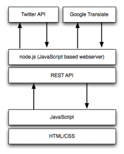
There are a few technical pieces required for this to happen. Let’s look at the larger architecture.

There are a few technical pieces required for this to happen. Let’s look at the larger architecture.

The two main pieces that enables this piece is the Twitter API and the Google Translate API. There are a few parts to the twitter API. The current implementation uses the search API. The search API retrieves tweets based on a search term up to five days historically, which is a current big limitation of the system. The Twitter API is used to look for conversations from a particular user that mentions another user. This is done for both sides of the conversation. The retrieved tweets are then sorted chronologically so there is a guise of some sort of conversation going on. However, the way that tweets are used currently, @mentions are much less about conversations rather than simply “mentioning” another user.

When that is done, the message is then examined, common acronyms replaced with long form words, and then fed into the Google Translate API. The API has a “secret” API that returns a mp3 when fed with text. However, there is a 100 character limitation currently. The JavaScript examines the tweet and breaks them into 2 chunks if the tweet is longer than 140 characters. The name of the user is then used to check against a small list of database to determine the “gender” of the user. The mp3 is then fed to a flash based sound player, and pitch bent based on the “gender” of the user.

User interface is built in HTML/CSS with a heavy dose of JavaScript.

In retrospect, the project would have benefited from a stronger dose of humor. As the project iterated through from the rough design to the clean design, I personally feel that some of the kitschy elements are dropped in favor for a cleaner identity. However, there is definitely this whole notion of being able to play up the kitsch-ness of the site. There is still a need to rework some of the API elements to make it easier to work with. There is perhaps a problem with discovery of tweets by users, both because of the limitation in the search API as well as @mentions not being sufficiently dominant as a method of conversing on Twitter. There can be some more work done on that front, but what I have for now, is really, just kinda LOLz.

Meg Richards – Final Project

by Meg Richards @ 11:17 am

Catching Flies

Using a Trampoline and Microsoft Kinect

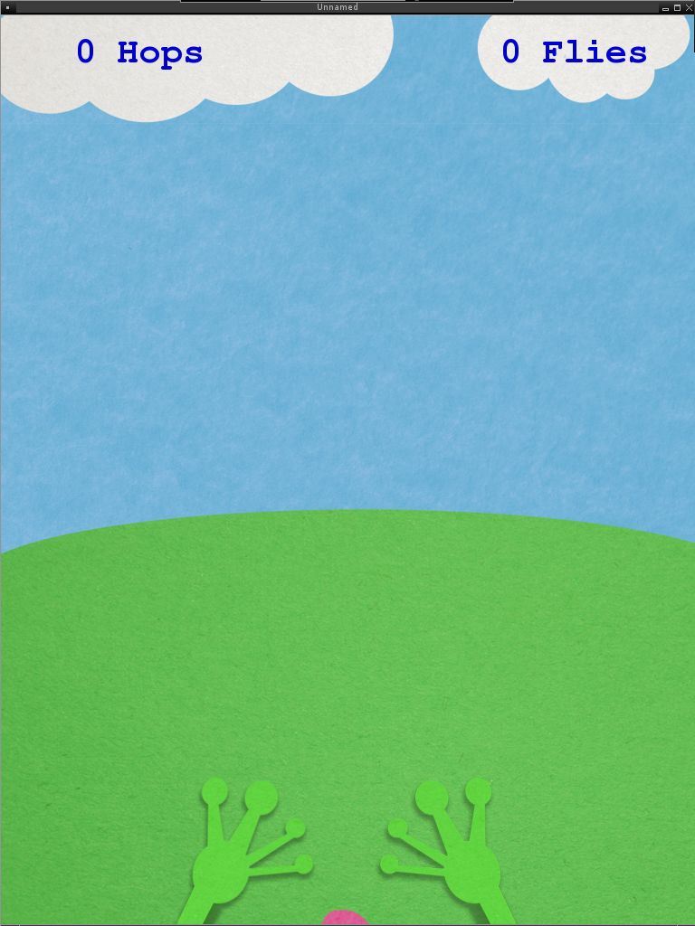
This project is a game that incorporates a trampoline into the player’s interaction with a Kinect. The player controls a frog by jumping and using his or her arm to extend the frog’s tongue and catch flies. The goal is to catch as many flies as possible before reaching the water.

Trampolines offer a new degree of freedom while interacting with the Kinect, and I wanted to create a game that demonstrated how one could be used to enhance the Kinect experience. Unlike regular jumping, a trampoline creates a regular and more predictable rhythm of vertical motion and can be sustained for a longer period of time.

Starting with that concept I originally began to create a side-scrolling game similar to Super Mario Brothers that would have the user jump to hit boxes and jump over pipes and enemies. I abandoned this attempt when it was clear that
it was uncomfortable for the player to adjust their actions to one that affected an orthogonal vertex. Additionally, complex object intersection became arbitrary complexity for a project attempting to achieve a proof of concept of rhythm
detection, skeleton tracking while bouncing, and hop detection.

Frog Arms

In the next iteration, the player was a frog whose arms would reflect their relative vertical position. A spring force at the end of each hands directs upward motion slightly outward and creates the illusion that the player is a frog jumping forward at each hop.


Hop Detection

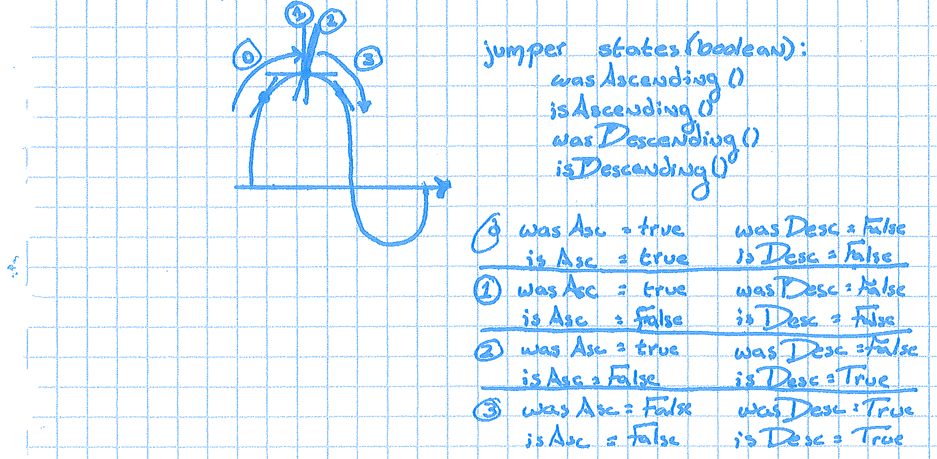
The most interesting phase of the project involved player hop detection. One full cycle of ascending and descending could be broken down into logical phases of a bounce. Using the middle of the shoulders as the most stable part of the body from which to determine the acts of ascending and descending, every update cycle would pull that vertical position and place it into a height cache. The height cache was an array of height values treated as a sliding window: Instead of comparing the current y position to the most recent y position it was compared to some defined number of former y positions. As the current y position would have to be larger than all the former readings within the window, the sliding window reduced the likelihood of a bad reading or jitter causing a false determination that the player has started a new phase of ascending or descending. After a period of ascension, the player is considered in stasis when a future y position fails to be larger than all members of the height cache.

This is reflected in the following logic:

bool asc = true;
bool desc = true;
for( int i=0; i < HEIGHT_CACHE_SIZE; i++) {
    float old = properties.heightCache[i];
    //height pulled from tracked user is relatively inversed
    if(old > y) {
        desc = false;
    }
    else if(old < y) {
        asc = false;
    }
}
 
// if we are either ascending or descending (not in stasis)
// update the previous state
if( asc || desc) {
    // on first time leaving stasis; preserve former asc/desc states
    if(!properties.inStasis) {
        properties.wasAscending = properties.isAscending;
        properties.wasDescending = properties.isDescending;
    }
    properties.isAscending = asc;
    properties.isDescending = desc;
    properties.inStasis = false;
}
else {
    if (!properties.inStasis){
        properties.wasAscending = properties.isAscending;
        properties.wasDescending = properties.isDescending;
        properties.isAscending = false;
        properties.isDescending = false;
        properties.inStasis = true;
    }
}

Finally, with this logic in place, a hop is accounted for by the following:

if( wasAscending() and isDescending() and 
        (abs(y - properties.average_weighted_y) > REST_Y_DELTA)) {
    properties.num_hops++;
}

NB: The REST_Y_DELTA is used to account for the trampoline’s affect on a player’s rest state.

Gameplay – Flies

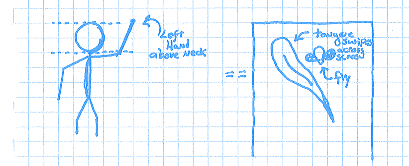
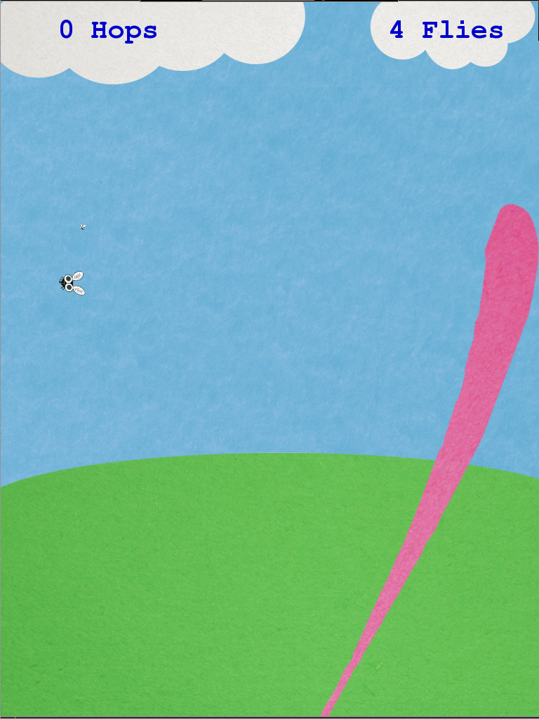
With the foundation in place, gameplay became the next phase of development. Continuing with the frog theme, I introduced flies as a desired token within the game. As the arms were presently unused, they became the tool used for fly interaction. Once the fly came close enough (they would gradually become larger as they approached the player), the player could wave their hand above shoulder level to swipe the frog’s tongue across the screen and gather any flies that hadn’t escaped off screen.


Gameplay – Stats

In order to show a player’s progress and bring encouragement, their number of hops and the number of flies their frog had collected were displayed on clouds at the top of the screen.

Gameplay – Endgame

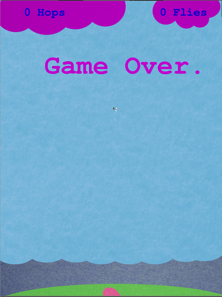
Finally, the end game became the grass descending into the sea. Each hop would keep the grass from descending some marginal amount increasing the length of the game and thus the time available to catch flies.


Conclusion

While gameplay left a lot to be desired, I believe playing to my strengths and focusing on logical determinations of the jumper’s state and the resulting generic ‘jumper’ class and header files, which can be dropped in to future games involving rhythmic vertical motion, will ultimately prove worthwhile. After the public exhibition, it became clear that smaller children were having trouble getting proper hop detection and corresponding calculations. Once I fix some of the code that relied on incorrect constant values, it should be ready for general release.

Icon & One Sentence Description

Fly Catching is a game using a Kinect and trampoline where the player controls a frog that can hop and catch flies.

Passengers: Compositing Assistant + Generation

by chaotic*neutral @ 11:12 am

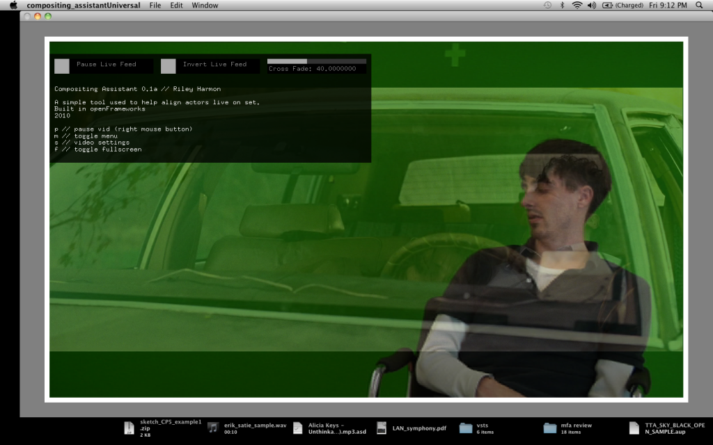
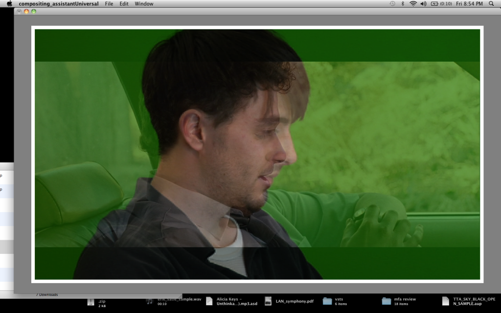
This project conceptually started before this class. I was working on compositing myself into Hollywood car scenes. I was using a crappy piece of software to live preview and align the actor within the background plate they would be composited into. I realized I could write a bunch better application to do the job. It allows the live feed + image to be paused together to look closer/discuss with camera assistant, toggle between images, crossfade between images, load directory of images. It is a very simple application, but a tool for something much greater. That was the first step of the process.

The compositing assistant allows me to take a live HD image over firewire from the film cam, and cross fade between that video feed and the background plate. Think onion-skinning. A by product of this process are interesting screenshots where self and original actor are morphed.

The second process was to make these films generative, so they could theoretically be infinitely looping. Currently these films only reside on youtube and dvd’s – the generative versions are created to an hour long dvd – so perceptually a viewer seems them as infinite. It could also run on a computer.

The Markov Chain code is implemented and works, but I have yet to add a GUI for tweaking of values.

INSPIRATIONS

Inspiration comes from a lot of experiences in cars. People moving in and out of vehicles. Instead of action based, or narrative driven, I thought I would rather have a scene of superficial nothingness, but when you start examining thin-slices (http://en.wikipedia.org/wiki/Thin-slicing), the viewer projects something there. (Kushelov effect)

(a facebook status update)
I park on the street, start rummaging through my bag. Girl idk is confidently walking towards my car on the phone. She opens my passenger side door and gets in. I say, “oh hello.” She looks freaaaaked out and says, “oh jesus, you’re not my dad.” I respond, “No Im not, but I guess I could pretend to be if you want.” She apologizes and states how confused she is, gets out and continues walking down the street.

Literature:
Remainder, Tom McCarthy
Platform, Michel Houellebecq

THE FUTURE

I still have yet to see these projected large format and in context with each other. I need to play with presentation and how they function together as a whole. I need to continue pushing the scenes and play with genre. Right now the films come from a very specific time range and very specific film stock, thus they look similar. What if it was a horror film car scene? Or a sci-fi car scene, etc? I need to create more. My goal is 10. I currently have 5, but one of which I wont ever show.

Marynel Vázquez – Future Robots

by Marynel Vázquez @ 5:08 am

Future Robots

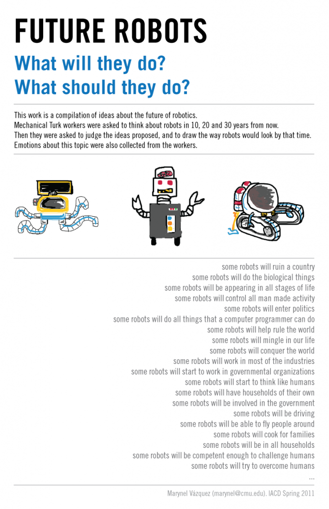
  627 crowdsourced ideas about robots in the future.


INSPIRATION


As the field of robotics advances, more intelligent machines become part of our world. What will machines do in the future? What should they be doing? Even if we know what we would like machines to do, would other people agree?

To address these questions, I made a (crowd-sourced) book that compiles predictions and emotional responses about the role of robots in the future. The ideas collected about the use of robotics technology are mainly a product of popular culture, personal desires, beliefs and expectations.

We may not know what will happen in 10, 20 or 30 years from now, but we know what we want to happen, what we fear, what excites us. Is the robotics field expected to impact our future for better? Hopefully, the book product of this work will be a valuable sample of opinions.


BACKGROUND


Crowdsourcing has been used in the past for collecting creative human manifestations. One of the most famous projects that used Amazon’s Mechanical Turk for collecting drawings is Sheep Market by Aaron Koblin. The author of the project paid 2 cents to 10,000 Turkers to draw a sheep.

More recently, Björn Hartmann made Amazing but True Cat Stories. For this project, cat stories and drawings from Turkers were compiled in the form of a physical book. More details about this project can be found in Instructables.com.

In term of data collection, another important reference is the work of Paul Ekman on emotion classification. Ekman’s list of basic human emotions includes sadness, disgust, anger, surprise, fear, and happiness.

When collecting information from Turkers, a traditional scale for ordinal data is the Likert Scale. Different Likert-type scale response anchors have been studied by Wade Vagias. In particular, the traditional “level of agreement” scale turned out to be very useful for the Future Robots book.


THE PROCESS


CROWDSOURCING DATA

The ideas, opinions and drawings presented in this book were collected through Mechanical Turk. The data collection process went as follows:

  1. Workers were asked to complete two sentences: “In X years, some robots will…”; and “In X years, robots should…”. The possible values for X were 10, 20 and 30.
  2. For a given sentence from step 1, five workers had to agree or disagree with the statement that it was good for our future. Each of them had to select a feeling that would represent their major emotion if this sentence became true. The possible feelings they could choose from were Ekman’s basic emotions.

    Workers also had to agree or disagree with the statement that they foreseed a bad future if the sentence became true.
  3. A drawing of a robot was collected for each of the sentences from step 1.

The first step of the data collection process involved 627 sentences proposed by the workers (refer to this post for more information). Five different people had to give their opinions about each of these sentences in step 2, while only one person had to provide a drawing (see this other post for more details on steps 2 and 3 – there you can find the Processing.js code used to collect drawings -).

Note that different workers responded throughout the data collection process, though some completed many of the steps previously described.

MAKING THE BOOK

Mechanical Turk outputs comma-separated-value (.csv) files with the workers’ responses. Python was used to process all this data, and generate summarized files with results and simple statistics. Some of the data was later used by Processing to generate emotion charts such as the following:


In 10 years, robots may make us feel...

A LaTeX class was created for the book after organizing all the images and graphics that were generated. This class was based on the classic book template, though it alters noticeably the title page, the headers, and the beginning of each section. Once the layout was set, a Python script was run to automatically create all the sections of the book as LaTeX input files.

The pdf version of the book can be downloaded from here. A zip file containing all LaTeX source can be downloaded from here.


VIDEO


CONCLUSIONS


My first impression was: the future is going to be bad! When I started reading the completed sentences proposed by the Turkers, I encountered many ideas that resembled famous Hollywood movies were the Earth and our race is in danger. Certainly, popular culture had an impact in the Future Robots book. Nonetheless, after generating the graphics for the book, my impressions drastically changed. A lot of happiness can be seen throughout the pages. Even though the data shows that there is concern about a bad future because of robots, the expectations of a good future are significant. From the ideas collected, for example, the expectation of a good future in 10 years has the following distribution:


Goodness

If I had had more time for the project, I would have computed more statistics. For example, having a chart that compares the future in 10, 20 and 30 years from now would be a nice addition to the book. Also, an index of terms at the end of the book would be an easy and interesting way of exploring the data.

Another format for the project could have been a website. This option is very promising because, in general, it is easier to access for people than a physical book. A Processing visualization could be made to incorporate additional ways to analyze the data.

Le Wei – süss

by Le Wei @ 1:19 am

süss

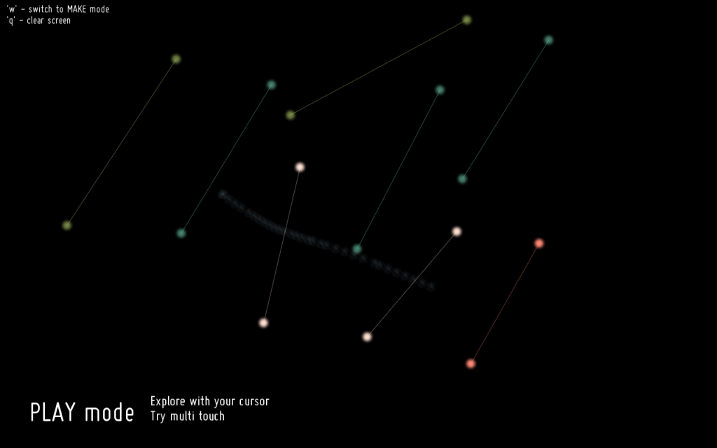
süss is a sound generator where the user creates lines that play sounds when strummed. The user controls the length and color of each line, which in turn affects the pitch and voice of the sound it makes. By putting lines near each other, chords and simple melodies can be created. Currently, the project is controlled using a trackpad and supports a few different multi-touch interactions, so it can easily be adapted to touchscreen devices such as the iPad or iPhone in the future.

INSPIRATION
Since I have never worked with audio in any projects before, I decided this would be a good time to learn. I was inspired by a few projects which incorporated music and sound with a visual representation of what was being heard. In some projects, the sound was support for the visuals (or vice versa), but in other projects the two aspects were combined quite seamlessly. I was especially interested in applications that allowed users to create their own music by making something graphical that then gets translated into audio in a way that looks good, sounds good, and makes sense.

mta.me is actually very similar to what I ended up doing for this project, although I only realized this just now when looking back on my research. This is a visualization of the NYC subway schedule, and every time a line is crossed by another it gets plucked and makes a sound.

A couple of other, more painting based projects that I looked at:

PROCESS

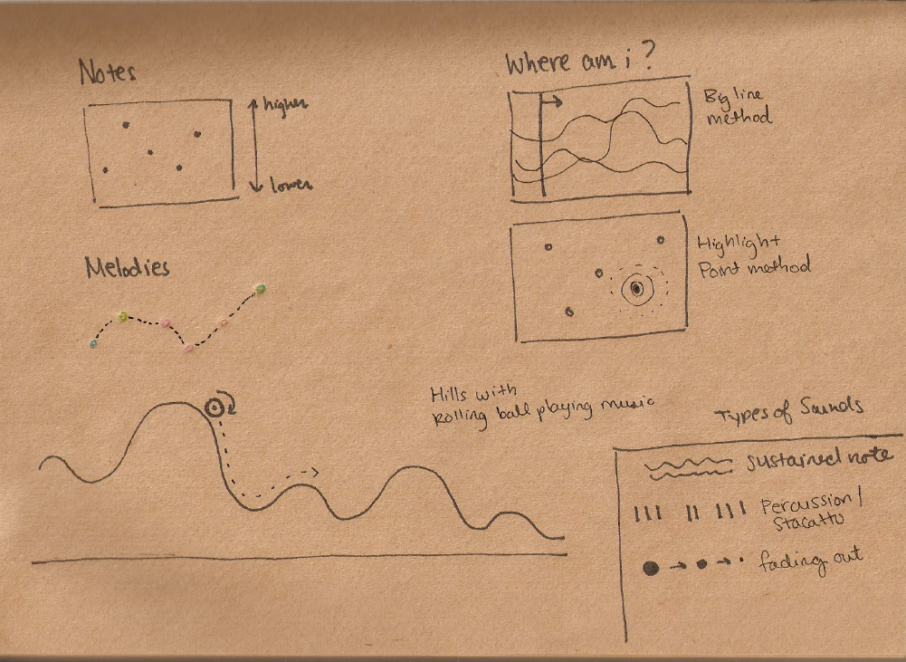
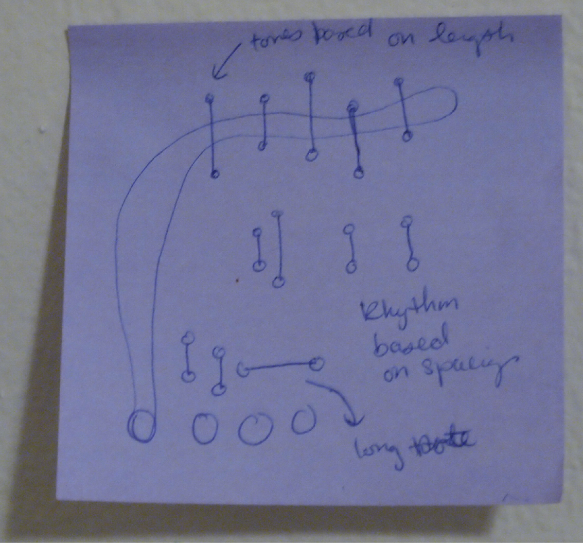
I knew from the beginning that I wanted to make a visual tool for creating music. However, I didn’t really know what a good way to represent the sounds would be, and I didn’t know how to handle playback of the audio. So I did some sketching to get some initial ideas flowing.

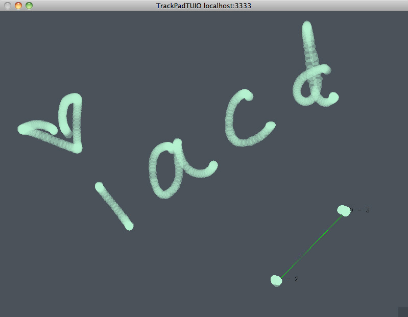
I also set up some code using TrackPadTUIO [http://www.010175.net/?browse=Monolithe], which gave me a way to access what the trackpad was recording. This got me started on thinking about ways to finger paint with sound.

I also chose to use maximilian [http://www.maximilian.strangeloop.co.uk/] to synthesize sounds. I had a lot to learn in this area, so in the beginning stages I only had really simple sine waves or really ugly computery sounds. Nevertheless, I gave the user the option of four sounds represented by paint buckets, that they could dip their fingers into and paint with around the trackpad while the sounds played. I decided to have the y-position of the fingers control the pitch of the sounds, but I wasn’t really sure what to do with the x-position, so I tried out tying it to some filter variables and some other random stuff. Eventually, I got tired of playing around with such ugly noises and decided to see if I could make real notes, so I implemented a little touchpad keyboard. It sounded okay, but it really wasn’t what I was going for in my project, so I eventually got rid of it. However, the keyboard was a good exercise in working with real notes, which made its way into the final iteration of my project. Even so, I was pretty unhappy with my progress up until a couple of days before the final show.

Two nights before the final show, I decided to scrap most of what I had and switch to a new concept, which ended up being süss.

My main motivation for switching concepts was to simplify the project. Before this, I had too many sounds and visuals going on with all the paint trails and long, sustained notes. By having the user create areas that get activated through their own actions, sounds are only played every once in a while, and we get closer to features such as rhythms and melodies. Another success was when I figured out how to use envelopes with the maximilian library, which led to slightly more pleasant sounds, although they are still not great. With help from my peers, I was also able to give the project a facelift so that it looks much better than what I had in my intermediate stages.


REFLECTION
From the beginning of my project up until the very last days, I only had a general idea of what I wanted to do. A big problem throughout the process was my indecision and lack of inspiration in figuring out exactly what would be a good visualization and interaction for my project. At my in class presentation, I was still not happy with what I had, and I had to do a lot of work to turn it around in time for the final.

I’m pretty satisfied with what I have now, but there are definitely areas that could be refined. I think the project could be really helped by adding animation to the strings when they get plucked. As always, the different voices could be improved to sound more beautiful, which would contribute to making nicer sounding compositions. And the way I implemented it, it would really be more appropriate for something with a touchscreen, so that your fingers are actually on top of the lines you are creating.

I learned a lot from this experience, especially in the realm of audio synthesis. Before this project, I had no idea what waveforms, envelopes, filters, and oscillators were, and now I at least vaguely understand the terms (it’s a start!). I also know how hard it is to make sounds that are decent, and how easy it is to write a bug that almost deafens me when I try to run my code.

100×100 and quick summary

süss is an interactive sound generator using touch interactions to create strings that can be “strummed”.

shawn sims-Robotic Mimicry-Final Project

by Shawn Sims @ 9:21 pm 10 May 2011

The future of fabrication lies in the ability to fuse precision machines with an intuitive, creative process. Our built environment will become radically different when standardization is replaced with robotic customization. This project is designed to generate a collaborative space for humans and robots by offering a unique design process. ABB4400 will mimic. ABB4400 will interpret + augment. You + ABB4400 will share and create together.

flickr set

Process
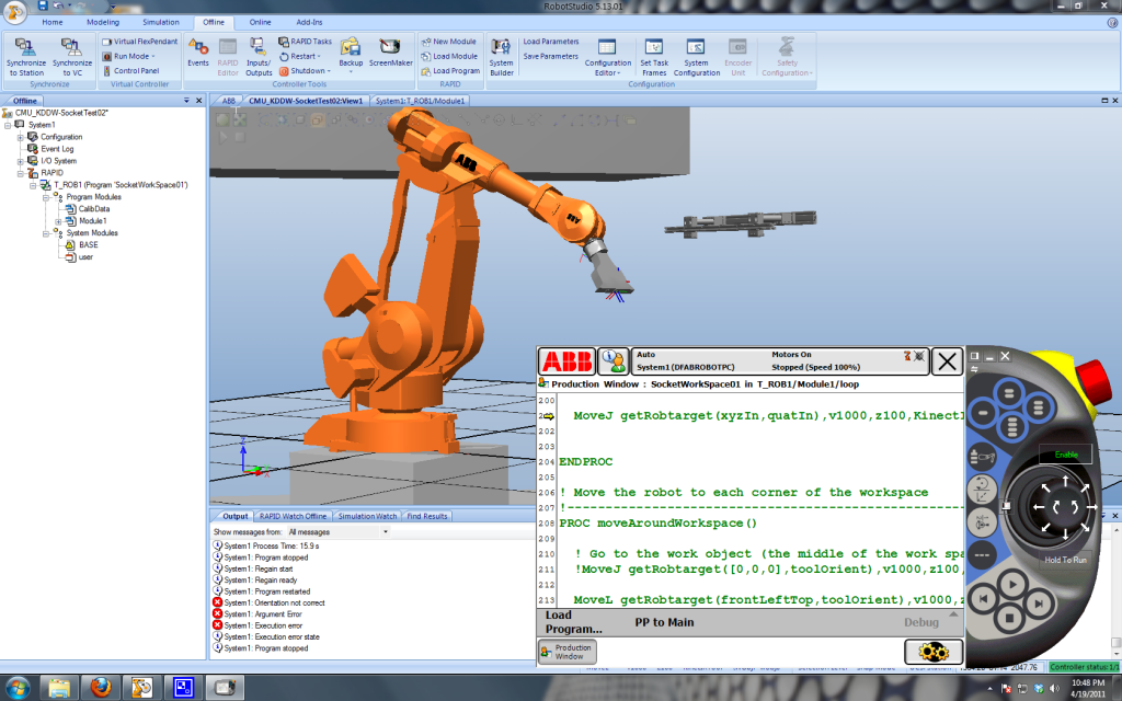
We set out to produce live RAPID code in order to control a fabrication robot, typically programmed for repeatability, in real-time. This meant we needed to interface first Robot Studio ABB simulation software. This insured that we would sort out bugs before using the real, potentially dangerous robot. We created a local network where the robot controller listened only to the IP address of the computer running the openFrameworks application.

Once live control was established we then limited the work area in order to avoid collision with the workspace. This meant that every iteration of RAPID code being sent we were checking to make sure that the quaternion point was within the 3d workspace. This was once of the more challenging parts of the project. We needed to coordinate the axis’ of our camera sensor, ofx quaternion library, and the robot’s computer.

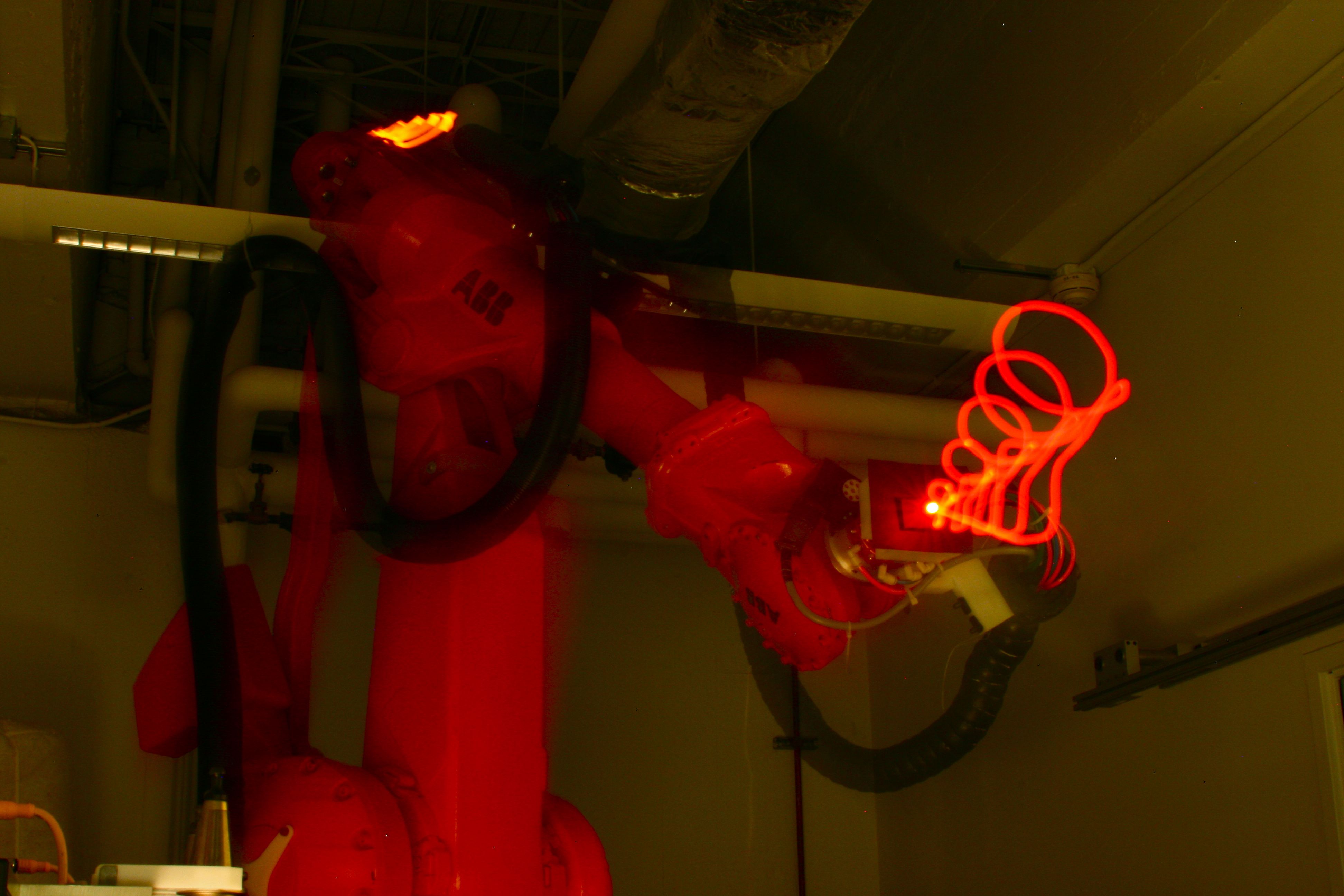
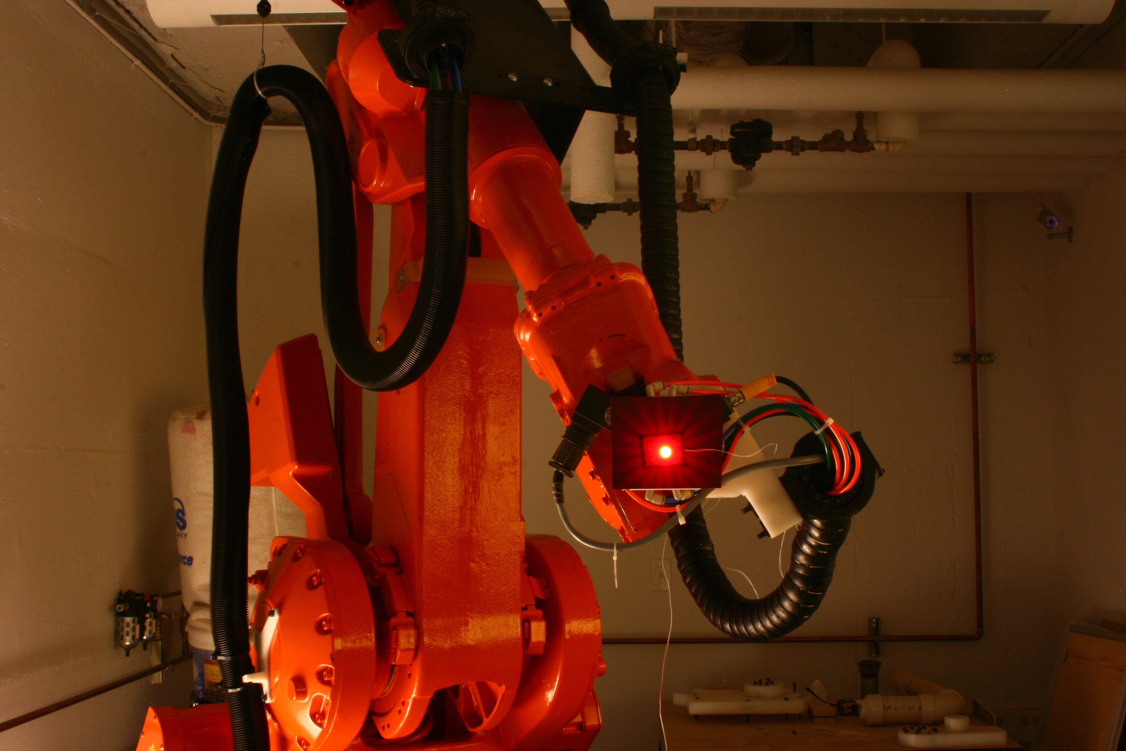
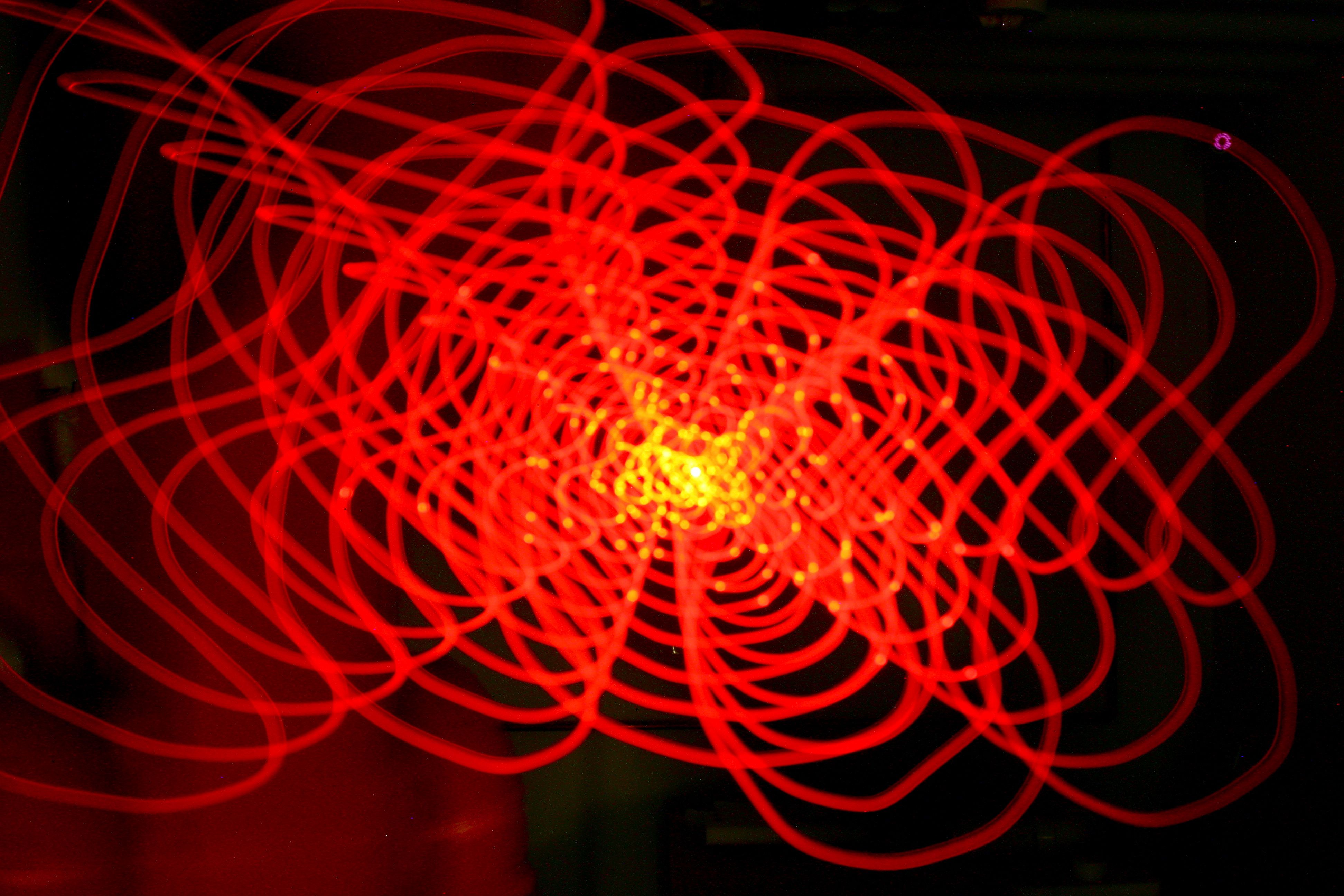
The main focus of this research was to really invest in the interaction. In order to demonstrate this we wanted the robot to mimic you 2d drawing live and then remember that drawing and repeat and scale it in 3d. We have come to call this the “augmentation” during our collaborative design process with the robot. In order to reveal in video and photographs the movement we placed a low wattage LED on the end of the robot and began to light write.

Below is a video demoing the interaction and the process of light writing. here is also a link to the flickr set of some of the drawings produced.

Susan — SketchCam

by susanlin @ 7:09 pm

Top
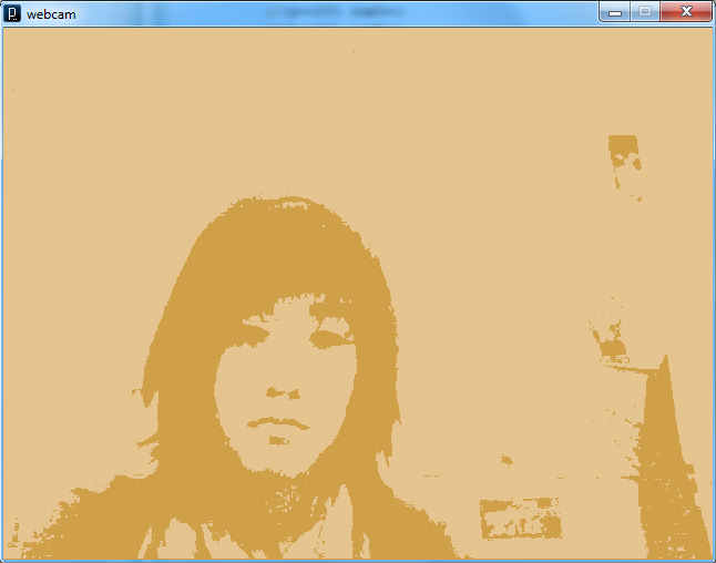
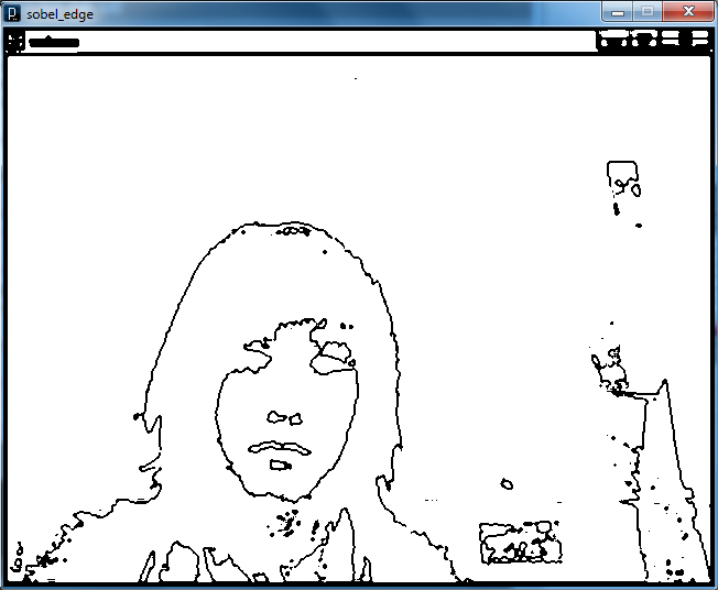
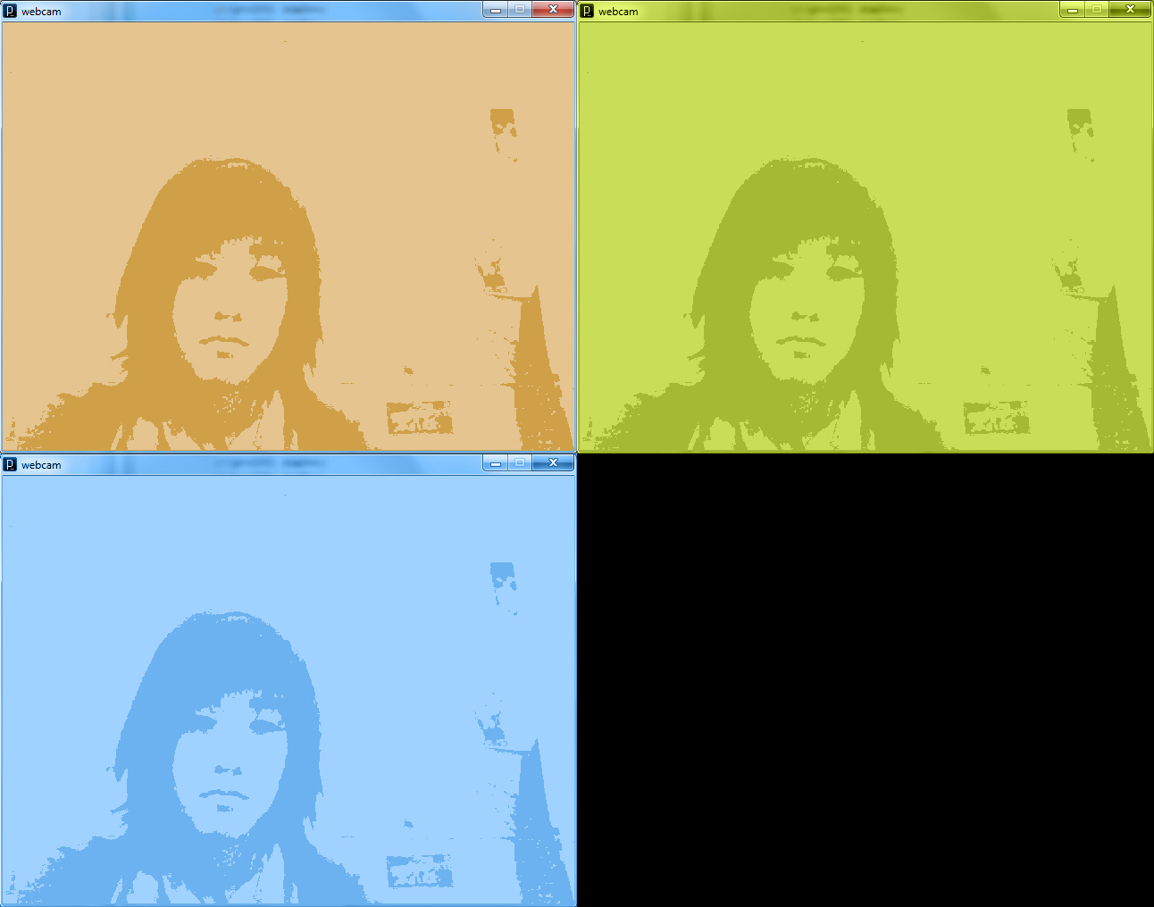
SketchCam is exactly what it sounds like: a webcam mod which enables viewers to see themselves as a moving sketch through image augmentation. Viewers are able to see themselves as a black&white or sepia sketch.

Inspiration
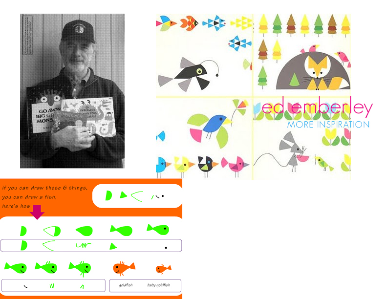
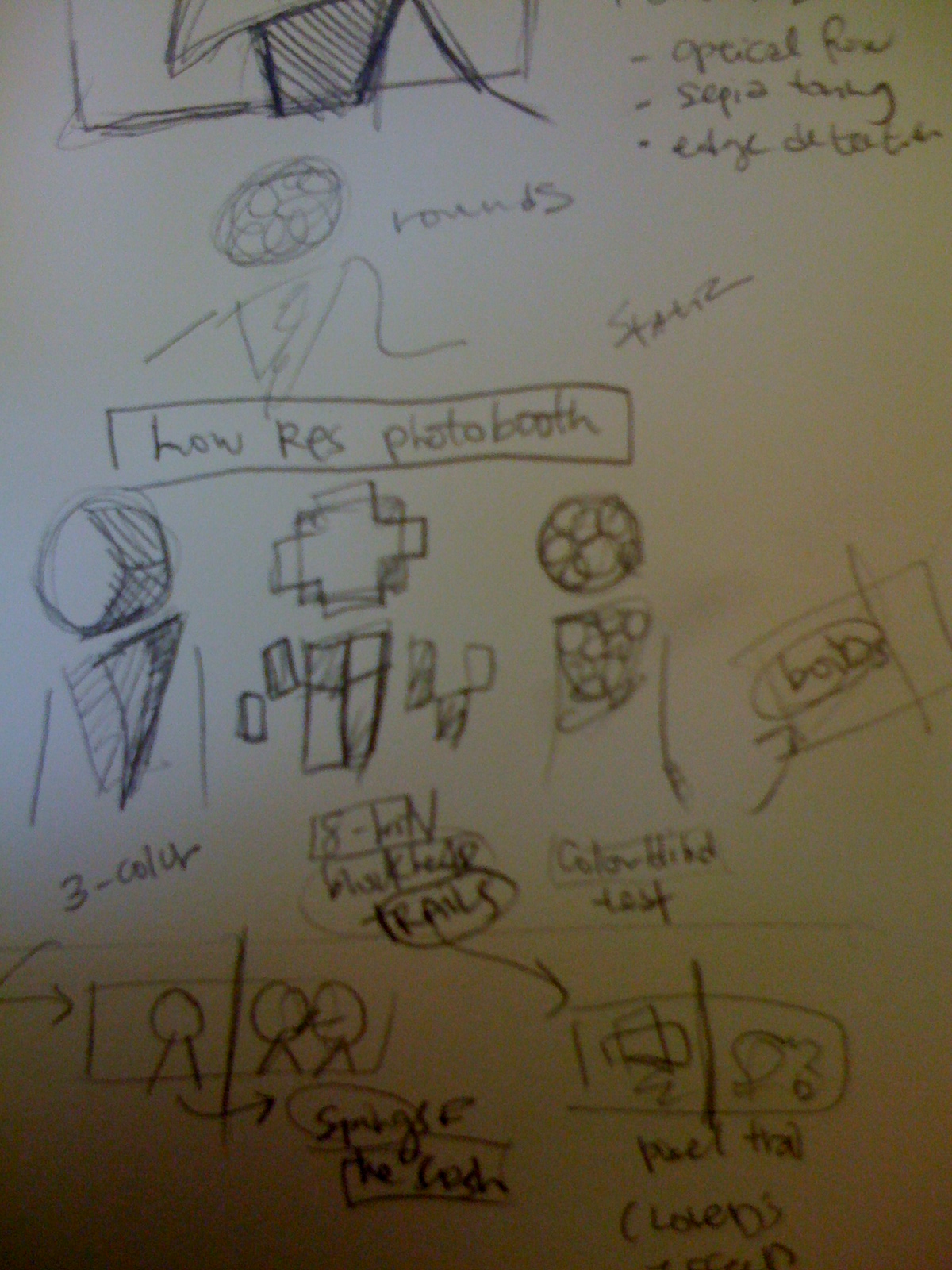
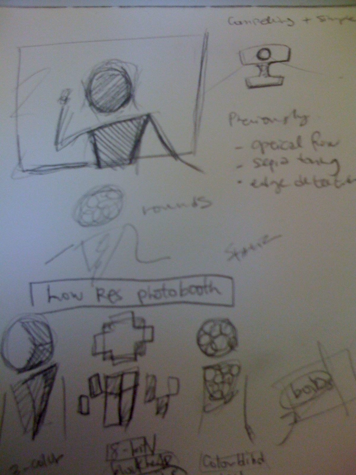
I was drawn to 2d animation which had intentionally left process work, or sketchy, qualities behind in the final production. The beauty of the rough edges, grain, and tangential lines added to the final piece unlike any polish piece would be able to accomplish. In terms of an exhibition, I wanted to see if I could make something that was interactive, since the final pieces were meant to be showcased publicly.

Here are a few pieces which piqued these feelings:

Background Reference

Originally over-thinking the colorization issue http://dippix.tp.chiba-u.jp/papers/CIC13_Horiuchi.pdf

Sifting through a ton of Learning Processing before stumbling upon Brightness Thresholding  http://www.learningprocessing.com/examples/chapter-15/example-15-10/

And realized I could simply colorize as 2-toned sepias.

Edge Detection http://www.pages.drexel.edu/~weg22/edge.html Sobel/Laplace algorithms and background studies before reproducing Sobel successfully.

Reading about Optical Flow http://people.csail.mit.edu/bkph/papers/Optical_Flow_OPT.pdfhttp://robots.stanford.edu/cs223b05/notes/CS%20223-B%20T1%20stavens_opencv_optical_flow.pdf (openCV before switching to Processing)
and trying to find simpler examples to learn quickly from http://andybest.net/2008/07/particle-engine-optical-flow/http://processing.org/discourse/yabb2/YaBB.pl?num=1222478633

Finally, using physics via Box2D http://www.shiffman.net/teaching/nature/box2d-processing/ particularly, http://www.shiffman.net/itp/classes/nature/box2d_2010/blob/

Process

I half-heartedly committed to the idea of analyzing cute characters, perhaps via Mechanical Turk before being swept away by great 2d animations. The entire thought can be found in this previous post. Brainstorming time and precious time before crunch-time was lost changing my mind… Unfortunate, this previous idea might have scaled a lot better and leverages some existing strengths of mine (producing cute like mad).

Before this madness: I tried coding in C++ using OpenCV via Code::Blocks, only to struggle just getting things compiling. In the interest of time/feasibility, I switched to Processing.

Pieces which ended up working

Brightness Thresholding

and

Sobel Edge Detection

After some sighing and frustration of trying to get things to play along with Optical Flow, I took another detour: instead of producing one robust augmenter, thought having 2 or 3 smaller pieces of a bigger project would help showcase the amount of work that went into this.

And a detour on a detour:

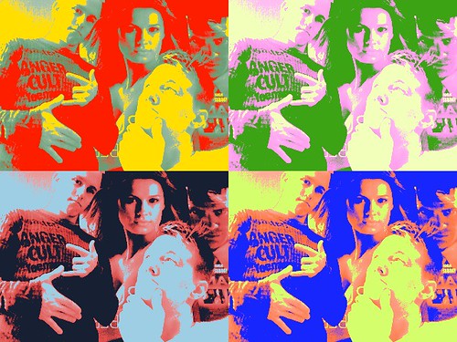
Pretty reminiscent of Warhol actually…

Of course, that’s been done… (Macbook Webacam filter)

What’s been done

Introspective

It is evident that this pursuit was a very erratic one which could have benefited from a bit of focus or external constraints. Overall, it has been a great learning experience. If anything, the whole experience has told me that I am a slow coder, and benefit from creating things visually, instead of algorithmically. I prefer to slowly absorb new material and really dissect it for myself, unfortunately, that ends up being a timely process that requires more attention than if I were scrambling a visual together. Help is nice, but there is a larger of issue of the balance between not getting enough help and getting too much help. If anything, my preference is to get less help, at the cost of being slower, so long as I learn. The best thing academia has given me is the vaster timeline and flexibility to learn anything I would like to, largely at my own pace.

The biggest downfall for this final project was simply the lack of time between job onsite interviews and capstone project report. Sticking with one key “magic” would have been better instead of splitting the already limited attention across colorization, filters, camera processing, optical flow, and edge detection. Committing to an idea would have helped too. Not feeling the pressure of having to feel like I needed to create something not already done could also be a part of this struggle. Also, there was a ton of researching, dead-ends, and things which did not inhabit the final form (ironically, considering the ideal project outcome).

All-in-all, if I were to ever uptake another coding pursuit, it’s evident that good timing will be key to success. What I got out of IACD was a bunch of initial exposure to both my pursuits and my peers’ pursuits. If anything, I hope it refined my process for the better to produce code-based projects and show the amount of heart put in each step of the way… I was successful in the sense I had the opportunity which forced me to look at a ton of different new code-related things.

100×100 and one-liner

SketchCam is exactly what it sounds like: a webcam mod which enables viewers to see themselves as a moving sketch through image augmentation.

Asa & Caitlin :: We Be Monsters :: The Final Iteration

by Caitlin Boyle @ 6:05 pm

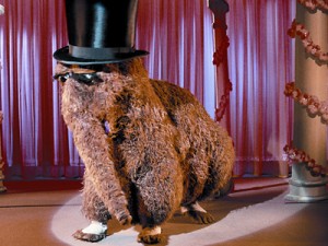
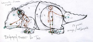
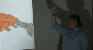
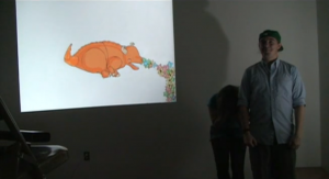
The joint project of Caitlin Boyle and Asa Foster, We Be Monsters is an interactive collaborative kinect puppet built in Processing with the help of OSCeleton and openNI. It allows a pair of users to control the BEHEMOTH, a non-humanoid quadruped puppet that forces users to think twice about the way they use their anatomy. With one user in front and another in the rear, participants must work together to Be Monsters! The puppet comes to life further with sound activation, with user’s sounds past a certain threshold causing the BEHEMOTH to let loose a stream of star vomit.

( also available on vimeo)

The two users must come to terms with the fact that they represent a singular entity; in order to get the BEHEMOTH moving in a convincing manner,  movements have to be choreographed on the fly- users must synchronize their steps, and keep their laughter to a minimum if they don’t want the puppet projectile vomiting stars all over everything.

WHY a 2 PERSON PUPPET?

vs.

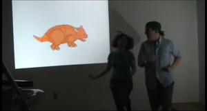
Why not? Inspired by the muppets and chinese lion costumes, We Be Monsters was initially developed for Interactive Art/Computational Design’s Project #2, a partner-based kinect hack. One person puppets had been made for the kinect before, one of the most famous being Theo Watson & Emily Gobeille’s, but as far as we knew, a 2 person puppet had yet to be executed. The first version of We Be Monsters was completed and unleashed upon the internet back in March.

(also available on vimeo)


Version 1.0 solidified our derp-monster aesthetic and acted as a stepping stone for further iterations, but we ultimately decided to go back to the drawing board for the majority of the code. Ver. 1 was only taking x and y points, and thus was essentially rendering the kinect into a glorified webcam. The program took in our joint coordinates from the skeleton tracking and drew directly on top of them, forcing puppeteers to stand in a very specific fashion; as you can see in the video, we spend the majority of time on tip-toe.

see that? we’re about to fall over.

Using the puppet in this fashion was tiring and awkward- it was clear that the way we dealt with the puppet pieces needed to be revamped.

In order to make the user more comfortable, and to take proper advantage of the kinect, we had to change the way the program dealt with mapping the movement of the puppet to our respective joints and angles.

MAKING THE BEHEMOTH USER-FRIENDLY

Asa dove into figuring out the dot product of each joint family “an algebraic operation that takes two equal-length sequences of numbers and returns a single number obtained by multiplying corresponding entries and then summing those products.”

a QUICK BREAKDOWN of DOT PRODUCT and JOINT FAMILIES

Joint family : 9 values that make up the x, y, a nd z point of three relative joints; in this example, the shoulder, elbow, and wrist.

Dot product : the combined angle of these three points/9 values.

Thanks to this math-magic, a person can be much more relaxed when operating the puppet, and the results will be much more fluid.

In layman’s terms, our program now reads the angles between sets of skeleton joints in 3 dimensions, instead of 2. We finally started utilizing the z point, so the program now takes depth into consideration. This is preferable for a multitude of reasons; mostly for the sheer intuitive nature of the project, which was practically nonexistent in the first iteration: Mr. BEHEMOTH moved as nicely as he did because Asa & I understood the precise way to stand in order to make it not look like our puppet was having a seizure.

Now, users can stand in any direction to puppet the BEHEMOTH; it’s much more enjoyable to use, as you can plainly see in the video for We Be Monsters 2.0.

MUCH better. We can face the camera now; the new joint tracking encourages users to be as wacky as possible, without sacrificing the puppet’s movements- and you can see by my flying hair that we’re jumping all over the place now, rather than the repetitive, restricted movements of our first attempt.

Puppeteers can now jump around, flail, or face in any direction and the puppet will still respond; users are more likely to experiment with what they can get the BEHEMOTH to do when they aren’t restricted in where they have to stand.

Making the BEHEMOTH scratch his head; something that would have been impossible in the first iteration of the project. DO NOT ATTEMPT without a wall to lean on.

SOUND ACTIVATION and STARVOMIT

Caitlin created a sound trigger for the star-vomit we dreamed up for IACD’s Project 3. Now, users can ROAR (or sing, or talk loudly, or laugh), said sound will be picked up by the microphone, and the stream of stars will either be tiny or RIDICULOUS depending on the volume and length of the noise.

+ =

The ability to produce stars was added as a way to further activate the puppet; we were hoping to make the project more dynamic by increasing the ways players can interact with and manipulate the BEHEMOTH. The result was marginally successful, giving the users the option to dive headfirst into MONSTER mode; the stars force the puppeteers to make loud and elongated noises. This, in turn, pushes the users to embrace the ‘monster’ inside and step away from humanity, at least for a short burst of time.

Asa roars, and the BEHEMOTH gets sick all over the place. Note his raised arm, which controls the top part of the puppet’s head, allowing for the stars to flow in a larger stream.

The goal of the project was to push people into putting on a (friendly) monstrous persona, and, cooperating with a friend, learn how to pilot a being more massive than themselves; in this case, the BEHEMOTH.

IN THE FUTURE, the BEHEMOTH will hopefully be joined by 3 and 4 person puppets; the more people you add into the mix, the more challenging (and fun!) it is to make the puppet a coherent beast.

We are also hoping to further activate the puppet with Box2D and physics (floppy ears, bouncy spines, blinking eyes, swaying wings); this was a step that was planned for this iteration of the project, but was never reached thanks to our novice programmer status; we’re learning as we go, so our progress is always a little slower than we’d hope. We did not get enough of an understanding of Box2D in time to incorporate physics other than the stars, but will both be in Pittsburgh over the summer; it’s our hope that we can continue tinkering away on We Be Monsters, until it transforms into the behemoth of a project it deserves to be.

– Catilin Rose Boyle & Asa Foster III


Paul Miller – Final Project

by ppm @ 5:10 pm


Blurb: “The Babblefish Aquarium” is a virtual aquarium where users can call in and leave a message, and a fish is generated from the pitches of their voice. Try it at babble.zapto.org.

As I explain in the video:
“Please Leave a Fish at the Beep” or “The Babblefish Aquarium” is a website at babble.zapto.org where users can call a phone number and record a message and a virtual fish is created from the pitches of their voice. The fish appear in the aquarium along with the first few digits of the caller’s phone number.

Pitch detection on the recordings is done in Pure Data, with higher pitches making fatter sections of the fish’s body, and lower pitches making narrower sections. Learned: Pure Data’s “fiddle” pitch detection object works great at 44.1 khz with a nice mic, but not so well with an 8 khz cell phone recording. In my patch, I’m doing a band-pass to filter out high and low noise, and then further rejecting detected pitches which fall outside an expected human vocal range.

The backend is Twilio communicating with my web server written in Java (using the ridiculously convenient HttpServer object) which communicates with Pure Data via OSC. My server keeps a list a phone numbers and detected pitches, which the graphical web client (JavaScript & HTML5) periodically requests to generate and animate the fish.

Also learned: the strokeText JavaScript function is hella slow in Safari (not other browsers though). Use fillText for decent FPS.

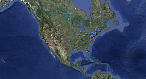
The reception at the final show was encouraging. Here’s a map of some of the area codes I got:

It would have been sweet if I could automatically take the area codes and produce a .kml for viewing on Google Earth, but I didn’t find an efficient area-code-to-latitude-and-longitude solution, so the above map was annoyingly made by hand.

The recordings I got were very entertaining. Most were either funny vocal noises or speech regarding the fish or the project like “I’m making a fish!” or “Make me a BIG, FAT, FISH.” I got a few songs, some whistles, a number of confused callers (“Hello? Is anybody there?”) and one wrong number who apparently thought they had reached an actual answering machine and left a message regarding someone’s thesis project.

Things to have done, given more time: The graphics are crap. It could do with a pretty aquarium background image, some seaweed or something for the fish to swim between, some animated bubbles… The fish also could have more interesting behavior than swimming in straight lines and staring awkwardly at each other. Flocking would help.

The pitch detection is somewhat crap, though it’s hard to fix that given my reliance on Pure Data and the audio quality of the cell phones. This caused the correspondence between sound and fish shape to be rather weak. Combined with the delay between leaving the message and the fish appearing on the screen resulted in poor user feedback. Participants didn’t feel control over the shapes and therefore (generally) didn’t try to express themselves by making certain kinds of fish. However, the delay did add an element of suspense, which participants seemed to find very exciting.

A solution would be to ditch the cell phones (as I initially intended to do, before my classmates urged me not to) and just have a single reasonable-quality microphone mounted in front of the computer at the show. This would facilitate better pitch detection and remove the time delay, but also remove the mystery and technological prestidigitation of the phone-based interaction.

In all, I’m most excited about the recordings I got. Some of them are very funny, and I hope to find use for them (anonymously, of course) in future projects. Hopefully, the Internet discovers my project and leaves me more interesting sounds.

Kinect Fun House Mirror: Final Post

by Ben Gotow @ 3:21 am


A Kinect hack that performs body detection in real-time and cuts an individual person from the Kinect video feed, distorts them using GLSL shaders and pastes them back into the image using OpenGL multitexturing, blending them seamlessly with other people in the image.

It’s a straightfoward concept, but the possibilities are endless. Pixelate your naked body and taunt your boyfriend over video chat. Turn yourself into a “hologram” and tell the people around you that you’ve come from the future and demand beer. Using only your Kinect and a pile of GLSL shaders, you can create a wide array of effects.

This hack relies on the PrimseSense framework, which provides the scene analysis and body detection algorithms used in the XBox. I initially wrote my own blob-detection code for use in this project, but it was slow and placed constraints on the visualization. It required that people’s bodies intersected the bottom of the frame, and it could only detect the front-most person. It assumed that the user could be differentiated from the background in the depth image, and it barely pulled 30 fps. After creating implementations in both Processing (for early tests) and OpenFrameworks (for better performance), I stumbled across this video online: The video shows the PrimeSense framework tracking several people in real-time, providing just the kind of blob identification I was looking for. Though PrimeSense was originally licensed to Microsoft for a hefty fee, it’s since become open-source and I was able to download and compile the library off the PrimeSense website. Their examples worked as expected, and I was able to get the visualization up and running on top of their high-speed scene analysis algorithm in no time.

However, once things were working in PrimeSense, there was still a major hurdle. I wanted to use the depth image data as a mask for the color image and “cut” a person from the scene. However, the depth and color cameras on the Kinect aren’t perfectly calibrated and the images don’t overlap. The depth camera is to the right of the color camera, and they have different lens properties. It’s impossible to assume that pixel (10,10) in the color image represents the same point in space as pixel (10, 10) in the depth image. Luckily, Max Hawkins let me know that OpenNI can be used to perform corrective distortions, aligning the image from the Kinect’s color camera with the image from the depth camera and adjusting for the lens properties of the device. Luckily, OpenNI performs all of the adjustments necessary to perfectly overlay one image on the other. I struggled for days to get it to work, but Max was a tremendous help and pointed me toward these five lines of code, buried deep inside one of the sample projects (and commented out!)

// Align depth and image generators
printf("Trying to set alt. viewpoint");
if( g_DepthGenerator.IsCapabilitySupported(XN_CAPABILITY_ALTERNATIVE_VIEW_POINT) )
{
printf("Setting alt. viewpoint"); g_DepthGenerator.GetAlternativeViewPointCap().ResetViewPoint();
if( g_ImageGenerator ) g_DepthGenerator.GetAlternativeViewPointCap().SetViewPoint( g_ImageGenerator );
}

Alignment problem, solved. After specifying an alternative view point, I was able to mask the color image with a blob from the depth image and get the color pixels for the users’ body. Next step, distortion! Luckily, I started this project with a fair amount of OpenGL experience. I’d never worked with shaders, but I found them pretty easy to pick up and pretty fun (since they can be compiled at run-time, it was easy to write and test the shaders iteratively!) I wrote shaders that performed pixel averaging and used sine functions to re-map texcoords in the cut-out image, producing interesting wave-like effects and blockiness. I’m no expert, and I think these shaders could be improved quite a bit by using multiple passes and optimizing the order of operations.

Since many distortions and image effects turn the user transparent or move their body parts, I found that it was important to fill in the pixels behind the user in the image. I accomplished this using a “deepest-pixels” buffer that keeps track of the furthest color at each pixel in the image. These pixels are substituted in where the image is cut out, and updated anytime deeper pixels are found.

Here’s a complete breakdown of the image analysis process:

The color and depth images are read off the Kinect. OpenNI is used to align the depth and color images, accounting for the slight difference in the lenses and placement that would otherwise cause the pixels in the depth image to be misaligned with pixels in the color image.
The depth image is run through the PrimeSense Scene Analyzer, which provides an additional channel of data for each pixel in the depth buffer, identifying it as a member of one or more unique bodies in the scene. In the picture at left, these are rendered in red and blue.
One of the bodies is selected and the pixels are cut from the primary color buffer into a separate texture buffer.
The depth of each pixel in the remaining image is compared to the furthest known depth, and deeper pixels are copied into a special “most-distant” buffer. This buffer contains the RGB color of the furthest pixel at each point in the scene, effectively keeping a running copy of the scene background.
The pixels in the body are replaced using pixels from the “most-distant” buffer to effectively erase the individual from the scene.
A texture is created from the cut-out pixels and passed into a GLSL shader along with the previous image.
The GLSL shader performs distortions and other effects on the cut-out image before recompositing it onto the background image to produce the final result.
Final result!

Here’s a video of the Kinect Fun House Mirror at the IACD 2011 Showcase:

P3 final blog post

by honray @ 2:16 am

So, Alex & I decided to create a flocking effect with the Kinect, inspired by Robert Hodgin’s previous work in this area.

For this project, I was involved in the more low-level technical aspects, such as getting the Kinect up and running and finding out how to get the user data from the api. We spent a fair amount of time figuring out how to get the Kinect to work on the PC with a library that would give us both depth and rgb data on the detected user. After trying to use a processing library which eventually did not work, we opted for using OpenNI & nite. Since we both had PC laptops, this was arguably our best bet. Getting the project to work under Visual Basic was a hurdle, since there was poor documentation for the OpenNI library and how to get it up and running on VB.
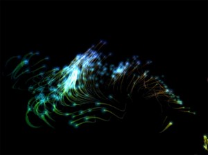
Once we did get it running, I wrote a wrapper class to detect users, calibrate, and then parse the user and depth pixels so that Alex could easily access them using her particle simulator. We iterated on the code, and looked for ways to improve the flocking algorithm so that it would look more realistic and work better. We also spent a lot of time tweaking parameters and finding out how to represent the depth of the user as seen from the camera. The flocking behavior didn’t look quite as nice when we first implemented it in 3D. As such, we decided to use color to help represent the depth data.

And this is what we ended up with:


final presentation blog post

by honray @ 1:48 am


Click the mouse anywhere to create a blob. Move the mouse to control the direction and magnitude of the force vector. Hit ‘i’ to see the underlying physics implementation. Note: Please use Google chrome!

<br />

This is the culmination of my blob experiment. Originally, I planned on implementing a game where one player controls a blob, and another player controls the level mechanics in a platform game. However, I decided to move away from that into something more artistic and expressive. I was looking at my blobs that I implemented in box2d js, and thought that the entire “blob” experience requires external forces to be applied on the blob. Originally I thought this could only be done using gravity, but upon closer inspection, I realized that I could simply apply the force in any direction.

As a result, I decided to experiment with applying a force based on the mouse position. To do so, I calculated a force vector from the center of the screen (window width/2, window height/2), and applied this to all the blobs on the screen. Blobs are created on mouse click, and based on the movement of the mouse, a different force is applied. Also, I wanted the experience to be continuous. Thus, I remove blobs when they are > 500px away from the screen, and created a function that would be called at intervals to recreate blobs at random locations on the screen, fading in when they appeared.

I also liked the “trail” effect from my twitter visualization project and brought it over to this project as well. Hence, the blob leaves a bit of a trail when it moves around, especially when it moves quickly.

If I had time to work on this project further, I would have controlled the blob movement using optical flow, so that the user can control the movement of the blobs based on his/her own movement.

KinectPortal

by Ward Penney @ 12:34 am

KinectPortal

Kinect Portal from Ward Penney on Vimeo.

Kinect Portal is an interactive installation that allows users to see into an invisible world. Developed in C++ using OpenFrameworks, it enables the participant walks up to a projector and XBox Kinect facing them, but no light is projecting. They then pick up a 2 x 1 foot opaque acrylic panel and hold it up to the projector. The projector then comes to life and displays an image fitted to the corners of the user’s acrylic panel. The user can then rotate the panel freely and watch the corresponding rectangle follow and fit to the panel, providing the experience of holding a custom display.

Concept

For my final project for Interactive Art and Computational Design, I wanted to build something that mixed reality with unreality. On the Comic Kinect earlier this year, I developed an interaction utilizing the OpenNI skeleton via ofxOpenNI with Xbox Kinect. For my final, I wanted to use the raw depth reading form the Kinect.

I drew up a few concept sketches to explore the idea.

Concept sketch for a Kinect rock climbing wall

Concept sketch for a Kinect rock climbing wall

Concept sketch for Kinect Tetris

Concept sketch for Kinect Tetris

Concept sketch for a Kinect hole-in-the-wall game

Concept sketch for a Kinect "The Wall" game


After talking with our professor, Golan Levin, he helped me decide on an interactive installation that would use the depth values from the Kinect. The idea was to have one or more users holding up opaque acrylic panels while facing a projector and a Kinect. The Kinect would sense the acrylic rectangles, and display a personal image for each user. The display would be decided later, but was intended to utilize the tilting of the rectangles in X, Y and Z spaces. I made this quick sketch to illustrate two users holding panels and gaining different viewpoints of an “invisible” object in 3D.

KinectPortal sketch with two users holding panels facing Kinect. Lower is "light" beam users would reflect as a team towards a target.

KinectPortal sketch with two users. Lower is "light" beam users would reflect as a team towards a target.

Data Recording / Playback

In order to make development easier, I wanted to get the recording and playback functionaltiy working. With Comic Kinect, I was using ofxOpenNI and the recording did not work there. Because it took longer to compile, longer to load, longer to get a skeleton, and we needed two users, my test cycle for ComicKinect was almost 5 minutes! That means I really only got about 30 tests with it. By just using the depth pixels with ofxKinect, and the recording / playback, I can now test very quickly (~15 sec).

Depth Histogram to Discover Object Blobs with OpenCV Depth Image Thresholding

Next, using ofxOpenCV Thresholding, I went for getting the depth threshold to target just behind the square plane. First, I had to generate a histogram of the depth map. Then, I did some 3 point simple derivative math to figure out when the slope was increasing, decreasing and in a trough. I had to make sure that it only recognized reasonably-sized peaks in the histogram, to avoid noise from the environment. This took some tweaking:

  • smoothing the histogram
  • looking for edges larger than some tested amount of values from the histo
  • averaging the threshold over a few frames to avoid “jerking”

Control Panel Testing

KinectPortal Process screenshot with depth thresholding. No ofxControlPanel.

KinectPortal Process screenshot with OpenCV depth thresholding. Without ofxControlPanel.

I wanted to have more control over my variables, because I was about to start implementing and testing various algorithms to discover the corners of the rectangle. So, I decided to implement Theo‘s ofxControlPanel. The result is a display containing the RGP, Depth, Thresholded Depth pixels, and controls for selecting the rectangle discovery type and smoothing run counts.

The Acrylic Panels

KinectPortal acrylic panels with architect's vellum glued to one side, handles on the other.

KinectPortal Acrylic Panels with Architect's Vellum glued to one side.

I laser cut two 2 x 1 foot acrylic panels with rounded edges to be comfortable for the user. I then attached to bathroom cabinet handles from Home Depot to the back of the panels, and coated the front side with architect’s vellum. The Vellum was transparents enough to let through a lot of brightness from the projector, but still catch enough light to render a sharp image on the other side.

Kinect Portal Demonstration

For our final demonstration day, we set up at Golan’s office in the STUDIO for Creative Inquiry. My project was stituated with about 5 feet in a semi-circle in front of the projector and Kinect. Users walked by and picked up the acrylic panels and, with a little explanation from me, held them to face the setup with the face of the vellum perpendicular. Using a quad warper in the ofxAppUtils toolkit developed by Dan Wilcox, Kinect Portal then displays an image texture onto the corners of the rectangle discerned from the Kinect sensor.

Reactions

Many people expressed how the project was uniquely interesting because if offered something a lot of people had not seen or touched before. Some executives from Bank of America commented on how it was a really novel interaction and could be used for augmented reality.

Special Thanks

Source Code

Here is a link to the source code ZIP on my DropBox. KinectPortal Source

Next Steps

The following is a list of issues I am working on fixing, with the help of Golan and Dan.

  • The rectangle is jittery. I think this is because my contour smoothing of the blob counter from OpenCV is not working properly.
  • The quad warper does not take into account the Z-depth from the Kinect. I want to do that to allow the user to look “around” the scene.
  • I want to make this multi-user. For each depth threshold registered, I want to look for valid rectangles and throw out anything that is not a known panel.
  • The graphic rendered is a simple image put onto a texture. I want to make this a view into a 3D world, or some other interaction.

Thank you for reading! Email me if you have any questions.

Ward

Charles Doomany- Nest: Generative Tables

by cdoomany @ 2:00 pm 9 May 2011

NEST:

Inspired by genetic inheritance and the selective process of evolution, Nest was conceieved as tool for creating funtional and generative furniture with unexpected variation.

HOW IT WORKS:

1) Using a simulated physics environment, sticks that will later constitute the lower framewok of the table, are dropped and form random configurations (or piles). This stage introduces random variation to the table design.

2) Once the sticks are at rest, a table top is than placed onto the the random configuration.

3) Each of the generated tables from the simlation are then evaluated based on their “fitness” according to established design criteria. The fitness of each table is determined by parameters such as: levelness, height, and the amount of material used.

4) The tables designs that best satisfy the criteria (that are most fit) will survive to be passed onto the next generation of tables; their formal characteristics will be inherited by the successive generation.

5) The resulting output is a population of tables that confrom to the design criteria and exhibit some interesting variation.


PROCESS:

above: (a) first version of  the genetic algorithm to determine the optimal solution for a parametrically constructed table, (b) experiments w/ jbullet for collision detection and modeling caltrops, (c) random table configurations produced with updated version of the jbullet simulation, (d) final output from physics simulation


CONCLUSION:

Currently I have two versions of the program: one which handles the physics simulation and the other which consists of the genetic algorithm. Ideally these would be integrated so that the 3D configurations could be simulated, evaluated, and then sorted by the algorithm. My main obstacle was working out the simulation component -unfamiliarity w/ Jbullet and its methods (specifically collision detection and creating the appropriate compound shape for the “sticks”), which in turn prevented me from creating the appropriate output for the genetic algorithm. Although I haven’t had the time to work out the simulation yet, I have plans to get the final program up and running soon.


Next Page »
This work is licensed under a Creative Commons Attribution-Noncommercial-Share Alike 3.0 Unported License.
(c) 2023 Interactive Art & Computational Design / Spring 2011 | powered by WordPress with Barecity