Final Project: Transit Visualization & The Trouble With Large Datasets
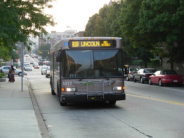
If you’ve ever come into contact with the Pittsburgh Port Authority bus system you’re likely familiar with the following situation: You come to the bus stop just before the time when it’s scheduled to arrive. Minutes, often tens of minutes later the bus arrives—full—and is forced to pass you by. Frustrated and disappointed you give up on the bus and walk or drive to your destination.
In my two years in Pittsburgh I’ve become quite familiar with this situation, and this semester I was lucky to come into come across an interesting dataset that I hoped would help me understand why buses so frequently let us down.
The Data
It turns out that every bus in Pittsburgh (and in most other large transit systems) is equipped with some fairly sophisticated data collection equipment. A GPS-based system called AVL or Automatic Vehicle Location records the location of every bus in the fleet once every 500 feet. Another device called an APC or Automatic Passenger Counter is installed on the doors of each bus to track the numer of people boarding and departing the buses. The data from these devices and others is recorded in the bus’s computer and downloaded to a central server at the Port Authority in the depot each night.
This data is then periodically transferred to Professor Eddy in the statistics department at Carnegie Mellon to support an ongoing research project studying the Pittsburgh bus system. I discussed my interest in the bus system with Professor Eddy and he graciously granted me access to the data—all 40 million records—to play around with.
The Work
I was surprised, humbled, and frankly a bit disappointed with how difficult it was to deal with 40 million rows of data. Since I’m a data mining newbie, I unfortunately ended up spending the majority of my time wrangling the data between formats and databases.
However, I did achieve some interesting (if modest) results with the data I was able to process:
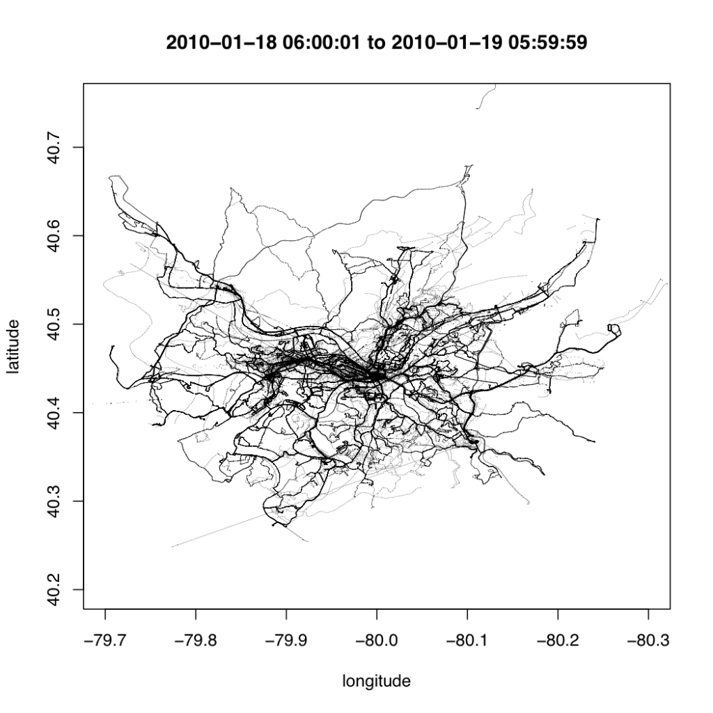
First, I created a “hello world” of sorts by using R to plot one day’s worth of AVL data in a map
Though graphically this visualization is quite rough, it gives you an idea of the type of data contained in the bus dataset. Simply plotting the data gives a rough outline of the map of Pittsburgh in a way that echoes Ben Fry’s All Streets. The data alone is all that’s required for the map to emerge.
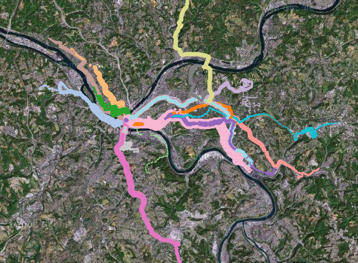
To better understand the data, I built a console that allowed me to interactively query the data and make quick visualizations. The system, built in Protovis and backed by MongoDB, allowed me to make queries based on the type, location, speed, and passenger count of the bus.
I created the above visualization using the console I created. It shows the path of every bus operating at 6:00 AM. The color of the line describes the route that the bus is servicing and the width of the line describes the passenger load. The map is zoomable and live-configurable using javascript.
The most interesting insight that I was able to gain from this console is that single buses often service multiple routes in a given day. The 71D you ride might service two or three other routes in a given day.
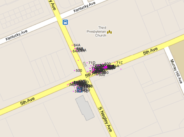
The other (troubling) thing that the console alerted me to was the amount of noise present in the data. Like most real-world sensor data, the location data collected by buses is quite fuzzy. One of the things I struggled with the most was cleaning this data to understand how the records were related and how far along the route each bus was.
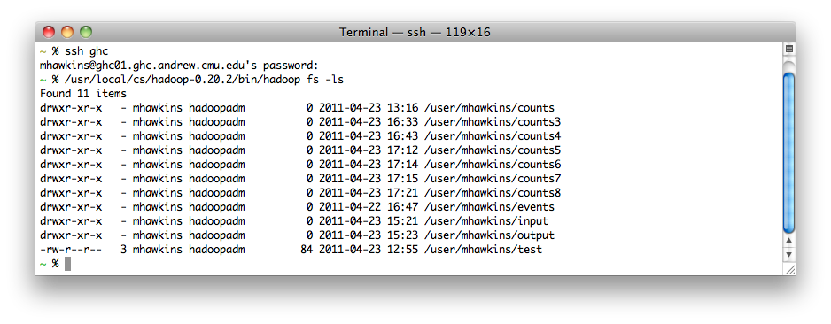
At this point I realized that the modest computing power available on my laptop would not be enough to process all of the data efficiently and I decided to bring out the big guns. In retrospect it may have been overkill, but I decided to throw the data into the School of Computer Science’s 80-computer Hadoop cluster
What’s still to be done
Why It’s Important
== Transpo Camp & Context ==
==
== The Trouble With Large Datasets ==
