Lumar-Reading03
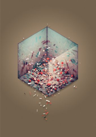
Question 1A. Read the first 20 pages of “Generative Art Theory” by Philip Galanter (p.146-166). In your own words, and in just a few sentences, discuss an example of something you like which exhibits effective complexity. Where does your selection sit between total order (e.g. crystal lattice) and total randomness (e.g. gas molecules, white noise, static). Include an image which illustrates your selection.
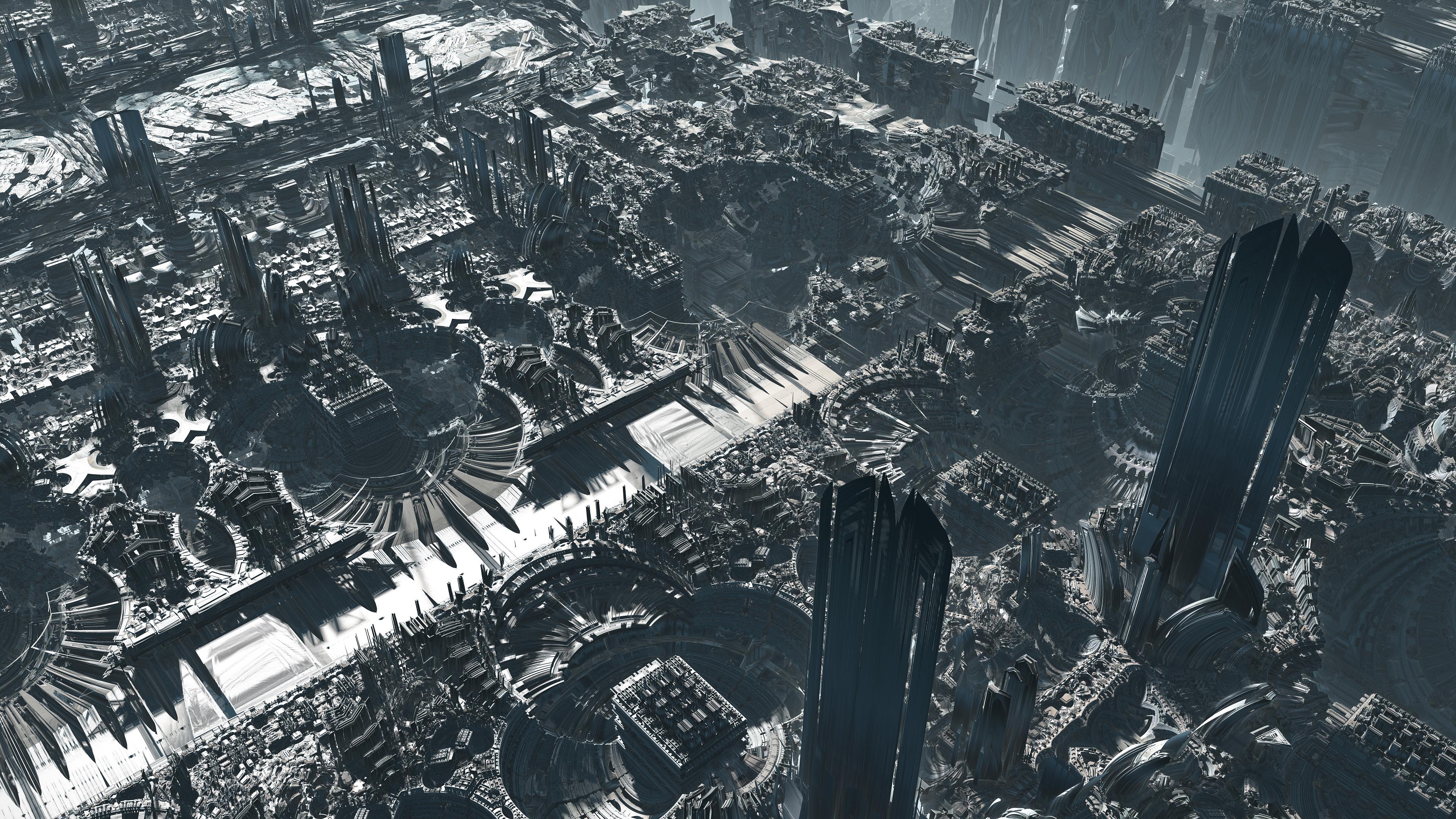
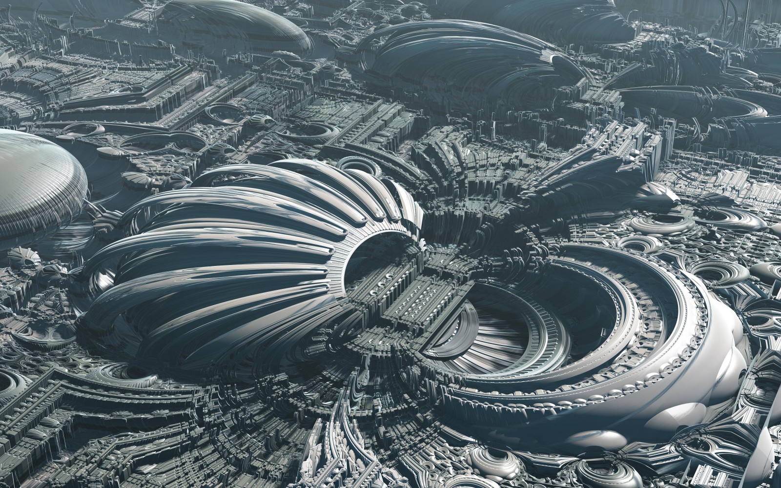
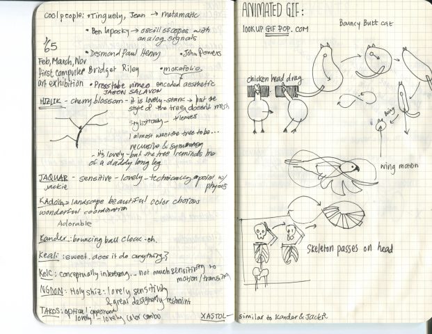
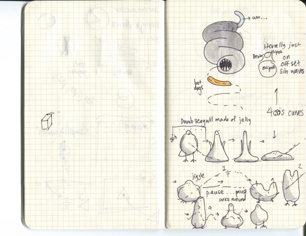
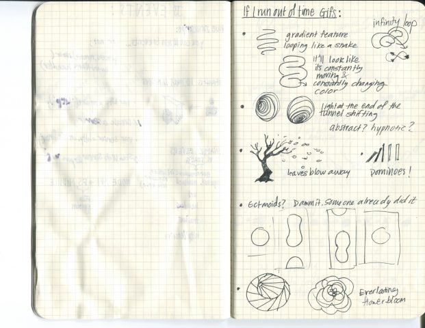
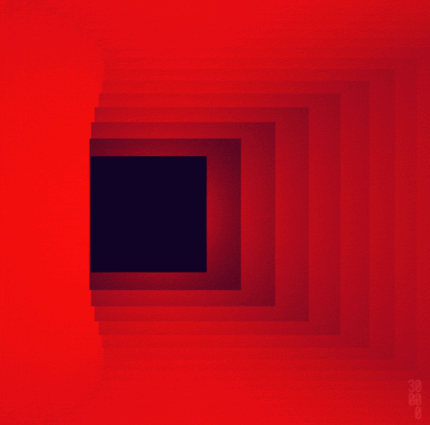
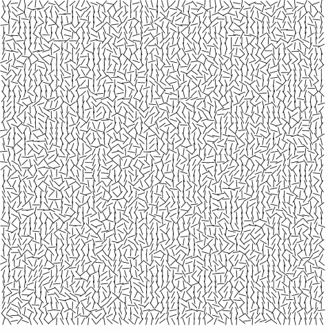
EFFECTIVE COMPLEXITY for me, I think a great example is the gif assignment actually. It was part of my decision process for how I’d choose which idea for a gif to go with. With my intial idea of making a bird made of jelly that bobbled up and down with bezier curves and offset sin motion to control end points, the computer program would’ve been a heck of a lot of work for that specific desire when it could be more easily done (and better executed) in adobe aftereffects. Entire companies’ /softwares are built on making such transformations. In this, I wanted to choose a gif design that validated the use of a computer…..otherwise, it’s needlessly complex.
Question 1B. Quickly skim the remaining 10 pages of the article, in which Galanter outlines nine different problems with generative art (The Problem of Authorship; The Problem of Intent; The Problem of Uniqueness; The Problem of Authenticity; The Problem of Dynamics; The Problem of Postmodernity; The Problem of Locality, Code, and Malleability; The Problem of Creativity; The Problem of Meaning). Select one of these problems for which you yourself feel some sort of internal conflict or personal stake. Discuss your internal conflict. Which side of the argument do you come down on?
YES. VERY MUCH AGREE BODEN! Creativity is so frustrating! Historical creativity is so darn hard to achieve – and yes, I agree that psychological creativity is valid, but it really doesn’t translate as social creativity because it’s already been thought of – that is suuuuuch a struggle!!! Half the time, it’s the impediment to ‘why bother designing something along those lines’? When I was choosing majors, I was thinking about in what area would I be good at vs what area is there that would be any different whether or not I decided on it. I had at one time, really really wanted to be an anesthesiologist, but while I was good at Bio, and Chemistry, and was confident in my work ethic to carry me through to be relatively ok, there would make no difference whether it was me as an anesthesiologist versus any other person who had a knack for numbers and sleepless nights. There was no extra drive or burning curiousity, no fuel for potential creativity outside simply the psychological. That’s not to say there will necesarily be any HC with my current major….but…..I’d like to think there’s a chance.
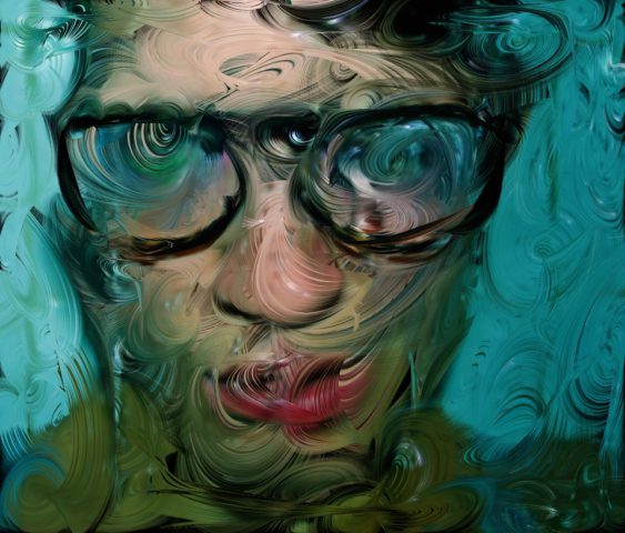
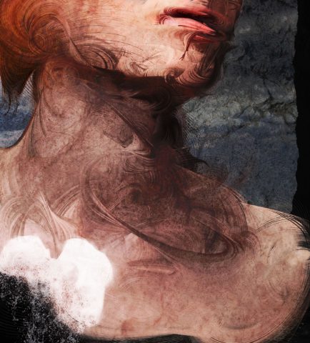
 Portrait of Cara Walker by Chuck Close


 One of their table napkins

 Bound – Plastic Studios
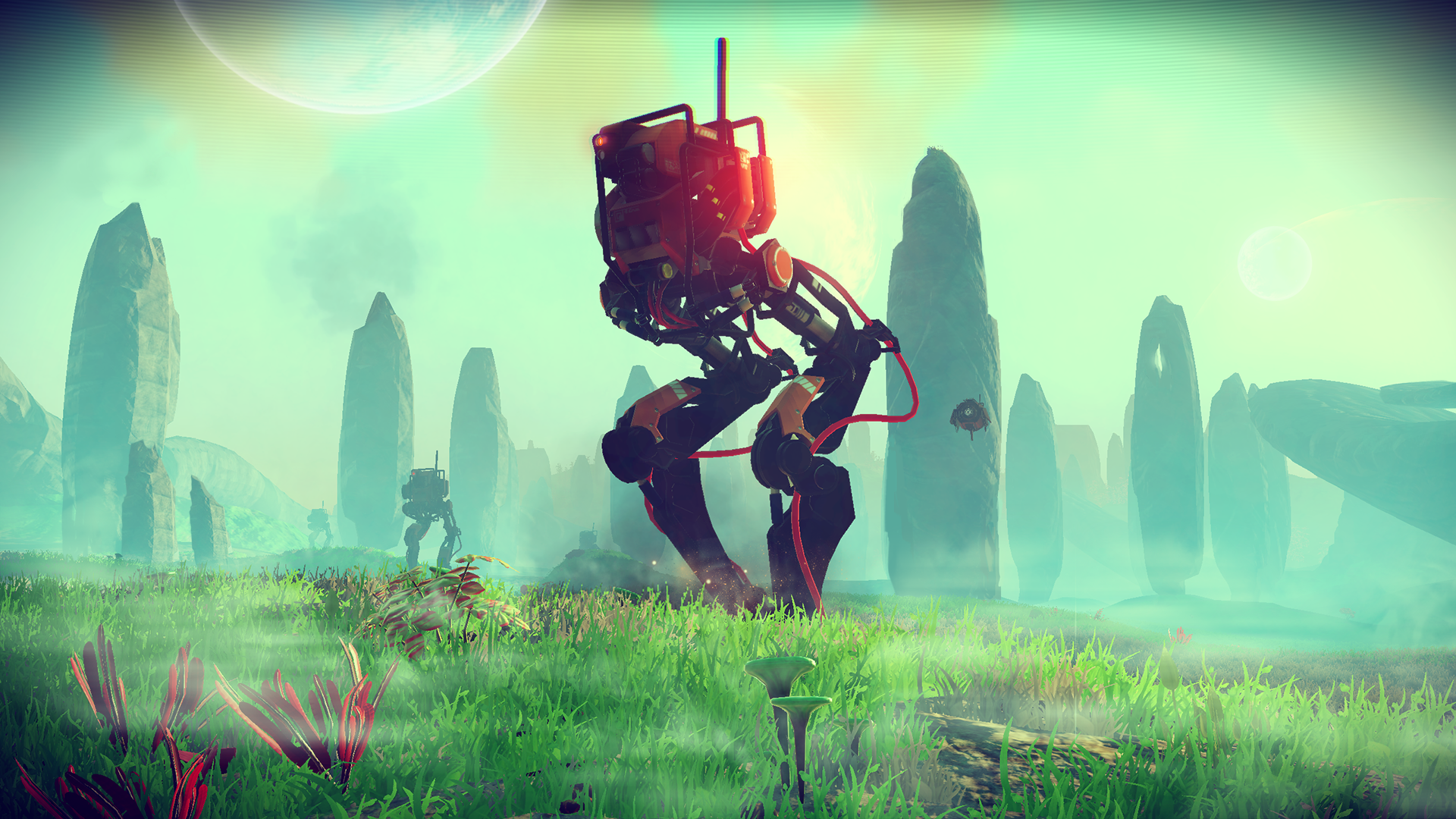
 Code and Theory presentation (2014)

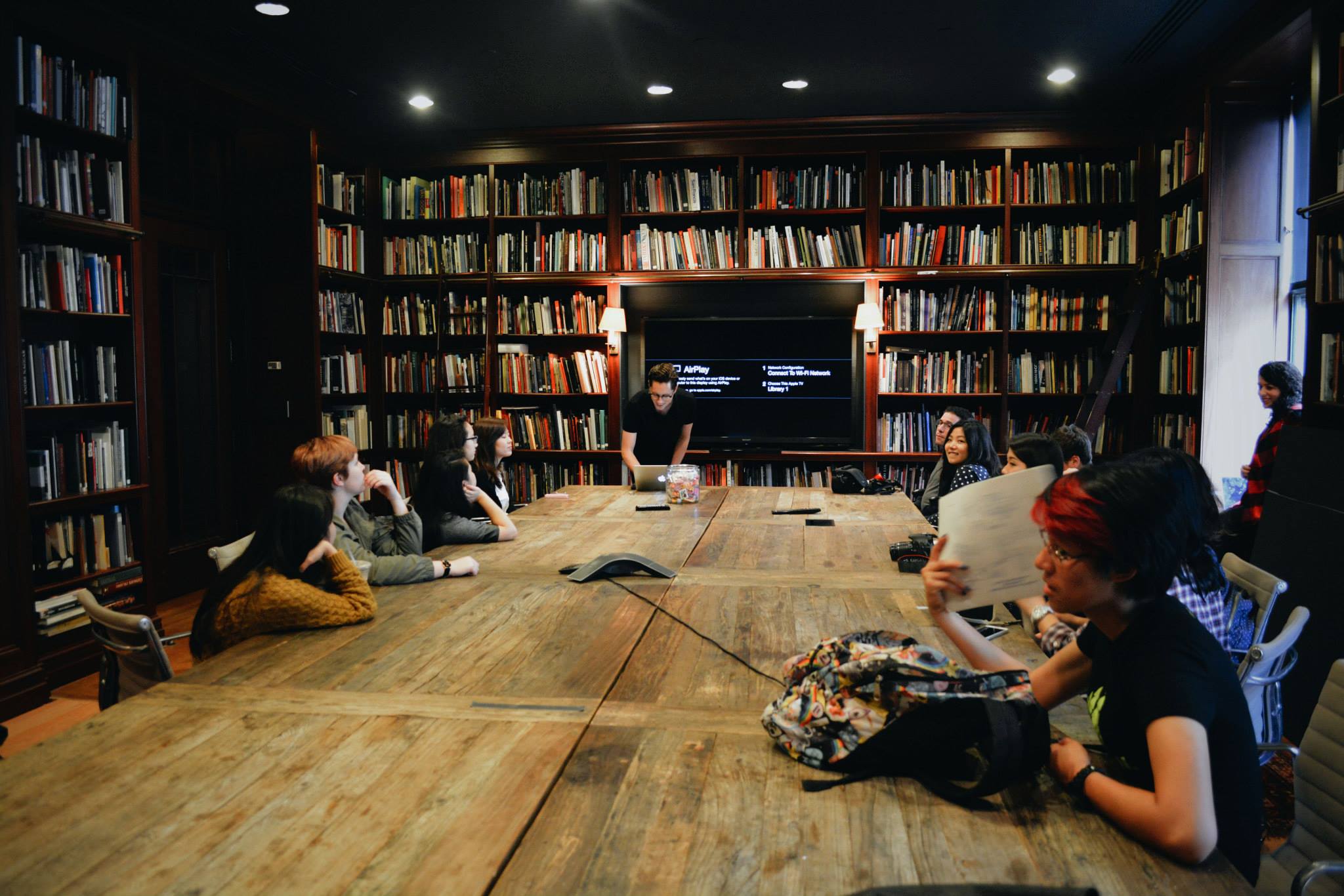
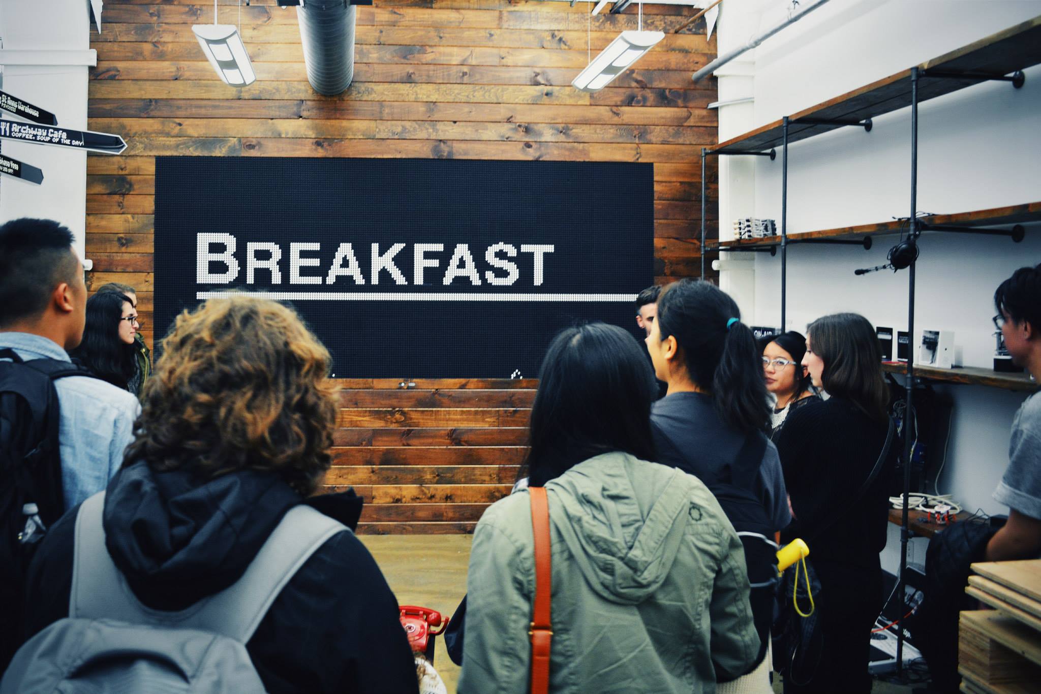 visiting Breakfast with some of my peers (2014)
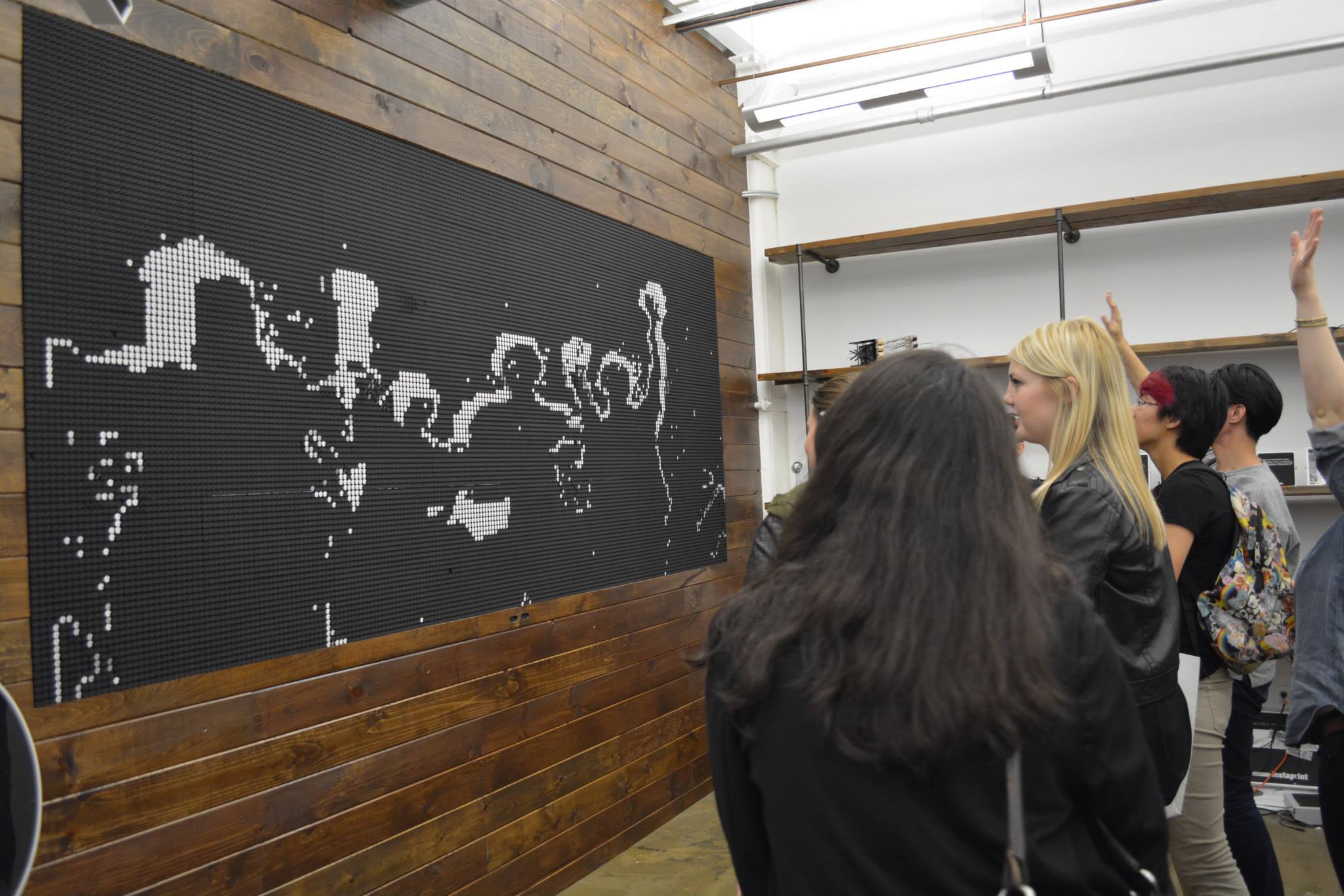 We experienced it up close!
 40,000 flip dots
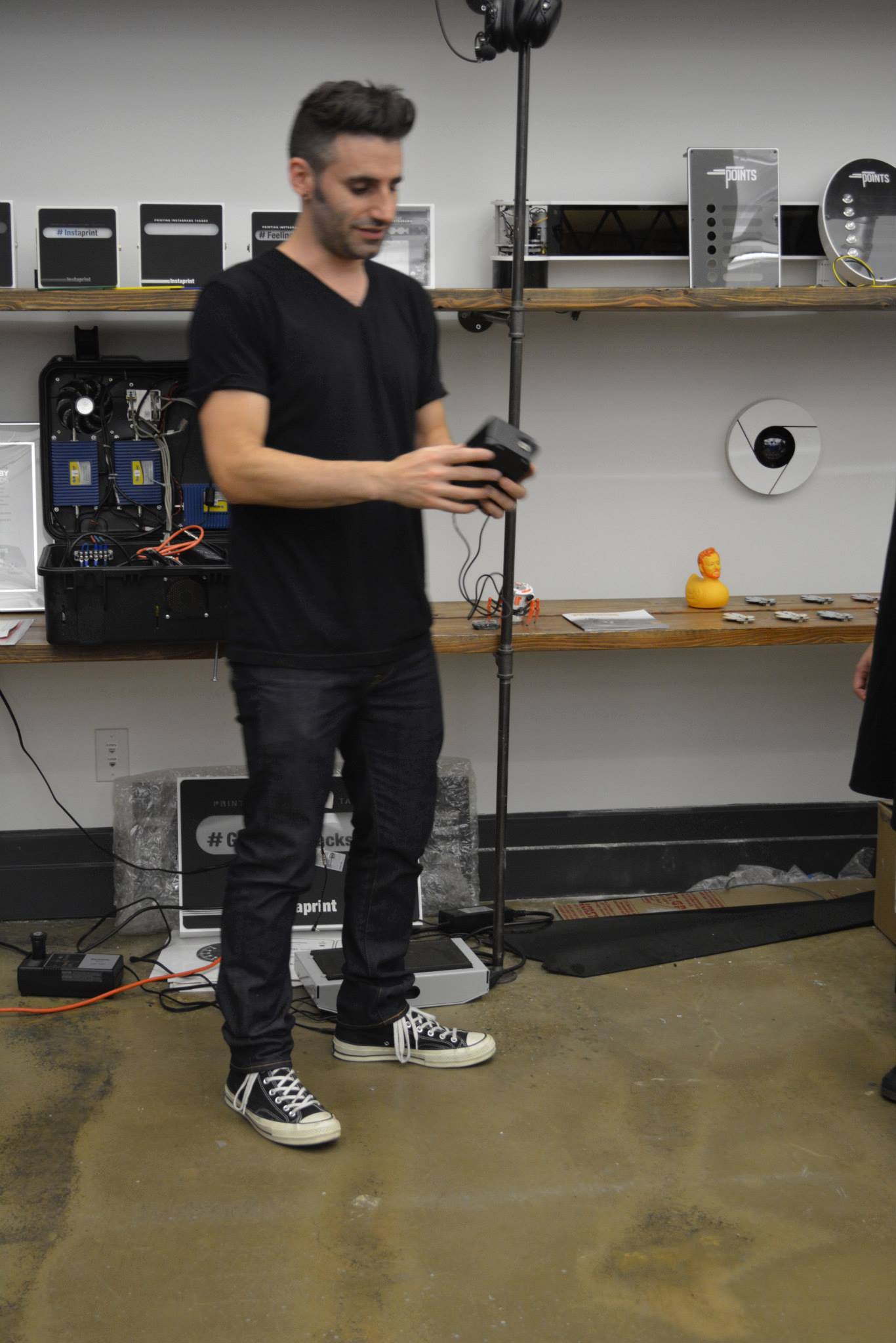 Meeting Andrew Zolty, the creative genius, director, and founder of Breakfast
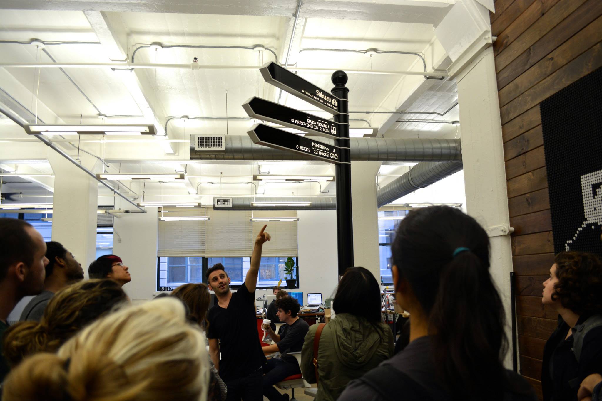 Checking out another project, Points, a robotic sign system
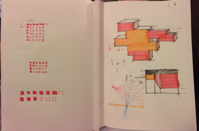

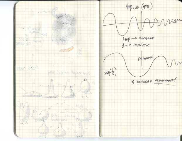
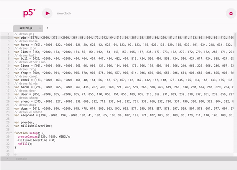 An early attempt at trying to figure out how the animals should move. I felt like this was too messy to be read as a clock
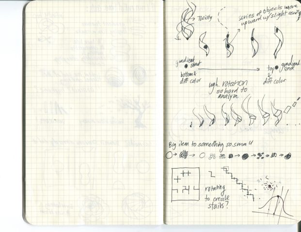
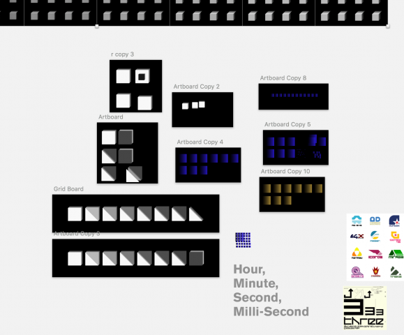
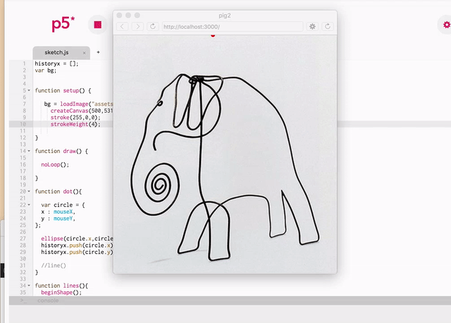 The program I made that allowed me to trace and store the drawing’s coordinates
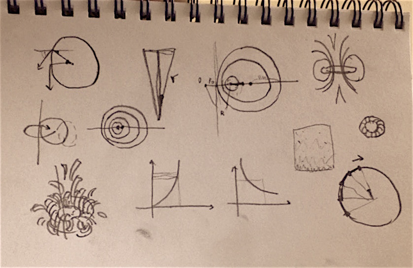
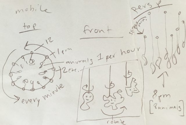 Planning!