Table of Contents
(This post is very long and boring. Please, just jump to the pictures.)
INSPIRATION
Idea
My project is partly inspired by ideas hidden in the traditional Chinese landscape paintings that have always been fascinating to me. In these paintings, the artist tries to create a spiritual world consisting of mountains and waters into which he can escape from the worldly values. Thus the painter never tries to copy a mountain from life, instead he paints the mountain as he envisions in his mind, which often resembles an amalgamation of many mountains he has in his memory. That way the rocks and trees in the painting don’t represent actual rocks and trees, and instead they speak a language of their own and tell of the inner state of the painter. These paintings are often immersed in a sense of stillness and solitude.
And this is my inspiration. The plotter, a machine, shall draw a landscape conceived in its mind, using the elements not to depict an actual scene, but only to tell about the deep sense of distantness and desolation in its heart, to show us the world to which it desperately wants to escape.
 A painting by Ni Zan (1301–1374)
Visuals
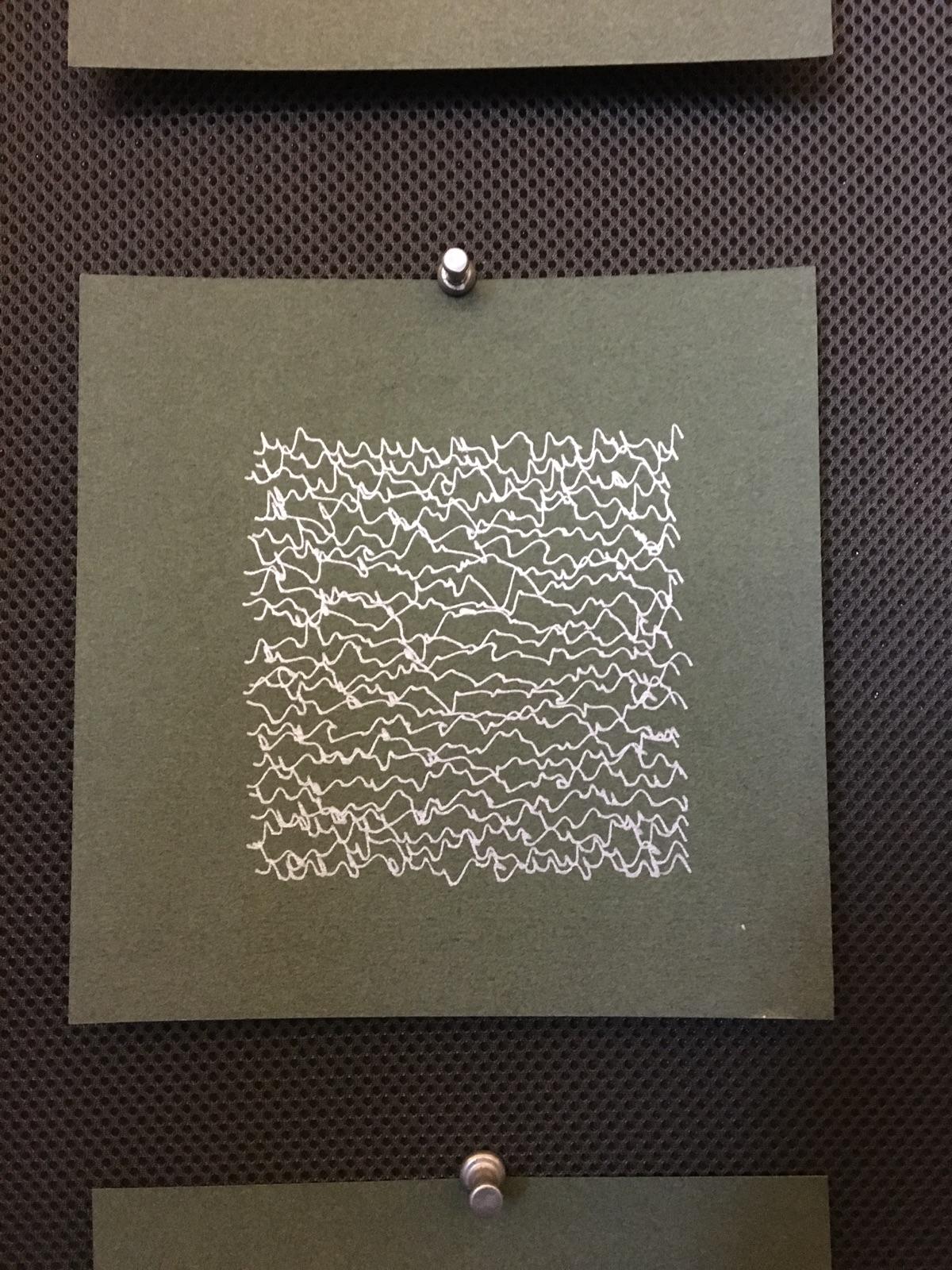
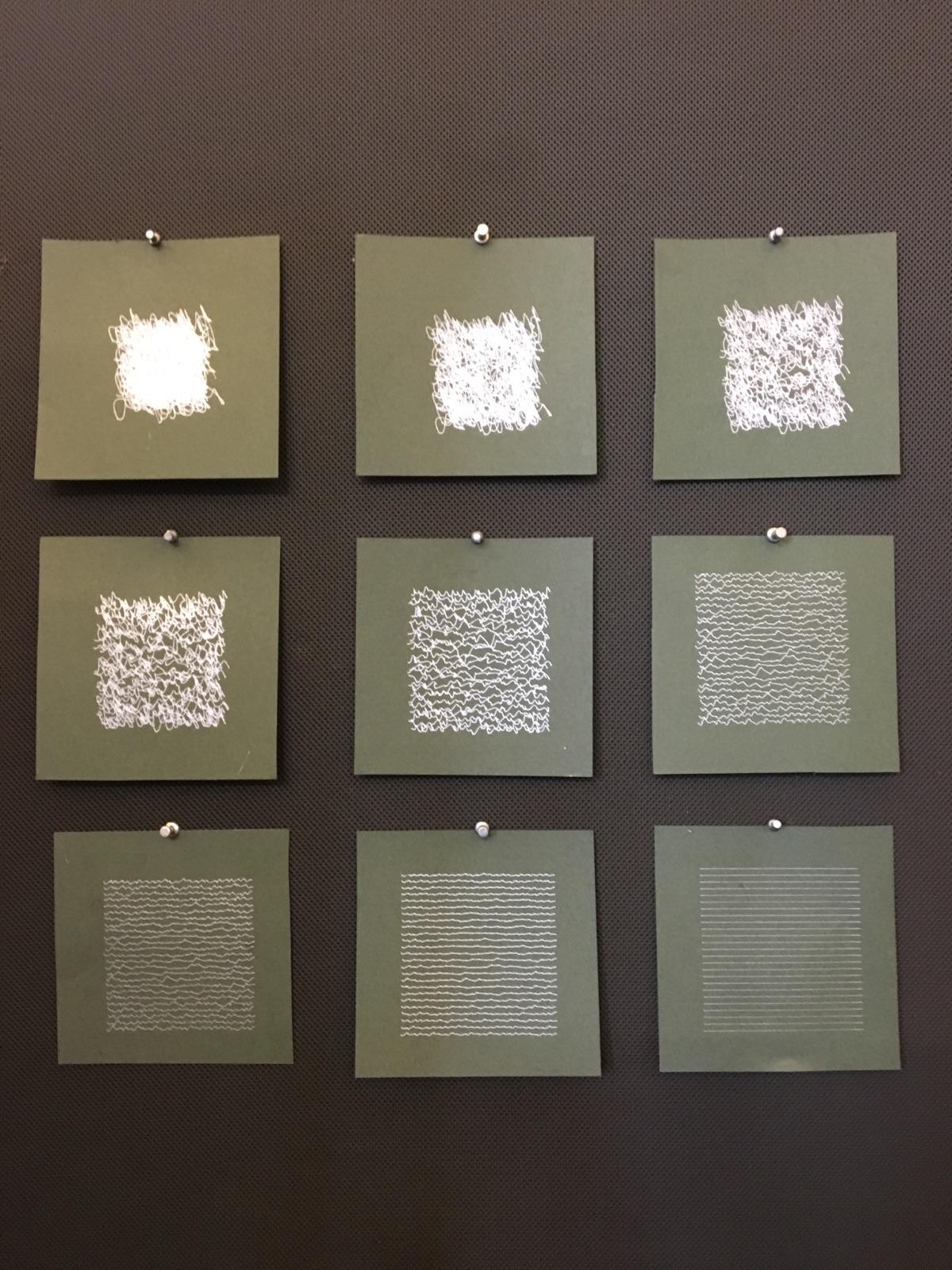
The fact that the plotter draws only uniform width lines reminds me of the hatching technique in drawing. I am fascinated by the way how lines closely drawn to each other seem like grayscale when viewed at a distance and at the same time feel very delicate when looked at closely. More specifically, I was thinking of Piranesi, the 18th century Italian printmaker’s etchings of Rome in ruins.
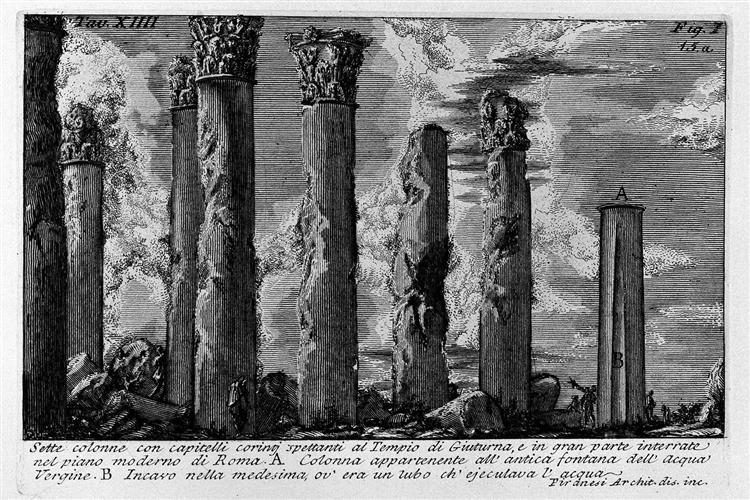 The Roman Antiquities, T. 1, Plate XIV by Giovanni Battista Piranesi
I also want my plotter drawing to look as if it is done by a person, albeit an incredibly patient one. I want it to have the imperfections, the whims and variations that are usually present in drawings done by a human artist. Moreover, I want it to resemble the style of my own drawings, so that when people see the plot done, they would say: “That’s Ngdon’s plot.”
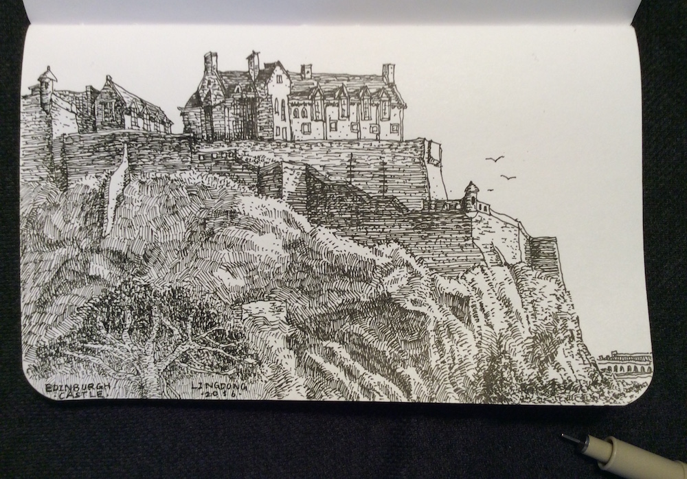 One of my sketches, drawn with the very same pen that was to plot my plot.
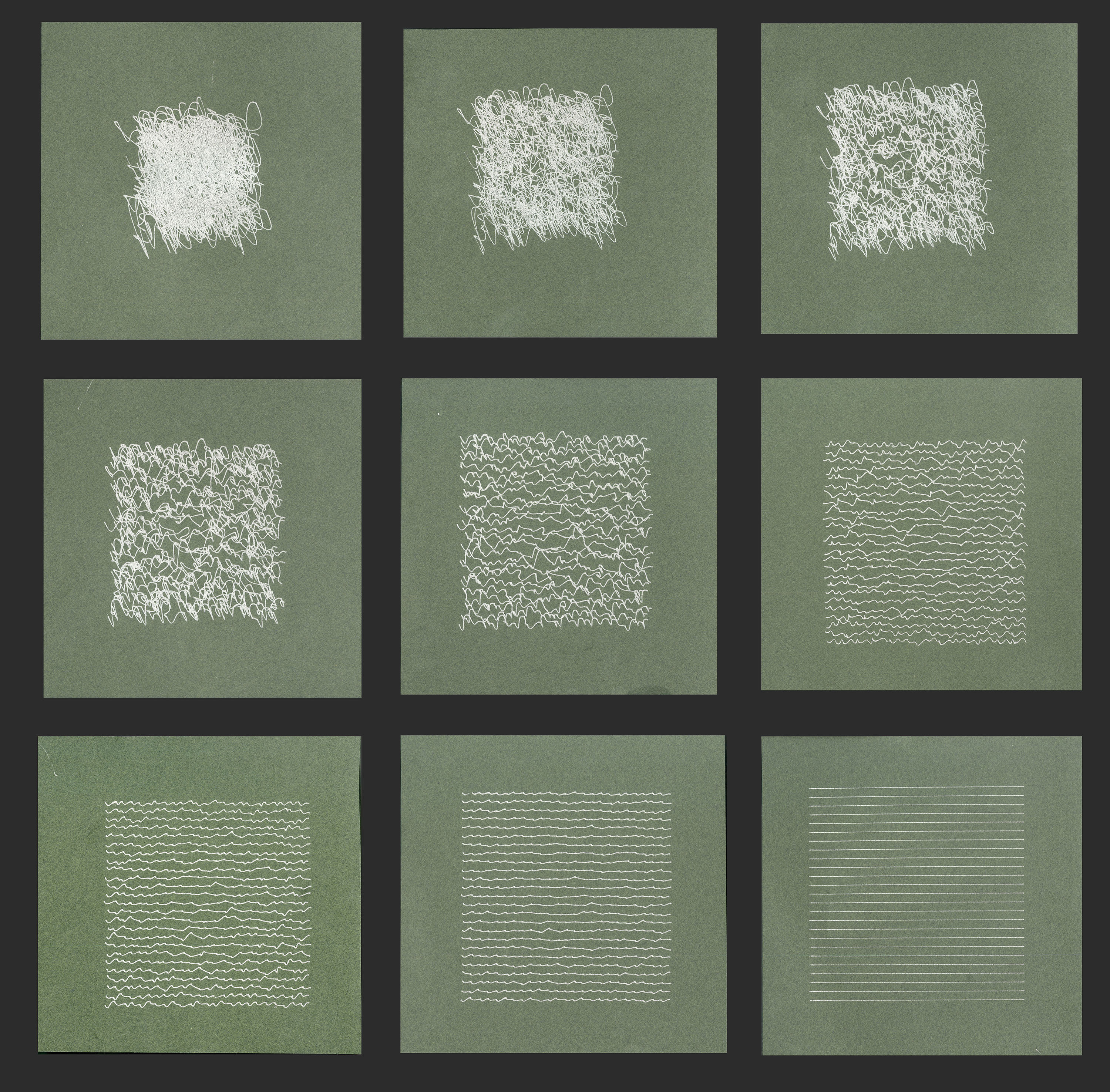
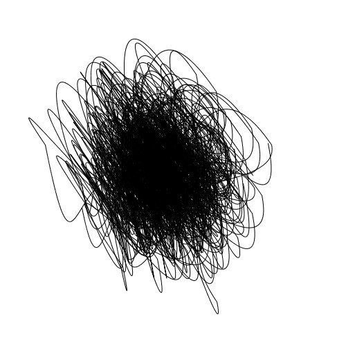
These considerations led me to decide that line hatching and dots will be the major elements in my plotter drawing.
TECHNIQUE
The drawing is rendered with two major steps. In the first step, the program procedurally generates a photo-ish picture of the landscape, and in the second, translates it into a half-tone drawing to be plotted.
Shape of Terrain
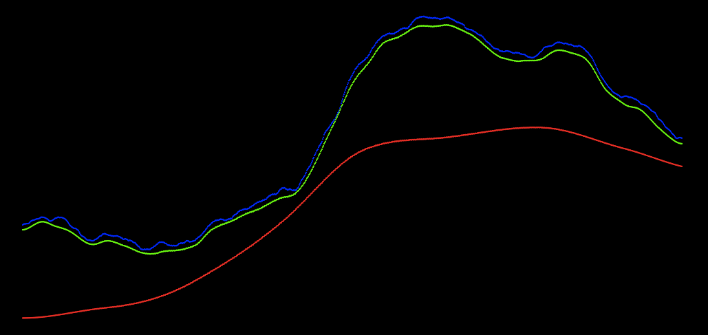
The shape of the mountains is generated with 3 perlin noises added on top of each other. As you can see in the image above, the red line represents a perlin noise with very small steps between seeds yet multiplied by a huge coefficient. This determines the general shape of the whole mountain. The green noise has a larger steps between seeds and a smaller coefficient, thus gives the mountain a more detailed outline. The blue noise, with large steps between seeds and a tiny coefficient, adds the finest details to the shape.
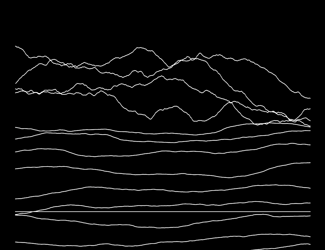
Such process is repeated multiple times to generate many mountains. To create the illusion of depth and distance, the y coordinate offset from bottom of the screen is incremented with every mountain. The field in the foreground is just basically very low mountains.
Texture of Terrain
The texture of the terrain is also generated with a controlled Perlin noise to imitate a rocky and grainy surface. Near the peak of a mountain it would be “noisier” and at the foot of the mountain less so. Then, a second perlin noise, closely related to the noises that generated the shape of the mountain, is used to divide the terrain into highlights and shadows.
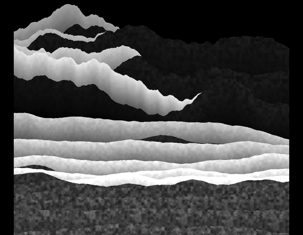
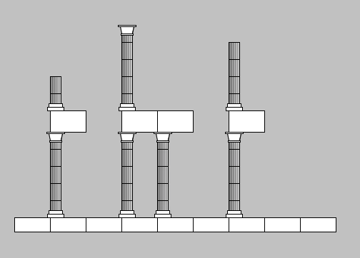
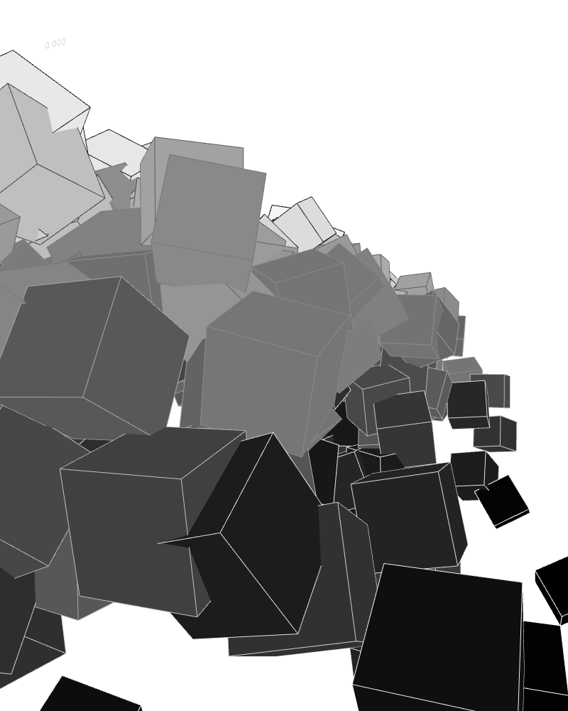
Generative Ruins
I generated some ancient ruins at the foot of the mountains with an algorithm similar to the Markov Chain. Each piece of the ruin, a column, a wall, etc. would guess who its neighbor shall be to its right and above. For example, a piece of floor would probably guess that next to it is also a piece of floor, and above it, a column. And that column also tries to guess who its neighbor shall be: may be another column, or may be a wall.
Edge Finding
The pixels in the generated scene are categorized based on their greyscale values. Each pixel is rated in a scale of 1 (very dark) to 20 (very bright), and the score is stored in an array. Then, a loop iterate through this array, and checks if a pixel has a different score than the one next to it, and if so, that pixel is an point on edge.
I originally wanted to use a more sophisticated algorithm such as Sobel, but tried this first as a test. Then I discovered that I quite like the result, so I clang on to the method.
Half Tone
I used horizontal lines to hatch my drawing. Hatching generally works as follows: the darker an area is, the more hatches it’s going to get. Therefore, a very dark area might get a horizontal hatch every other row of pixels, while a very bright area might only get one every five rows of pixels.
Therefore, for each edge point, the program checks if the brightness of that pixel dictates that a hatch shall be drawn on that row, and if so, a horizontal line will start from that edge point and extend to the right, until it meets another edge point.
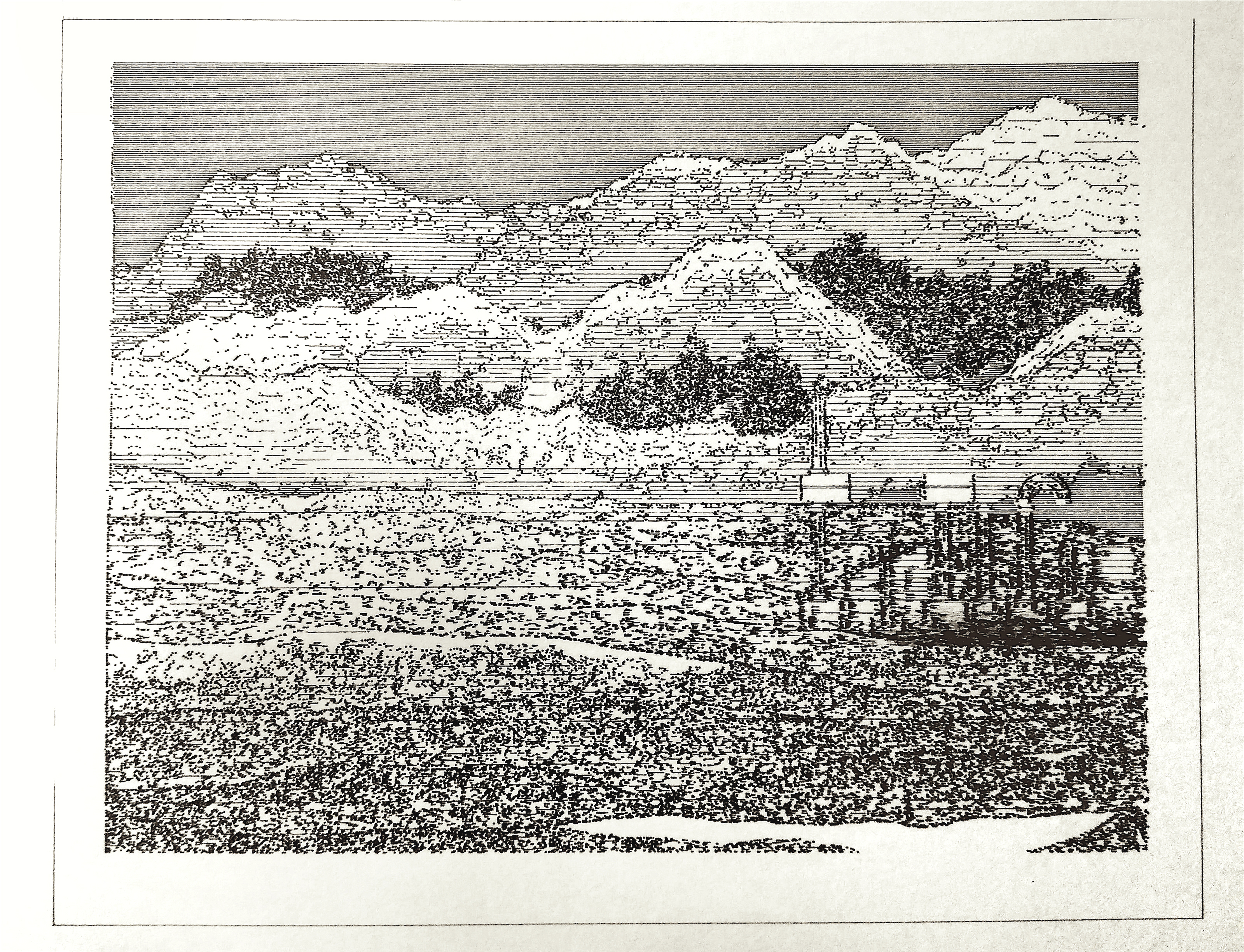
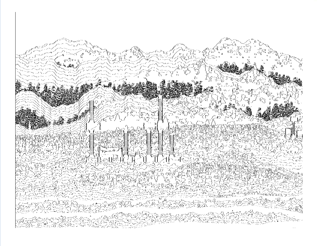
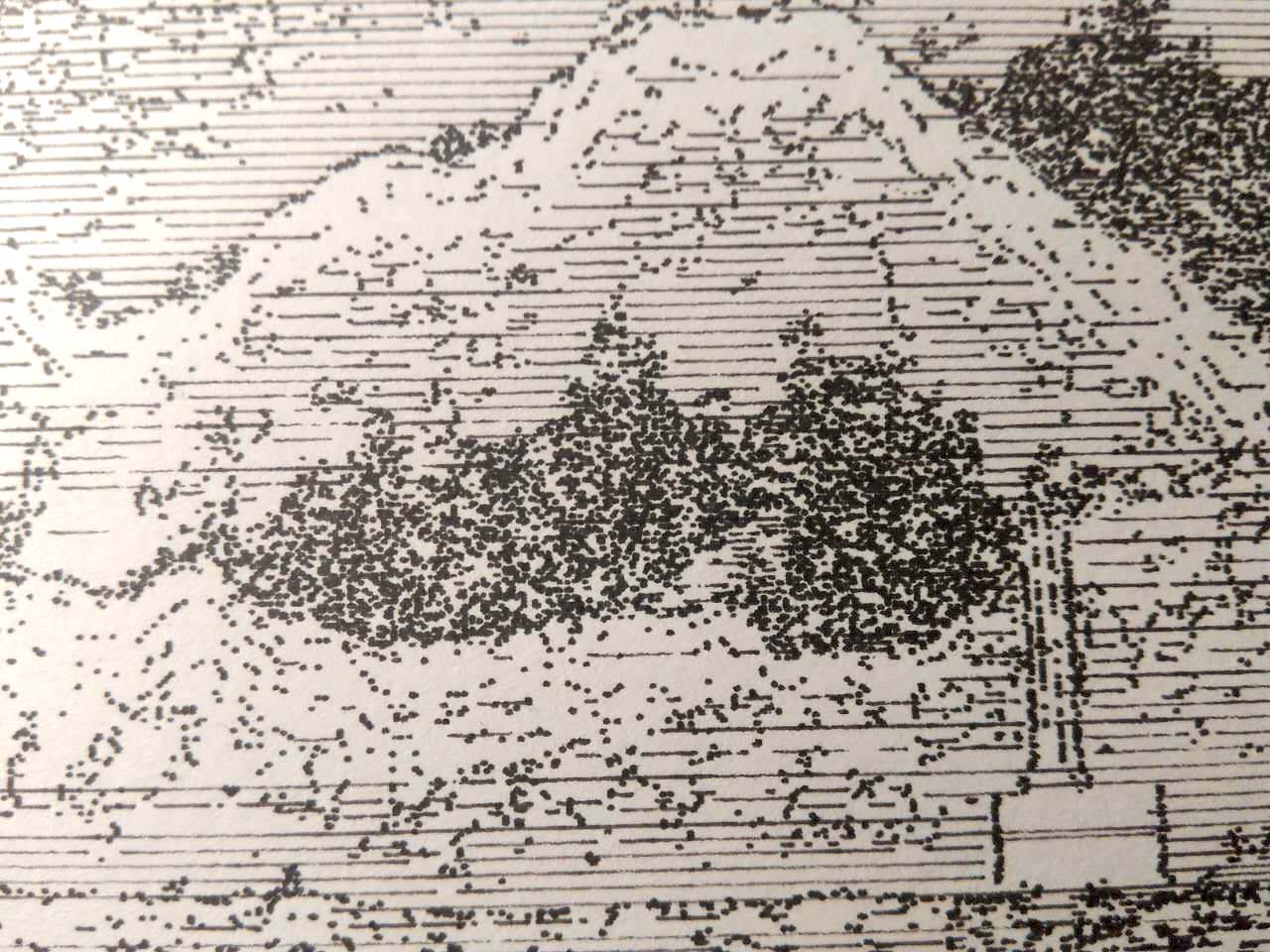
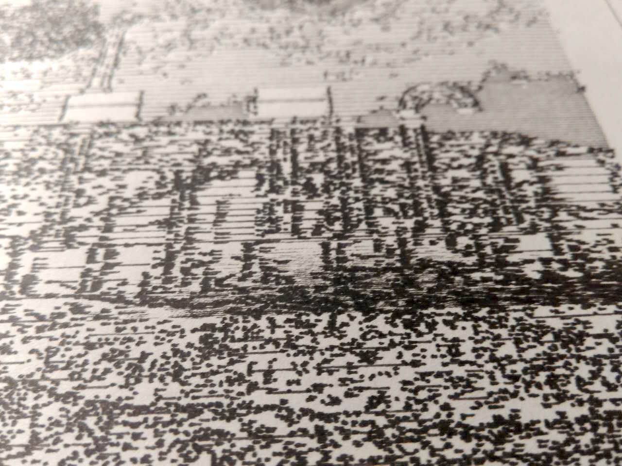
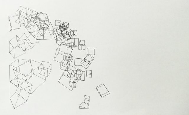
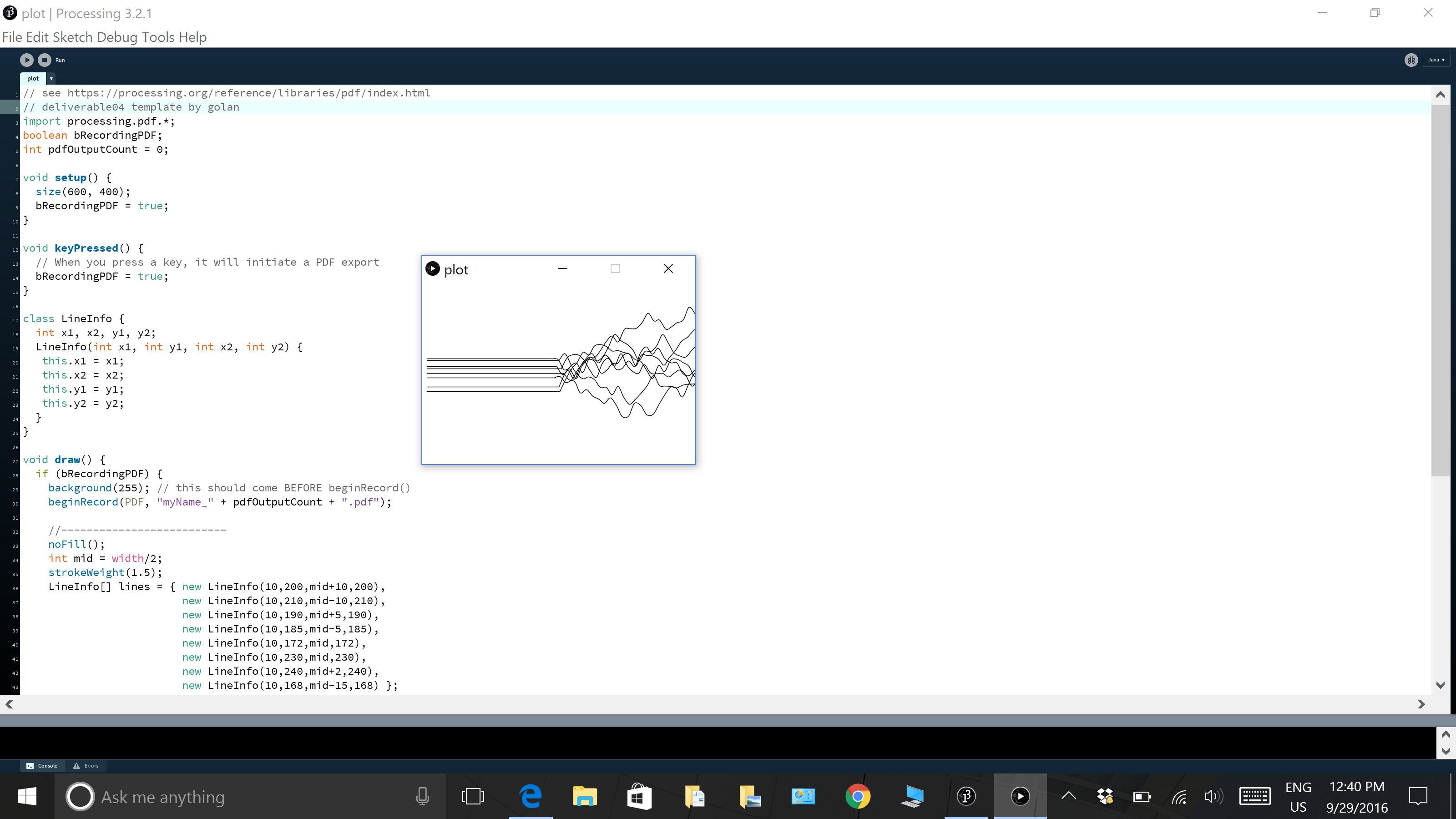
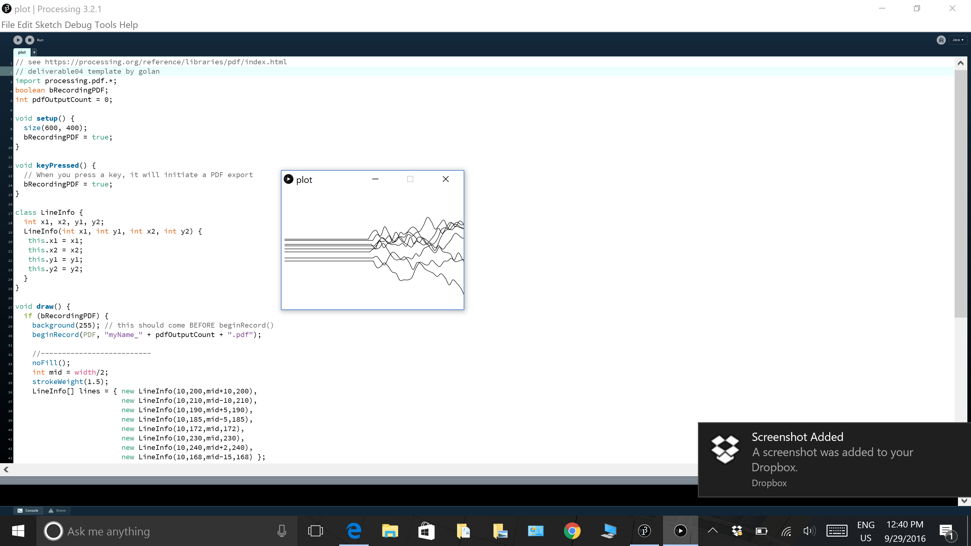
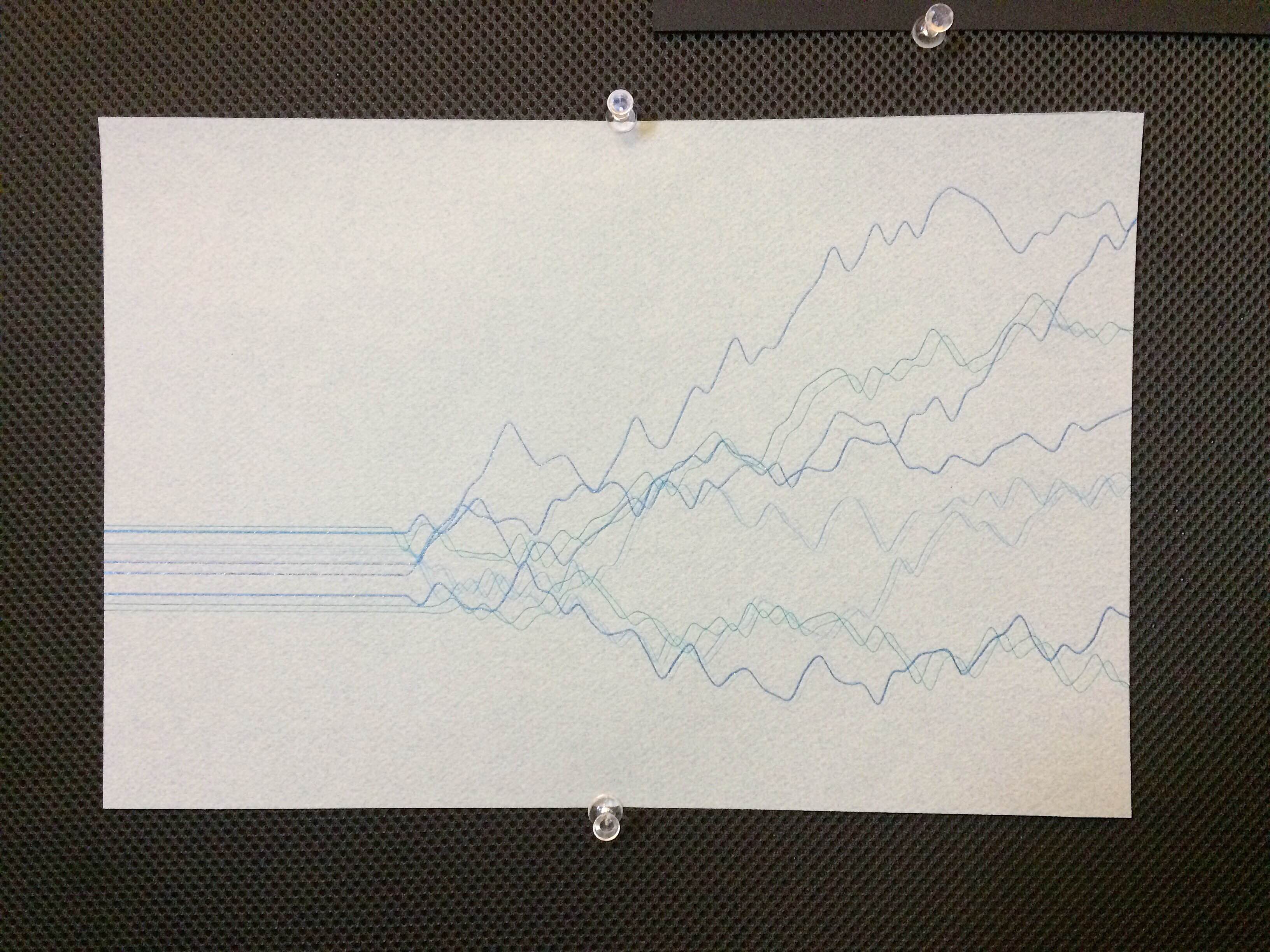
RESULT
PDF Exports
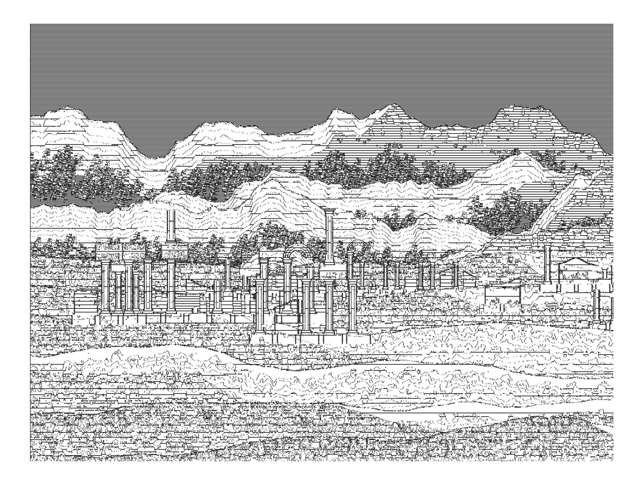
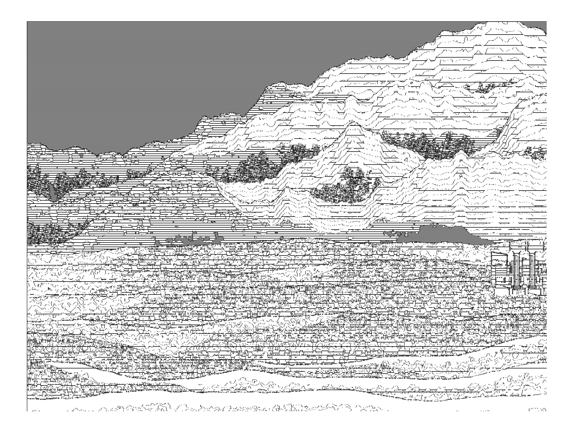
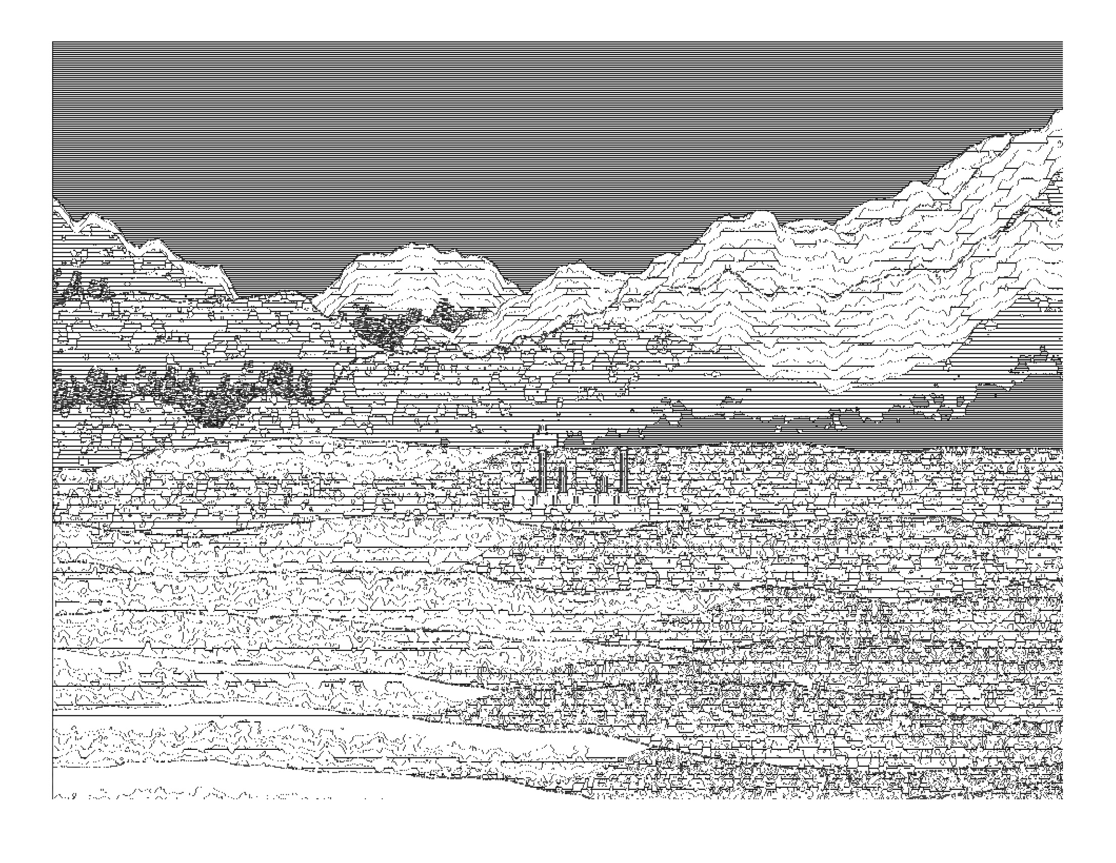
The Final Plot
THOUGHTS
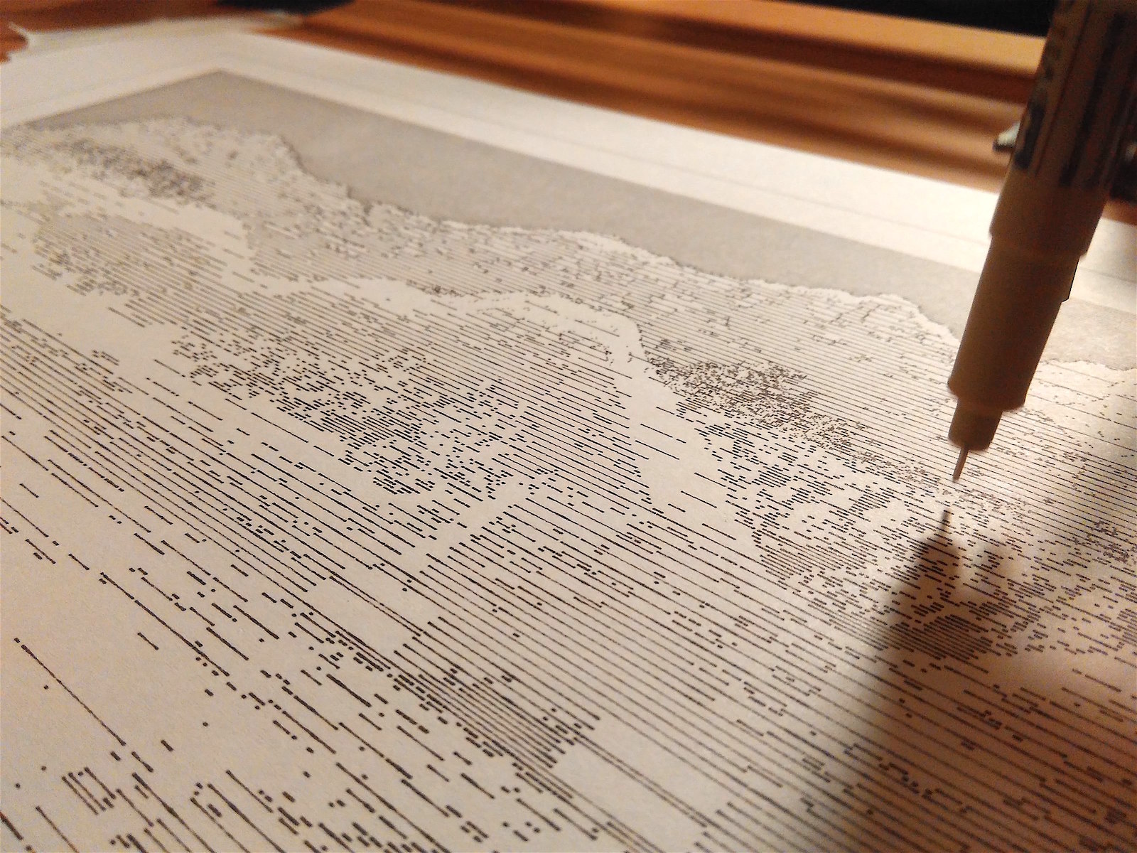
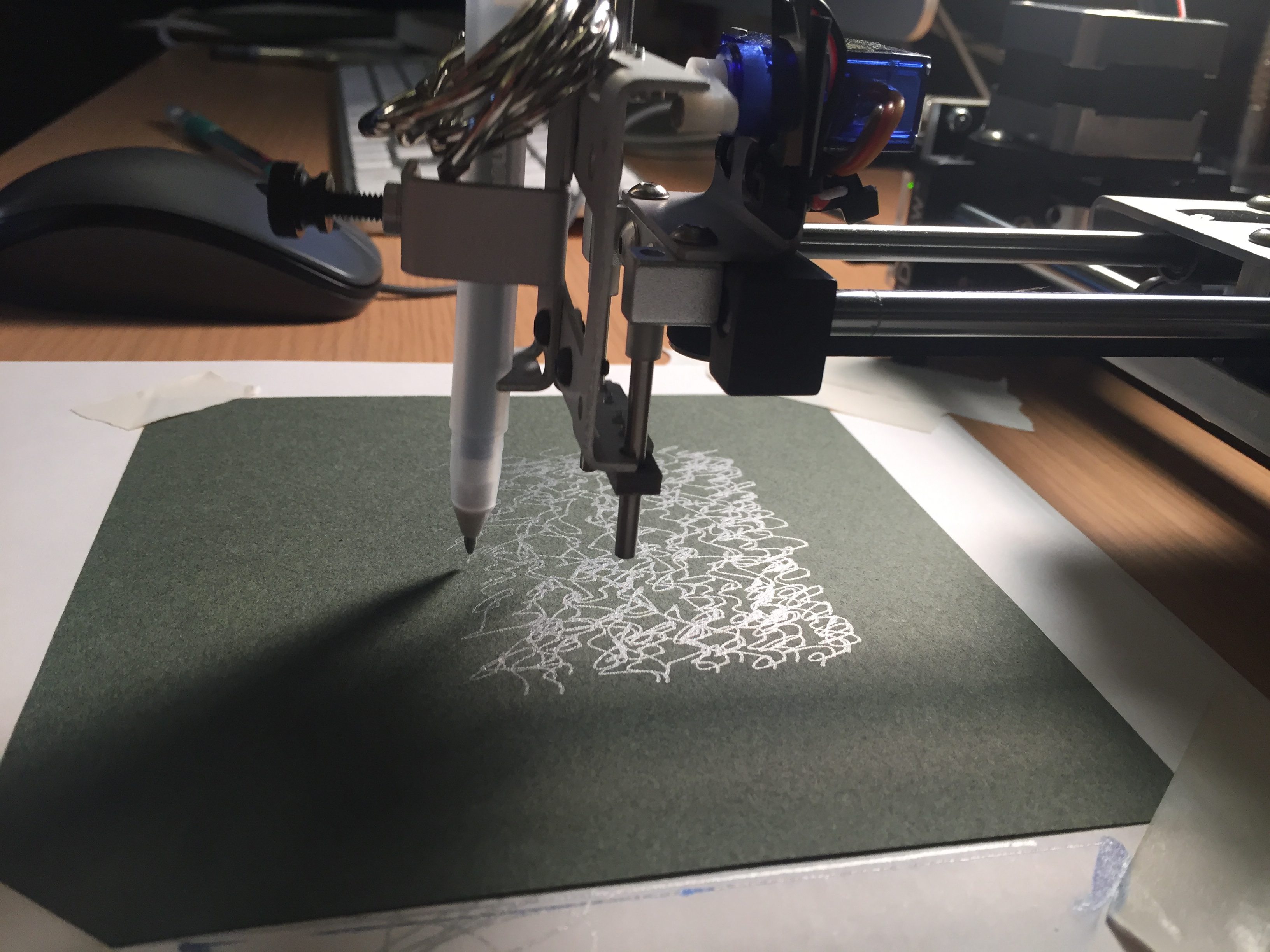
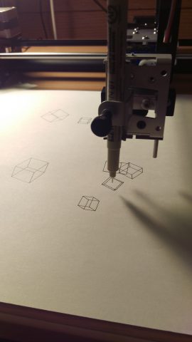
Plotting my design was a complicated experience. Five minutes into plotting and the tip of my micron pen is already bent. An hour later the plotter started rocking back and fro as its weight shifted. Another hour later it refuse to plot on certain areas due to uneven height. While I was having dinner for some reason it decided to make a black smear on the paper.
However I found that it was these unpredictable events/accidents that made the final plot so enchanting, so more interesting than something printed out of a printer. The errors in small places and the variation in line quality look almost human. The dots exhibits a wide range of variations due to the bent in shape of the pen tip. All the struggles I had been having with the plotter while it was plotting, now turns out to the most exciting parts of the result.
As I watched the plotter draw the plot almost the whole time, it felt as if I myself did the drawing. Looking at it afterwards, I can recall all the details about it such as “When drawing that tree, I so thought that it’s going to screw up the whole piece, but it turns out it didn’t” or “It felt so nice drawing this outline of mountain”. This kind of recollection I had been only able to do with my own drawings.
So it becomes a very strange feeling. I instinctively believe that I had done the piece myself, but then I know I didn’t. It’s like a dream, a deja-vu.
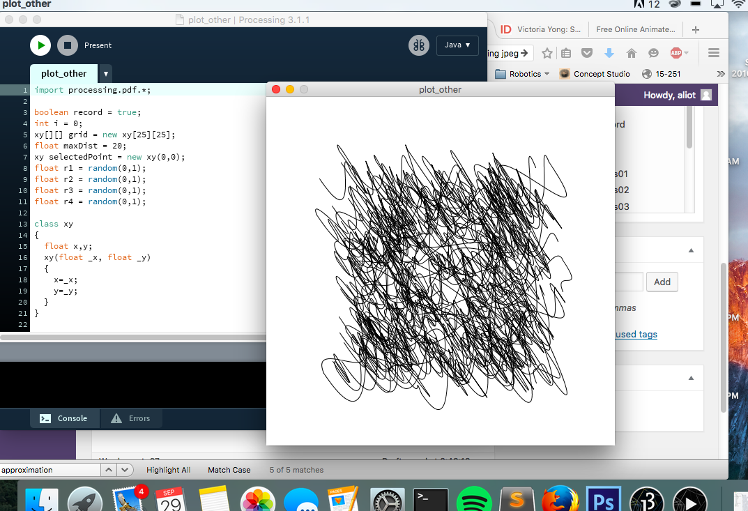
CODE
public class Piece {
  Piece right;
  Piece up;
  Piece down;
  Piece left;
  int w;
  int h;
  float l;
  int typ;
  int[] dat;

  int row;
  int col;
  public Piece(int typ){

    this.typ = typ;
    this.l = random(1.0);
    if (typ == 0){
      this.w = 50; this.h = 20;

    }else if (typ == 1){
      this.w = 15; this.h = 120;

      this.l = ceil(random(2.0));
      if (this.l == 1){
        this.l = 1;
      }else{
        this.l = random(1.0);
      }
    }else if (typ == 2){
      this.w = 50; this.h = 30;
    }else if (typ == 3){
      this.w = 60; this.h = 30;
    }else if (typ == 4){
      this.w = 50; this.h = 120;
    }
    //grow();
  }

  public int[] locPiece(){
    if (left == null && down == null){
      return new int[] {0,0};
    }else if (left != null){
      return new int[] {left.locPiece()[0]+left.w, left.locPiece()[1]};
    }else{
      return new int[] {down.locPiece()[0], down.locPiece()[1]-down.h};
    }

  }
  public void gr(int n){
    //println(col);
    if (col < random(1.0)*20){
      right = new Piece(n);
      right.left = this;
      right.col = col + 1;
      right.row = row;
      right.grow();
    }
  }
  public void gu(int n){
    if (row < random(1.0)*4){ up = new Piece(n); up.down = this; up.col = col; up.row = row+1; up.grow(); } } public void grow(){ if (typ == 0){ gr(0); if (random(1.0)>0.5){
        gu(1);
      }else{
        gu(4);
      }
    }
    if (typ == 1){
      if (l == 1){
        if (random(1.0)>0.1){
          gu(2);
        }else{
          gu(3);
        }
      }
    }
    if (typ == 2){
      if (random(1.0)>0.2){
        gu(1);
      }else{
        gu(4);
      }
    }


  }


  public void drawPiece(){
    int[] loc = locPiece();
    //println(loc);
    if (typ == 0){
      fill(200,210);//floor(random(2.0))*180+20);
      stroke(0);
      rect(loc[0]-5,loc[1]-h,w+10,h);

    } else if (typ == 1){
      int mseg = 5;

      int seg = ceil(l*mseg);
      pushMatrix();
      translate(10,0);
      for (int i = 0; i< seg; i++){
        noStroke();
        fill(220);
        rect(loc[0],loc[1]-(i+1)*h/mseg,w,h/mseg);
        for (int j = 0; j Lines=new ArrayList();

int[] Epts;

PImage img;


int[][][] Vmap;


void tree(float x,float y,float a,float o, float l, int depth){
  if (depth > 0){
    float x1 = x + l*cos(a-o);
    float y1 = y + l*sin(a-o);
    float x2 = x + l*cos(a+o);
    float y2 = y + l*sin(a+o);
    strokeWeight(1);
    stroke(random(1.0)*255);
    line(x,y,x1,y1);
    line(x,y,x2,y2);
    tree(x1,y1,a-o,o,l*0.6,depth-1);
    tree(x2,y2,a+o,o,l*0.6,depth-1);
  }

}


void tree2(float x, float y, float l, int depth){
  if (depth > 0){
    float x1 = x;
    float y1 = y-l;
    strokeWeight(1);
    stroke(0,0,0);
    tree(x1,y1,-PI,PI/16,l,2);
    tree(x1,y1,0,PI/16,l,2);
    line(x,y,x1,y1);
    tree2(x1,y1,l*0.8,depth-1);
  }
}


void noisefill(int[][][] vm){
  for (int i = 0; i < vm.length; i++){
    for (int j = 0; j < vm[i].length; j++){
      vm[i][j][0] = parseInt(noise(0.01*i,0.004*j)*255);
    }
  }
}

void scanimg(int[][][] vm){
  //image(img,0,0);
  for (int i = 0; i < vm.length; i++){
    for (int j = 0; j < vm[i].length; j++){

      vm[i][j][0] = parseInt((red(get(j+dx,i+dy))+green(get(j+dx,i+dy))+blue(get(j+dx,i+dy)))/3);
    }
  }


}


void genterr(int[][][] vm){
  for (int i = 450; i < vm.length*2; i+=50){
    float hl = 0;
    for (int j = 0; j < vm[0].length; j++){
      float nz0 = noise(0.005*i,0.001*j);
      float nz1 = noise(0.1*i,0.005*j);
      float nz2 = noise(0.1*i,0.05*j,200);
      //stroke(map(i,0,vm.length,0,255));
      //line(j,i,j,i-nz*100);
      float h;
      if (i < vm.length*0.9){
        h = nz0*500+nz1*200+nz2*20;
      }else if (i < vm.length*0.95){
        h = 0;
      }else{
        h = 200+nz0*200+nz1*40+nz2*4;
      }
      for (int k = 0; k < h; k++){ float nz3 = noise(0.1*i,0.1*j,0.1*k); if (k > 2.0*h*noise(0.005*i,0.001*(j+1000))){
          if (i < vm.length*0.9){
            fill(constrain(parseInt(map(k,h/2,h,0,300)*(0.9+0.1*((1-k/h)+(k/h)*nz3))*i/vm.length),0,255));
          }else{
            fill(constrain(parseInt(map(k,h/2,h,0,250)*(0.8+0.2*((1-k/h)+(k/h)*nz3))*i/vm.length),0,255));
            //fill(0,0);
          }
        }else{
          if (i < vm.length*0.9){ fill(constrain(parseInt(map(k,h/2,h,0,80)*(0.1+0.9*((1-k/h)+(k/h)*nz3))*i/vm.length),0,255)); }else{ fill(constrain(parseInt(map(k,h/2,h,0,120)*(0.1+0.9*((1-k/h)+(k/h)*nz3))*i/vm.length),0,255)); //fill(0,0); } } noStroke(); rect(j,i-k,1,1); if (random(1) > 0.99 && k < h*0.7 && k > h*0.5 && i < vm.length*0.8){ tree2(j,i-k,5+5*random(1.0),5); } } fill(200); if (random(1) > 0.5){
        rect(j,i-h,1,1);

      }
      if (random(1) > 0.9){
        //tree2(j,i-h*0.9,5+5*random(1.0),5);
      }


      hl = h;
    }
    for (int j = 0;  j < vm[0].length; j++){ float h = 400; if (random(1) > 0.9995 && i > vm.length*1.0 && i < vm.length*1.2){
        Piece p = new Piece(0);
        p.grow();
        pushMatrix();
        translate(j,i-h*random(0.7,0.9));
        scale(0.0+3*(i-vm.length*0.9)/(vm.length*1.1));

        p.drawPiece();
        popMatrix();
      }
    }

  }

}


void levelfygrc(int[][][] vm){
  for (int i = 0; i < vm.length; i++){
    for (int j = 0; j < vm[i].length; j++){
      vm[i][j][1] = max(parseInt(map(vm[i][j][0],0,255,1,20))*2,1);
      //println(vm[i][j][1]);
      //vm[i][j][1] = 2*parseInt(255/max(1,vm[i][j][0]));

    }
  }
}


int[] getedgepts(int[][][] vm){
  int[] epts = new int[width*height*2];
  epts[0] = 1;
  for (int i = 0; i < vm.length; i++){
    for (int j = 0; j < vm[i].length; j++){
      if (j==0 || vm[i][j-1][1] != vm[i][j][1]){
        epts[epts[0]] = i;
        epts[epts[0]+1] = j;
        epts[0] += 2;
      }
    }
  }
  return epts;
}


void shade(int[][][] vm, int[] epts){

  for (int i = 1; i < epts[0]; i+=2){
    if (epts[i]%vm[epts[i]][epts[i+1]][1]==0){
      int[] l = new int[4];
      l[1] = epts[i];
      l[0] = epts[i+1];
      for (int j = 0; j < width; j++){
        if (epts[i+1]+j==vm[0].length-1
            //||epts[i]+j==vm.length-1
            ||vm[epts[i]][epts[i+1]+j][1] != vm[epts[i]][epts[i+1]][1]
           ){
          l[3] = epts[i];
          l[2] = epts[i+1]+j;
          //stroke(0,255,0,200);
          //line(l[0],l[1],l[2],l[3]);
          float d = dist(l[0],l[1],l[2],l[3]);
          int[] w = wiggle(l,max(parseInt(0.1*d),1),parseInt(vm[epts[i]][epts[i+1]][1]/2));
          for (int k = 2; k < w.length-1; k+=2){ int[] nl = new int[4]; nl[0] = w[k-2]; nl[1] = w[k-1]; nl[2] = w[k]; nl[3] = w[k+1]; if (random(10) > 0.0001*pow(vm[epts[i]][epts[i+1]][1],3)){
              //Lines.add(nl);
            }
          }

          Lines.add(l);
          break;
        }
      }
    }

  }

}

int[] wiggle(int[] l, int p1, int p2){
  //int d = parseInt(dist(l[0],l[1],l[2],l[3])/p1);
  if (p2 == width){p2 = 0;}
  int[] ls = new int[p1*2+2];
  for (int i = 0; i < p1+1; i++){
    ls[i*2] = l[0] + i*(l[2]-l[0])/p1;
    ls[i*2+1] = l[1] + i*(l[3]-l[1])/p1;

    ls[i*2] += parseInt(noise(0.1*ls[i*2]/p1,ls[i*2+1],10)*p2-p2/2);
    ls[i*2+1] += parseInt(noise(0.1*ls[i*2]/p1,ls[i*2+1],100)*p2-p2/2);
  }

  return ls;

}

int dx = 50;
int dy = 40;

import processing.pdf.*;
boolean bRecordingPDF;
int pdfOutputCount = 0;

void setup(){
  size(1060,820);
  background(0);


  Vmap = new int[height-100][width-100][2];
  //noisefill(Vmap);
  translate(dx,dy);
  genterr(Vmap);

  scanimg(Vmap);

  levelfygrc(Vmap);
  Epts = getedgepts(Vmap);

  shade( Vmap,Epts);
  noLoop();

}

void draw(){
  beginRecord(PDF, ""+parseInt(floor(random(1000000000)))+".pdf");

  background(255);

  translate(dx,dy);


  for (int i = 1; i < Epts[0]; i+=2){
   stroke(0);
   strokeWeight(1);
   noFill();
   line(Epts[i+1],Epts[i],Epts[i+1],Epts[i]);

  }


  println(Lines.size());
  for (int i = 0; i < Lines.size(); i++){

    stroke(0);
    strokeWeight(1);
    line(Lines.get(i)[0],Lines.get(i)[1],Lines.get(i)[2],Lines.get(i)[3]);
  }

  endRecord();

}
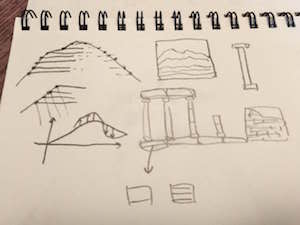
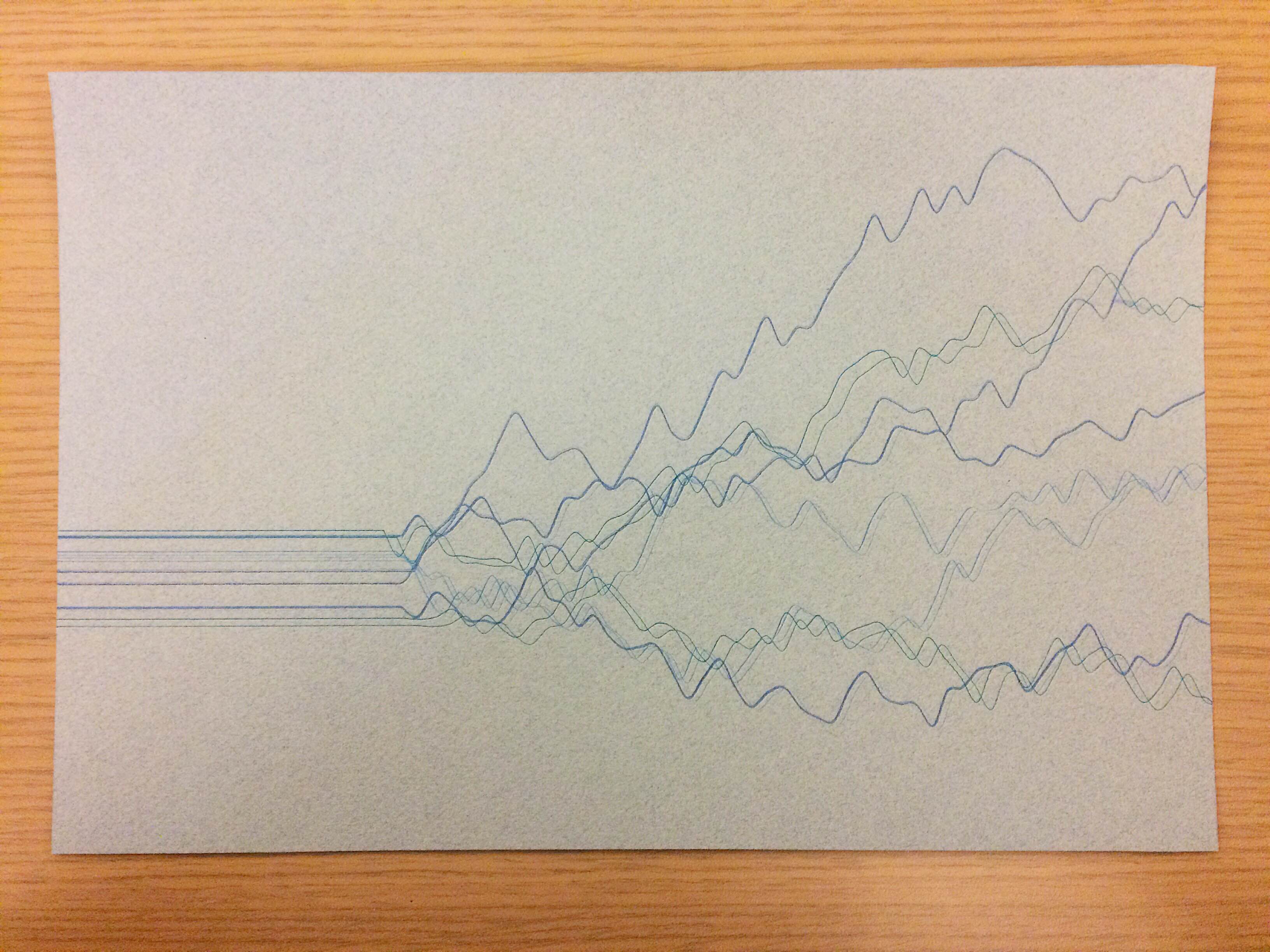
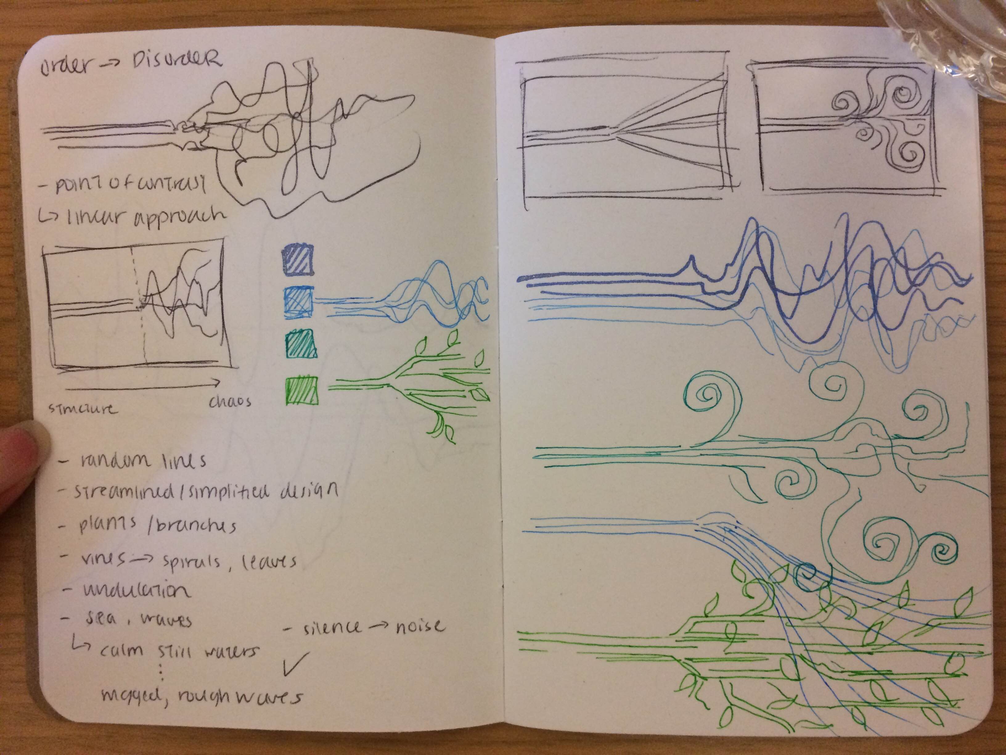
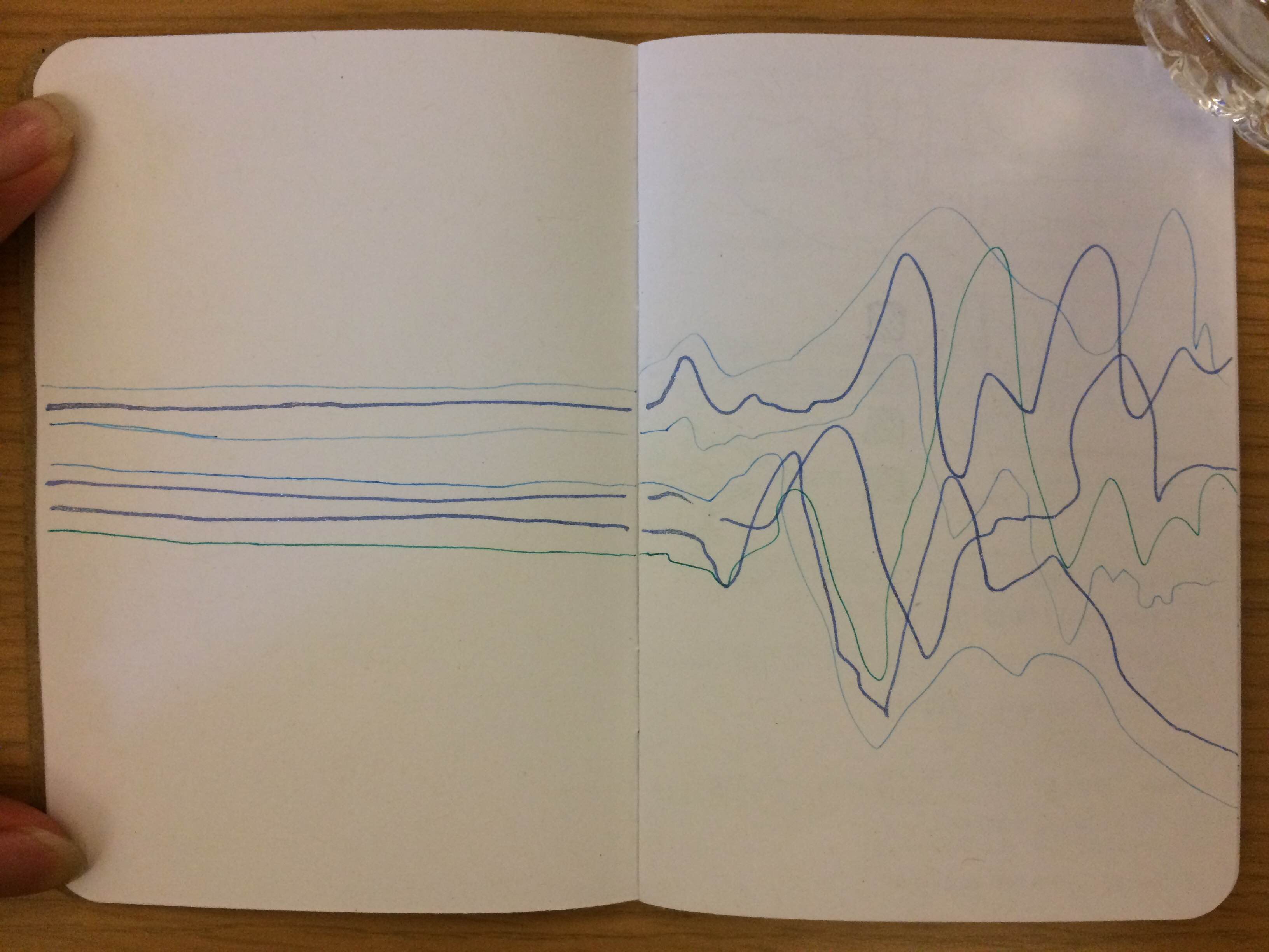
SKETCHES
P.S. Sincere apologies to those who couldn't use the plotter on Wednesday night because my plot was taking so long.


 I believe much of