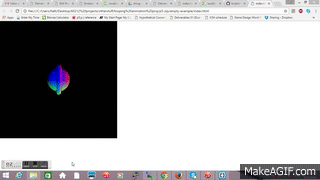
Jaqaur – Clock-Feedback

In general, people seemed to like my clock (or they’re all just very nice), which is good because its my favorite of all the projects we’ve done so far. I’m really proud of it, and I haven’t yet gotten tired of watching it. Still, there were some flaws, as people noticed. The main complaint was in regards to my physics: some didn’t like how the balls overlapped at the bottom, and some didn’t like the jostle-y-ness. I was well aware of this before I turned the clock in, and most of my time working on the project was trying to fix this. There was basically an inverse relationship between these two issues. I could raise the sensitivity, which would reduce overlap, but lead to more vibration and shaking throughout the whole sea of marbles. I could also reduce sensitivity, which would make the marbles bounce around less but also make them more likely to overlap at the bottom where there was a lot of pressure on them. I ended erring on the side of high sensitivity, so as to reduce overlap as much as possible, and then put a velocity cap on the marbles so they couldn’t shake past the point of legibility. I think I did the best I could without implementing a seriously more complicated physics system. So, in short, I agree with the complaints against my physics, but I couldn’t do much to totally get rid of those issues.

My color palette was a little more across the board. Some people said they really liked the monochrome, and in general I do too. I especially like how I prevented the color generated from being too gray/brown. However, Tega suggested I do more with interesting color palettes, and that’s not a bad idea. I knew I didn’t want totally random colors, but I did want a lot of potential color options. Implementing particular color palettes would take a lot of work if I really want there to be as many options as there are now, but maybe it would be worth it? It might make the whole thing more dynamic if minutes, hours, and seconds, were more differentiated. Some people suggested an accent color, too, but I actually thought about that and decided I preferred the aesthetic when the only thing distinguishing the active marbles from the inactive marbles was size.

All in all, I wasn’t surprised by most of my feedback, and I’m still pretty happy with my clock!

arialy-AnimatedLoop

arialy_loop

img_8398

I focused more on the process of creating this piece more than what the end result be. I wanted to see what would happen when I make the end points of lines trail around the opposing edges of the canvas border. I made one line do so and just mouseClicked to find what its coordinates were later on. It was satisfying to see what pattern it would make in the end. I could have pushed the pattern a little further by perhaps creating another square in the middle, and maybe find more sense in the amount of lines I used.

Guodu-LookingOutwards03

Product Design and Parametric Forms

I got really into looking at generated parametric 2D designs on tangible materials (mostly lasercut) and 3D forms because I just never knew it was possible to create programs to generate 3D forms or on 3D mediums. My interest in this area of generative products comes from playing with the laser cutters in Ideate and the 3D printer in my products studio.

There were so many amazing programmer artists and designers from the lectures that I wish I could all write about (my top three being Marius Watz’s laser drawings, John Edmark’s Fibinocci bloom sculptures, and Wertel Oberfell’s Fractal Tables). Something I find similar and extremely intriguing in most programed 3D forms is this sort of meta design going on of nature inspired patterns and forms are applied on either natural materials (wood, plywood) or a nature inspired pattern/form grows from 3D printers (stereolithography). It’s a new way of seeing nature and materials. The end results are beautifully nature inspired and only possible through generative programs.

Marius Watz left the deepest impression on me because before this summer started, I bumped into a designer in my studio who created similar forms like Watz’s below. He was designing various organic and nature inspired “knobs” he called. One of them looked like a sea urchin shell:

61fi275tcml

He told me he was designing for patients who have suffered a stroke and can no longer understand or realize what they are interacting with. That’s why he was exploring some organic forms that have more tactile grip and interaction compared with a door knob’s smooth cylinder.

Marius Watz’s forms (2011) make me think about how his design process could be applied to more fields like helping medical patients improve their senses and ability to feel, acting as indicators on walls or products for changes in environmental setting, or simply enhancing our interaction with objects instead of just swiping or tapping on smart phones.

I’m not entirely sure what the steps would be but it seems like he created an algorithm to create these forms, entered the data in CAD software like Rhino, then exported it as stls for the 3D printer, and had to adjust the design to create the best fidelity since the 3D printer can be janky. His CAD files look more chaotic in complex layers and forms than some of the final results, so there are definitely adjustments. His effective efficiency looks to be more on the disorderly and complex side with forms that look more inspired by natural organisms and the ones that are less rotationally symmetrical. Overall I find Marius Watz’s forms both beautiful to look at, potentially functional in their strong tactility, and just fun. It looks like he enjoyed his process and explorations just by the quantity, varying designs, and his bright choice of color.

See Marius’s form studies and more of his work

7660-sf-kinotek-form-studies-makerbot-800-1 screen-shot-2016-09-25-at-11-20-07-am screen-shot-2016-09-25-at-11-19-02-am screen-shot-2016-09-25-at-11-17-03-am

Really inspiring and work 🙂

kadoin-lookingoutwards03

Melanie Hoff is a Brooklyn based artist who actually does a lot of generative art. In her project “15,000 Volts” she sticks metal screws into a piece of wood and passes a current of 15,000 volts through them. While the current goes through the wood it burns its path while trying to find the path of least resistance to complete the circuit.  Despite being a mesmerizing process to watch, the end results of the tiny lightning bolts burned into the wood is also beautiful.

I like this piece because  watching things burn is just very satisfying to watch. I love looking at the embers of a dying campfire and I love using the laser cutter to burn precise markings into things. This piece is like a combination between those two things with its slow burning but delicate line work.

Apart from the start point and endpoint of the burn lines, the resulting burn marks that make up the piece are almost impossible to predict, putting this piece of generative art in the the more disorderly category.

Jaqaur – Looking Outwards 03

incendianext_2
I think Incendia is really interesting, because rather than being an individual art project, it’s a software that allows users to make designs with fractals. The examples on their website vary wildly, from traditional swirls to pictures made up of stone columns and suns (show below) or hot air balloons. In this project, the computers seem to have little autonomy, because users get to control most of the factors like color, type of fractal, and anything that would really affect the image. Still, there is a high amount of complexity that just comes with all fractals–they continue infinitely (in theory), so there are a lot of intricate details. Even though everything is extremely orderly, the pictures created by Incendia appear very complex to viewers, and sometimes very beautiful.
suns

Jaqaur – Reading03

1a. I think that mathematics, particularly mathematical proofs, exhibit effective complexity. Technically, there isn’t much disorder (or any at all), but they show a flawless transition from complexity to simplicity, or vice versa. They can be incredibly complicated, but still beautiful. Below is a picture of a proof of Euler’s identity, which is often called “the most beautiful proof in mathematics.” I guess on a scale from total order to total disorder, this would definitely be on the total order side, but there is still a great deal of variation from one proof to another, such that some don’t even look like math anymore.
euler-derivations

1b. As much as the Problem of Meaning intrigues me, I think enough of my classmates have answered it the same way I would have to warrant me discussing another problem. So, I will talk about the Problem of Uniqueness, another question which has bothered me in the past. Before I was even exposed to computer-based art as I know it, I was shown prints: pictures carved into a piece of wax, metal, or wood, covered in ink, and then pressed onto paper after paper. This made me a little uncomfortable. No matter how good the art was, the fact that it was mass-produced made it feel less real to me, and certainly less valuable then something that was painted by hand. I remember just a few years ago I saw a rack of 20 copies of the same painting in a “World Market,” and I said “Wow. Before I saw how many there were, I thought it was a real painting.”
So, even before I was presented with this question in the reading, I guess I had an answer: to me, mass produced artwork is less valuable than one-of-a-kind artwork (even if there are slight variations in some generative art), if for no other reason than supply-and-demand economics. That being said, I don’t want to negate the actual artistic thinking that goes into writing the code or carving the initial print block that leads to the mass-produced art–that act can be incredibly creative and skillful. Rather, I think that the actual “art” in this scenario is the code or the block rather than the pieces that get generated. When a musical is performed every night, the true art is in the writing, direction, choreography, and design rather than the individual performance. Similarly, each piece of generated “art” is but a child of the original artwork, like a poster of a Picasso painting. While they can be beautiful, I think their intrinsic “value” is reduced by their quantity.

Written by Comments Off on Jaqaur – Reading03 Posted in Reading03

kadoin-reading03

1a. Crochet was first used to replace flimsy paper classroom models of hyperbolic planes in 1997. By following a fairly straightforward pattern, anyone could crochet themselves an awesomely weird, wiggly, yet orderly (in a non-euclidean sense) shape. What two sisters from Austrailia found, was they could imitate the look of coral by varying certain elements of the hyperbolic algorithm and create an infinite amount of organic looking yarny shapes. These  crocheted coral reef sculptures still lean towards order, but the wide variation of shapes from small tweaks to the pattern give the end result a slightly more disorderly outcome. Crochet Coral Reef website

1b. Making meaningful art is hard, especially in art school where you’re expected to juggle 4 or 5 projects at once and all of them are expected to be equally profound and meaningful. Meaningful work touches people in a lot more ways than just a pretty picture. It’s not so hard to paint a nice and meaningless bowl of fruit just as it’s not so hard to write a generative program that produces infinite images of fruit arranged differently in a bowl. The problem of meaning isn’t just a problem for generative art, but art in general. There are ways to make any type of art meaningful, it just takes a lot of thought, creativity, and ingenuity from the artist.

Guodu-Reading03

tokyo-adventure-354-of-379-motion

1a. Effective Complexity

I think Tokyo’s Shibuya Cross is an interesting example of effective complexity. This pedestrian crossing system is orderly yet chaotic. There are traffic laws and order when looking at the urban planning from above; we recognize the intersection, light signals, and an indicated pathway for people to walk from one street to another. Yet as many as 2,500 people navigate across every time the light changes, creating chaos yet somehow avoiding deathly collisions.

But if everyone crossed with their smartphones (as humans naturally do), then the system becomes even more complex:

1b. The Problem of Uniqueness

Does it diminish the value of the art when unique objects can be mass-produced? (Gallant 2016)

Digital generative art introduces a completely new problem: rather than offering an endless supply of copies, it provides an endless supply of original and unique artifacts.


The arguments surrounding the idea of human touch and an artist’s uniqueness in products, digital or analog, really excites me. Studying product design, we’ve had discussion about designing products and forms that lie on the spectrum between emotive and personal, to cold and machined. Basically understanding when a product looks like there was a human behind it (personal touch, possibly imperfect, individualistic), or a machine (looks like it was meant for the masses, too perfect, utilitarian).

So far in my design education, I’ve been making everything by hand so all my products are uniquely mine, a signature if you will. As much as I can say with pride that I not only designed the product but I made it with my own hands (yay for human touch), it is a tiring process. For me, I find the idea that an algorithm can create unlimited unique products to be extremely helpful and efficient for the design process. As much as I would enjoy thinking and designing originally, there have been so many instances where I get stuck and can’t iterate off a concept. I don’t want to sound like I’m lazy and that I want a robot to do my job for me. But I think as systems and problems become more complicated to design for, being able to iterate to an unlimited degree is efficient in the design process. It’s almost scary to think about a future where robots can make creative decisions, and may replace designers and artists though that it still quite a ways in autonomous technology. But ultimately, I think this is an emerging field where we can’t even visualize the potential and power of limitless iterations. When it comes to the value in unique products created algorithmically, I think that will be up to the user and audience. Whether something was created by a machine or human, I find it extremely gratifying and appreciative that it is one of its kind. But who knows, if everyone started to say, “I have a one of a kind iPhone ” it may become mainstream and less valuable really quickly.


Written by Comments Off on Guodu-Reading03 Posted in Reading03

tigop-Readings03

imageimage

1) when I think of effective complexity, or even just order and disorder combined in a powerful way, I remember this particular poem that I once read about three years ago. I can’t remember the name of the poem, the artist was pretty unknown as she was just a high school student, but I remember her work being complex in that it expressed cohesive thoughts through using a very bizarre and amusing word choice which added to the disorder. Because I cannot remember the name of this artist, I will talk about another work which illustrates order and disorder in a similar manner, but I just felt the need to at least mention the work of this artist who’s work I read three years ago. Someone else who seems to do something similar is James Joyce in The Portrait of the Artist as a Young Man, which I happen to still need to finish (I made it like a quarter of the way through the book and never finished it, but I do plan on doing that at some point!) here are some excerpts from the beginning. His word choice is very reflective of the perspective of the main character during a specific moment in time (in this case, as a very young child), and it seems like he is pulling complete gibberish into his writing, but it is actually very thoughtful and expressive.

2) The problem of intent is an important problem to me, and is something I have been thinking of while I’ve considered trying my hand at artistic practices that can be achieved through coding as well as artistic practices in other mediums. Towards the end of last year is when I really started questioning my intentions- I mean, I decided to go to college as an art major for crying out loud. To be so deeply embedded into art culture and the art world and whatever else I might be getting myself into, what was I planning on doing while being in that position? I began to think about how artists can have a significant impact on their environment, and I thought about how I wanted to maybe do something that benefited humanity somehow. I thought that using my art to help society would be valuable, and right now I’m in a position where I’m asking myself “Okay, so with what I’m doing right now, with my interests, what am I willing to communicate with my work/ actively implement in order to help others?” It’s a question I’ve still been thinking of, and I also want to preserve the elements I find valuable in my work such as ridiculous characters I might make, humor, stuff that metaphorically screams weird noises in your face, the personal connection I have with my work, while attempting to accomplish this goal. It’s something I’ll have to find a sweet balance of, it’s there.


Written by Comments Off on tigop-Readings03 Posted in Reading03

aliot-ClockFeedback

A lot of people like the general design. Admittedly, I did too. I think my success came from keeping it simple and smooth– the motion was coherent and corresponded to every other element. The elements that people didn’t like were the motion of the smallest circle– they wanted it to be on the outside of it’s path-circle and the colors. I definitely understand the color criticism especially given that I had not put much consideration into that part of my project. I was more focused on the movement of the circles at the expense of the color consideration. As for the criticism about the placement of the circles: I tried many different combinations of which circles go inside which and had carefully considered this component. Perhaps this is just a difference of opinion.

Moving forward I will consider color more and I especially liked the suggestion to xor the colors.

Kelc-AnimatedLoop

my_ezvid_video

loop.js

github link coming soon

****Better footage to be up soon****

My gif is much different than originally intended. I really wanted to work 3d and set out to use Maya to create gifs similar to those of Julian Glander. His work was very playful and stylized but also very simple. However his work is very object- and character-oriented, aspects of animation that are hard to execute ONLY through code. From there I began looking at the creation of fractals and recursive designs using Python in Maya. All in all, the learning curve kept me from creating a gif that I would be proud of. Instead I decided to experiment with the 3d primitives of p5.js,  and tried out creating a neutron-looking gif using those tools.

tigop-LookingOutwards03

image image image image image image

R&Sie(n)

R&Sie(n)’s work is very interesting in that it seems to generate landscapes or extensions of landscapes. These landscapes and extensions seem rather extraterrestrial, and I enjoy how the artists merge the extraterrestrial with the mundane by allowing people or animals(or animal figures?) to interact with the space created within the sculptural versions of the generative works. I like the use of code to manipulate an environment.

aliot-LookingOutwards03

beddard

Tom Beddard is based in Scotland. He started his career as a laser physicist with a PhD but has since moved onto more creative endeavors. He started Hyper Digital Ltd, which produces mobile and web applications as well as explores information visualization and interactivity. The project photographed below was created with Fractal Labs, an in-browser application which allows people to create and modify 3d fractals in real time with chosen parameters. Beddard describes it as a side project. He exported some of his creations with PixelBender and QuartzComposer. Performance of the algorithm used to generate the fractals was obviously a huge concern, so many optimizations were used in his code.

What I admire most about this work was that it’s not just generative, but Beddard wanted it to be publicly accessible so that anyone can create their own fractals. I appreciate efforts in creative fields that are not exclusive and that make the process transparent. The actual making of the fractal is a nice gui– wonderful!

Beddard has balanced disorder and order in a way that greatly favors order. Every pixel has a correct color, every curve has one correct orientation; this is the inherent nature of fractals. Given that this would theoretically be a software available online, perhaps the results of many iterations by multiple users is disordered.

Link to fractals!


aliot-Reading03

Something I like that exhibits effective complexity is grocery stores. Between crystalline lattice and the the total randomness of gas particles, grocery stores lean heavily towards total randomness (maybe a 70/100, where 100 is random and 0 is ordered). Regardless of what grocery store you go to there are infinite possibilities for where isles are, how they are oriented and how fruits and vegetables are displayed. Every grocery store is different from the last but at the same time, one can easily forget that they are in a Giant Eagle in Pittsburgh and not the WalMart in Virginia.
Here is a screenshot of image search “grocery store interior”:
screen-shot-2016-09-23-at-9-16-42-pm

Galanter effectively articulates what I’ve felt about a lot of generative art. In relying on things beyond our control as artists to make work– to remove ourselves and our hand in some way from a creation, and to remove our subjectivity– is an inherent statement. Generative art, I’ve always thought, isn’t usually focused on the artist’s rendition of something beautiful and it’s not usually focused on the craftsmanship and labor of creation. Generative art, then is in a direct conversation with more traditional art forms and must inherently take a sarcastic point of view. But then again as I am exposed to more forms of generative art, I think that the interpretation can perhaps replace these ideals of beauty. Also, combined with other methods of working, the inherent impersonal nature of generative art can be used to make a different statement. In all, I think about both sides of the argument and inherently the generative nature of generative art is quite postmodern, but the way artists pick and choose how to use it and in what context to display it broadens the statement the art can make.

Written by Comments Off on aliot-Reading03 Posted in Reading03

arialy-Reading03

1A. I enjoy using Arduinos. It’s pretty complex when you analyze all of its components, but it’s also very orderly. If there isn’t electricity running through a pin, that pin is turned off. There isn’t too much disorder when it comes to running electricity through wires.

1B. The Problem of Authenticity – I see art as a form of expression of myself. I’m not sure what to make of art that I make and only afterwards think of a meaning for. If I accidentally create something I like, I’m unsure whether or not it’s expression of myself. When it comes down to it I’m the one that decides whether or not it’s art, so I would still feel ownership of it even if it’s even accidentally generated.

Zarard-AnimatedLoop

My initial inspirations for the piece were orbits, constellations, compasses, and time. When I fist thought of looping, I thought about how hands loops around the face of a clock. Even in the absence of numbers, the looping still give a sense of time passing. As i sped up the time of the loops I noticed a pendulum effect starting to emerge. I really just wanted to experiment with the aesthetics of time passing, and as I tweaked different details , I noticed that I could make myself feel like time was moving slower or faster, solely based off of my mind’s association between the pace of the orbiting lines and time. When i think of where I fell short in this project, I think of detail. When I was designing this loop, in my head I had pictures of chronograph watches which is the classic and refined style I was looking for. It was just hard to accomplish that aesthetic through graphics. So even though it conveys a sense of time and space, it looks more like a diagram than a design piece.

Animated Loop

Kelc – LookingOutwards03

Harvey Moon – Bugs Draw For Me

I wanted to explore artist Harvey Moon for my project simply because I was most interested by his drawing machines, namely the one which was controlled by an insect (linked below). After writing about the problem of authenticity addressed in the Lanier’s article, I think this piece expands what I considered the possibilities of robot art and further challenges this authenticity. The tool is now man-made but animal controlled– what other living or nonliving elements can an artist use as a means to instruct a machine? How does the person, animal, or force controlling the robot influence the meaning, impact, and authenticity of the resulting drawing? This piece alone has a very great balance of randomization and instruction in terms of its effective complexity; the insect’s movements are unpredictable and random to US, yet the machine and the resulting drawings have a sort of pattern to them. What I additionally find great about this piece is that the artist has minimal involvement with the resulting process. Nothing innately personalized or stylized comes out of this piece other than the drawing machine itself, which has now been overruled by the creative prowess of the fly it follows. The whole project challenges and pushes the boundary of what can be considered artwork.

harvey-moon-project-4


aliot-Interruptions

interruptions

I really enjoyed copying another artists work, mostly because I liked analyzing the process. It was a good break from inventing the process. The key observations I made were:

  • using a grid with a line each cell
  • adjusting the cell width and height to most optimally fit the average line angle
  • not choosing each line angle randomly, but rather deviating a little from an initially randomly chosen angle
  • choosing several chunks of the grid to omit lines gives the illusion of the lines being “interrupted”
  • there is a white border

In the end I thought that the user would have more fun if they could click to reveal a new iteration of the algorithm. This way, you can more accurately analyze the way I formed my own lines.

GitHub Link

aliot-AnimatedLoop

output_ztvaj4


img_4343gif-wholeline

For this project, I wanted to create something simple but organic– something that actually repeats in real life. I tampered with various rolling object ideas and falling objects, but the mechanics of water/fluid interested me the most.
My original idea for this project was to create a droplet falling from a horizontal surface. I didn’t quite get to the point where the droplet would detach and fall, mostly due to my inability to figure out how to use geometry and trig with bezier curves. I ended up just making the drop formation loop.

GitHub Link

Keali-AnimatedLoop

seastarsgif

kealiseastarsgif

The introduction to the assignment and the subsequent examples shown made me instinctively assume that the gif project would have to be approached in a very geometrical and structured way–which was different from my usual ideas. As such, a lot of my original sketches and planning were ingrained in shapes and solids, trying to integrate a seamless transformation while manipulating perspective in space. However, I was unable to come up with an polished idea from this track, mainly because I couldn’t tell without modeling, whether some figure would be able to translate or rotate into a continuously looping gif. So I worked off my personal aesthetic of a streamlined design again, particularly inspired by the sinusoidal wave from Golan’s sample gif. With my affinity for nature, almost reflexive because of my constellation clock from the previous assignment, I thought of utilizing multiple sinusoidal waves as strings and curtains of stars against another dynamically rendered blue backdrop–but then finally decided to actually contrast this by customizing horizontal waves with differing heights and angles to mimic waves; I increased the substance of the idea of a body of water by also adding noise waves that barely blend in with a top-down gradient, upon which I loop the raining down of stars that lose opacity as they fall, as if swallowed by the waves of the water. I believe I succeeded at sticking true to the type of design and atmosphere I wanted to output–like my clock, I wanted the visuals to exude a calm sense of smoothness and serenity, rather than the mind-boggling, logically impressive illusions and riddles of the complicated, geometric gifs. Food for thought on improvements include: an alternative to noise waves that better compliment sinusoidal waves by being more wavy and streamlined, but also visualizes a solid color underneath it’s boundary; comets/shooting stars in the skies to add texture (streaks from the changes in velocity), perhaps another approach to gradient backgrounds (increase complexity/layers if necessary).

**in regards to exporting the gif, I used Photoshop after exporting the frames from the p5.js framework–but as to why it’s incredibly slow on some browsers, I unfortunately can’t tell why…
I also realize that my noise waves end up becoming the bug in the animated loop–they don’t carry over seamlessly like the sine waves do, so it probably would have been better if I just kept and multiplied the sine waves (I’m so sorry)
for future reference, I’ll try to learn how to somehow “hardcode” noise waves–I could numerically manipulate the sine waves to customize height, girth, speed, and ensured that the frames exported matched up as it loops, but I could only change the potential height and depth of the noise waves, and as such they are still “random” with each run of the program.
I also made the conscious decision to keep the noise waves because I felt like the bottom of the graphic felt a bit too empty with just the linework of the sine waves, and the gradient of the background..

gifnotes

GitHub repository//

tigop-AnimatedLoop

imageimage

tigopgif.js

I am actually mesmerized by my gif(not to toot my own horn, I just didn’t think I could make something like this). I don’t know how fast it runs, but I had a problem with having it run faster than I had wanted for it to run. On my phone it seems to be running okay. I had a completely different vision of this project before I began, I was going to end up creating something that represented my hand drawn cartoons but then I ended up painting. This piece actually reminds me of some of my physical 2D work in a way (old work) so it was kind of weird to see something that reminded me of that on my laptop. Lots to work on, I need to move onto the next step, which means taking this style and applying it. Right now it just feels like a painting, and I don’t find anything wrong with that, I actually came to realize how exploring the algorithms and processes of the code and just playing around was something really special, and I think that new found appreciation is important. I really had fun making this. Just to show you how off this was from my original game plan, you can look at some of my sketches. I had planned to have a creature flying through the air and have these little circles fly behind the creature. Then I became interested in mapping and using trig functions to map, and then I realized that I could use noise, and here we are today. What a journey.


kadoin-AnimatedLoop

kadoin-loop

Based on the inspirations below, I wanted to create an underwater seaweedy scene because wiggling seaweed seemed like a fun motion to imitate. Without the random bubbles, it would be able to loop continuously because the seaweed is just based on sinusoids, but I felt like it needed some kind of other movement to it so I put them in. The seaweed isn’t drawn very efficiently so it’s a bit slow running.

tumblr_ncq1zwmemo1tf7qzao1_500Light Processes

looperCarl Burton

Keali-Interruptions

  1. the artwork is square
  2. many short black lines
  3. white background
  4. thin white border at edge
  5. lines are the same length
  6. empty gaps in piece with no lines
  7. most lines are not parallel
  8. not all lines intersect
  9. intersections are not crowded or clumped
  10. many lines form a V/Y formation
  11. appears to be a general direction the lines point to

kealiinterruptions

GitHub repository//

My gut feeling when I first viewed what we were to copy was worry–and I was not let down. Instinctively I started with the structure similar to how I coded my linesIntersect from deliverable01, and as expected, the lines were arranged too randomly, and from then I had to look closer. I hence noted the generally one-directional slope of each line–this prompted me to somehow control the slopes of the lines so that they were not too haphazard, and I did so with trial-and-error constants being applied to PI. The next consideration was that each line was not too messily spaced–they seemed to follow a grid pattern such that each line appeared per grid of the overall square canvas. So, I consequently scrapped the truly random implementation of my lines and restructured my loops so that the x and y values of each line strictly iterated by the hard-coded size of my imaginary grid, which amongst many other variables like gaps (where lines didn’t show) and slopes were visually estimated and set to actual numbers. It goes without saying that I have immense respect for any coder, programmer, artist–regardless of the era they were active; and naturally if anything, it is incredible that Vera Molnar created this during her time when technology was not as advanced or thoroughly explored. Re-coding this was a challenge (and I expected, admittedly–and I’m curious as to how Vera created this herself.)