Lumar-PlotterArt
I was really hyped over premise 5 and 6 – the visual processing of real time data and the custom pixel (would be really cool to have a program that runs through a poem and manipulates the type elements with scale and color to fit the color data of an imported image within the script).
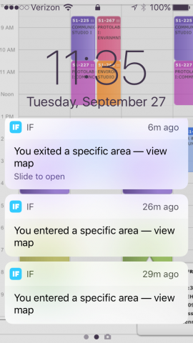
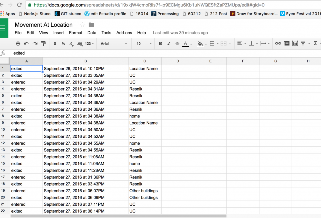
For the real time data ….well, I wasn’t as interested in manipulating the plotter in real time, I am really excited to explore data visualization – in this, I’ve been using IFTTT to use IOS location services – whenever my phone detects I’ve entered a predetermined area, the data/time info is recorded in a google spreadsheet. I figured it wouldn’t have been too complicated to set up a system to access the google data (downloading it as a csv/text file at continuous intervals – version control it up with git to push to a repository where then I could have a visualized report of how/where I’ve spent my time every time I pull up that url)….only time got short, plumbing got a little over my head and I really wanted to see what I could do about generative typography with interesting ‘pixels’ or strokes that create the letters.
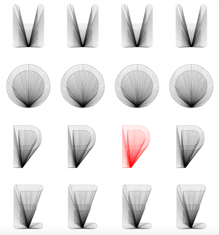
The first idea was to go with Hershey fonts (see clock project where I wrote a program that would refit hershey font data to a series of vector points in an array that are fitted to a specified size/proportion of your choosing) and have lines go from the vector points to some randomly generated other formula (was really excited to go through the interesting polar graphs/formulas Golan previewed last class).
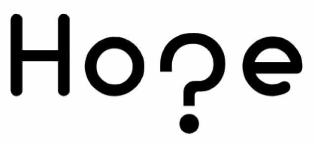
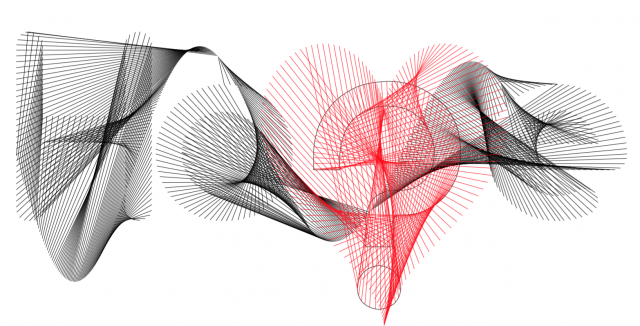
I argue that the lines, while they can do with some more consideration towards….designerly restraint, certainly do add a certain smoky ephemerality to the aesthetic that I think works well metaphorically with the question this type exploration brings up.
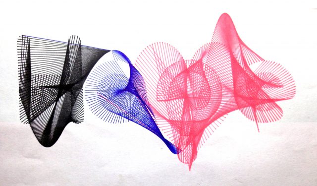
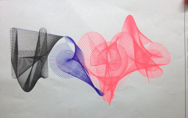
I messed up slightly on the plotter; the first black pen on there was a little thicker than I’d like (0.2 micron) and the thinner copic multiliners I brought in didn’t run smoothly. (hence the blue – I was very much under the impression this was going to be my test run and I would come back to print my final design which would be different on nicer paper with nicer pens). The fluorescent pink was only meant for the heart shaped ? ‘p’ of “hope”.
What I had ended up using instead of hershey fonts (because the vectors for those aren’t evenly spread over the letter and the letter itself is a single stroke collection rather than a complete shape) was the library ‘Geomerative’ (thank you Golan for all the advice!!).
The first iteration self critique:
- Needs some designerly restraint – the message is interesting (HO?E – spells out “hope” except with a “?” instead of a “P” but the execution is difficult to read)
- Again – too much going on without a justification for it.
Second iteration (thursday night trying to figure out my own plotter at home):
- planning:
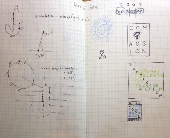
- Really wanted to make a limited color palette type poster for World Vision or Compassion international (international programs that sponsor children – covers their education, clothing, shelter, food, etc)
- The composition would be the word in diagonal with all the other squares within the grid as the letters becoming increasingly disintegrated/randomized
NOTE: the first iteration is what I’m turning in. (the second iteration is what I’m doing for fun – running a fundraiser for World Vision/Compassion international in November, so I wanted to get a head start on making a poster for it)
Process:
I first made iterating shapes in a grid:
I’ll post the next step wherein the diagonal HOPE is the clearest and the rest of the letters slowly ‘disintegrate’ and become more randomized if I have more time just for fun!
