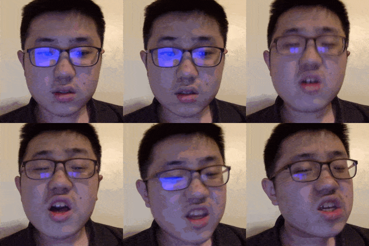
age2death
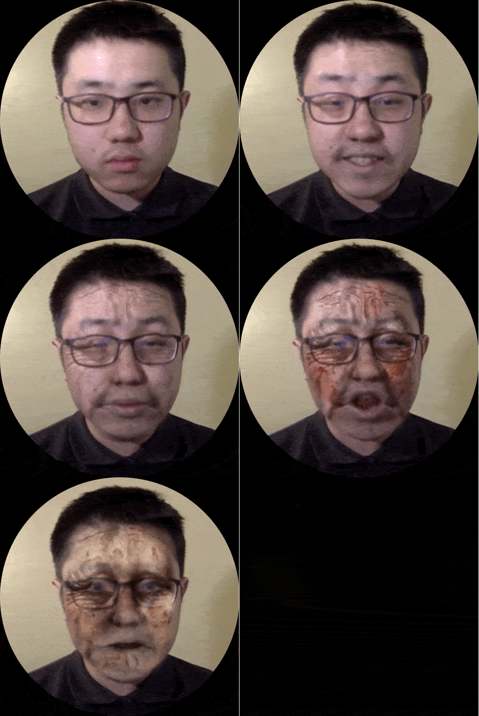
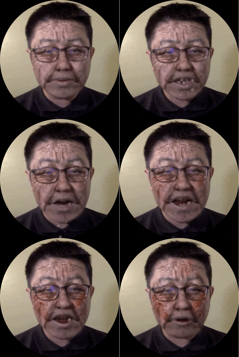
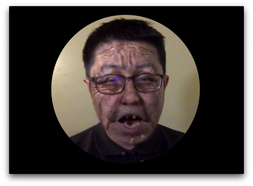
age2death is a mirror with which you can watch yourself aging to death online. Try it out: https://age2death.glitch.me
GIFs
^ timelapse
^ teeth falling
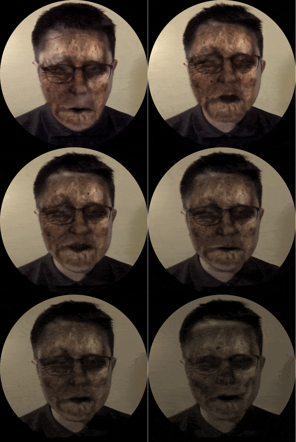
^ decaying
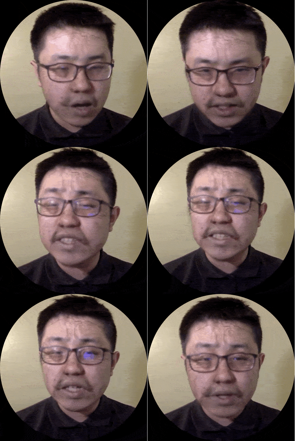
^ subtle wrinkles
Process
Step 1: Facial Landmark Detection + Texture Mapping

I used brfv4 through handsfree.js to retrieve facial landmarks, and three.js to produce the 3D meshes.
I wanted to get the forehead too, which is not in the original 68 key points. However, a person’s forehead’s size and orientation is somewhat predictable based on the rest of their face. Thus I calculated 13 new points for the forehead.
To achieve the effect I wanted, I have two possible approaches in mind: The first is to duplicate the captured face mesh and texture them with “filters” I want to apply, and composite the 3D rendering with the video feed.
The second is to “peel” the skin off the captured face, and stretch it onto a standard set of key points. Then the filters are applied onto the 2D texture, which is then used to texture the mesh.
I went with the second approach because I my intuition is that it would give me more control over the imagery. I never tried the other approach, but I liked my current approach.
Step 2: Photoshopping Filters
My next step was to augment the texture of the captured face so it looks as if it is aging.
I made some translucent images in Photoshop, featuring some wrinkles (of different severity), blotches, white eyebrows, an almost-dead-pale-blotchy face, a decaying corpse face, and a skull according to the standard set of key points I fixed.
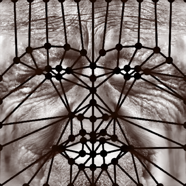
I tired to make them contain as little information about gender, skin color, etc. as possible so these filters will ideally be applicable to everyone when blended using “multiply” blend mode.
Moreover, I made the textures rather “modular”. For example, the white brow image contains only the brow, the blotch image contains only the blotch, so I can mix and match different effects in my code.
Most of the textures were synthesized by stretching, warping, compositing, and applying other Photoshop magic to found images.
Currently I’m loading the textures directly in my code, but in the future maybe procedurally generating the textures fits more to my taste.
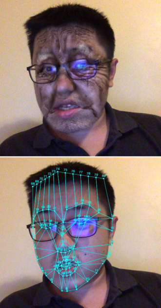
^ Some early tests. Problem is that the skin and lips are too saturated for an old person.
After spending a lot of time testing the software, I feel so handsome IRL.
Step 3: Skewing the Geometry
Besides the change in skin condition, I also notice that the shape of old people’s face & facial features also changes in real life. Therefore, I made the chin sag a bit and corners of the eyes move down a bit over time, among other subtle adjustments.
Step 4: Transitions
After I have a couple of filters ready, I tested out the effect by linearly interpolating them with code. It worked pretty well, but I thought that the simple fade in / fade out effect looks a bit cheap. I want it to be more than just face-swapping .
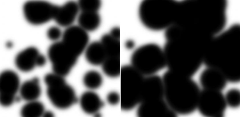
One of the improvements I made is what I call “bunch of blurry growing circles” transition. The idea is that some part of the skin get blotchy/rotten before other parts, and the effects sort of expand/grow from some areas of the face to the whole face.
I achieved the effect with a mask containing a bunch of blurry growing circles (hence the name). As the circles grow, the new image (represented by black areas on the mask) reveals.
My first thought on how to achieve this kind of effect is to sample a perlin noise, but I then thought that it would be less performant unless I write a shader for it. The circles turned out to be pretty good (and fast).
Another problem I found was that the “post-mortem” effects (ie. corpse skin, skull, etc) are somewhat awkward. Since only the face is gross while other parts of the body are intact, I think the viewer tends to feel the effects are “just a mask”. I also don’t want to the effects to be scary in the sense of scary monsters in scary movies. Therefore my solution was to darken the screen gradually after death, and when the face finally turns into a skull, the screen is all black. I think of it as hiding my incompetence by making it harder to see.
I also made heavy use of HTML canvas blend modes such as multiply, screen, source-in, etc. I desaturate and darken parts of the skin.

^ Some blending tests
Step 5: Movable Parts
After I implemented the “baseline”, I thought I could make the experience more fun and enjoyable by adding little moving things such as bugs eating your corpse and teeth falling down when you’re too old.
The bugs are pretty straightforward. I added a bunch of little black dots whose movements are driven by Perlin noise. However I think I need to improve it in the future. Because when you look closely, you’ll find out these bugs are nothing more than little black dots. Maybe some (animated?) images of bugs will work better.
I did the falling teeth with two parts: the first is the particle effects of the individual tooth falling, and the second is to mask out the teeth that have already fallen.
I liked the visual effect of teeth coming off one by one, but sometimes the facial landmark detection is inaccurate around the mouth, and you can sort of see your real teeth behind the misaligned mask. I probably need to think of some more sophisticated algorithms.
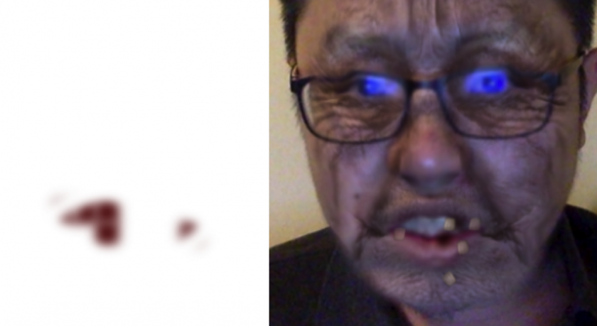
^ left: teeth mask, right: teeth falling. Another thing I need to improve is the color of the teeth. Currently I assume some yellowish color, but probably better way is sample user’s real teeth color, or easier, filter all other teeth into this yellowish color.
Step 6: Timing & Framing
I adjusted the speed and pace of the aging process, so at first, the viewers are almost looking into a mirror, with nothing strange happening. Only slowly and gradually they’ll realize the problem. And finally, when they’re dead, their corpse decay quickly and everything fades into darkness.
I also wanted something more special than the default 640x480px window. I thought maybe a round canvas will remind people of a mirror.
I made the camera follow the head, because it is what really matters and what I would like people to focus on. It also looks nicer as a picture, when there isn’t a busy background.
Step 7: Performance
I decided to read a poem for my performance. I thought my piece woldn’t need too many performative kind of motions, and some quiet poem-reading best brings out the atmosphere.
I had several candidates, but the poem I finally picked is called “Dew on the Scallion (薤露)”. It was a mourning song written in 202 BC in ancient China.
薤上露,何易晞。
露晞明朝更复落,
人死一去何时归!
蒿里谁家地,
聚敛魂魄无贤愚。
鬼伯一何相催促,
人命不得少踟蹰。
I don’t think anyone has translated it to English yet, so here’s my own attempt:
The morning dew on the scallion,
how fast it dries!
it dries only to form agian tomorrow,
but when will he come back, when a person dies?
Whose place is it, this mountain burial ground?
yet every soul, foolish or wise, rest there.
And with what haste Death drives us on,
with no chance of lingering anywhere.
Byproduct: face-paint
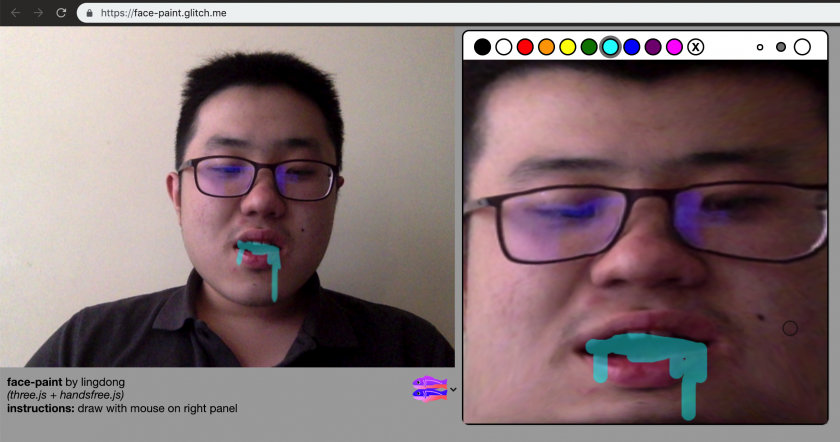
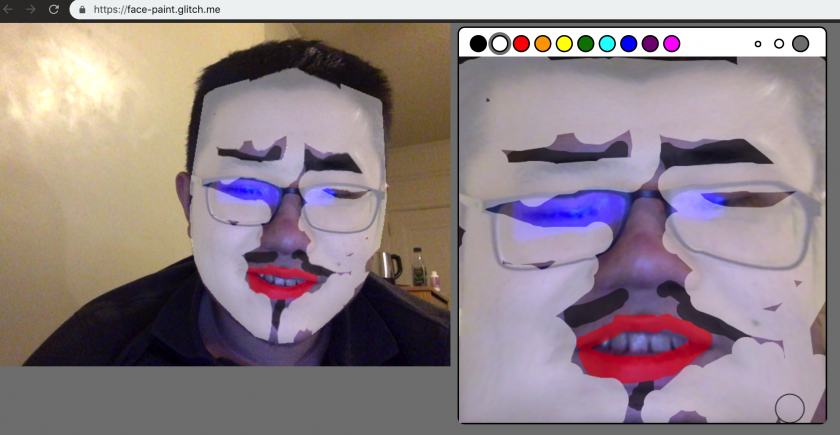
Try it out: https://face-paint.glitch.me
While making my project, I found that painting on top of your own face is also quite fun. So I made a little web app that lets you do that.
