dorsek – Looking Outwards – 3

So initially I was interested in doing something relating to genome art or in other words….

genetic code (art) — (hahaha)

but didn’t really find anything that seemed to strike my fancy (that wasn’t also presented already by Golan – i.e. the artist testing bacteria in NYC subway lines) BUT I did find a piece which I found to really influence the way I was thinking about communication, which is this (it’s also not technically an art piece but I think it raises a lot of funny questions just in the nature of its existence)
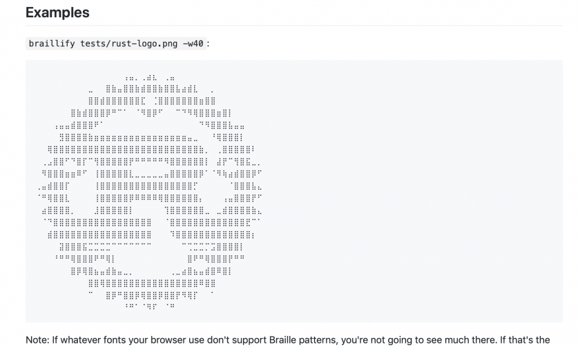
Braillify

Basically, this is code tool used for converting images into braille! Now, it doesn’t actually translate into braille but rather translates the image into a second made of out braille-based patterns. What’s quite funny to me is how braille’s original intent is being rendered completely useless in two ways… A) in that it’s not actually translating anything but rather being used to pictorially represent something that is already an image, and B) that even if somebody wanted to test the braille, they couldn’t because it exists on a digital screen (though I’m sure somebody could created a way to stream that information so it can be 3-d printed or something similar…); the irony here is painfully potent.

Some other interesting resources: 

An article about injecting a synthetic copy of your DNA into your art in order to prove it’s not a forgery

https://news.artnet.com/art-world/dna-art-forgery-954971

~~

An open-source platform meant to “Kandinskyfy your Genome” making your DNA into a Kandinsky style digital painting (this is really funny). The website provides a link to their GitHub where you can view all of the code they use to analyze DNA and generate “findings” with

https://www.impute.me/kandinsky/

https://github.com/lassefolkersen/impute-me

~~


greecus Looking Outwards-3

I am interested in exploring one of two different ideas for this networking project. The first is a fun take on a chat application where some arbitrary value judgement will be placed on them by a computer third party. The main challenge in the piece is going to be choosing an absurd enough value to judge the “quality” of the conversation to make it clear that the overall interaction is made to be silly. I want people to change the way that they talk to one another to conform to the computer’s idea of a valuable conversation. The inspiration for this idea came from the frustration, competitiveness and finally relief that we feel when we are asked to create a “strong” password for any of the web services that we use. What happens when this extends to more than just our passwords?

Image result for password strength meter

The second idea has to do with the way that we cope with loneliness in the increasingly connected world. This work, Loneliness, by Jordan Magnuson. The piece is an experimental, minimalistic microgame about loneliness, made for the Korean middle school students the creator taught for a year.  despite the very simplistic nature of the interaction with the game, it is very effective in making the player feel lonely and separated from the “human” interaction that is constantly just out of reach. This piece affected me more than I expected it to. However, I feel like a lot more could be done here with a deeper analysis of what it feels like to be “lonely.” Furthermore, I feel like adding a multiplayer aspect to the game would have made it more effective as well

Greecus Looking Outwards-2

For this project, I’ve been interested in playing with the idea of creating a lightweight VJ tool. Making a full functioning VJ tool would be too complex an endeavour for the short period of time that I have to work on this project, however I would like to toy around with the core concepts of transitions, looping and beat detection.

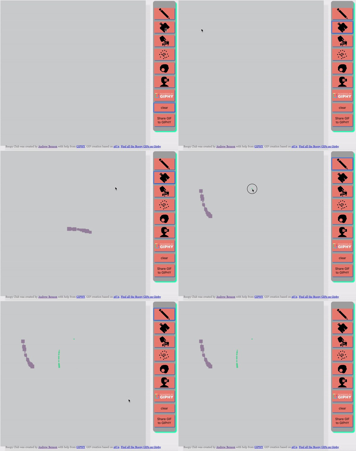
The first piece of inspiration came from the tool, boopy , which is a unique GIF drawing tool developed by Andrew Benson in collaboration with Giphy Arts. The tool allows users to commit drawings to a canvas that records the strokes over time so they can be replayed in a gif format.

The second piece of inspiration came from a piece by Corey Walsh where he used processing to make a visualizer that classified different kinds of drums (kicks, snares and flams).

Beat Detection in Processing

My hopes are to combine these aspects to create a rather simple but enjoyable VJ application.

Arialy-LookingOutwards-3


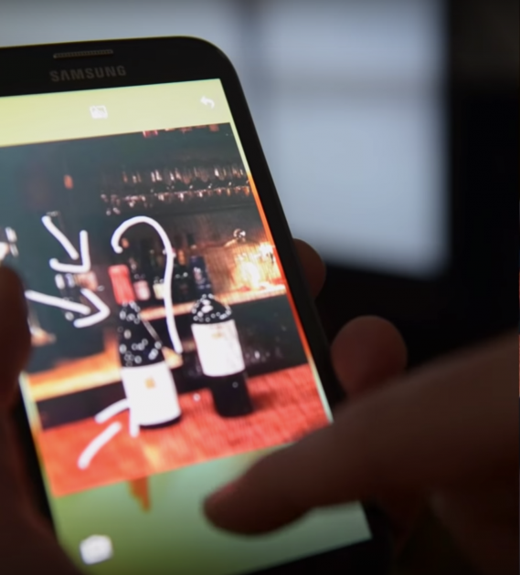
LokLok is an Android phone app/widget for people to draw on each other’s phone lock screens. It’s similar sending people snapchats, but is much sweeter in that it doesn’t require opening an app to receive the messages. Instead, it’s a surprise that appears on your lock screen. It’s also possible to use it as a couple or in a larger group of people.

The best thing about the internet is its ability to connect people regardless of their location. With email, FaceTime, Skype, text messages, the many forms of group chats, and the ability to share locations, there’s a ton of ways to actively communicate. In contrast, the draw of Telematic Art for me is the opportunity for a more poetic form of passive communication. I came across LokLok because I’m was interested in communicating through text and drawings through screens we see on a daily basis (our new tab screen, desktop, home screen, etc). Though LokLok is advertised as a sort of commercial product, it’s successful in ways that I find lacking in other attempts of networked art. It’s actually functional in its ability to send messages, isn’t a physical product, and seamlessly integrates into daily life.


takos-lookingoutwards01

Irene Posch & Ebru Kurbak – The Embroidered Computer

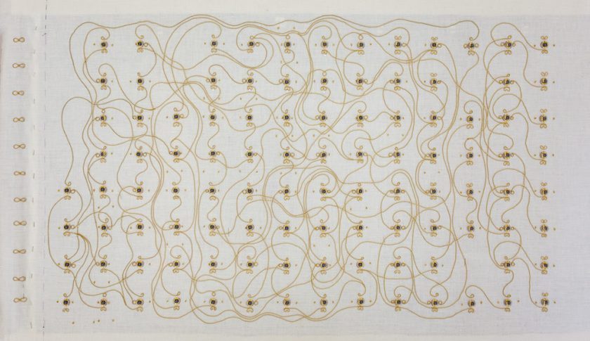
The Embroidered Computer is a programmable 8-bit computer that’s made completely out of magnets, glass & metal beads, the cloth frame, and metal threads. It uses gold thread to create relays, and “Individual relays switch and consequently pass through signals to perform the calculation based on the instructions given.”

What I admire about this project is that the artist took more traditional fields of embroidery and quilting, and re purposed them as a way to create a simple computer. The fact that it is an 8-bit computer is also important because it highlights the history of computing as well as the simplicity (in contrast to modern cutting edge tech like multi GPU computers, etc)

There is not a lot of documentation of how this piece was physically created, but we have the schematics of the logic circuit, and so by necessity we can mostly assume that it was created by embroidering thread in the pattern of the schematic, following the outline and sewing the various pieces and attachments. There was a very specialized team involved in creating this piece.

This work seems to have been inspired by a history of wearable technology, interactive textiles, and embroidered circuitry such as the kind of stuff found on http://www.kobakant.at/DIY/


People involved in making the project: (quoted from link)

Irene Posch, Ebru Kurbak

Computer circuit design and simulation software: Matthias Mold
Generative routing: Raimund Krennmüller
Embroidery consultant: Susanne Frantal
Metal thread consultant: Sophie Fürnkranz
Crafting assistants: Pascale Ballieul, Abdulrahman Ghibeh, Ramona Hirt, Ngo Thi Dao Nha, Katta Spiel, Isabella Wöber, with special thanks to Eva Ganglbauer, Anna Masoner and Angela Posch
Video documentation: Ulrich A. Reiterer / UAR Media

Funded by the Austrian Science Fund (FWF): AR 284-G21 in the Programme for Arts-based Research (PEEK).

dechoes – LookingOutwards3

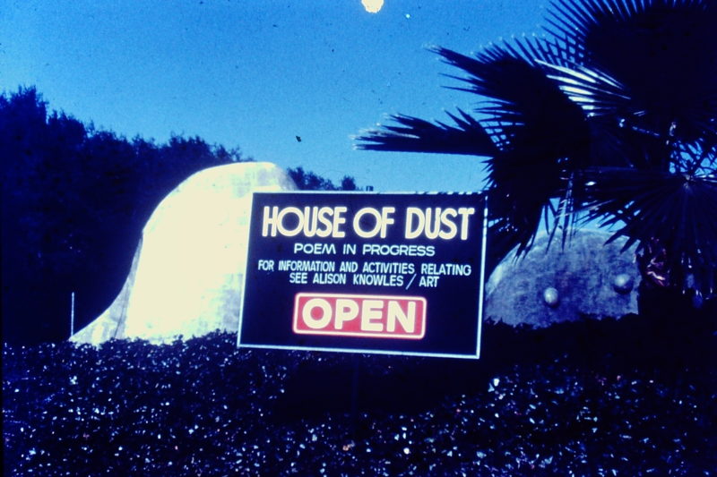
The House of Dust by Alison Knowles is one of the first generative text computer pieces. The computerized poem is built off a very specific structure “consisting of the phrase “a house of” followed by a randomized sequence of 1) a material, 2) a site or situation, a light source, and 3) a category of inhabitants taken from four distinct lists.” In 1968, Knowles got a fellowship to create a physical structure of her generative poem from the Guggenheim. It was later moved to Cal Arts, California, and she used it as her teaching space.

I will also be working on a generative text project, inspired by Italo Calvino’s Invisible Cities. I will be using Kate Compton’s Tracery and Rita.js as a tool to generate sequences of new cities, accompanied by their individualized city maps.

ngdon-lookingoutwards-3

1. Your Line or Mine – Crowd sourced animation installation

https://yourlineormine.com

  • Explain the project in a sentence or two (what it is, how it operates, etc.);

Each visitor can draw on a piece of paper and their drawings are combined into an animation. There are both visual and textual hints on the paper telling visitors what to draw, but visitors can also ignore them.

  • Explain what inspires you about the project (i.e. what you find interesting or admirable);

I think the most interesting part is the dots on the image. Even though the visitors often improvise, they almost always incorporate the dots in their drawings in some way. Therefore the resultant animation still looks continuous, since the path of the dots are predetermined. I think this is a smart choice.

  • Critique the project: describe how it might have been more effective; discuss some of the intriguing possibilities that it suggests, or opportunities that it missed; explain what you think the creator(s) got right, and how they got it right.

I think dots are enough, so maybe the textual hint can be removed since users don’t follow it anyways. I’m curious to see how this effects users’ creativity.

  • Research the project’s chain of influences. Dig up the ‘deep background’, and compare the project with related work or prior art, if appropriate. What sources inspired the creator this project? What was “their” Looking Outwards?

I think it is closely related to the project where everyone tries to trace the previous line, but looks at the “crowd-sourced drawing” idea from a different perspective.


2. fridgemoji

https://glitch.com/~fridgemoji


  • Explain the project in a sentence or two (what it is, how it operates, etc.);

This is an online interactive fridge where users can place food (emojis).

  • Explain what inspires you about the project (i.e. what you find interesting or admirable);

This project showed up on glitch.com’s front page one day. It seems to be like a demo, but I like the simplicity. I also admire the fact that there’s no apparent goal, and users just add and rearrange items, which is very much like the communal fridges at CMU Gates.

  • Critique the project: describe how it might have been more effective; discuss some of the intriguing possibilities that it suggests, or opportunities that it missed; explain what you think the creator(s) got right, and how they got it right.

The food I placed there a couple of weeks ago disappeared. Maybe it is because the app doesn’t have persistent storage.

  • Research the project’s chain of influences. Dig up the ‘deep background’, and compare the project with related work or prior art, if appropriate. What sources inspired the creator this project? What was “their” Looking Outwards?

I think real fridges as well as the internet’s use of emojis inspired the artist.


sjang-looking outwards03

Figures in the Sky (2018) – Nadieh Bremer

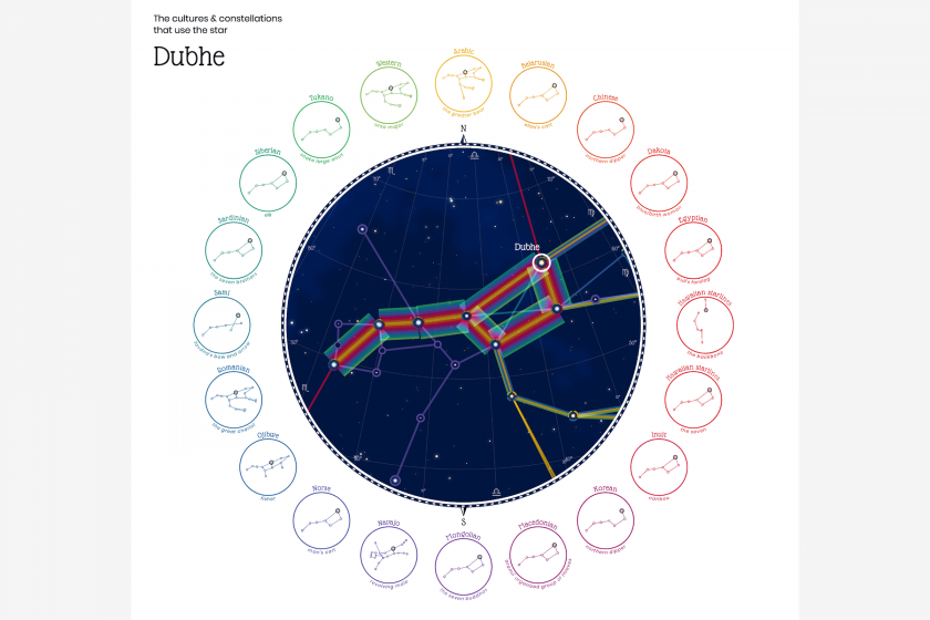
How the star Dubhe is used in constellations of various cultures

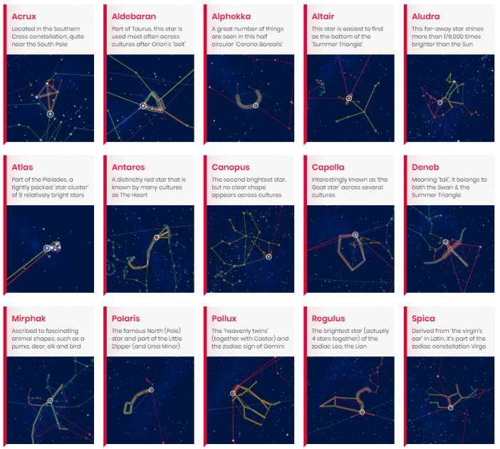
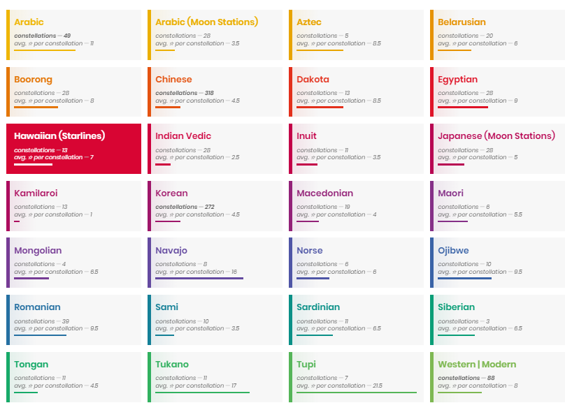
A visualization of constellations from 28 sky cultures, based on Stellarium data. It includes focused visualizations of a select number of major stars in the sky, which show overlapping constellation shapes from various sky cultures that include a specific star. The visualization captures how the shapes converge and diverge, and allows users to view the shapes individually. Despite the ambitious aim and scope of the project, I found the lack of cultural contextual information very limiting. It would have been more interesting to be able to view them within a broader sky view, and to learn more about the various mythologies behind the stars and constellation shapes.  (Project link)

a selection of major stars
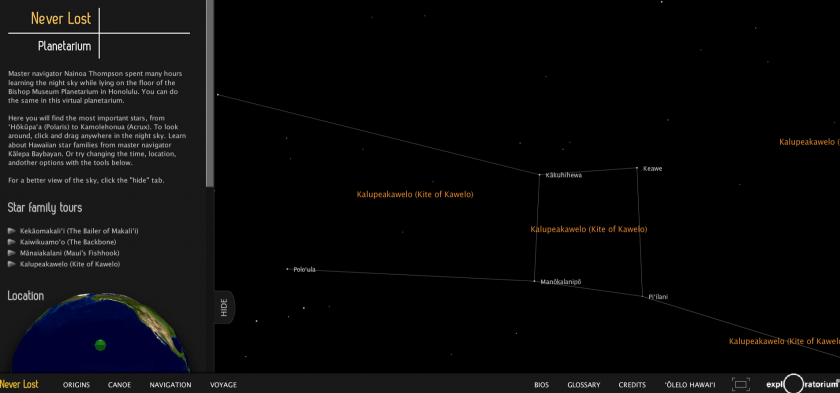
The Hawaiian constellation skyview

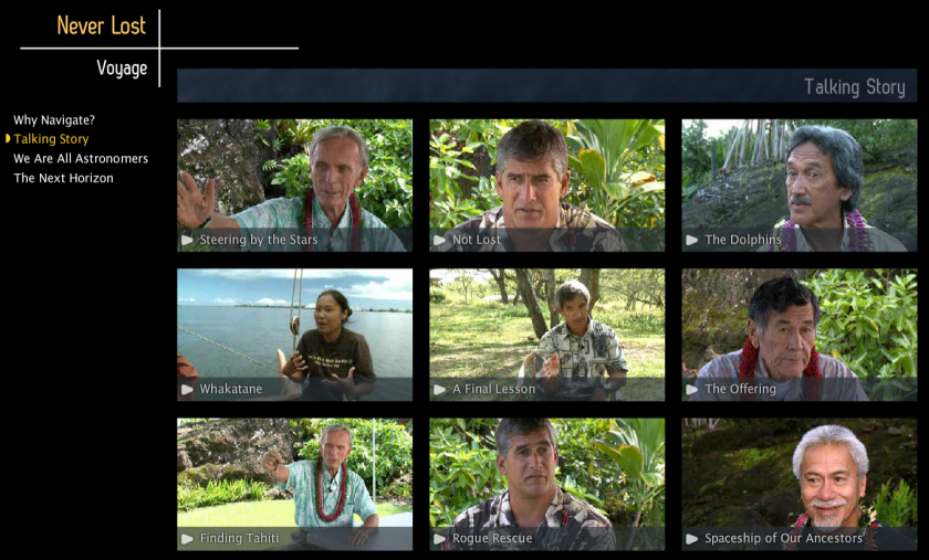
 Never Lost: Polynesian Navigation (2011)

Produced by NASA and Hawaiian collaborators, the project intertwines astronomy, Hawaiian ancestry, and traditional navigation. The project website shows how the ancient Polynesians voyaged across vast expanses of open ocean without maps or compasses by relying on direct observation alone.  While the project’s vast scope and content is compelling, the entirely flash-based website has not aged well over the years. The way the content is structured and presented makes it cumbersome to explore and navigate, and many of the video links are no longer working. The views and interactions provided by the virtual planetarium are also pretty standard and lackluster.  (Project Link)