yeen-lookingoutwards03

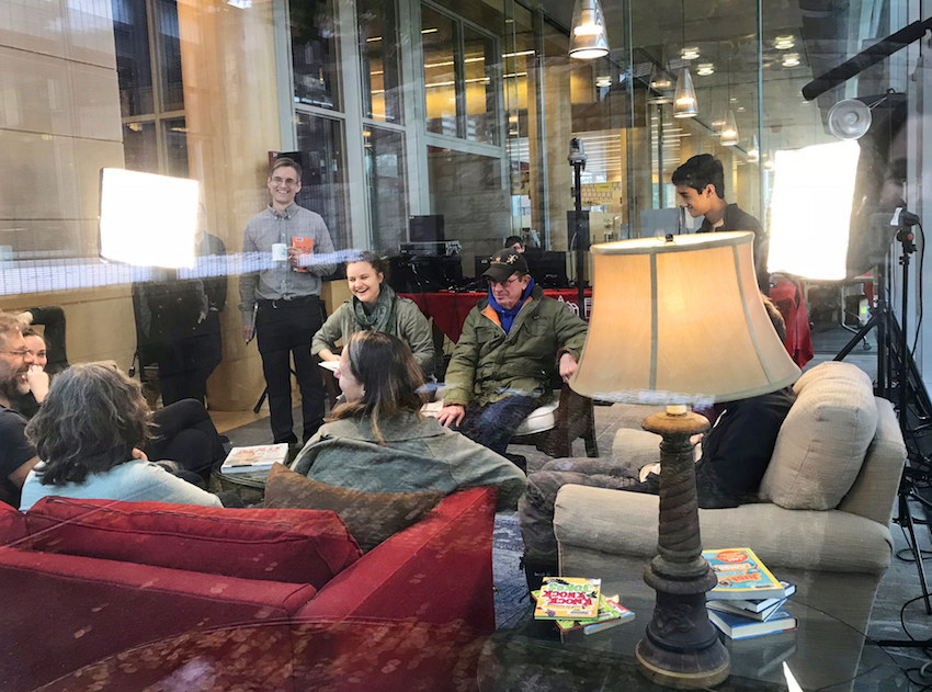
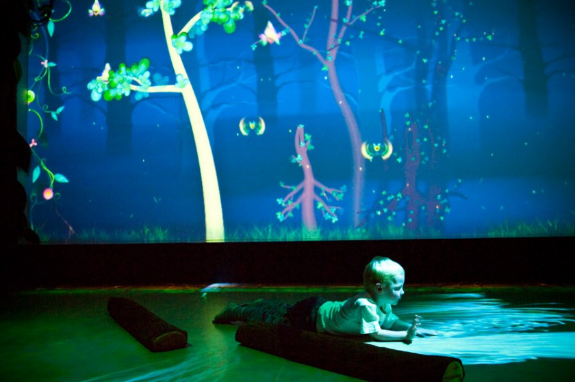
I visited a Funky Forest installation at One Dome in San Francisco. This multi-user installation invites people to join in an immersive virtual space to create trees with their bodies, and interact with the forest creatures. It uses multiple Kinects.

Tiles of Virtual Space is an “infinite mirror”-like space that visualizes sound patterns that are generated by movements. It uses Kinect to capture multiple people’s movements.


jamodei–lookingOutwards03

I am interested in making a simple, poetic intervention/noise creation/corruption of the transactional, capitalist systems of desire production embedded into our everyday (digital) communications.

Here are a few pieces of research that I have found exploring this:
drone triptychs

drone triptych 1

drone triptych 2drone triptych 3


by Tivon Rice, 2016
photogrammetric digital prints
Link Here

Rice describes this project as:

“These images and texts represent Rice’s studies of Seattle’s rapid change. As many sites and landscapes in the city disappear, a new kind of visuality emerges: one shaped by economic forces, the influx of tech, and developments that often favor these interests rather than those of the diverse communities that call Seattle home.

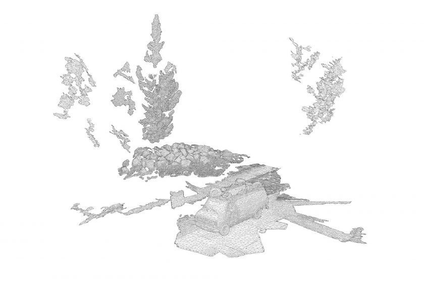
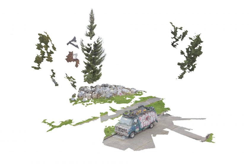
In Drone Triptychs, these scenes and locations are explored through a digital process – photogrammetry – which generates a virtual 3D model by analyzing hundreds of two-dimensional photos. In order to access all possible perspectives, many of the photos were captured using a drone, an airborne camera funded by 4Culture’s 2015 Tech Specific grant.

The models that result from photogrammetry can then be scaled, rotated, inverted, animated, textured, or rendered as a wireframe. This act of virtualizing a space, which often creates a glitchy, hollow, or flattened shell of the original site, seems similar to many of the large-scale image-making processes at work in the city: regrading, demolition, faux preservation, façadism.

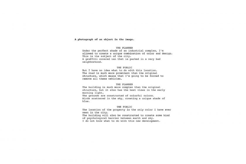
The accompanying texts further explore a virtual or uncanny representation of Seattle’s image. Working in collaboration with Google AMI – Artists and Machine Intelligence, a computer was trained to “speak” by analyzing over 250,000 documents from Seattle’s Department of Planning and Development. Ranging from design proposals and guidance, to public comments and protest, the vocabulary that resulted from this training was used by the software to automatically generate captions and short stories about each photo. In these stories, the “voices” of city planners and the public are put into a virtual dialogue (or argument) with each other as they describe each scene. ”

What I enjoy about this project is the pairing of disappearing visual landscapes with a poetic reinterpretation of the language that is out there acting as a force which is creating the disappearance.

Fifteen Unconventional Uses of Voice Technology

Article Link Here

This is an interesting article G0lan showed me about a course taught to explore creative uses in voice technology. The github and syllabus from the class are filled with interesting resources.

–Objects summoned in VR by voice in Aidan Nelson’s “Paradise Blues”–
 

tli-LookingOutwards03

1. I’m Here and There [https://anthology.rhizome.org/i-m-here-and-there]

In I’m Here and There, Jonas Lund creates and uses a custom browser extension that reports every website he visits to http://imhereandthere.com/. I chose this as a Looking Outwards for my project because I’m interested in the idea of opting in to a cairn as a participant. There is nothing inherently tying the browser extension to Lund specifically in this project, so I imagined a version of this project where the browser extension was a public software that any user install and therefore opt in to. While this act of opting in is inherent in many of the telematic cairns we viewed in class, I’m interested in exploring this choice in particular.

2. Form Art [https://anthology.rhizome.org/form-art]

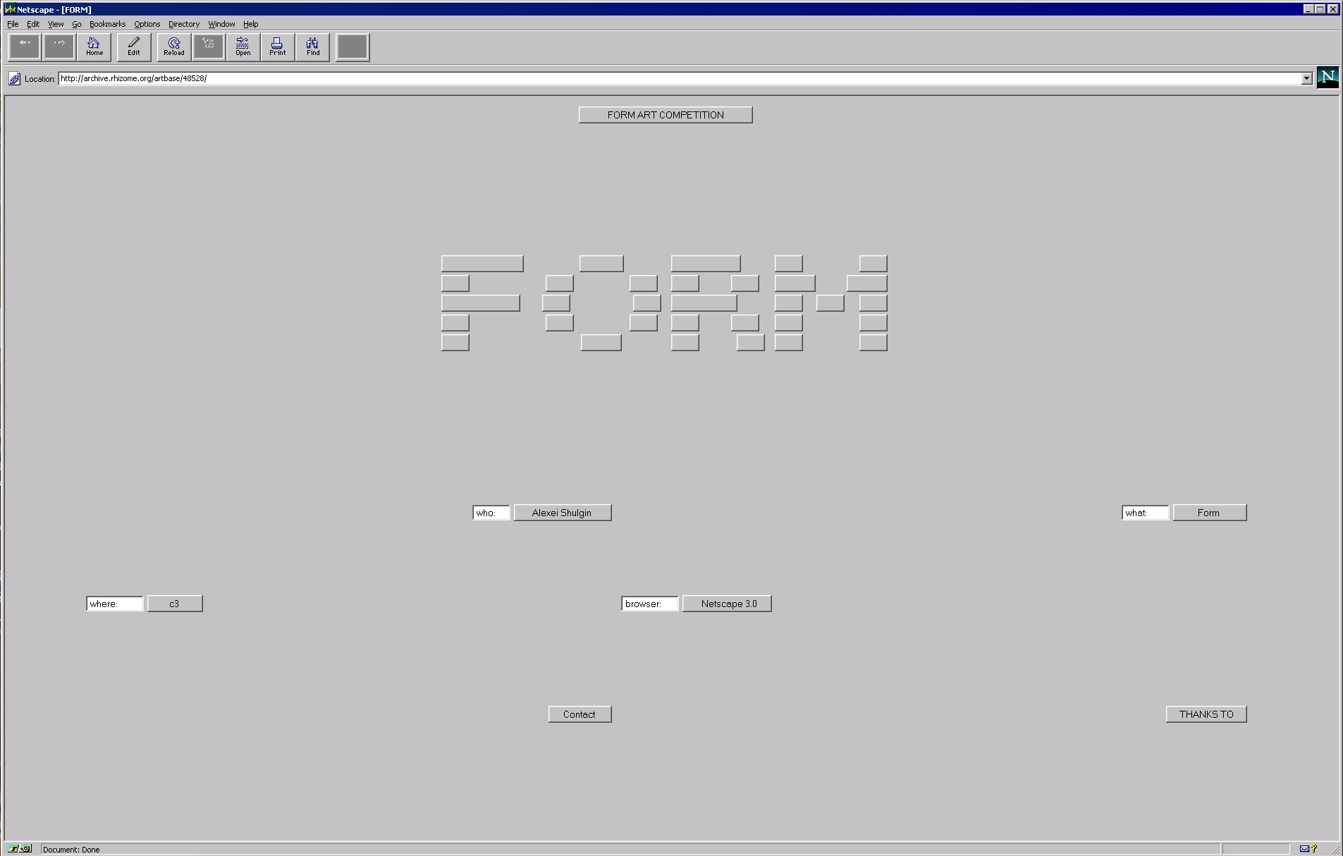
Form Art is Alexei Shulgin’s exploration of mundane HTML buttons and boxes as compositions. With this project also came a short-lived submission-driven competition wherein users were allowed to create their own form art. I chose this work as a Looking Outwards because I was immediately attracted to the abstract, reductive yet nostalgic visuals. I was also inspired by the concept of the button as an artistic element–as an abstract force that pushes you down a certain path. Viewing this work brought up strong memories of interactive texts, such as email, collaborative writing tools and text games. That Shulgin opens his idea and art form to user submissions is particularly important to my reception of Form Art as Internet art.

BONUS: Mezangelle [https://anthology.rhizome.org/mez-breeze]

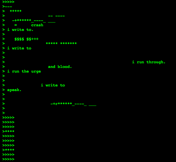
I’m attracted to Mez Breeze’s Mezangelle for the same reasons as Form Art. I enjoy the poetry that arises from the reductiveness of the green terminal text, as well as the palpable undercurrent of programmatic rules that drives it. This work reminds me of the concept of readable code and code poetry. Much like using the HTML button as an artistic unit, I am fascinated by the idea of using functional blocks of text as modular visual elements.

lumar-LookingOutwards03

Heart monitor from camera feed from Marisa Lu on Vimeo.

I can calculate people’s heart rate from someone’s finger over the phone’s rear camera with flash turned on. But what should I do with this heart rate?

Posting social media with heart rates tagged in

^ I find this completely….un-compelling. What’s a simple but elegant use of heart rate?

I’m wary of using it as a way to create visuals, because as often seems to be the case, the system is more creative than whatever traditional form of art it produces.

turning heart rate into a visualization, but really it’s just data into ink blobs that are kind of arbitrary and meaningless to me. What use is this visualization? For me, the humanity of the heart rate is gone in this.

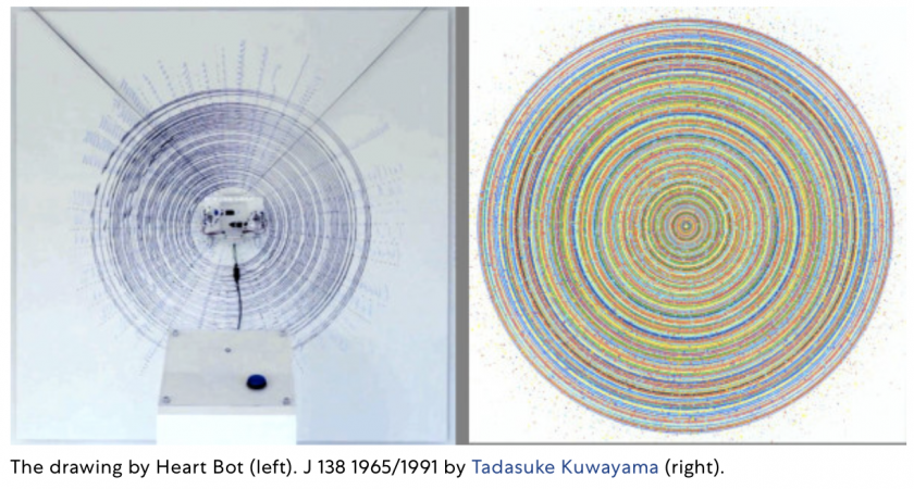
Heart bot turning pulse into art

Kyle Machulis’s shared thumb kiss app makes me wonder if meditating to the hear beat of your partner might be an interesting experience. Get some of that Taptic Engine action here with the above heart program. There’s something elegant about holding someone’s heart in the palm of your hand. Ok. Maybe more cheesy, but there’s plenty of angles to take this.


The benefit of meditating in pairs

While not entirely similar, but still in the realm of pulses and beats and body signals —

Electro-neurographic signals to morse code from Marisa Lu on Vimeo.

geebo-LookingOutwards03

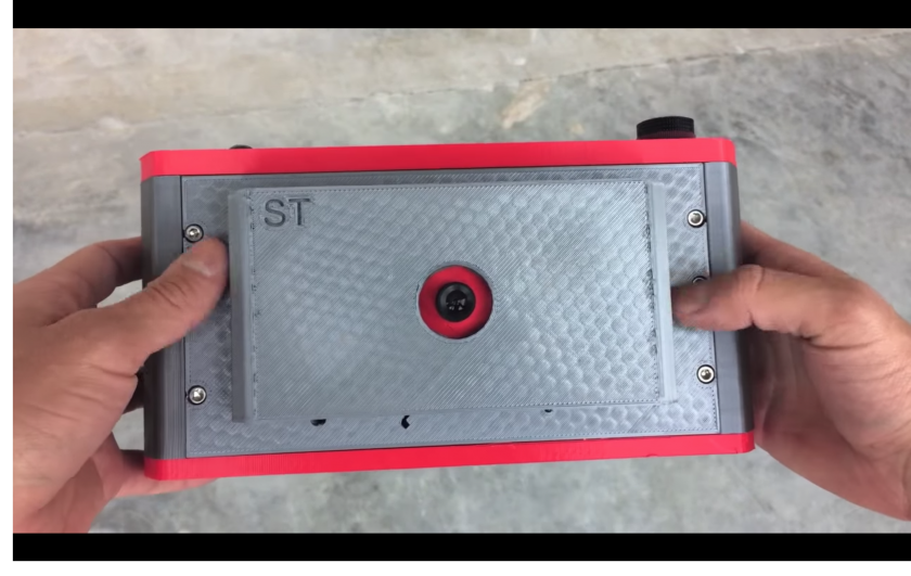
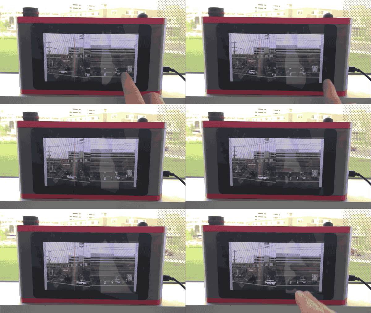
Space Time camera by Justin Bumstead is a small, real time slit scanning device that anyone can use to create their own space time images. The system consists of a small, wide angle camera, some simple buttons and potentiometers, and a raspberry pi running processing.

The system is battery operated and portable, allowing people to preview and edit their own images and videos in real time.

In 2012 Adam magyar used this diy camera built from industrial slit scanner parts and a medium format camera lens. He then used these to capture striking photos

The part of the project that is most interesting to me is the interface described on the camera. I unfortunately haven’t managed to find any photos of the project, but I think that the kind of interface used to move the slit could allow for new interpretations of the ‘time space’ concept made in real time by the photographer.

“Magyar wrote a program that would operate the scanner “with a special user interface that was optimized for the project,” which allowed him to preview the compositions before he began to scan the scenes.”

Links:

[1] https://www.pdnonline.com/gear/diy-camera-adam-magyars-slit-scan-camera/

[2] https://www.instructables.com/id/How-to-Stretch-Images-Through-Time-With-Space-time/

[3] http://www.magyaradam.com/


sheep – LookingOutwards03

My game is called BUMPmap, and the works I am interested in are Bumpnet and No Man’s Sky. I am interested in allowing players to rename countries, invading one another’s spaces rapidly. However, there can only be four players at a time, and every time a new player joins, the first on the queue gets kicked.

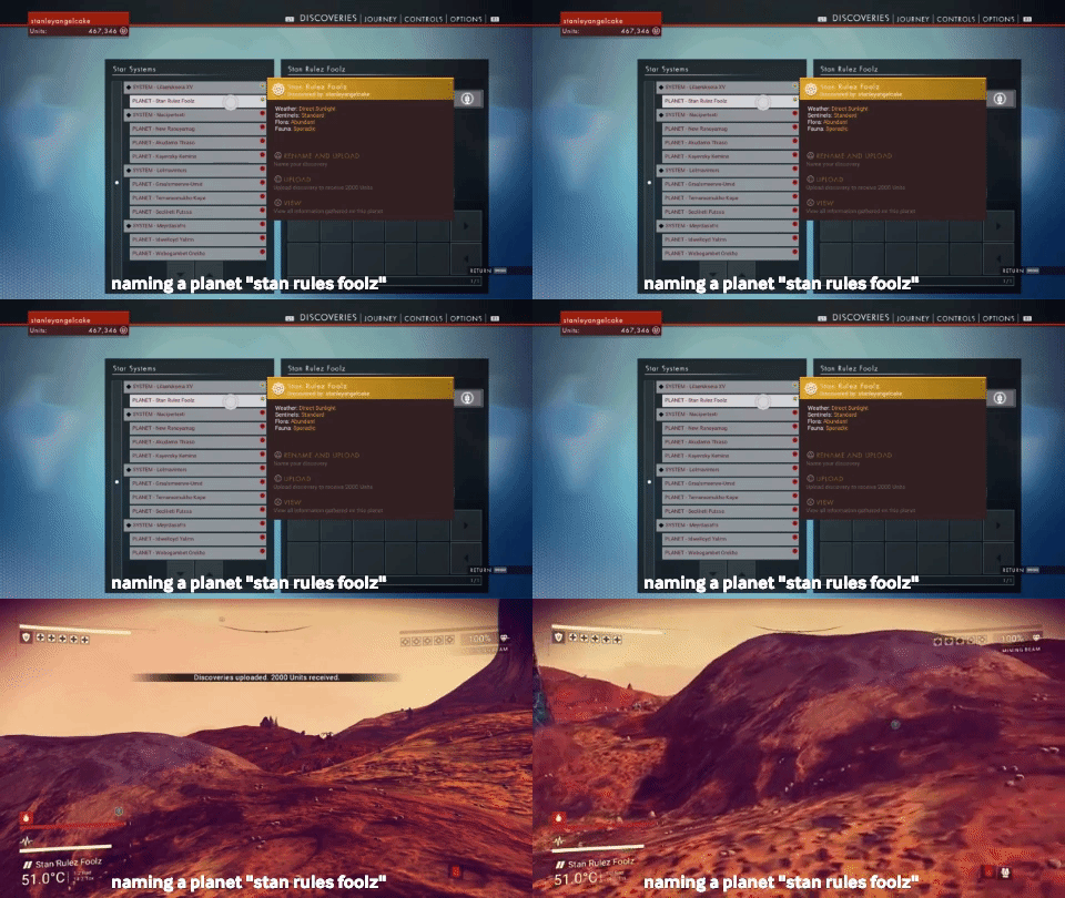
No MAn’s Sky is a space exploration game which uses procedural generation to generate 18 quintillion planets. Player start on a random planet and ideally make their way to the center of the galaxy. However, they can also choose to explore other parts of the world. Nearly all parts of the galaxy are made through procedural generation using deterministic algorithms and number generators from a single seed number. Not much data is stored on the game’s servers, as the proximity of the player to a location is what generates its appearance based on the algorithm. I think that many of the criticisms people had with the project (that it was boring, that the multiplayer was artificial since you couldn’t see one another, lack of interesting generated content) have been met in the form of updates, which have come out over the last year. I think the commitment to making a massive explorable world which you can get lost in is what makes me attracted to this project. Also initially, the game was panned by audiences. Many “gamers” felt they had been cheated somehow, that the game was a scam, which kept me from buying it. They wanted combat and looting in a game about exploring and discovery. The ability to name your planet, and the creatures on it, and for it to be permanently named that, is a bold and optimistic decision. The game itself was influenced by the science fiction works of the 1970s and 80s, especially the look and feel, as well Neal Stephenson’s belief that it was mainstream to make a dystopian story. The studio behind it, Hello Games, and its founder Sean Murray, wanted to tell an optimistic and uplifting experience.
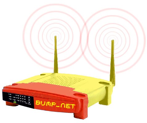
BumpNet is made by Jonah Brucker-Cohen as a successor to BumpList, except this time, it’s a public wireless network with a cap of how many clients it can have. The process involved using a consumer wireless router and modifying it to put people in competition with one another to get access to wifi. When a client joins, they will see the name of the person and machine they bumped off the queue, similar to Bumplist. There is a login screen where they enter their information and can then use the internet— eventually getting kicked themselves. I like this project because clients need to be geographically close to one another, allowing for non-violent, productive physical confrontations as well. I think that Bumplist has a more interesting metric for bumping people, rather than time with which they entered however.

LookingOutwards03

I’m not sure yet what my project will be about, so I have found projects related to two different directions I am considering.

1. Real World Third Person Perspective VR

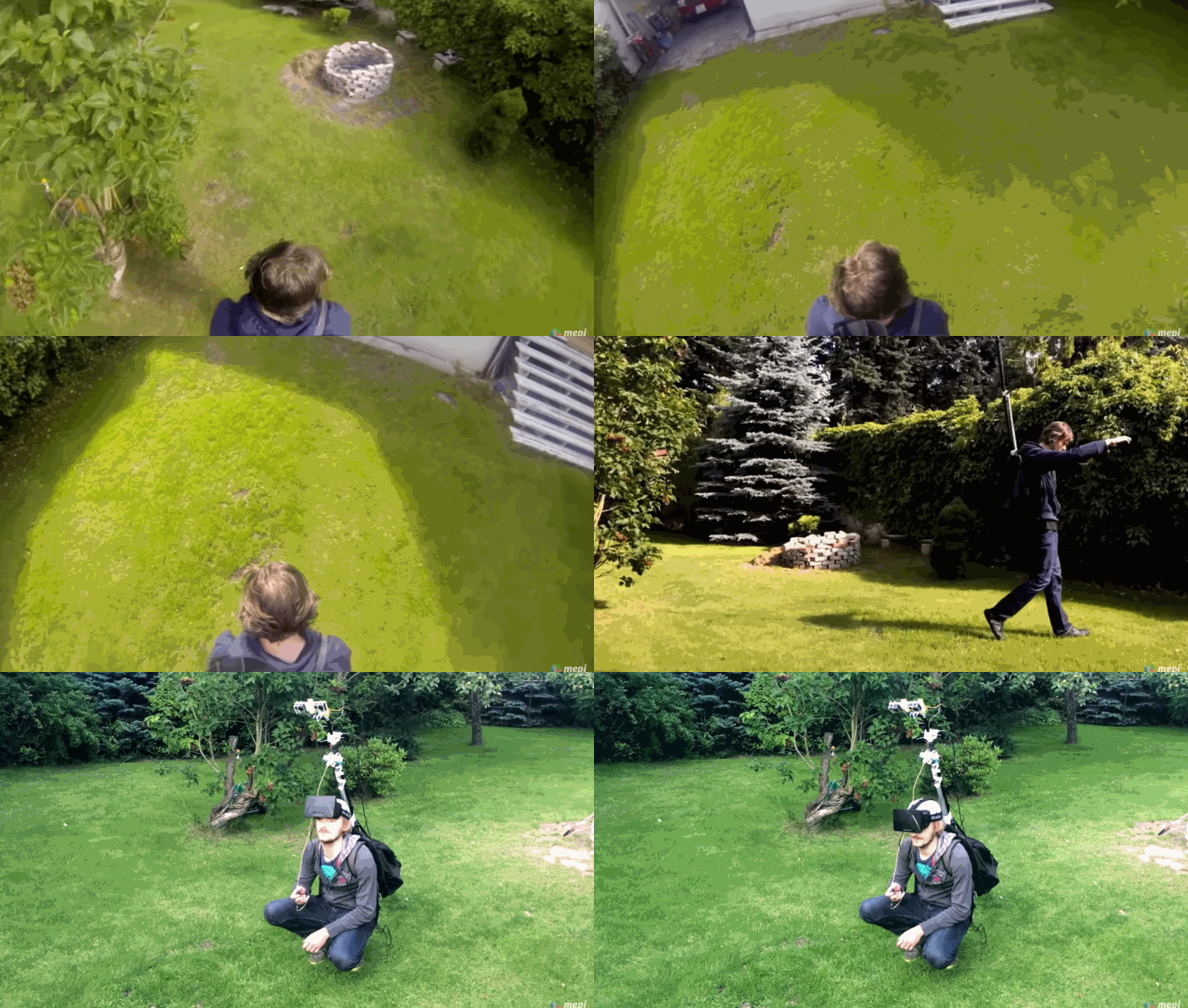
This is not an art project as much as a technical experiment, but it’s similar to something I am considering involving streaming a camera feed to a VR headset. Here, the user wears a backpack with a stereoscopic camera mounted a few feet above them. They wear a VR headset that displays what the camera sees, and controls the camera with servos based on the headset’s position.

This gives them a videogame-like 3rd person perspective of themselves and the world. I find this idea very interesting, because I often see myself in videos and in my memories as different than I do in the moment, and because people behave differently when they can see themselves (like in mirrors) than when they can’t. I’d be curious as to how people feel about wearing this, and how it affects their interactions with people (besides the obvious effects of wearing a backpack and VR headset around…).
I’m not sure these people were interested in those questions (and from this video, I’m not sure they even got their idea fully working), but I love the concept and it’s a really cool technical experiment too.

2. King’s Cross Phone-In

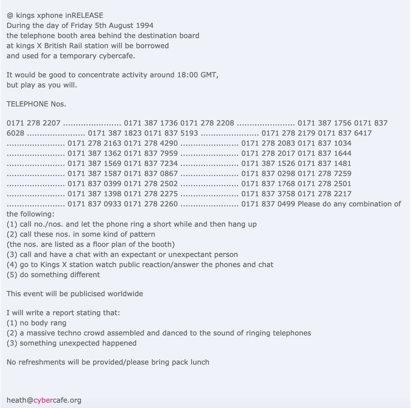
For my second project, I wanted to go really old-school, or at least more analog than a lot of the web-based telematic artworks we’ve been looking at. “King’s Cross Phone-In” is a performance art piece (kind of a flash mob) orchestrated by Heath Bunting in 1994. He posted the numbers to the public phones in King’s Cross Station on his website with the following message:

At the specified time, the station was flooded with calls, causing an orchestra of phones ringing. Bunting spoke with several people on the phone, as did many people in the station. Others didn’t know how to react. People were interacting with strangers from different sides of the world, and (maybe I’m imagining the whole thing rather romantically) it must have been a really beautiful experience, demonstrating the power technology has to connect people before smart phones with wifi took over the world. Bunting did a lot of early internet art projects that I really like, but I especially appreciate this one’s use of a different technology–landline phones–to bring the artwork out of the net and into real life.

lass-LookingOutwards03

mushtari7_1.jpg

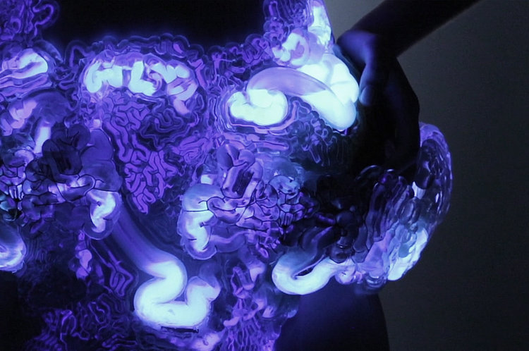
Living Mushtari is a 3D printed wearable accessory that serves as a microbial factory. The shape of the object is designed using generative algorithms based off of biological growth and recursion. It is intended for the wearer to “be able to trigger the microbes to produce a particular substance – for example a scent, a color pigment, or fuel.” I recognized the pieces from the 3D printed fabric Nervous System video we watched in class. The pieces are clearly not intended for everyday use since they are stiff and uncomfortable, which was the point made in the fabric video. Now I understand that they are this way because they need to hold liquids filled with living organisms. I wonder if the same technology could be applied to something smaller and jewelry-like. I don’t really understand why they chose to make a strange looking crotch cover.


Miguel Nobrega made a series of generative isometric drawings that I like, called possible, plausible, potential. They are printed using a plotter. I like how the drawings look like buildings, and by looking close you can see how the plotter marked each line individually. Even though the drawings are modeled in 3D and printed in 2D, the plotter gives it them an illustrated effect that I really enjoy.

aahdee-LookingOutwards03

The Laughing Room by Jonny Sun and Hannah Davis

https://youtu.be/UlLQW662WYc?t=4897

This is an installation of a living room that is usually found in sitcoms. People were allowed to sit and talk while a machine learning algorithm that was trained against audio recordings of stand-up comedians listened into their conversations. This algorithm was trained to know what phrases were said by comedians before their audience laughed, so if the algorithm heard something that was considered to be “funny”, a laugh track would be played throughout the room in response.


The Story Room by Hannah Davis, Matt London, and Elena Parker

The main concept of this project was a room that didn’t narrate a story to you, but a room that narrated your story as you interacted with it. As one entered the closed, dark space, they can use a flashlight to listen to a narrative that described their actions. Due to the eerie nature of the narrative and the small dark setting, one feels like they have a strong connection to the narrator and the events that it describes.


a-LookingOutwards03

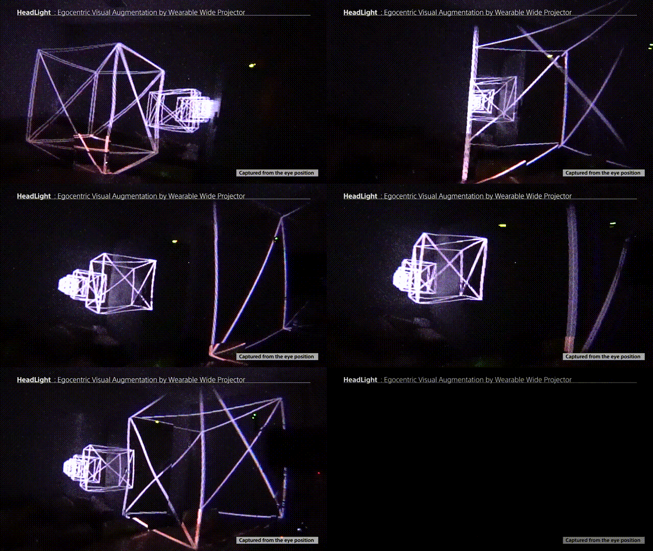
HeadLight is a mixed-reality display system that consists of a head-mounted projector combined with spatial tracking and depth inference.

HeadLight uses a Vive tracker to track the head pose of the wearer.  Combined with the depth information of the space in front of the viewer, this enables the wide-angle projector mounted on the viewer’s head to projection-map the room and the objects within it, with a working 3D illusion from the viewer’s point of view.

PE001


Speed of Light is short film created using two pico projectors and a movie camera.  The pico-projectors are used to project animations of the things in the movie onto the surfaces of a room.  By moving these animations, the sharp & jenkins turn the room into a movie set for these mixed-reality “characters.”  This piece could have come out of just experimenting with stock footage on a black background, or through extensive planning and creation of the animations to match up to the scenes.


GVBeestje is a sticker used to activate a game on the Amsterdam transportation system (the GVB).  It consists of a set of stickers of a beest, that invites the viewer to play by using the parallax between the fore- and background to position the beest by moving their head and eat the people the bus is going past.


In all of these projects, there is exploration of some non-traditional ways of activating a space, much in the way the “AR” or “MR” does.  The GVBeestie is successful in operationalizing the latent interaction of parallax the rider experiences daily into a game using nothing more than a sticker.  Speed of Light is an interesting concept, however the film itself is relatively uninteresting.  The idea of it arising out of play, or creating some tool allowing one to play in this way is more exciting than the film itself.  the HeadLight is an ugly and cumbersome device, with sub-par tracking (even in the official documentation video).  The single-user nature of it is interesting, as is the notion of augmenting space in an egocentric way that other people can see, having their space be overridden.