Category: Projects
conye – telematic – manufactory
here’s some of my progress, please view my final project for the final result:
Jackalope-Telematic
This is a project for Eric, but also just for me, as is most of my projects. For some context, Eric is my roommate/platonic life partner(as dubbed by tli), and I made this thinking about patterns and routine in communication and also honesty. A very embarrassing project to look at really. Also it’s mildly Undertale inspired because we played that together recently and I like it.
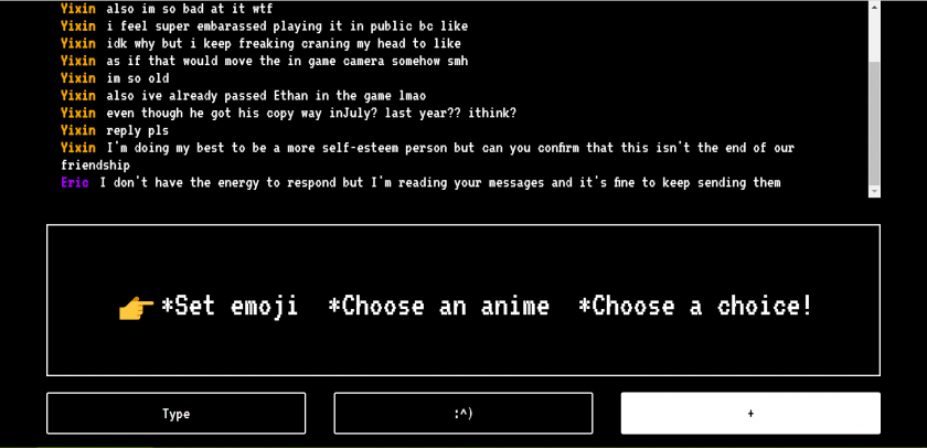
So the gist of it is; as we message, certain specific buttons will appear based on the current conversation. Hit one of those buttons and an message will be sent on your behalf explaining your situation/feelings. Also, because we’re both indecisive there’s a button that’ll webscrape either mine or Eric’s MyAnimeList and choose an anime one of us was planning to watch, and a button that allows you to input a list of choices for it to choose from.

sheep- telematic
-
shhhh.glitch.me
- A communication tool which asks users to avoid using either the letter ‘s’ or ‘h’, and to guess who is avoiding (or not avoiding) your letter.

- I used glitch.com to make a chat room. I thought about complementary roles and how two strangers might work together (against one another) and how anonymity, both of identity and intent, can cause people to not trust or to trust each other. I thought about how regulations in communication can yield inventive solutions, and new tactics can be invented to communicate in these regulations.
- Things I wanted to implement:
- prevent spamming of guessing a player (so don’t do this)
- high scoreboard
- better UI
links to prototype glitch pages:
dechoes – visualization/manufactory
Infinite Cities Generator
This project is based on Italo Calvino’s book Invisible Cities , a novel which counts the tales of the travels of Marco Polo, told to the emperor Kublai Khan. “The majority of the book consists of brief prose poems describing 55 fictitious cities that are narrated by Polo, many of which can be read as parables or meditations on culture, language, time, memory, death, or the general nature of human experience.” (Thanks wikipedia)
What interested me about this novel, was how much it could be assimilated to generative storytelling and big datasets. I noticed as I read on, how closely the author was following specific rule sets, and how those same rules could be used to generate a vast amount of new stories. I was fascinated by the complexity, detail and visual quality of each city that Calvino created and decided to create more of my own.
I started by decomposing the structure of his storytelling and separated his individual texts into multiple categories, such as Title, Introduction, Qualifiers, Actions, Contradictions and Morals. I sampled actual thoughts, sentences and names from his book but also added my own to the mix. I programmed my Infinite Cities Generator in p5.js using Kate Compton’s Tracery (Thanks Kate!).
Over the course of the next few weeks, I would like to complexify my rule sets as well as create generative maps for each new city, as a way to offer a visual escape into them. In addition to that, I would like to generate pdfs and actually print the book as a way to have a physical and believable artifact by the end of the project.
Below are a couple samples of the kind of stories my Infinite Cities Generator can create:

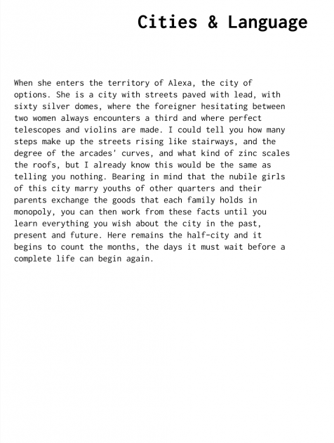
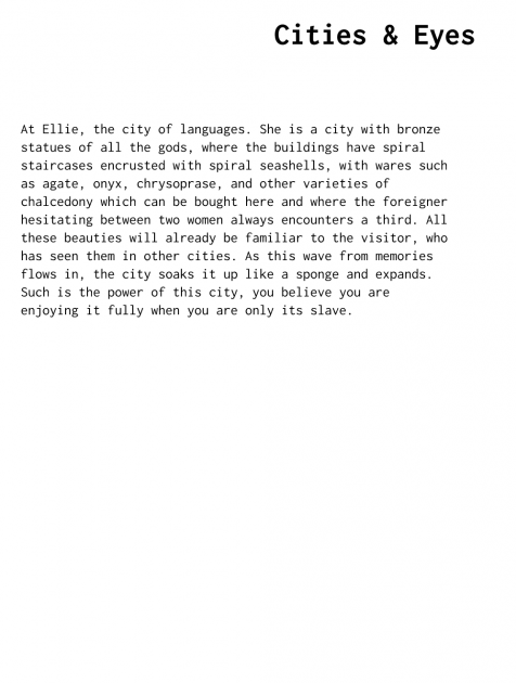


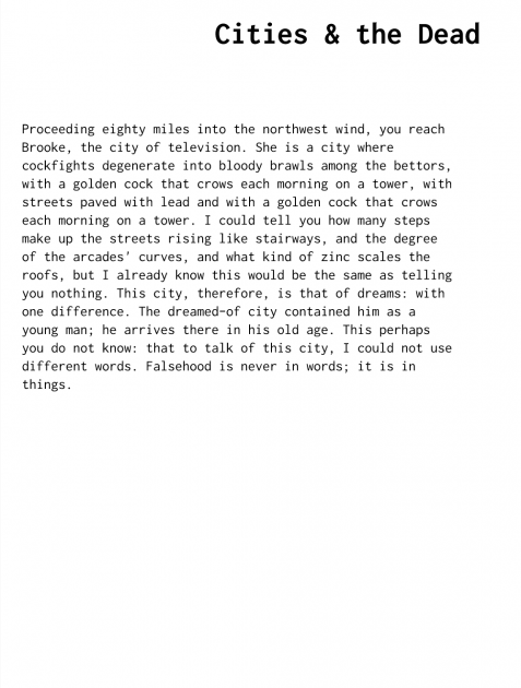
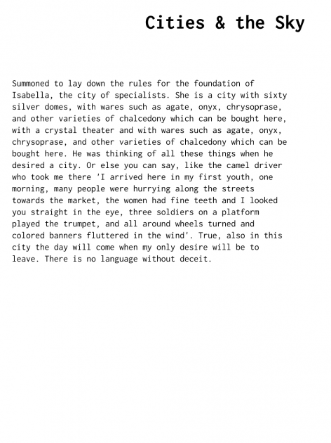
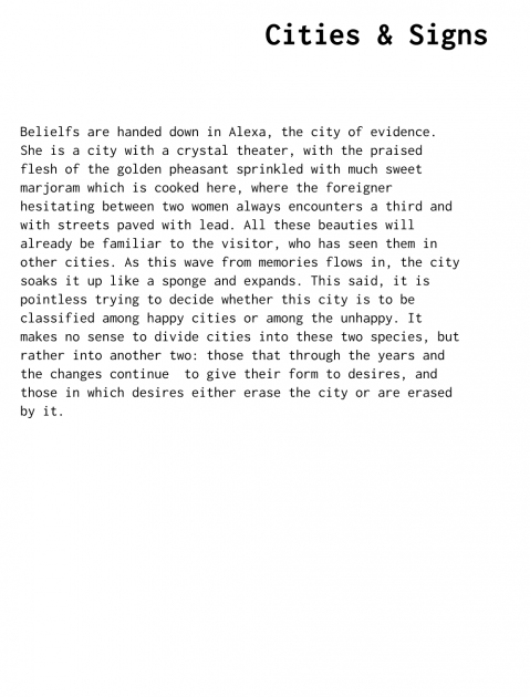
In addition to this project, I have been working on a 3D map experience, retracing all the places I have walked to in an entire week while dealing with grief. I walk when I have things to deal with or think through, and that week I walked an average of 2h a day. I’m thinking of displaying this instead of/or in addition to the Infinite Cities Generator. It would be displayed on the LookingGlass as a 3D video playing in real time, with the camera traveling on the exact paths I did.

And in addition to THAT, I have been slaving over my thesis project Dedications I-V, a volumetric documentary on storytelling in the context of progressive memory loss. It will be taking the form of five individual chapters on memory, with five different protagonists. Although I can’t really show it just yet, this is where all of my energy has been put into.
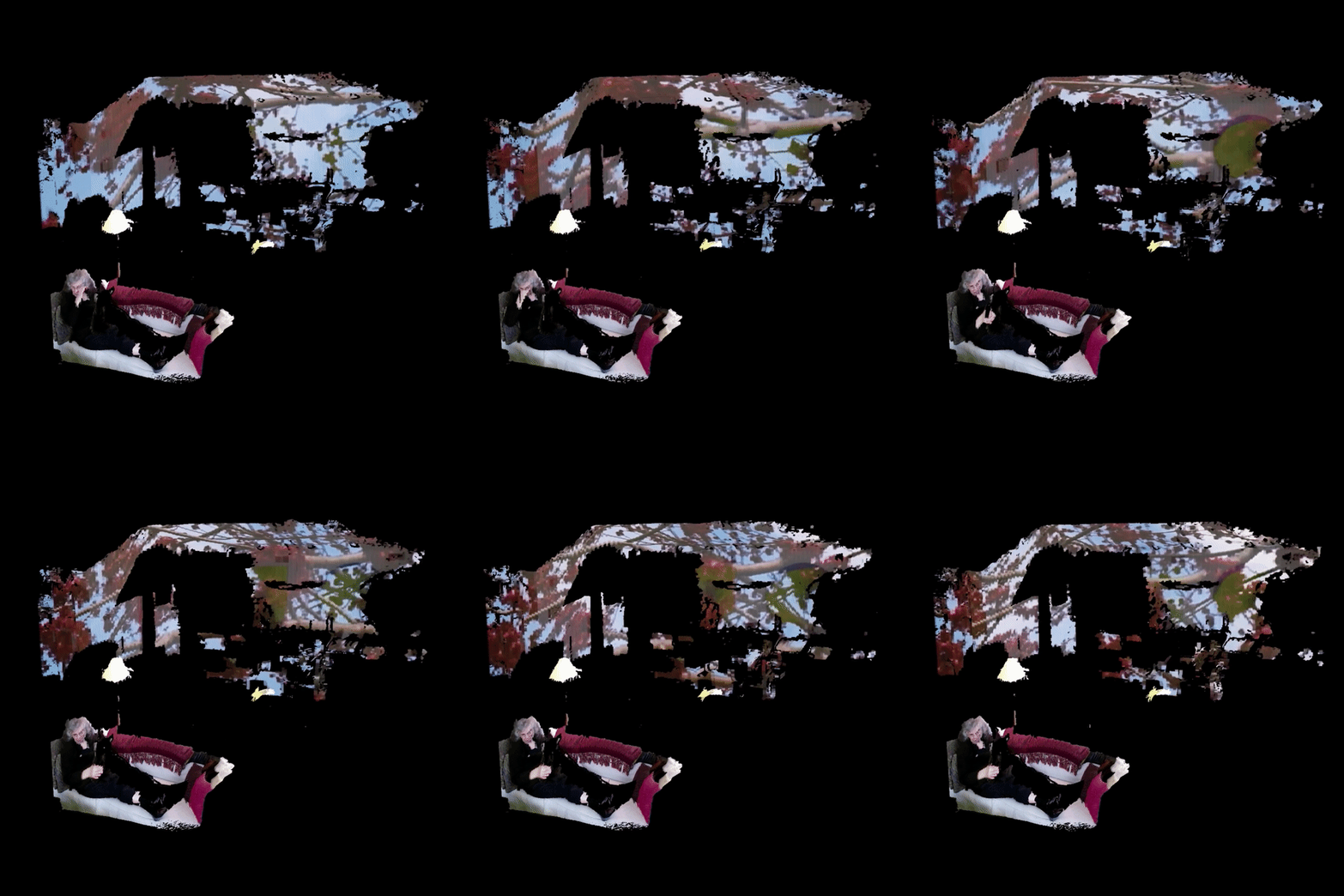
(i’m overcompensating because i haven’t produced anything real in this class yet — whoopsie)
jaqaur – Telematic
Android App development proved harder than I thought, and I didn’t want to phone it in, so this is very unfinished. Still, since I really like my idea and plan to continue working on it, I’ll share what I have so far.
My project is a messaging app called Rebus Chat that automatically converts typed messages to Rebus puzzles like the one below, and sends them that way.

Even the usernames and the buttons like “back” will be images rather than text. All the images will come from The Noun Project. A mock-up of the design I was thinking is below (can you guess all the messages?)

I really like this idea, because it reminds me of the puzzlehunts I love to participate in, and requires a little tricky but fun thinking to decipher each message. To convert text to Rebus, here is the pipeline I had in mind (mostly unimplemented):
- Strip out punctuation/capitalization/etc.
- Try to correct spelling errors (I am looking for an existing tool to help me do this; if I can’t find one then any “words” that don’t parse as words jump to the last bullet)
- Split everything into syllables (this will be done using Rita). We only care about pronunciation here, so “Where are you” could just as well be “Wear arr ewe”.
- For each syllable, if one interpretation of it is as a (non-abstract) noun, look it up in The Noun Project and use that picture (if multiple noun interpretations, use the most common one–there are tools for ranking words based on popularity)
- If a syllable still doesn’t have a picture, try combining it with neighboring syllables to see if it makes a two-syllable noun (if so, use that image).
- If that doesn’t work, try near rhymes.
- If there still isn’t anything, then I’m not sure what to do. Some words/phrases just aren’t 100% Rebus-able (eg. “Relevant Job Experience”–what should that even look like?). I have thought of a few options:
-
- Option 1: Use “word math,” like R + (elephant) for “relevant” or (smile) – S for “mile.” This seems pretty hard to do programmatically, at least robustly, and there will still be words that don’t work. Like “the.”
- Option 2: Just put those parts in as text, like “(eye) (half) the relevant job experience”. It will be as Rebus-ified as possible, and still a bit of a puzzle to decipher, but not purely images, which is too bad since I like the all-images look.
- Option 3: Just remove those parts, keeping only what can be Rebus-ified. This might turn “I have the relevant job experience” to “(eye) (half)” and then… nothing. That’s no good, because it loses important content. However, maybe in the case of just small words (a/the/and) it’s okay. This could perhaps be fused with Option 2, then?
- Option 4: Prompt the user before the message gets sent, marking that word as un-rebus-able and encouraging them to try something else. This is a little clunky and less smooth from a UI perspective, but might result in the best Rebuses.
-
I am leaning towards Option 2, but would be interested in hearing your opinions on this. I really do want to make this a reality, because I think it could be super fun and it really is time I learn Android App development.
tli-telematic
 My telematic project is a website where you can publish a text work and watch it get vandalized by visitors in real time. Once a work is published, each visitor is given a random word in the work that they can replace by submitting a text form. Every time a word is replaced, this is communicated to each client using sockets. The visitor also gets a new word to replace. This project is implemented in glitch.com using JQuery, Sequelize, and Socket.io.
This project’s concept has evolved far from its starting point. Originally, I was looking into text RPGs and sought to create a cairn where each visitor can add a new “page” to the text RPG. This text format naturally led me to look more into the implications of language rather than taking on a game-like structure. At that point, I fully intended to write some form of poem remixer in which visitors could do things like change the rhyme structure of a written poem or transform a word to a synonym, antonym, or other related word. This still felt lacking to me, because what was the point of this transformation? I realized that I could create a more interesting work (at least to me) by focusing on that transformative aspect. I have a long history with transformative works and the futile notion of authorship and content ownership on the internet. That, and it would be kind of funny to watch a troll vandalize your work before your very eyes.
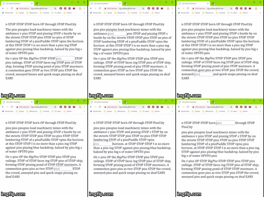
So I opened up the format to freely change any single word in the published piece. A few limitations apply. Instead of choosing which words to change, the programming assigns you a random word. You can only replace words with single words–no spaces. In order to go to a different word, you must submit your change (or lack of change) for the current word. Additionally, the text supports HTML, which provides another avenue of mayhem in exposing the ugly syntax by getting rid of an end-bracket. Where I found the most interesting interactions to arise was in the networking. Once the work is published, the author is simply another visitor to the site. The author can see their work be vandalized in real time. Just as the vandalizers can bastardize words in the original text, the author can defend by restoring their original words or even communicate with the vandalizers by sacrificing a word with an angry, caps-locked “STOP”.
ngdon – telematic
emojia.glitch.me
An online multiplayer world made entirely of emojis. check it out on https://emojia.glitch.me
^ Gameplay on Windows 10
^ Left: Apple Color Emoji, Right: ASCII
^ Comparison of 4 OS.
Process

Emojis
I collected the useful emojis in a dictionary and built a system to find and draw them. Since the center and rotation of individual emoji graphics are arbitrary and different on different OS’s, I built a mapping for different OS’s to rectify them.
Rendering
Emojis are rendered as text in HTML divs. It turns out that mac Chrome and Safari are bugged in displaying emojis. Emojis cannot be rotated to axis-aligned angles (90°, 180°, 270°, etc), otherwise it will glitch crazily, being scaled to random sizes at frame. Also emojis cannot be scaled above 130 pixels in height, otherwise the emojis will not show up. I made some tricks and hacks so these problems are not visible.
Another problem is that mac Chrome and Safari cannot render emojis very efficiently. If there are many bunches of emojis flying all over the screen, the render loop is going to get very slow. Current solution is to not generate too many items, and delete them as soon as they’re no longer in sight.
Server
I used node.js on glitch.com to make the server. In my previous networked projects, precise sync was not very crucial, and “fairness” for all the players didn’t have to be enforced. However with this project I had to redesign my data structures multiple times to find the ones that optimizes both speed and fairness.
glitch.com seems to be limiting my resources, so from time to time there can be an outrageous lag (5 sec) in communicating between the server and client. I also tried to setup a server on my MacBook using serveo/ngrok, and the lag is much more consistent.
I also found another solution, which is to get a good noise filter. This time I’m using the One Euro Filter. I knew this filter for a while, but for my previous projects a Lerp is suffice. But for this project, Lerp means that everything will be always behind their actual position, which is quite unacceptable for a game. One Euro Filter turns out to be very magical, and the game no longer look laggy even on glitch.
Game Mechanism
Once you connect to the server, the server will put you into the most populated, yet not-full room. The capacity of a room is currently 4. I was hoping to have infinitely many players in a room, so it will look really cool if there’re many people online. However testing this made the network communication infinitely laggy.
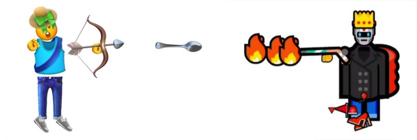
When there’re less than 4 human players in a room, bots, which look almost human but can be easily distinguished with their bot “🤖” faces, will join the game to make things more interesting. Once another user want to connect, the bots will self-destruct to make space for human.
The bots have an average IQ, but it is already fun to observe them kill each other while my human character hide in the corner. Watching them I feel that the bots are also having a lot of fun themselves.
Currently players can pickup food and other items on the floor, or hunt small animals passing by for more food. But I have many more ideas that I haven’t got the time to implement.
Platform Specific Looks
Since for different OS’s and browsers the emojis look different, I made a small utility so that I can render the same gameplay video on different devices for comparison. How it works is that I first play it on my mac, and my code writes down the position and so on of all the stuff on the screen for each and every frame. I download the said file, can upload it again to different browsers on different OS’s to render the same play through, but rendered with platform specific emojis.
Currently I’ve rendered on 4 platforms: macOS mojave, windows 10, ubuntu 18, and android. I got access to windows 10 via connecting to virtual andrews in vmware. I have a USB-bootable linux which I plugged into my mac to get the linux recording. Golan lend me a Pixel phone which I used to make the android recording.
Though I’ve made a timer in my code so all the playbacks should be played at exact same speed, each browser seems to have a mind of its own and the resultant 4 videos are still a bit out of sync. Also took me all night to put them together.
You can find the recordings in a 2×2 grid view at the top of this post.
Todo
- Mobile/touch support
- More type of interactions: drawing stuff with emojis, leaving marks to the landscape, change facial expressions, etc.
- Tutorial, instructions and other GUI
Let’s Practice: Alexa Music Practice Tool
- I made an Alexa skill with Abby Lannan, a Euphonium performance major Graduate student at CMU, where it will help you to practice music in various ways. It allows you to play music with other people’s music recordings or upload your own music. It helps you with music ear training, intonation and rhythm accuracy. This project is pitched to Amazon’s Alexa Day as a future Alexa project.
It tracks users’ practice progress and helps them achieve their practice goals. It synthesizes sounds on a cloud server based on voice commands.
Basic Functions:
Skill Development: It has a metronome and drone that offer a variety of sounds. It also allows users to upload recordings to play music with each other.
Tutoring: It has ear training game that teaches music theory.
Record Keeping: It saves user info on cloud database and allows them to track longterm practice progress.
A detailed slides is attached here:
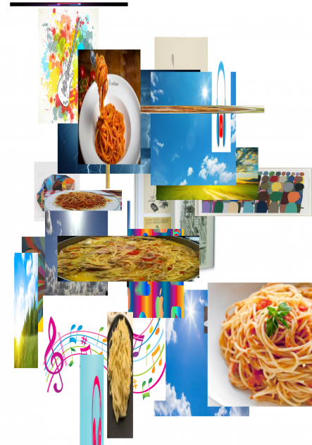
2. Also, I attempted to make an Alexa skill that sends you an email of a pdf of pictures that ‘will make you happy.’ First of all, you tells Alexa what makes you feel happy/grateful. Then, she sends you a pdf to remind you the happy things in the world. The results look pretty like trash.
[hands, anime, butt, beach]

[spagetti, good weather, chris johanson, music]
Arialy-Checkin
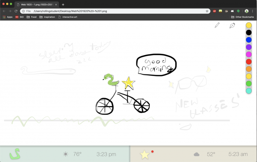
I’m currently working on a synced new-tab screen for two people. Telematic art for me is most exciting in the way it can uniquely connect people and create different modes of communication. For this project I was specifically interested in how to use digital spaces we interact with daily into something more interesting.
I thought about what has been used in connecting two people in art/design projects. I’ve seen several (more generic ones) that use someone’s heartbeat, but for me personally, a person’s heartbeat is conceptual poetic, but doesn’t really feel unique. I’ve seen watches designed to have two times on it, one for the time zone of another person.
As for new tab screen, they generally are aesthetically pleasing and/or focus on productivity. For my project, I’d like to combine the “new tab” functionality with communication between two people.
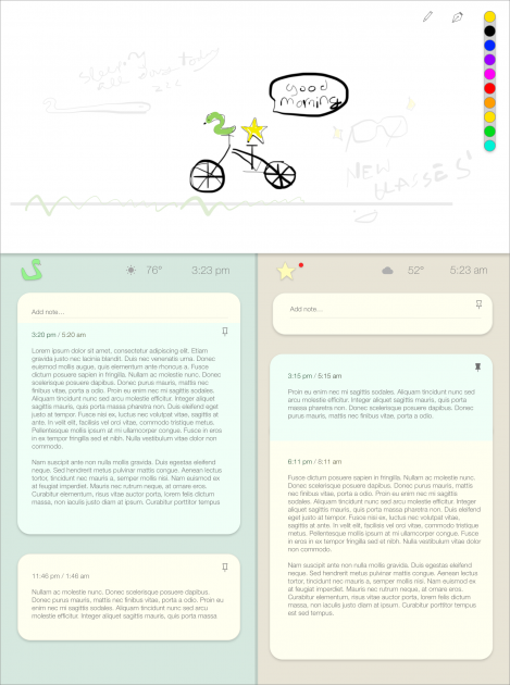
In the new tab screen I designed, people can collaboratively draw on the top white area. As days pass, the drawings fade into the background, encouraging new drawings while also letting old ones stick around. On the bottom section, there’s a customizable avatar, the weather and time for each person, and an area to leave longer form notes. I’ll now be spending my time coding this design! My focus will definitely first be the collaboratively drawing space on top with the drawings fading over time, and then with time allowing the supplementary long notes that appear beneath it.
