Category: Looking Outwards

Connie D : Looking Outwards; Assignment 8

[vimeo 31087781 w=500 h=281]

SoundSculpture. from Akollectiv. on Vimeo.

In this piece the different mannequins have instruments rigged to them with proximity sensors so when others approach them, the instruments begin to play based on their distance. I really like the aesthetic of the sculptures in this piece, and I believe they create the interesting condition of using the familiarity of the human form and presenting it in such a way that is alien and slightly unsettling. By replacing the mannequin heads with television sets there is a dehumanizing element, as well as a visual reminder that while the humanoid figures aren’t actually playing they instruments; the instruments are mechanized. The uncanniness of this piece is further emphasized by the the fact that while the instruments and screens change and move, the figures remain still – the human element remains still.


[vimeo 49782012 w=500 h=281]

Chiaroscuro (Étude Op. 3, No.3) from sougwen on Vimeo.

This piece features projected light on an ink drawing. I find this marriage between the still two dimensional image and the moving, electronic element interesting. By projecting the different light patterns on the drawing the still image is given a new dimension of movement. Furthermore, by projecting onto a drawn image (as oppose to a blank wall) the light projections can a greater depth and complexity as well.


[vimeo 13385017 w=500 h=281]

Kinetic Chandelier “Silke” from Sebastian Neitsch on Vimeo.

This is a light installation where the different bulbs of the chandelier turn to face and illuminate the viewer via sensors. The slow motion and warm lighting personify the light bulbs and give them the quality of being alive. Combined with the gradual movement to facing the viewer it evokes the feeling of being watched. This feeling of being watched dialogues will with being lit up or illuminated because in both ways the audience is being exposed. Exposed both to the light bulbs “stare” themselves and exposed to others via light.
Michael Importico – Looking Outwards 2

#1

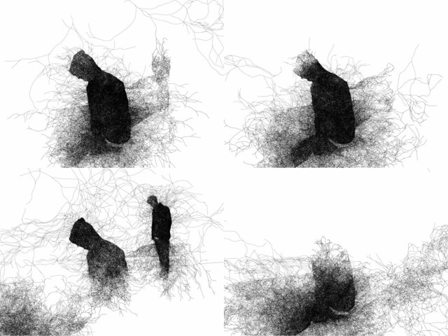
Noise Ink: Body Reactive Installation is a work of art by Trent Brooks that utilizes Processing in conjunction with the Kinect camera.  This drawing tool is the perfect blend of choreography and calligraphy.  As one moves or dances though the Kinect sensor, the motion is not only recorded but also further enhanced by the algorithmic processes applied to the Kinect data.  By involving the body in the creative process, the resulting image, seems to me to have less the the visual markers that I often see in other computer generated works of art, instead, the marks generated have many of the free flowing movements and patterns of a brush stroke with a definite painterly feel.  The freedom and immediacy of expression allows for nearly any person to quickly understand the interaction with man/code and the output making an environment that facilitates uninhibited creation from a wide range or participants, many non-artists.

[vimeo 21691884 w=500 h=281]

Noise Ink setup from Trent Brooks on Vimeo.

(Setup video: Processing source code and binaries available on GitHub https://github.com/trentbrooks/Noise-Ink)

#2

Hemesh and HemeshGui

This is a processing library Fredrick Vanhoutte that very quickly allows one to enter paramaters to generate very complex 3-d models.  These models can then be physically prototyped with the aid of a 3d printer.  This bit of software focuses of the connections of and angles of framework like structural supports.  The important information manipulated to the creation of the elaborate forms is the connection points and the angles of the connections.  It is this ‘mesh’ that serves as the support for the skin or planar elements, making the mesh objects solid.  As more information is supplied to the the software, the object becomes increasingly more visually complex as well and geometrically complex, creating, in the end a fractal like object in 3 dimensions.  I do beging to wonder about the non-art possibilities of this tool.  The potential for developing new, stronger, lighter and economical architectural forms that could have mass re-producablity and possible portability are great.  Similar to the exercises of circle packing, I envision modular housing units for developing countries that are mass produced, folded for storage/delivery and then unfolded and compiled into the final form.  The potential as a tool for artists is nearly limitless.  From creating very complex forms for animation or physical forms, the rapid prototype nature of this tool will help speed up  creative discovery allowing for more development in less time with less investment from the artist, allowing for a freer creative process.
[vimeo 18057421 w=500 h=281]

HemeshGui – Showcase from Amnon Owed on Vimeo.

http://www.creativeapplications.net/processing/hemesh-and-hemeshgui-processing/

#3

Type Case by Martin Birchir is an installation/sculpture that uses processing to control the data and manipulate the lights.  The think I like most about this project is how it appears to be very analoge in nature.  The age of the object housing the lights is stunningly beautiful.  This fact juxtaposed against the what is actually required underneath its digital hood.  The push and pull of this dynamic displaces this work in time and space, further enhancing the uncanny nature of this work.  The physicality of this work is controlled by an Arduino, and while this work is not solely a Processing project, I wanted to include it anyway because it does demonstrate the power of the interface.  To accomplish anything remotely similar from a purely analoge perspective would be infinitely more complicated as well as more expensive to build due to the cost of electronic components.

http://www.mar.li/type_case.php

http://www.creativeapplications.net/processing/type-case-processing/

[vimeo 16204003 w=500 h=281]


Looking Outwards II

http://www.stonespray.com/

Stone Spray is a project by Petr Novikov, Inder Shergill and Anna Kulik using Arduino UNO, a Processing application and a “custom built jet spray system” that uses soil and binder as a method to construct architectural shapes. The first thing I noticed was how the video was shot from different angles and perspectives, as well as showing the different steps that are going into the process, making the piece very much about both the process, the execution, and the fact that it was documented in video format. I loved the interaction between human and robot, where, compared to some forms of newer computer technology, the human presence is not stressed or displayed. With the human controlling the machine, rather than the other way around, the piece seems to comment on current controversies on new technologies, the need for technology, as well as the overwhelming fear for the future “lack of need” of humans, which the piece seemed obviously coming from the opposing point of view, that human presence within the realms of technology and robotics are a necessary tool. I also enjoyed the end results of the project, with each sand sculpture having a completely different organic shape and structure.

Sidenote: This project reminds me of childhood experiences of building sand and muddy sand castles: another reason why I wanted to comment on this video.


http://wearechopchop.com/“unnamed-soundsculpture”/

Unnamed Soundsculpture was a project, by artists Daniel Franke & Cedric Kiefer, that also 1) made sand sculptures(I think maybe I miss the beach?), and 2) relied heavily on the human presence and the interaction between the computer and human. Using the recorded motion data of a person, as well as the computer tools of Kinect and Processing, the piece creates a sand sculpture(simulation) that moves with the person, constantly spilling and falling and changing form. Random side note, but, what I found especially interesting was how the video looked, with random flashes of light and pops of noise. This is an effect I have seen in many of these types of human-computer interaction processing videos and I am still unsure of why this happens. This was, again, another piece that requires not only a human, but also human movement and human experience, a quality I really enjoyed about it. The way the sculpture moves is very ballerina like, flowing, graceful, and organic, which three qualities that I find are more uncommon in the realm of computer processing artwork.


https://vimeo.com/3872857

The Jelly Face Experiments, by NYX (Liina Nilsson), is a project which, once again, uses the human form as a tool for expressing computer visual arts. Rather than being a complete project, this piece is more so a series of experiments using pixelated operations in real time to explore the world and possibilities of processing, playing around with various processing tools, such as slit scan, frame differencing, and datamoshing. The artist called it a “short test combing two glitch effects I’m developing, frame differencing and luma key”. There are two separate videos, which I am assuming the artist overlayed, a video of Gamen, and a video of the artist with food on her face. The experiments are written in Processing and controlled using a hand control with a 3-way accelerometer Arduino. Tilting the hand control affects the amount of effect changes. I found this piece a very different and interesting way to combine processing with human interaction and movement. The piece, while stressing the need of a human hand, also greatly develops, distinguishes, and displays the technology being used, with the result being purposely glitchy, digitized, and pixilated. One other cause of this effect was the fact that the eyes were eliminated from the face during the entirety of the video, making me question whether this was a purposeful decision and comment on the previously talked about computer technology controversies, and if so, what the artist was trying to say through these decisions.

RobbGodshaw-LookingOutwards-2

Plinko Poetry — Inessah Selditz & Deqing Sun


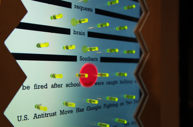
Plinko Poetry is an electronic installation which produces poetry out of news tweets and the trajectory of a pachinko chip. Pegs extend from a screen which is constantly scrolling with recent tweets from @foxnews and @nytimes. The participant takes the peg and drops it above the peg board. As the chip careens down the board, the words it passes over become random portions of a poem. These poems are short and nonsensical while still expressing aspects of the world today.
These are some of my favorites, pulled from the @PlinkoPoetry stream

Dozens blood Finals that Tribute of Champions flesh-eating
Bendukidze in Fund-Raising storm Terrorism administration’s Arrives say
Obama texting Past convicted Catch receive Egypts dog

Squeeze Past – Steven Kay


I’m just as fond of Voronoi as I am of bubbles. This is pretty, fun, and mathy. I love the visible pixels and the retro feel of spherical gradients.

Curtain — BlueThen


I wish wordpress allowed iframes. Here is a still.

This gorgeous fabric simulation allows the user to manipulate a small “curtain” in low gravity. As an added bonus, you can slice and tear the curtain by moving your mouse quickly. The natural and fluid way that this piece behaves is very appealing to me.
The code for this sketch is much shorter than I expected it to be.

Andrea Gershuny: Looking Outwards #2 (Assignment 03)

Ebru Kurbak + Mahir Mustafa Yavuz: “News Knitter”


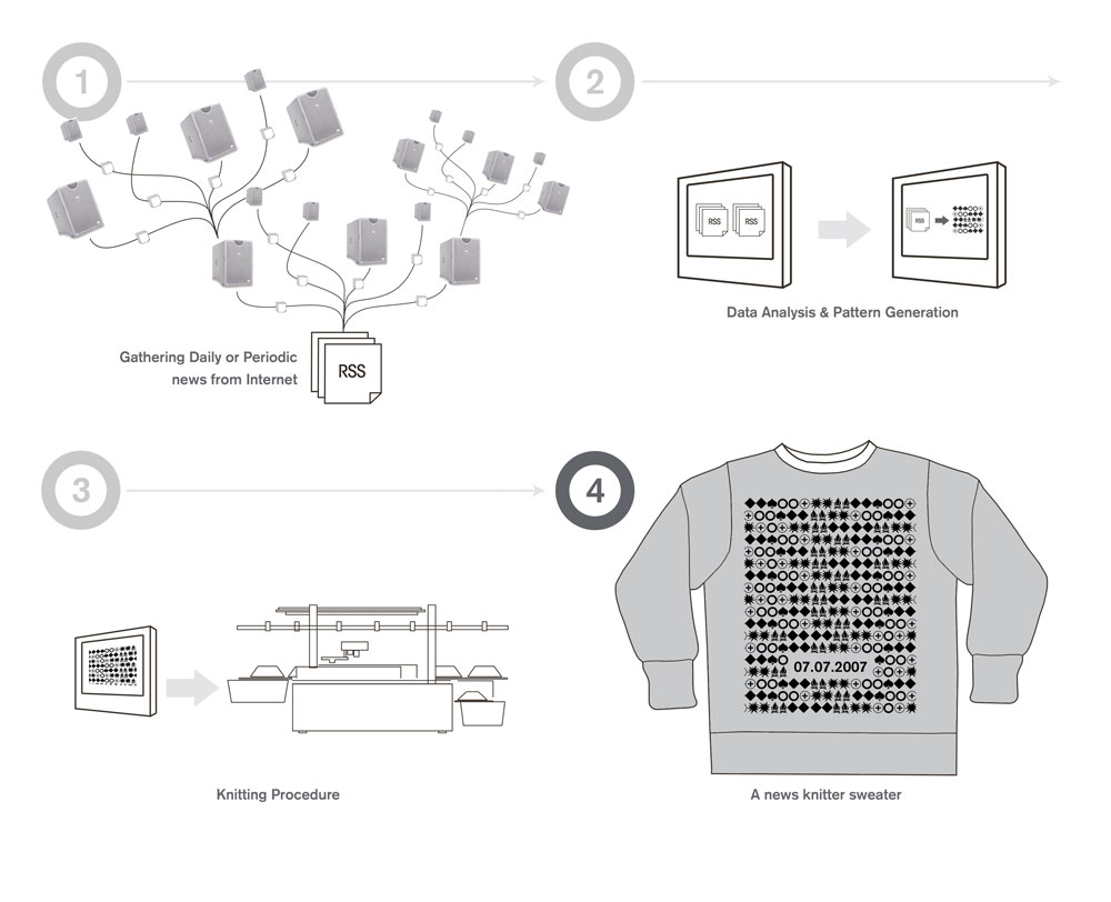
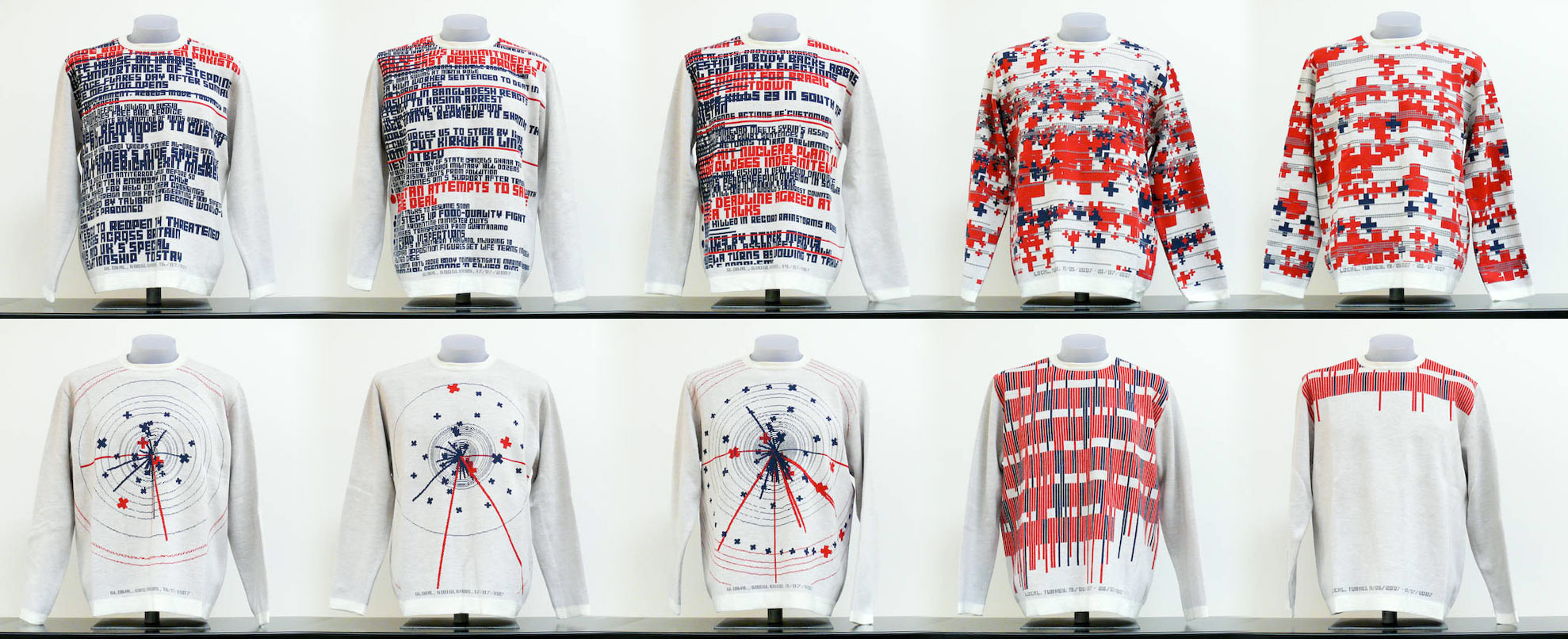
This project uses Perl to collect and analyze data from global and local (Turkish) RSS news feeds. Then, using Processing, the data is “visualized” and the visualizations knitted into sweaters using knitting machines. Those sweaters are then put up for sale (currently I’m on the waitlist to buy a sweater once some more are ready.) What I like about this project is that it converts something which often feels abstract and distant (the news) and converts it into something very personal and tangible (a sweater). I just wish I knew more about what the visualizations meant–I’m not exactly sure how the data is quantified or visualized but there seem to be four different types of patterns. I also wish the colors were defined by the news inputs (or maybe they are, I’m not sure). I love this project as it is, but, similar to how I wished the drawing robot included more variables, I wish this project included more variables as well.

Everyware [Hyunwoo Bang + Yunsil Heo]: “Cloud Pink”

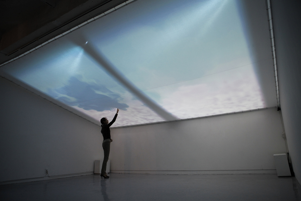
“Cloud Pink” is an installation by Everyware, a “creative computing group” composed of Korean artists Hyunwoo Bang and Yunsil Heo. In this installation, drifting pink clouds are projected onto a sheet stretched horizontally overhead. Two kinects “watch” the sheet and, wherever it is touched, swirls of blue clouds appear. What I like about this piece is the ethereal, dreamlike quality, as if you were a little kid daydreaming yourself touching the clouds. It’s a simple piece without pretense or ego and it really makes me wish I could see it in real life–I especially want to feel what that fabric feels like; it seems so wonderfully stretchy and kind of heavy but still translucent (I am kinda of a fabric nerd though, so that might just be me). At first, when viewing this piece, I thought it would be nice to have some  sort of ambient music accompanying it in the background, but thinking about it now I think that that would bring it into the realm of cliche. As it is, I think it’s a lovely piece that seems  to really captivate everyone who interacts with it.

bitcraft [Martin Schneider]: “Codex Processianus”

(I tried to embed this one but it wouldn’t work… these sample photos will have to do for now I guess.)

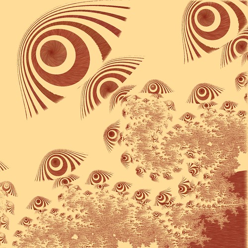
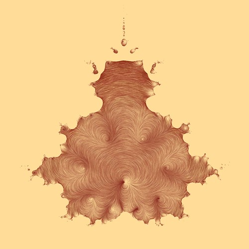
“Codex Processianus” is a project from openprocessing.org that creates “flow map based drawings”. I’m not sure what a flow map is,but I think it has to do with the flow of a fluid across or through an object; in this case, the objects are predetermined and you “uncover” the drawing by moving your mouse across it. The longer your mouse stays in one place, the darker/more “drawn” that area becomes. Whatever the science behind it is, this piece is a really simple way to create (or reveal) really elegant drawings. I wish there were a way to generate the object yourself, though you can change it by hitting the spacebar and see it by right clicking. There are also a few different color palettes to choose from, though my favorite is da Vinci, the one shown. I wish I knew more about how this drawing works, so I’ll have to look at the code more sometime in the future– at this point it’s a bit beyond me, I can basically understand how the code works but not the physics behind the drawing itself. Either way, it’s a fun thing to play around with that creates really elegant drawings just by waving your mouse around!


Minnar – Assignment 3 (OP & Looking Outwards)

Part 1: Open Processing Account

username: minnar

link: http://www.openprocessing.org/user/20930

Part 2: Looking Outwards

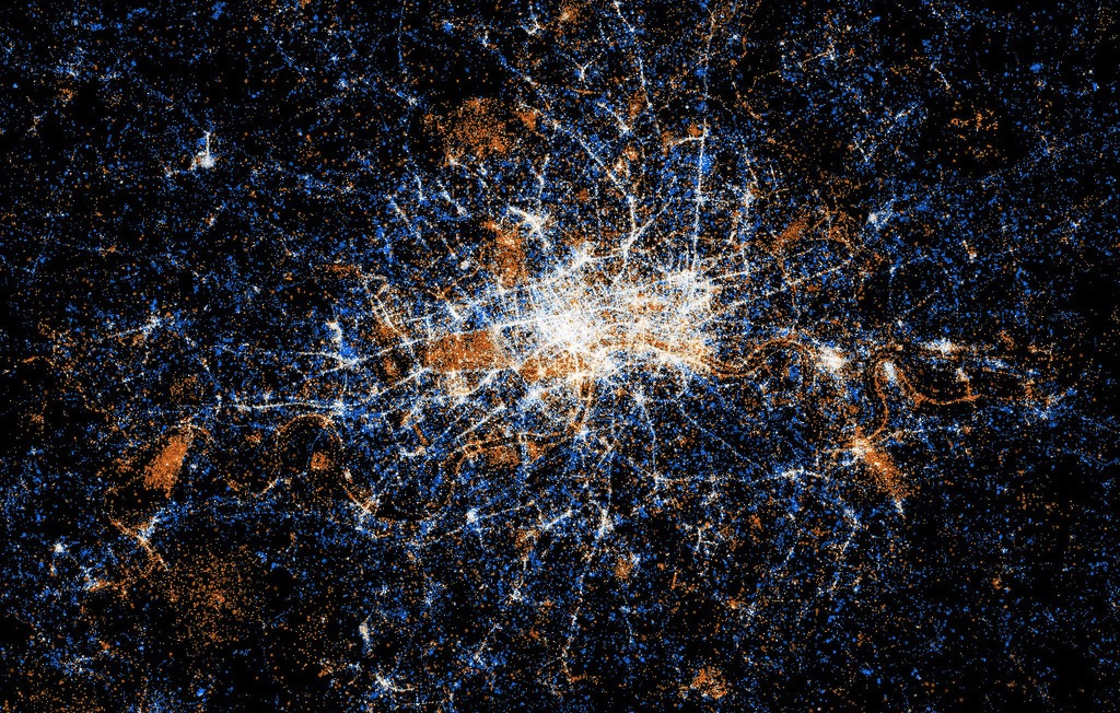
See Something or Say Something by Eric Fischer is a data visualization project that analyzes where people are uploading images to flickr (mapped orange) and where people are tweeting (mapped orange), or both (mapped white). I’m fascinated by the exploration of what differentiates a place that someone wants to capture visually, and a place someone has something to comment about. I really like the ability to see concretely the differences between place to place, and I just generally really enjoy data visualization because I see it as a really great starting point for exploration and discussion about components of what defines our culture and how that varies from other cultures. Like is it that people want to take more photos instead of talking at places that are scenic? Or is a preference for people talking evidence of a more verbally intellectual community? I think it would be interesting to also parse the data from twitter and flickr to reveal what the top three topics these concentrated areas are talking about and taking photos about (or, even better, the distinctive things they’re talking about or taking photos of) given in real time when hovering over an area.

Watch the super neat video!

Cloud Pink by Everyware is an interactive installation where visitors are invited to touch and poke a sheet of fabric stretched across the ceiling, where a projection of swirling pink and blue clouds swish around in response to the participant’s movement. I’m not entirely sure how the mechanism behind it works, but I’m guessing they’re using a Kinect sensor to determine where the fabric is punctured, and Processing deals with the movement of and generation of the colored swirls. I mostly enjoy the sheer whimsical-ness of the installation, and just the physical realization of people’s childhood fantasies of being able to touch clouds. I think it could be even more interesting if the colors of the clouds were dictated by a sensor that measures the actual weather conditions outside of the gallery (ie: sunny daytime clouds are white on blue, rainy clouds are grey, sunset clouds are vivid orange and purple) as a way to bring the outside, inside.

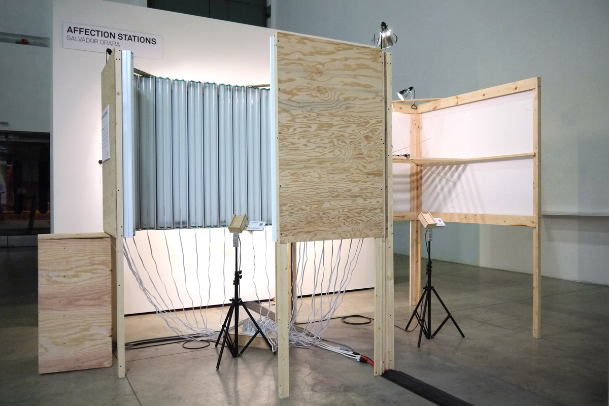
Affection Station by Salvador Orara is a series of three booths that allow participants to tangibly experience the faint, inherent sounds produced by their mobile or handheld devices. One booth amplifies the little sounds emitted by their phone though a series of small speakers lined up against the wall (watch the video) where each speaker transmits one frequency, providing a surround sound-like experience. Another booth translates the little small sounds into gesture (video) that a person can visualize, and a final booth translates the small sounds into light (video). It reminds me a bit of FELD’s to hear the grass growing piece (that I blogged about last week) in the sense that the motivation is to reach a more tangible way to experience something that is very subtle and passed over in day to day life.

Luo – Looking outwards 2 (Assignment 3)

Game mod

This project was conducted as part of a six hour long workshop that involved modifying the code of the classic Atari game Breakout. The source code provided didn’t allow for game overs, which meant that participants didn’t have to worry about dealing with the game ending unexpectedly. I love videogames, and a huge fan of pixel art, so this is really relavent to my interests. The great part is that the participants have never even heard of processing before this workshop, and yet were able to create these pieces within a span of six hours. The participants came up with a lot of creative pieces with this, like making the path of the ball visible, making multiple balls and redesigning the wall.

This project shows how experimentation and creativity can lead to great results, and that extensive knowledge of a technology is not necessary to be creative with it. I’ve already downloaded the source code myself, and might experiment with it in my free time.

You can read more about it and download the source code here.

Cascade

Cascade is a project by NY times R&D to visualize and analyze sharing activity on Twitter. I think it’s a really neat way of visualizing how information travels through the intricate web of the net. The design of the cascade itself is really slick, although they could have included a legend that explained what each of the colored boxes mean.

It would be interesting to compare how different types of information travels, like the death of a celebrity, or the announcement of a scientific breakthrough. Integration with other social networking sites would be great, and they are working on that. I would also like it if there were more visualization of the information about the participants of the cascade. Something like highlighting what age group they’re in or where they are from. With the integration of other social websites more information would be available for them to analyze, which would make gathering information about the participants a lot easier, but may also raise some questions about privacy and such.

You can read more about it here.

Oasis

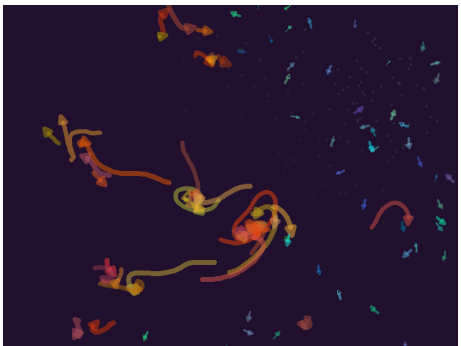
Oasis is an art installation that involves participants interacting with virtual creatures in a simulated pool. I love the way the creatures move and interact with their environment, and the sketchy texture makes them look really unique. However, I do prefer the color versions in Oasis 1, because the creatures look a lot more vivid and alive this way. The sand also adds another level of texture to the piece, and it looks really fun tracing out different shapes in the sand and seeing how the creatures respond to it.

This installation reminds me a little of the videogame Spore. It would be great if the creatures could interact with each other, or maybe even evolve. Maybe they could allow people to feed the creatures, and if the creatures get hungry enough, the bigger creatures will start trying to consume the smaller ones. Overall, I think it just needs a lot more interactivity instead of just responding to touches. Many aspects of this project could be expanded upon, because of the different kinds of biology involved.

Assignment 3 – Looking Outwards – MacKenzie Bates

Lb to Sf via bike:
http://createdigitalmotion.com/2009/04/a-bike-journey-reimagined-as-an-arty-3d-game-with-blender-processing-real-bike/

[vimeo 4049839 w=500 h=338]

lb to sf via bike from vince mckelvie on Vimeo.

I found this to be a really interesting use of various open source materials. The 3D game uses processing and the blender game engine. The only non-open source material is a Wii controller, which is very reasonable priced. The game is a fun, arty and “out there” experience as you travel from Long Beach to San Francisco. Game creator Vince McKelvie described his interactive installation/game as a documentation of “a bike trip my friend and I took from long beach to san francisco”.

Sea Snakes with Steering:
http://openprocessing.org/sketch/11105

Sea Snakes with Steering is a simple yet fun game. You are a marine biologist in a way, and you are tasked with releasing sea snakes (drag mouse), releasing prey/fishes (click mouse) and destroying snakes (hold mouse). The sea snakes try to eat the fishes while avoiding each other. Longer snakes get tangled in themselves and others, while short snakes move with ease around the open waters. The resulting game is quite and the predators self destruction makes for interesting and engaging game play.

City Symphonies:
http://www.creativeapplications.net/maxmsp/city-symphonies-the-future-sound-of-traffic-by-mark-mckeague-di-rca-2012/

[vimeo 44197369 w=500 h=281]

City Symphonies – Westminster from Mark McKeague on Vimeo.

The movement of traffic has fascinated me for a while now. Thousands of cars moving together and forming a sense of order among the chaos. In City Symphonies, Mark McKeague puts a soundtrack to the transportation system. Instead of cars noises changing according to their engine, the sounds change according to their location relative to other cars and the environment they are in. The mixture of sounds combined with sleek, ascetically-pleasing vector based artwork make for a very well designed simulator. City Symphonies uses Processing and MaxMSP.

Kyna – Assignment 3 Looking Outwards

Medusa #2 by Denis Hovart

http://www.openprocessing.org/sketch/25908

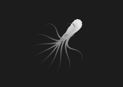
The most interesting aspect of this piece to me is how organic the movement feels. There is another version of this piece done by someone else in the most favorites section on openprocessing.org but the motion of this piece I think is much more convincing. He adds an undulation to the path that makes the movement much more believable. I really admire anyone with the ability to make pretty basic code that has a very organic feel to it.


Star Nursery by Ryan Alexander

http://www.processing.org/exhibition/works/starnursery/index_link.html

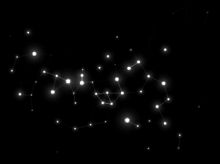
Star Nursery is a piece created in processing for R.E.M.’s music video animal. The stars interact with motion, becoming brighter and clumping to form their own constellations when motion is detected, whether from underlying footage or mouse movement. This is another example of a very organic project. Though stars don’t ever achieve this sort of motion in life, there is something about the simulated physics of this piece that I find very appealing.


La Gabbia (The Cage) by auroraMeccanica

http://vimeo.com/25831269#

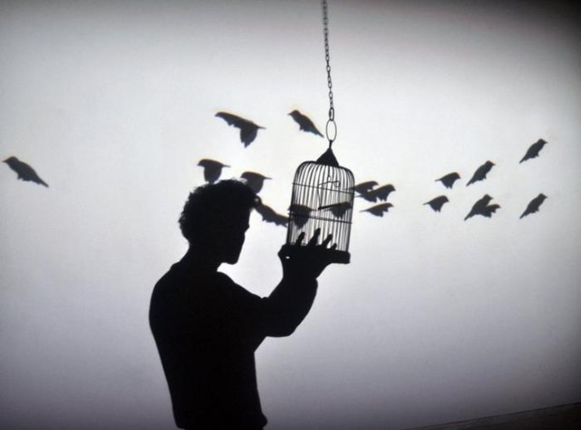
La Gabbia is a simple piece wherein when a suspended bird cage is disturbed, the shadows of small birds are projected flying out of the cage’s shadow, as though freed by its disturbance. What attracts me most to this piece is the simple way in which it manages to incorporate interactivity while still maintaining aesthetic beauty and a meaning beyond itself. The choice of the cage as the object to be moved makes the act of interaction also one of liberation.

Assignment 3 Looking Outwards – Rosey

One Perfect Cube

http://florianjenett.de/one-perfect-cube-making-of/

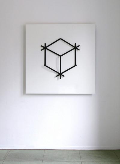
This is a combination of three clocks that form a perfect cube once every twelve hours for only one second. Processing was used to create the design and make sure there would be no unwanted collisions during the rotation times. For me, it is interesting that the piece is constantly changing and it seems like we long for it to be in its perfect form, but the completed cube occurs so rarely, and for only a moment. It is kind of nice though, that even when the piece is in its “imperfect” times, it can still produce interesting forms from the three hands of each clock. In the future, perhaps the artist could explore making even more shapes or forms using the concept of clocks and time, but I like the fact that the piece itself is always moving and changing in a set cycle. I’m sure this piece was inspired by other mechanical kinds of artworks that use things like motors or gears that give a constant cycle of action.

Mycelium

http://onecm.com/projects/mycelium/

This project written in processing, called Mycelium simulates the growth of a fungal hyphae that is “fed” with images. The hyphae grow more into lighter area (because branching and growth speed are affected by the lightness of the image) and avoid their own trails. It’s cool that this program leaves a very expressive, yet somewhat organic trail as it moves and essentially recreates the image that it is fed in black and white using only small lines. I like that it really does seem like the image is only made from plants like vines and keeps such a natural form. I almost wonder if it would be worth it to add an element of color to the fungus, or if such a thing would ruin some of the organic feel of the piece. Part of the fun is also simply watching this happen – on the link there is a video of the fungus moving around, and to me, it’s interesting to see something that starts as just a few rogue lines turn into a complete piece of work in less than a minute.

Boids + Perlin Noise Flow Field

http://openprocessing.org/sketch/8407

This sketch on open processing where these tadpole-like objects, if left untouched will naturally move about and eventually start flocking with each other. But, if you click the mouse near them, they will try to avoid your cursor by all means, even if they have to split up from their group. I like these sorts of projects because to me, it is really cool seeing something like a computer program recreate something that is very natural looking. The crossover from technology to nature is also kind of neat because nature is something that simply happens without much explanation, yet we seek to comprehend it and use things like programming to try to make it into something calculated. This project would be pretty cool if it became a 3D thing so it could be looked at from different angles and seem more like birds flocking rather than tadpoles or something swimming together.