Category: Looking Outwards

Sarah Anderson – Looking Outwards

Not long into browsing for cool Processing projects and I already found some really great ones.

Curtain (on openprocessing.org)

http://openprocessing.org/sketch/20140


Curtain is a really cool physics-based program by BlueThen on Openprocessing.org. You are given this curtain/mesh grid and two different keys to press: one that turns the gravity on and off and another that resets the program. You just drag the curtain around with the mouse and see how you can mess with it. But the program doesn’t stop there. What I really like about this program is that not only does it take into account the strength of the curtain,  but it allows and even encourages you to break it if you pull too hard. You can even play with the broken pieces on the ground and the strings hanging about. Simple in concept as it is, I found myself playing with it for nearly 20 minutes.

Thinking Machine 4 (Processing exhibition)

http://www.turbulence.org/spotlight/thinking/chess.html

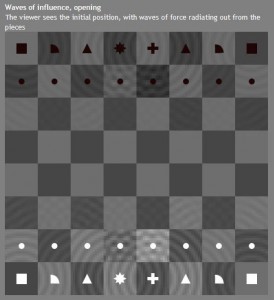
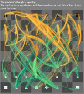
Thinking Machine 4 is basically just a game of chess. Except it’s probably the prettiest game of chess you’ll ever play. When it’s the player’s turn, pulses emanate from the pieces on the board. When it’s the computer’s turn you can see all the possible moves and scenarios that could be made, as calculated by the computer and depicted in green and yellow lines. What I really like about this program is the beautiful images that the visualization of these multiple connections make. I like how the player can actually see in real time, what the computer is thinking, but it’s such a confusing train of thought that no one except the computer would be able to follow it. It reminded me a lot of the one guy who did a visualization of flights landing and taking off and that spiderweb of connections made across the globe.

Sociomantic (Vimeo)

[vimeo 48480845 w=500 h=281]

Sociomantic from Michael Auerswald on Vimeo.

Sociomantic is a commercial for an advertising firm that was prototyped and animated almost entirely with Processing. He did use some Kinect software and XML for the walkcycle, but the rest really shows how truly graphic, visual, and professional Processing can be. I like it because it does look professional and it’s a good ad. Usually I don’t see processing used much in the professional company setting, or maybe I just don’t notice it. This commercial makes me wonder how many other ads I see, either on the television or internet, are created with processing.

Oliver – Looking Outwards – Assignment 3

MIT Media Lab Identity

by TheGreenEyl and E Roon Kang

http://www.thegreeneyl.com/mit-media-lab-identity-1

[youtube http://www.youtu.be/tgT6FaV3VJ0]


I’m really excited about this MIT Media Lab Identity project. A design group called The Green Eyl wrote Processing code to produce multiple iterations of logos based on the same general shapes, colors, and movements. Each student, faculty, or staff member at the Media Lab can customize their own logo based on this design that they can then use on business cards, etc., as a sort of personal branding and a way to show their affiliation with the Media Lab. It seems like a relatively simple script (though the code was not available), including a certain amount of randomization in the movement of the shapes and a certain set of rules determining how the shapes move and interact with each other. The result is aesthetically pleasing, and looks simple and complex at the same time. I’m not sure what the customization interface is like, but I imagine it allows the user to toggle with color and some other aspects of the design. I am applying to the MIT Media Lab for graduate school, so this is especially exciting for me to think that I could possibly have my own personalized logo like this next year.


Cascade

by NYTimes R&D Lab

http://nytlabs.com/projects/cascade.html

[youtube http://youtu.be/yQBOF7XeCE0]


Effectively visualizing the way that information spreads throughout social media is quite a challenge, and the NYTimes R&D Lab has done a great job of it with its tool called Cascade, built using Processing along with a database called MongoDB. Network visualizations are difficult because they are often very dense and complex, which often gives a “ball of yarn” visual effect. Cascade unravels the yarn by allowing not only a 3-D look at the network of people sharing a particular news story on Twitter, but they also add in a 4th dimension – time. The network starts at the middle of a circle, and expands outward with each hour. The user can also zoom in on particular nodes in the network, and see the cascades of information diffusion that stem from each. Of course, it’s still difficult to comprehend the complex spread of information through a network, but Cascade makes the job of deciphering such a network and gaining insight much easier.


EarthQuake viewer

by Johan Terryn

http://www.openprocessing.org/sketch/48871

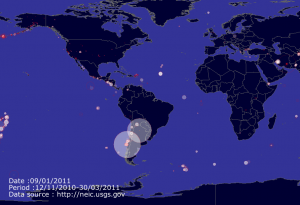
This is a visualization of earthquakes around the world from 2010 to the present. It shows a world map, and goes quickly through time. Each earthquake is represented by a circle in the location where it occurred. I assume that larger circles mean more severe earthquakes, but it doesn’t clarify. The program scrapes data from the National Earthquake Information Center’s website, so that it can present up-to-date data. I think that this program works well and looks cool aesthetically, but as a source of information it’s a little bit lacking. It would be much more useful if the user could enter a date to look at earthquakes that happened on that date, and a Pause button would be extremely helpful. It would also be good to have the capability to zoom in on certain areas of the world map. I was impressed by how little code it took to write a program like this – only about 60 lines of code, which I’m assuming includes the website scraping! I don’t understand much of the code yet but I hope to be able to soon.

Josh Lopez-Binder, LookingOutwards, Assignment 03

Life ; History

http://openprocessing.org/sketch/7508

Another Cellular Automata Visualization.  But this one is pretty cool.  Each generation of cells falls and gets rendered progressively darker each frame until it disappears into the black background.  The Cells are in a 2d grid. Each cell is a small colored tile, and each generation’s tiles sit directly below its child.  The result is a 3d form. When there is a  high degree of change the structure appears branched . This particular implementation uses the rule that less than 2 or more than 3 neighbors causes death, and exactly 3 neighbors causes the cell to come alive. In addition the cells are colored according to their neighbors.  The cells are initially colored in random patches. This gives a sense of which cells “took over” or had dynamic behavior that caused them to move about and influence other cells. Pretty interesting.  They should 3d-print it or make it somehow. With those colors.

This project makes me think about how cellular automata could be a macroscopic model for population dynamics.  Each color could represent a tribe or tribe of tribes, that takes over other regions, grows, and dies.  Maybe this could even be a model for civilizations.

In fact it has been used in this way in relation to biology. Here is one example:

http://www.exa.unicen.edu.ar/ecosistemas/Wetland/publicaciones/papers/29_ISRSE_RM.pdf

We Met Heads On


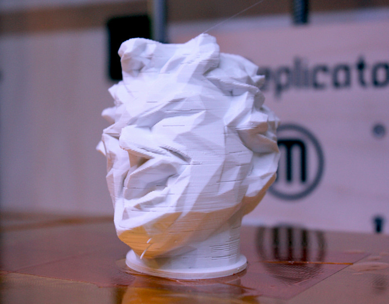
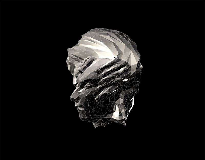
This project takes a mesh and deformes it using sound as input. The vertices of the mesh are twisted according to the strength of the soundwave.  The objects were taken from 3d-scans made available on thingiverse.  I like the idea of being able to visualize sound by using it as a parameter in distorting a mesh.  It seems like many computational tools, and art being made with those tools, allow for creating simulated synesthesia.  Synesthesia, the confusion of different senses, seems like a data mapping phenomena.  Input like sound might be mapped to another sense like vision.  While the ways that the human brain does this are undoubtedly insanely complex, I imagine that the mathematical and computational methods for mapping data to other sets of data are related to synesthesia.

It would be pretty interesting if this project could be re-created in physical space realtime.  Maybe if each vertice of the mesh was a physical node, and each edge a small gas-spring, and motors or solenoids pulled on the mesh, one could get a rough approximation of what these people have done using processing. Obvously it would be way slower than the animation, but it might be pretty interesting. And it has the potential to be interactive.


Pixel Knitting

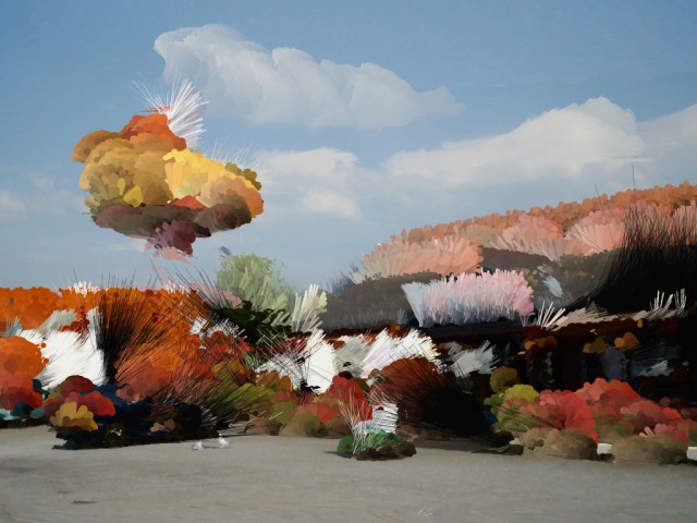
This project, by Pierre Commenge, takes a digital image and draws lines and circles whose properties are determined by the pixels’ color, brightness and saturation in the images.  The code is beautifully simple, yet the output is bizarre and complex.  While clearly generated from photographs, the images take on a cartoonish or surreal nature.

I would like to see a set of images where the output from one image is fed back into the algorithm.  Perhaps the algorithm, when run once, would make very minor tweeks, but over many iterations of feedback would produce wild results. Or maybe that would just produce mush (it probably depends alot on the details of the algorithm).

An even more ambitous extension of this idea would be taking it into the 3d realm.  The input would be a 3d scan.  The algorithm would add points, spheres, cubes, rods, etc. according to the point cloud or mesh.  Maybe local curvature, relative position in space, or surface roughness could be used as parameters in generating new geometry.  If the 3d-scan was one of those fancy ones with textures as well as 3d information, then similar methods used in the above video could be used: color, brightness, saturation.

Assignment 3 – Looking Outwards : Connie

ofxMSAPhysics v2 from Memo Akten on Vimeo.

ofxMSAPhysics v2 is a physics engine that includes things such as springs, collisions and attractions, etc. I like how the creator was able to give personality to the different particles in the simulation by taking advantage of the background music and the different capabilities of the physics engine. I found the mood whiplash between majestic and ridiculous to be all good fun.

GENERATIVE ART WORKSHOP // GAFFTA | San Francisco MMXII from realitat on Vimeo.

Microsonic Landscapes is an algorithmic expression of music/sound that is then turned into a physical object. In the real world people can see the space or shape of sound. Even though it obviously exists and fills up space. It is really interesting to me to effectively “see” sound. The physical sculptures created are all very interesting as are their accompanying soundtrack but I would have liked to be able to see the interpretation of more organic  sounds (the sounds in the video being very obviously digital). Such as say – would shape would the sound of a voice take?

Digital Rube Goldberg Processor from The Product on Vimeo.

Rube Goldberg Prozessor the electronic media equivalent of a rube goldberg machine. Rube goldberg machines have always been very interesting to me – seeing the domino effect between many elaborately set objects that more or less demonstrate Newton’s second law of motion. This piece however is almost frustrating in comparison because while each effect is demonstrated each screen – culminating in a photo to be uploaded onto flicker the very nature of the medium prevents you from seeing the whole picture. Sure electrical signals are being passed through wires but it cannot really be seen – things just seem to magically appear at the next step and because of that it almost feels like cheating.

Minnar Xie-Looking Outwards-1

http://www.feld.is/projects/hearing-gras/

To Hear the Grass Growing is an installation that employs a sensor around the roots of grass to pick up the electrical pulses as the grass grows. These currents are used to generate sound that fills the room, amplifying the clicks and frequencies of the natural growth process. I love the poeticism of being able to make something so subtle and into something very tangible, and in this way allowing people to have a greater recognition of the constant unnoticed activity in our natural world. It reminds me of the recent research on the social life of plants that Professor Momeni was telling me about the other day, and how there is actually a lot of complexity in the way that plants interact with one another (ie: plants recognize kin) but mere human-eye viewing of plants aren’t able to really detect that on a surface level. The use of sensors in this project really arrives at something deeper for me.


I have really been interested in work involving biofeedback lately, in line with my project for my Hybrid Instruments Building course. I found this really cool project Mindchill, which uses a sensor that measures galvanic skin response (a way to measure emotional activity based on your skin’s electric connectivity) and uses that data to control whether a video feed of water either boils or freezes (ie: a stronger emotional reaction, the more the water boils and shifts state into a gas). The video is projected on a large screen in front of the participant.

There aren’t really good photos of the installation itself, but I love the notion of the participant creating a feedback mechanism with themselves. By placing the projection right in front of the viewer, the participant’s emotional state causes the video to react a certain way, which in turn influences the participant’s emotional state, and so on… I think an interesting possible expansion of the project is making it so that a group of people are all providing the emotional response, so the video is reacting to the collective emotion and the individuals all sort of emotionally merge in response to the feelings of others.

David Bowen’s Fly Blimps are also really really neat, a project which each balloon contains a little pod of flies that control the movement of the blimp by their collective movement. A sensor detects the light between the moving flies and sends this data to a microcontroller that then moves the blimp. I like the idea of exploring group behavior and movement in an abstracted way, drawing parallels between fly group behavior and human group behavior, especially the notion of how our seemingly inconsequential gestures as a result of just living can amount to the fate of our group.

Michael Importico – Looking Outwards #1

1. Measure of Discontent: Sigh Collector – M. Kontopolus – 2009

*images from the artists website – http://www.mkontopoulos.com/?p=586

Sigh Collector on Vimeo

This object measures the intangible tangible.  A sigh, an emotional, release is not only measured by this machine but made quite visible.  I like many things about this piece.  Firstly the concept is wonderful.  It taps into the human condition in a way this is fun a kitsch.  The aesthetics on both the object and the accompanying video make for a light hearted work that appeals to  my emotions as well as my gadget lust.

Is is useful? no, but entertaining and though provoking.

Is is scientific?  I don’t really think so, I have reservations about the prescision of this instrument, which rules out any scientific usefulness.

The use of technology is is quite interesting.  There is sensor reading and motor control working together to make this object function.  In addition, I consider the video to be an asset of this work, and should be mentioned as an element of this work.  The production of this video is wonderful and really tells the story of this work.

2. After Thought (2010) – Portable Testing Kit and Custom Video – Scott Kildall

Scott Kildall | KILDALL.COM | Artwork: After Thought

Again, the gadget whore in me loves this piece.  This work of art is disguised as a scientific instrument, and it does intact have much in common with scientific and medical technology.  It utilizes an eeg sensor to read a test subjects levels of stress while being shown a series of images.  During this time, the stress levels are recorded, additionally a custom video is them compiled from a bank of 200 video clips to represent the test subjects emotional status.

Art that creates art is an exciting direction I see really expanding in the digital age, and I see this piece doing that and going beyond.  The human interaction, as well and the balance of the biological and technological elements are what make this work special, and more interesting than the art making machines of the 1970’s.

3. Bill Smith – Nonlinear Pendulums 2011

nonlinear pendulums on Vimeo

I have no idea what to actually say about this work, but I will say that despite me not fully comprehending the concept/motivation/technology employed here, I am drawn to this work as one might be drawn towards an ancient alien artifact.  After watching the video, Im no better off in that regard.  I seems as if this object is controlling video streams from outside the workshop and plotting this data as well as displaying the video.

Plainly, this work utilizes many technologies in the name of art, but plays the part of some line crossing object of obscure origination and purpose.  The boundaries of the biological and technological and completely blurry as are this objects place in time and space.

I was not able to find much info on this work, and that does not bother me as much as it would with other works of art.  Actually, I enjoy the idea that this work is schrouded in mystery; which forces me to be purely objective allowing to to create my own mythology and meaning..  something I always enjoy.


Looking Outwards – Assignment 01

Ludwig Zeller: Introspectre – Optocoupler – Dromolux , Affective Objects 2011

http://www.youtube.com/watch?v=bPvPEMu5FtI&list=UUN8Aax8XICzHJzLScciViWQ&index=26&feature=plcp

When I first watched this video, I was immediately confused. The sounds, the camera angles, the close ups of the man’s face, then the man reading messages as the gaps between words became shorter and tempo faster, and finally, the final scene. To me, it felt like the last part didn’t match up as well to the others ones. In the first two segments, the man putting together a puzzle, and what looked like some kind of interaction between the man’s gear on his body and the metal object towards the end of the desk, it seemed as though there was some kind of research and testing going on, whether it be about scientific reactions or social reactions, more so on the scientific side. As for the last segment, the test seemed to be way more social, and pleasing. The audio was still abstract in all three, but the first two made me feel anxious, where the last one made me feel relaxed.

So then I looked it up; it was about information technology, which made sense. The “Introspectre”, the machine from the first scene, is one that forces you to concentrate by giving an audio of your brain activity, so that when you are about to “drift off into your thoughts”, or break concentration, you will hear a warning as the audio becomes increasingly abstract and anxious. The “Dromolux”, which was the machine in the scene with the man reading words at increasing increments of time, was about dementia, where the machine was trying to act as almost a catalyst to the disease, used as both prevention and treatment. The “Optocoupler”, which was the last scene’s machine, was to help with caffeine and alcohol. It’s trying to provide a depressant that will relax the mind digitally. This was a really cool piece in my opinion, but made me feel a bit anxious and out of body.

Sites Used:

http://www.ludwigzeller.de/project/new-needs.html


Hye Yeon Nam – Please Smile, Robotic Installation 2011

http://www.youtube.com/watch?v=C2-QiQzp67Q&list=UUN8Aax8XICzHJzLScciViWQ&index=10&feature=plcp

I really liked this one from the start. The robots, at first, seemed a bit depressing, but in the end, became almost whimsical and fun to me. Responding to a person’s smile, the robots seemed like they were just lonely and needed a little love and care. They have gestures for facial expressions a person makes, responding to movements, gestures, expressions, and especially a smile. When a person smiles, the robots all wave, where as, when the person does most other things, the robots mimic and point nervously. I thought that it was a very interesting way to show an interaction between robot and human, using hands instead of the face, and it made me question whether the artist did that purposefully, maybe trying to respond to, or make the audience respond to the sometimes forgotten and overlooked need for our hands, especially with technology and computers.

After looking up the installation and artist on Google, I found that this piece was a tool that the artist was using to “foster positive audience behaviors”.  That’s pretty cool… in some ways, could be viewed as controlling, but I had a positive reaction to it. Another cool thing was that the only materials used were a microcontroller, a camera, a computer, five external power supplies, and five plastic skeleton arms, each with four motors.

Articles Used:

http://www.hynam.org/HY/ple.html


Mihai Bonciu- Mirror, Kinetic sculpture 2011

http://www.youtube.com/watch?v=BJ9OkFQFs4U&list=UUN8Aax8XICzHJzLScciViWQ&index=32&feature=plcp

The camera angles were really nice and confusing, increasing the mystery of the object for me, the viewer. This video was probably my favorite in terms of how it was shot, making it seem like the factors of both kinetic sculpture and video became more separate and prominent, a feature I enjoyed. Though, once I saw the object, the robotic face, moving, I laughed, finding it both funny and confusing, and I believe it’s most likely because of my interpretation of the title of the piece, Mirror.  Before watching the video, strictly because of the preview picture and title, I thought that it was going to be a robotic face mimicked a person’s expressions, that it was going to be an interactive piece. First of all, the way the robot’s face was moving was in no way human-like. It was as if a person could do the wave using only their face muscles. With that said, it was really cool looking, interesting in an almost creepy and mysterious way, where all I could picture was a person trying to make those movements. Also, it did end up being an interactive piece, but not in the way I expected. Instead, the machine relied on the help of a human to make it move, which made me ponder whether this was a piece responding to some concerns about artificial intelligence, that the human race would still be in control over the technology.
Luo Yi Tan, Looking Outwards 1

Live 2D

Live 2D is a technology by Cybernoids that enables 3D animation to be applied to 2D images, and allows the user to interact with the image. So far it’s only been used in dialogue based games with limited movement, but I can see this expanding into full rotational movement in the future.  This technology will also make artists and animators think of their works in a different way, because they have to think of how 2D art moves in a 3D plane. This could possibly give rise to a new branch of animation (2.5D?).

The integration of 2D and 3D is really interesting to me because I’ve always loved animation, and this could be a way to bring a fresh new look to 2D animation, which we don’t see very much of in commercial movies anymore, sadly. It would also be funny to watch people bringing in 3D glasses for a 2D movie. This could also bring a different level of realism in video games, as it enables 3D humans to interact with 2D characters.

Generative Jigsaw Puzzles

Nervous System, a design studio founded by Jessica Rosenkrantz and Jesse Louis-Rosenberg, used the works of Jonathan McCabe, to create these puzzles. The puzzle pieces themselves are designed based on a process called dendritic solidification, with some pieces specially made to be shaped like small creatures like algae.

It’s a cool mix of biology and art with some engineering and math thrown in. Biology is my favorite science, so it’s really nice seeing it being applied like this. McCabe’s works also give a sense of unity to the puzzle, and they themselves are also created using a generative technique.

One thing they could do is the make the shape of the puzzle itself a dendritic pattern or at least something different other than boring geometric shapes. They could perhaps work with McCabe to create a technique that would be able to create generative patterns from non-uniform shapes. This would also make the puzzle harder to solve and probably harder to make, which could make a great challenge as well.

You can see the documentation of the project here.

The Exquisite Forest

This project is a collaborative online art project by Google and Tate Modern, which allows users to create short animations that are built off from a “seed”. Users can start from any branch on the story tree, creating almost infinite possible ways to tell the story. I find this project interesting because it is a very different way of storytelling, allowing a multitude of possible scenes and endings from just a couple of frames of animation.

The interface is very fluid and easy to use, and I had great fun browsing through the various animations that have been created. However, one thing I’ve noticed is that some of the trees look terribly ugly when users decide to continue the story from a single branch rather than work on the other branches. The designers should perhaps find some way to make lopsided trees look a little more aesthetically pleasing.

Unfortunately, since this project is based on Google App technology, it’s only viewable on Google Chrome. Hopefully in the future something similar can be made that is open to other browsers as well.

You can join in on the fun here.


Andrea Gershuny- Looking Outwards #1

Takahiro Yamaguchi + So Kanno’s “Senseless Drawing Robot”

Kanno and Yamaguchi’s creation is exactly what it sounds like: a robot that creates drawings devoid of any sensory input from its environment. Placed in front of a wall, it rolls back and fourth on four wheels while swinging a can of spray paint on a pendulum. The robot spray paints the wall at random intervals, creating a drawing on the wall.  What I love about this project is that it is a drawing created (mostly) without human input–after its construction and placement in front of a surface, the robot, though it does not know it, is creating art of its own (though, I suppose, Kanno and Yamaguchi own this art by virtue of creating the machine that created it). I like that this drawing’s creator is unaware that it is a creator, and I like that the drawing was born from a random combination of movements rather than the deliberation of a creator. However, I wish that Kanno and Yamaguchi had given the robot more “choice” and made the drawing even more random–for example, they could have had the robot randomly select colors of spray paint and change between colors at random intervals or had the robot randomly select a wall or space to paint on. (That may actually have been the case; it’s not apparent from the video.) I feel like they are so close to achieving art made without human intervention that, had they pushed the more random aspects of this piece and allowed for more possible combinations of placement, color, etc., the piece would have been much more elegant and striking.

Dominik Strzelec’s “Byzantine Geology”

http://www.dataisnature.com/?p=1594

To be completely honest, I have no idea how Strzelec creates these forms. The blog post linked above says that he uses “multiple generative processes… [such as] Belousov–Zhabotinsky reaction simulation coefficients to generate volumetric forms”. As far as I can tell (or as far as I can understand), a Belousov-Zhabotinsky reaction is a type of chemical reaction which is not thermodynamically stable and results in oscillating, color-changing liquids. Simulating reactions such as these, Strzelec creates three-dimensional forms with wildly varying, vibrant color schemes that look almost like psychedelic models of the Grand Canyon. In some of his pieces, Strzelec adds a floor underneath these generated forms, turning them from elegant computer-generated forms into “speculative archetecture”, bringing them from the abstract digital space to at least an imitation of the real world. While I do sort of like these forms on their on, as automatic computer-generated imagery, I wish Strzelec had not just stopped at simulating a floor but had pushed these models into real-life sculptures–I can just imagine turning these forms into sculptures, so large that people can walk through them.

Takeshi Murata’s “Pink Dot”

I came across Takeshi Murata’s work on The Creator’s Project blog. Primarily a video artist, Murata has two main branches of his work: mostly hand-drawn animations that rely on computers only to compile the frames, such as his video “Melter 02” below, and videos made using After Effects and other such programs which exploit glitches and flaws in digital video, transforming mundane and mass-produced media into a sublime combination of imagery (both recognizable and abstract), color, and sound. I am absolutely in love with Murata’s work and how it takes things that we perceive as banal or at least ordinary–like film–and crafts it into a sensory experience beyond the video’s intended purpose. My favorite parts of his videos are the ways he uses color, especially the eponymous pink dot in the above video, and how the sound in his videos is somewhat grating, like the video itself, but manages to still create a transcendent aesthetic experience.

http://www.youtube.com/watch?v=q6ucn3m7rN8

Kyna – Looking Outwards 1

http://archive.rhizome.org:8080/exhibition/montage/katchadourian/

Nina Katchadourian’s Continuum of Cute from 2008 is an interactive piece hosted online wherein the viewer arranges 100 pictures of animals in order of cuteness. The piece to me speaks of the  social construct that is conventional cuteness and has the potential to reveal many of the traits which are deemed collectively as attractive or unattractive. Since the piece is stored as individual continuums rather than one large continuum shared by all, I wish there was some sort of running average continuum wherein all the gathered results were compiled into some sort of conclusive but dynamic product.

[youtube http://www.youtube.com/watch?v=NXuQnDeIyY8&w=560&h=315]


Kinetic Rain is a fairly new piece that was installed at Singapore’s Changi Airport Terminal 1 earlier this year. It consists of over 1000 bronze-coated droplets suspended from the ceiling, which rise and fall in patterns determined by a custom piece of German software. The fluidity of the piece is what appeals to me most, it is both ambient and captivating.

http://www.staggeringbeauty.com/

Staggering Beauty is a recent project coded in JavaScript by George Micheal Brower. I believe it was intended as a demo, but the fluidity of the creature and its reactions to movement are appealing enough to me that I would consider it a work. The only thing about it that really bothers me is that it prompts the viewer when I feel that it’s more effective to let the viewer play around without instruction.