Category: Assignment-03

Michael Importico – Looking Outwards 2

#1

Noise Ink: Body Reactive Installation is a work of art by Trent Brooks that utilizes Processing in conjunction with the Kinect camera.  This drawing tool is the perfect blend of choreography and calligraphy.  As one moves or dances though the Kinect sensor, the motion is not only recorded but also further enhanced by the algorithmic processes applied to the Kinect data.  By involving the body in the creative process, the resulting image, seems to me to have less the the visual markers that I often see in other computer generated works of art, instead, the marks generated have many of the free flowing movements and patterns of a brush stroke with a definite painterly feel.  The freedom and immediacy of expression allows for nearly any person to quickly understand the interaction with man/code and the output making an environment that facilitates uninhibited creation from a wide range or participants, many non-artists.

[vimeo 21691884 w=500 h=281]

Noise Ink setup from Trent Brooks on Vimeo.

(Setup video: Processing source code and binaries available on GitHub https://github.com/trentbrooks/Noise-Ink)

#2

Hemesh and HemeshGui

This is a processing library Fredrick Vanhoutte that very quickly allows one to enter paramaters to generate very complex 3-d models.  These models can then be physically prototyped with the aid of a 3d printer.  This bit of software focuses of the connections of and angles of framework like structural supports.  The important information manipulated to the creation of the elaborate forms is the connection points and the angles of the connections.  It is this ‘mesh’ that serves as the support for the skin or planar elements, making the mesh objects solid.  As more information is supplied to the the software, the object becomes increasingly more visually complex as well and geometrically complex, creating, in the end a fractal like object in 3 dimensions.  I do beging to wonder about the non-art possibilities of this tool.  The potential for developing new, stronger, lighter and economical architectural forms that could have mass re-producablity and possible portability are great.  Similar to the exercises of circle packing, I envision modular housing units for developing countries that are mass produced, folded for storage/delivery and then unfolded and compiled into the final form.  The potential as a tool for artists is nearly limitless.  From creating very complex forms for animation or physical forms, the rapid prototype nature of this tool will help speed up  creative discovery allowing for more development in less time with less investment from the artist, allowing for a freer creative process.
[vimeo 18057421 w=500 h=281]

HemeshGui – Showcase from Amnon Owed on Vimeo.

http://www.creativeapplications.net/processing/hemesh-and-hemeshgui-processing/

#3

Type Case by Martin Birchir is an installation/sculpture that uses processing to control the data and manipulate the lights.  The think I like most about this project is how it appears to be very analoge in nature.  The age of the object housing the lights is stunningly beautiful.  This fact juxtaposed against the what is actually required underneath its digital hood.  The push and pull of this dynamic displaces this work in time and space, further enhancing the uncanny nature of this work.  The physicality of this work is controlled by an Arduino, and while this work is not solely a Processing project, I wanted to include it anyway because it does demonstrate the power of the interface.  To accomplish anything remotely similar from a purely analoge perspective would be infinitely more complicated as well as more expensive to build due to the cost of electronic components.

http://www.mar.li/type_case.php

http://www.creativeapplications.net/processing/type-case-processing/

[vimeo 16204003 w=500 h=281]
 

Kyna – Assignment 3 – Drawing Instructions

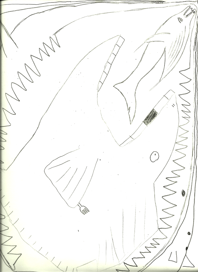
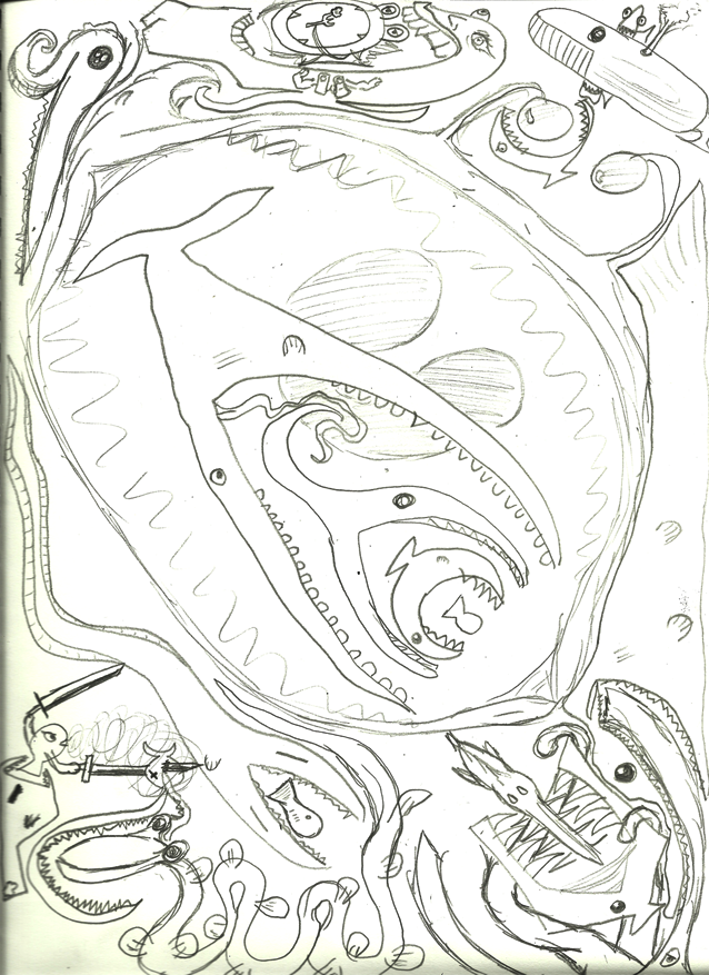
My instructions involved two players… Here they are:

PLAYER 1:

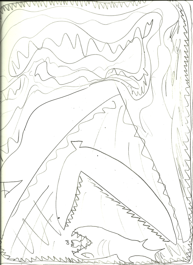
1. Draw a fish.

2. If player 2 draws a fish, unless it would run off the page or into another fish, you must draw a bigger fish eating their fish.

3. If the page is full, you are done. If player 2 does not draw a fish but there is still room on the page, repeat step 1.

PLAYER 2:

1. If player 1 draws a fish, unless it would run off the page or into another fish, draw a bigger fish eating their fish.


Here are the results:


Parametric Pencil Picture

I recently developed an interest in Voronoi figures. I have a habit of doodleing them in my Liberal Arts courses. I attempted to put my method into words and have others execute it. Included in the gallery is a drawing of my intent, the instructions, and 3 attempts. My instructions failed to yield a single “correct” drawing.
All three participants faltered under inconcise instructions around line 13. In retrospect, I should have carefully defined terms at the top of the page. Also, it was unclear when to switch colors. One participant, reading the instructions quite closely, didn’t lift the pencil after placing her random points. This resulted in pretty arcs.


Scanned with iPhone in lighting conditions that were only okay.

1. Orient the Letter sized paper in a random orientation. None of these directions reference the orientation
>Memorize steps 2 through 7. This is important. If you forget step 7 you will be unable to see for the rest of your life.
2. Close your eyes
3. Make a dot on the paper
4. Arbitrarily rotate the paper and move your hand to another arbitrary point
5. Make a mark
6. Repeat 9 times
7. Open your eyes
8. Make sure your 9 dots are dark and clear – the dots should have a similar visual prominence to
a black ant. A bit more than a sesame seed.
9. Connect the the dots with the straight edge and the blue pencil provided. Each must connect to at least 3 other nearby dots. If a dot has many neighbors, it should connect to them all. This should form only triangles. If you have a non-triangle, subdivide further. No lines should cross. Try to form the roomiest triangles possible.
10. At this point, you should have a pretty mess of triangles with an outer boundary that is exclusively convex. If you find a concavity, you forgot a line. Subdivide further. Again, making only triangles with lines converging only at your points.
11. From this point forward, lines will cross. This is normal.
12. Bisect all of your line segments with a cute little tick mark using the blue pencil. This mark
should fall exactly in the center of the line segment. You must measure. The tic should have about the prominence of a sesame seed.
13. With the supplied straight edge and a black pencil, extend the ticks into lines. These new lines should be exactly perpendicular to our segments. They should extend out in both directions, terminating only when they hit a previously drawn black segment or the paper edge.
>This means that the first lines will be outrageously long, and the last lines less so. Mark lightly, as they will be shortened later. Each node of the new black mesh should consist of exactly 3 lines. 14. When you have made all of these lines, go back and erase the portions that extend beyond their nodes, and darken that which was not erased.
>The darkened lines should extend between a node and other node or between a node and the paper edge.
15. Ensure the segments are dark and clear.
16. Fin.

Andrea Gershuny: Design of a Drawing Process (Assignment 03)

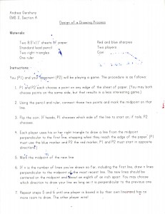
For this assignment, I designed a simple competition between two players. Here are my instructions and the results:

(The first drawing was a tie, P1 won the second drawing, and P2 barely won the third drawing.)

For the most part, the results were different from what I had intended but I wasn’t particularly surprised about that. I figured that, even though I’d proofread my instructions, there would be something ambiguous about them that I wouldn’t catch because I wrote them. Right away I decided I should have assigned the winner of the coin toss as P1 and the other player P2, that way we could see more definitely and clearly whether winning the coin toss led to winning the game. However, the  important thing that people interpreted differently was the amount of lines to draw on each turn: I intended that each player would draw one line the first turn, then two, then three, etc., drawing one more line in each set each turn. However, most people thought that they should draw one line, then two, then three (1+2), then six (1+2+3), then twelve (1+2+3+6), etc. I found that the second interpretation actually resulted in a bigger difference in outcome between players (for example, the difference between the winner and the loser when the players followed my original instructions was only one turn), made the game go faster, and created (I think) a more visually interesting drawing.

RobbGodshaw-LookingOutwards-2

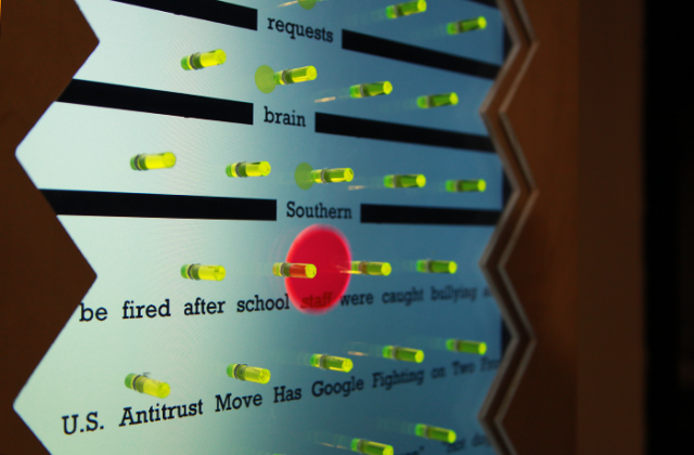
Plinko Poetry — Inessah Selditz & Deqing Sun


Plinko Poetry is an electronic installation which produces poetry out of news tweets and the trajectory of a pachinko chip. Pegs extend from a screen which is constantly scrolling with recent tweets from @foxnews and @nytimes. The participant takes the peg and drops it above the peg board. As the chip careens down the board, the words it passes over become random portions of a poem. These poems are short and nonsensical while still expressing aspects of the world today.
These are some of my favorites, pulled from the @PlinkoPoetry stream

Dozens blood Finals that Tribute of Champions flesh-eating
Bendukidze in Fund-Raising storm Terrorism administration’s Arrives say
Obama texting Past convicted Catch receive Egypts dog

Squeeze Past – Steven Kay


I’m just as fond of Voronoi as I am of bubbles. This is pretty, fun, and mathy. I love the visible pixels and the retro feel of spherical gradients.

Curtain — BlueThen


I wish wordpress allowed iframes. Here is a still.

This gorgeous fabric simulation allows the user to manipulate a small “curtain” in low gravity. As an added bonus, you can slice and tear the curtain by moving your mouse quickly. The natural and fluid way that this piece behaves is very appealing to me.
The code for this sketch is much shorter than I expected it to be.

Assignment 3 – Inception – MacKenzie Bates

Read the instructions I gave to the participants HERE

So…. After reading those instructions my three participants were rather confused and ended drawing things that didn’t look anything like what I had expected or wanted.

Were you confused by the directions? Most likely you were.

I switched EMS II sections, so I had already done an assignment very similar to this in Paolo Pedercini’s class. My first time around, I wrote very dry directions and my participants didn’t have much fun.

So this time around I  tried to make the exercise fun for the participants, and my attempt to do so resulted in an utter failure.

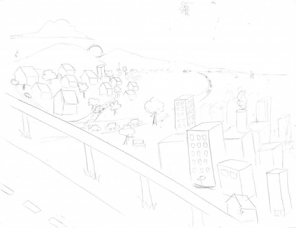
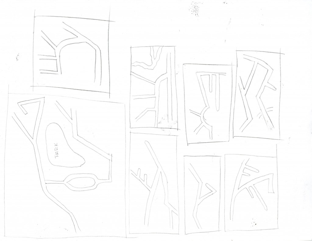
The directions overall were rather unclear but step 4’s “Improvise!!!!” was the tipping of the scale. For some reason I had thought the directions were very clear and that all my participants would draw imaginary cities. Instead people didn’t know what to do and they used  “Improvise!!!!” as their way out.

I would rewrite the directions entirely if I were to redo this experiment.

THE DISASTERS

By: Celina (Freshman — Design)

By: Keith (Sophmore — Industrial Design)

By: Random Person in Skibo at 1 AM (Grad Student — Structural Engineering)

Luo – Assignment 3, Design of a Drawing process

My process were fairly simple:

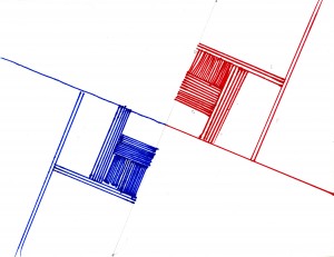
1) Draw a straight line that divides the paper into half. It can be vertical, horizontal or diagonal.

2) On both halves, draw a semicircle (bigger is better!). They don’t have to be the same size.

3) Divide the semicircles into halves.

4) Repeat step 2 and 3 until no more semicircles can be drawn.

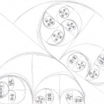
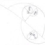
I’m fairly satisfied with the results, although one wasn’t carried out as much as I would have liked. It’s pretty funny that they all decided to divide the paper diagonally in the first step, I think it might have been due to the way I worded the instructions. It would be an interesting psychological experiment to do the same exercise but worded slightly differently to see how results turn out.

Minnar – Assignment 3 Drawing Instructions

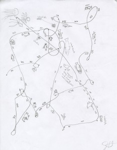
I was mostly interested in exploring human memory with my drawing algorithm, and the I guess just the human limitations of recall and timing compared to a machine. I wanted to see the differences in the pace that people went (how many loops they drew in their curved line would indicate their self-determined pace), and if that would affect their ability to remember their path across the paper. I guess my instructions didn’t suggest enough of a slow execution since everyone I gave it to interpreted it as “connect the dots as quickly as possible so I don’t have to loop much.”

———

Tools: 8.5 x 11 sheet of paper, pen or pencil

1. Choose a random number between 5 and 20

2. Draw your randomly selected number of dots scattered across the page, each dot must be at least 1-inch distance from the last dot you drew

3. Starting at any dot on the left, draw a curved line connecting your dot to any dot in the opposite direction to your current position (ie: first instance is any dot to the right of the leftmost dot). While proceeding from dot to dot, every two seconds your curved line must intersect itself. Repeat these steps until all dots have been connected.

4. Retrace your track across the page from the beginning and draw fish swimming next to your curved line, draw the fish facing the direction your curved line moved.

Andrea Gershuny: Looking Outwards #2 (Assignment 03)

Ebru Kurbak + Mahir Mustafa Yavuz: “News Knitter”


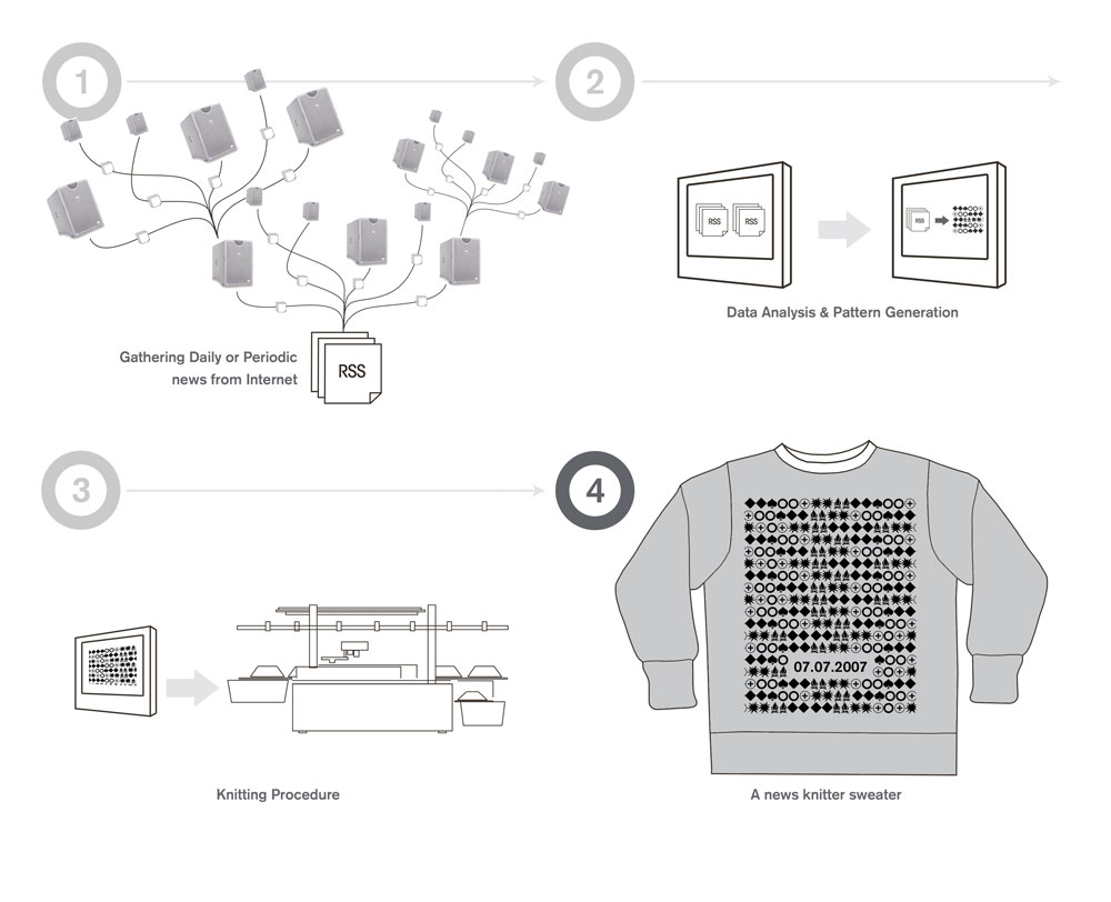
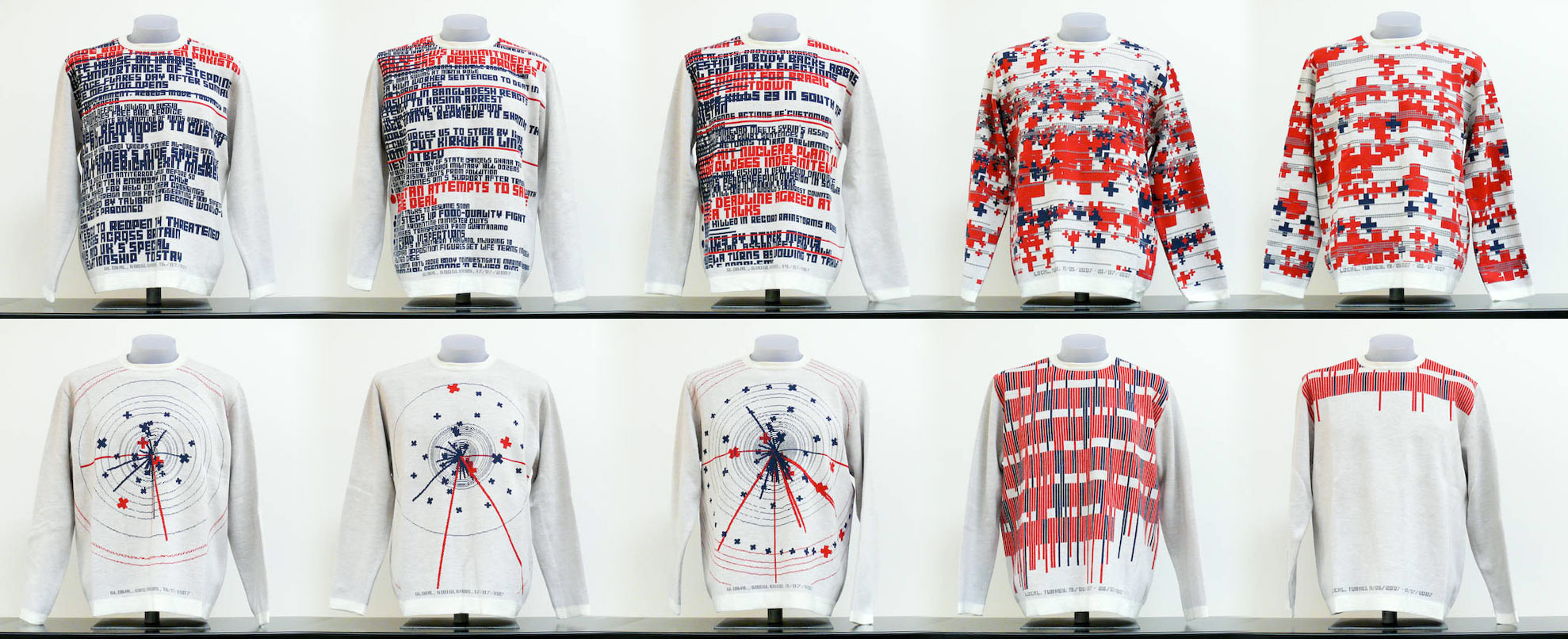
This project uses Perl to collect and analyze data from global and local (Turkish) RSS news feeds. Then, using Processing, the data is “visualized” and the visualizations knitted into sweaters using knitting machines. Those sweaters are then put up for sale (currently I’m on the waitlist to buy a sweater once some more are ready.) What I like about this project is that it converts something which often feels abstract and distant (the news) and converts it into something very personal and tangible (a sweater). I just wish I knew more about what the visualizations meant–I’m not exactly sure how the data is quantified or visualized but there seem to be four different types of patterns. I also wish the colors were defined by the news inputs (or maybe they are, I’m not sure). I love this project as it is, but, similar to how I wished the drawing robot included more variables, I wish this project included more variables as well.

Everyware [Hyunwoo Bang + Yunsil Heo]: “Cloud Pink”

“Cloud Pink” is an installation by Everyware, a “creative computing group” composed of Korean artists Hyunwoo Bang and Yunsil Heo. In this installation, drifting pink clouds are projected onto a sheet stretched horizontally overhead. Two kinects “watch” the sheet and, wherever it is touched, swirls of blue clouds appear. What I like about this piece is the ethereal, dreamlike quality, as if you were a little kid daydreaming yourself touching the clouds. It’s a simple piece without pretense or ego and it really makes me wish I could see it in real life–I especially want to feel what that fabric feels like; it seems so wonderfully stretchy and kind of heavy but still translucent (I am kinda of a fabric nerd though, so that might just be me). At first, when viewing this piece, I thought it would be nice to have some  sort of ambient music accompanying it in the background, but thinking about it now I think that that would bring it into the realm of cliche. As it is, I think it’s a lovely piece that seems  to really captivate everyone who interacts with it.

bitcraft [Martin Schneider]: “Codex Processianus”

(I tried to embed this one but it wouldn’t work… these sample photos will have to do for now I guess.)

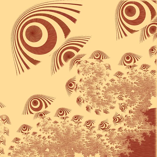
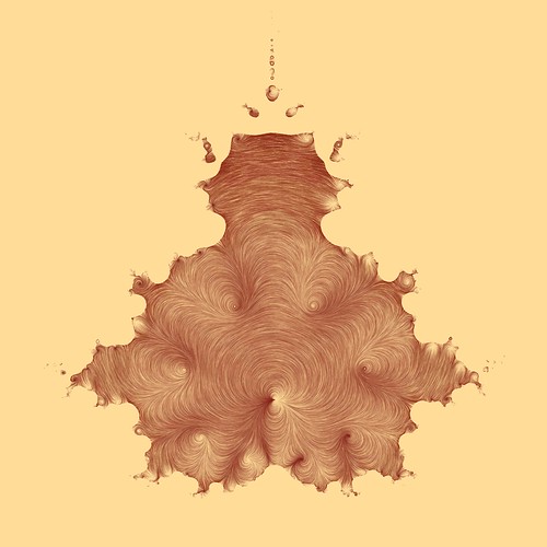
“Codex Processianus” is a project from openprocessing.org that creates “flow map based drawings”. I’m not sure what a flow map is,but I think it has to do with the flow of a fluid across or through an object; in this case, the objects are predetermined and you “uncover” the drawing by moving your mouse across it. The longer your mouse stays in one place, the darker/more “drawn” that area becomes. Whatever the science behind it is, this piece is a really simple way to create (or reveal) really elegant drawings. I wish there were a way to generate the object yourself, though you can change it by hitting the spacebar and see it by right clicking. There are also a few different color palettes to choose from, though my favorite is da Vinci, the one shown. I wish I knew more about how this drawing works, so I’ll have to look at the code more sometime in the future– at this point it’s a bit beyond me, I can basically understand how the code works but not the physics behind the drawing itself. Either way, it’s a fun thing to play around with that creates really elegant drawings just by waving your mouse around!