Susan Lin — Generative, Final
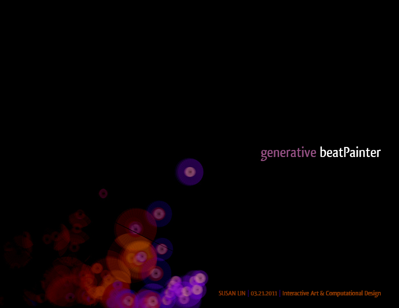
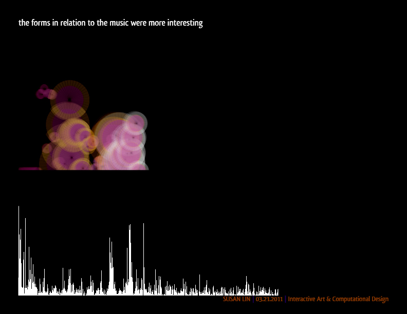
generative beat painter | live online
—
Revamped Version
- Coming soon! Modifications based on received feedback.
- A version which doesn’t wrap around and produces an infoviz-esque image of the entire song.
- And if it doesn’t give me too much trouble, add a UI to select a song to play.
—
from Monday
If anyone was interested, I presented with
FantomenK’s – Taking a Nap in the Jungle
and
We are Happy Planet’s – Time (remix)
You can screw around with songs of your choice. There’s no interface unfortunately, but just stick your song of choice into the data folder and add this in setup after the other songs:
song = minim.loadFile("YOUR_FILE_NAME_HERE.mp3", 2048);
—
Process
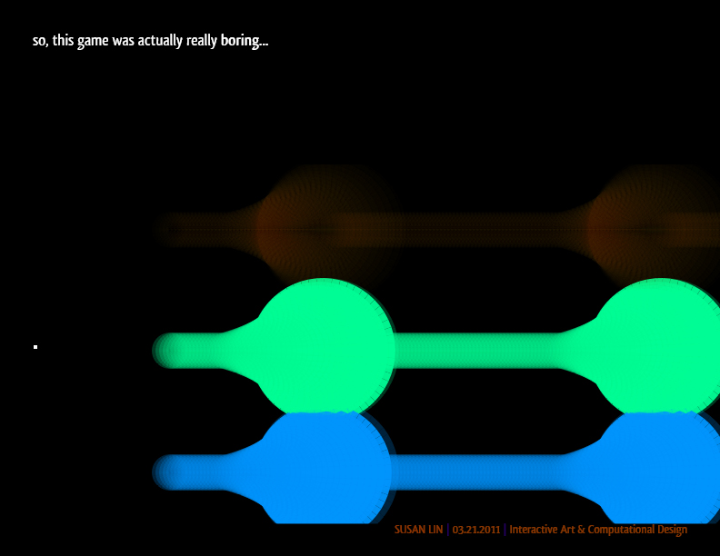
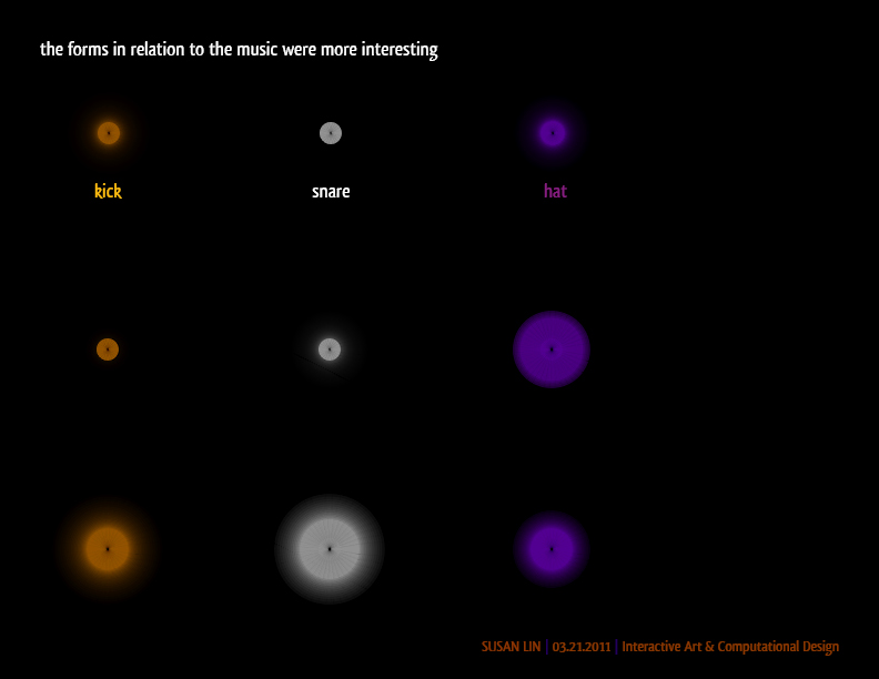
> minim beat energy
> wasd keyboard controls
—
Retrospective
Some goals:
- Present on Monday (Yay, it happened!), and related…
- Scope, scope, scope into a short doable project while keeping it meaningful.
- Leverage strengths more (visuals).
- Create something that involves input from the user.
- Make it fun, toy like.
It feels good to accomplish this.
I am pretty happy with the result regarding time and concept. As for what could have gone better, aside from the UI, I wish I had more time to read up on FFTs or another interesting way to plot the y-axis. My method ends up looking reasonable, but more nuance would have been ideal.
Thanks for reading, hope you guys got a kick out of it.

Hi Susan – good start! Please finish your blog post asap. Here are the comments from the crit. -GL
———————————-
The colors get a little muddled when they overlap. Maybe you could blend differently.
Nice project. It feels like it maps to the audio quite well.
I wish there was more hysteresis.
Yay chip-tunes! Very nice effect. i would love to see this as a long scrollable window. This could be a neat way to look back through a song. even though the graphics are nice, doing some more fading, adding more depth to the graphics would make it even better.
Gotta love ’em 8-bit beats. Maybe some cumulative effect? Use the whole screen instead of only the lower part?
The pitch stuff works well, maybe make the ones at the top really bright cause they’re kinda high-pitched anyway.
Cool music. Very pretty. I like the choice of colors.
I think the second visualization works much better. You can see the way the visualization responds to individual beats more clearly.
Pretty visualization. I think the music is very good for this project.
matches up with the music pretty well, and all the colors and transparencies look really good. Wow, huge contrast when you started playing the second song. nice. I think it would be smoother if instead of wrapping around, the screen scrolled and the images just kept going towards the right.
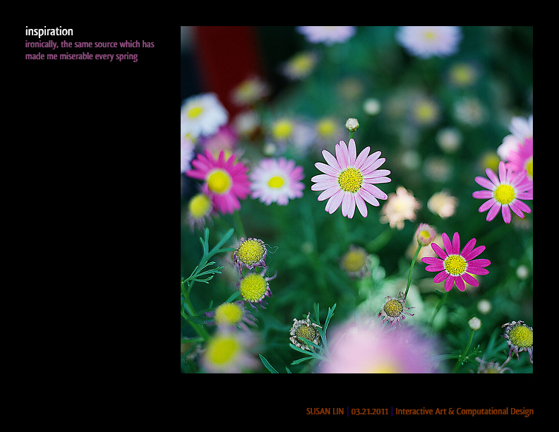
Solid implementation. The visualization matches the music. << +1 This is based off the modification of the main Minim demo. It's a good start. [Golan] Hey everyone, we should talk about how to use FFT data. Please remind me. Without better grasp on how to use FFT information, some of the positions seem noisier (and less well-coupled to the sound) than they could be. The visualization syncs with the music pretty well. I like that you demonstrated with different songs to show the different effects that can be achieved. I actually like how it looks better with the slower song. Nice evolution of your concept. It looks really fun. I think it came out much better than what it was intended to be. Very visually appealing. I wonder if you could have gone a little more abstract with it - it's pretty linear right now and I think you could have enhanced the etherial atmosphere if the ball/daisy's progression wasn't so rigid. Very pretty, especially with the slower song where the painting cursor doesn't jump around. This is beautiful!!! I think it's my favorite music-controlled thing yet.