SamiaAhmed-ProcessSketches-Infoviz
I am working with a log of all of my actions for the fall and spring of my sophomore year.
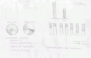
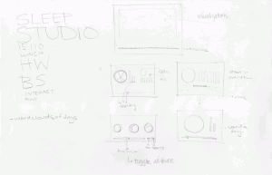
Below are some sketches that I made, beginning to think about the form of my visualization. They are mostly straightforward, looking at bar charts and pie charts. The bigger questions I’ve been asking is what I am comparing across — I think the interesting things will come out in looking at falls/spring or weekend/weekday, for example. I was also wrestling with the question of static/interactive. I’ve decided to work interactively, most likely in some kind of simple interface with a time line at the bottom, and the “visualization” at top. I am trying to figure out how to incorporate/build in small viz of a single day to the overall viz of the entire semester (so how does this specific day compare to the rest of the semester, or the “average” monday).
Next things next — typin’ up the data.


I’d recommend you check out The Feltron Report as found by Shawn Sims.