shawn sims-lookingOutwards-4
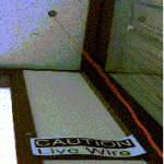
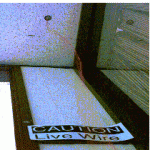
Natalie Jeremijenko’s “Dangling String” is a bit old-school at this point but I have to mention it if we are talking about favorite infrographics. While this isn’t drawing circles or drawing flow lines on a map like some data-heavy graphics recently emerging, the string is directly responding to bandwidth being used on the local network. As the traffic increases the string begins to spin more out of control. It occupied the corner of an office and much like a busy person in their own cubicle, the string had a space and an activity that was based on the collective action of the amount of internet use. Each byte flying through the ethernet cable moved a motor slightly. The output was a highly dynamic physical infogrpahic that had some embedded ambiguity. People were at first not entirely certain hows its movements were controlled. In my opinion some of the most successful physical computing projects use this as a tactic.
Find out more about the project here.
———————–
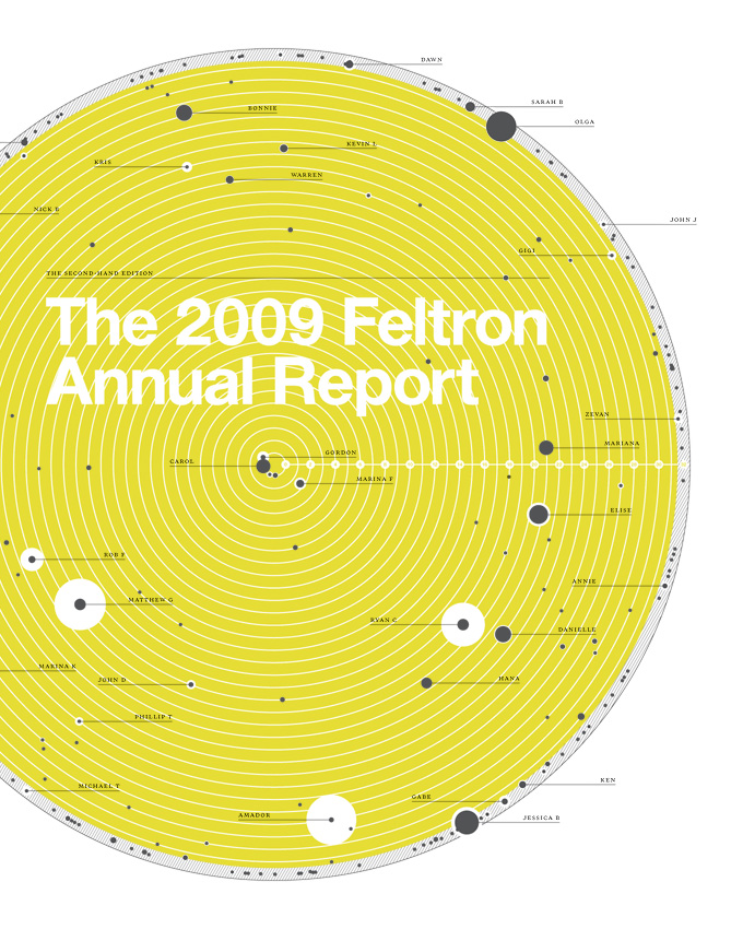
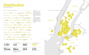
The Annual Feltron Report is an amazing collection of data visualizations from the private life of a data obsessed man name Nicholas Felton. Each day he collects data as he goes along ranging from the things he eats and drinks, to the destinations of travel, emails, parties, and even what his dog eats. He then turns this into an annual report that he publishes and has turned into quite a read. While his graphics aren’t jaw-dropping the amount of rigor it takes to extract this much data and consistently record it is inspiring. Simply put, you do not need an amazing data set to make an inspiring story behind your information visualization. Felton has some of the dullest data, but collectively it is someones life and everyone can relate to that and that is why it is truly awesome.
Find out more about Felton’s work here.


