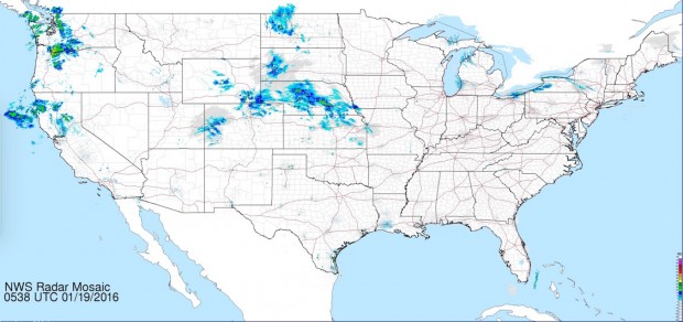
NOAA runs a weather website that doesn’t get much love, but I think it’s great. It’s at weather.gov (of course) and what it sorely lacks in ease of use and good design it more than makes up for in an un unguarded willingness to share highly detailed data.
A feature that I’ve always been drawn to is their full resolution (3400 x 1600) “national mosaic” of doppler radar stations. You can view this as a big static image or animated gif of the same dimension. The map is extremely short on options: it doesn’t, for instance, allow for any zoom/pan beyond the scrolling and zooming your browser affords you. And the projection is very peculiar; they don’t label it but whatever it is makes the lower 48 look oddly short and wide.
The beauty of this map is that all at once, you see everything. Want to see more detail? Use command +. This is basically the same sort of zoom that a paper map offers: if you want to see it bigger, then get closer. (If you click on an area of interest you’ll link to the regional map page, featuring a more detailed view.)
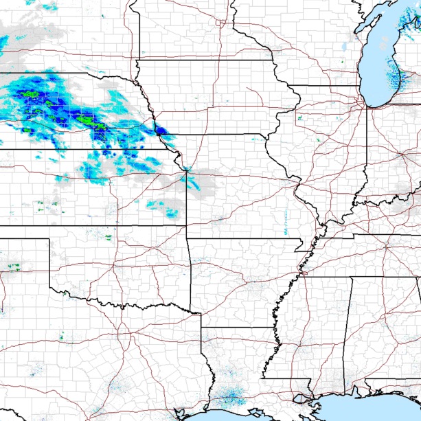
But my favorite part of the map was an odd pattern I first noticed more than a decade ago: it always seemed like there’d be a minimum of a little bit of light weather surrounding cities. Why was that? Maybe some sort of urban heat effect? No. The reason it looks like there’s clouds near cities is much simpler: the radar stations are in those cities, and they’re most sensitive to the closest air. The surrounding countryside is not covered in detail by radar stations and so unless there’s highly reflective storms there, it usually looks empty on the big map.
It’s a beautiful metaphor. The map doesn’t explicitly show where its data gathering points are or what their ranges are—but once you notice the little regions of sensitivity you start to see that the map is as much a representation of what sorts of weather are knowable and unknowable from radar, as it is a picture of where the storms actually are.

