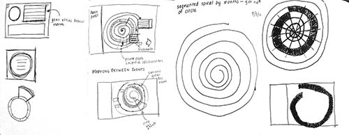
For my final project, I decided to continue on my Jewish time visualization. A main shortcoming of the previous version was that there was a disconnect between the circular timeline and the horizontal timeline and this, in combination with the second main shortcoming of using events that were on too large a scale, meant that it was hard to discern any patterns or growth from the visualization. Consequently, I decide to make two big changes: firstly, I combined the two timelines to create one 2-dimensional spiral timeline that is supposed to simulate the three-dimensional nature of a helix. Secondly, I decided to narrow the scope of events I was using to events that have occurred in my own life. Below are sketches thinking through different timeline options:

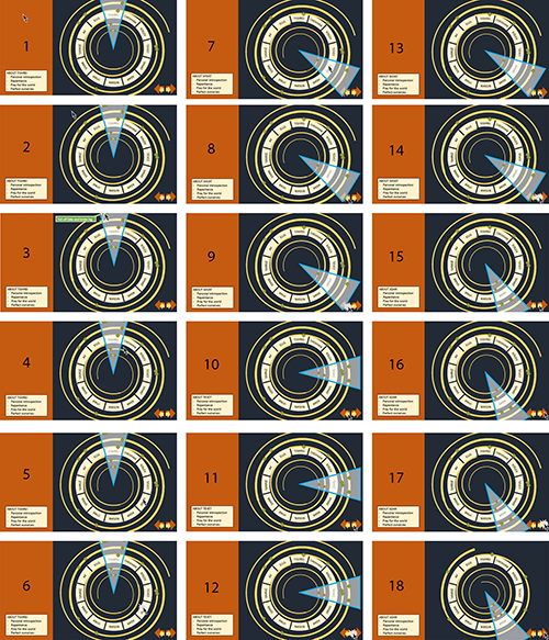
Following the hand sketches, I used PowerPoint to mockup some of the interactions that could be explored using the new spiral timeline:

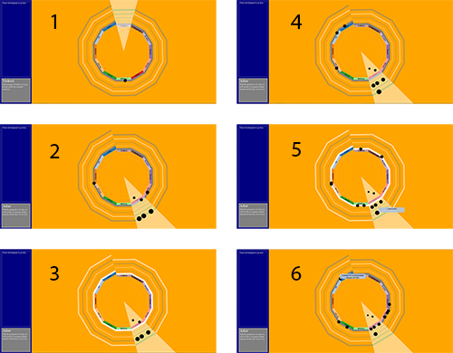
Each revolution around the spiral depicts a full Hebrew year. The current highlighted year is the outer spiral closest to the month names. All of the events on this year are visible. The selected month has a cone highlighting it, illuminating the events that occurred during this month over the visible year spirals. The combined highlighting allows the user to explore event sequences across a year or throughout a span of years. From these designs, I built the second Z’man prototype, Z’man Sheli (My Time):

The user has the ability to sift through the years using the right and left arrow keys and change the selected month with a month click. The user can also hover over any of the visible events to see the event’s description.
Z’man Sheli can be found here and the code for it here. Below is a video of it in use.
Z'man Sheli from Erica Lazrus on Vimeo.
There is still a lot of work to be done to Z’man Sheli, beyond the simple matter of further developing the graphical elements and color scheme. I would like to find a way to have the descriptions multiple (or all) of the visible events be on screen, instead of the user having to do a hover. Also, I would like to fill in the side panel with more user functionality such as the ability to sign in and view your personal events and to add and edit your events. Lastly, and I think most importantly, I would like to find a visual language that make sense to allow the user to create mappings through their events so that they can annotate their thoughts as they explore through their personal history.