World Cup Visualization Proposal
For my place visualization project, I want to visualize the 2014 World Cup in Brazil using Twitter data. I think long, international tournaments like the World Cup are particularly well-suited to visualizations, especially when combined with an incredible data source like Twitter. There’s just so many layers of data related to teams, countries, players, games, etc. that could be brought to life with interesting visuals.
Luckily, I found a dataset containing 32 million tweets relevant to the World Cup 2014: http://blog.aylien.com/post/94148001128/text-analytics-meets-2014-world-cup-tweets-part-1
Data Processing
Processing the data will undoubtedly be the most challenging part of this project. Not only is the dataset enormous (over 32 million tweets), but it’s quite limited. Because the dataset only lists the tweet IDs of each of the tweets, I have to make calls to Twitter’s REST API to get the complete tweet information such as text, geographic coordinates, and date. To do this efficiently, I plan on distributing the tasks using multiple API keys. However, if this doesn’t work out, as a backup, I’ll just take a random sample of my data and base my visualizations off that.
Visualizations
Here are some ways I want to visualize my World Cup data:
- Spheres of Influence – I want to understand how much of an influence a team has by showing where most of the tweets about that team originate from. Basically, I’m imagining three circles around each participating country, showing where 68%, 95%, and 99% of the supporters of that country are located. I suppose some countries like Germany and Brazil will have massive spheres of influence since they have supporters all over the world. Other nations, meanwhile, may have smaller, more regional spheres since their team may not have a global brand.
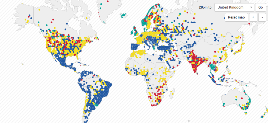
- Locations of fans – A simple choropleth map showing the favorite team for each country in the world. While most participating countries will probably support their own national team, it’ll be interesting to see which teams are supported by countries that did not participate in the tournament. Here’s a visualization that I’m using as a model:

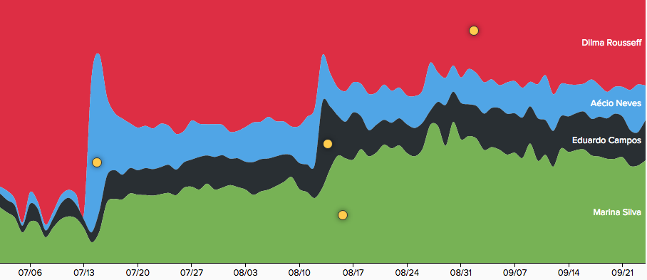
3. Follower growth over time – With multiple line graphs, I want to show how a team’s following (measured by the number of tweets about the team) changes as the tournament progresses. I was thinking of something along the lines of this political visualization:

4. Important Events – I want to zoom in to micro-time scale like a single game and visualize what people were tweeting about during that time frame. Some particular events of interest may be the Brazil vs. Germany game (Germany won 7-1) and the final game. Here’s a similar visualization idea, done on the State of the Union Speech.
